Skip to content
modern

in the modern manner

graphic deign

BT Telephone Exchange – Altrincham

Posted on January 28, 2021January 28, 2021 by modernmoocher

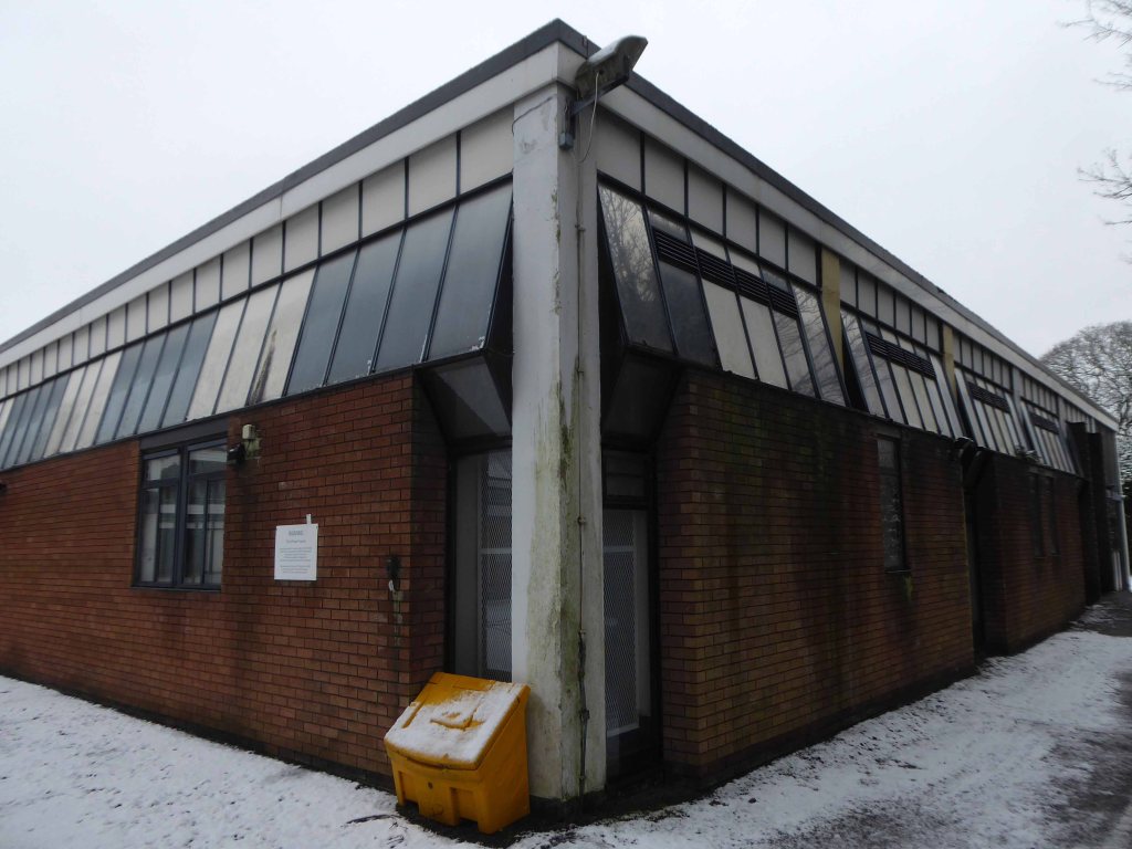
Woodville Road WA142AF

The BT Hunters – They came in search of paradise and found BT.

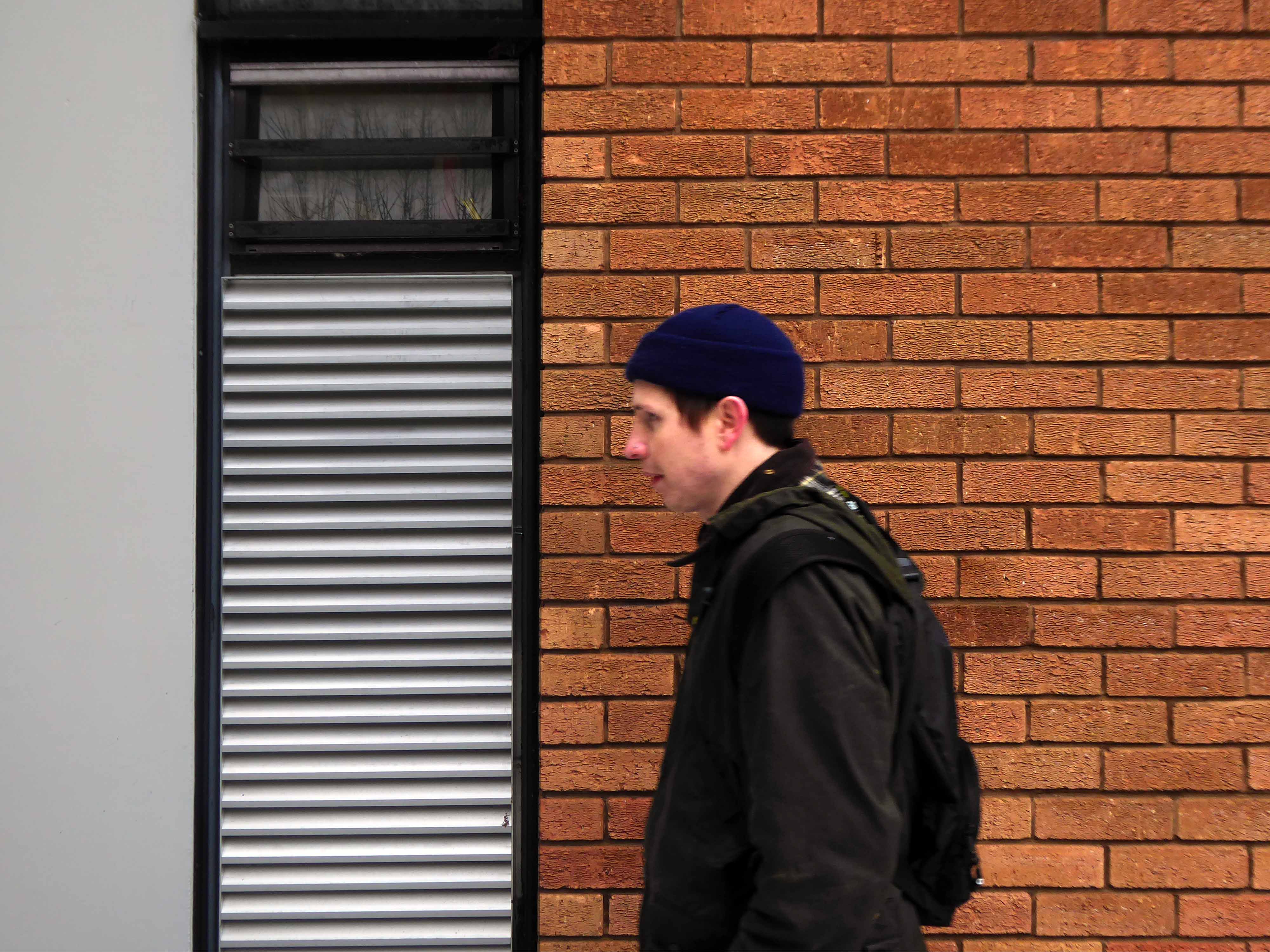
Many thanks to my partner in victimless crime – Mr Ryan Lloyd.

This is an atypical single storey building, with a raised central hall and butterfly roof, quite something.

Lots of utilitarian detail, mixing brick, glass and concrete, with pragmatic infrastructure grills and grids.

The upper glazed area an extended asymmetric, external delight.

To set the pulse racing a series of gorgeous Rose Carmine panels.

The angular porch displayed the BT Logo of 1991:

On 2 April 1991, the company unveiled a new trading name: BT accompanied by a new corporate identity designed by Wolff Olins and organisational structure focused on specific market sectors, reflecting the needs of different customers – the individual, the small business or the multinational corporation. The reorganisation was named ‘Project Sovereign’ to reflect the company’s commitment to meetings customers’ needs – ‘The Customer Is King’. Together with a succession of strategic alliances with telecommunications companies worldwide, these changes gave BT the ability to expand overseas.

Logo Fandom

Which prompted a brief yet uninformed discussion concerning the history of Telecom’s Corporate Identity.

So here’s a brief rundown logo lovers:

Previously the GPO was the umbrella grouping for both telephone and mail.

Sketch for the redesign of the GPO logo by MacDonald Gill in 1934 . The first approved version had two concentric circles but this was soon reduced to one. The annotations also mentions the typeface used as “Gill Sans” which had been created by MacDonald Gills’ brother Eric.

Postal Heritage

The previous telecommunications arm of the Post Office disappeared in 1981 when the British Telecommunications Corporation was formed.

I digress, so back to the building let’s have a good old look around whilst we’re here.

Where’s Ryan?

Posted in Architecture, brick, cheshire, Concrete, Design, doors, England, GPO, Graphic Design, Greater Manchester, High Street, Modernism, Modernist, Photography, Post Office, Post War Architecture, Signage, Signs, Typography, UK, UrbanTagged Altrincham, architecture, brick, British Telecoms, BT, Concrete, GPO, graphic deign, History, infrastructure, logo, MacDonald Gill, modern architecture, modernism, Modernist, Signage, signs, Telecommunications, Telecoms, Telephone Exchange, typography, Woodville RoadLeave a comment

Previous posts

  • March 2023 (3)
  • February 2023 (5)
  • January 2023 (4)
  • December 2022 (3)
  • November 2022 (7)
  • October 2022 (10)
  • September 2022 (10)
  • August 2022 (4)
  • July 2022 (6)
  • June 2022 (3)
  • May 2022 (8)
  • April 2022 (8)
  • March 2022 (5)
  • February 2022 (7)
  • January 2022 (5)
  • December 2021 (1)
  • November 2021 (14)
  • October 2021 (10)
  • September 2021 (5)
  • August 2021 (12)
  • July 2021 (9)
  • June 2021 (9)
  • May 2021 (4)
  • April 2021 (9)
  • March 2021 (7)
  • February 2021 (10)
  • January 2021 (9)
  • December 2020 (3)
  • November 2020 (9)
  • October 2020 (12)
  • September 2020 (7)
  • August 2020 (8)
  • July 2020 (10)
  • June 2020 (26)
  • May 2020 (15)
  • April 2020 (18)
  • March 2020 (11)
  • February 2020 (8)
  • January 2020 (7)
  • December 2019 (6)
  • November 2019 (4)
  • October 2019 (6)
  • September 2019 (5)
  • August 2019 (7)
  • July 2019 (3)
  • June 2019 (7)
  • May 2019 (9)
  • April 2019 (6)
  • March 2019 (7)
  • February 2019 (6)
  • January 2019 (3)
  • December 2018 (4)
  • November 2018 (8)
  • October 2018 (5)
  • September 2018 (7)
  • August 2018 (6)
  • July 2018 (7)
  • June 2018 (8)
  • May 2018 (12)
  • April 2018 (4)
  • March 2018 (7)
  • February 2018 (4)
  • January 2018 (5)
  • November 2017 (2)
  • October 2017 (2)
  • September 2017 (6)
  • August 2017 (7)
  • July 2017 (3)
  • June 2017 (4)
  • May 2017 (10)
  • April 2017 (9)
  • March 2017 (7)
  • February 2017 (9)
  • January 2017 (6)
  • December 2016 (1)
  • November 2016 (4)
  • October 2016 (7)
  • September 2016 (14)
  • August 2016 (7)
  • July 2016 (1)
  • June 2016 (6)
  • May 2016 (10)
  • April 2016 (11)
  • March 2016 (17)
  • February 2016 (9)
  • January 2016 (8)
  • December 2015 (5)
  • November 2015 (10)
  • October 2015 (2)
  • September 2015 (3)
  • August 2015 (3)
  • July 2015 (1)
  • June 2015 (12)
  • May 2015 (3)
  • April 2015 (10)
  • March 2015 (16)

Blog Stats

  • 782,231 hits

Abandoned Architecture brick Brutalism Church coast Concrete Decline demolition Derelict Design doors engineering England Graphic Design Greater Manchester History Housing housing estate Industry Interior Design lancashire Landscape Manchester Modernism Modernist Municipal Modernism Photography Post War Architecture Public Art Public House redevelopment regeneration Sculpture Sea Side Shop shop front Shopping Signage Signs Sign writing Social History Social Housing Stockport Tower block Typography UK Uncategorized Urban Yorkshire
Blog at WordPress.com.
  • Follow Following
    • modernmooch.com
    • Join 274 other followers
    • Already have a WordPress.com account? Log in now.
    • modernmooch.com
    • Customize
    • Follow Following
    • Sign up
    • Log in
    • Report this content
    • View site in Reader
    • Manage subscriptions
    • Collapse this bar
 

Loading Comments...