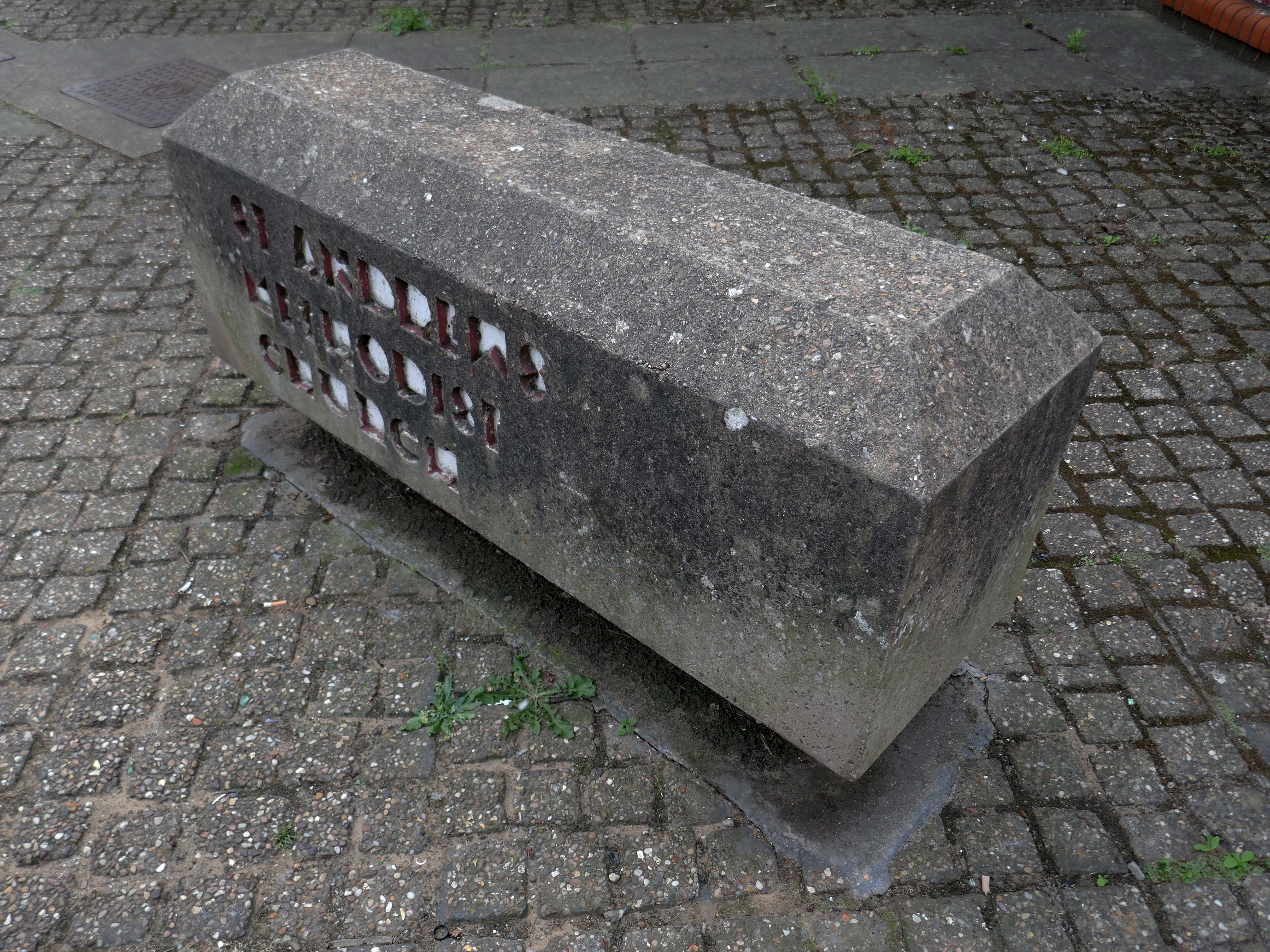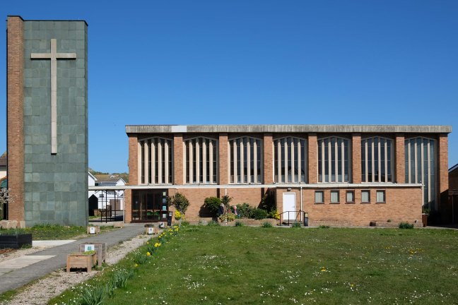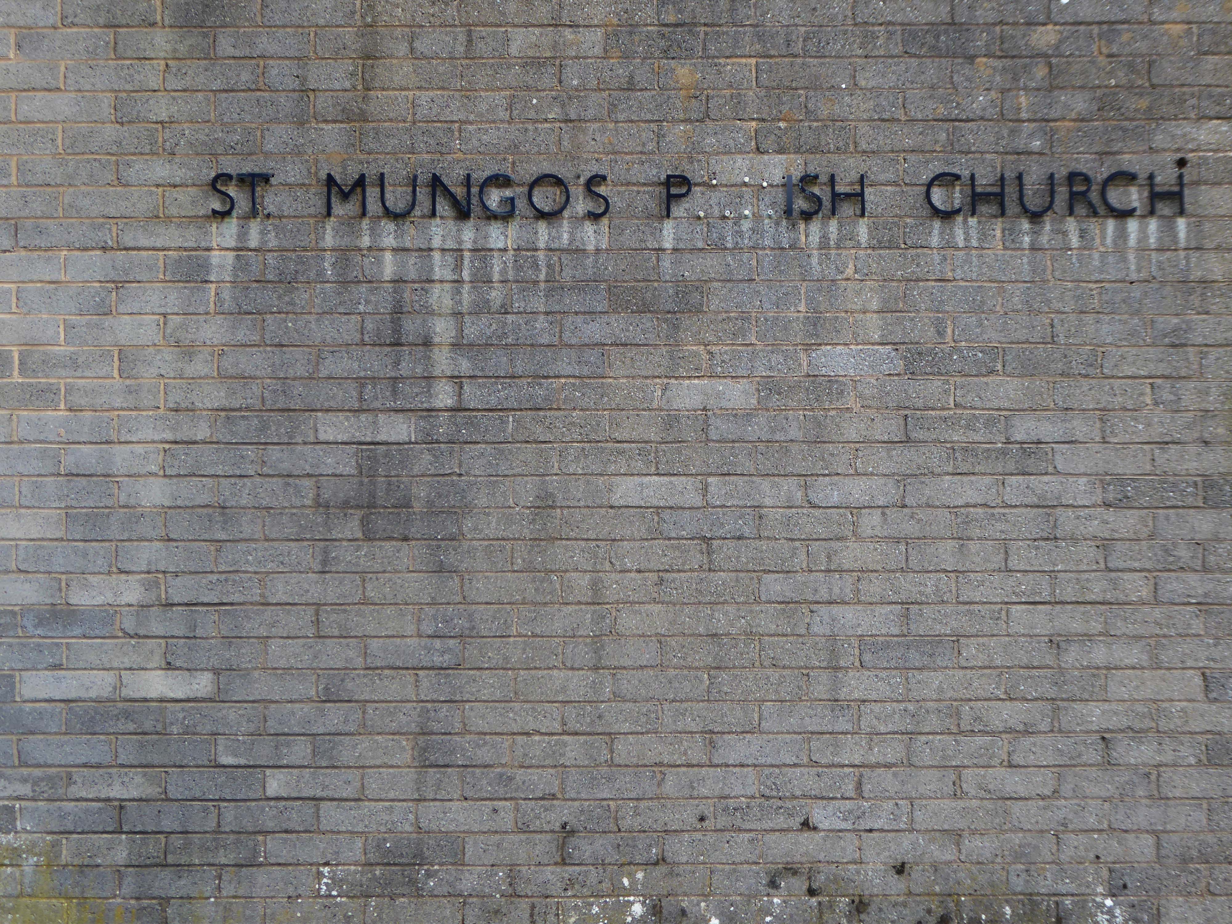

This is one of many George Pace Churches I have visited – St Marks Broomhill – William Temple – St Leonard and St Jude – Keele University Chapel – St Saviours – Church of St Mark.
I am grateful to Natalie Ainscough for directing me here to York.
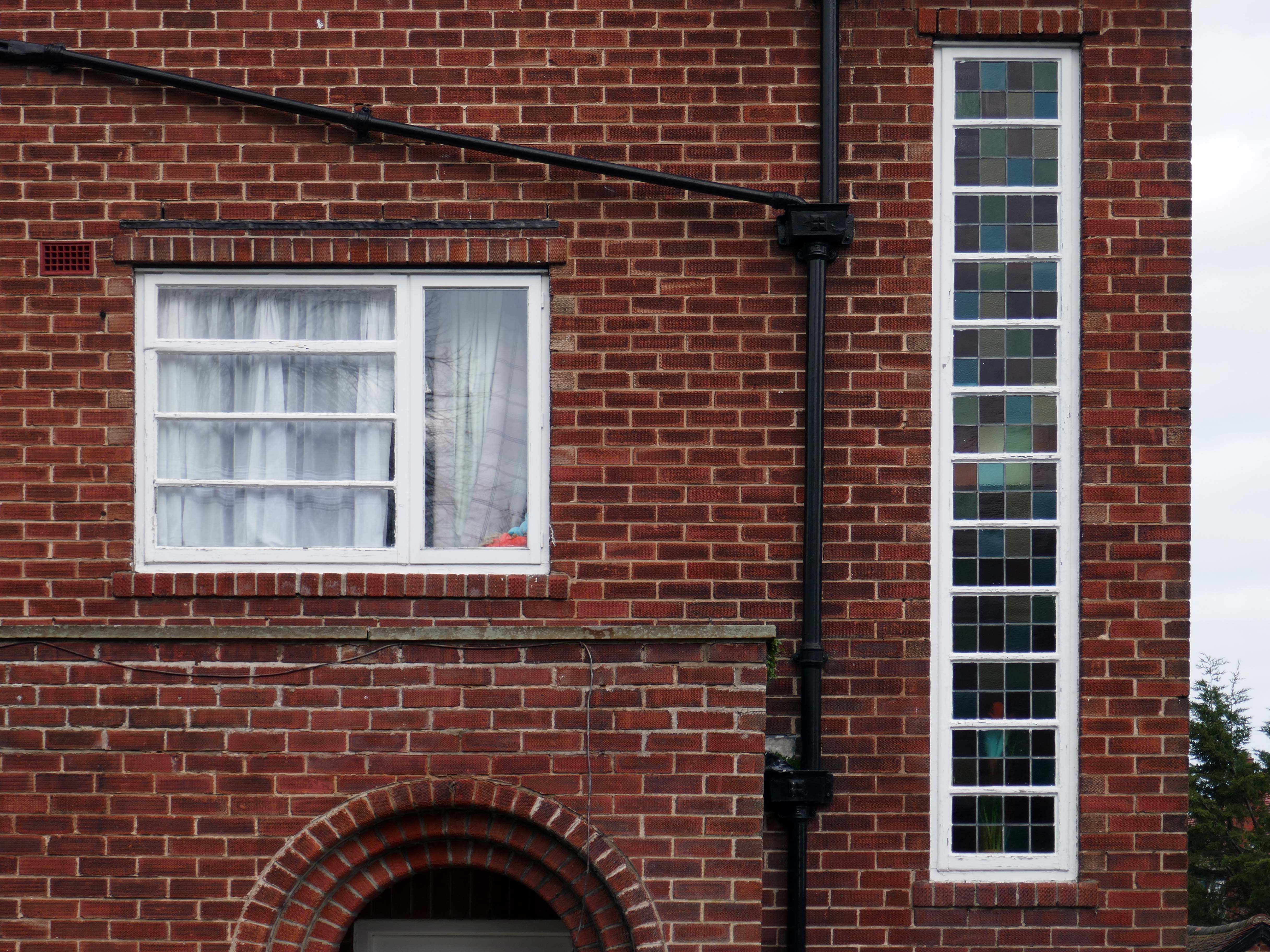
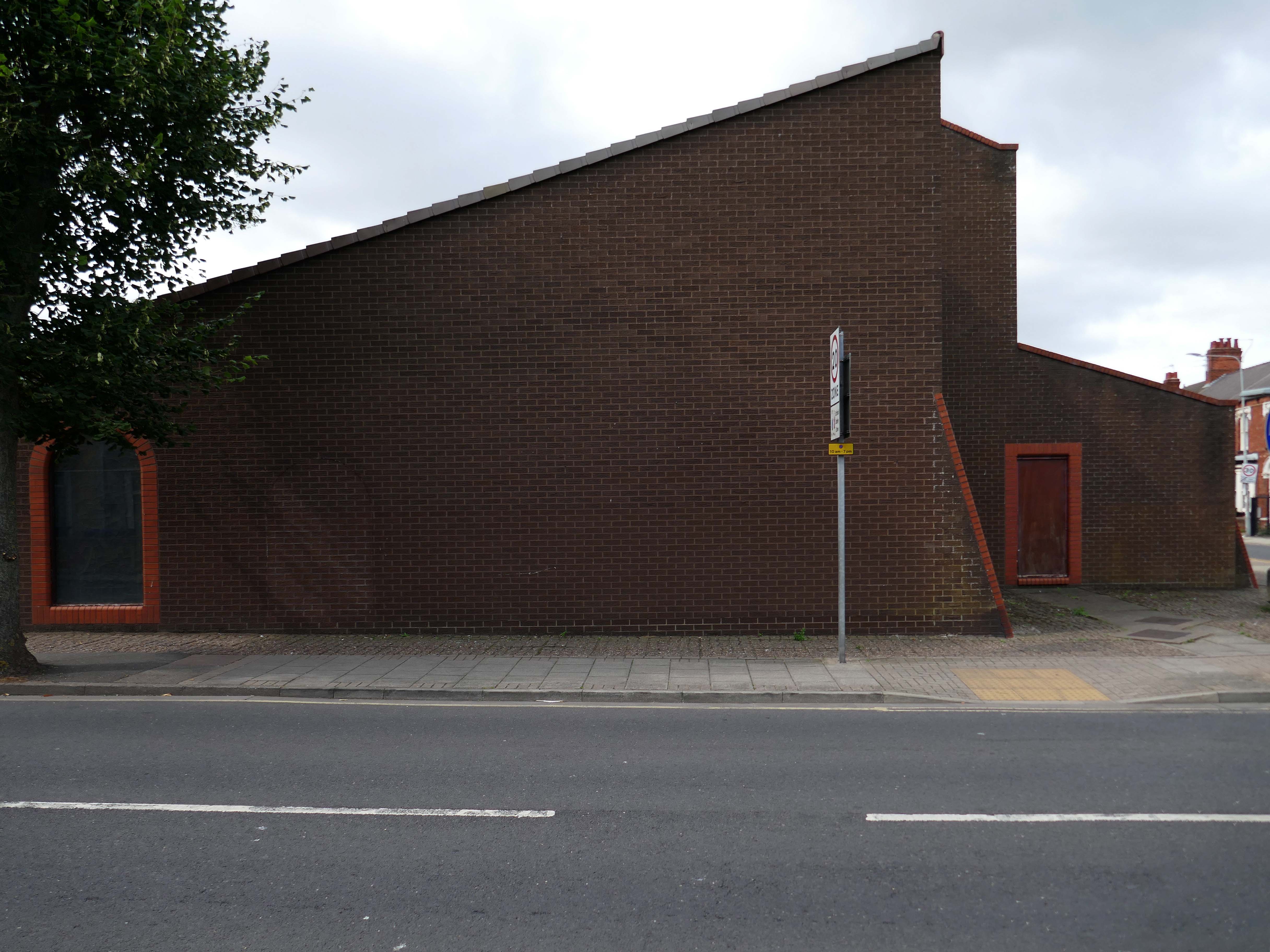
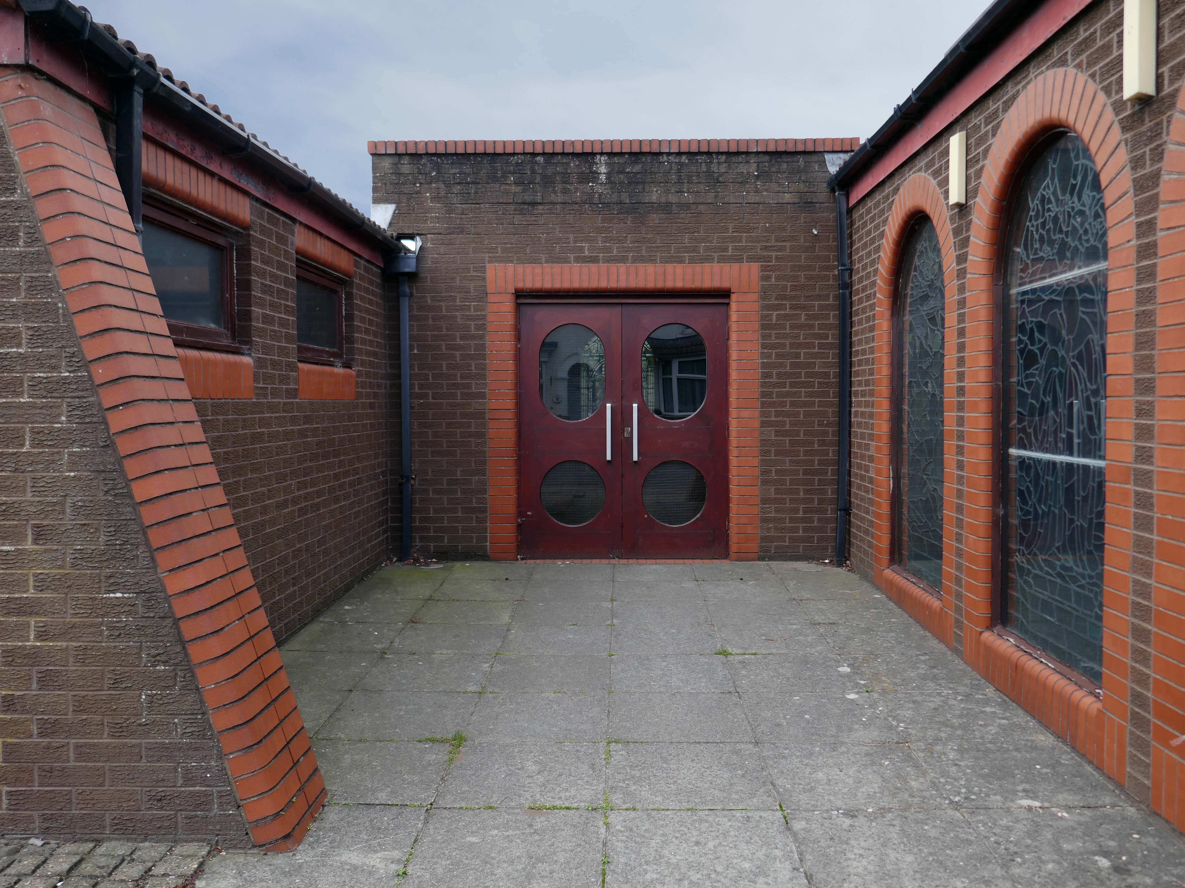
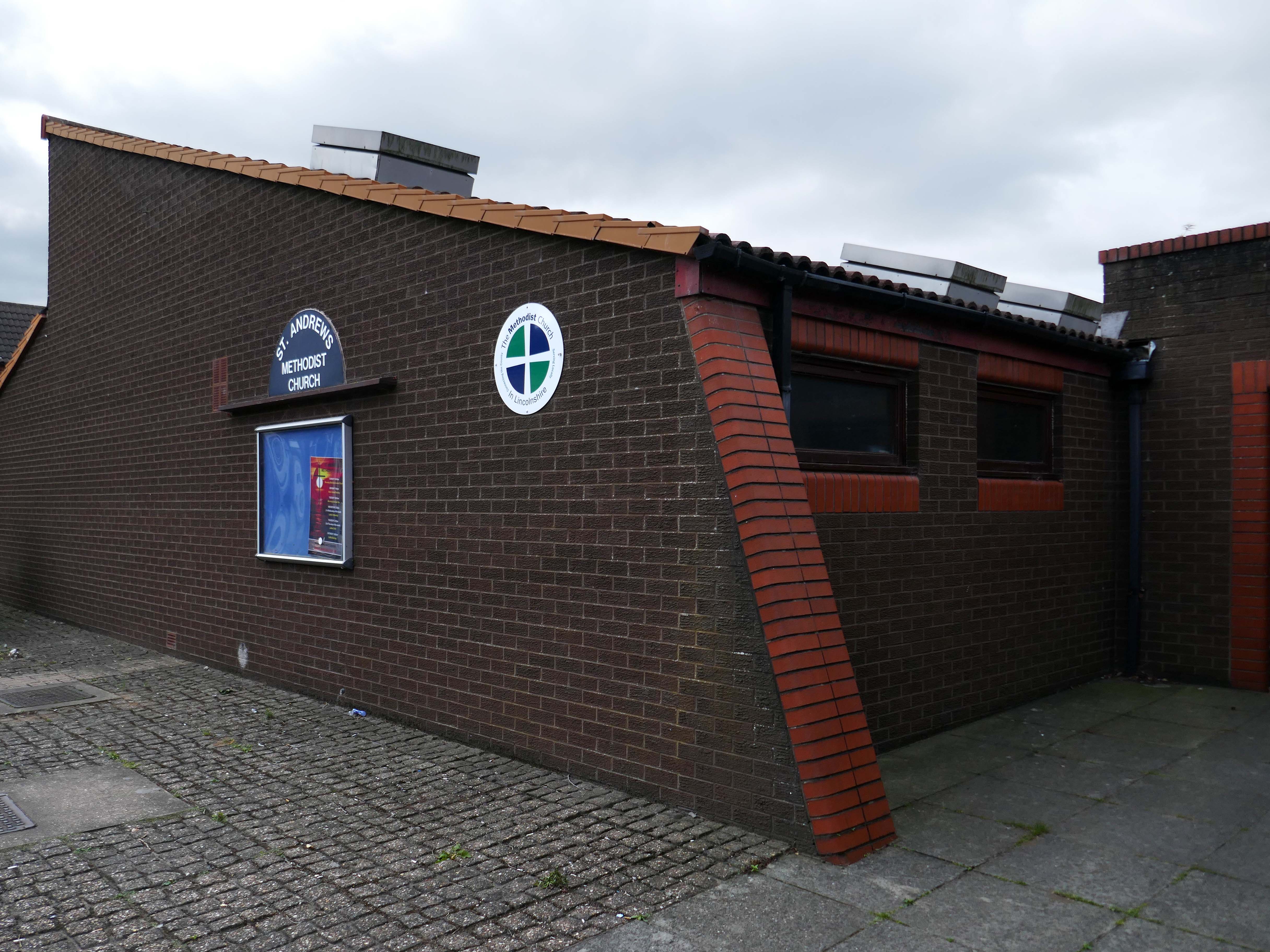
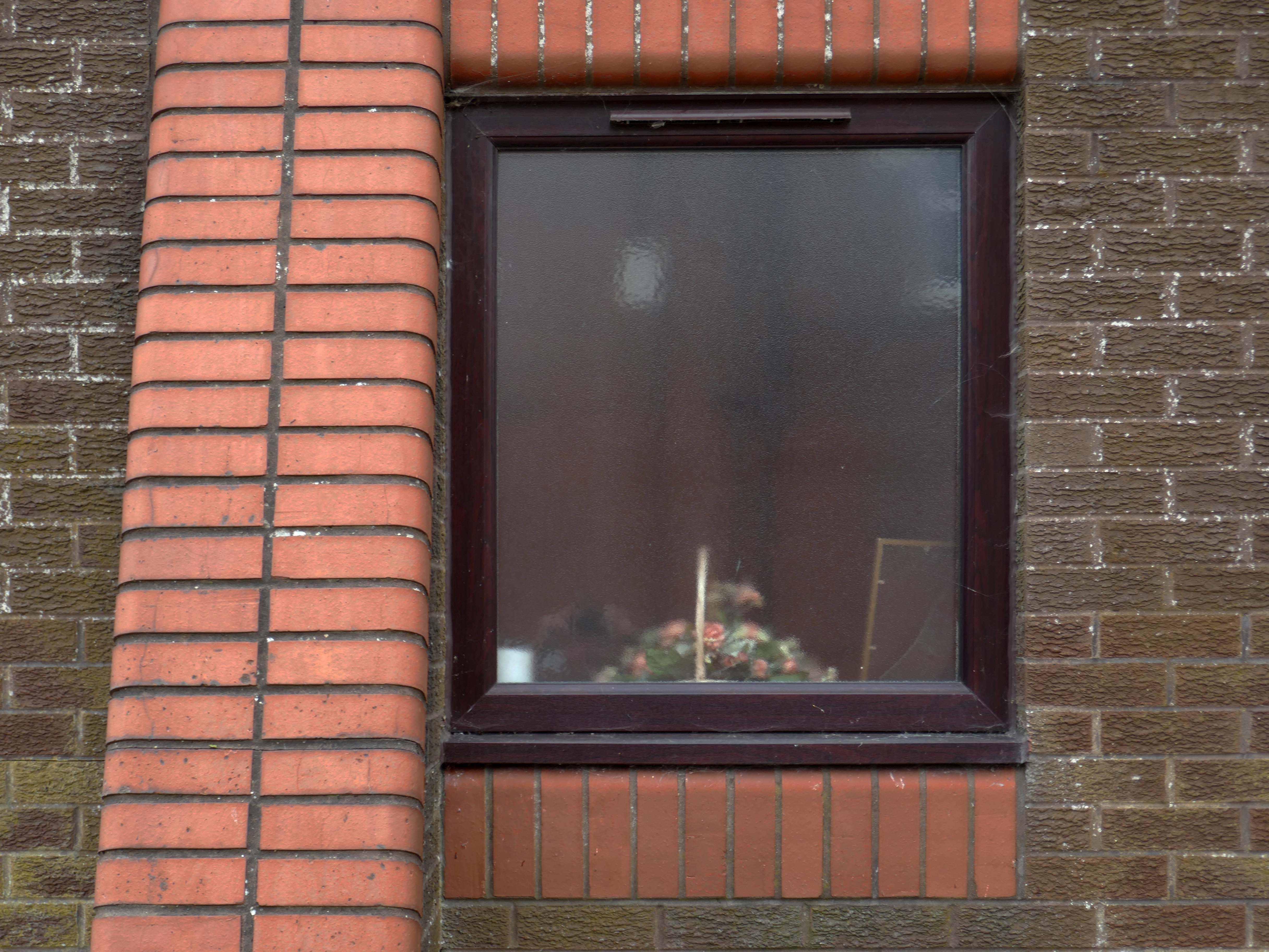
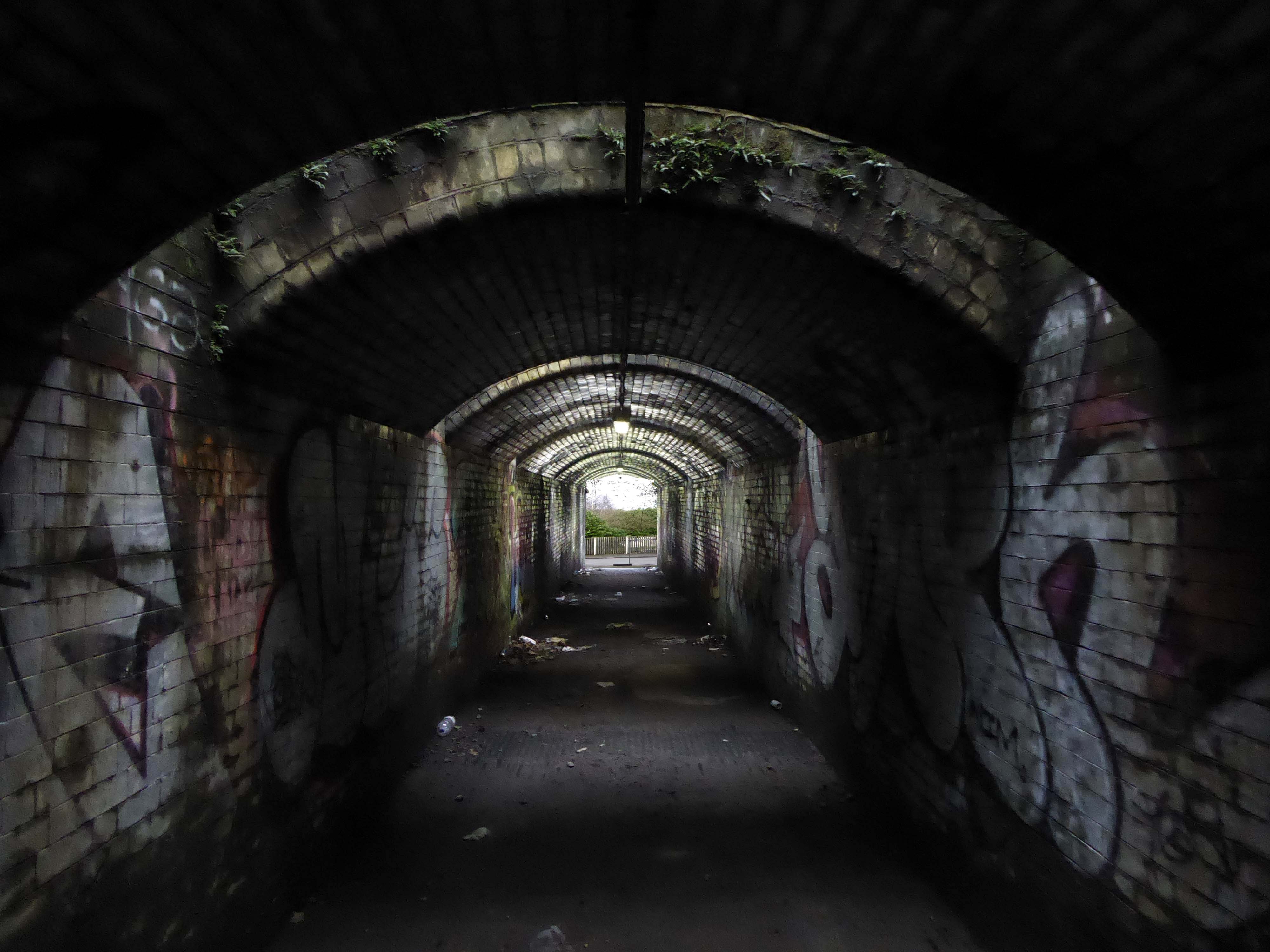
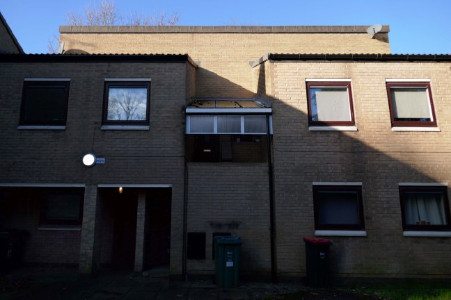
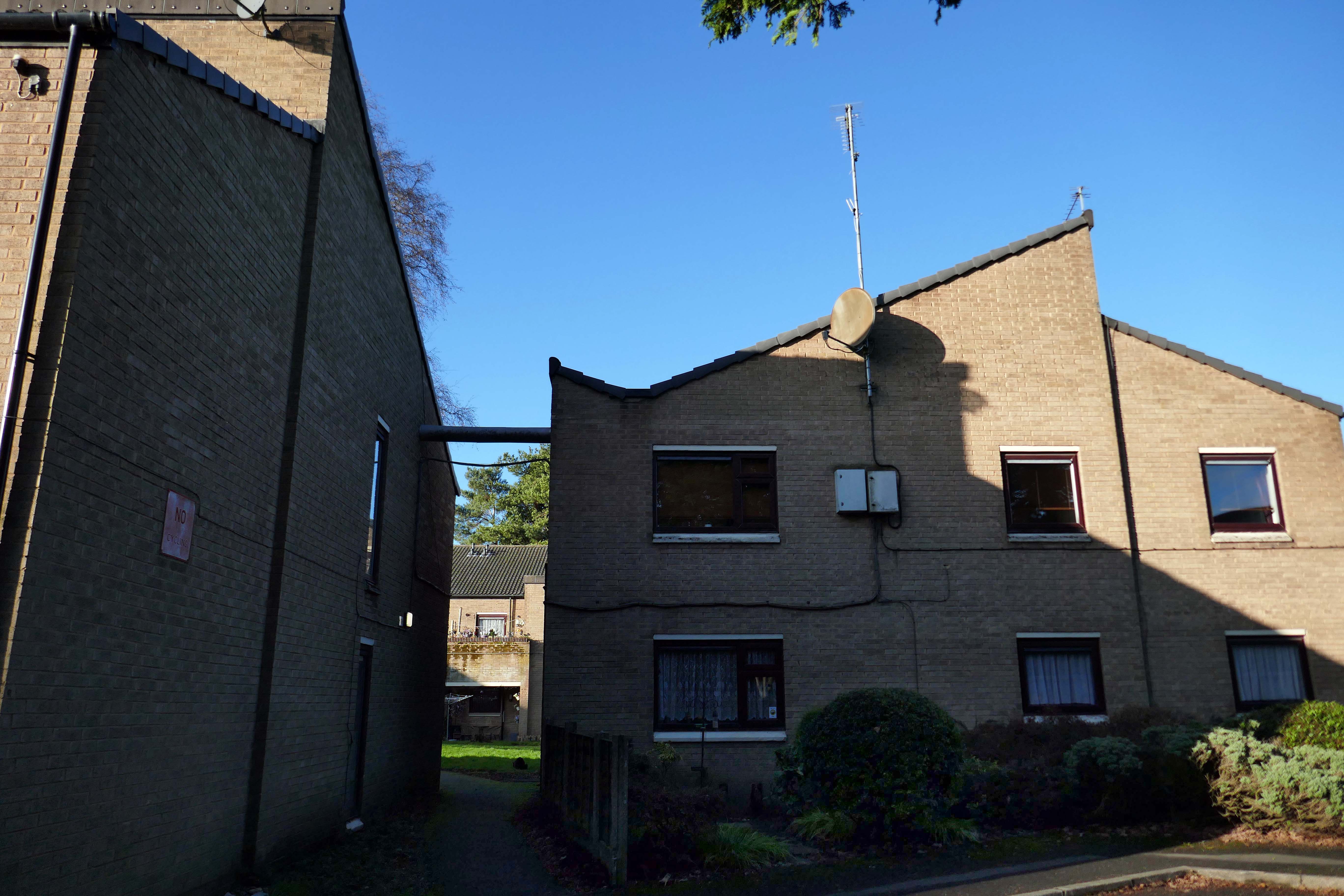
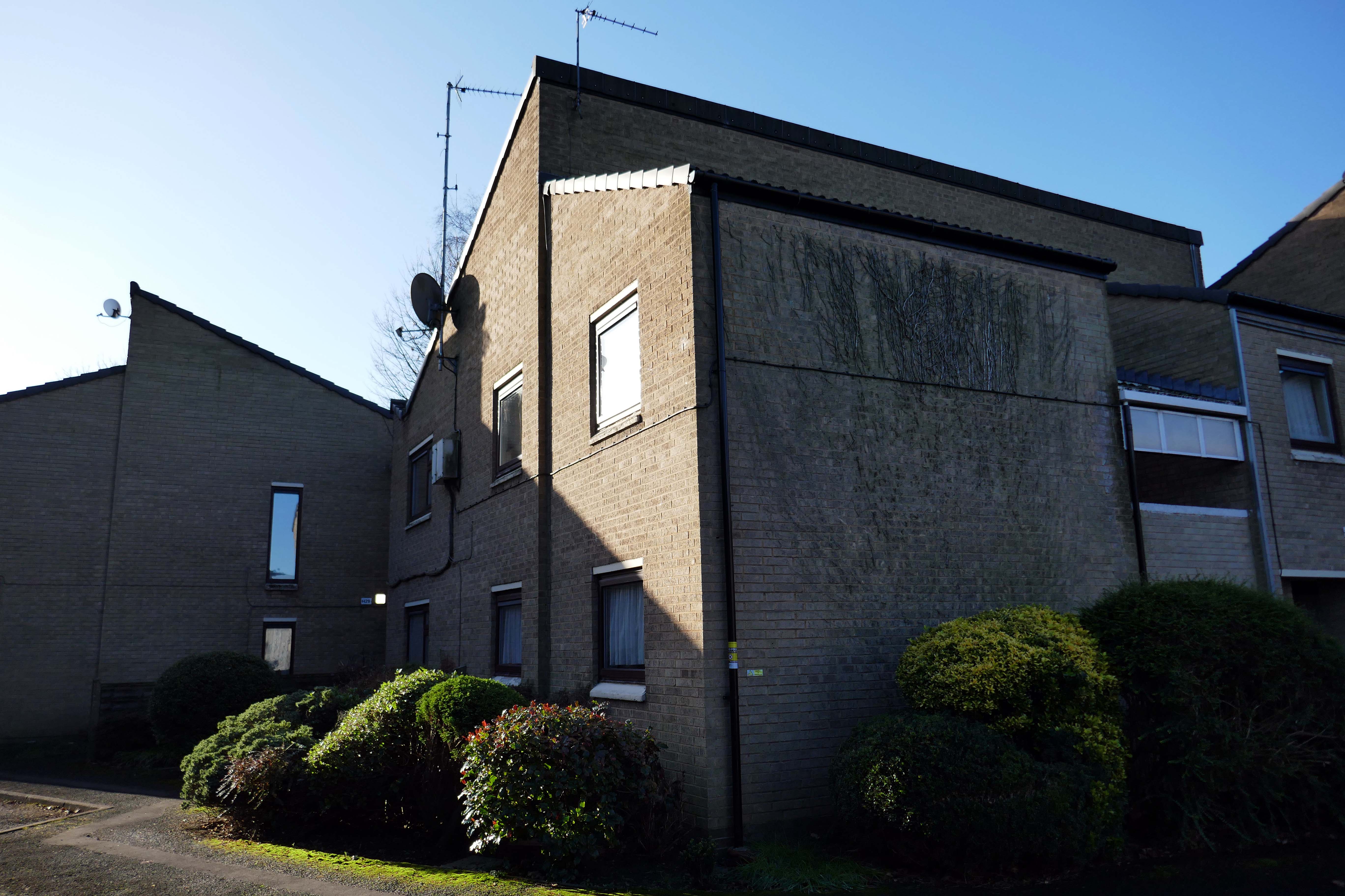
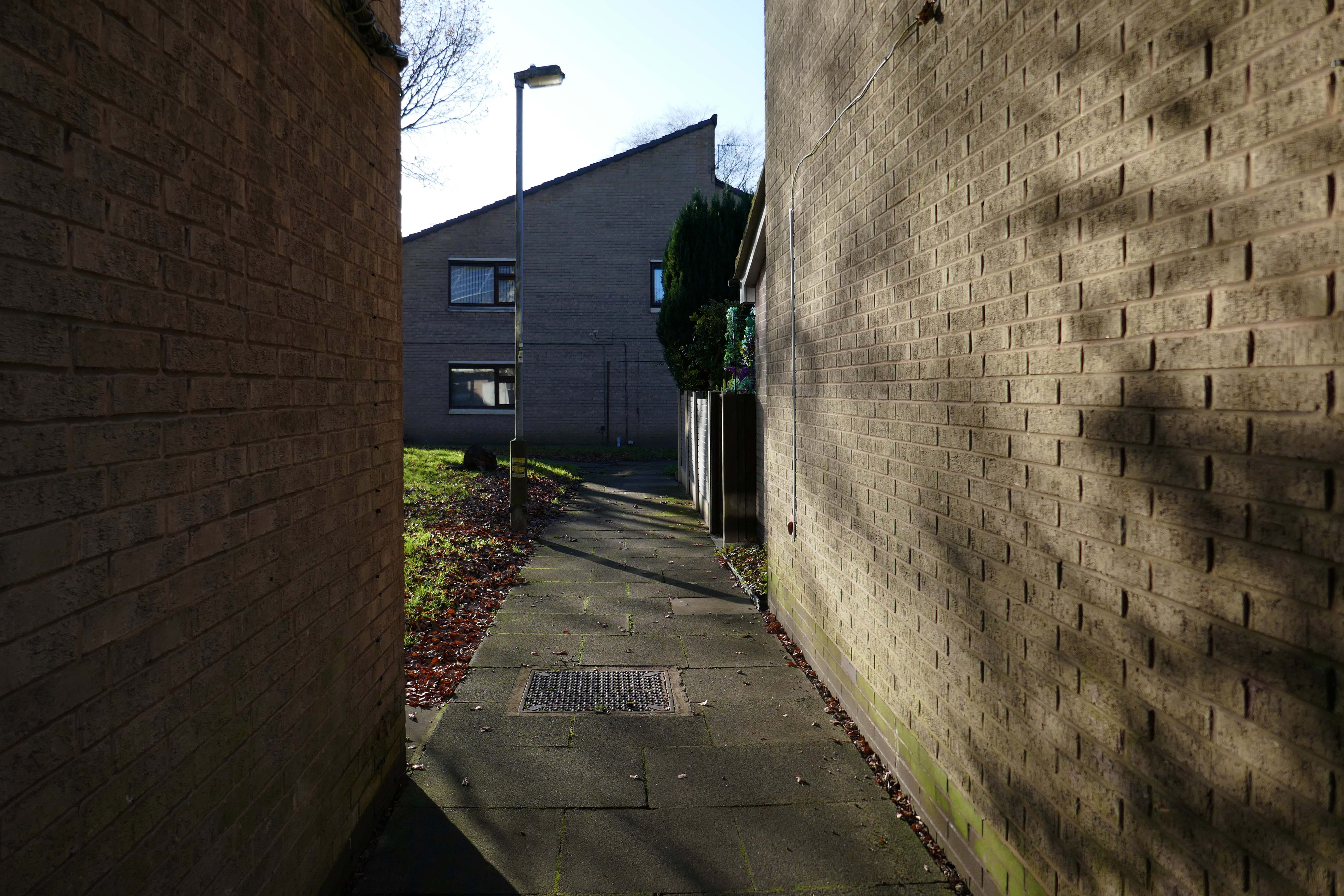
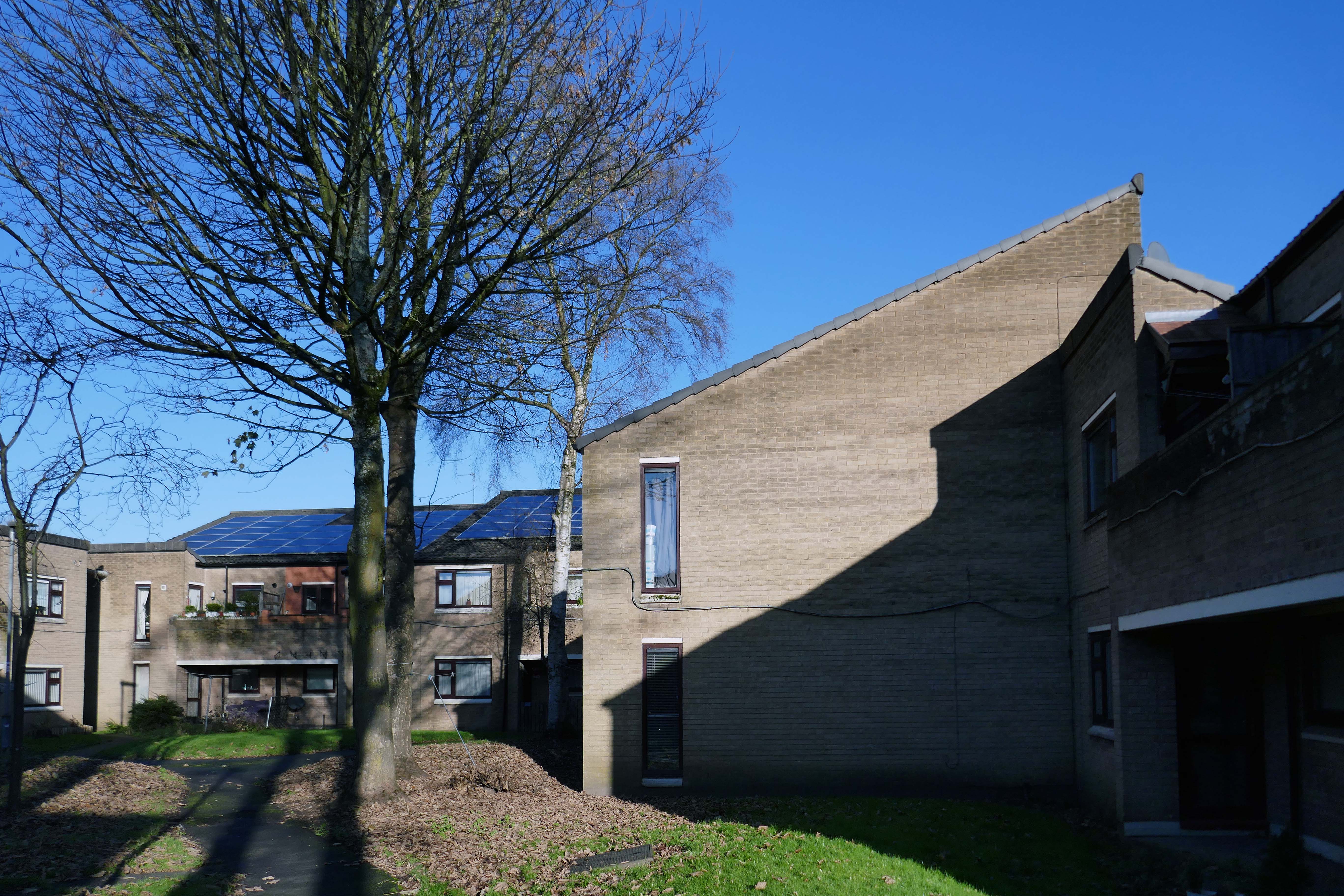
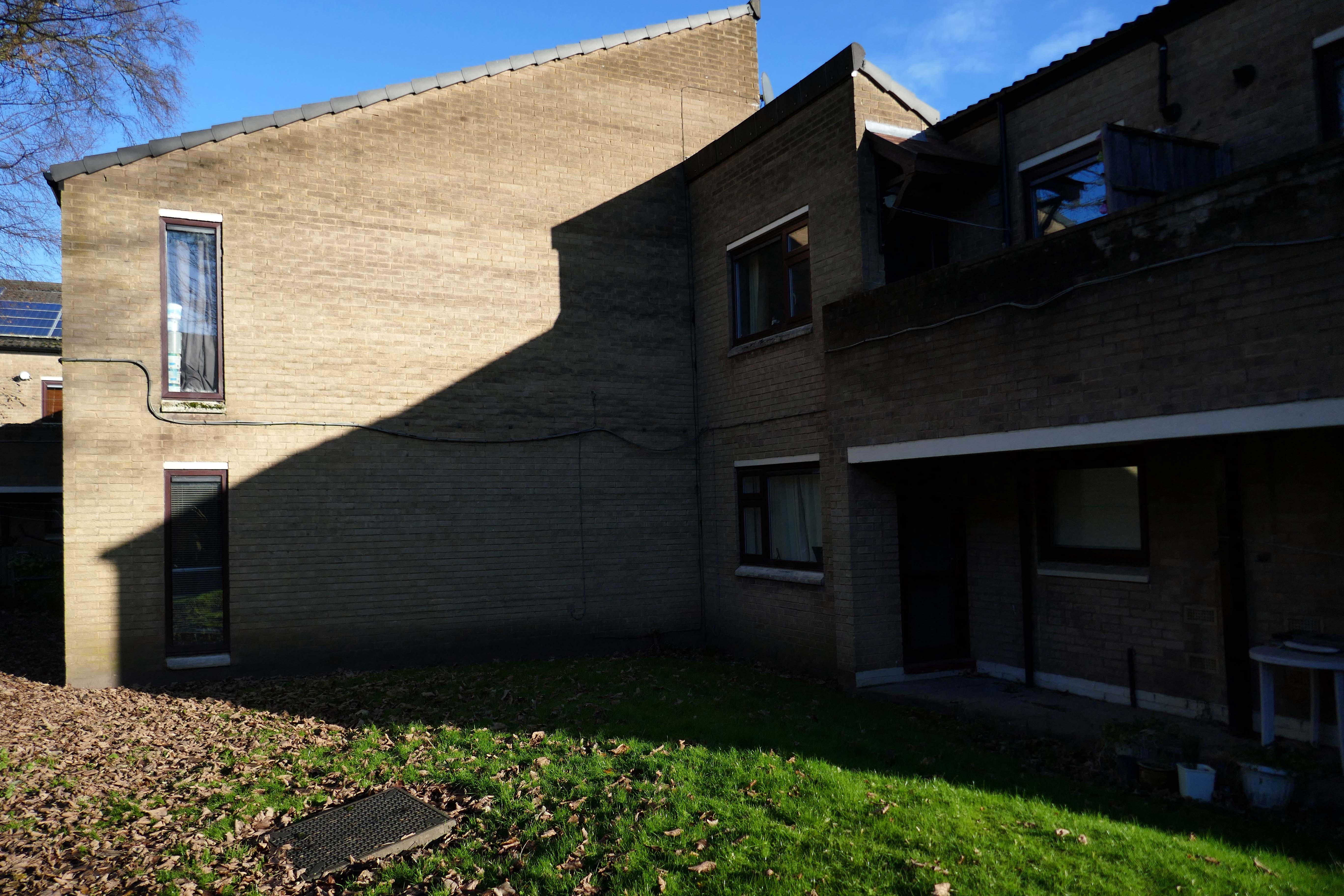
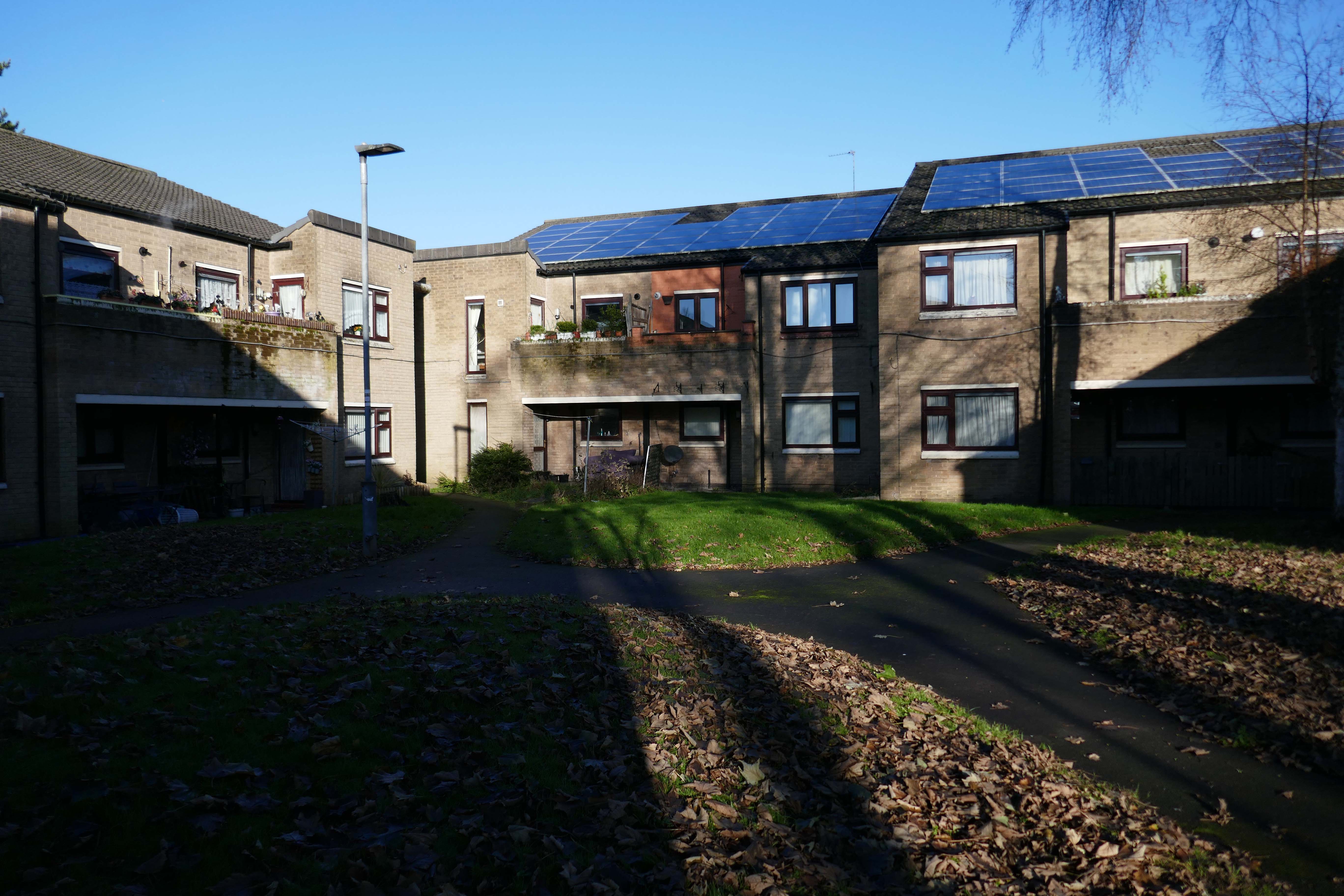
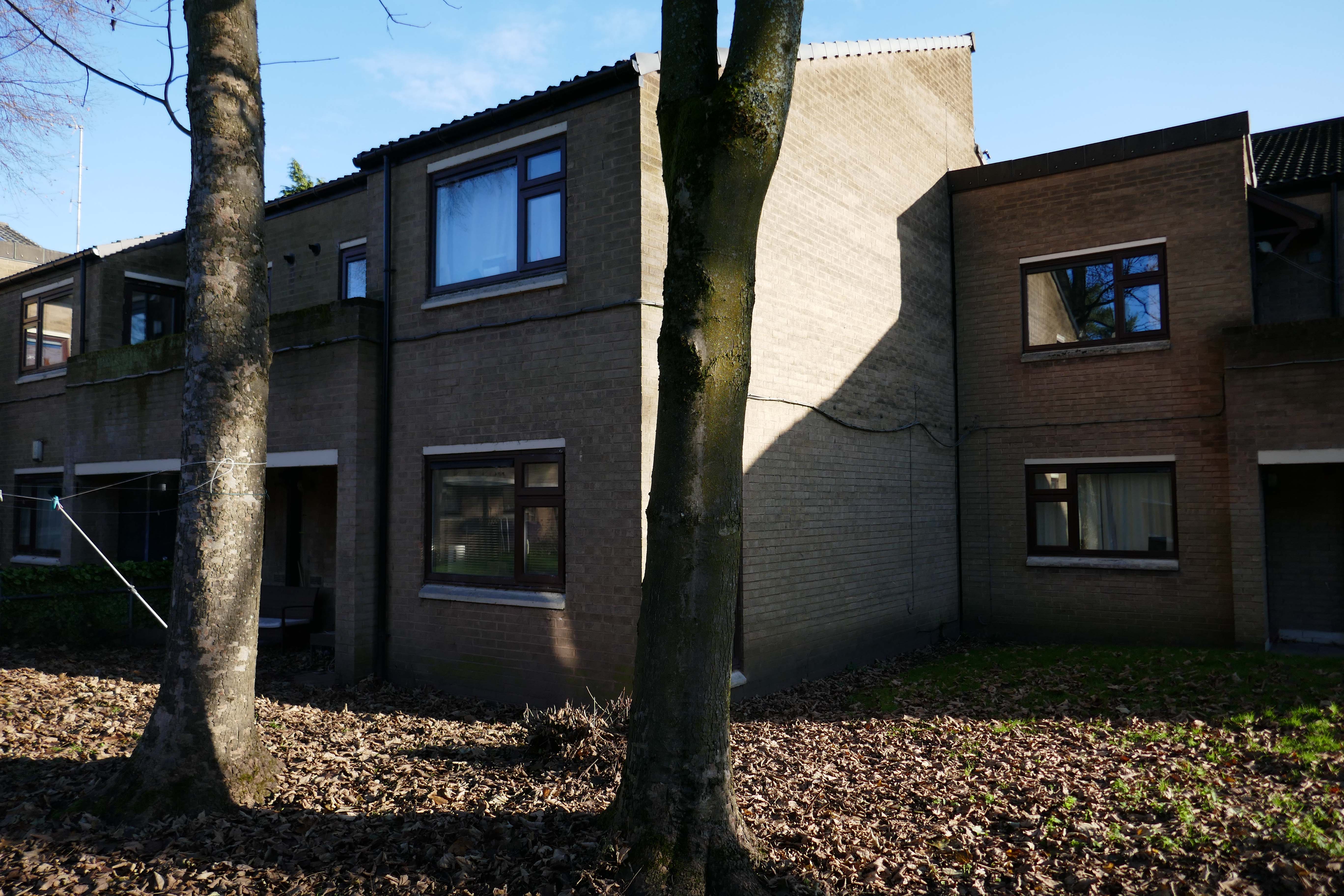
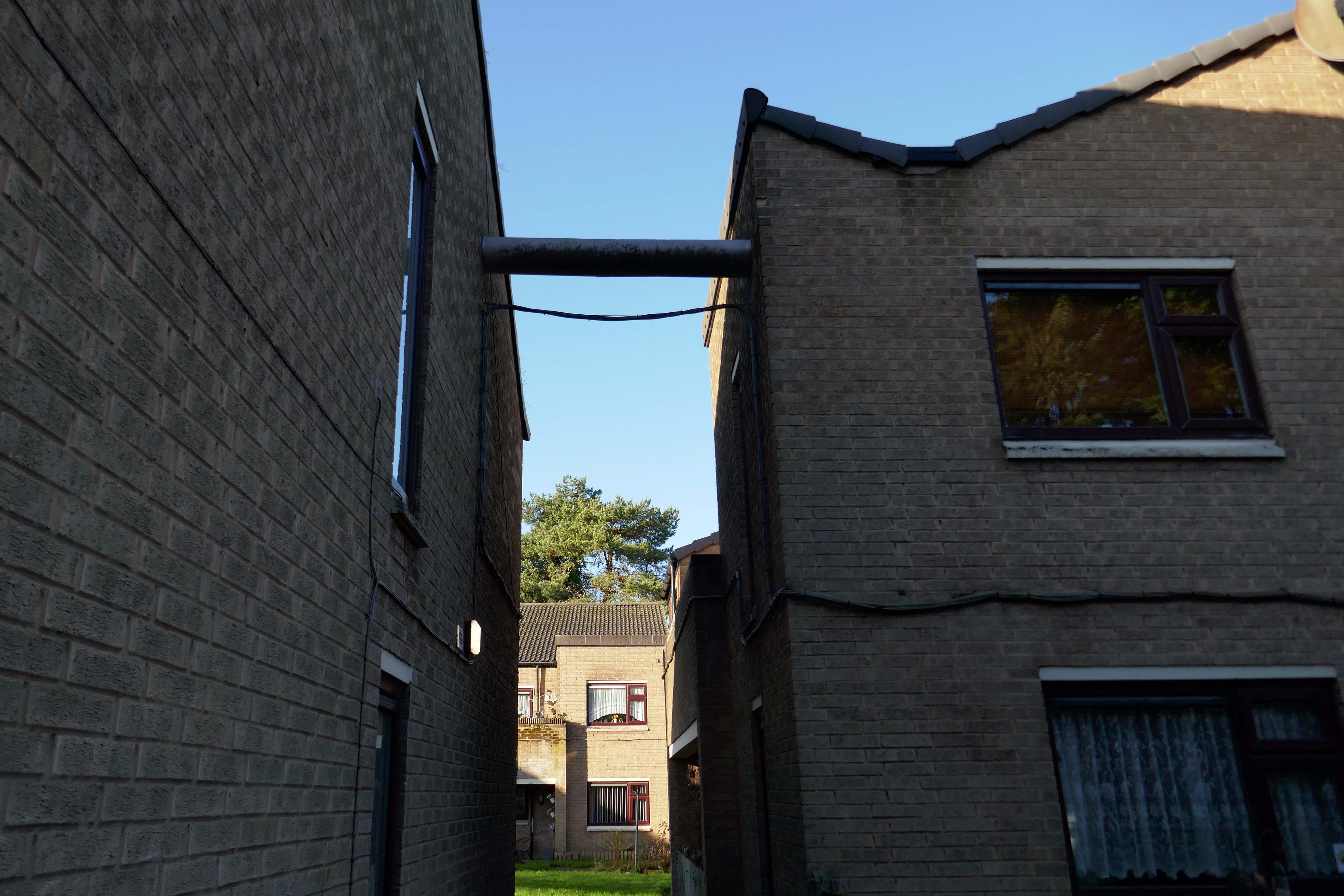
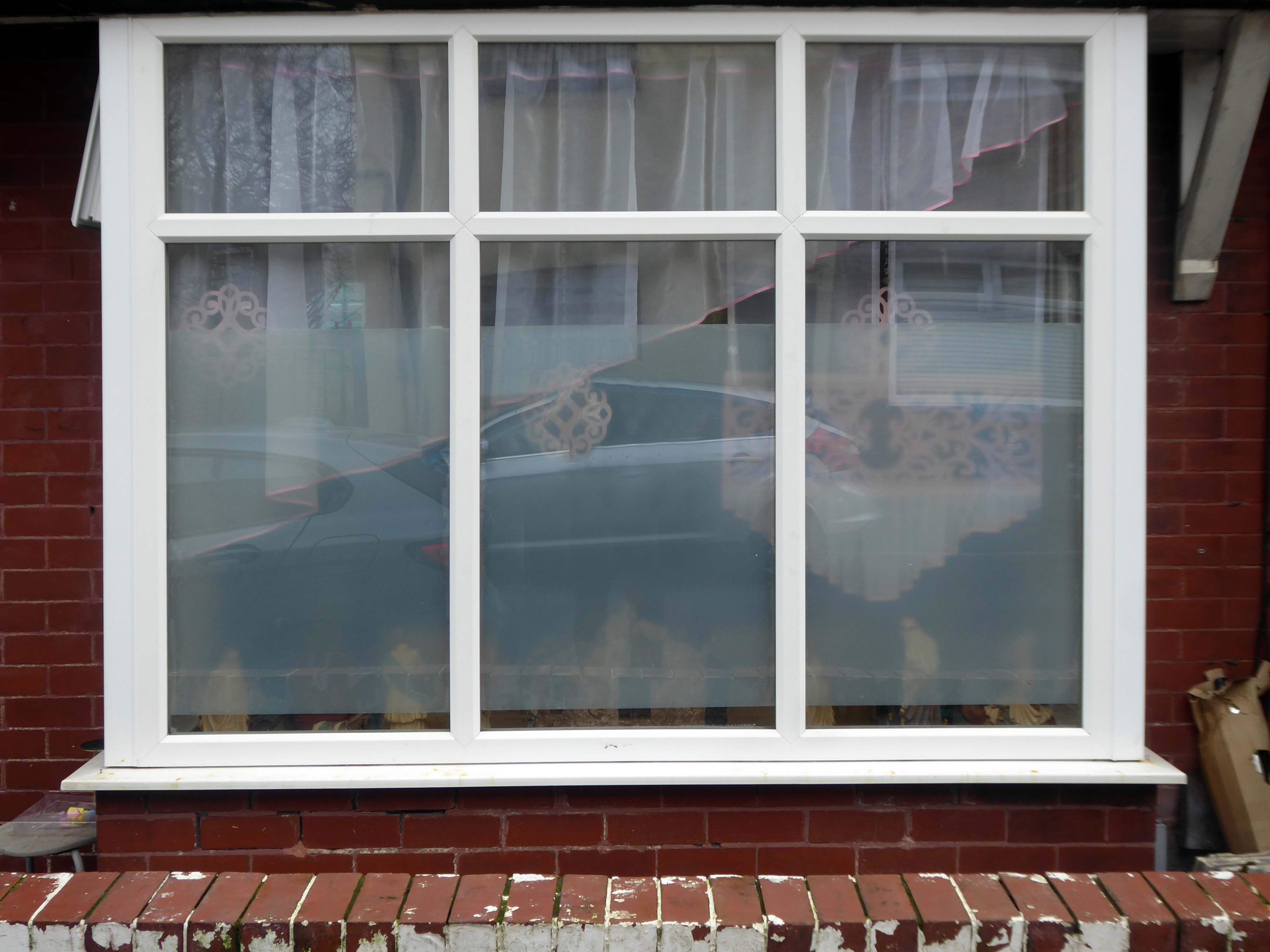
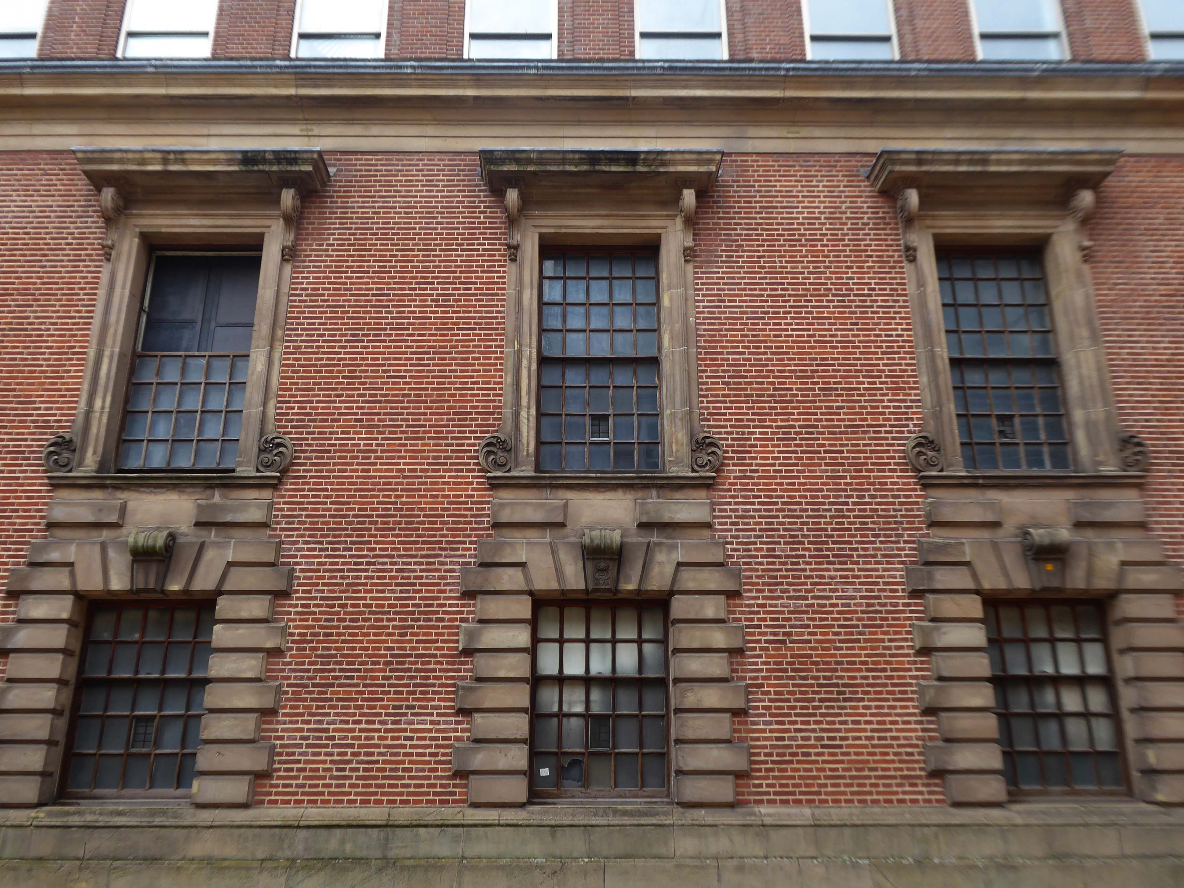
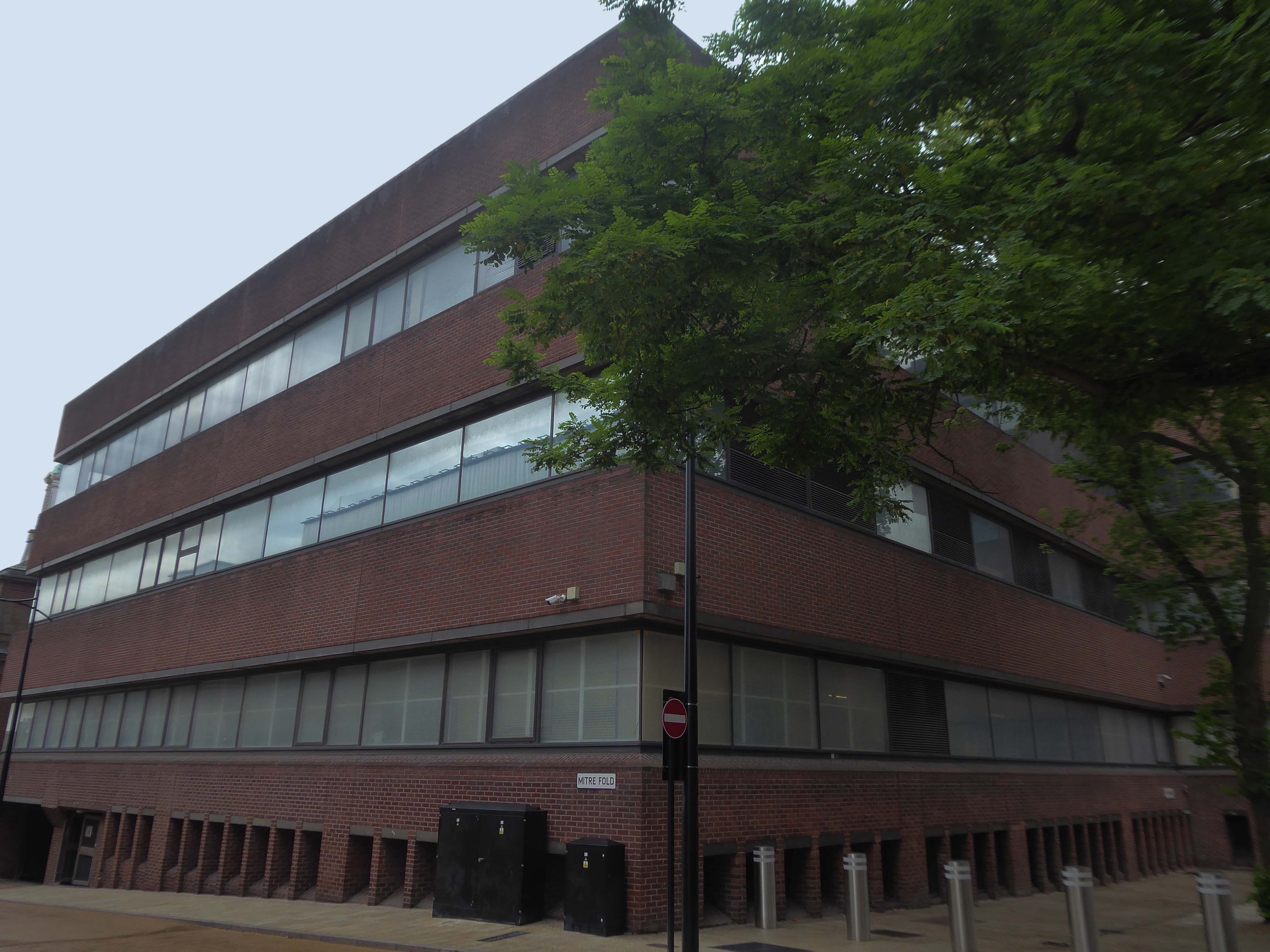
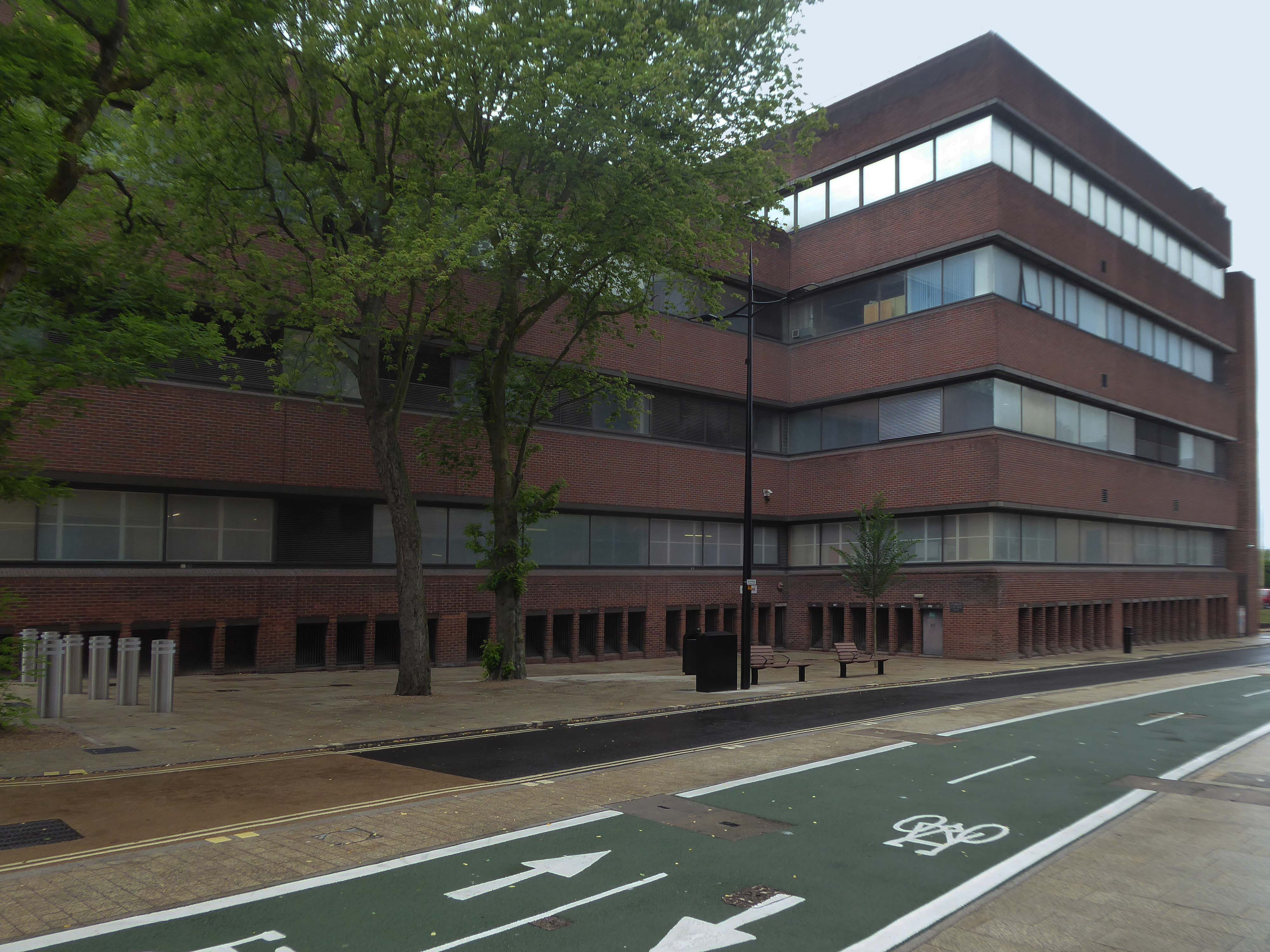
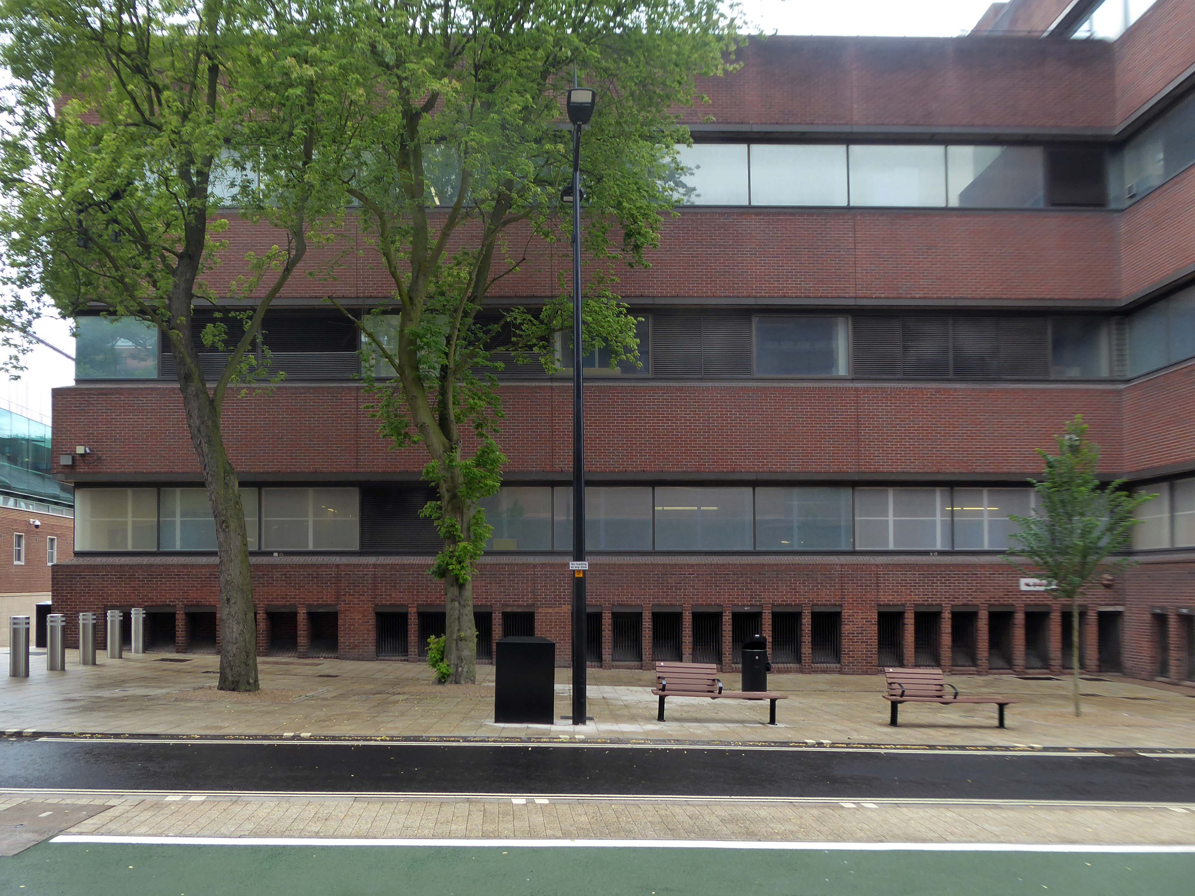
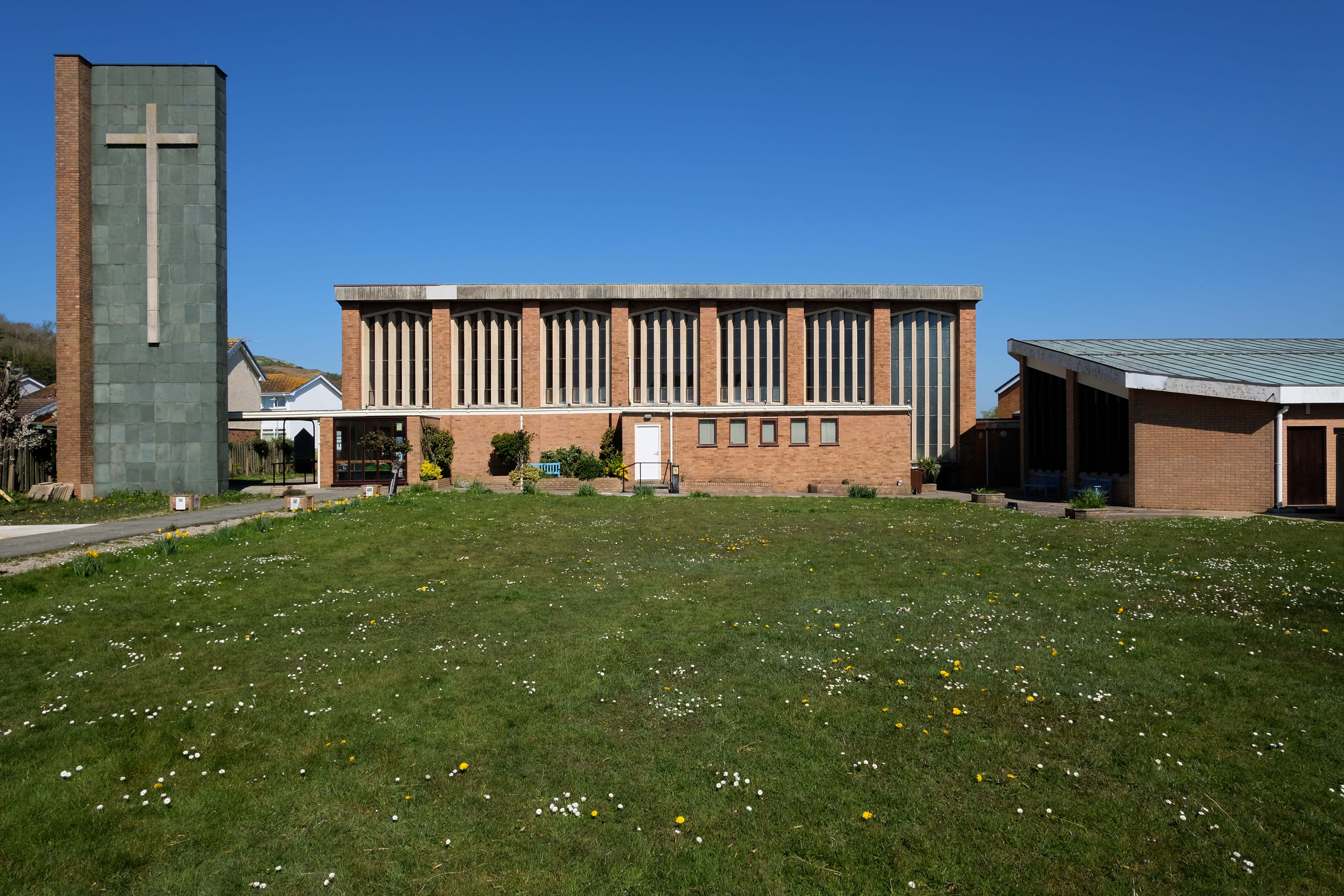
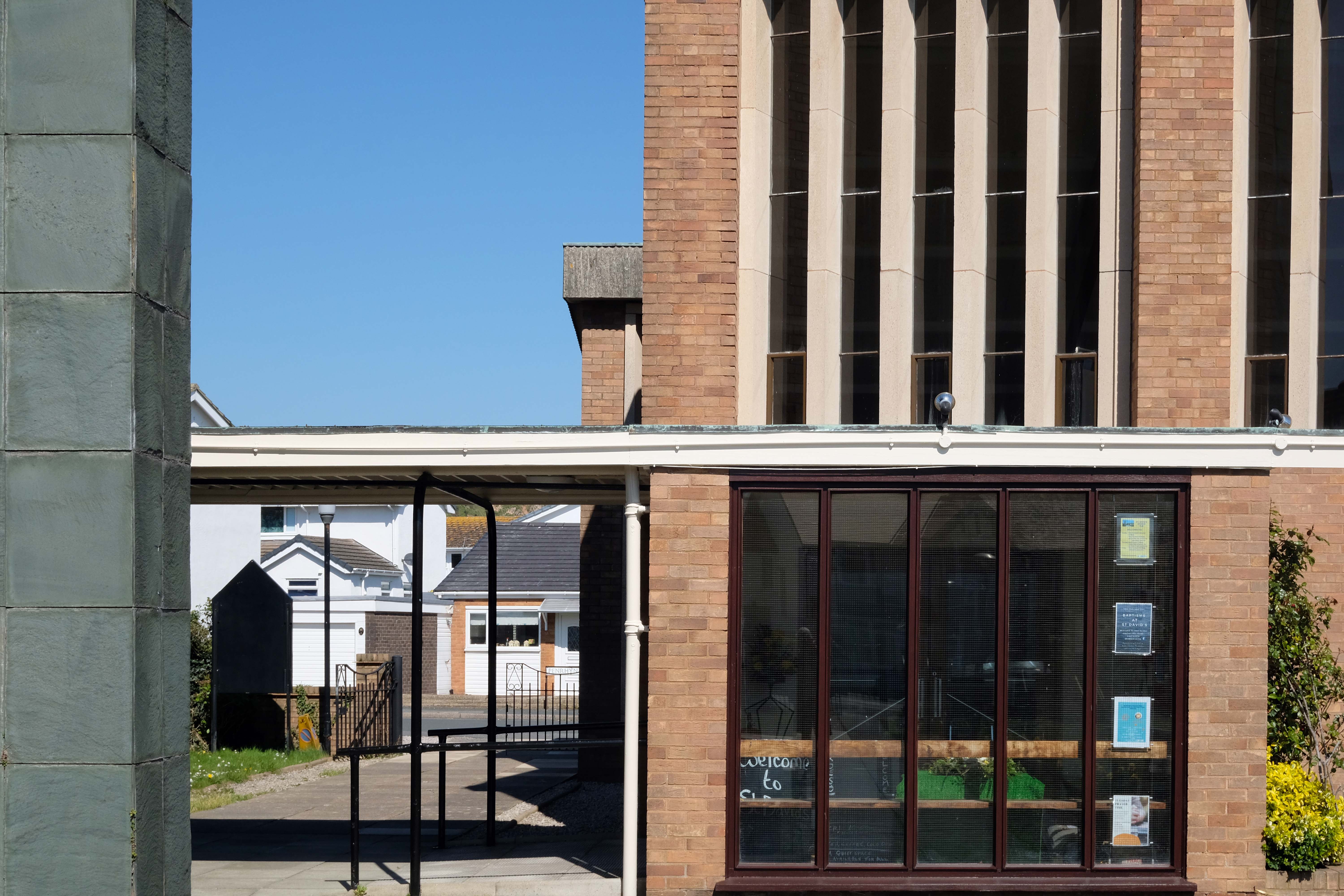
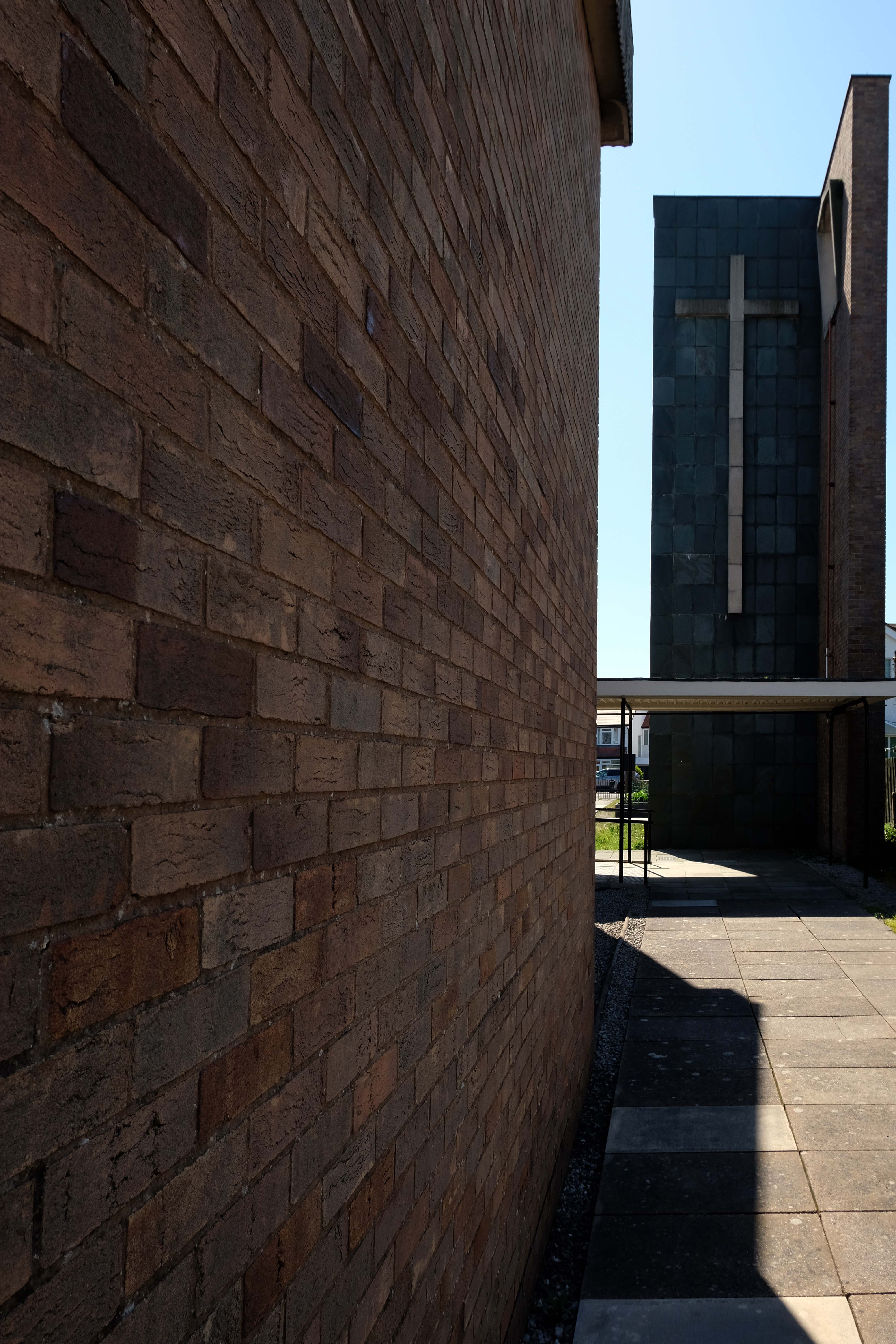
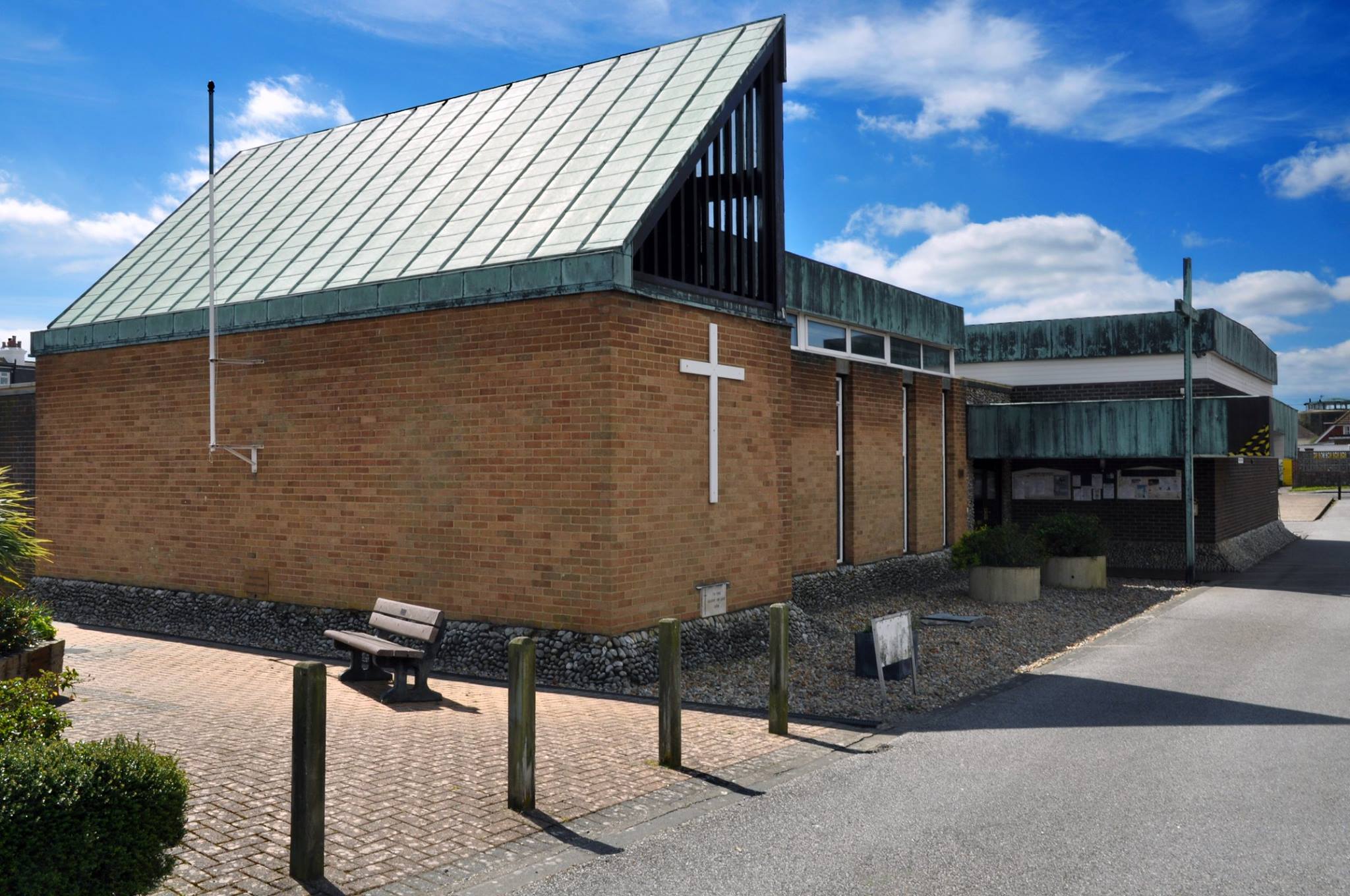
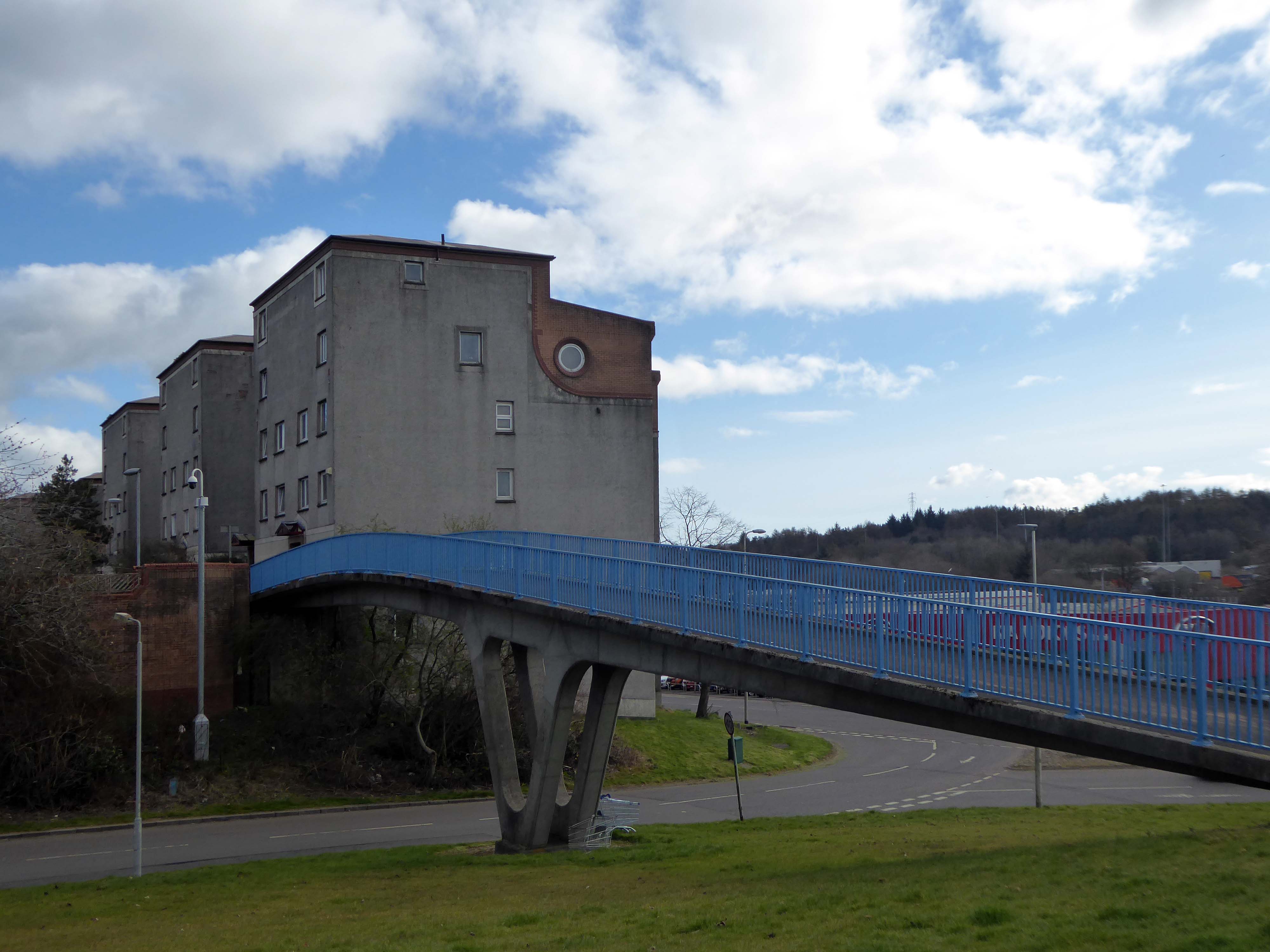
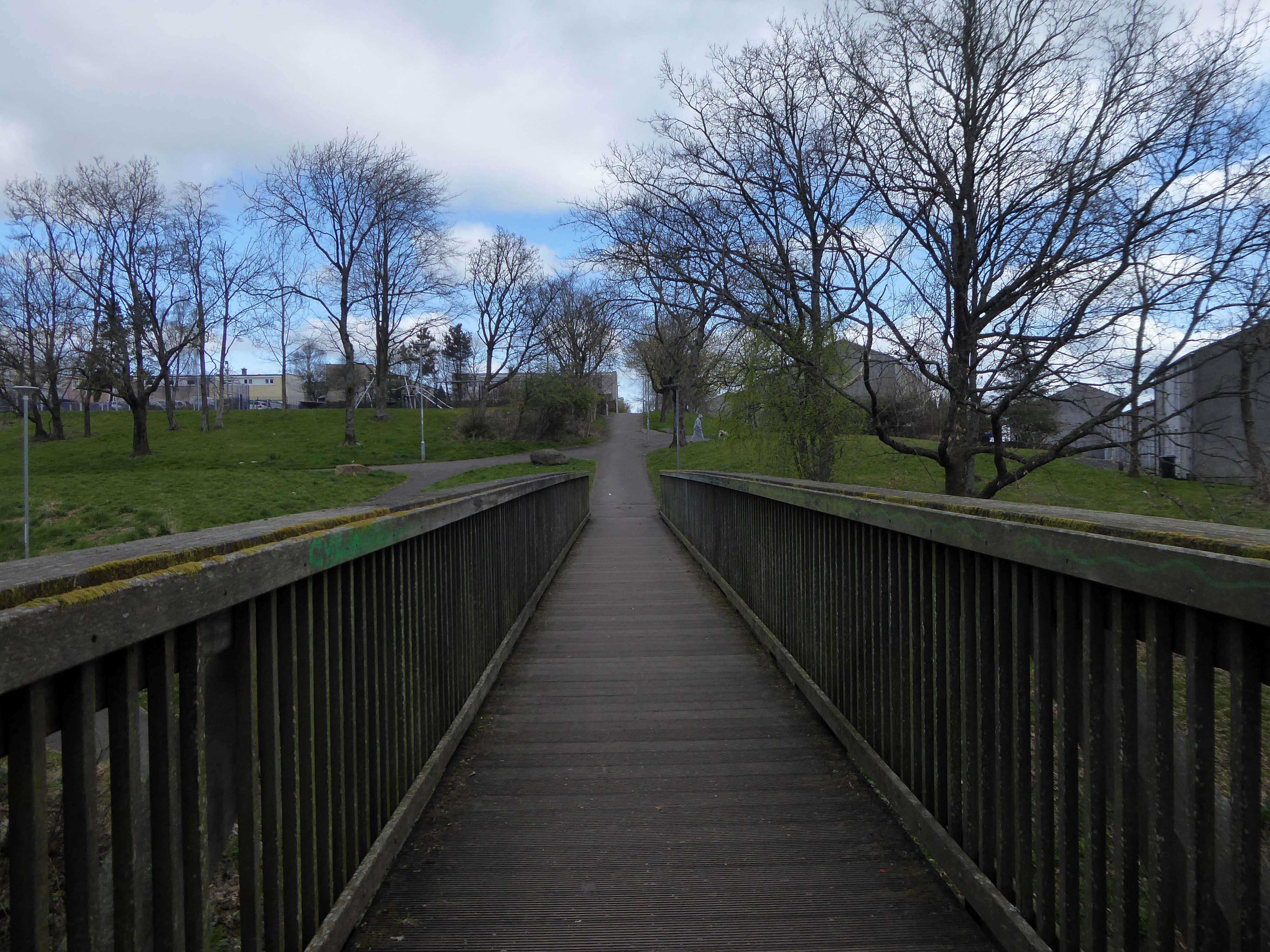
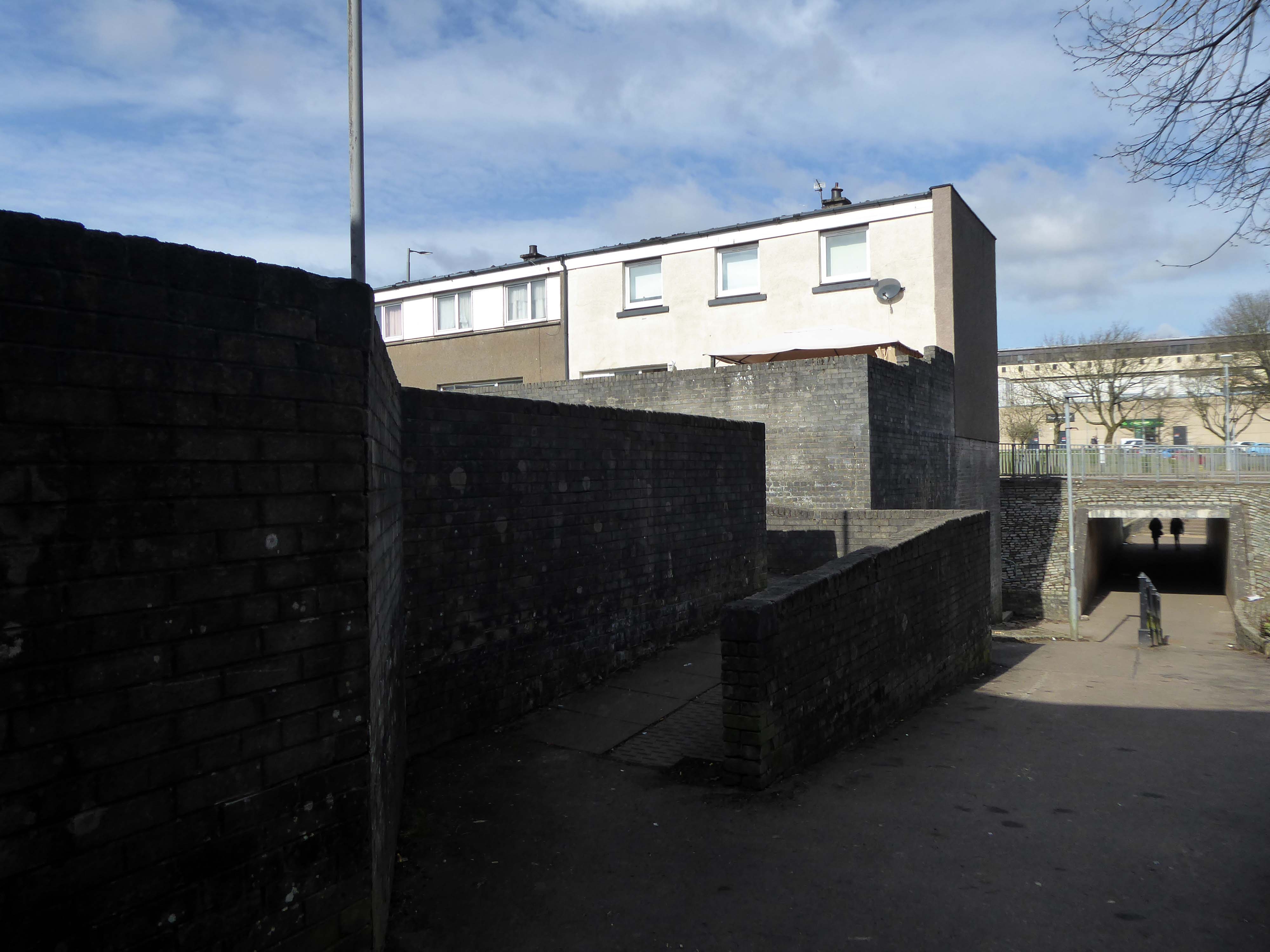
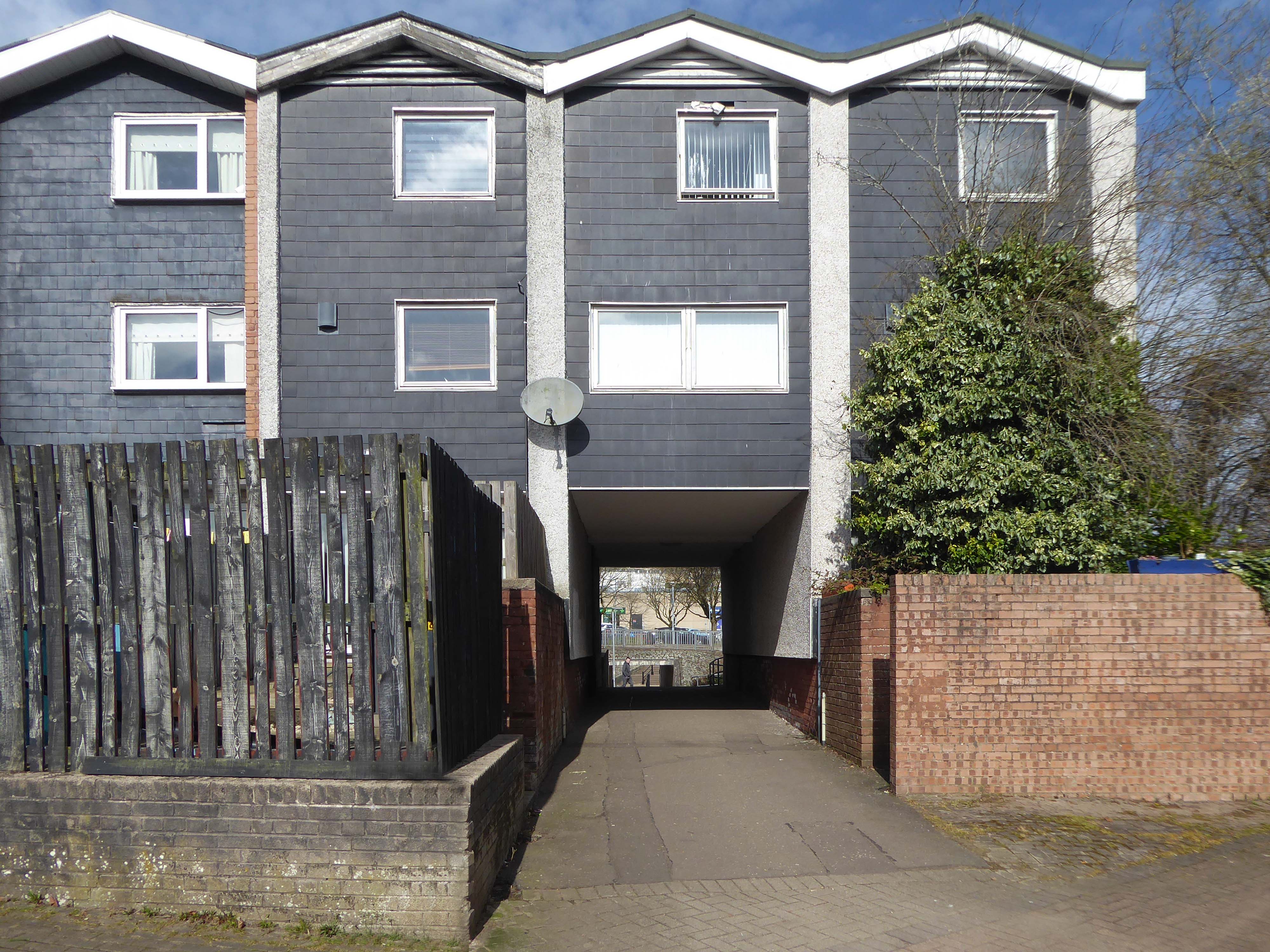
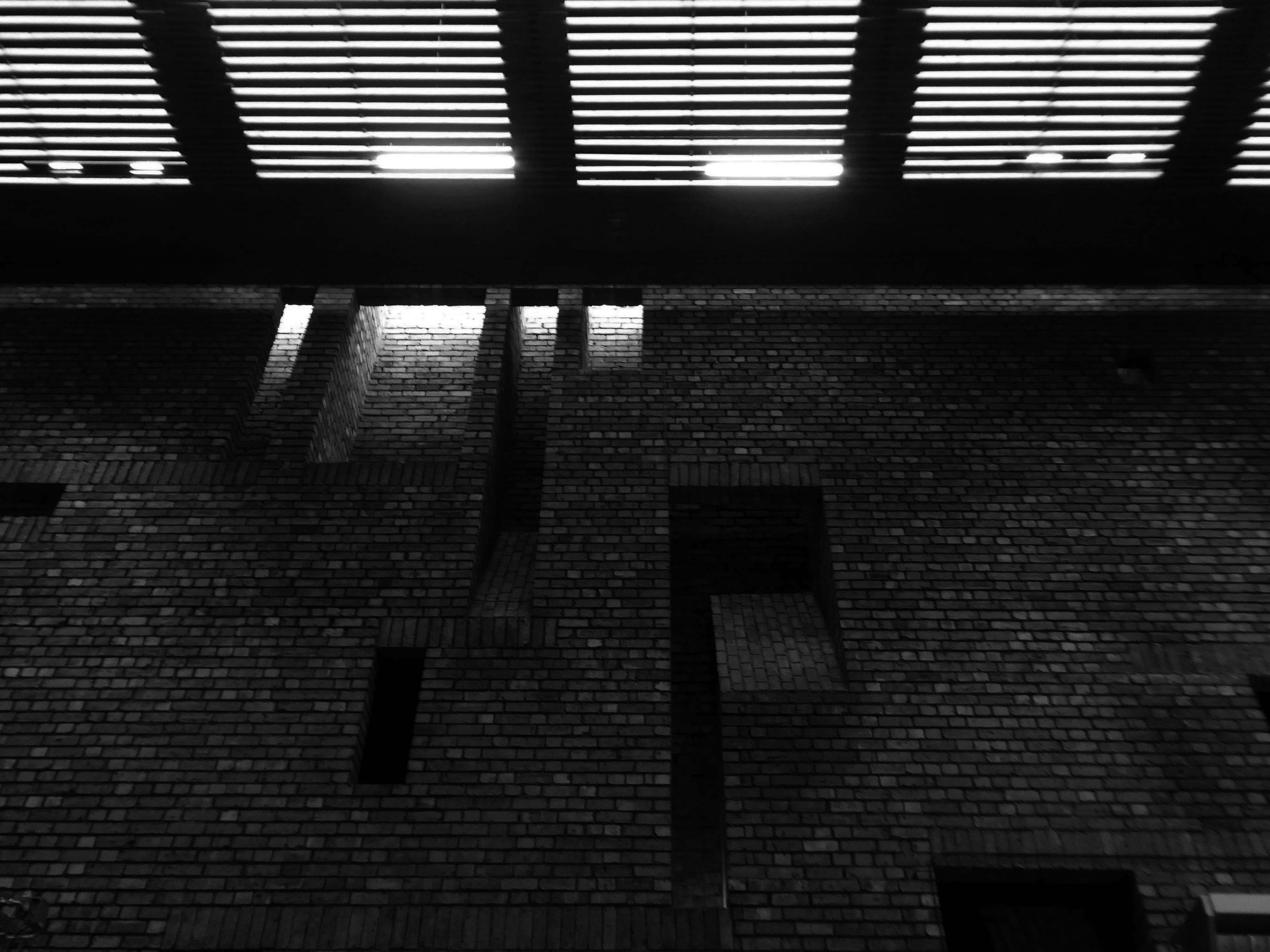
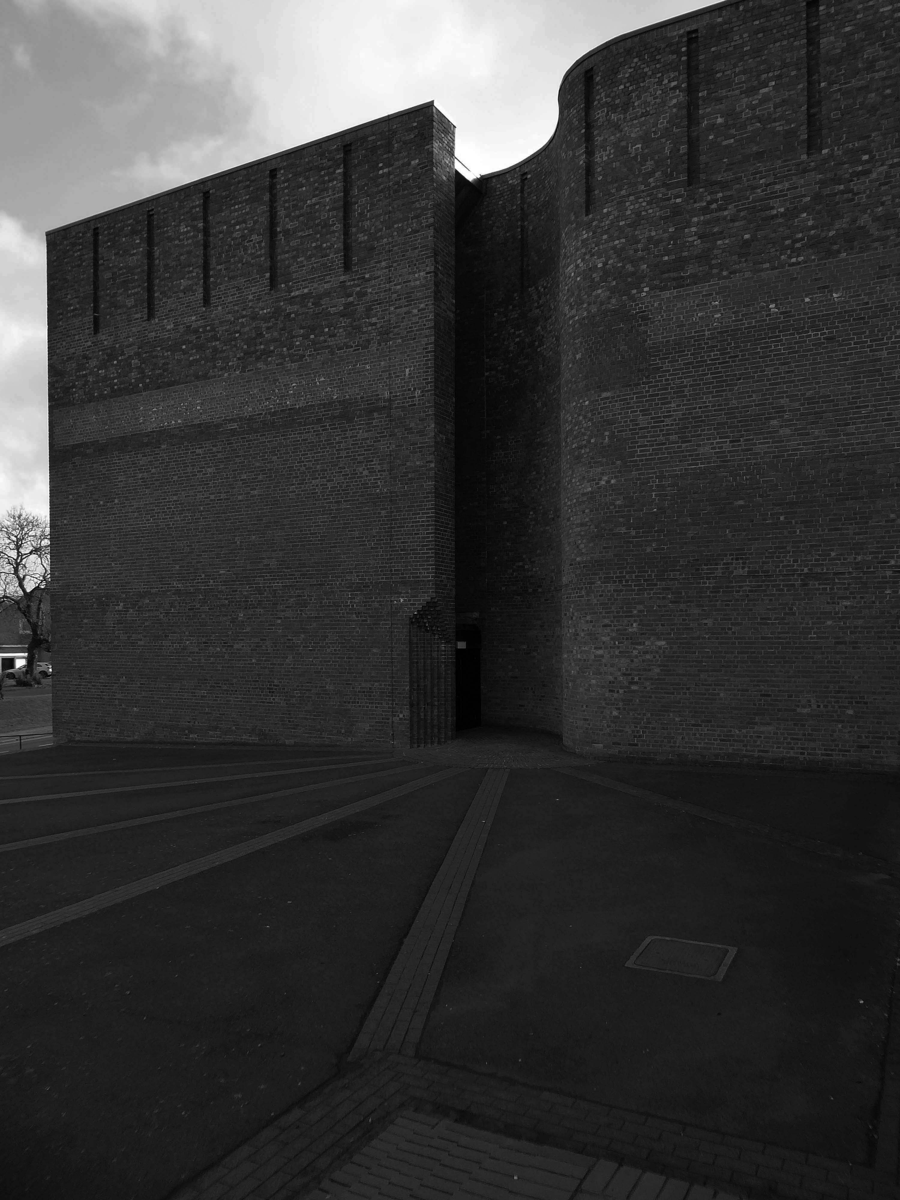
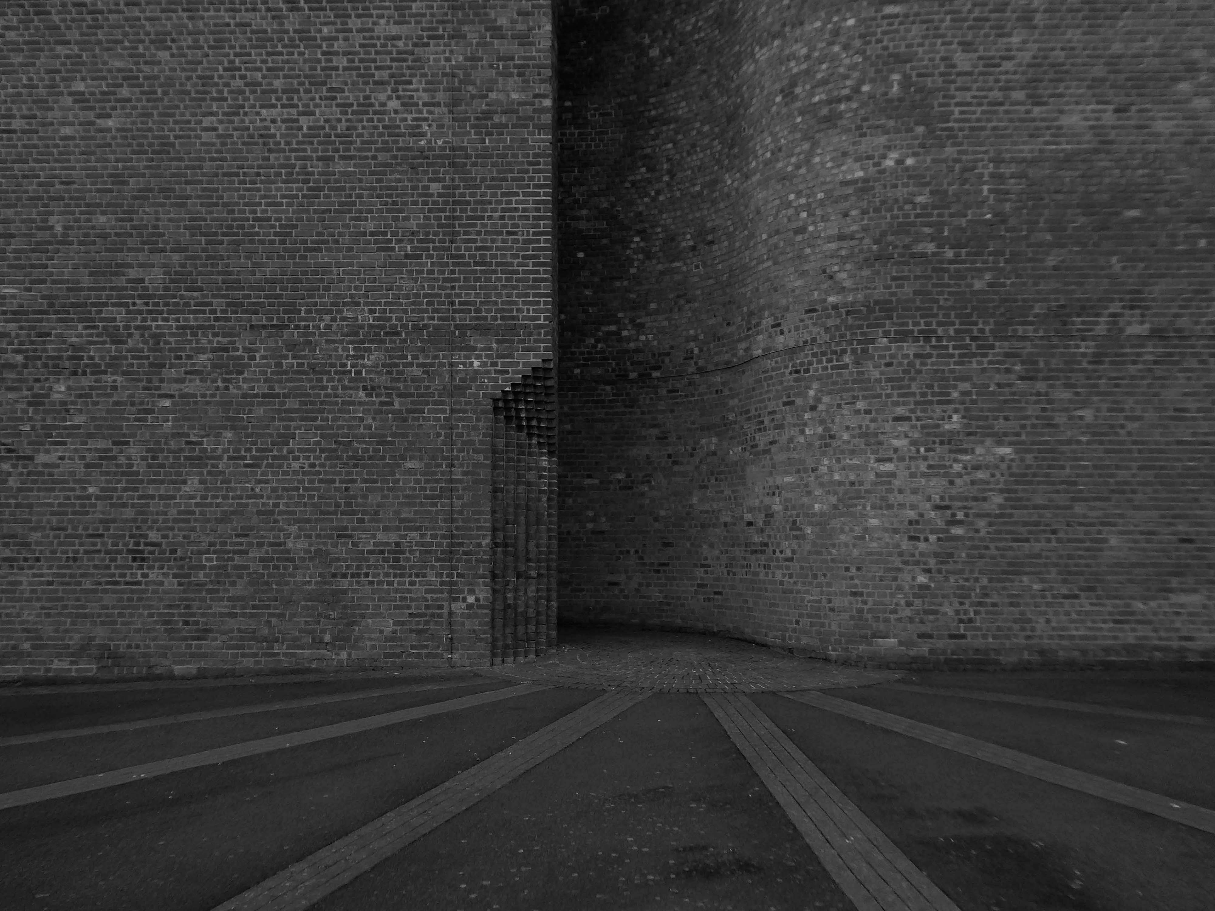
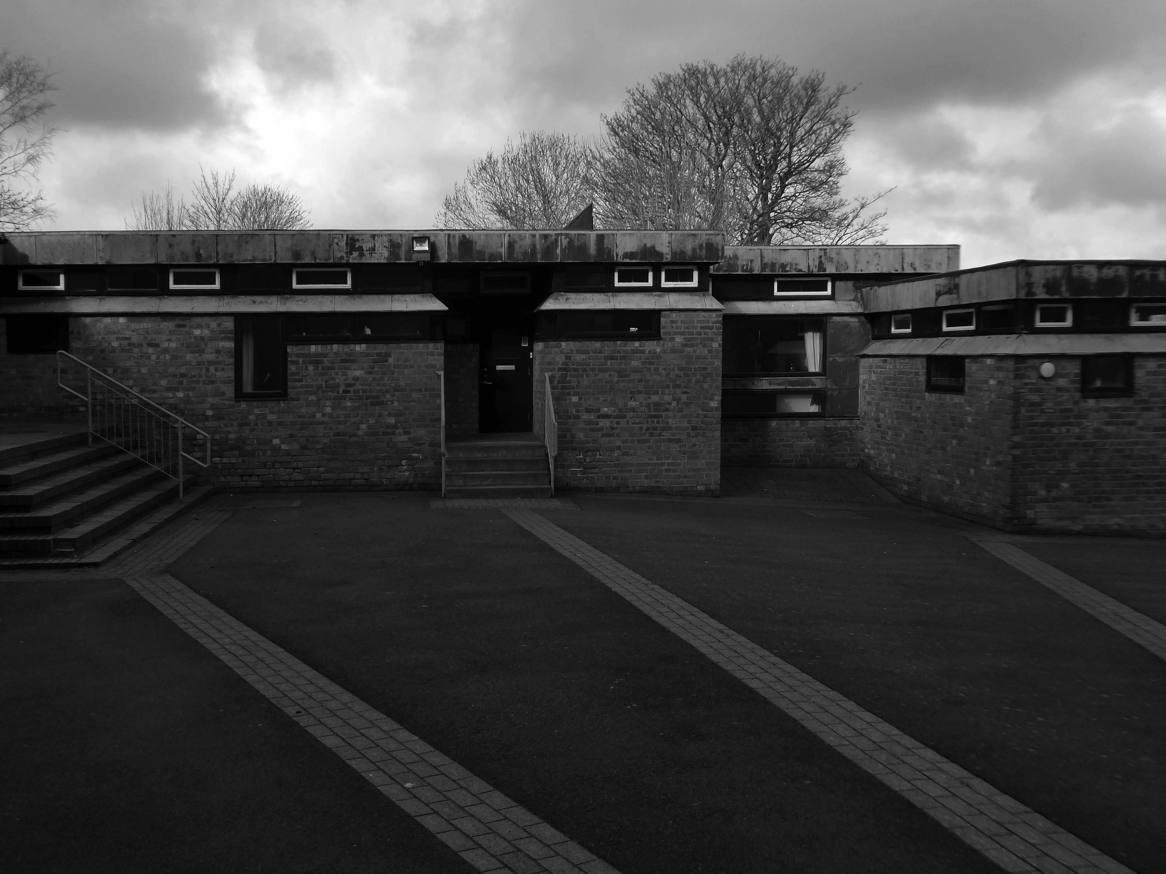
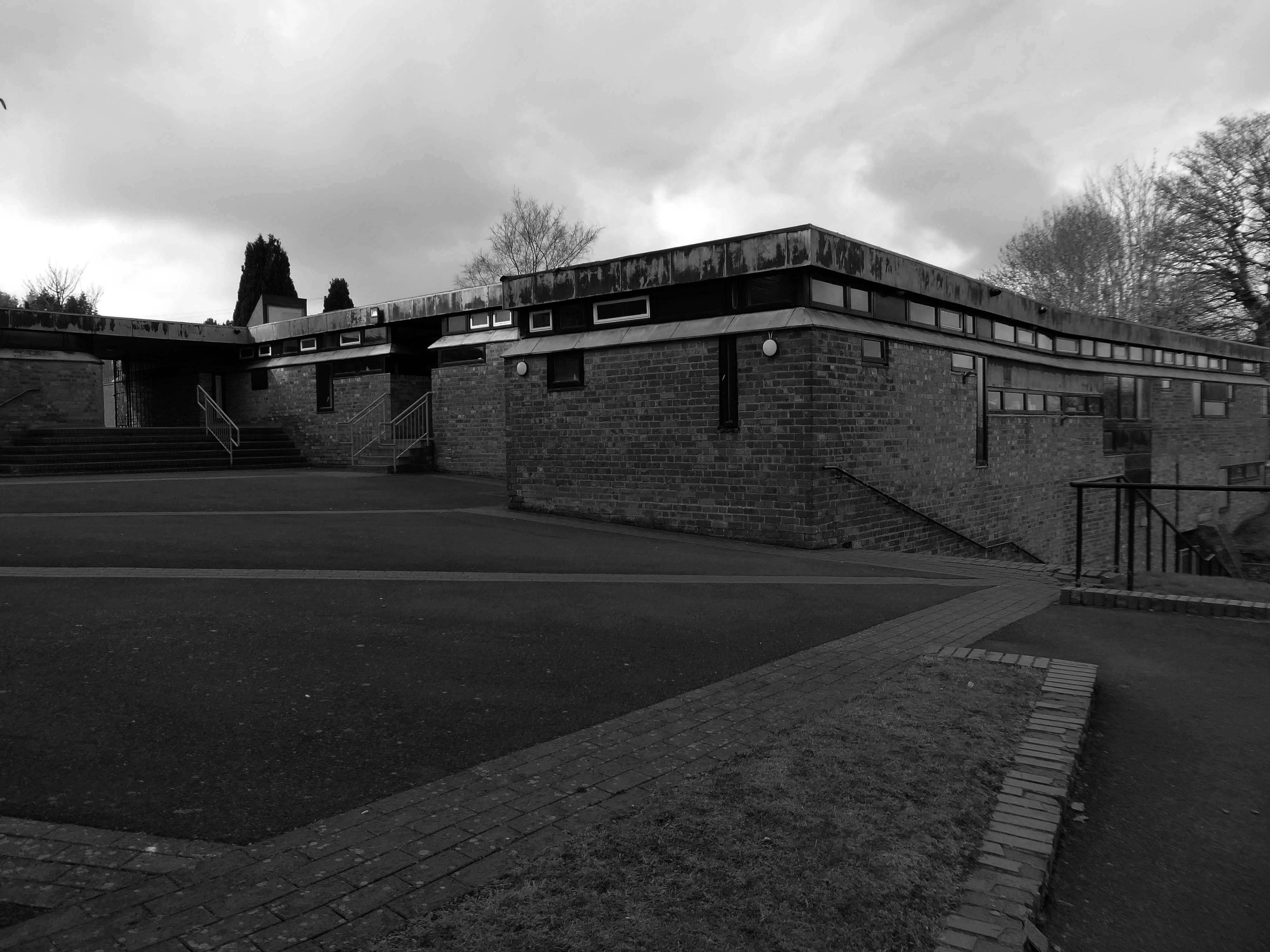
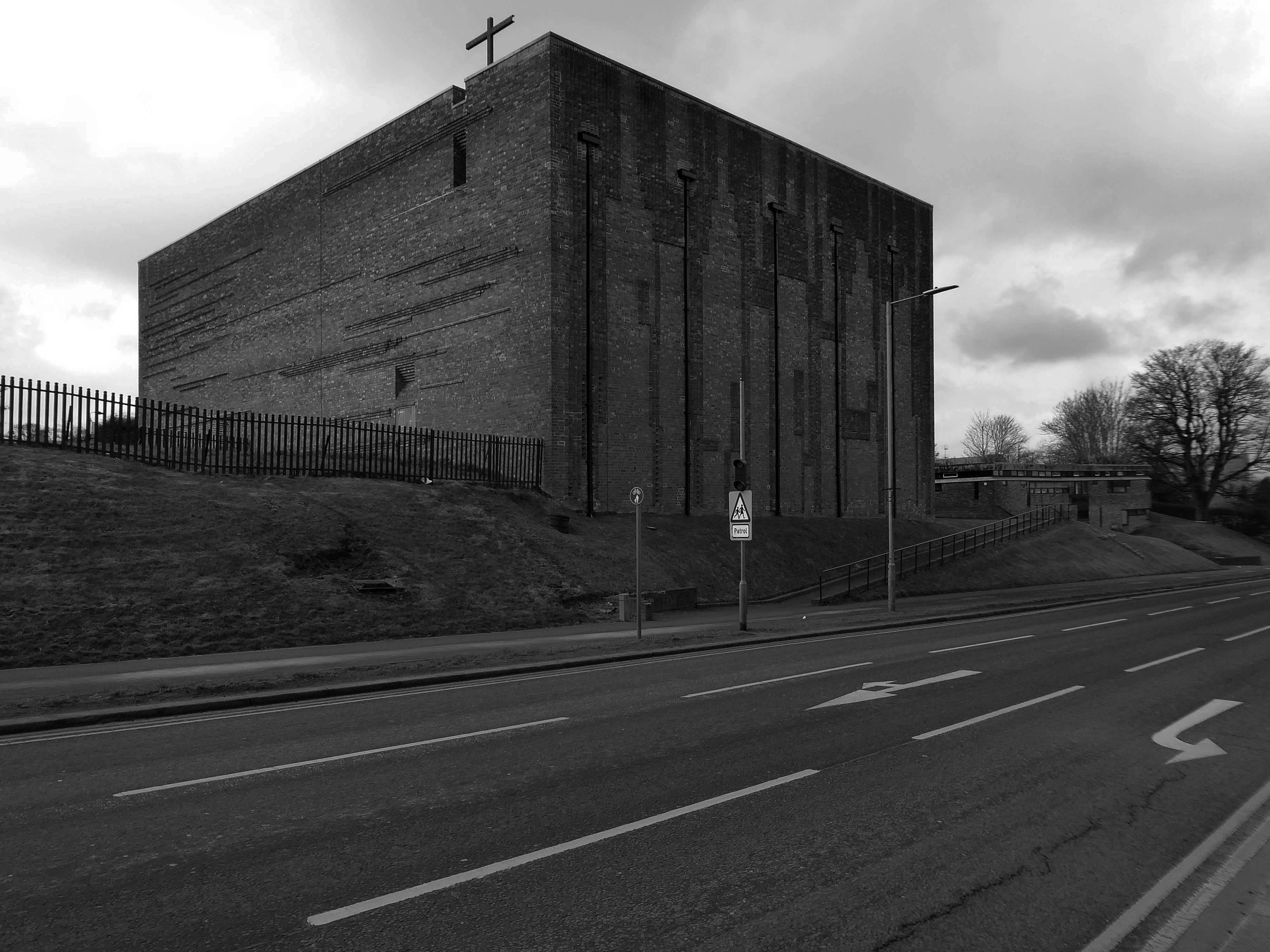
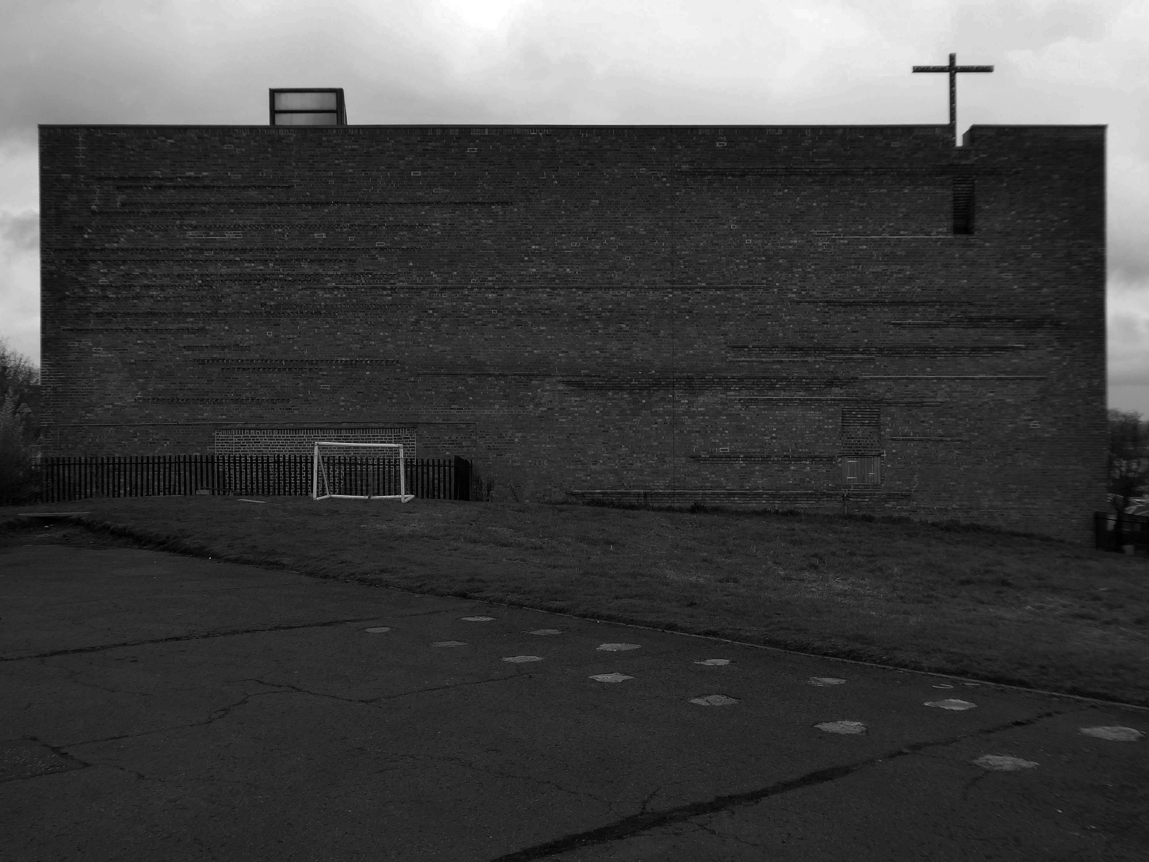
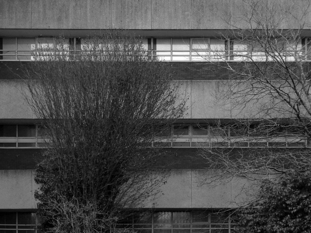
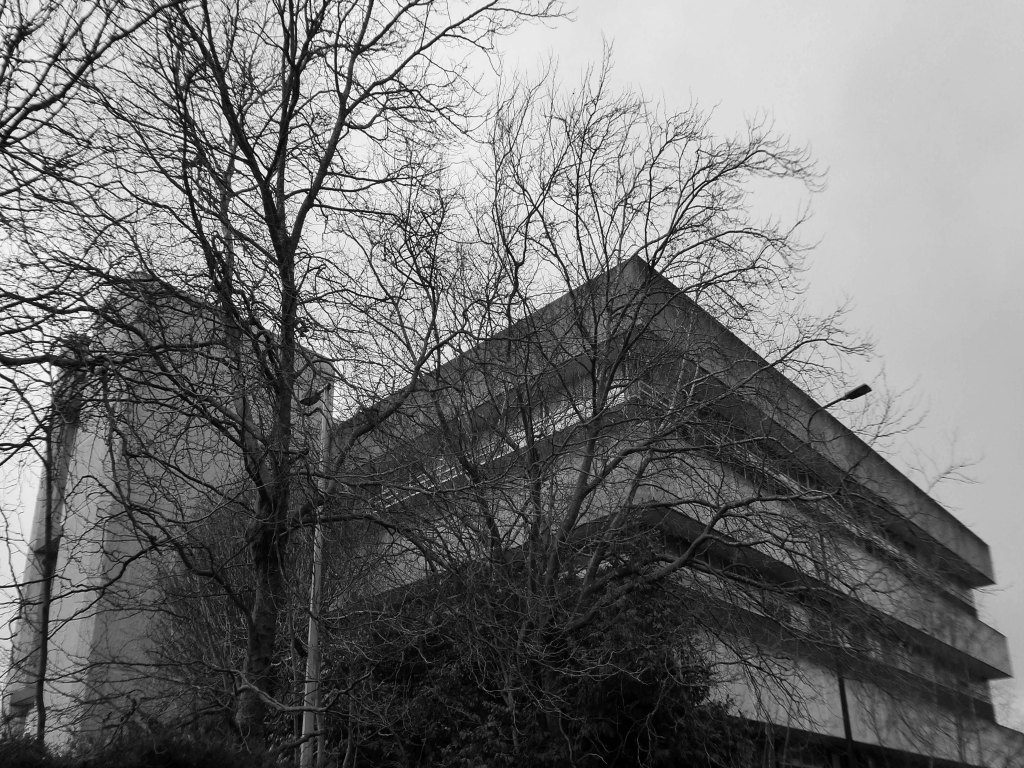
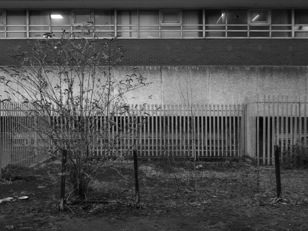
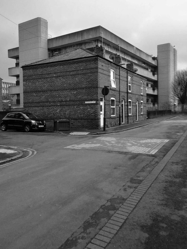
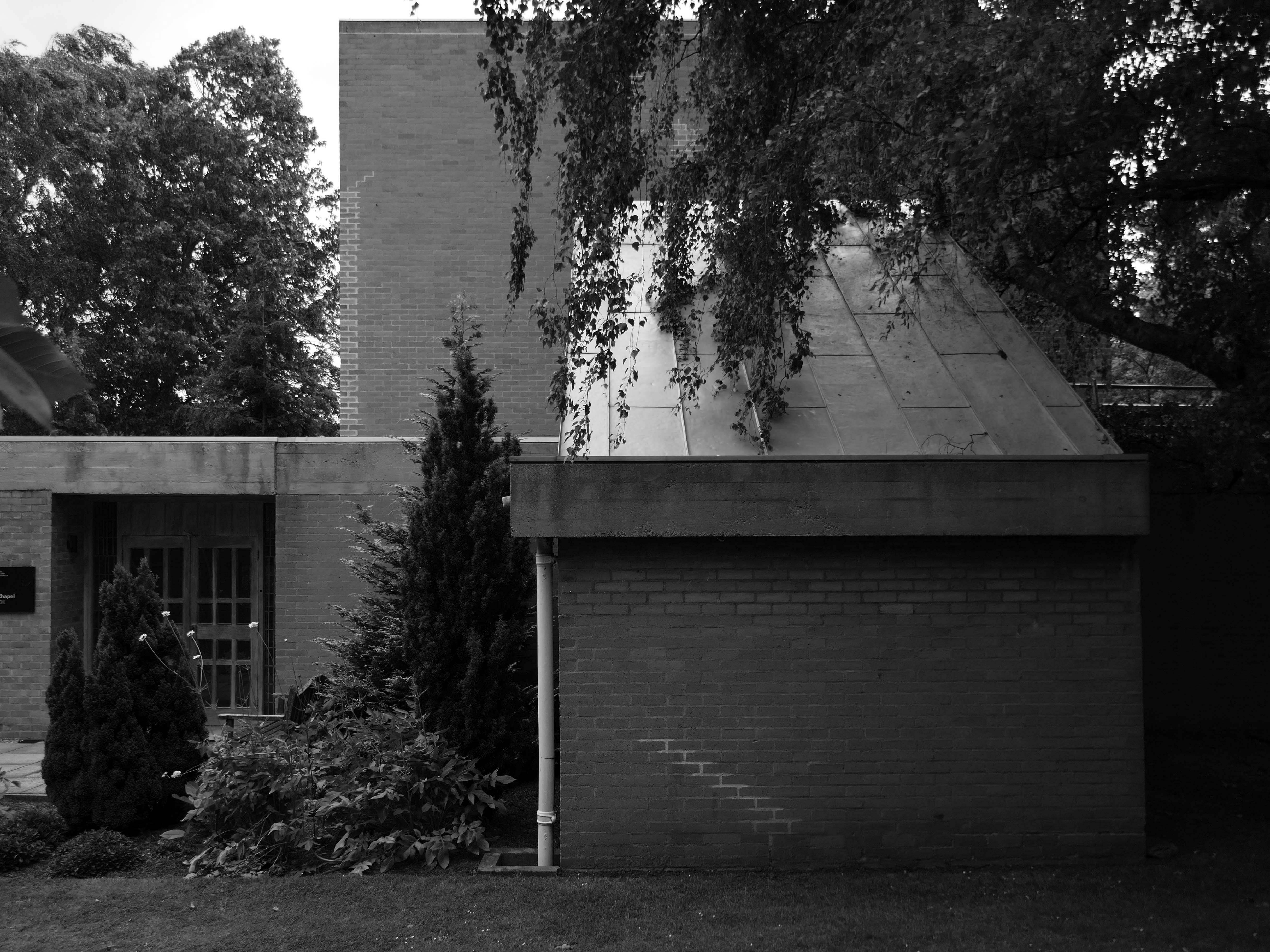
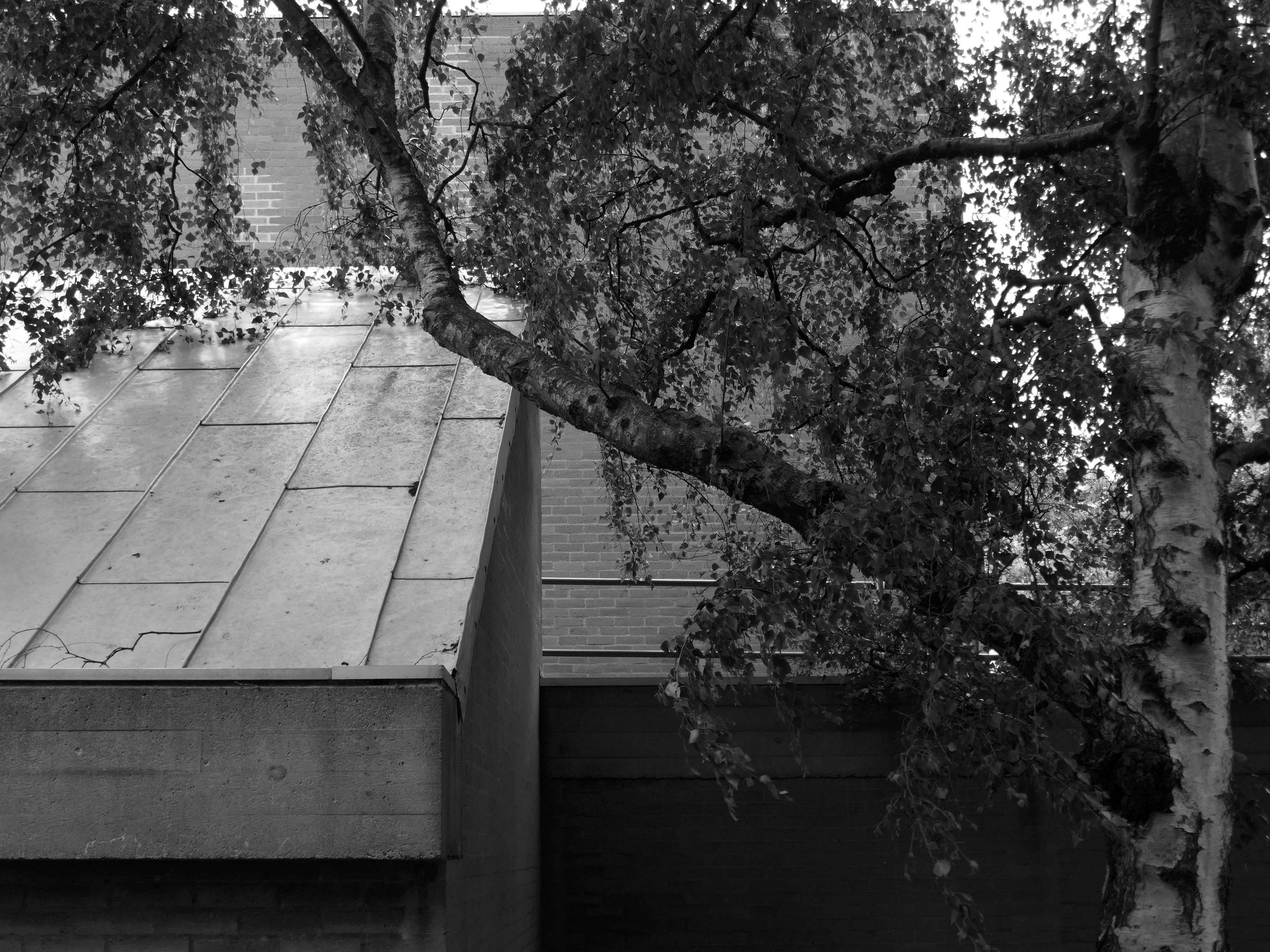
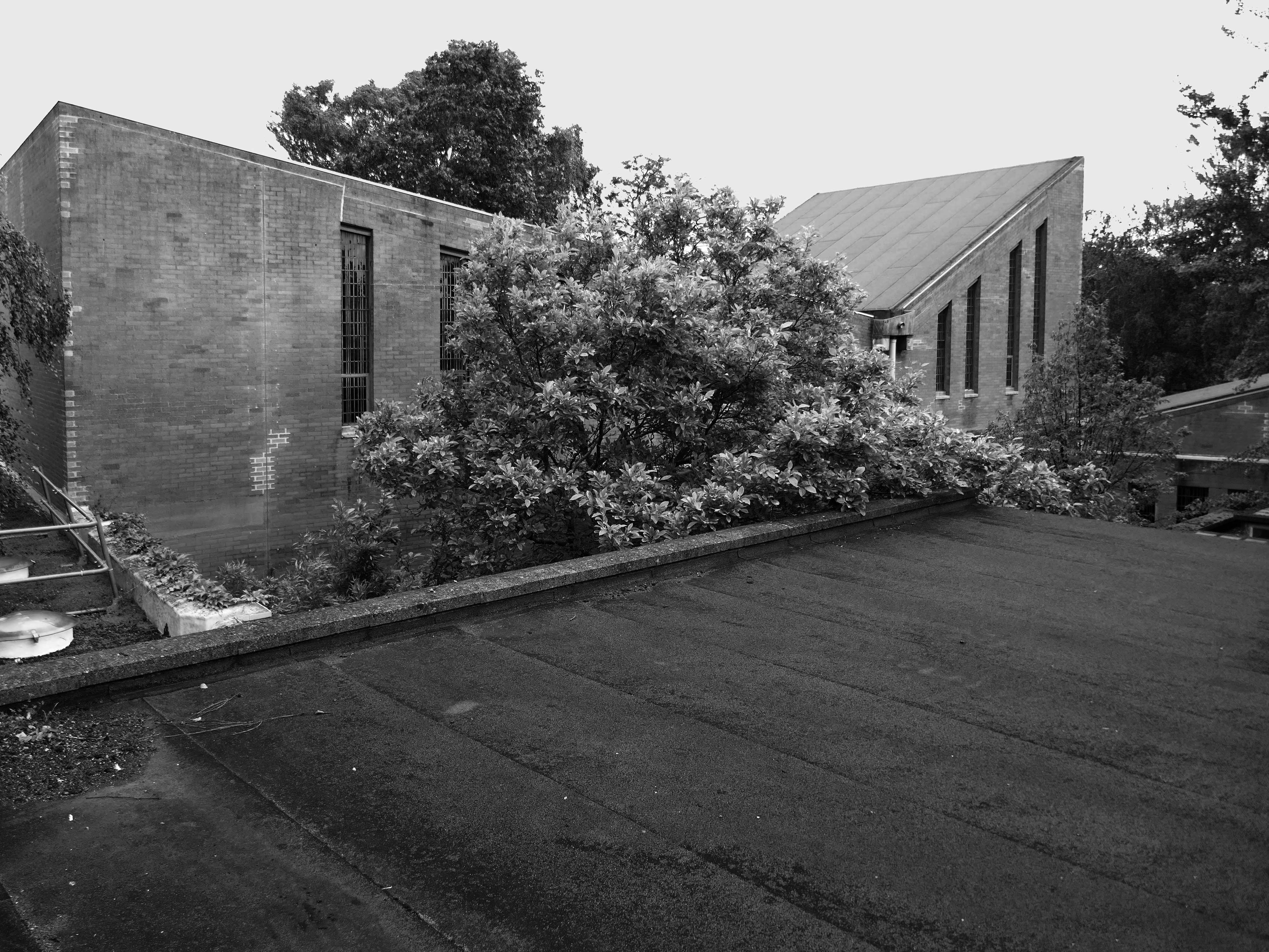
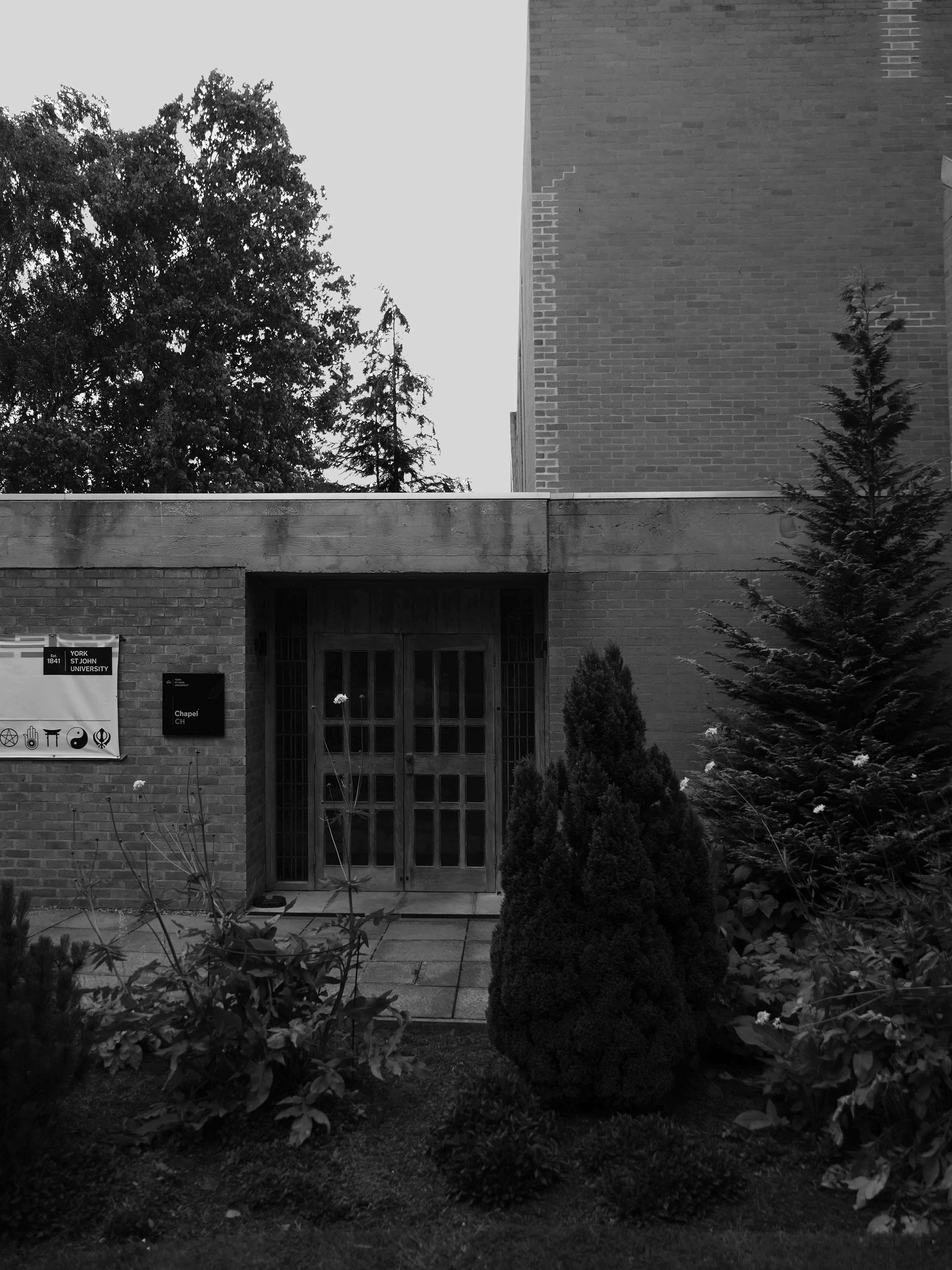
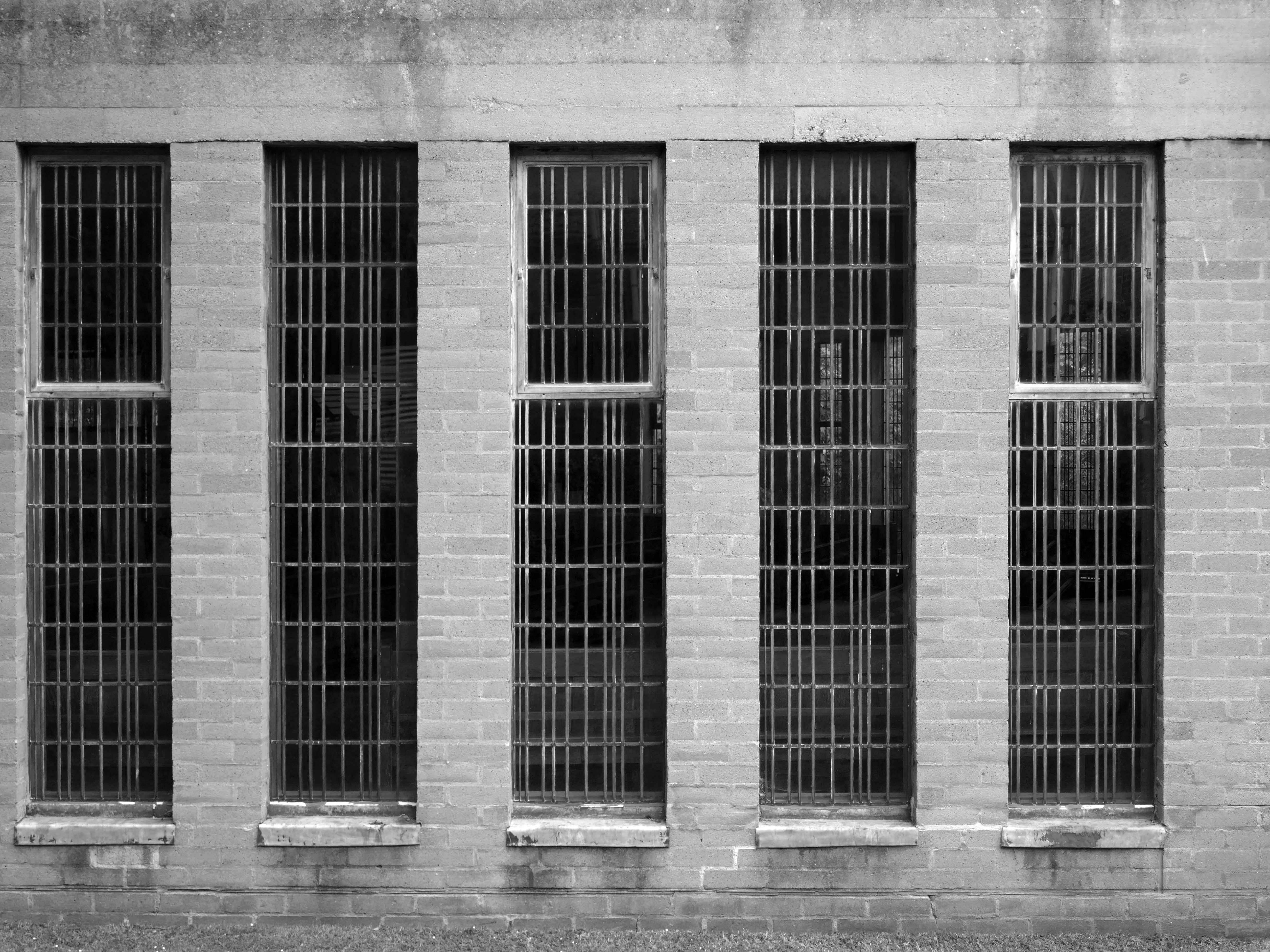
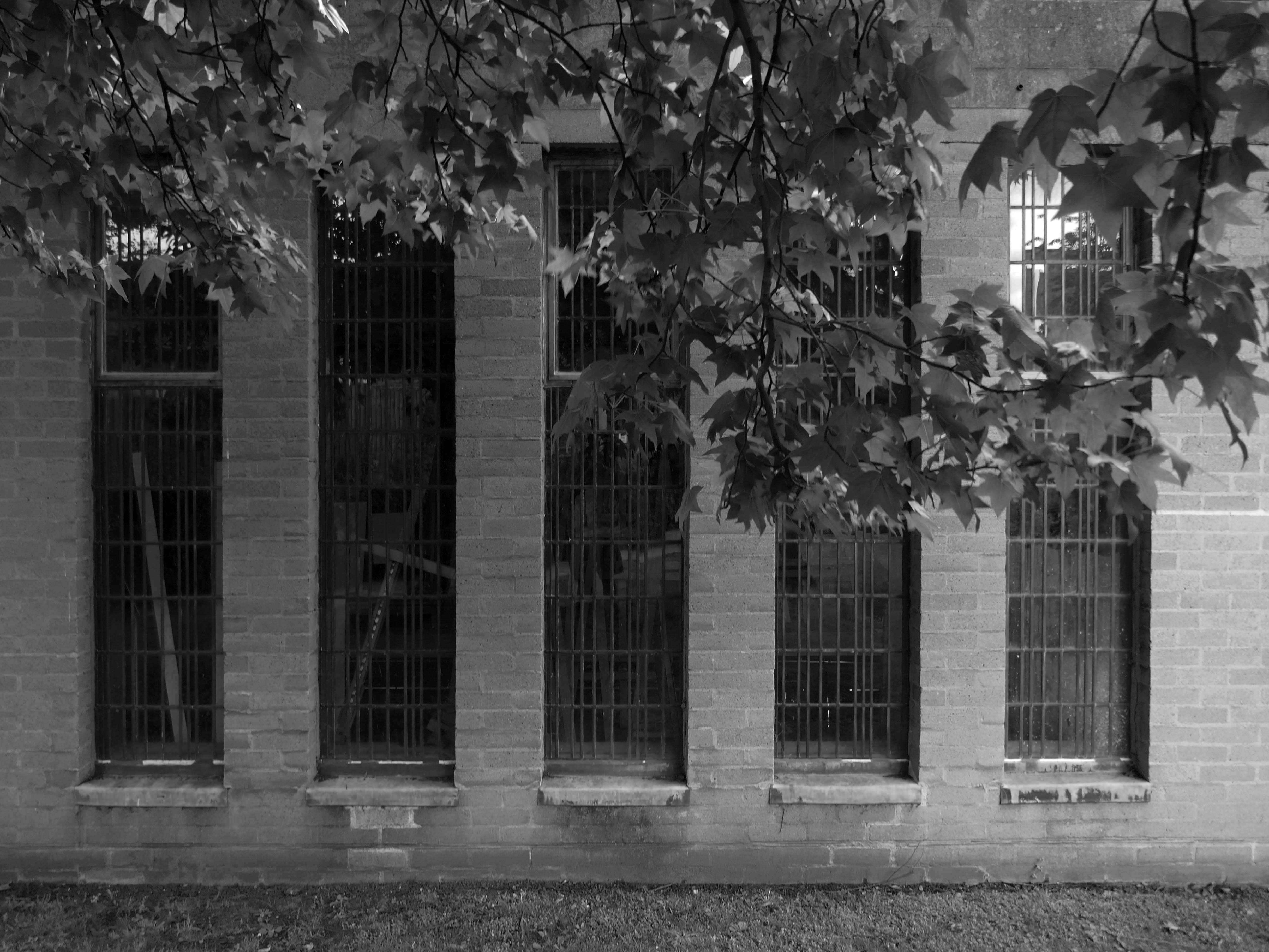
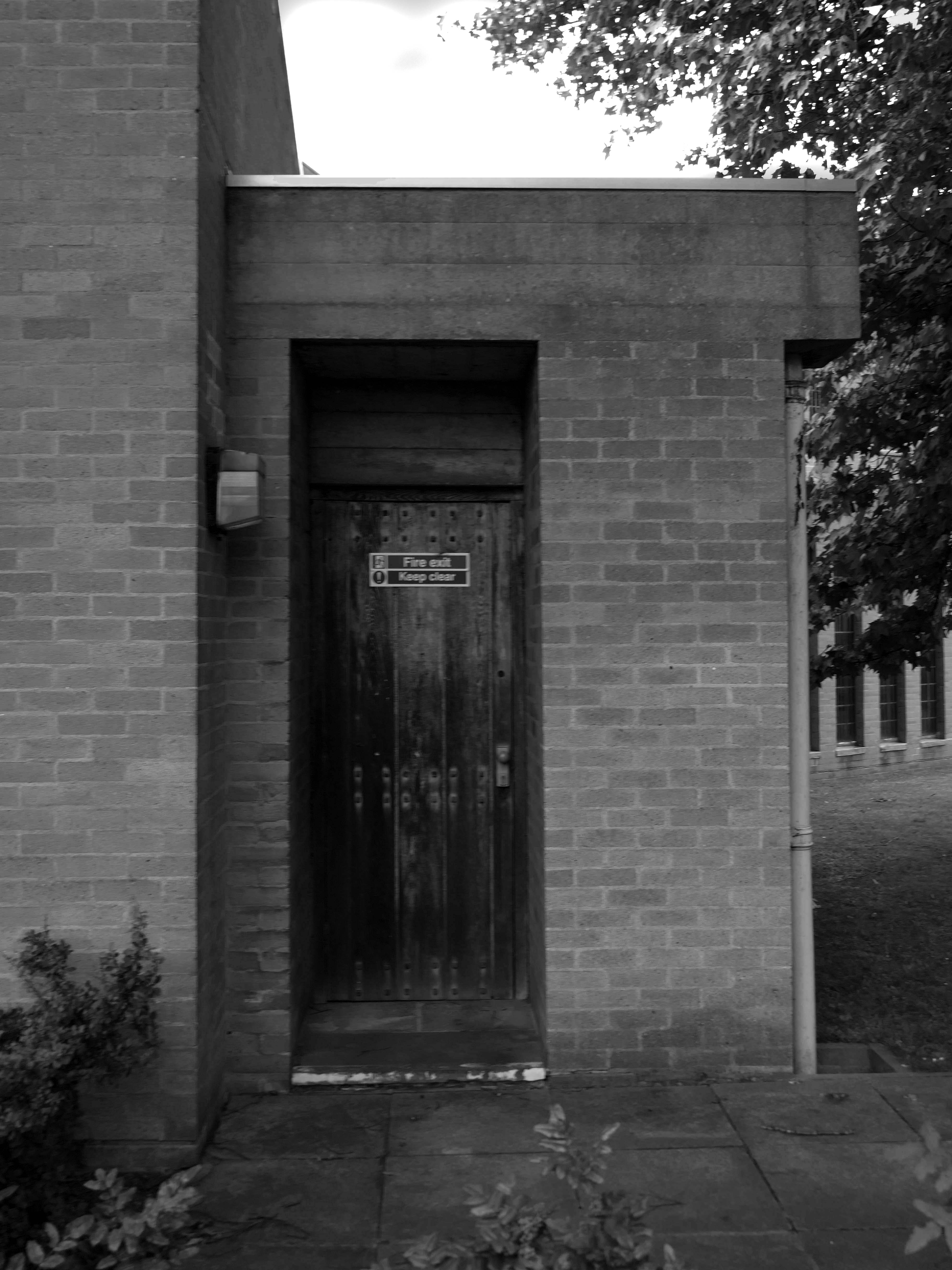
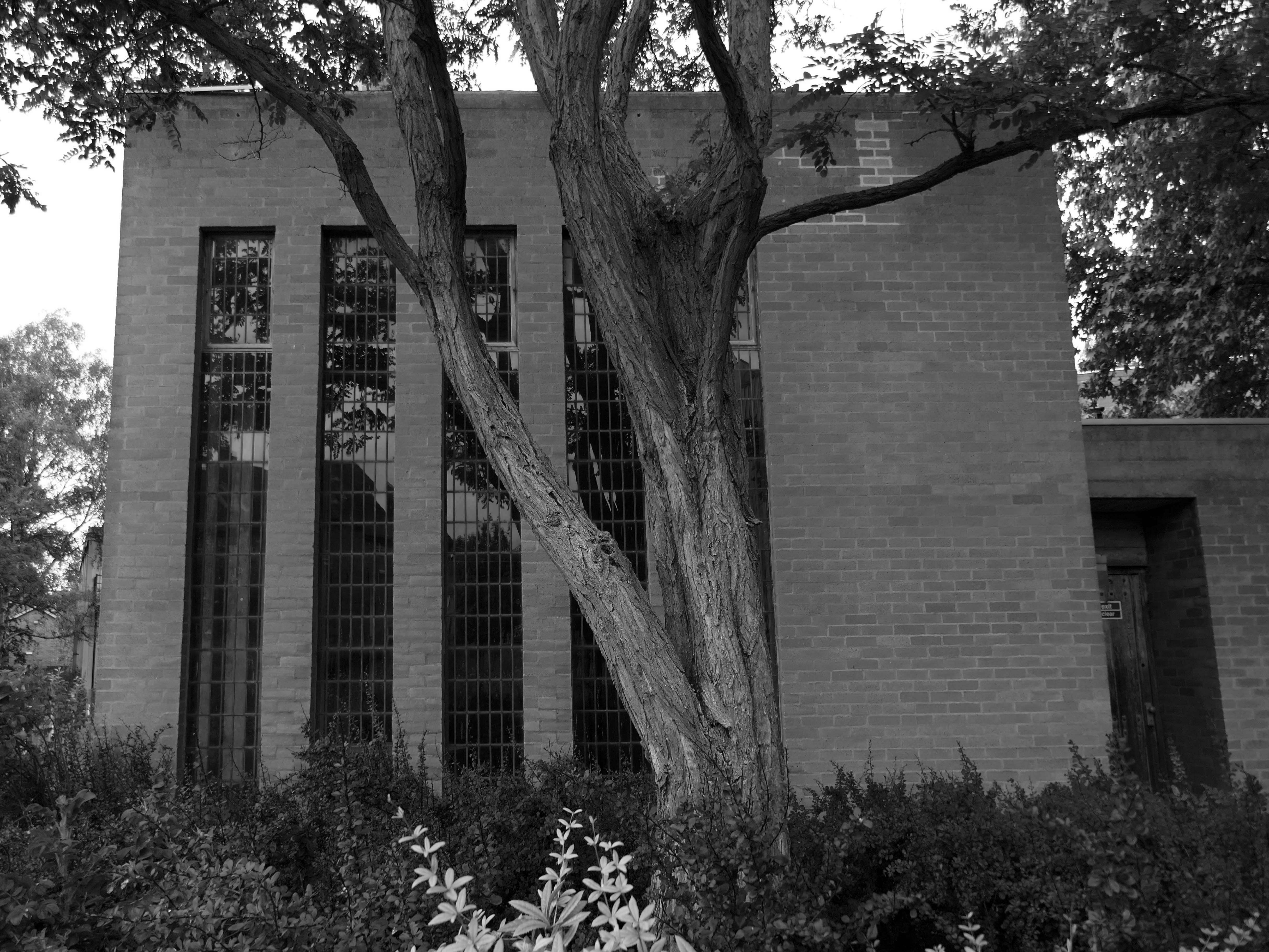
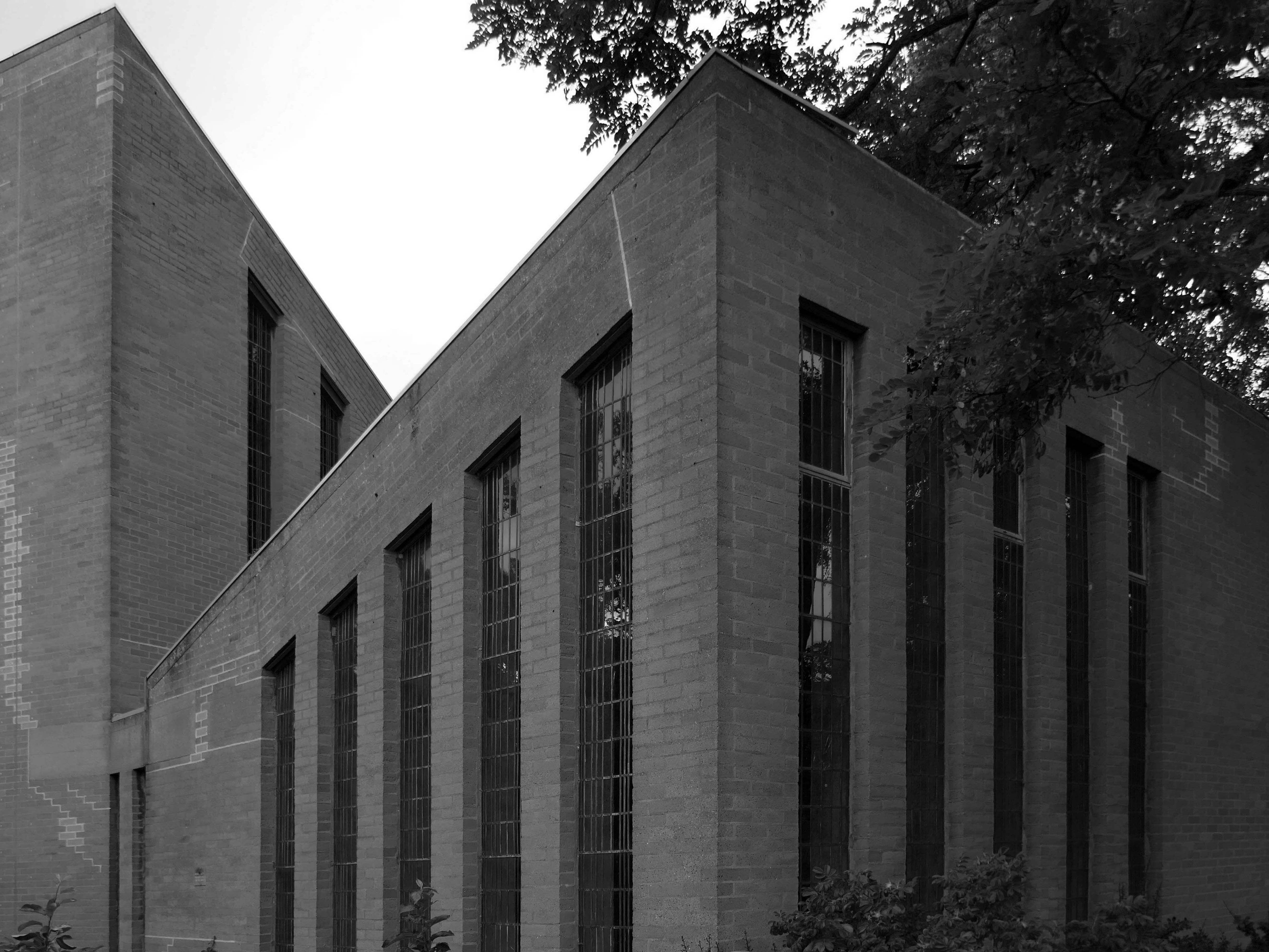
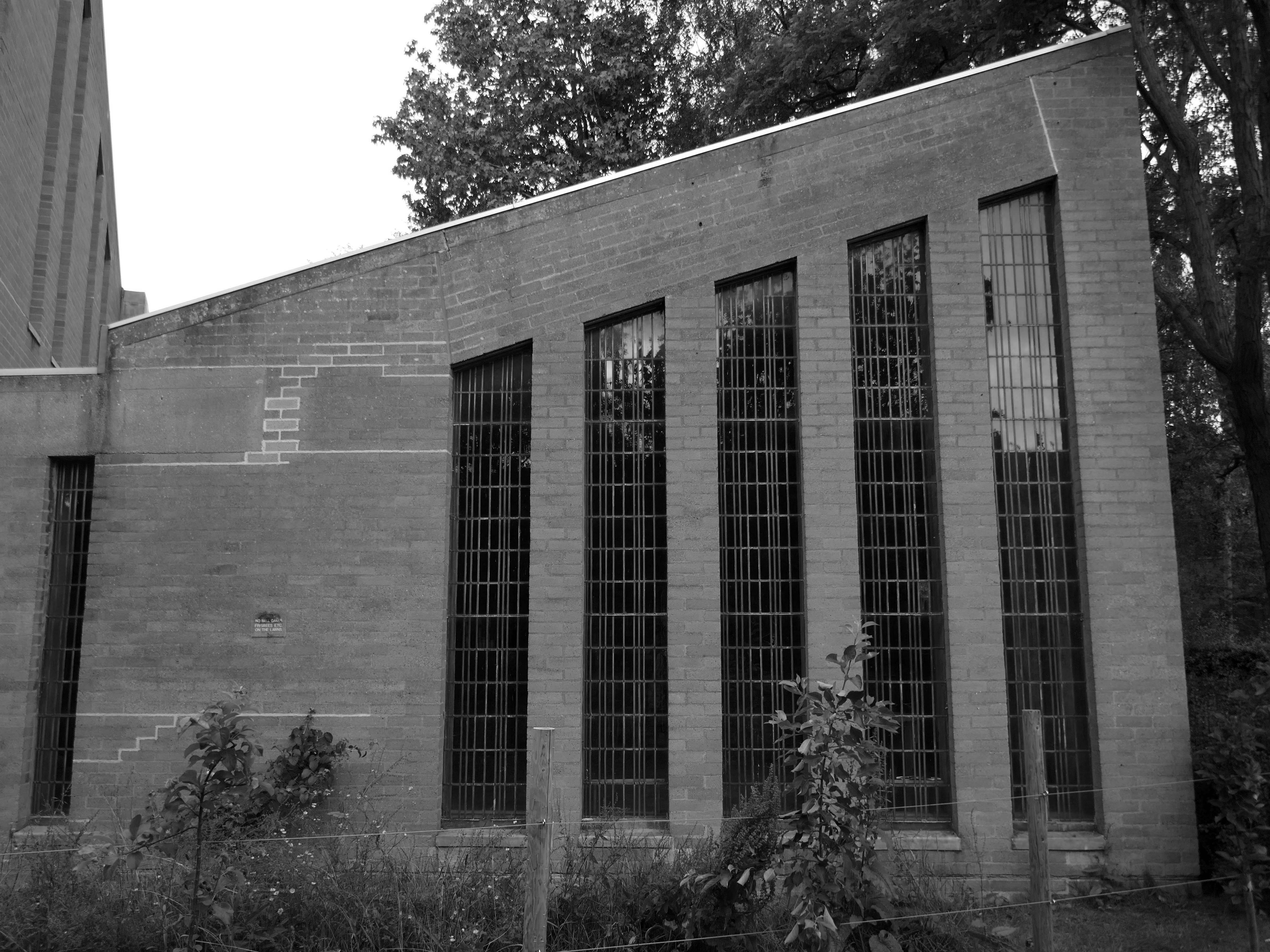
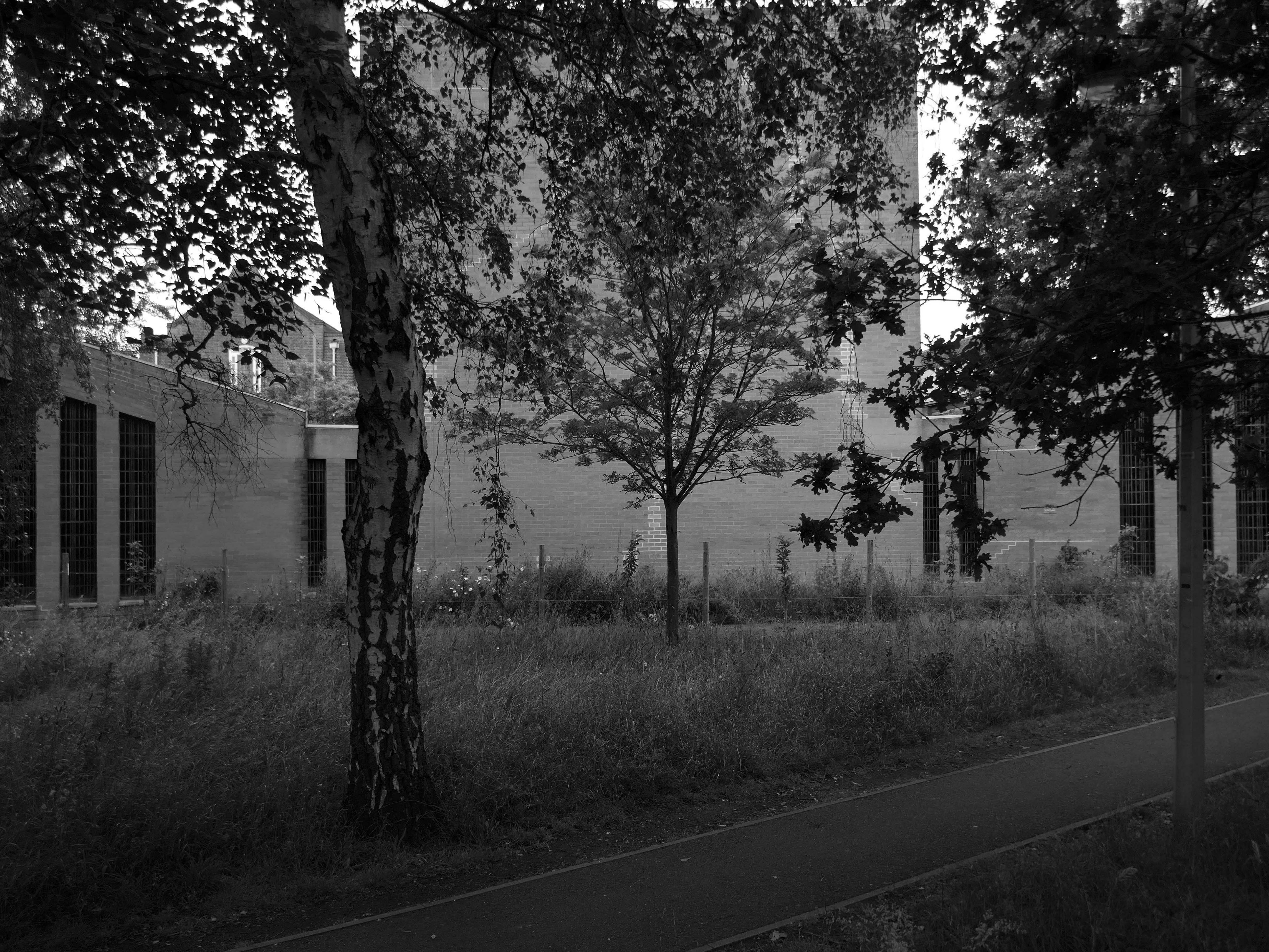
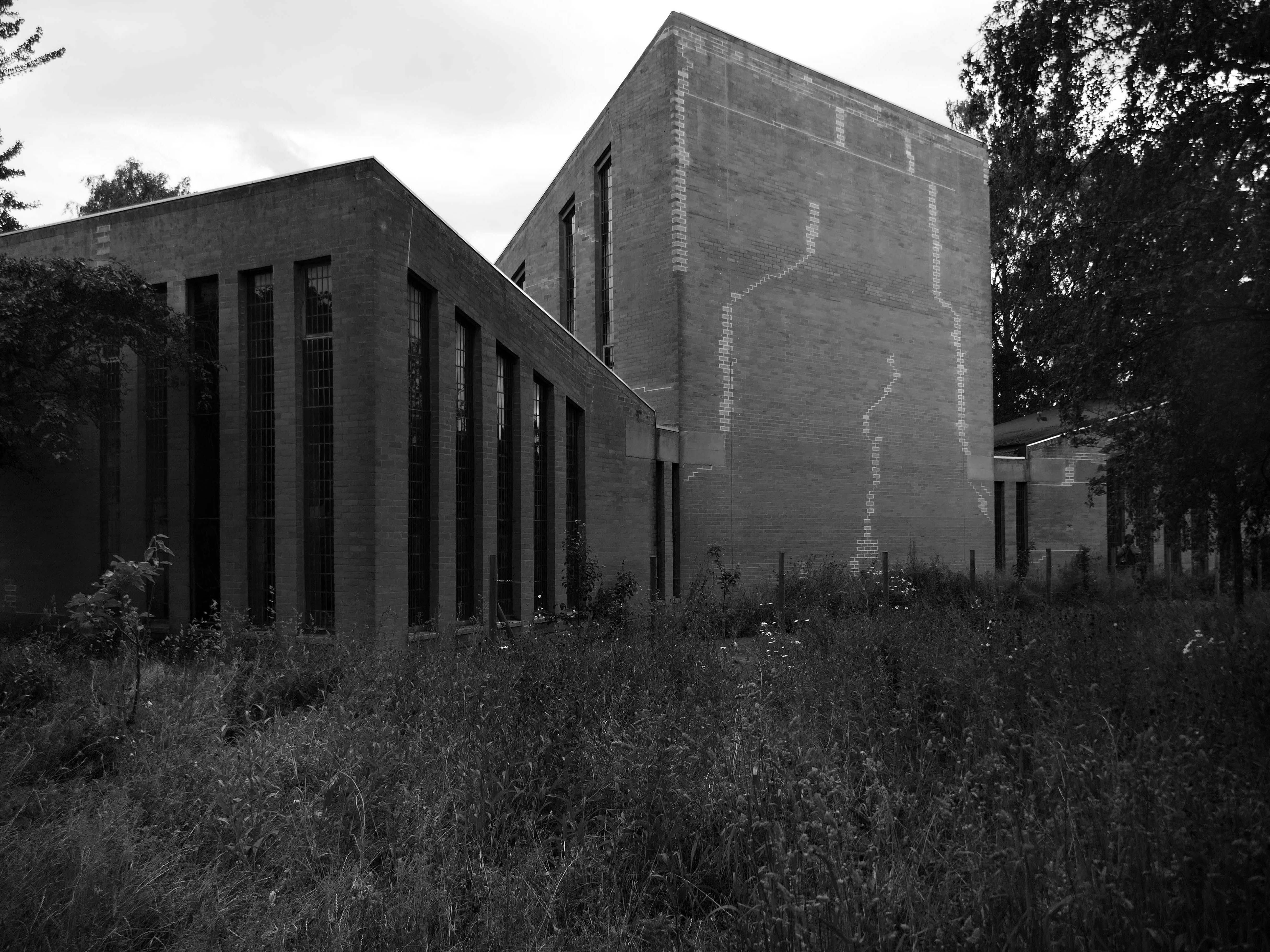
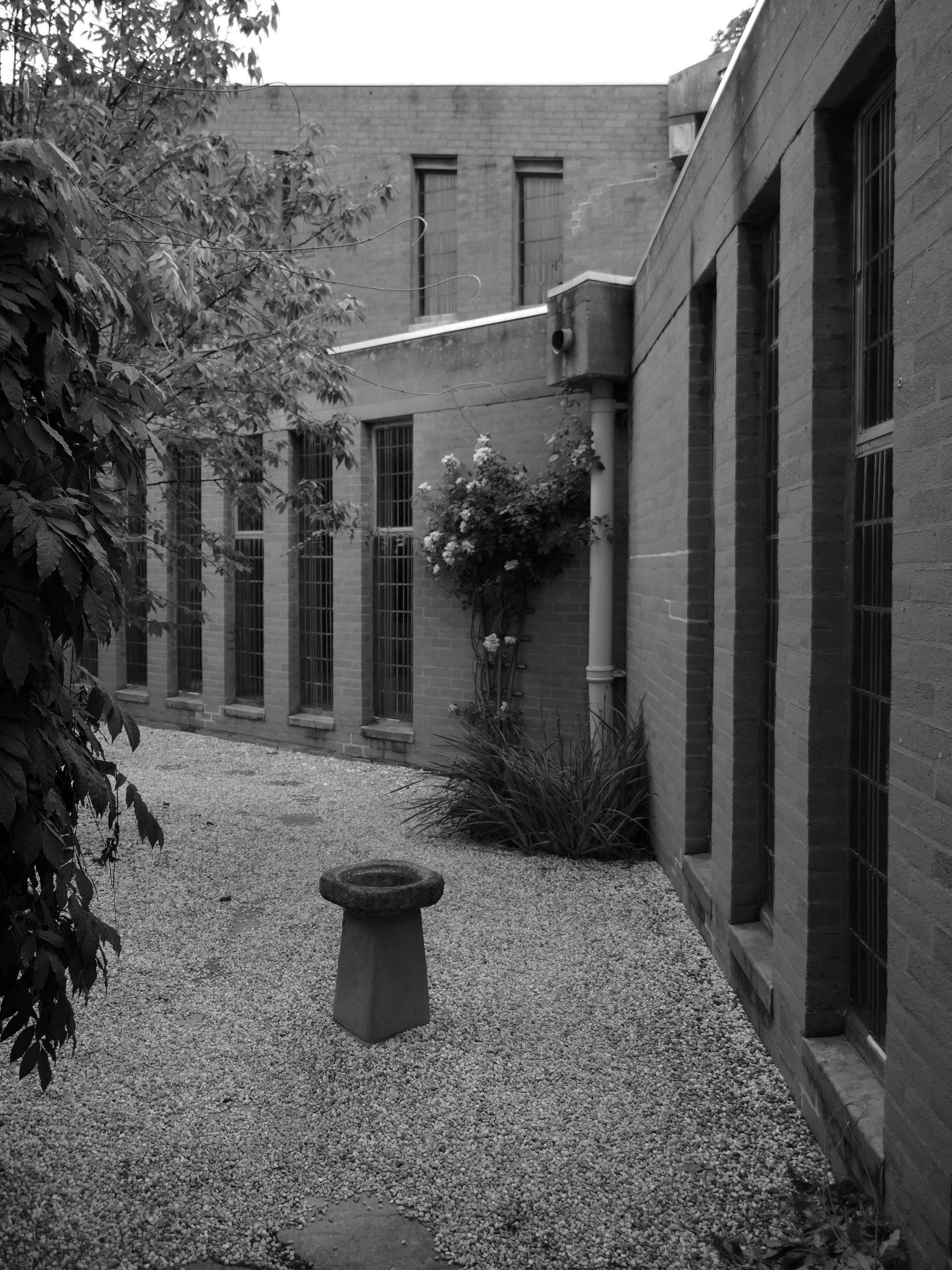
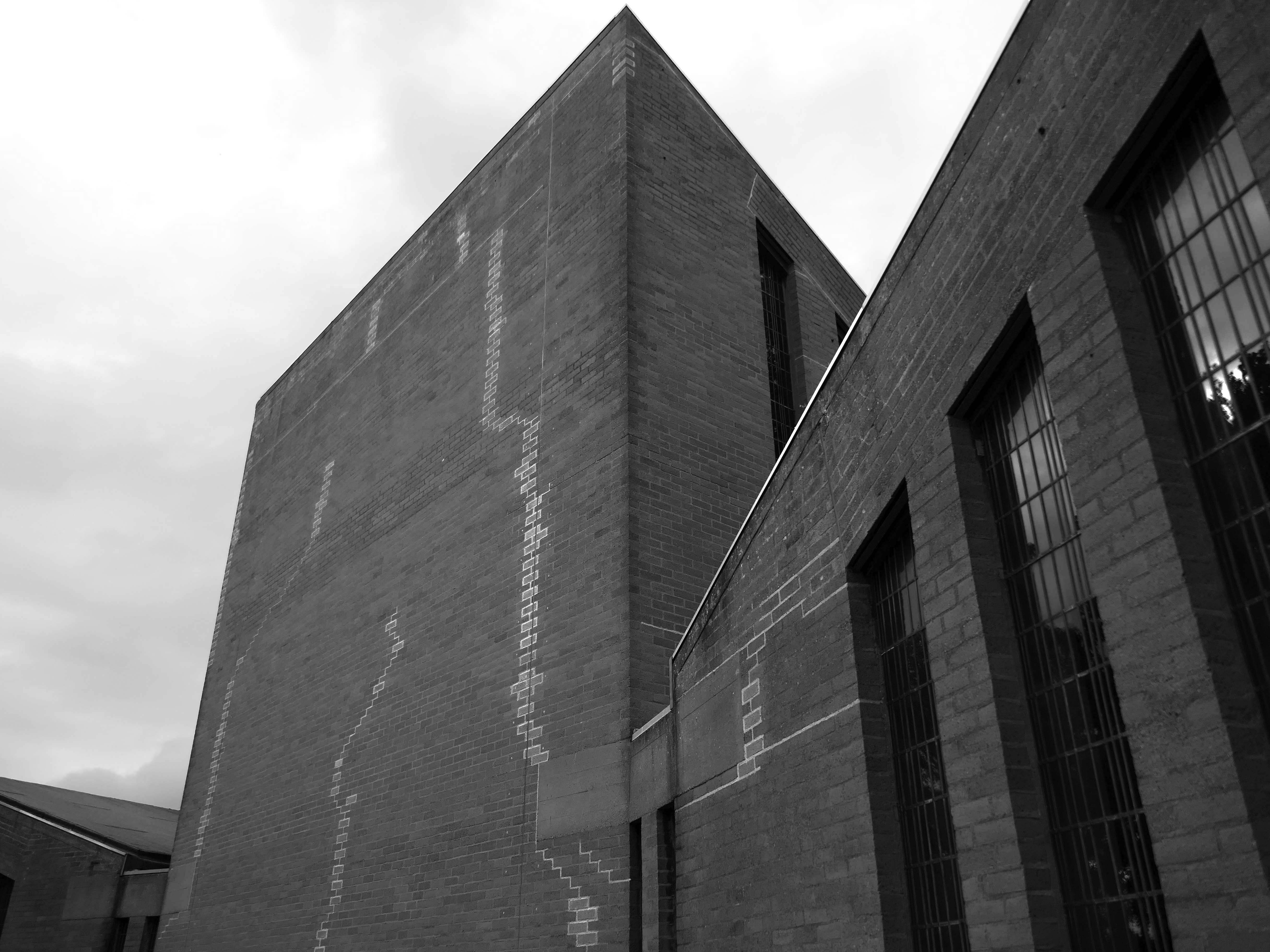
The chapel was closed on a Saturday so we wandered around outside, peering curiously through the windows. Surrounded by mature planting, the bare brick and glazing is more than somewhat softened, the planting however does inhibit the intrepid photographer.
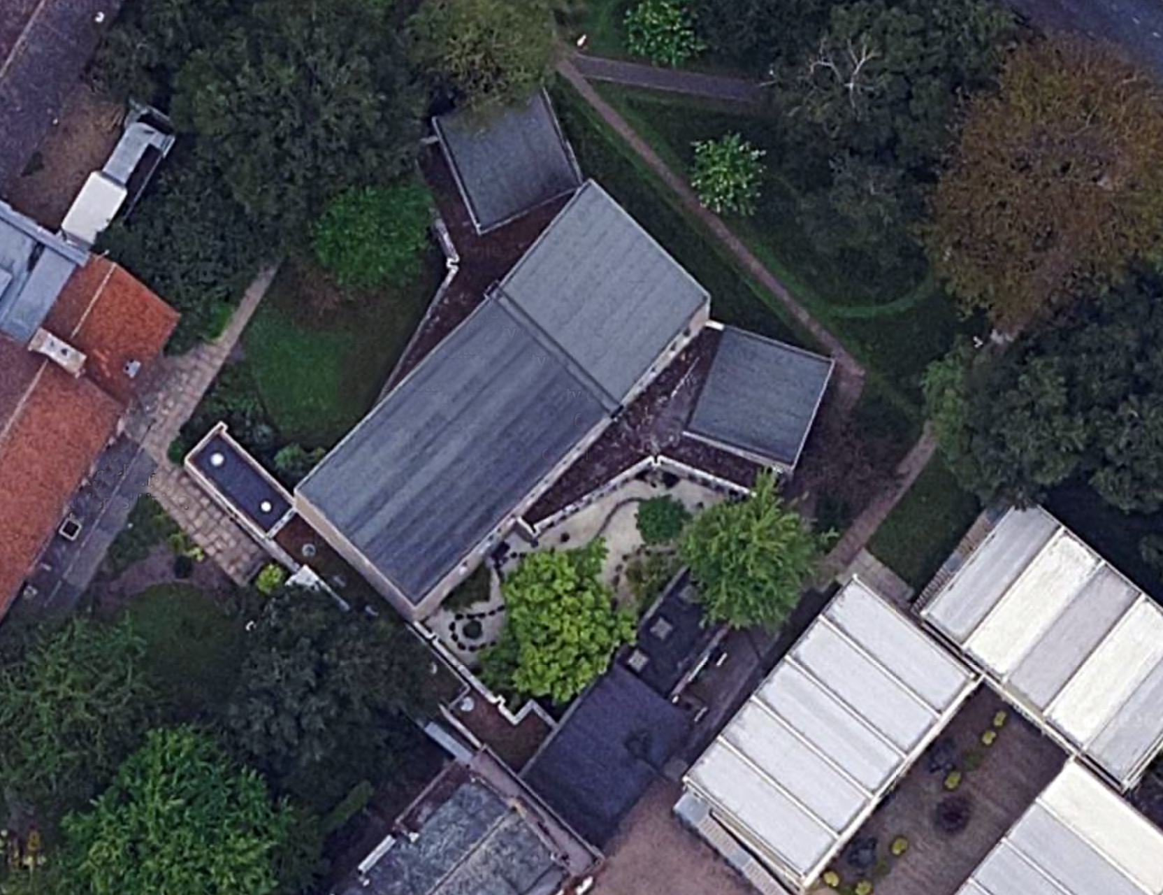
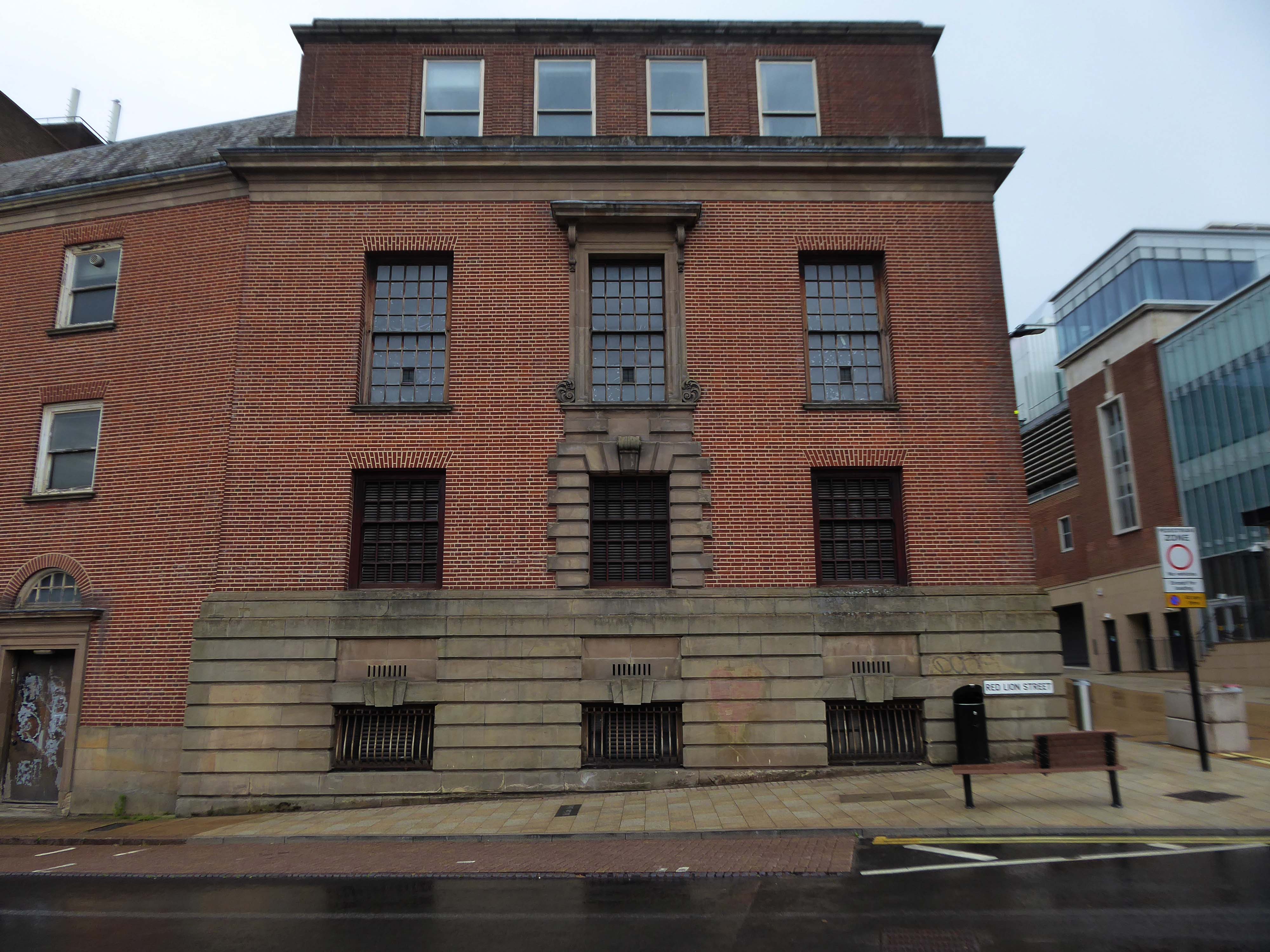
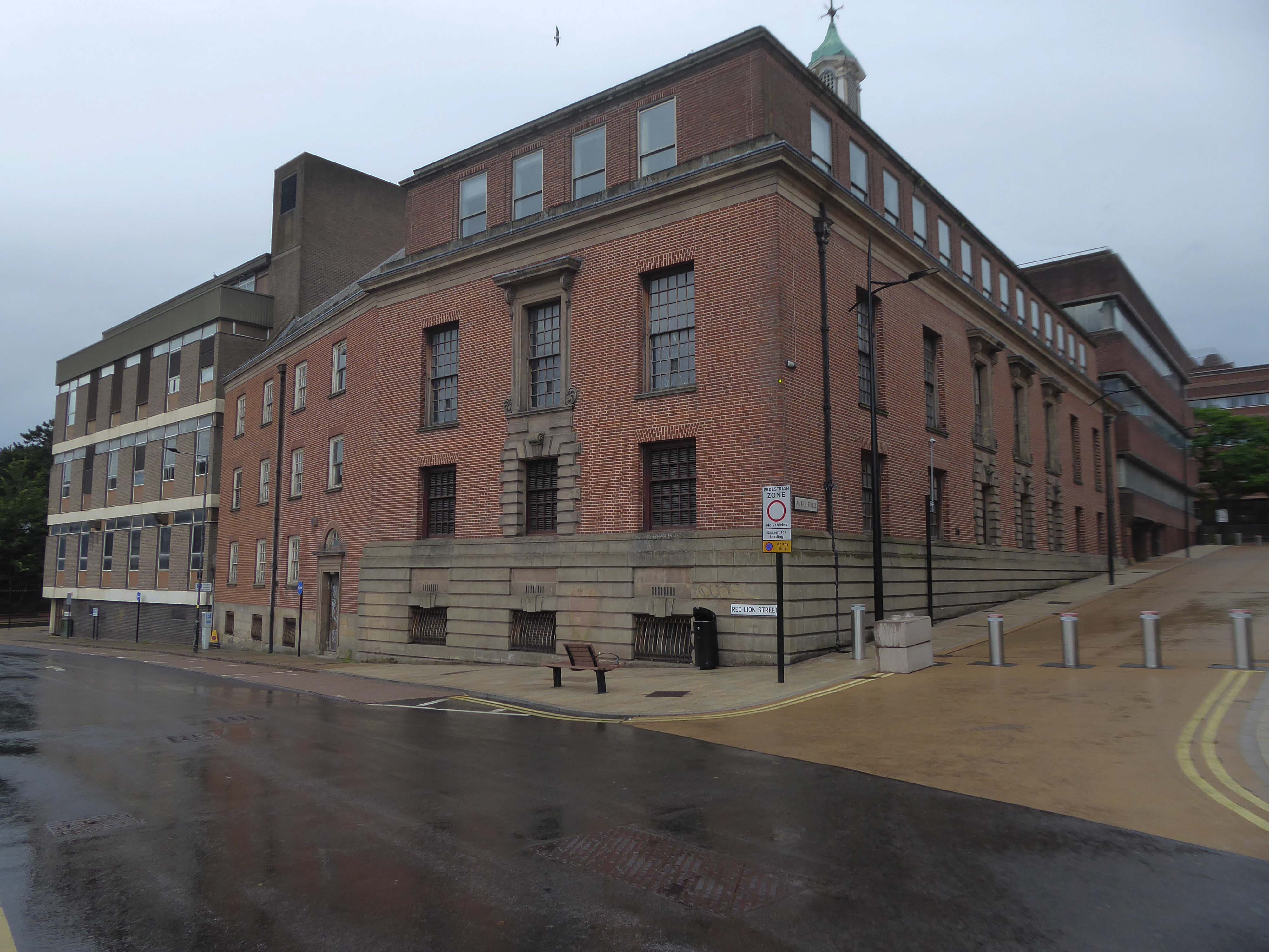
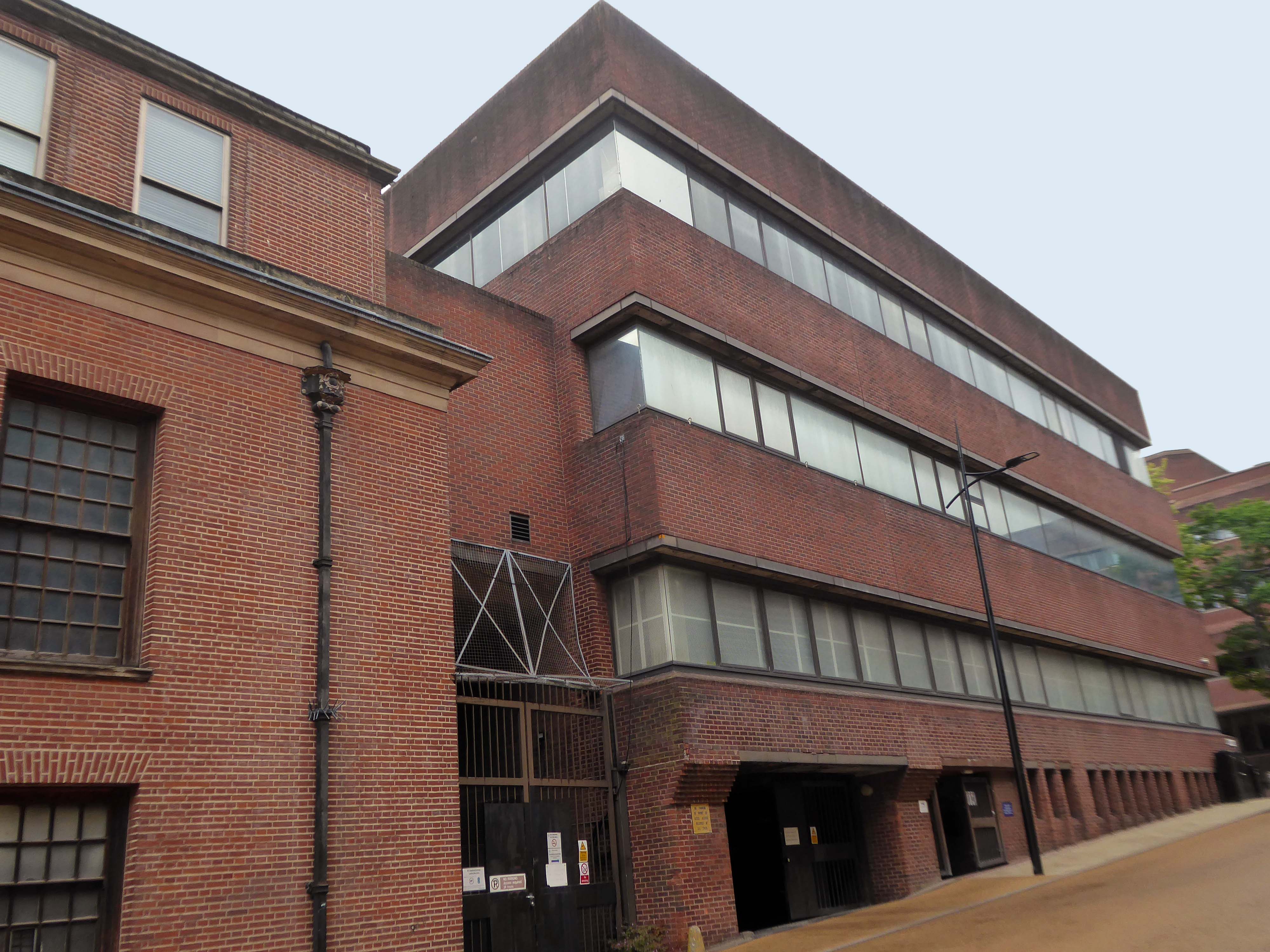
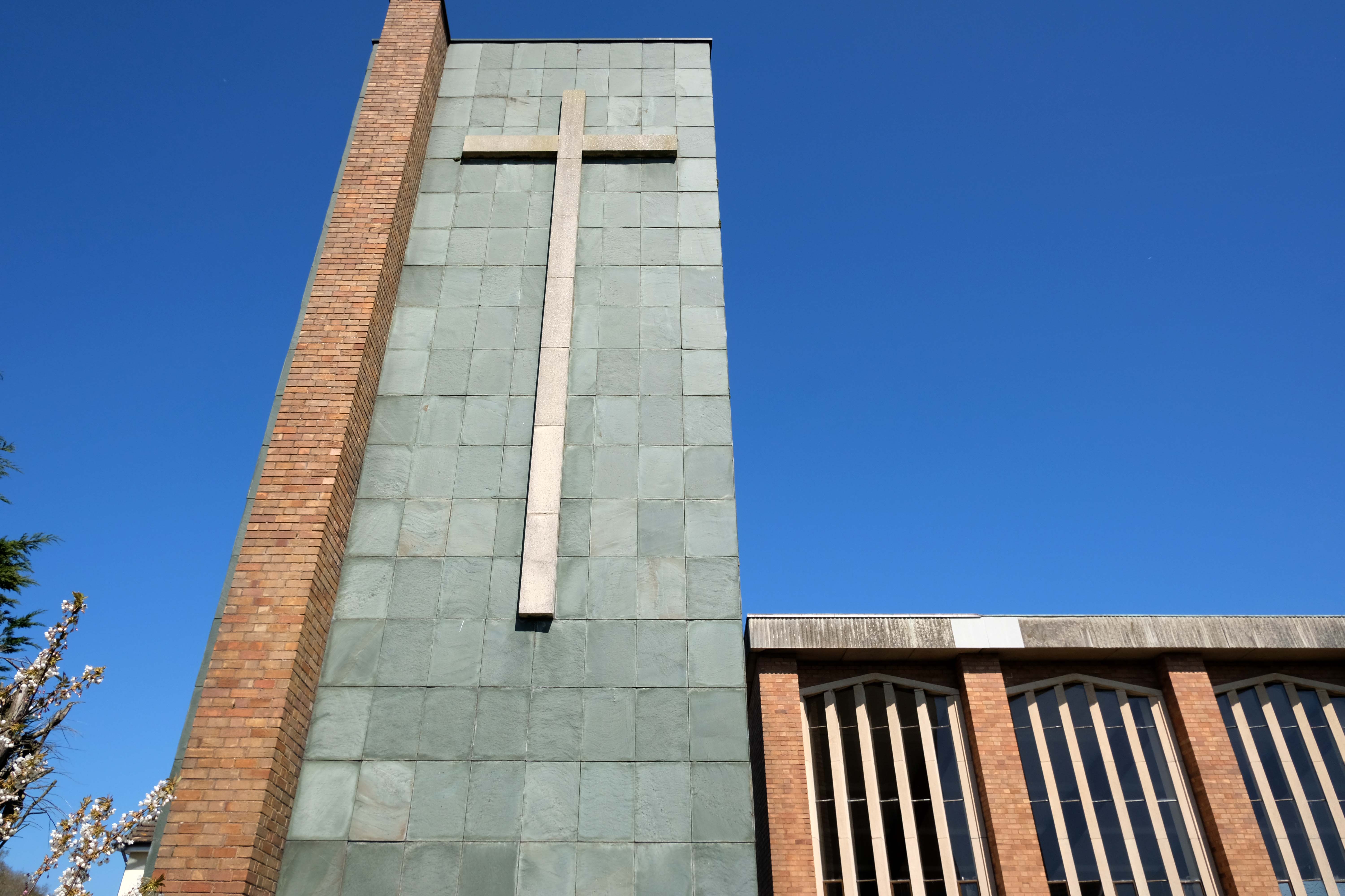
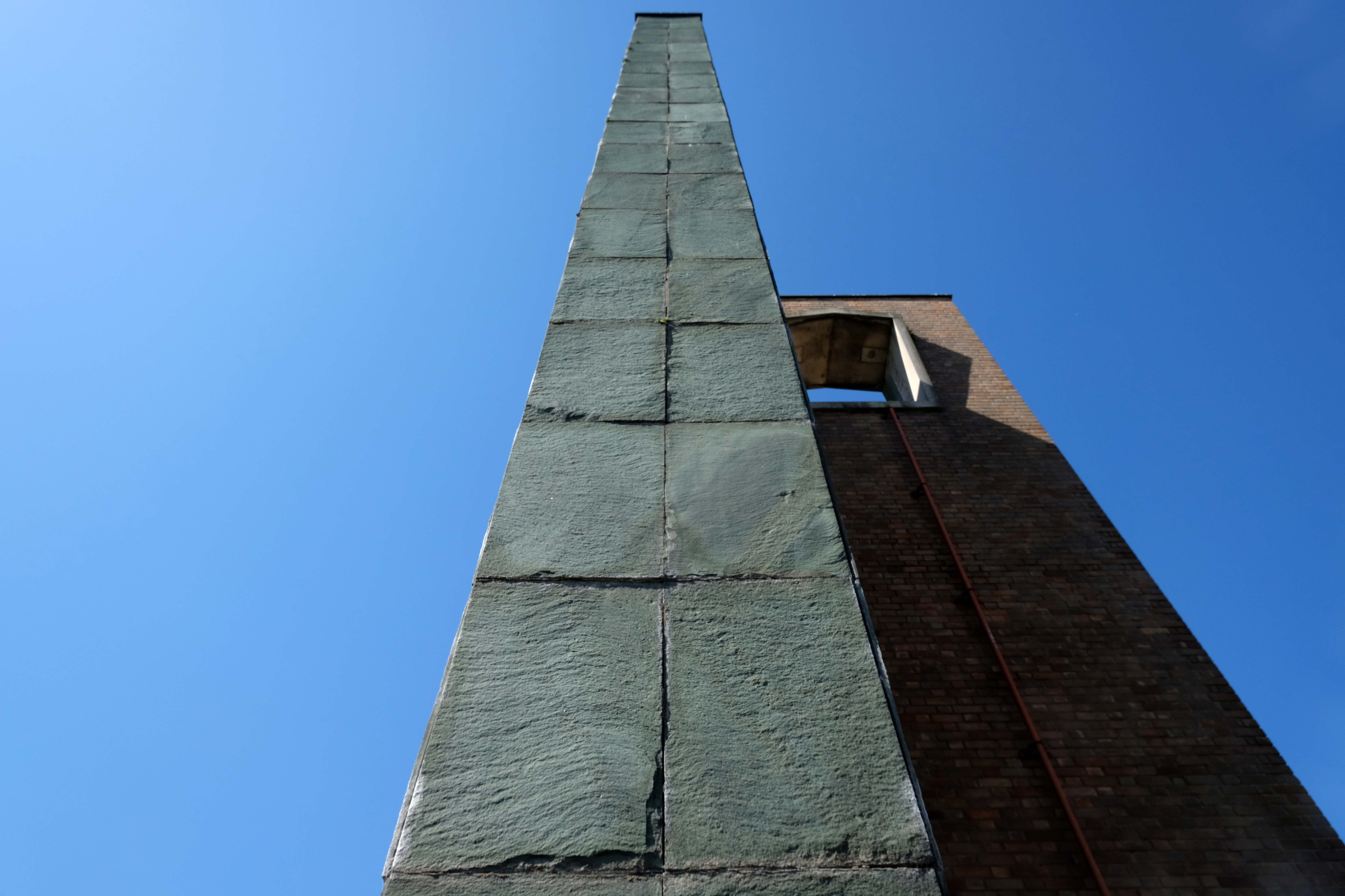
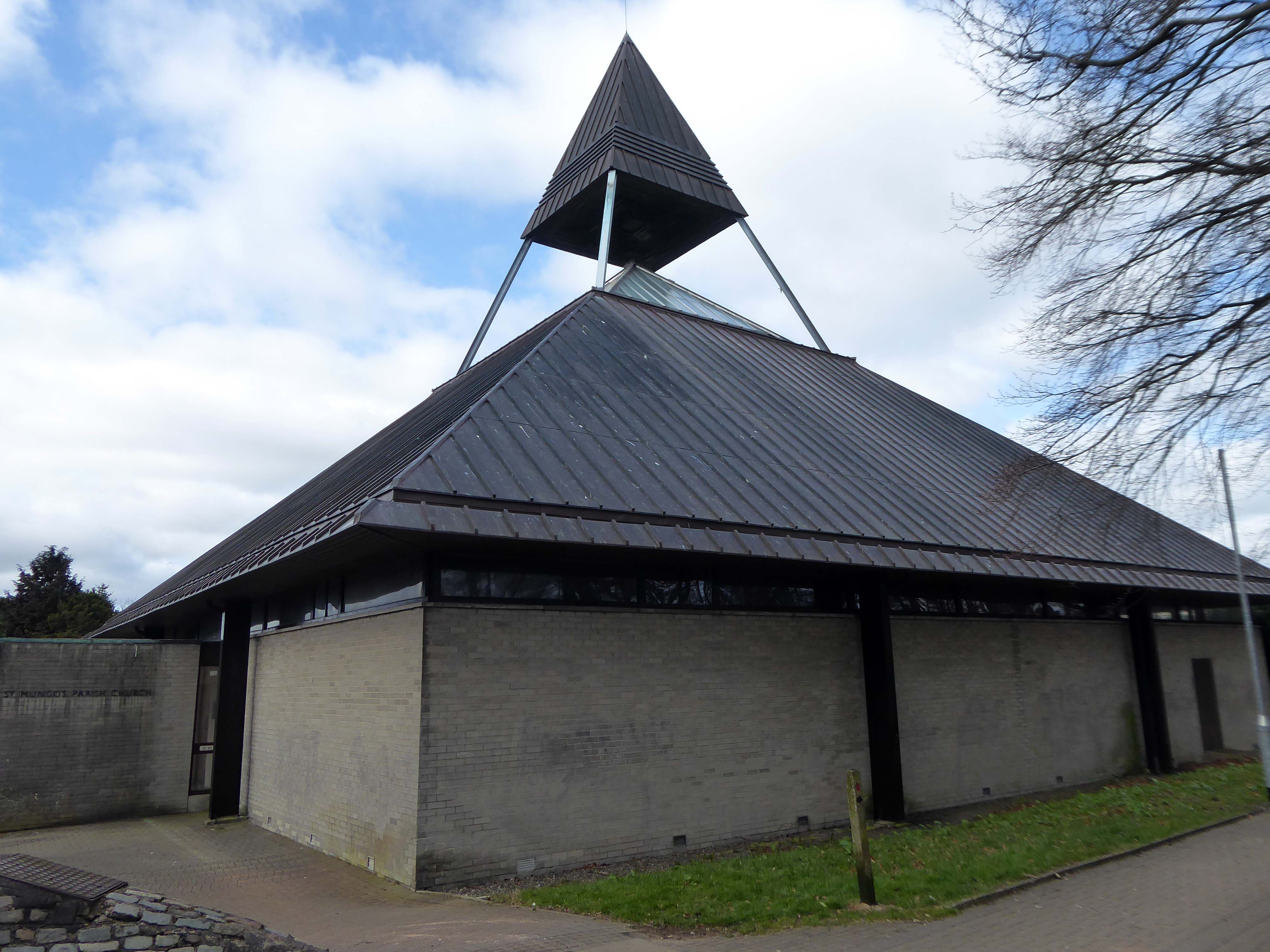
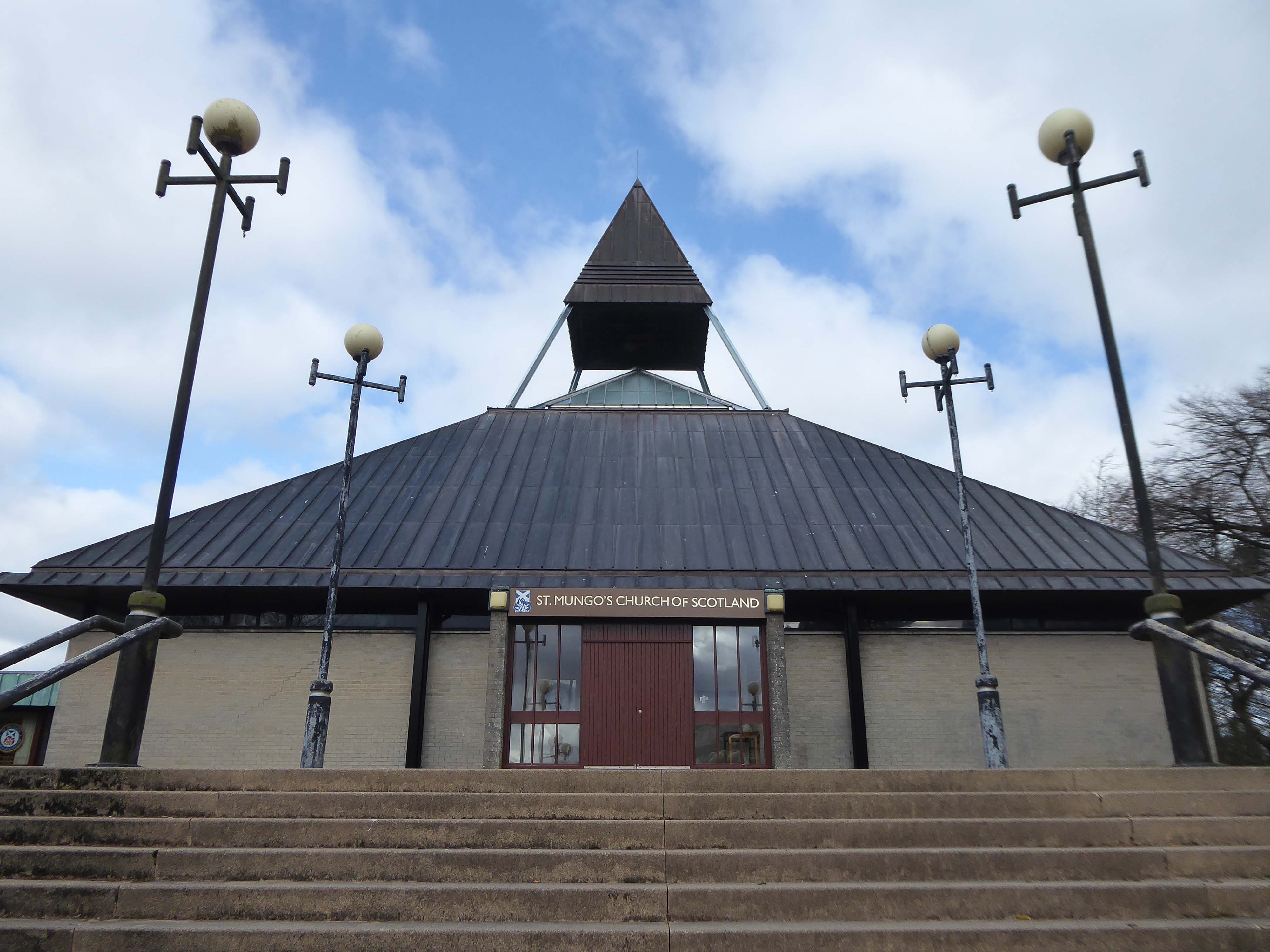
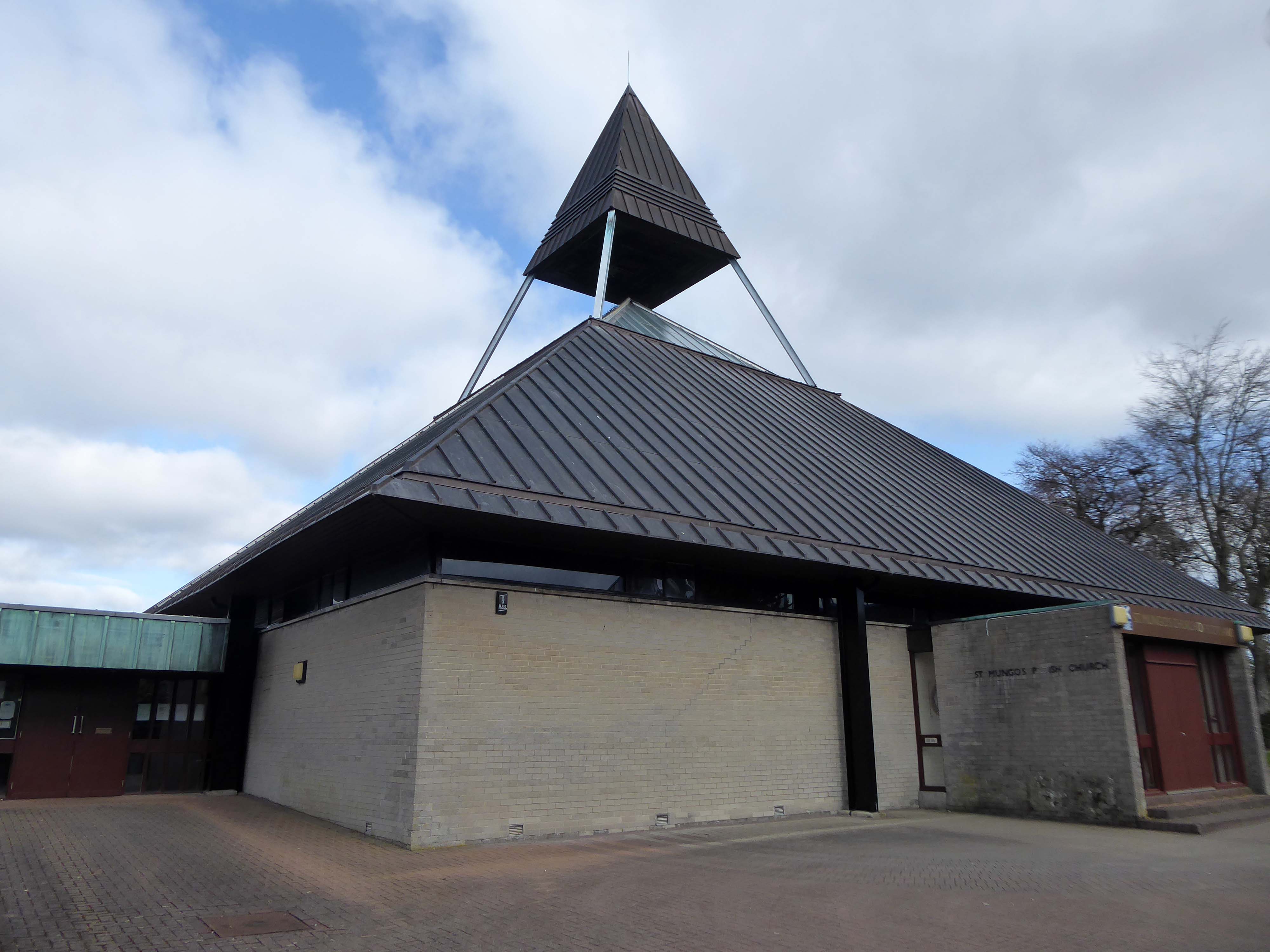
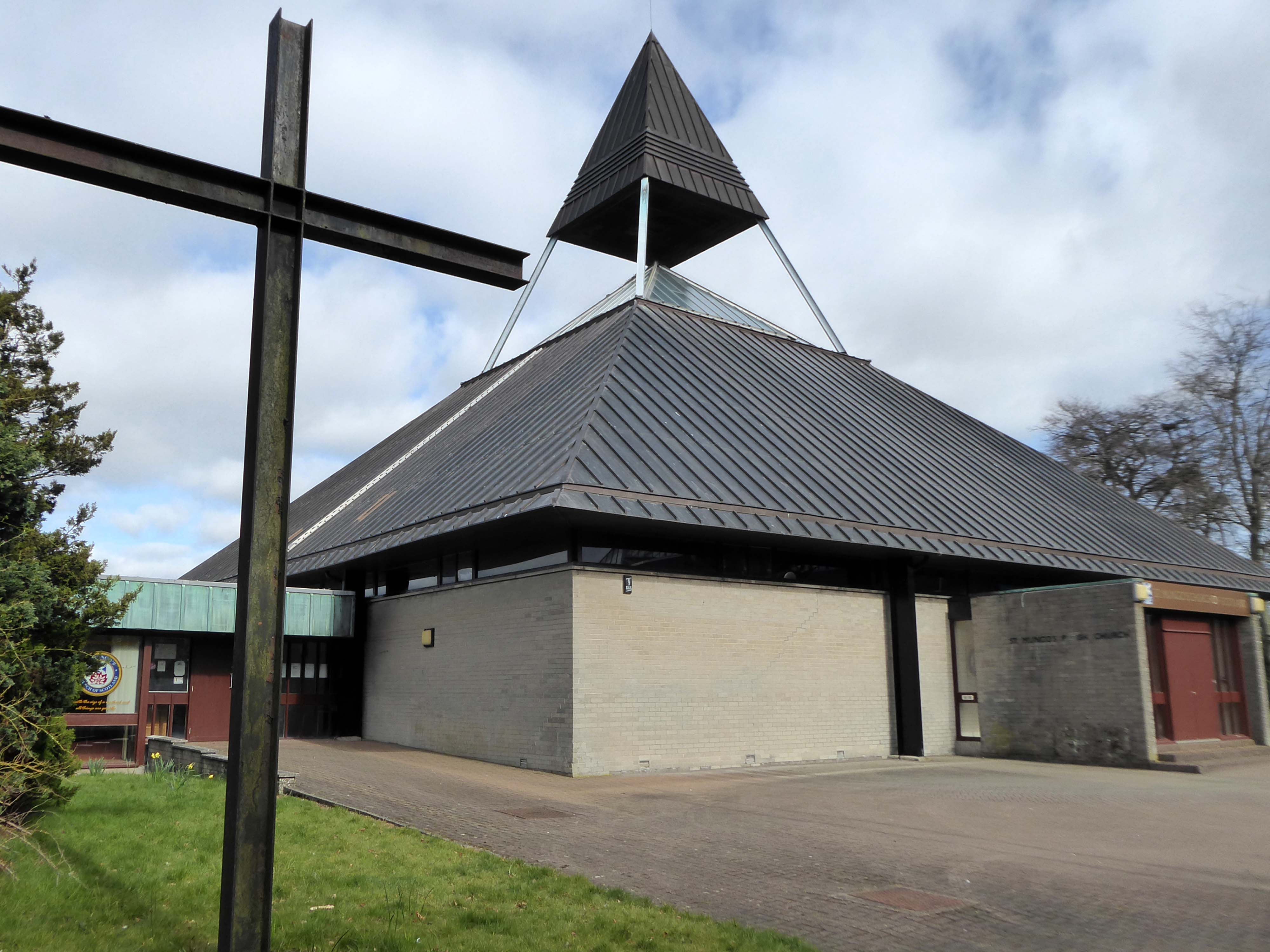
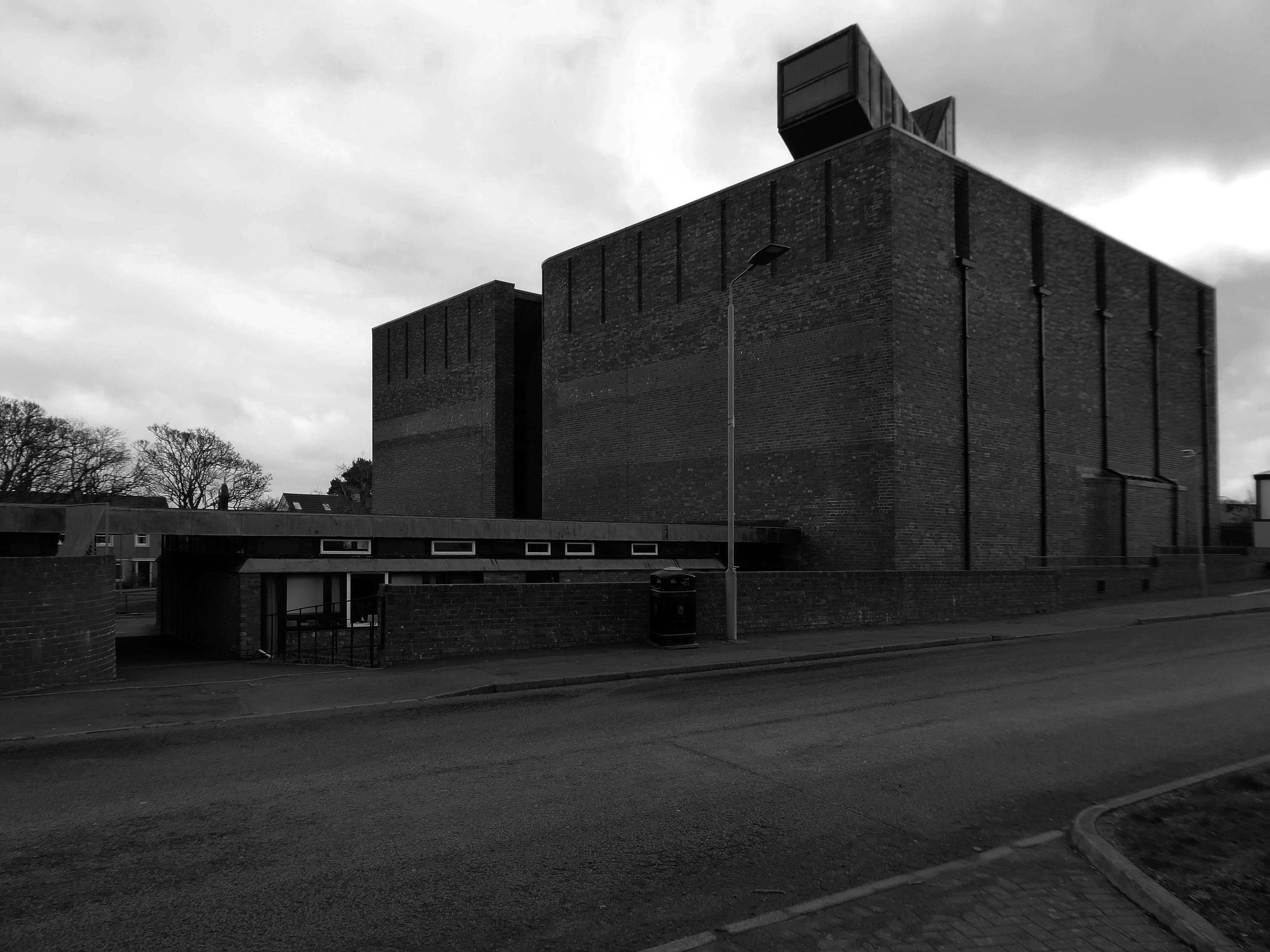
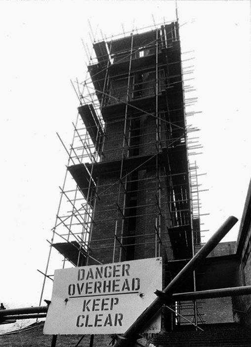
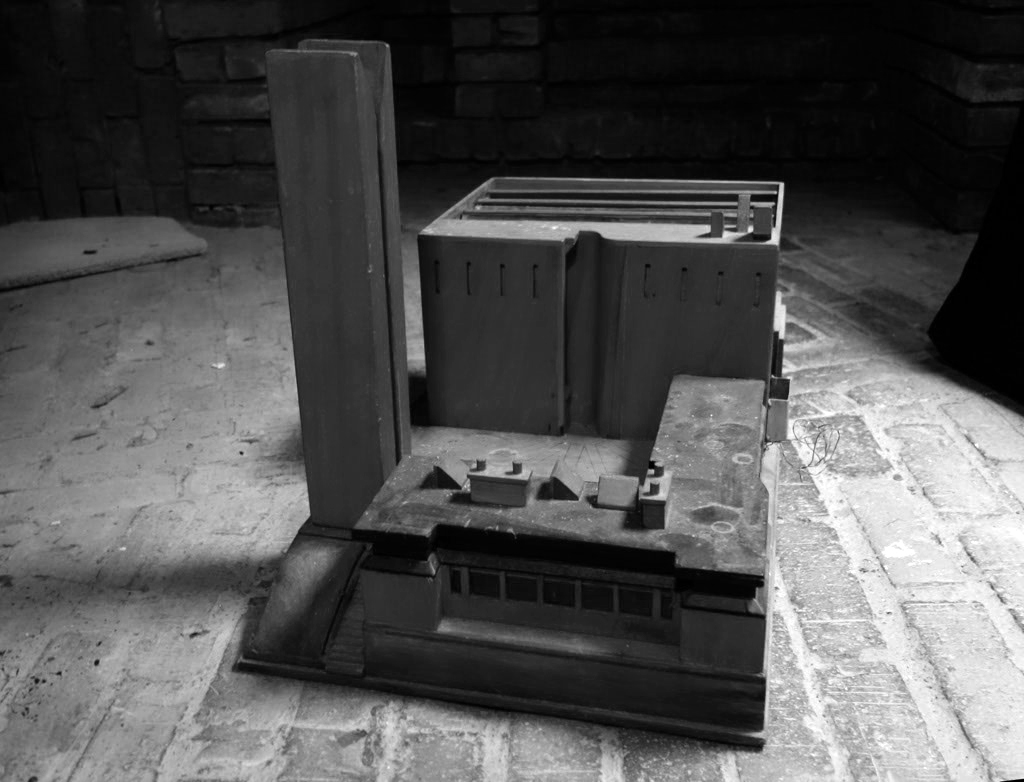
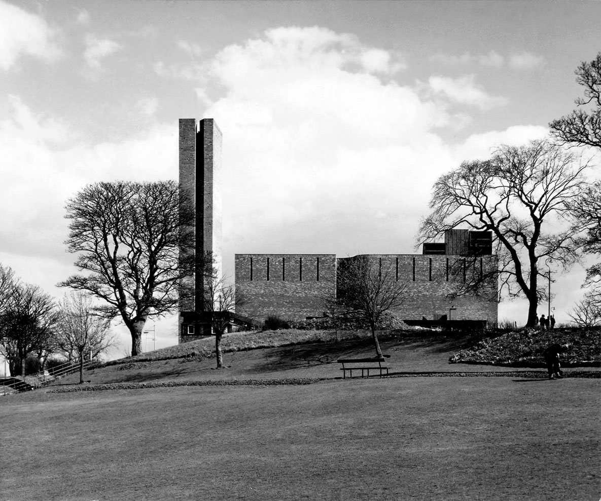
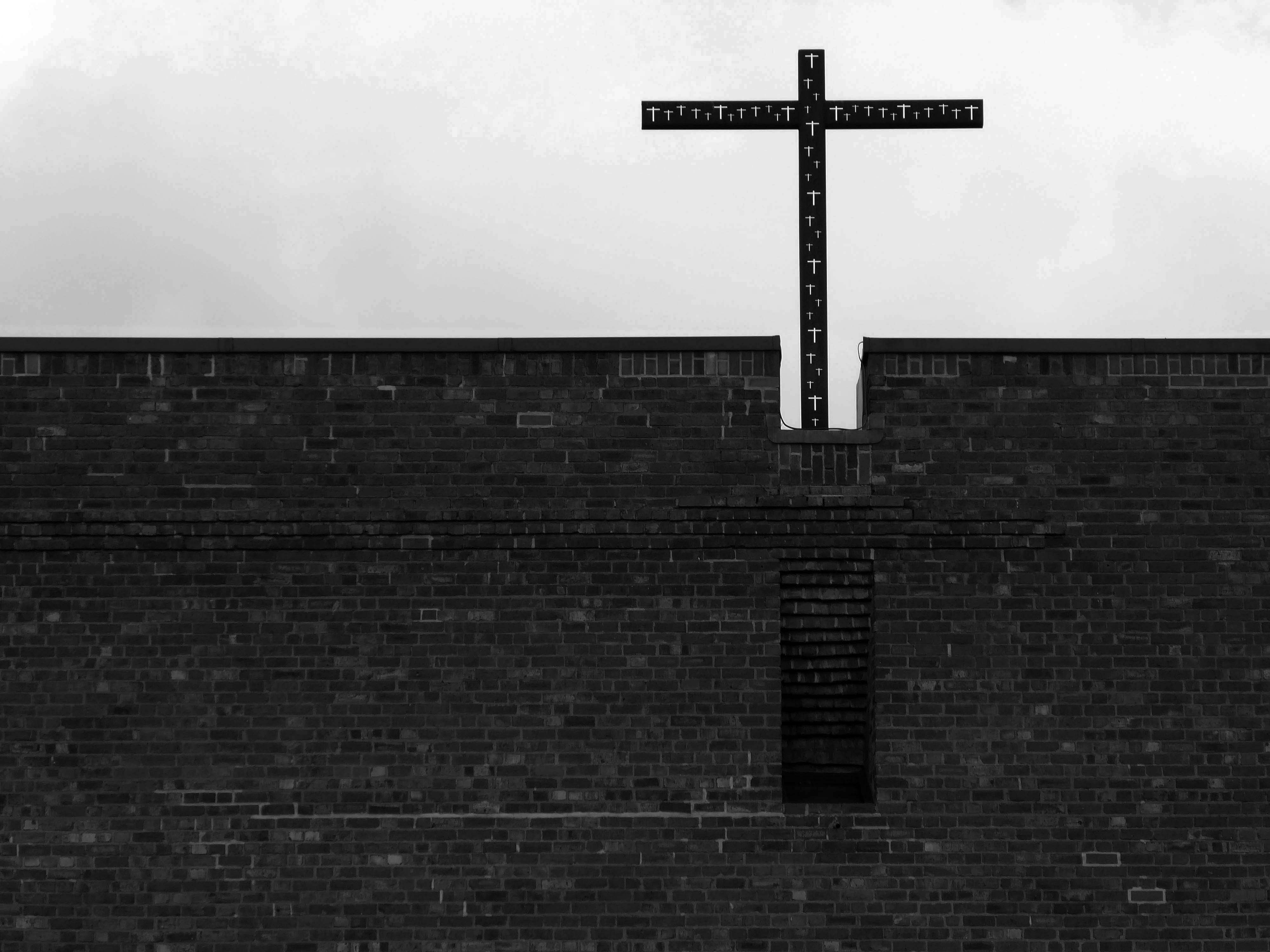
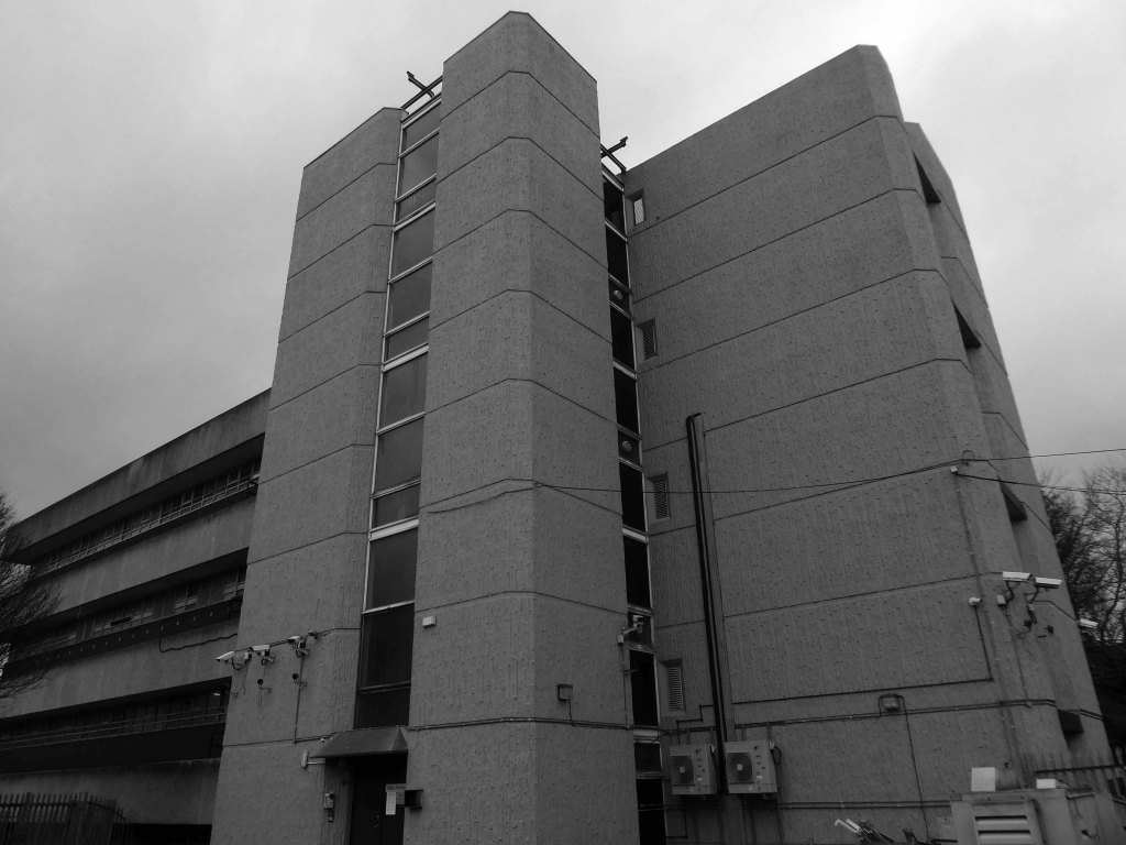
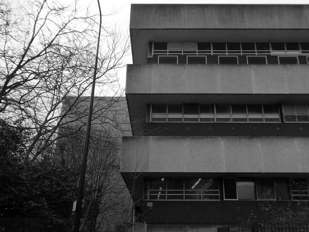
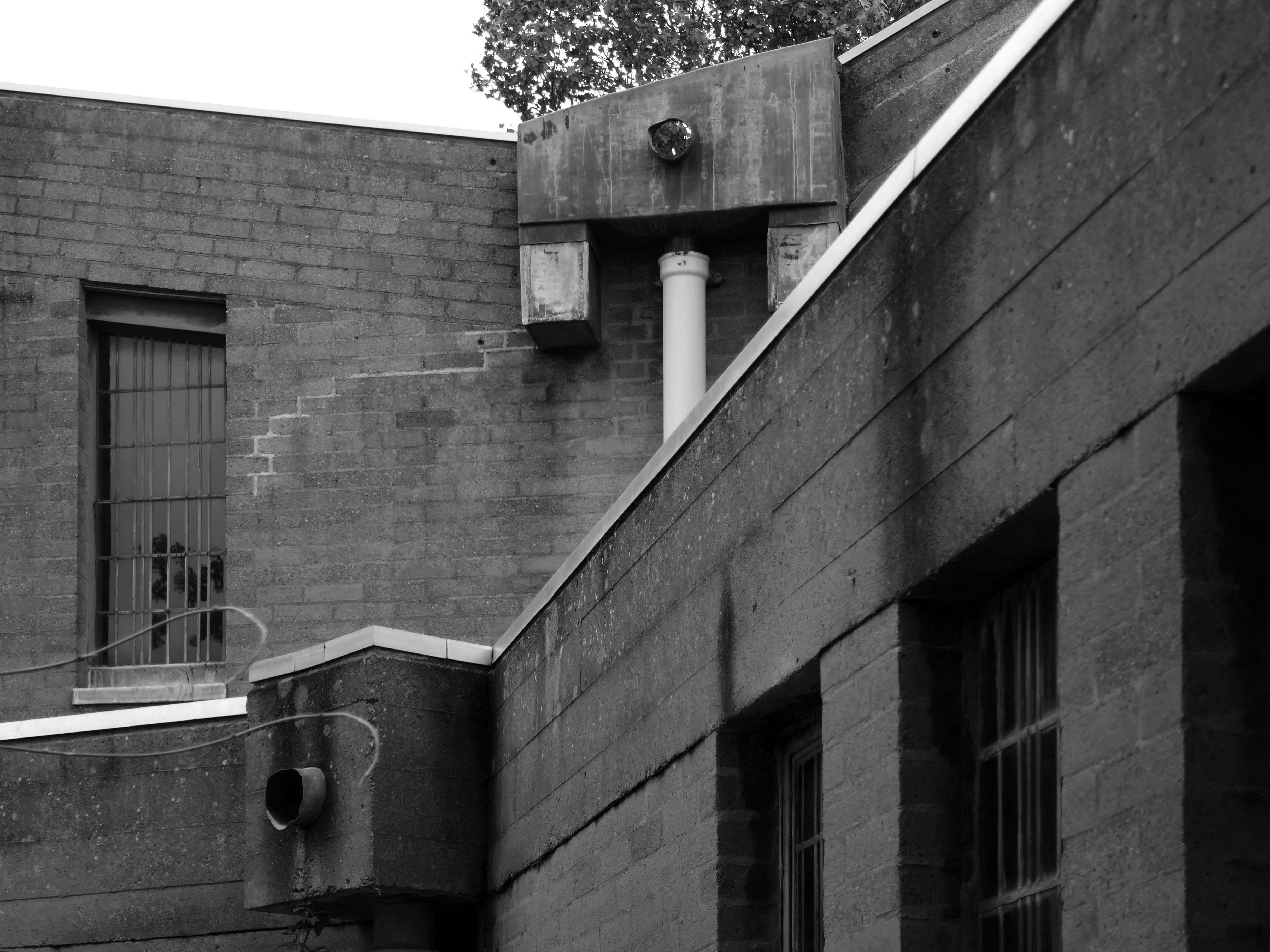
Designed 1965, built 1966-7; architect George Gaze Pace, executant assistant Ronald Sims.
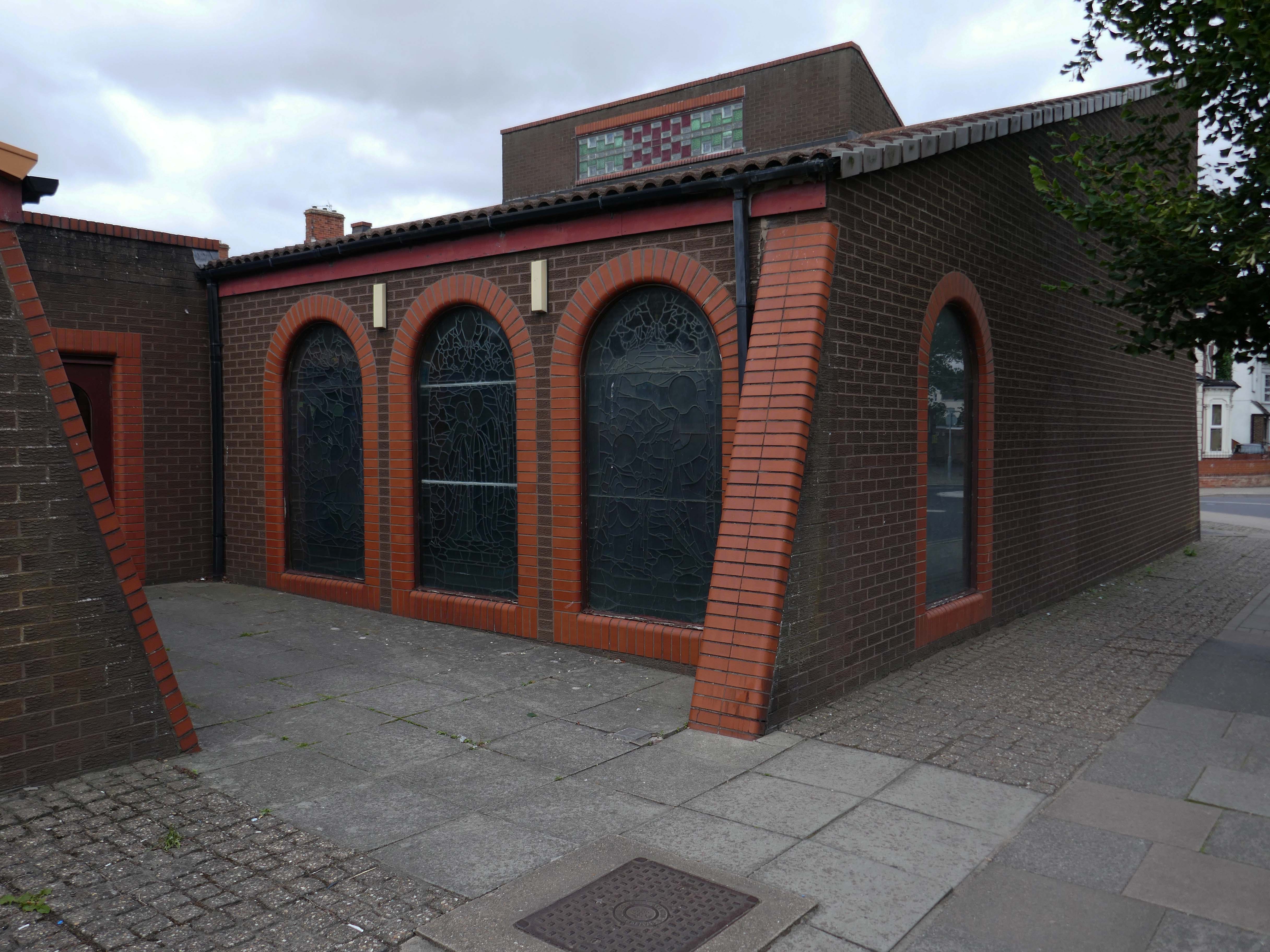
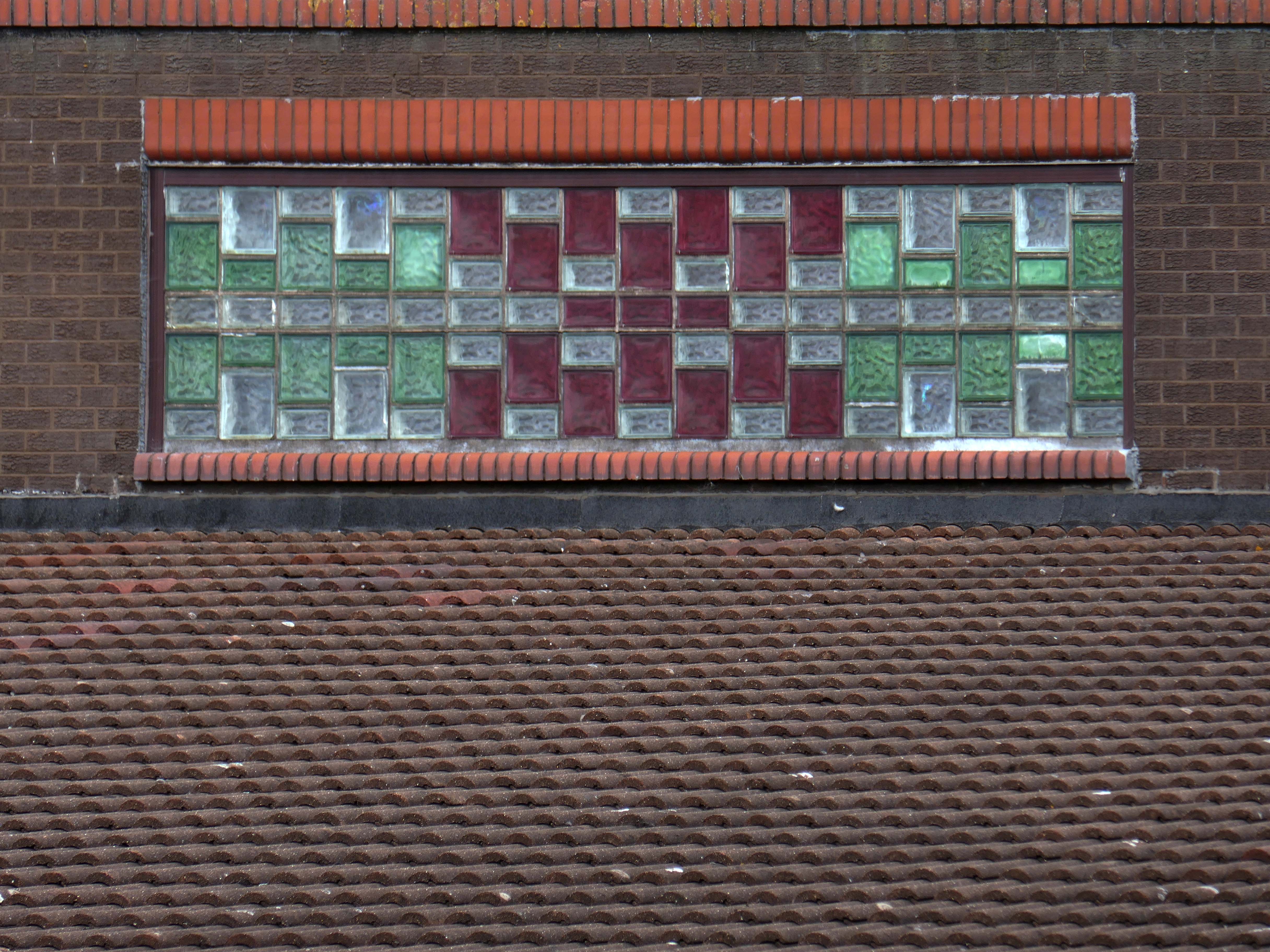
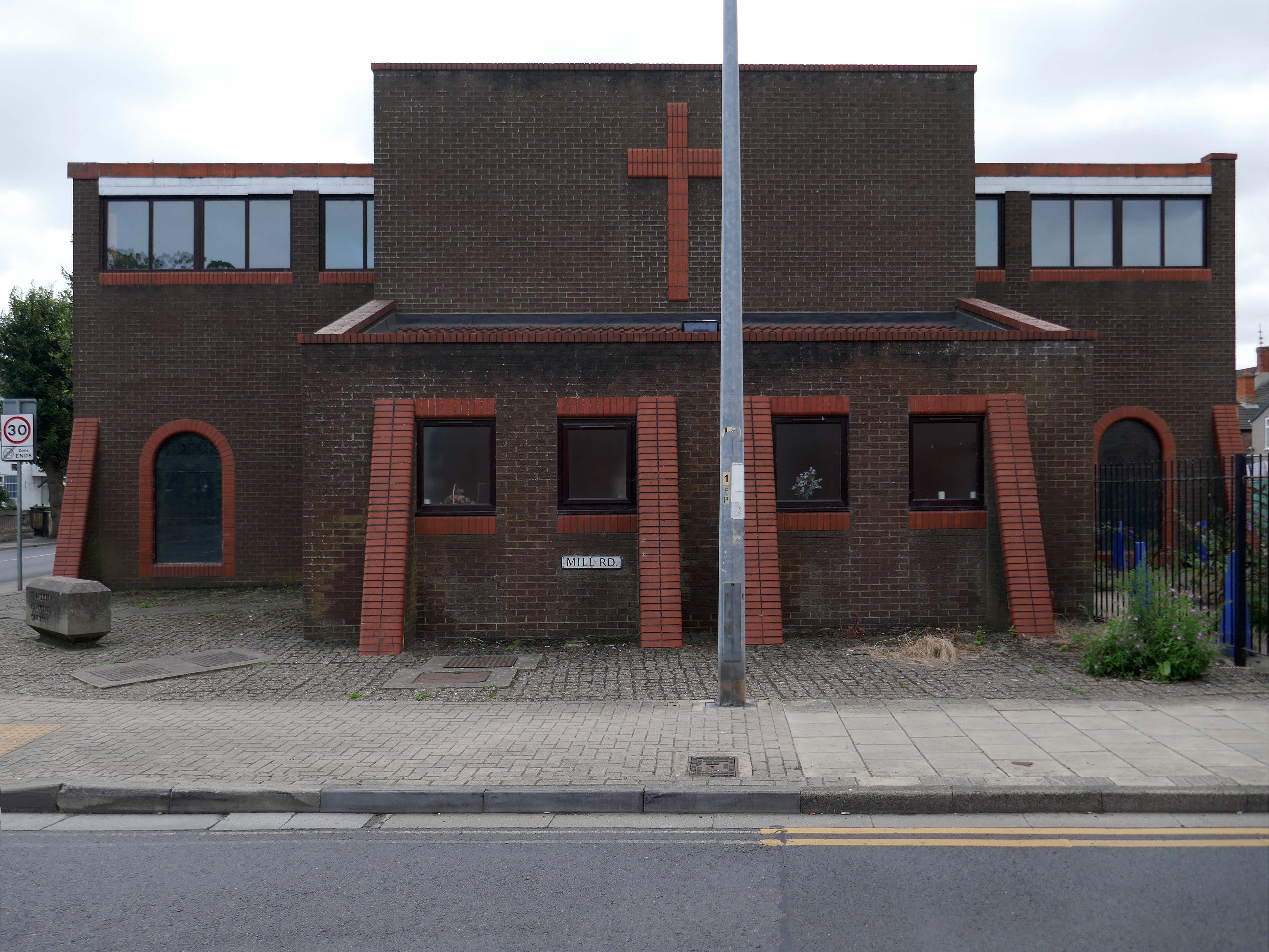
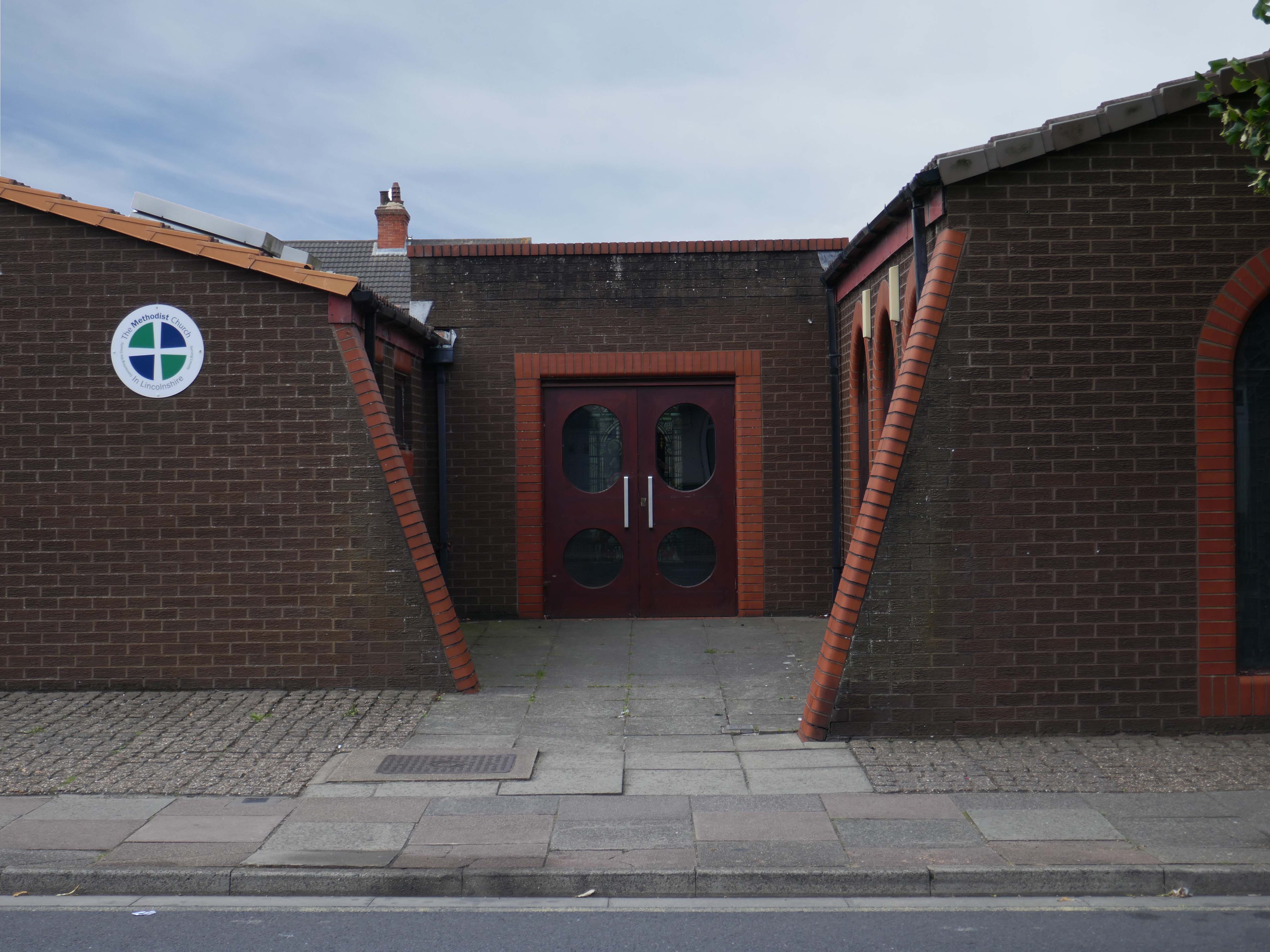
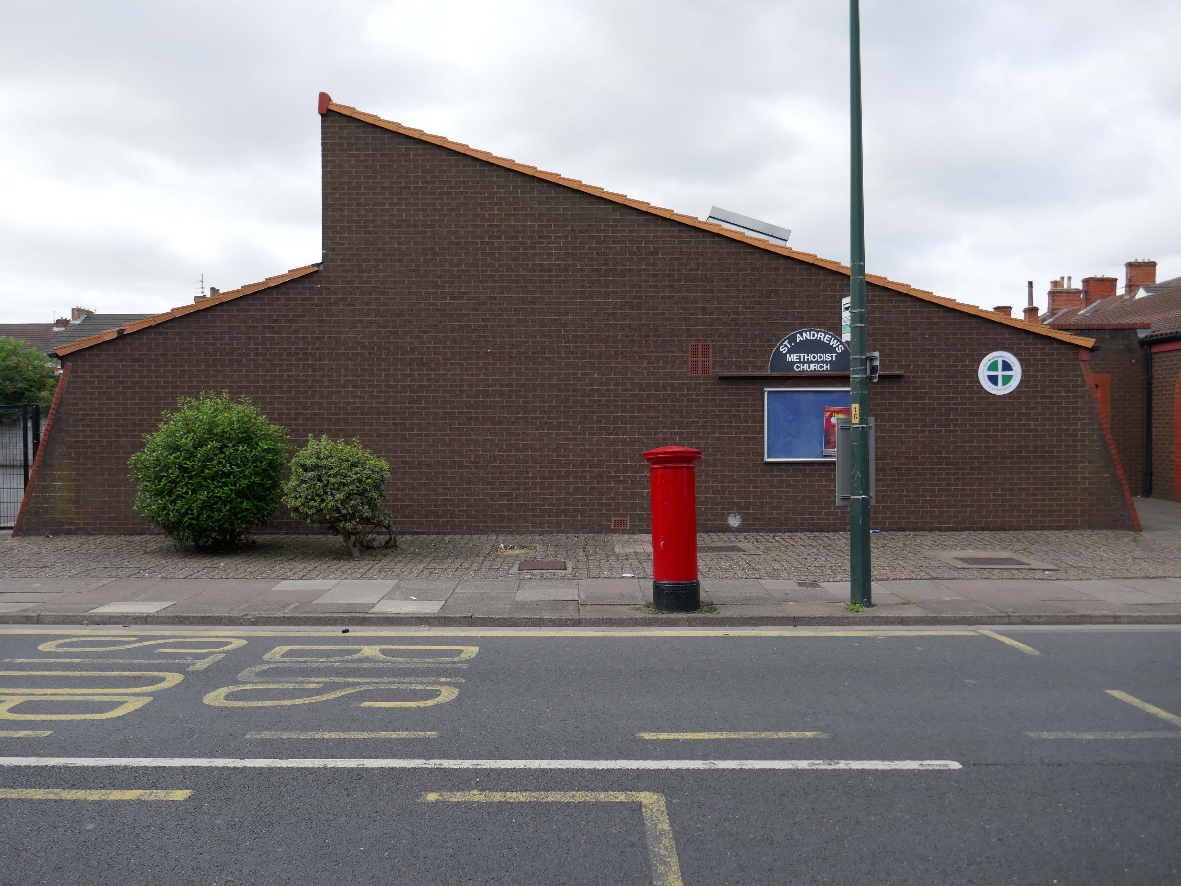
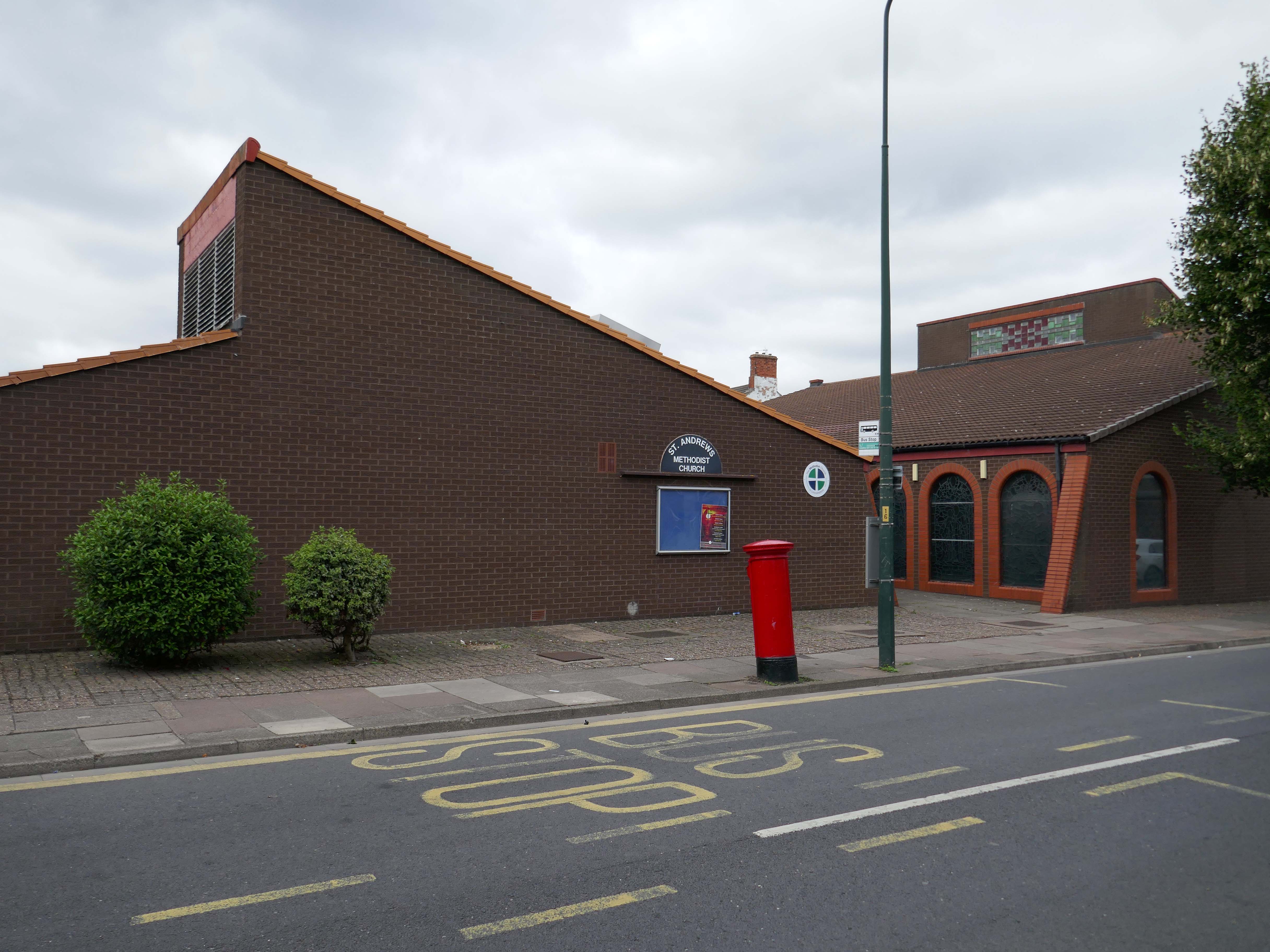
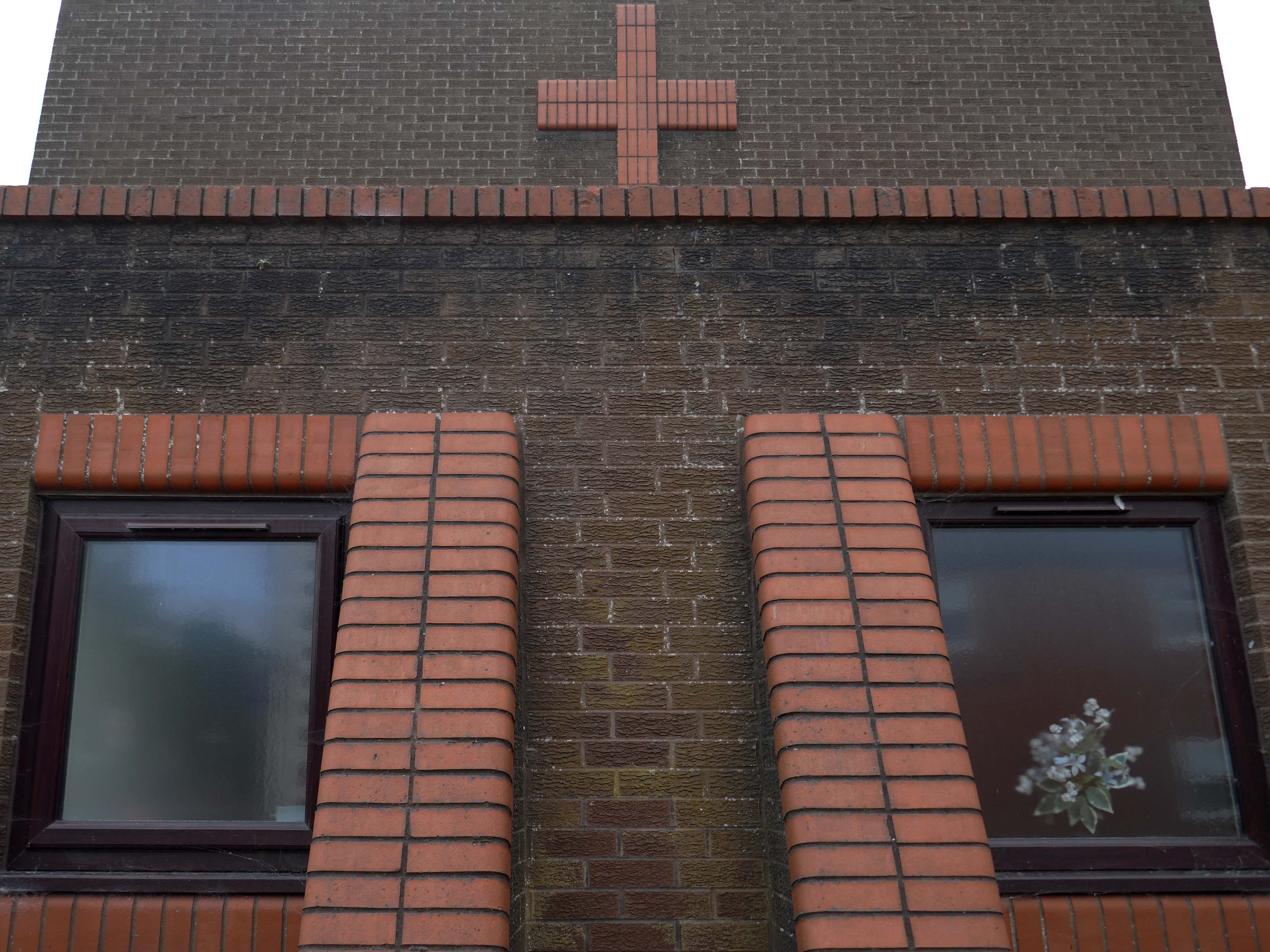
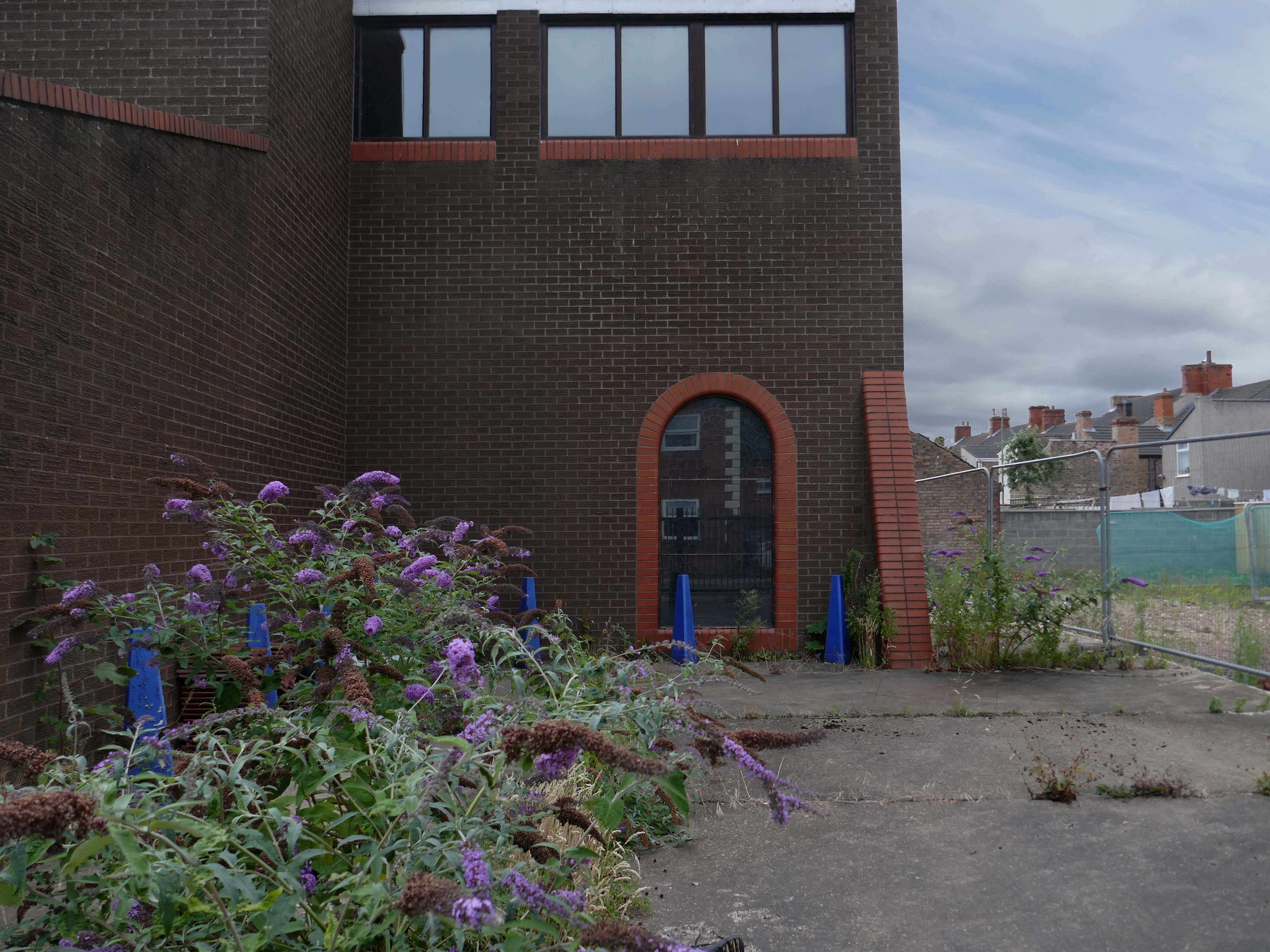
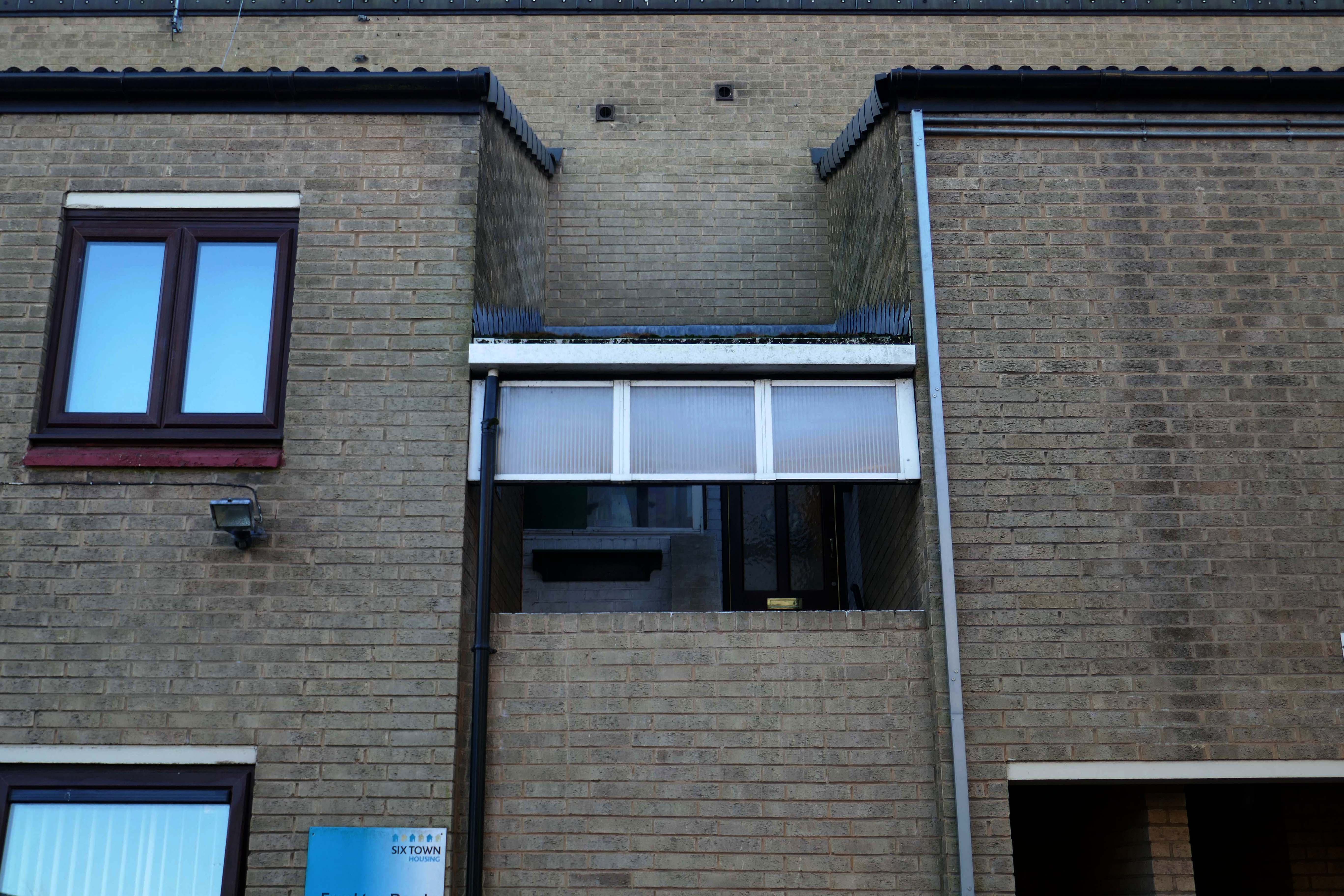
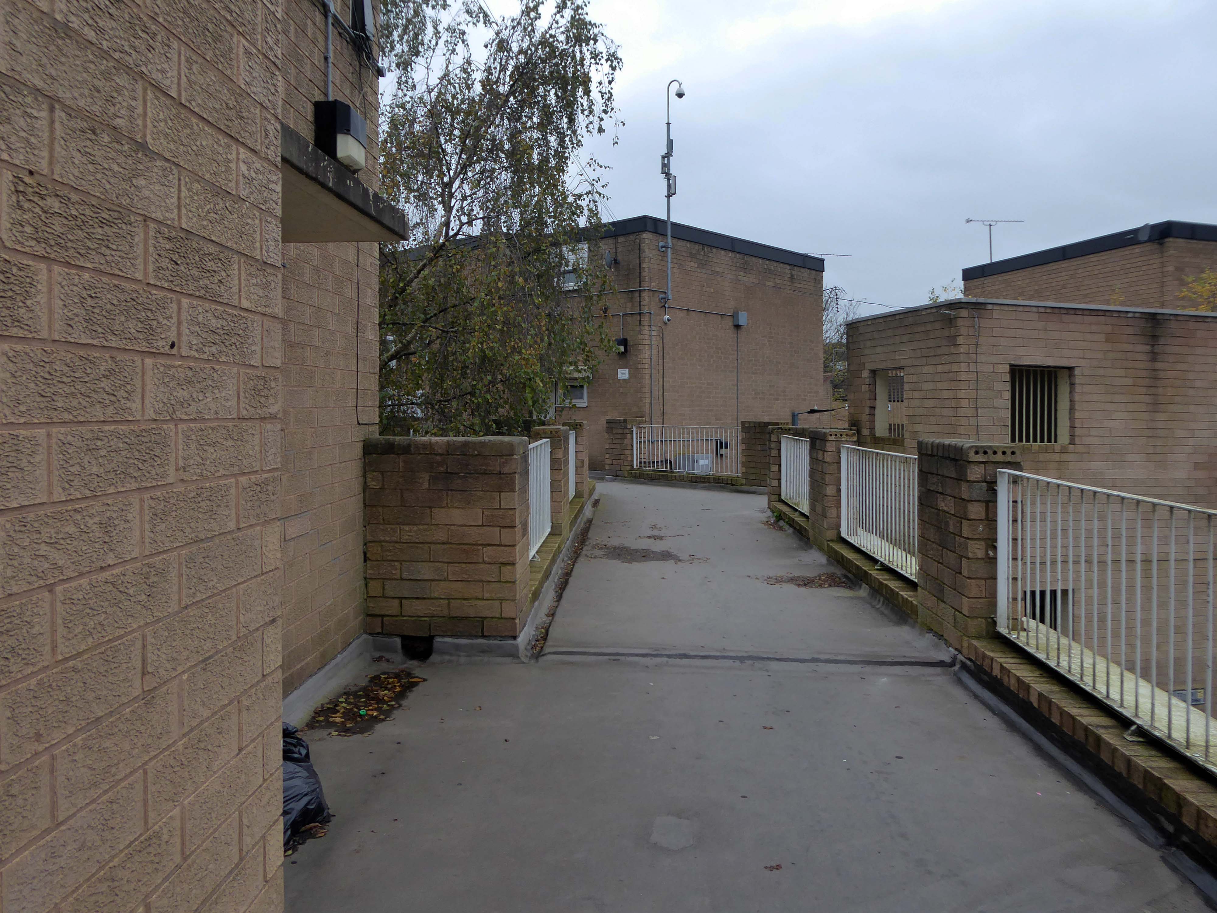
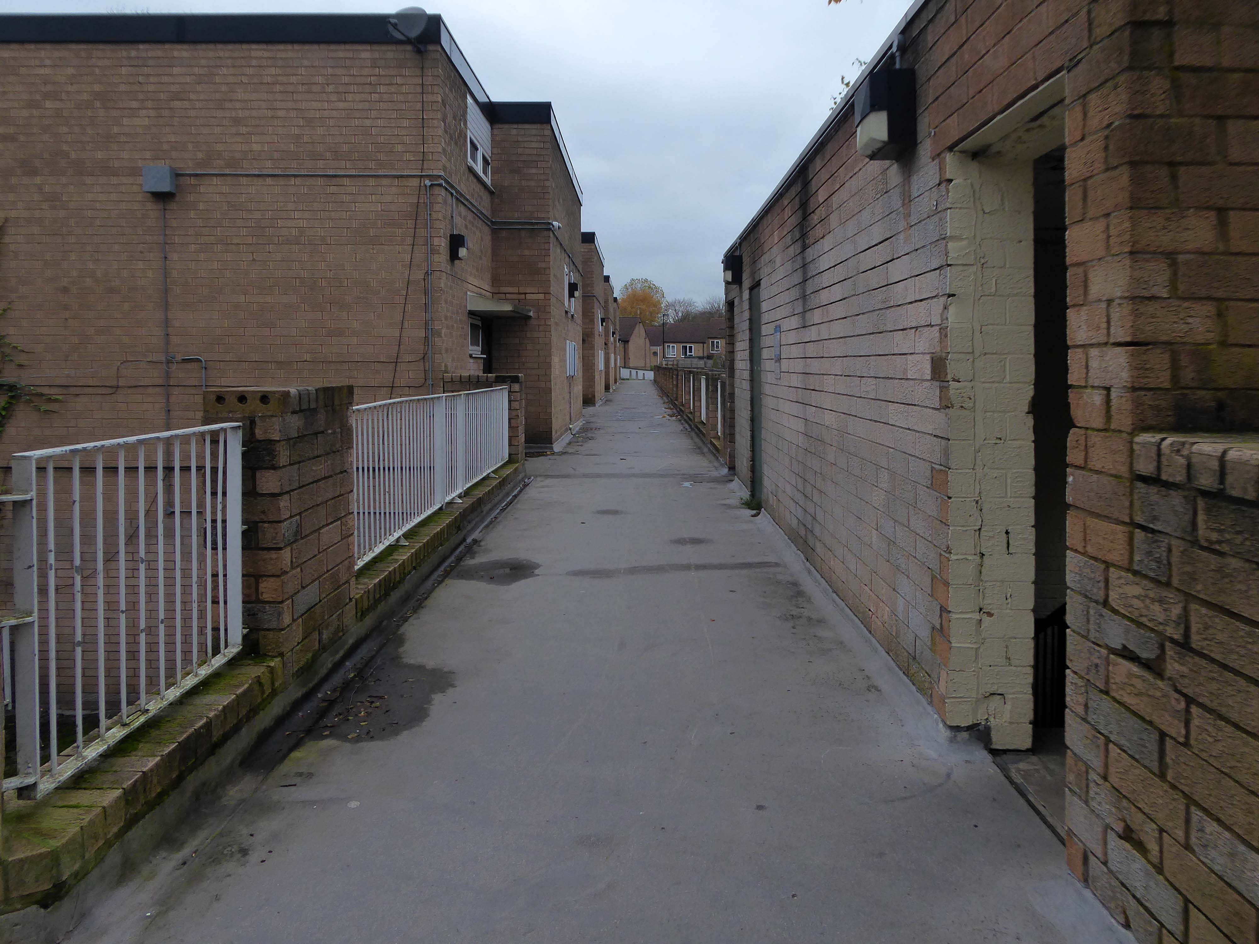
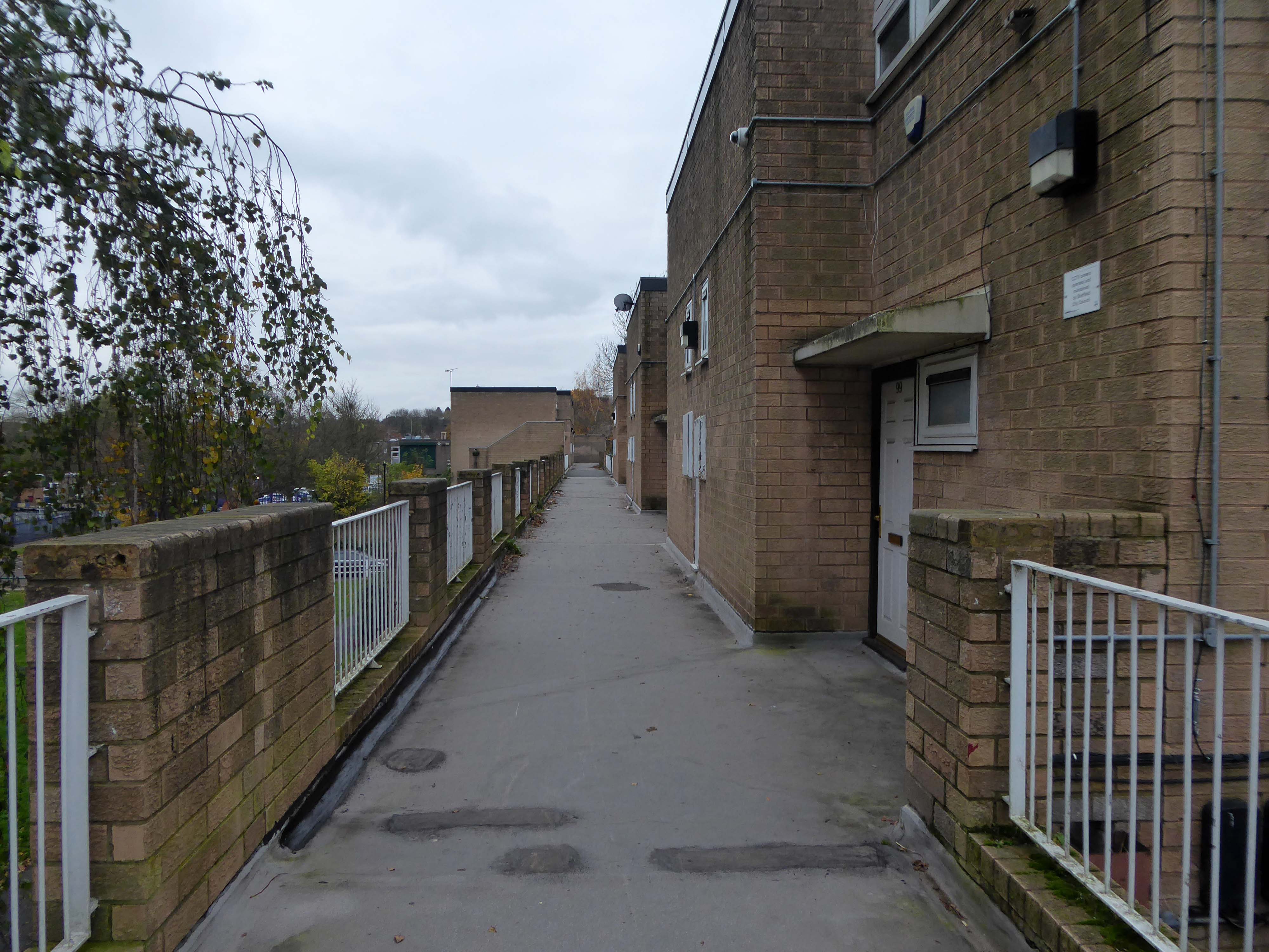
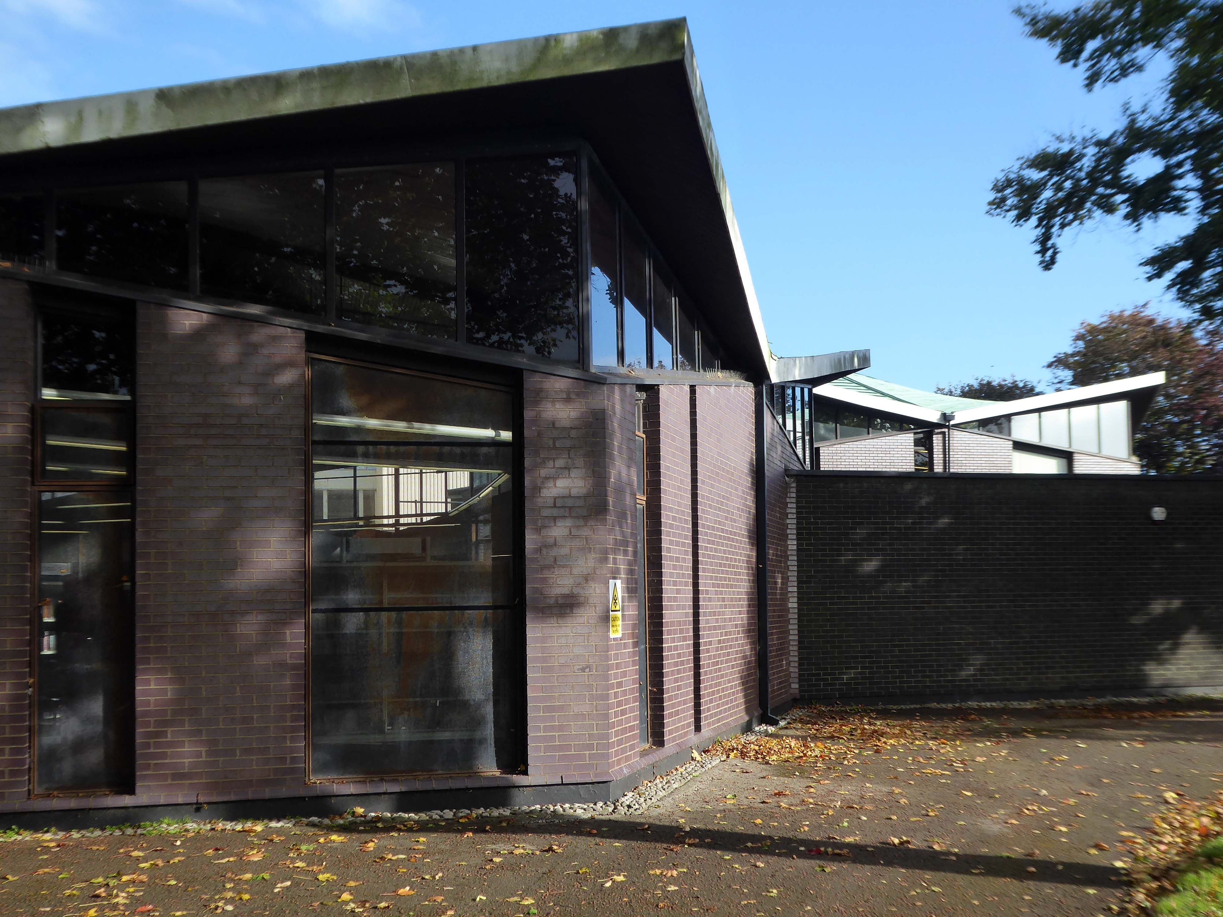
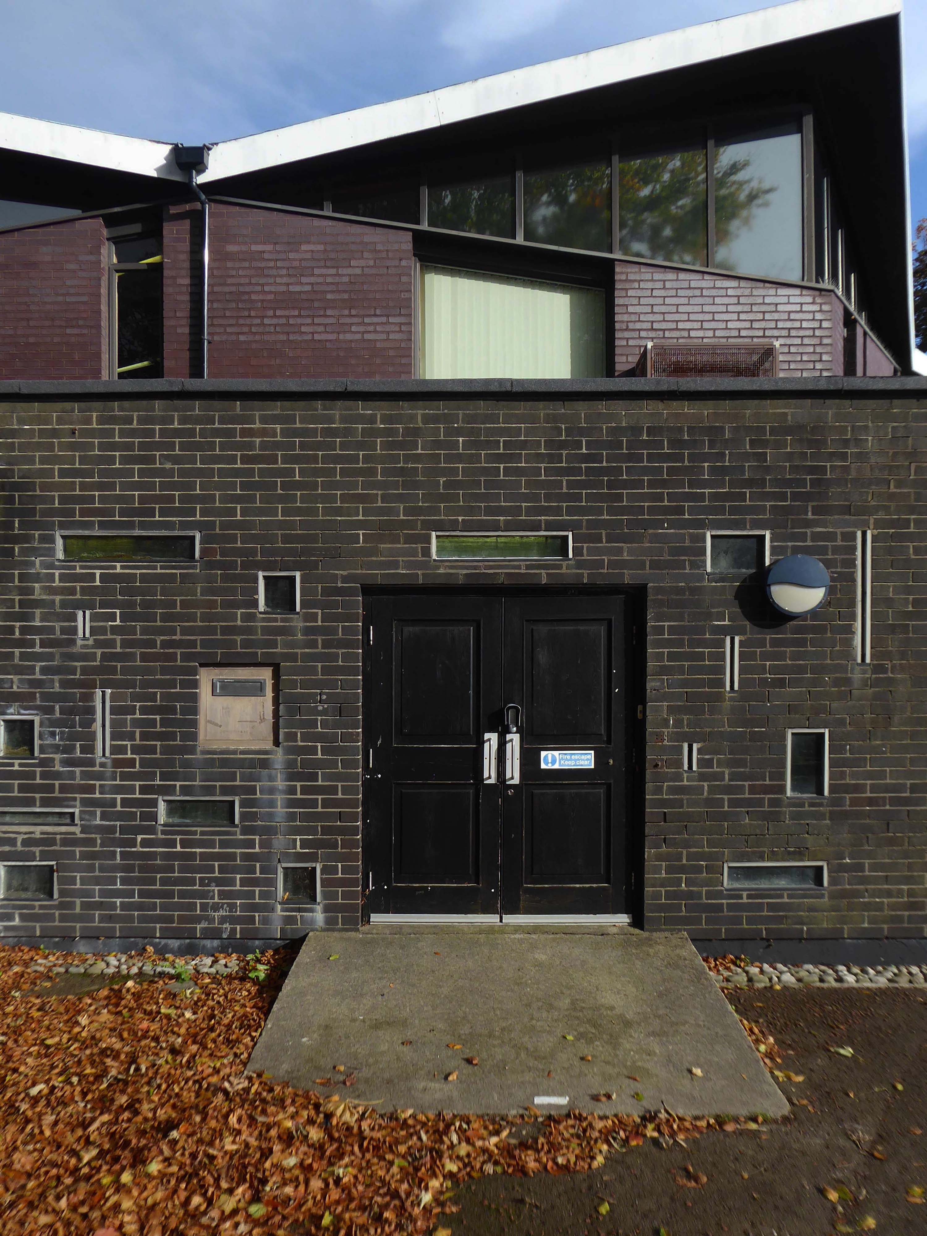
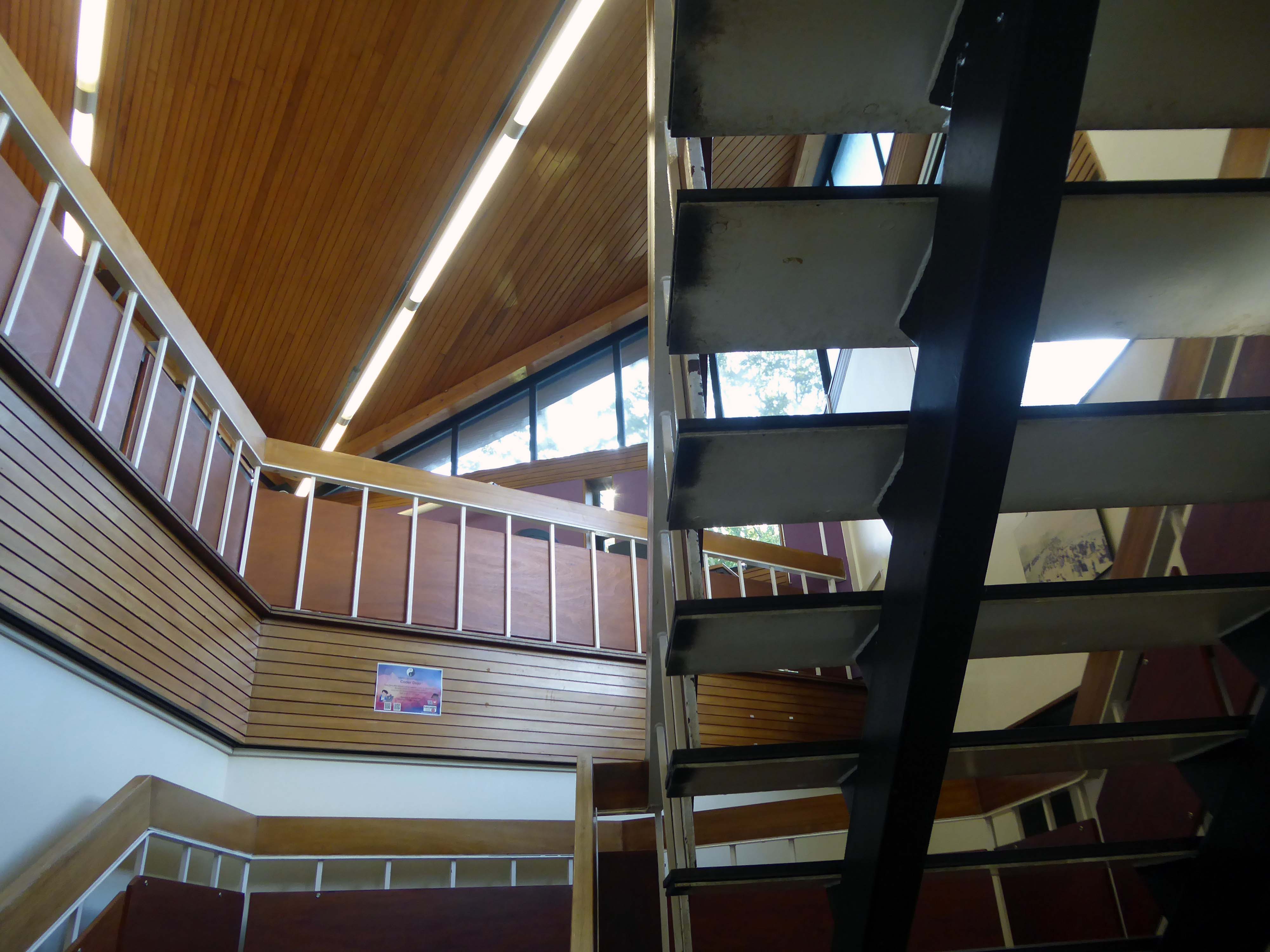
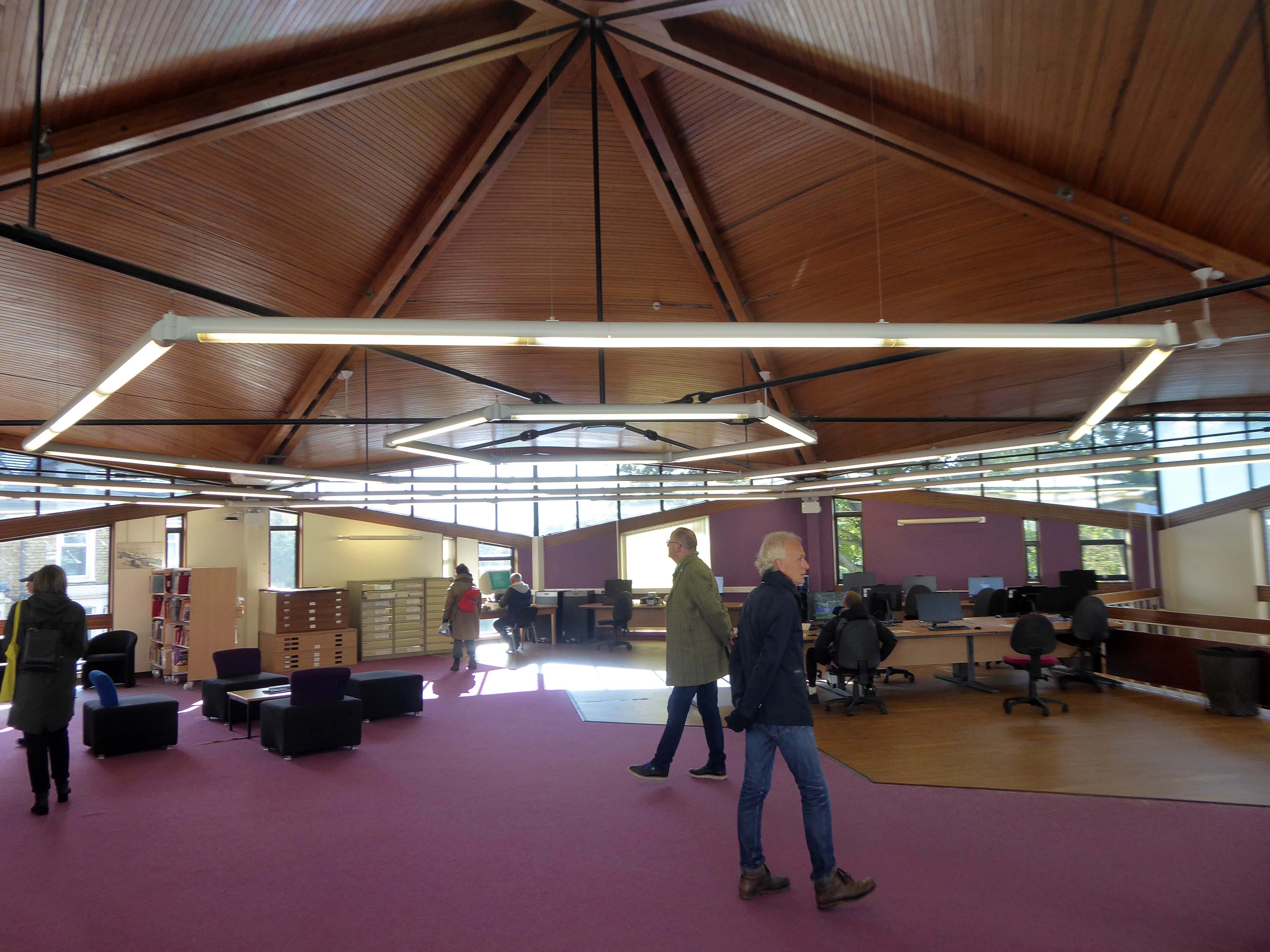
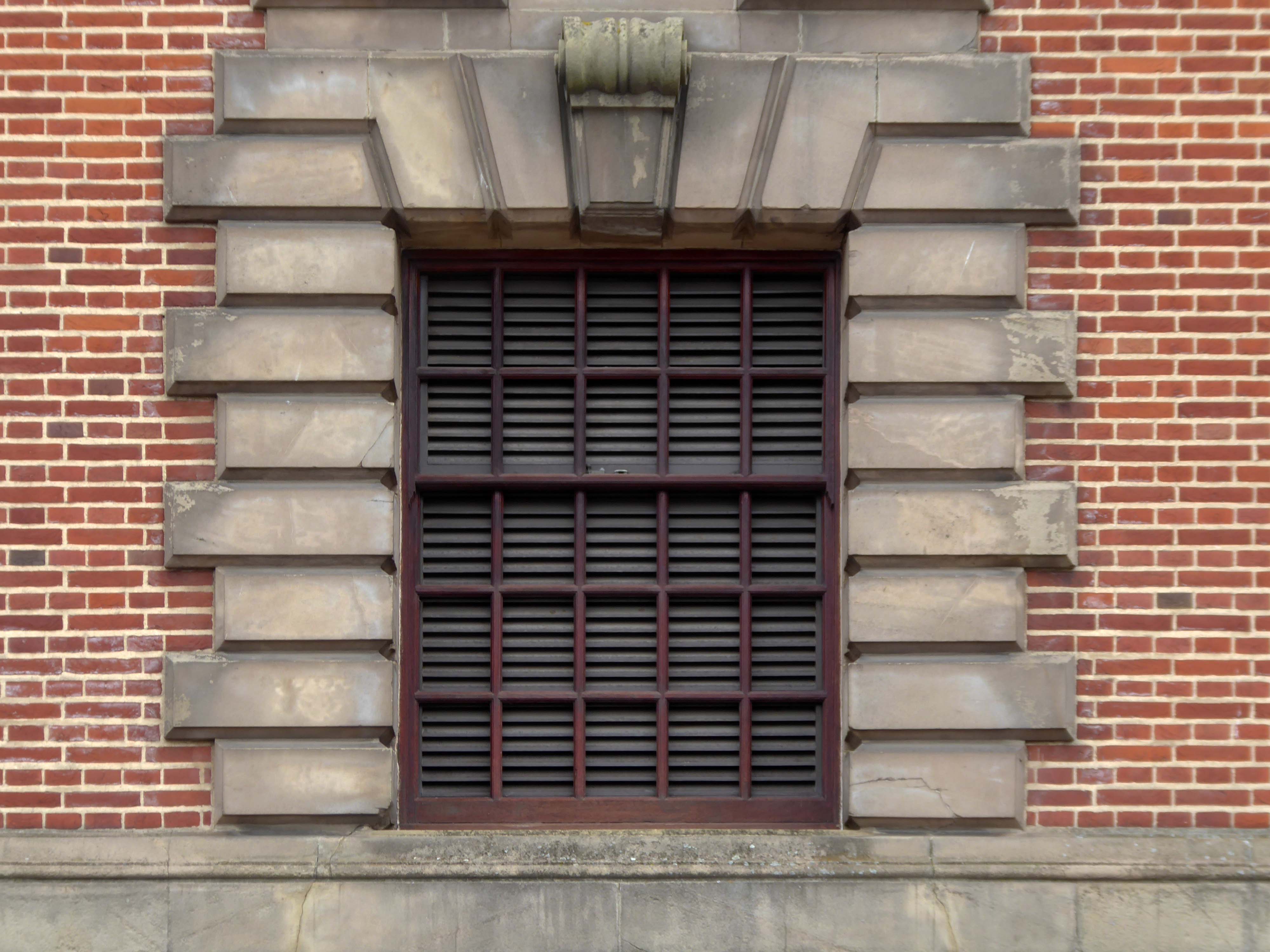
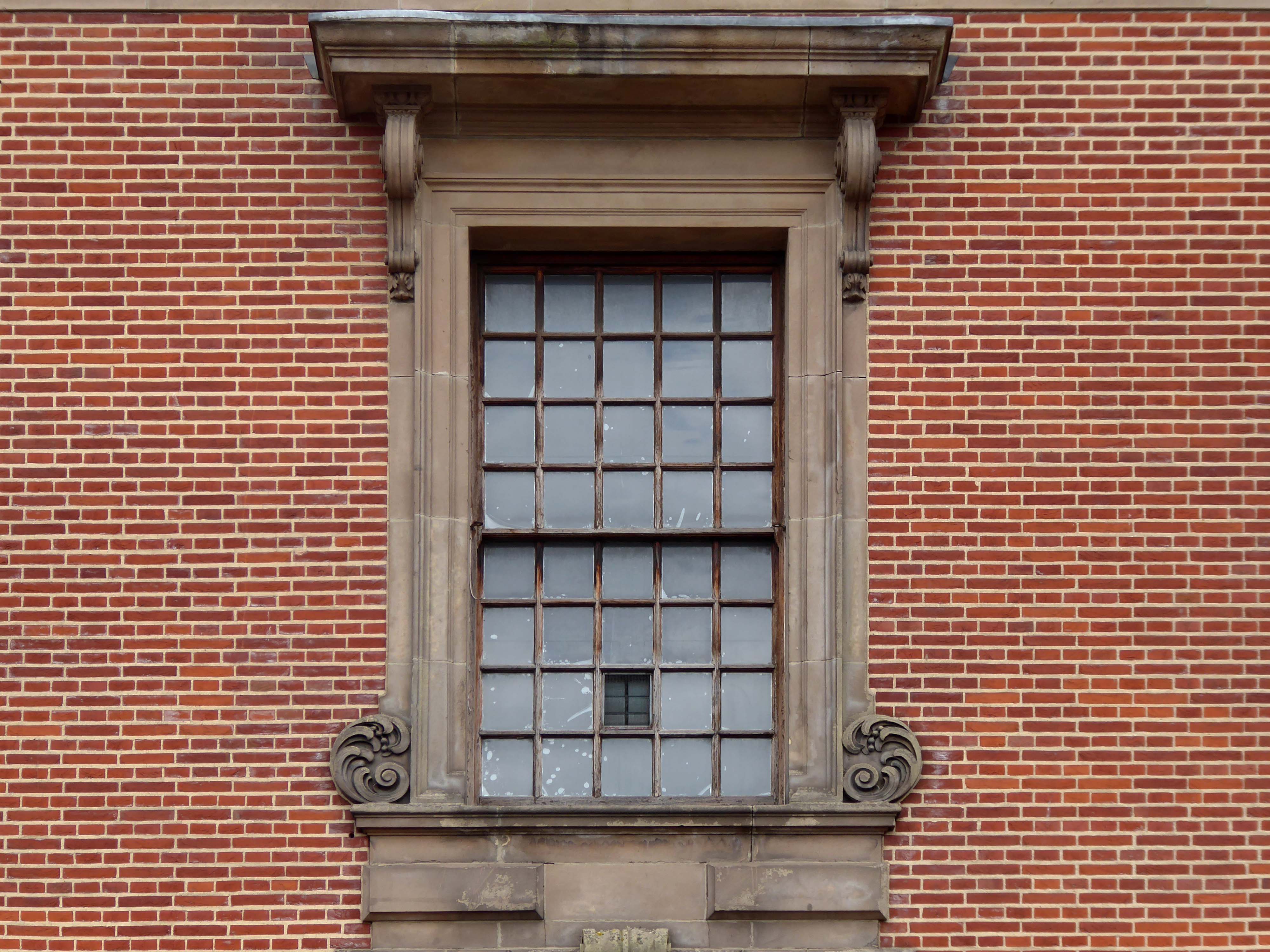
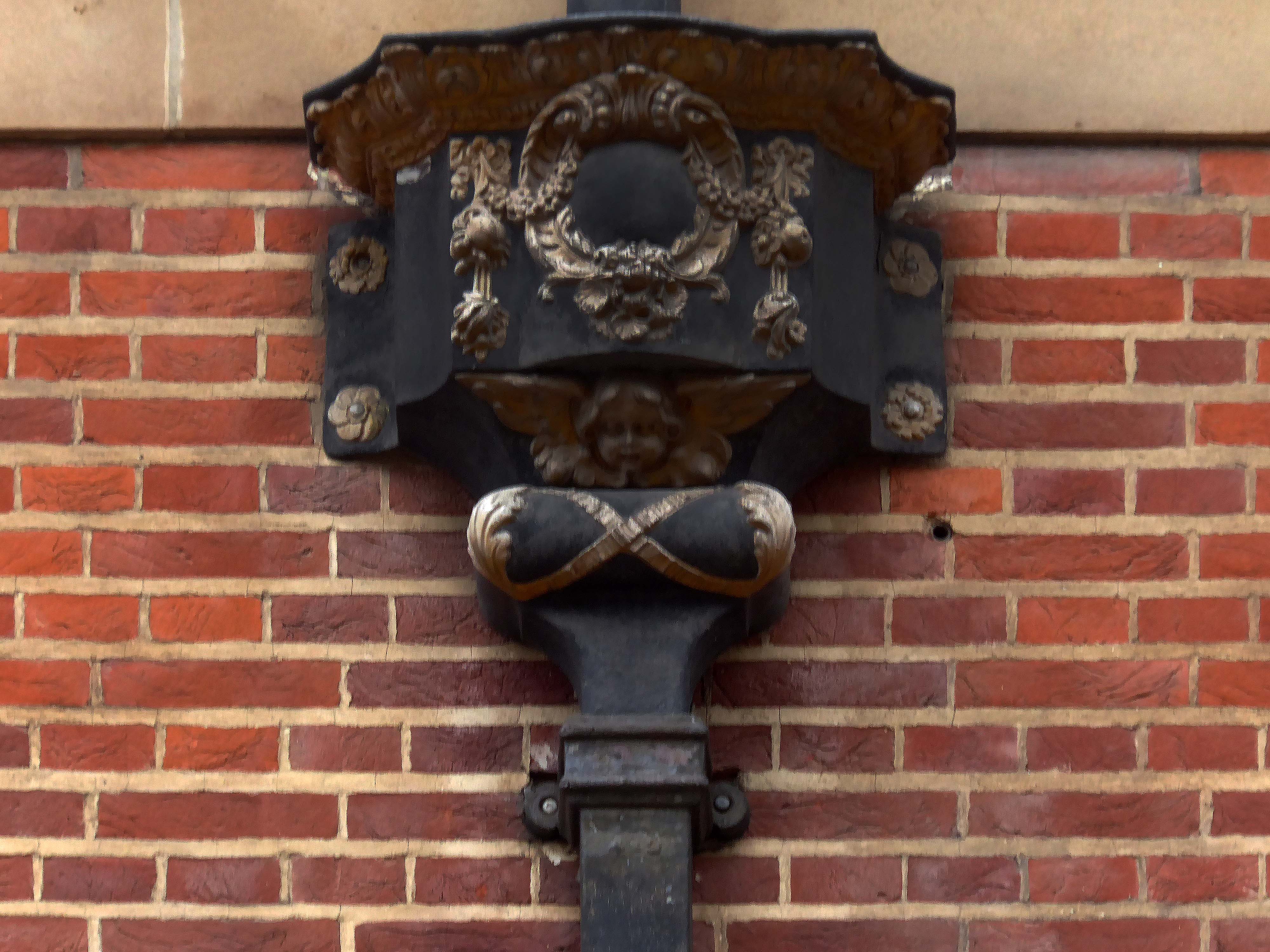
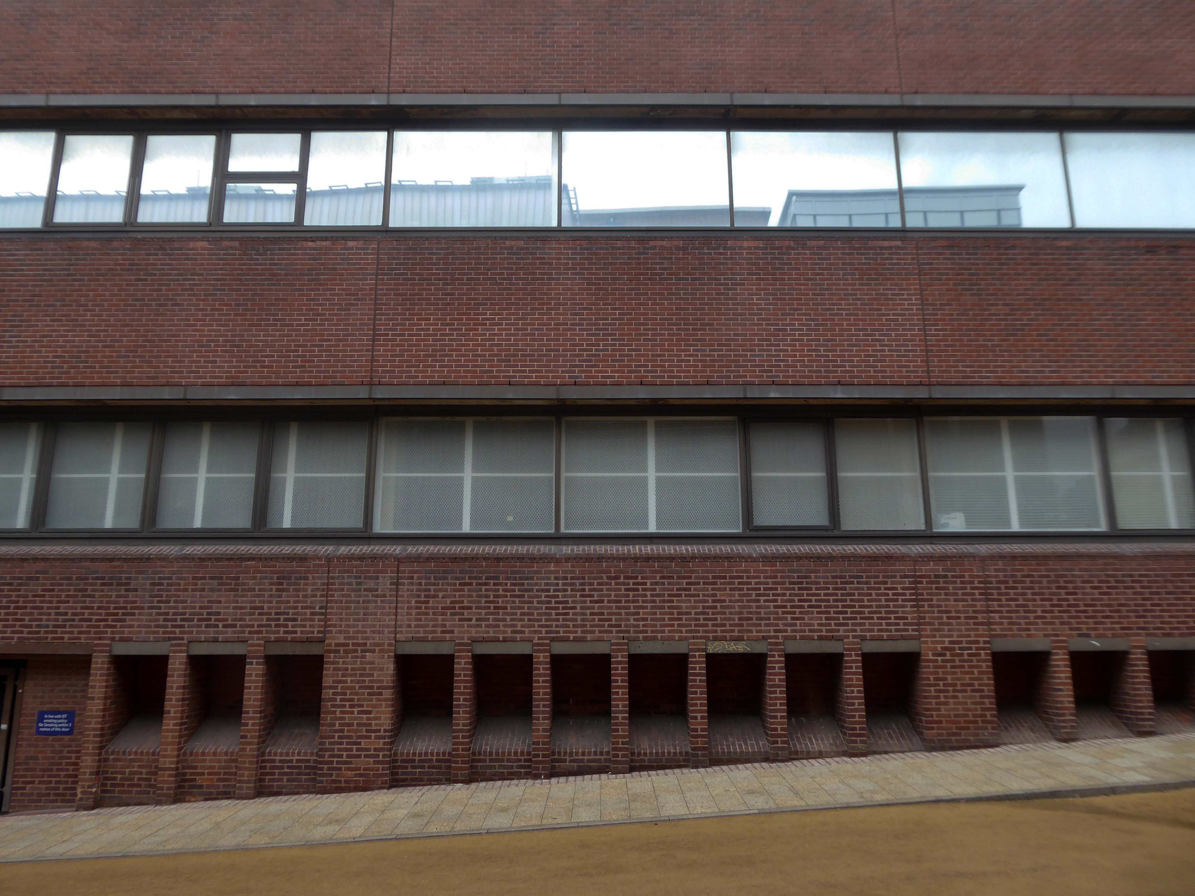
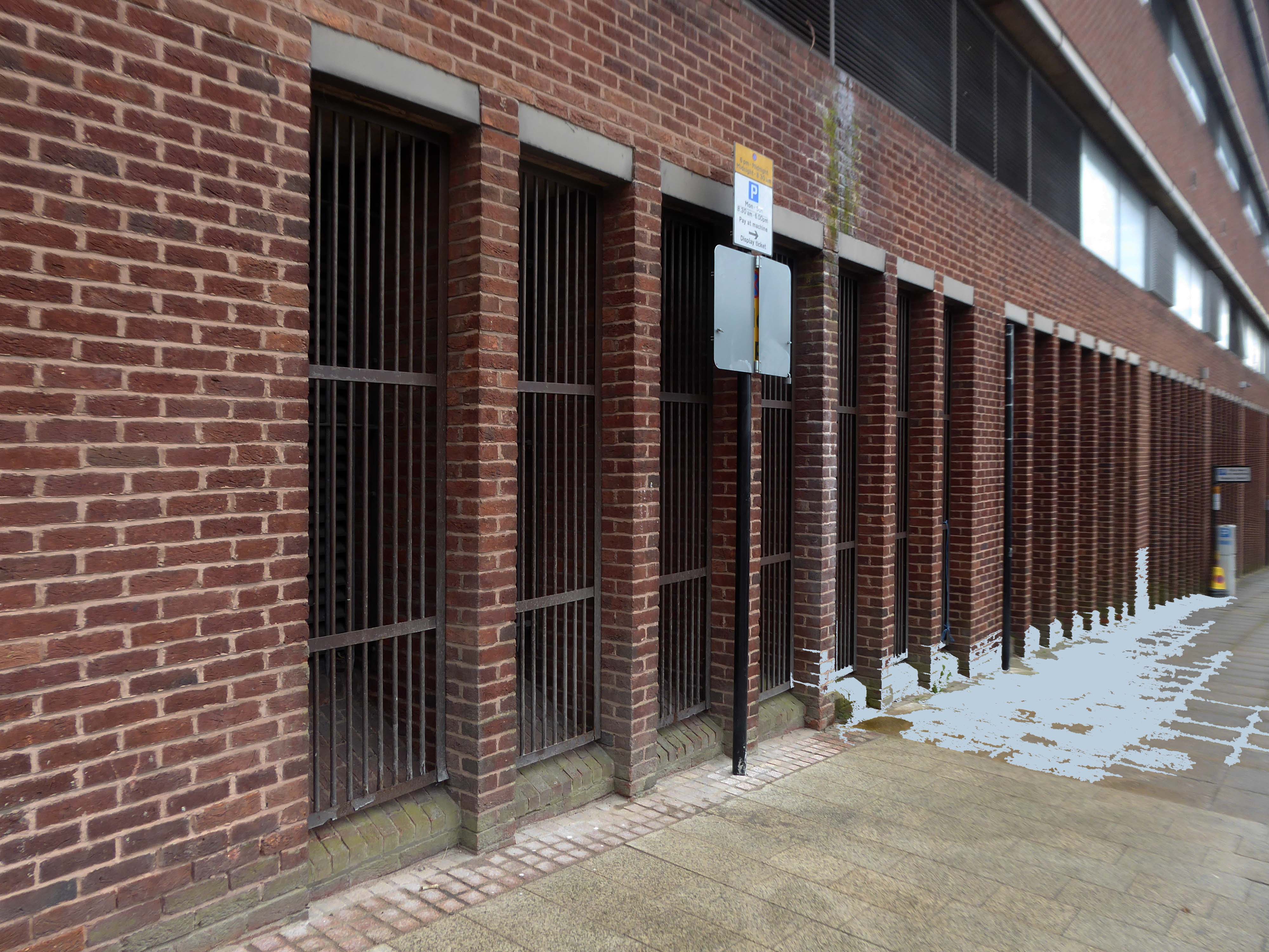
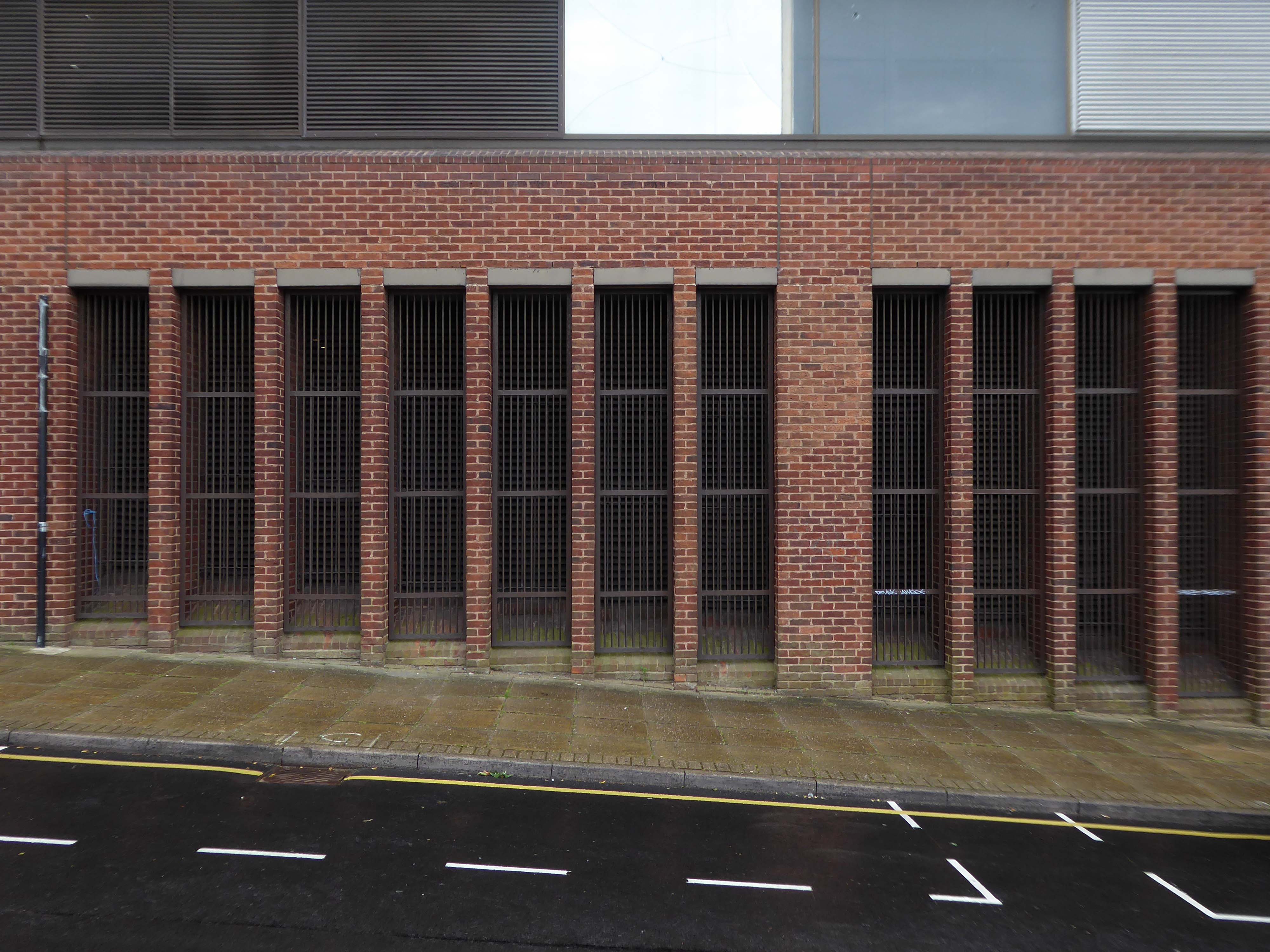
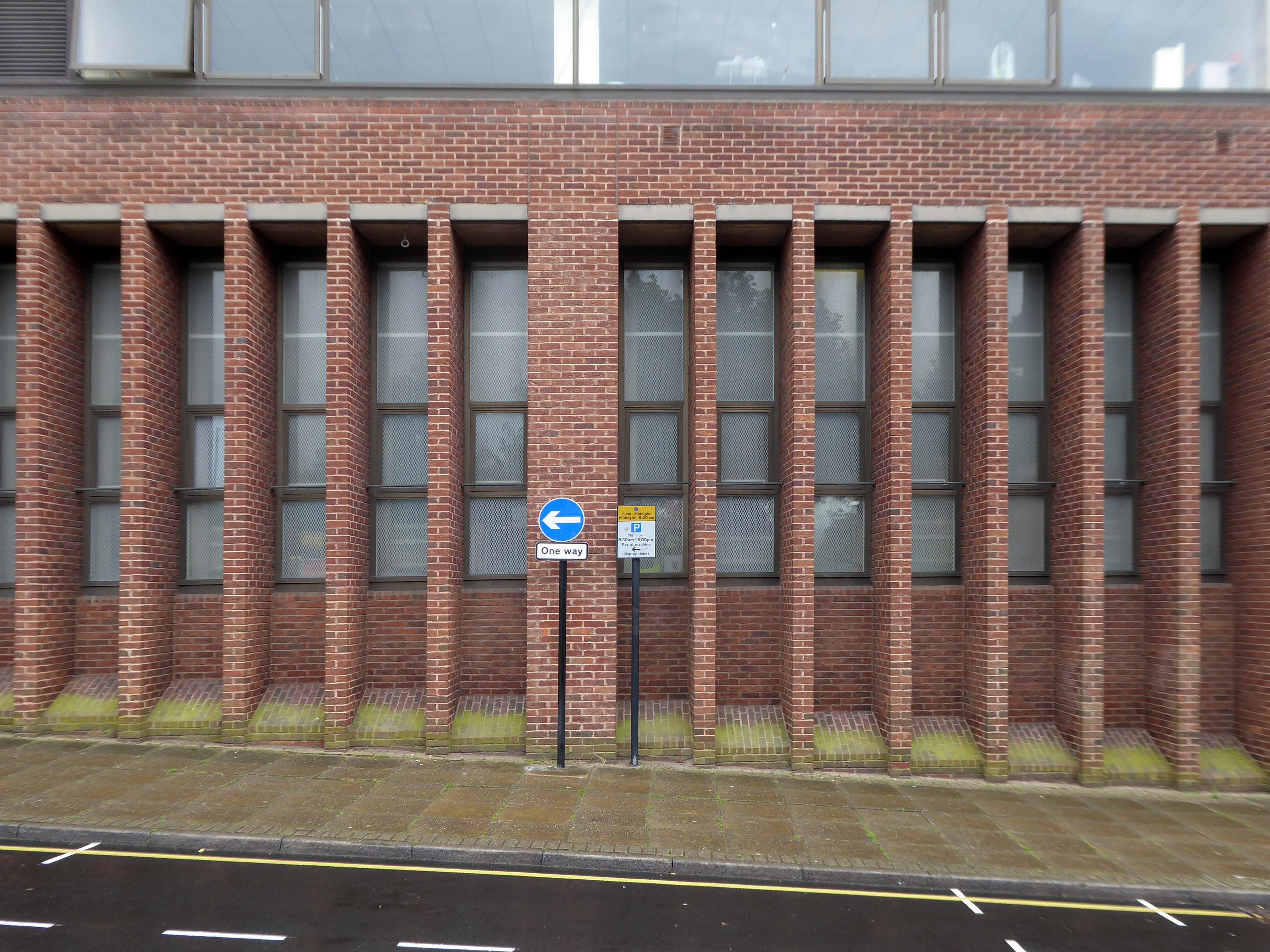
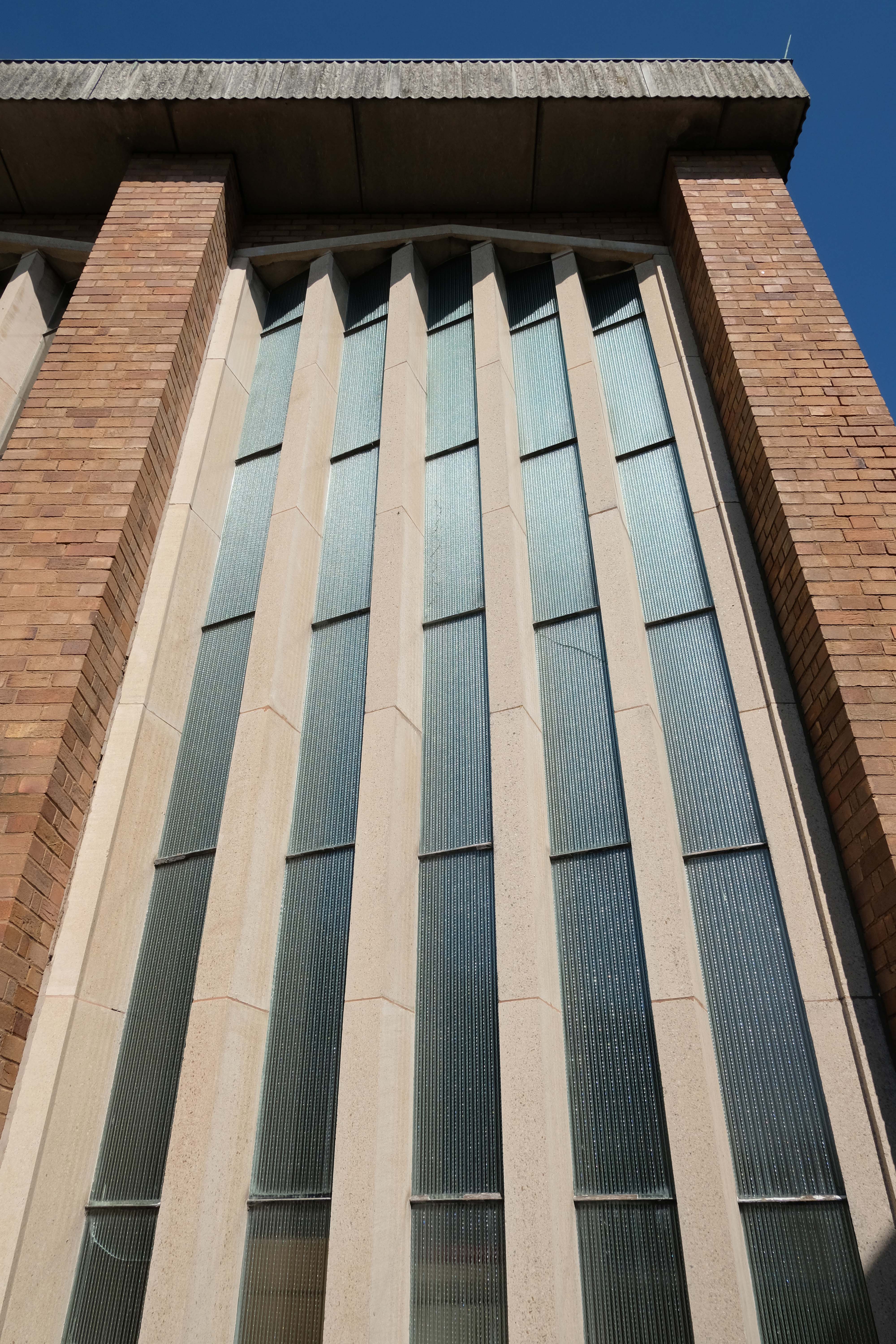
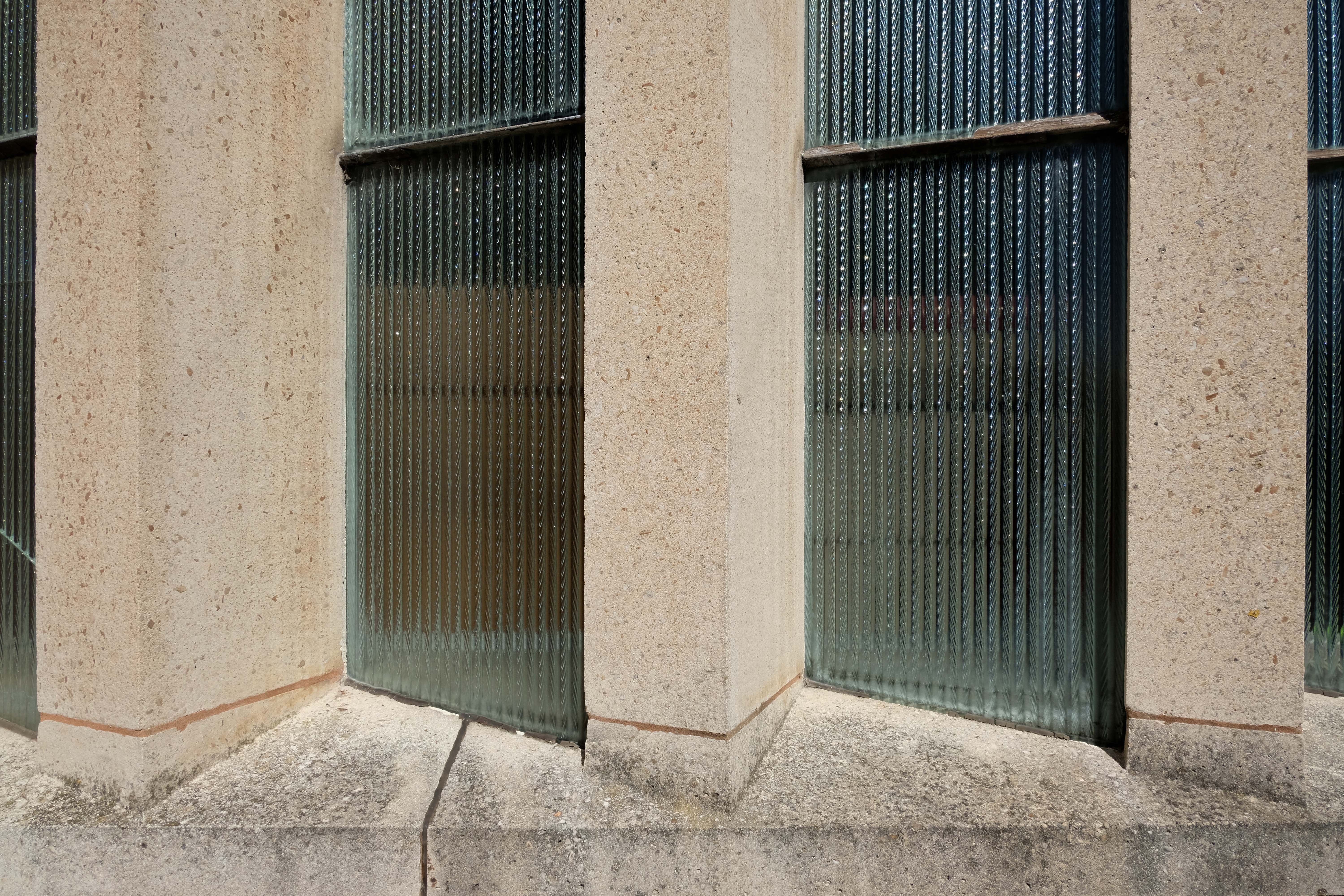
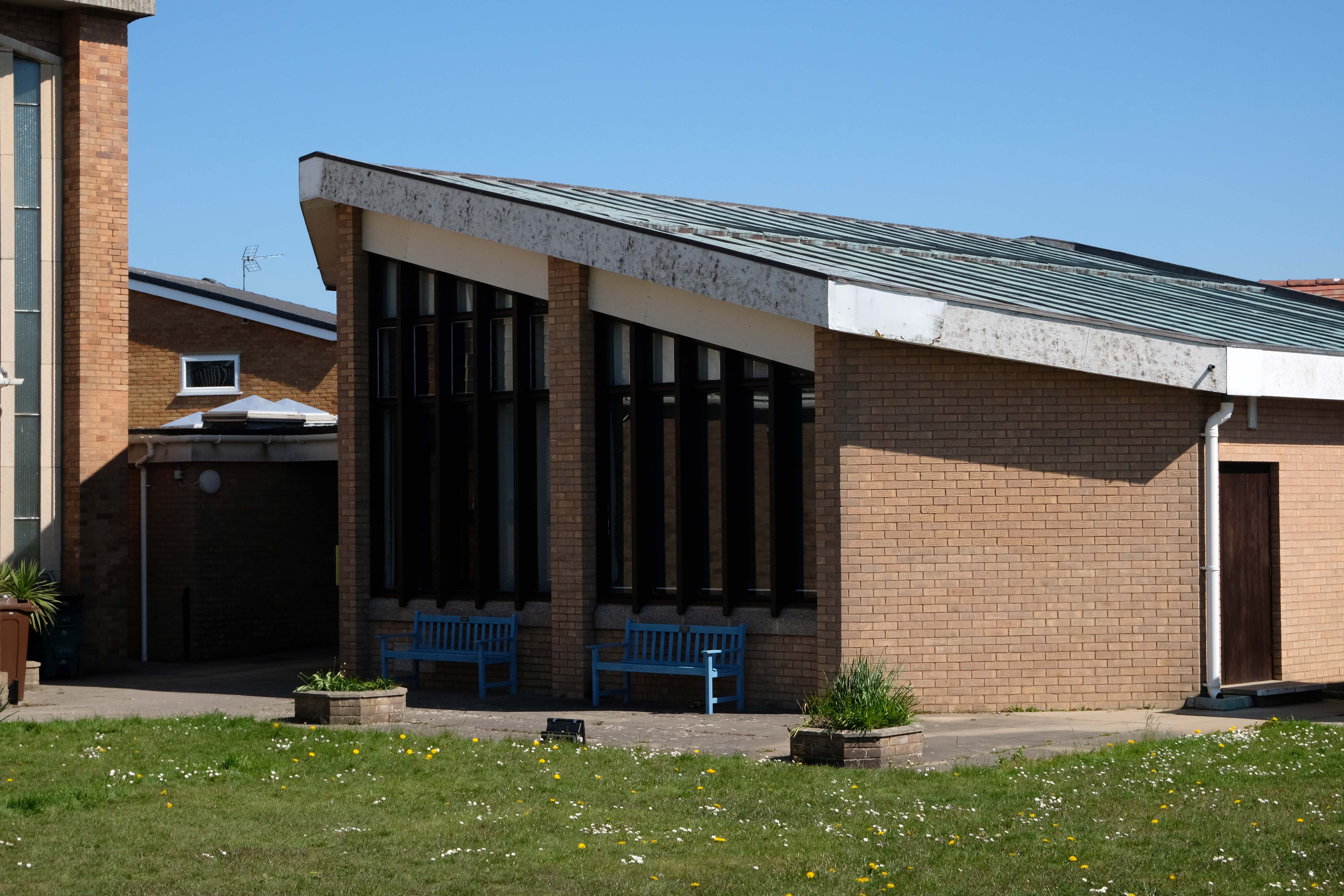
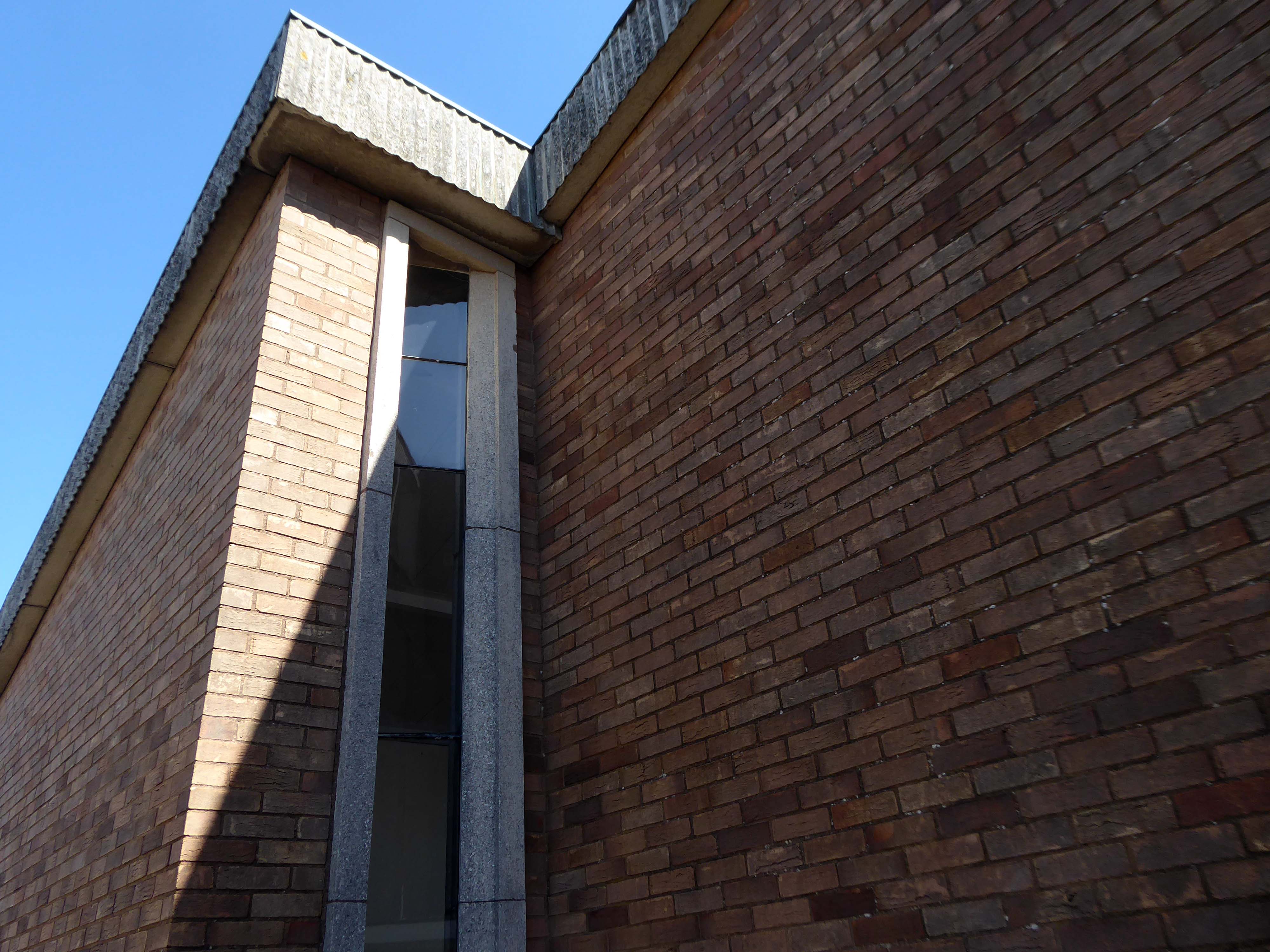
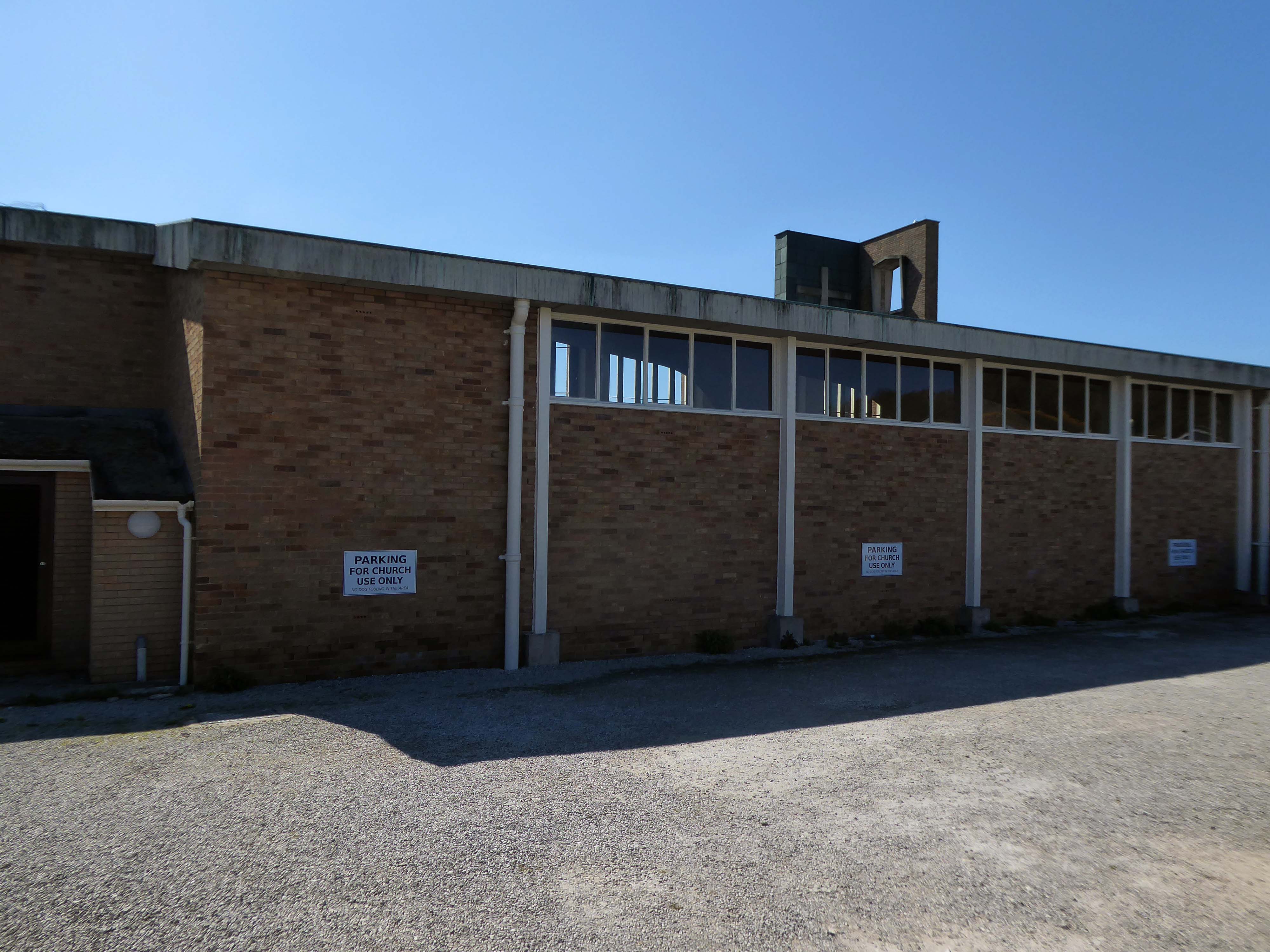
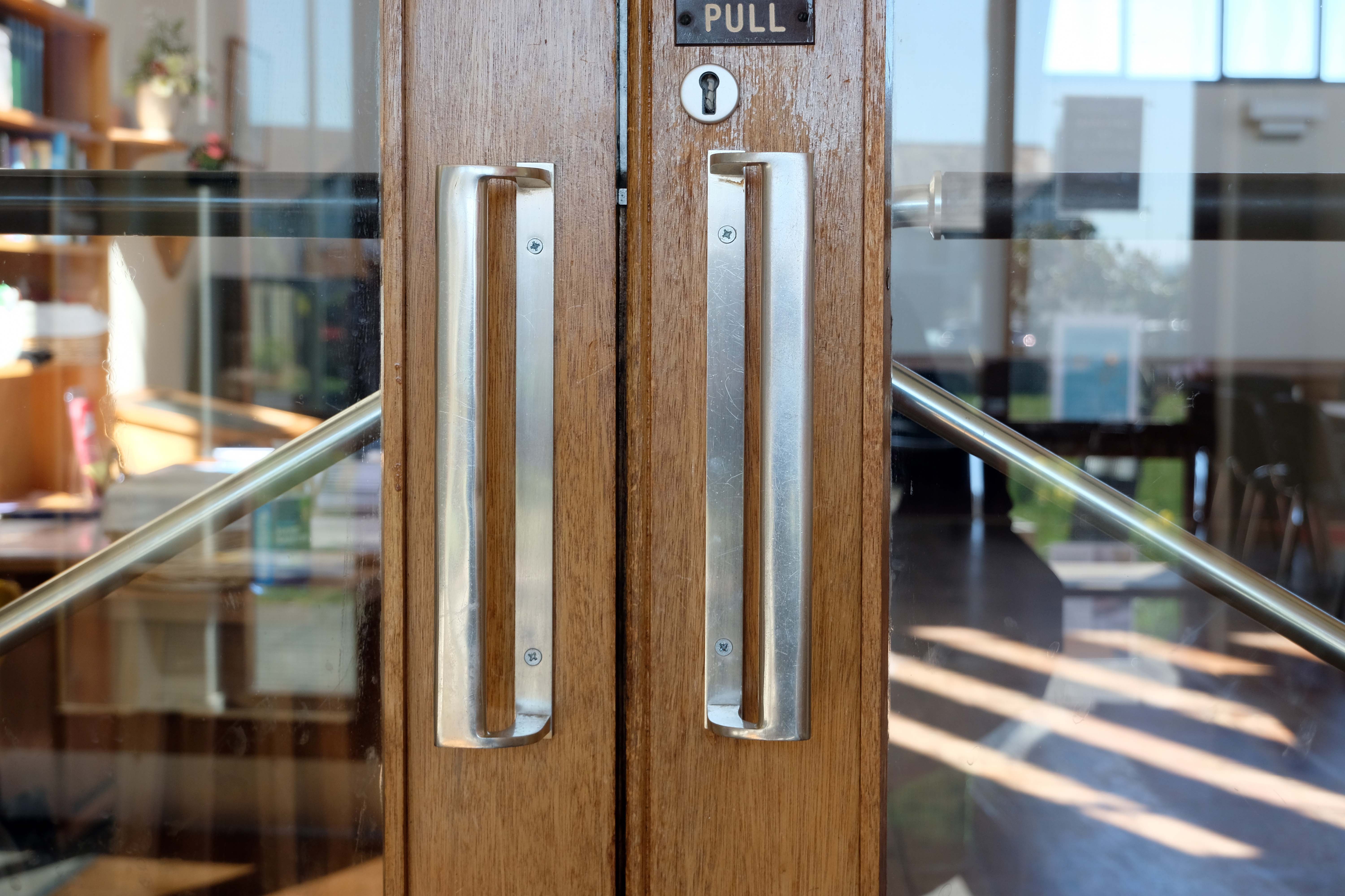
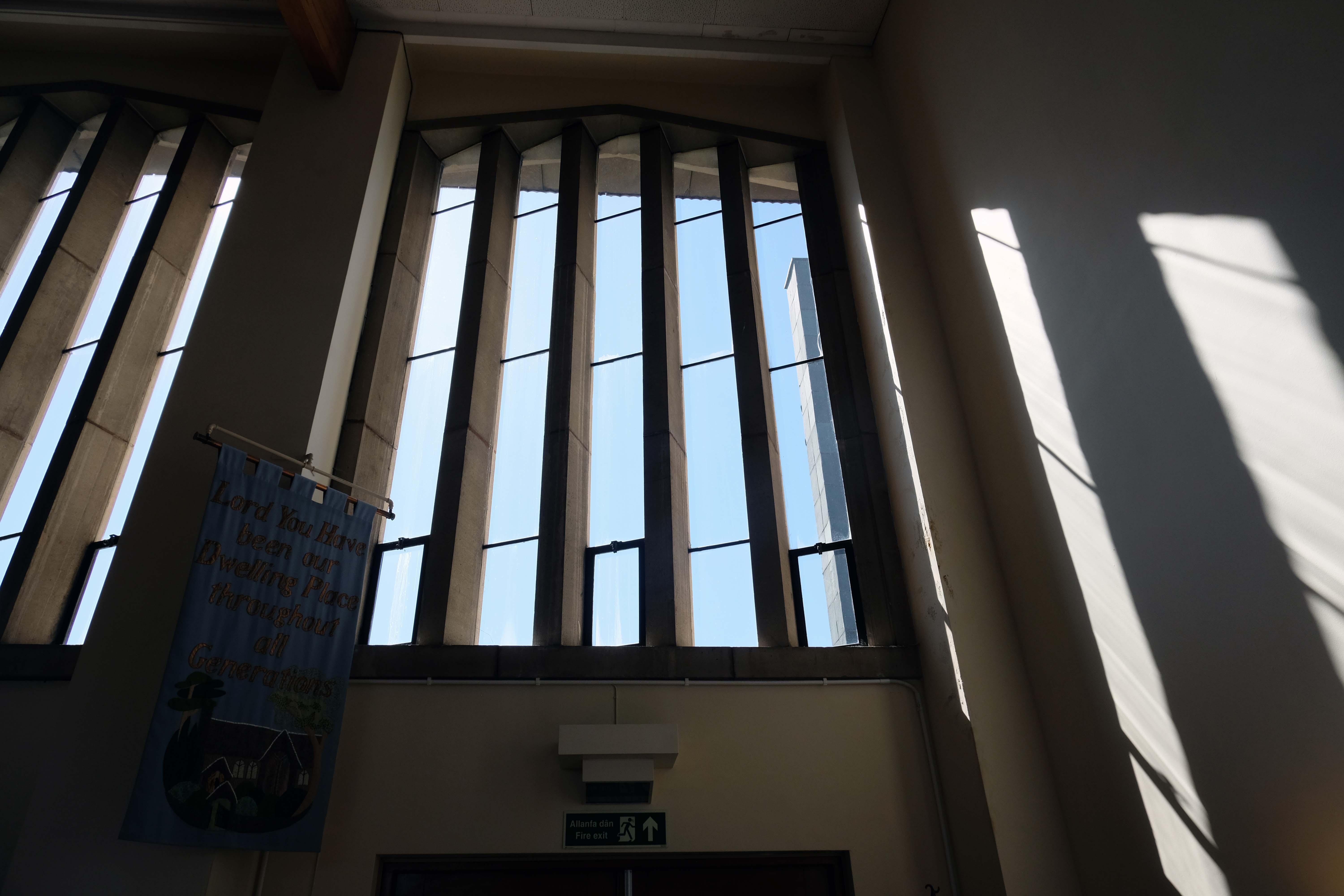
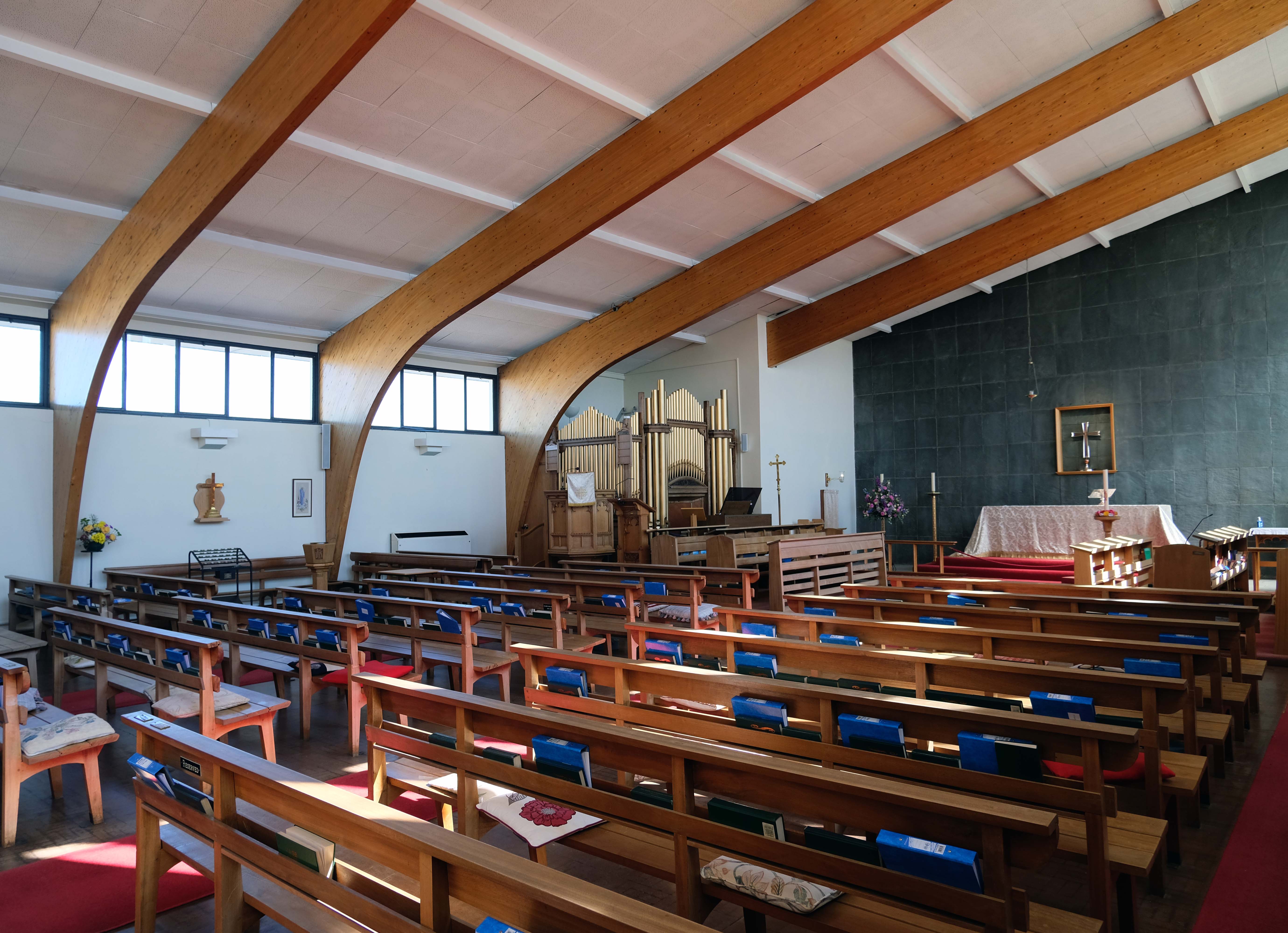
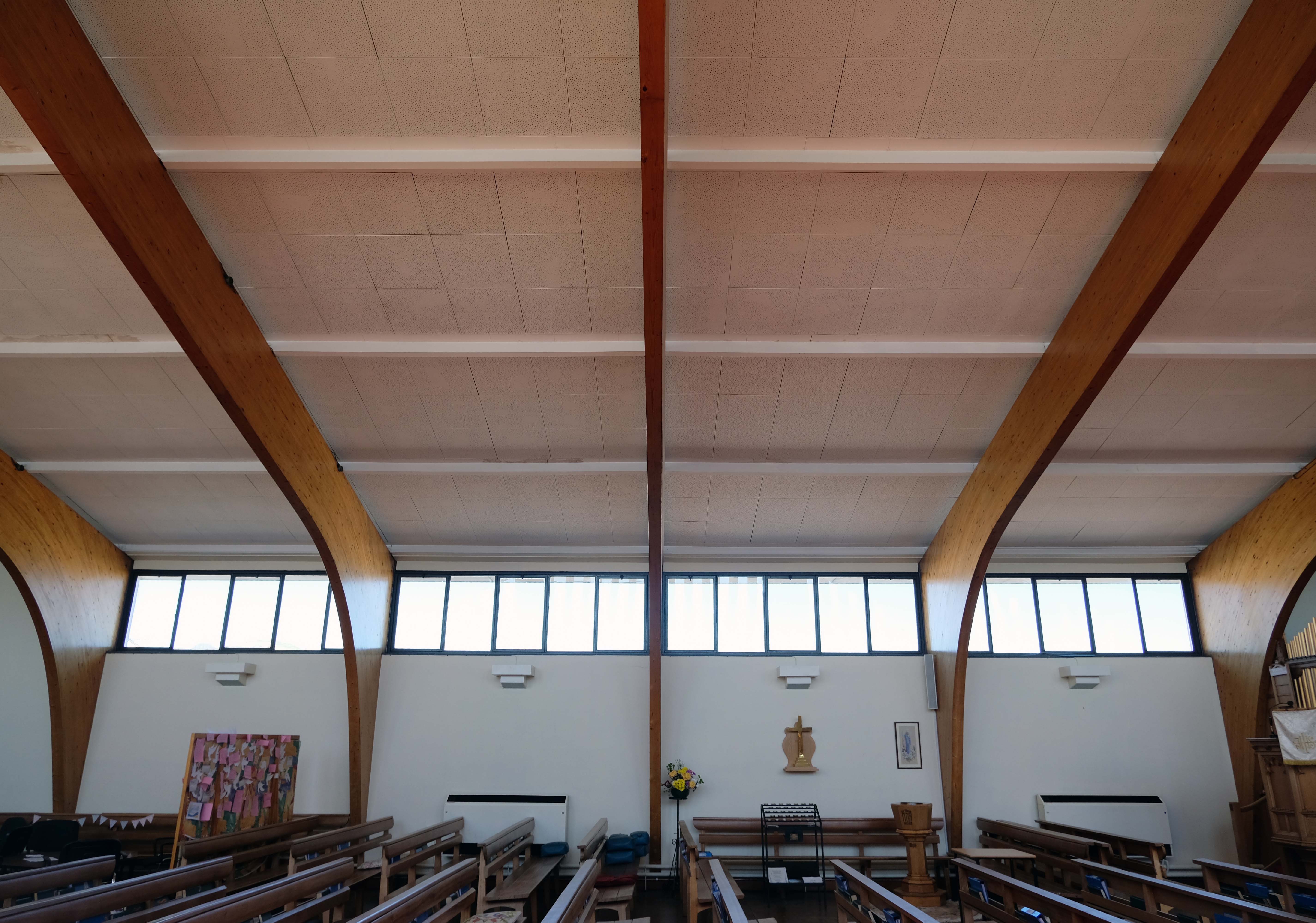
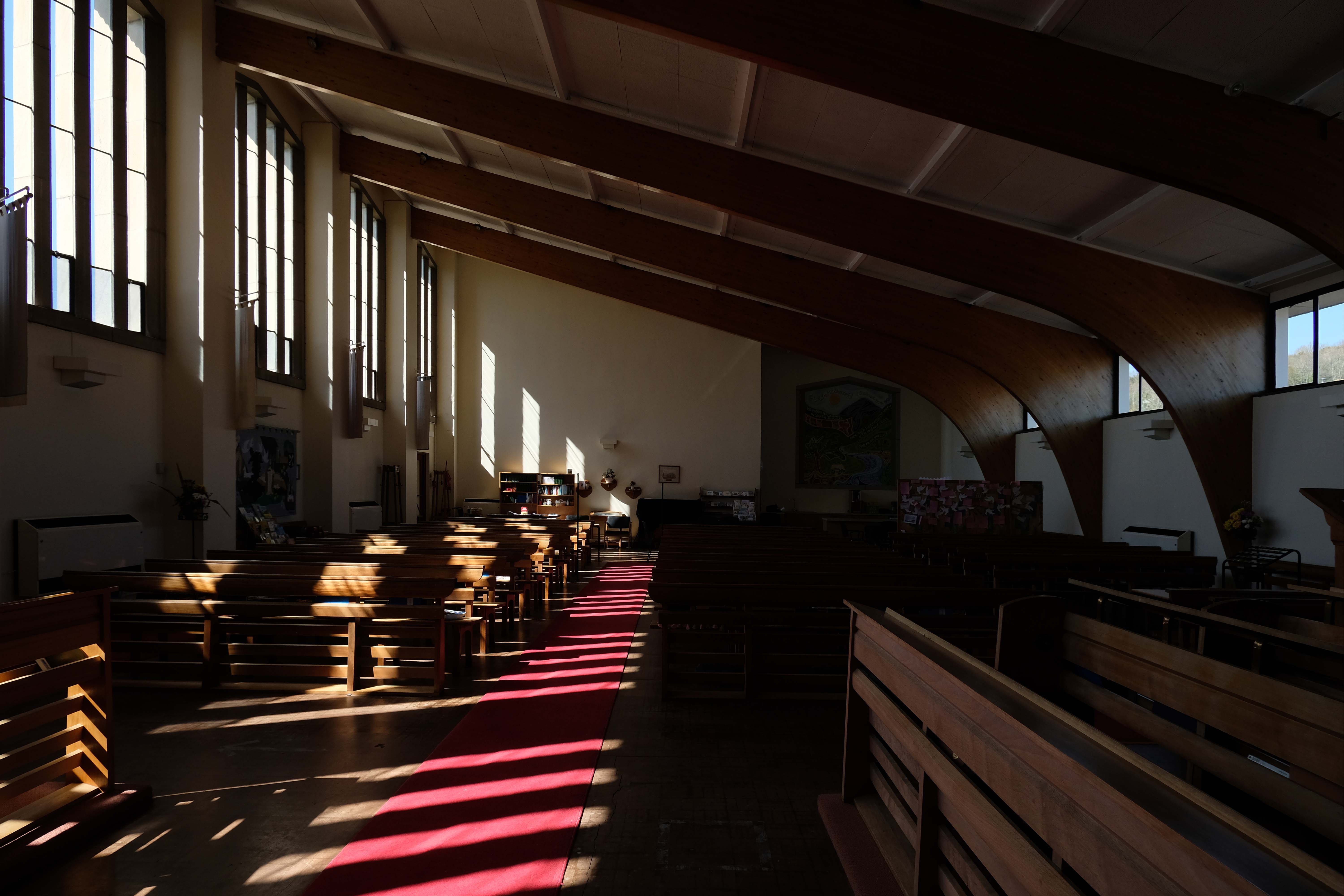
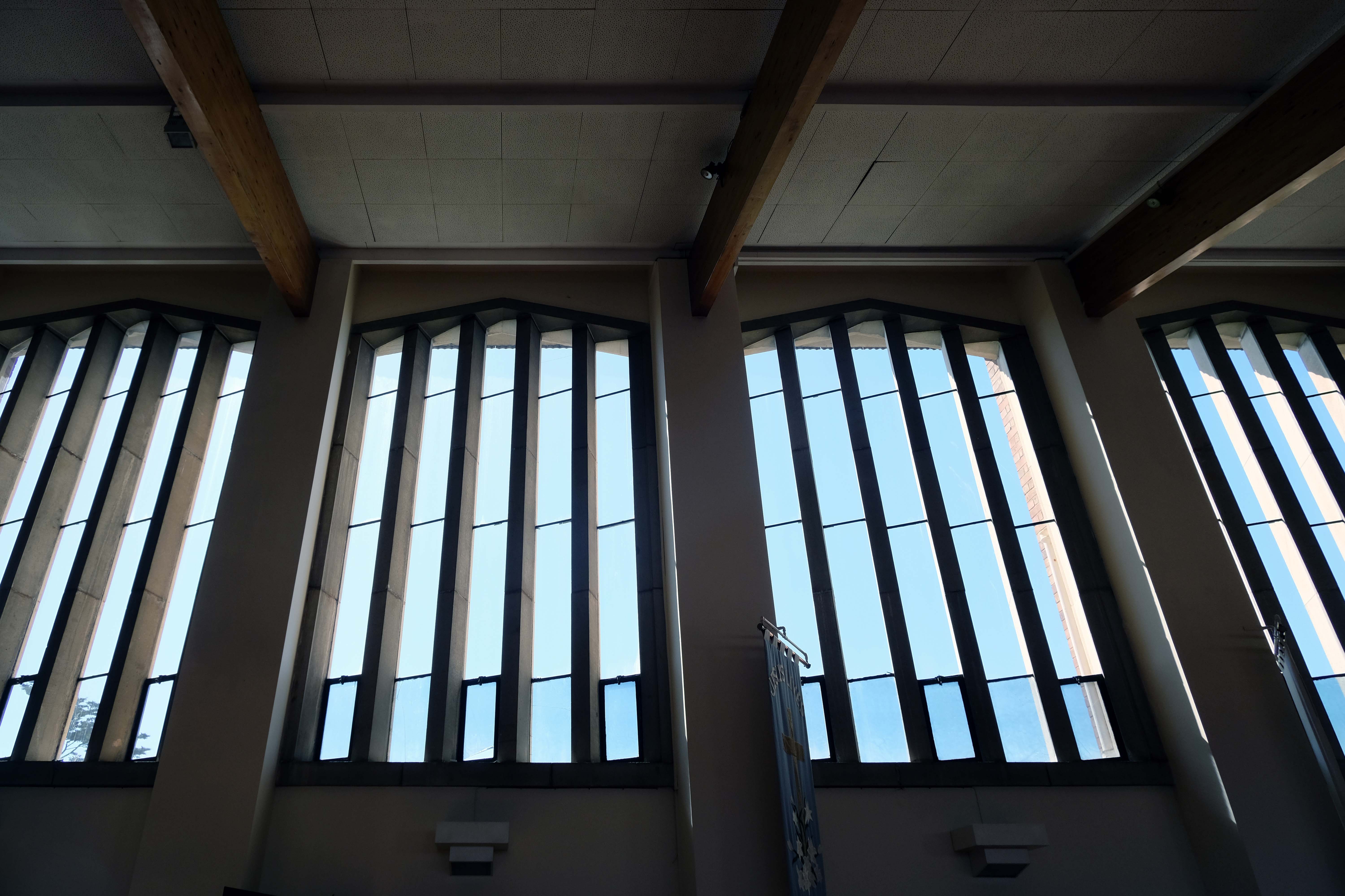
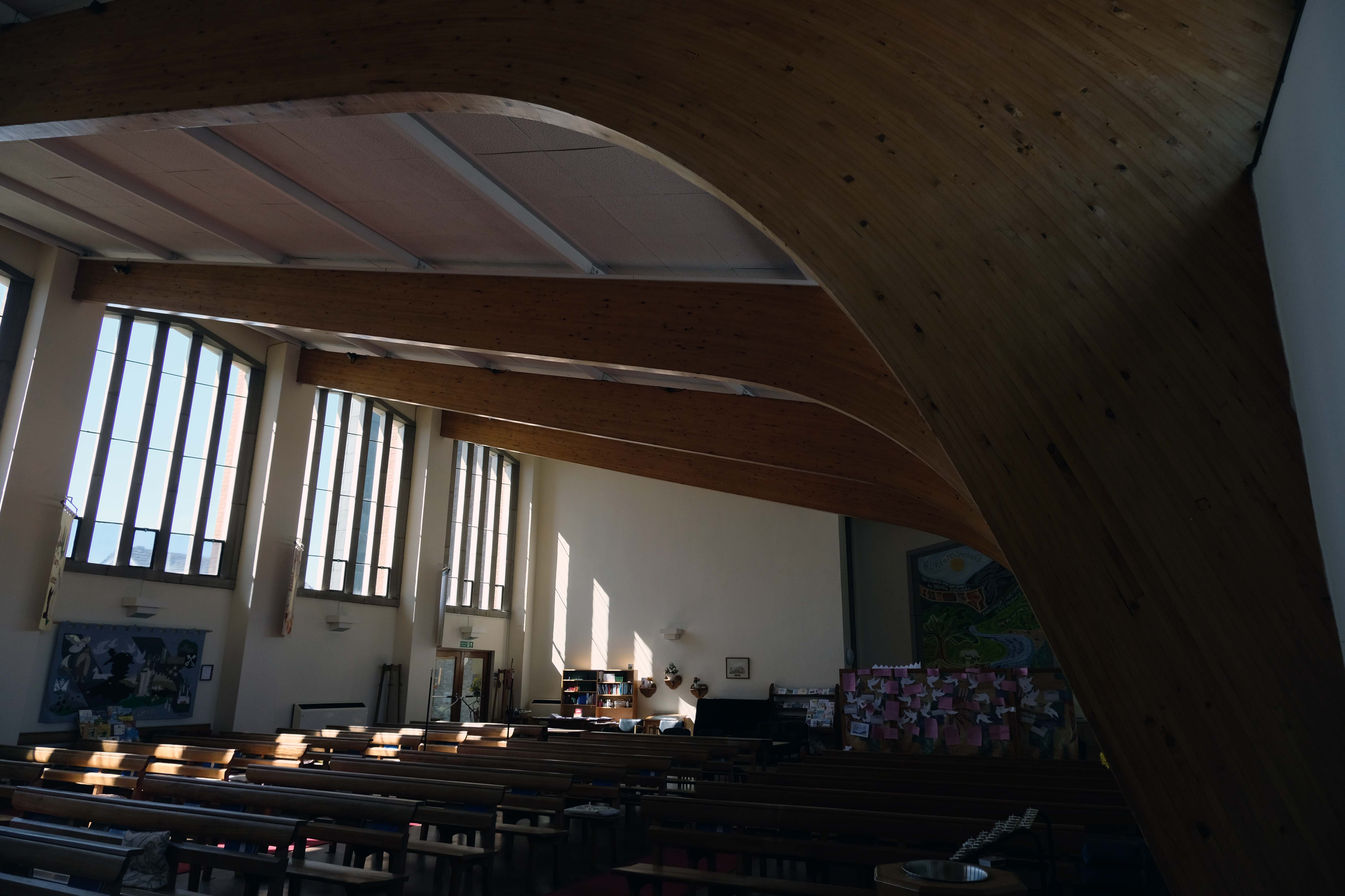
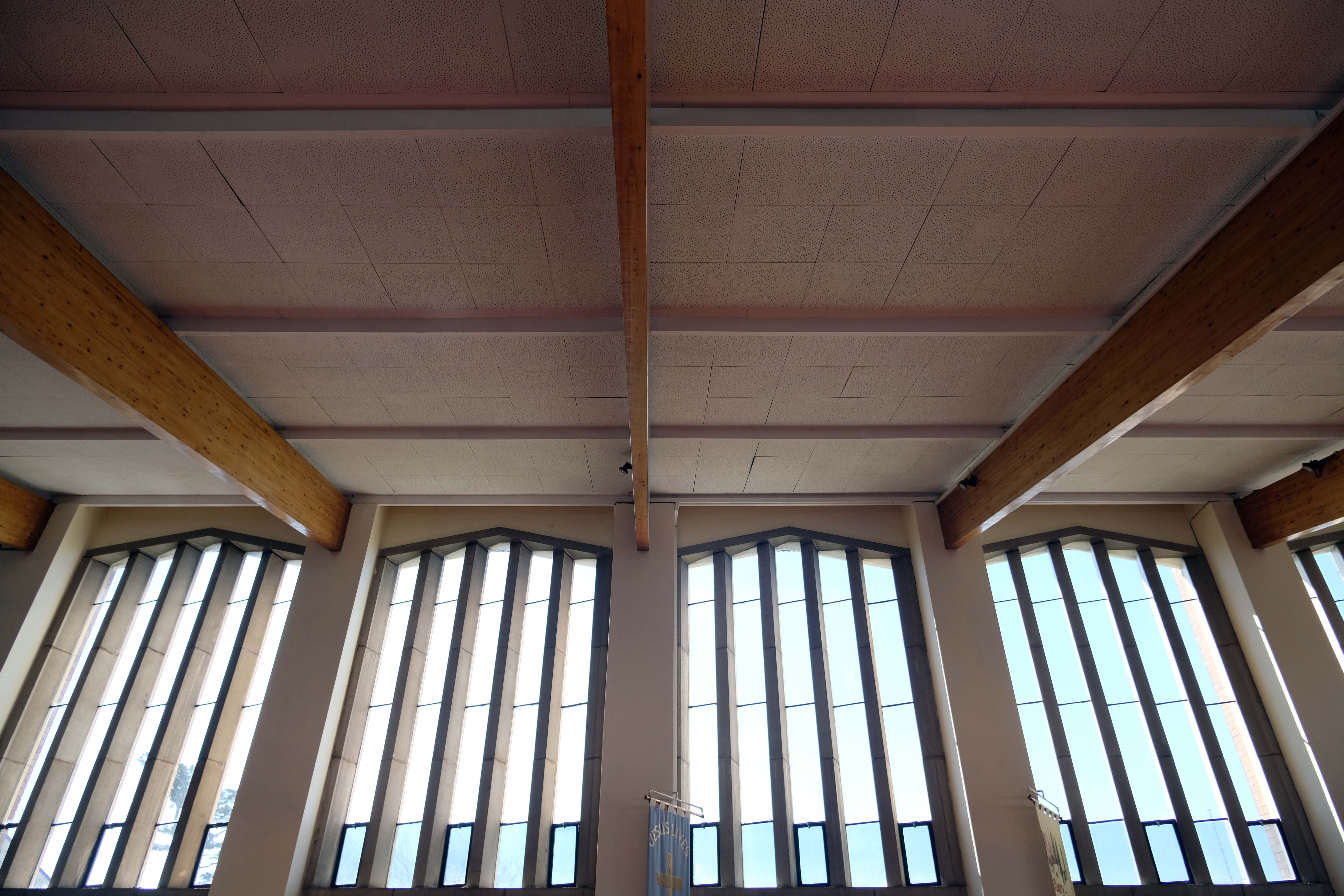
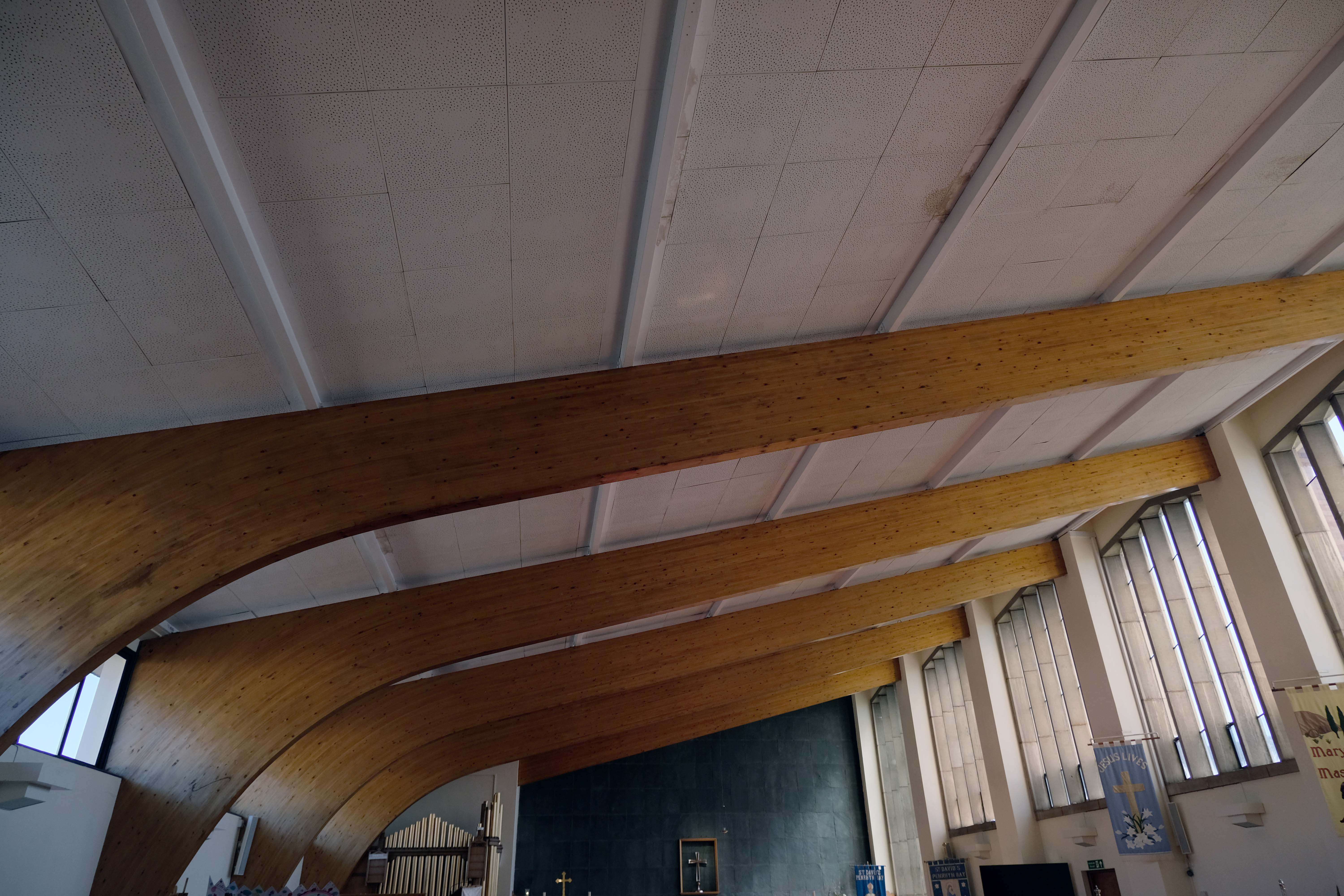
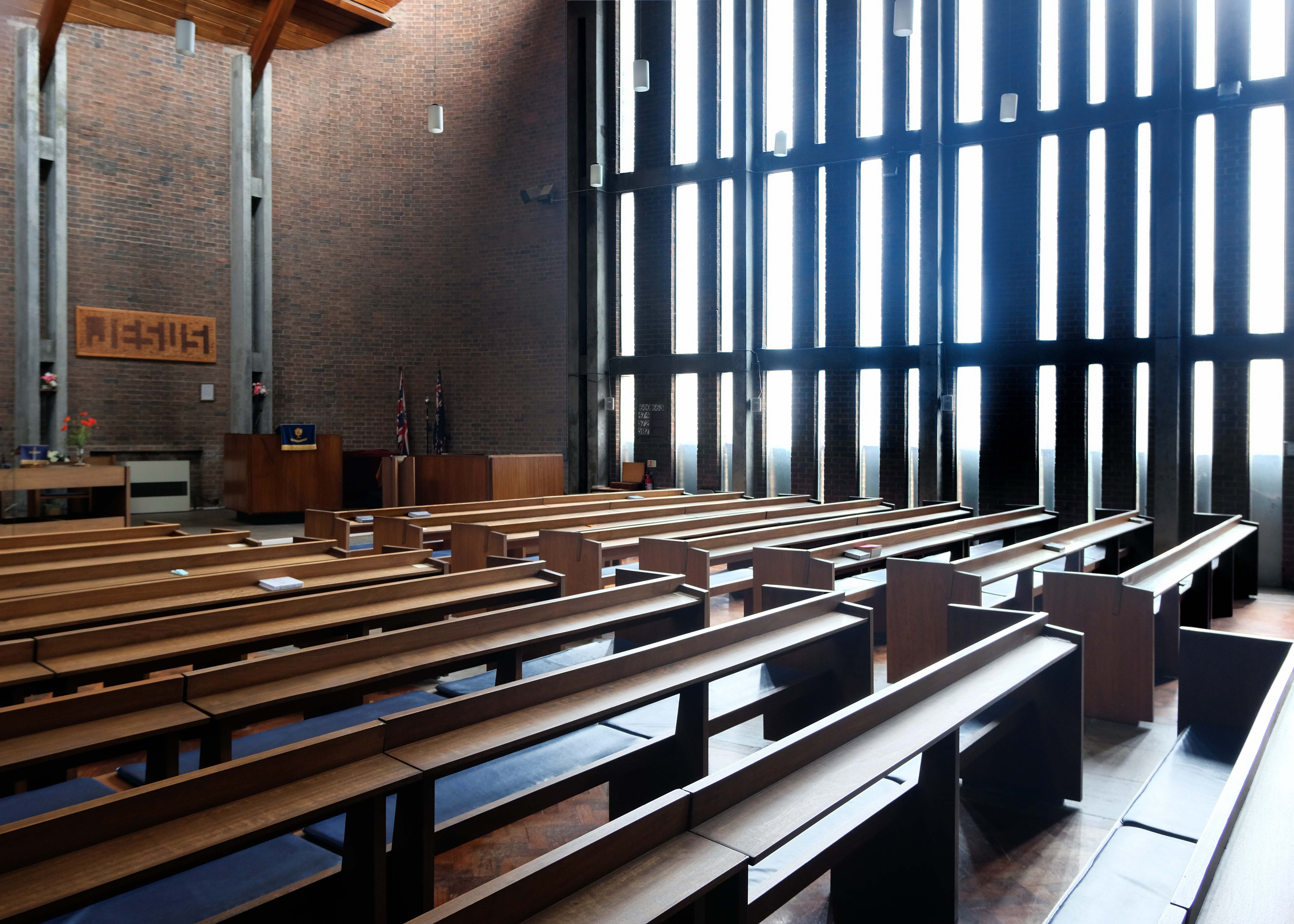
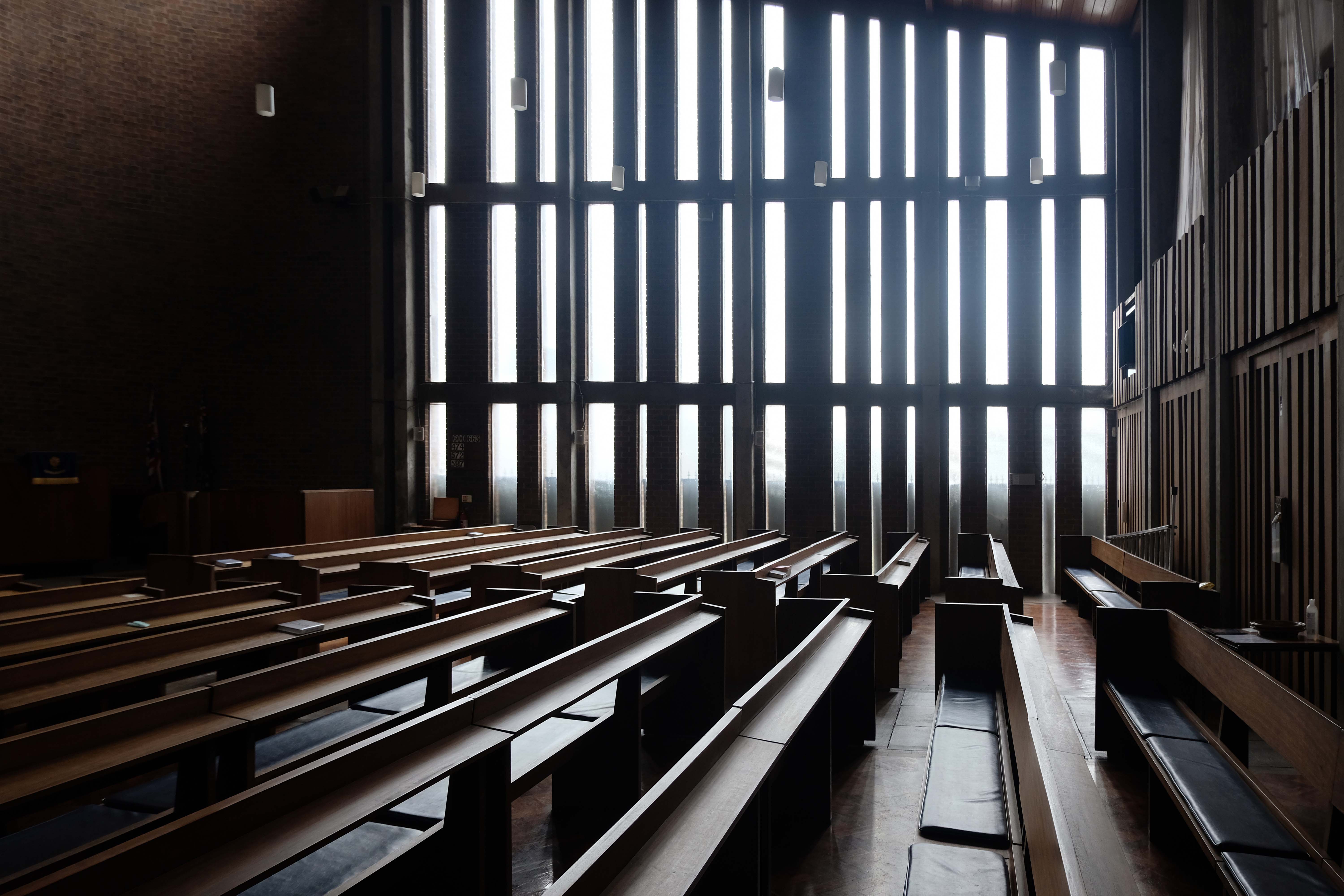
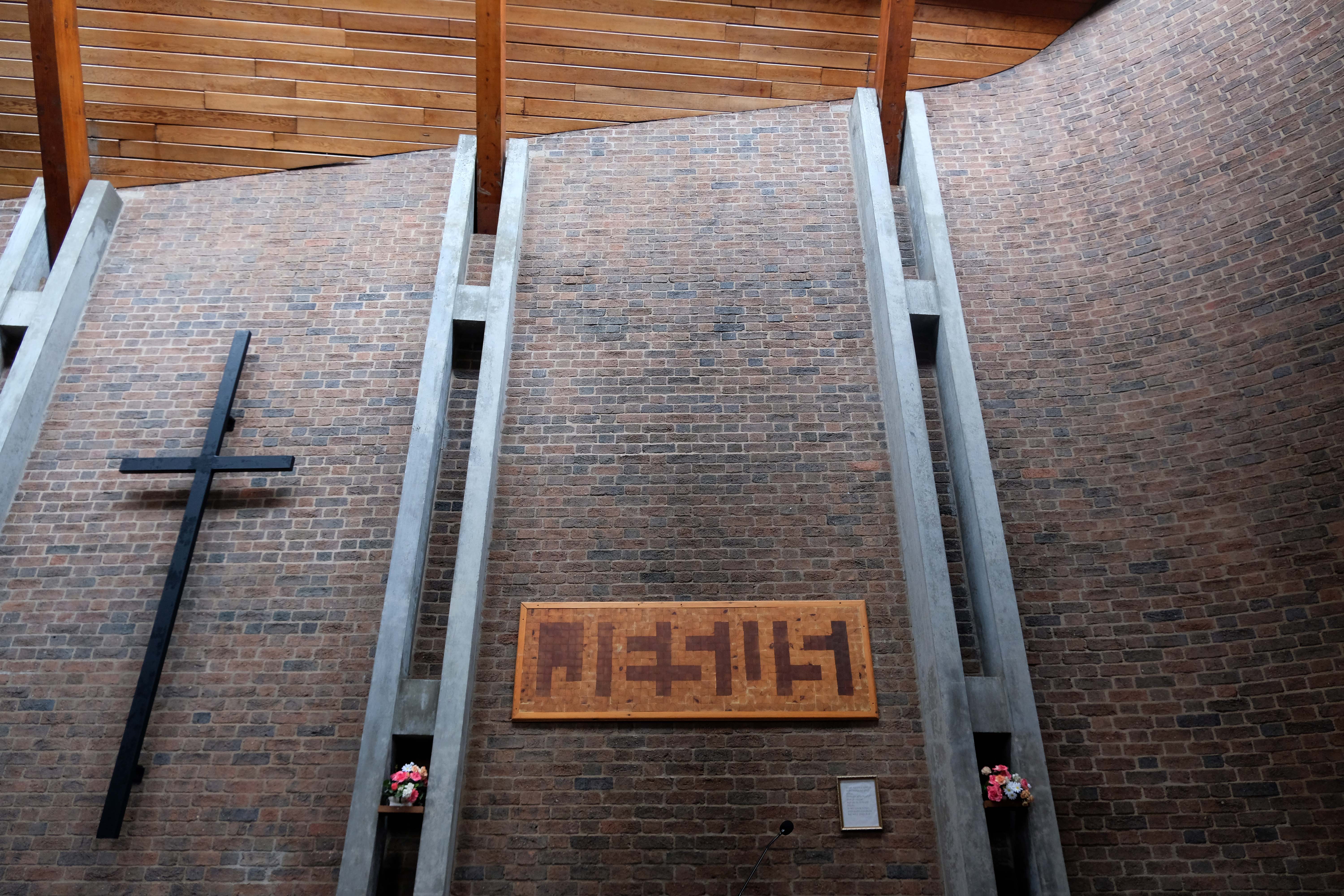
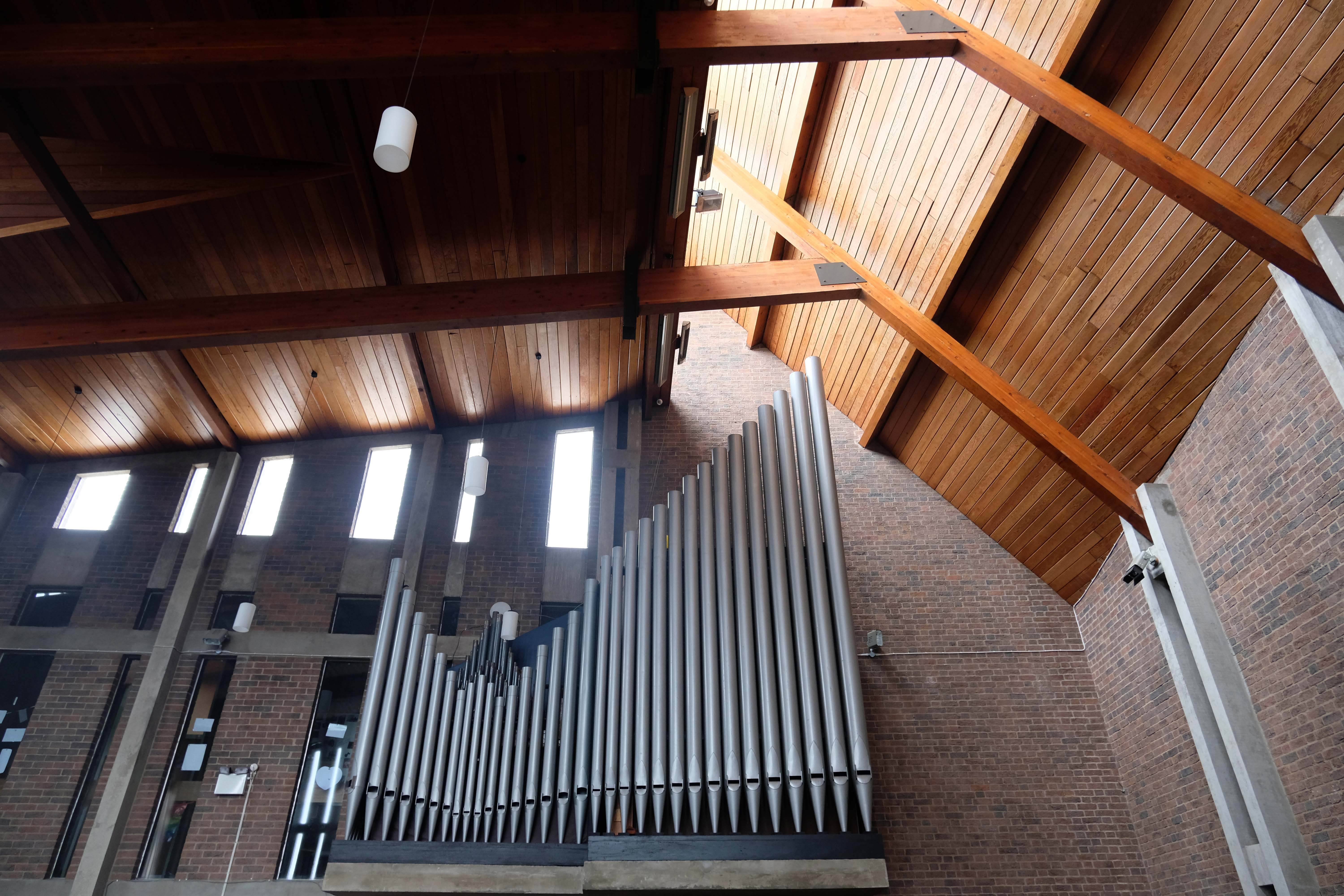
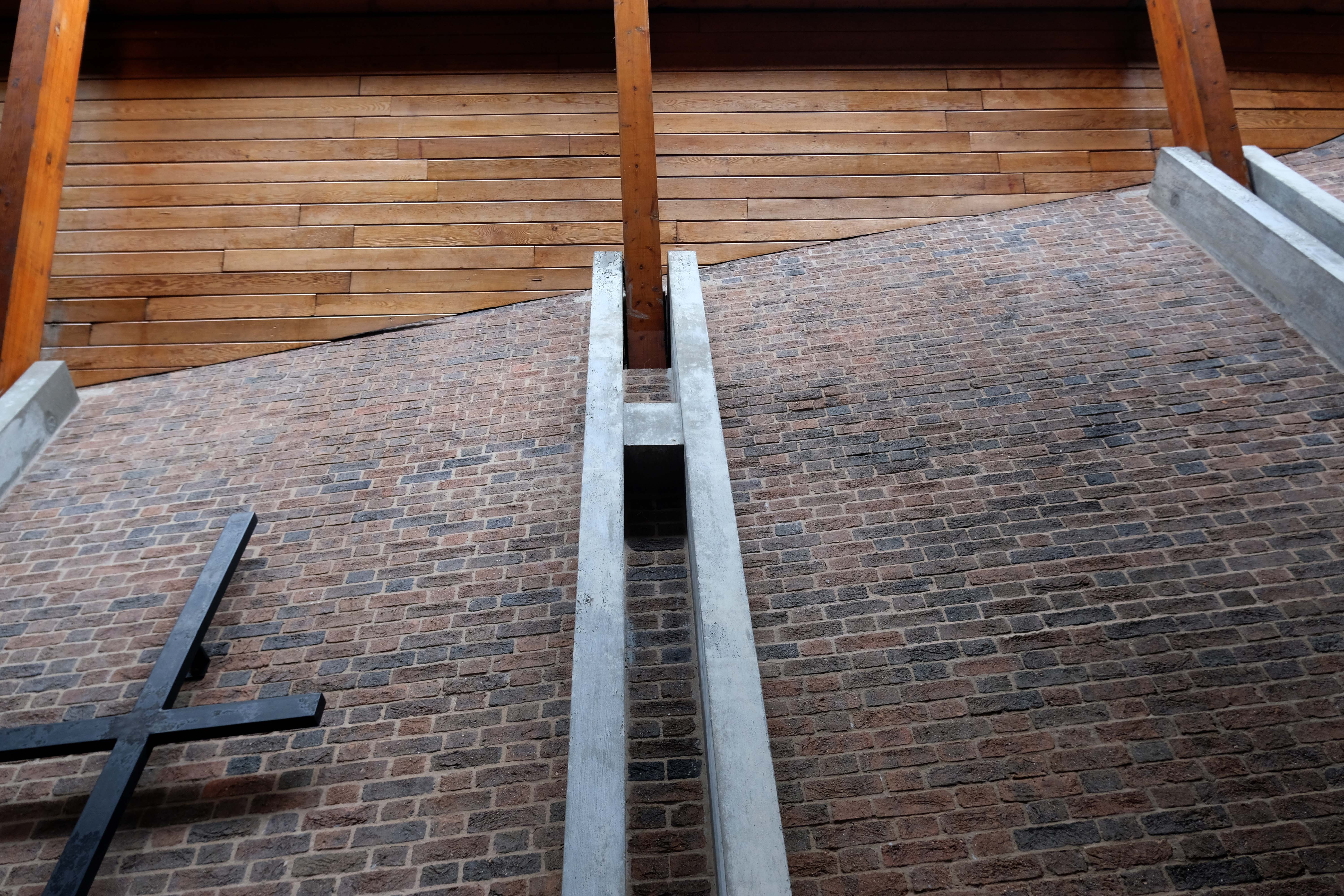
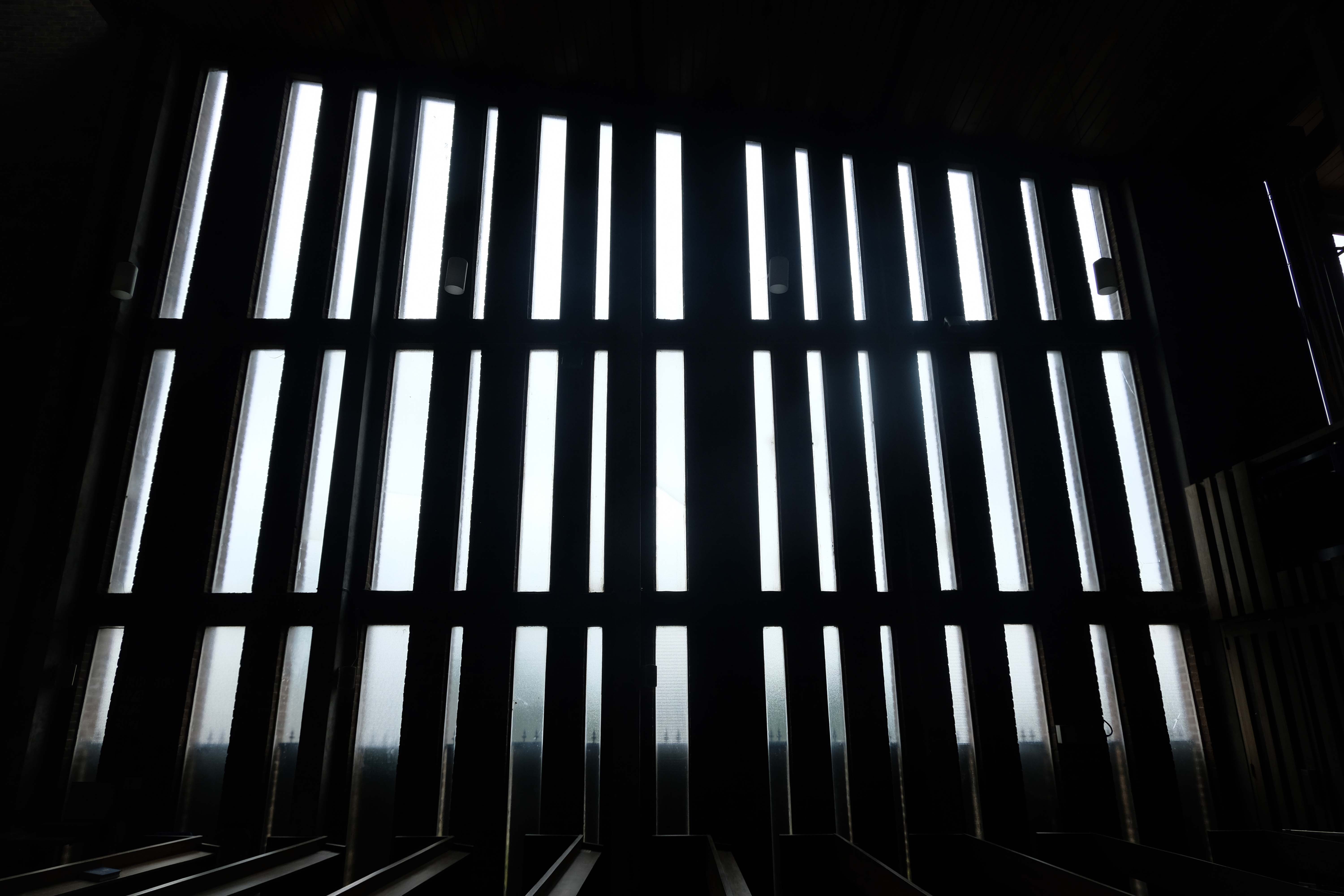
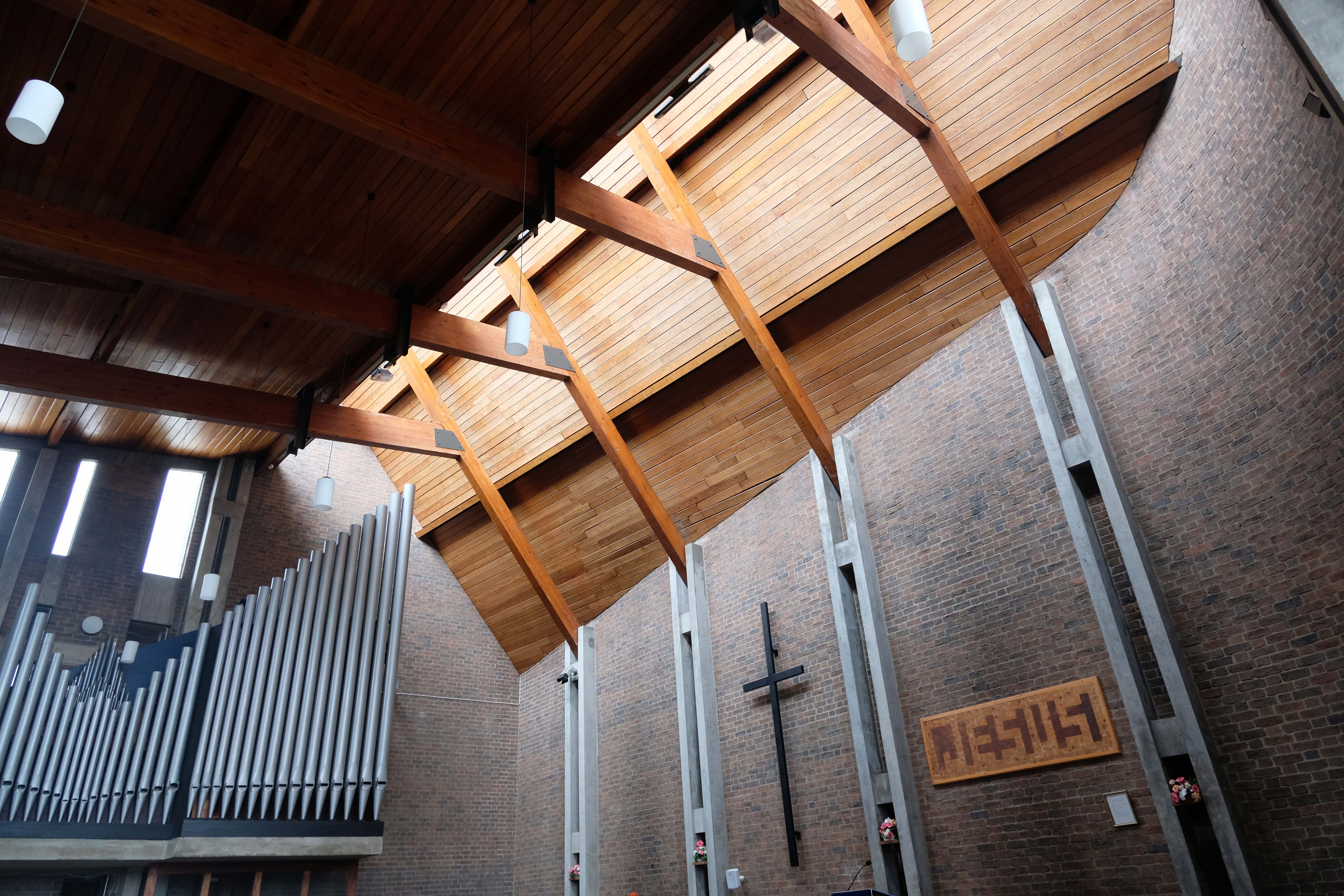
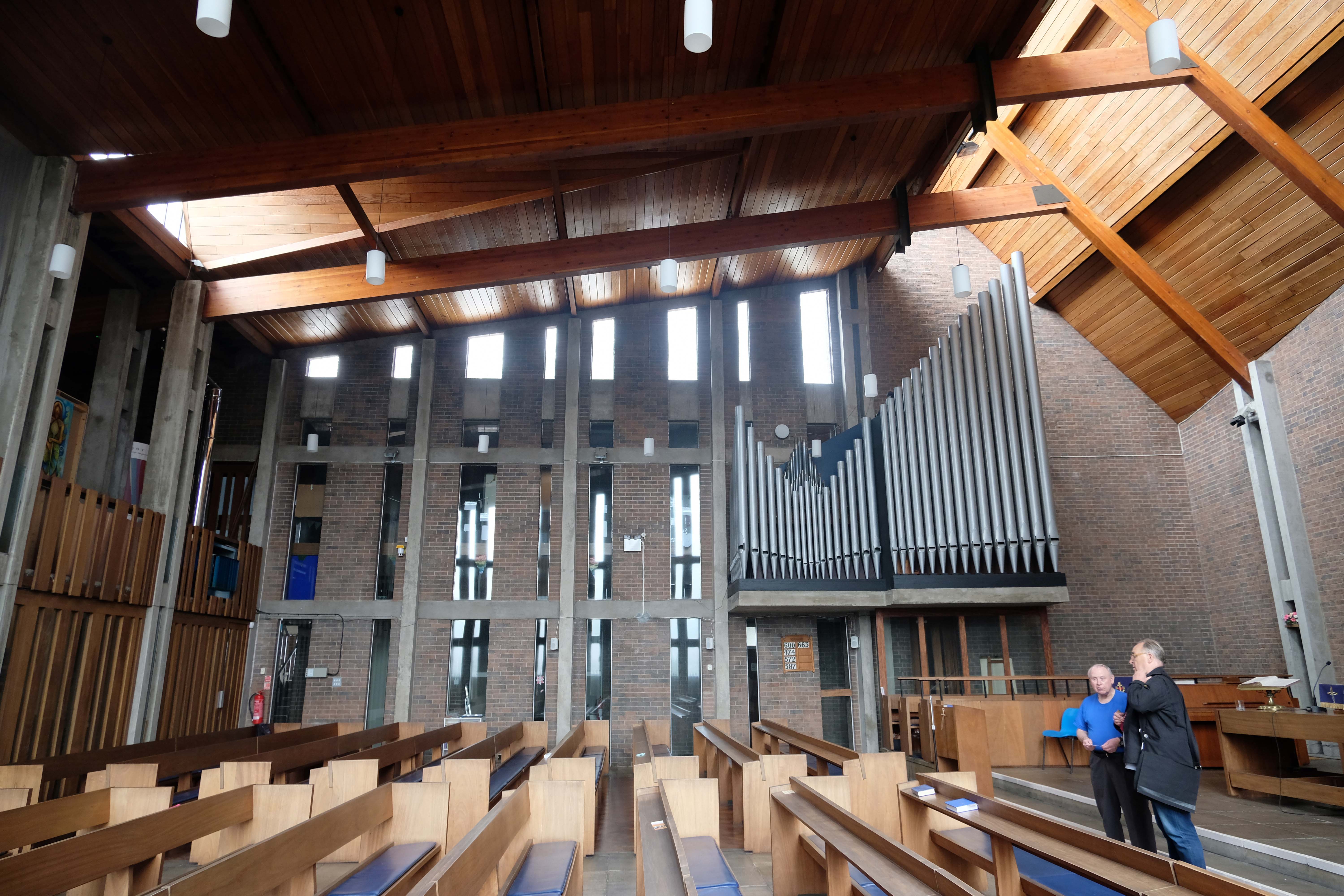
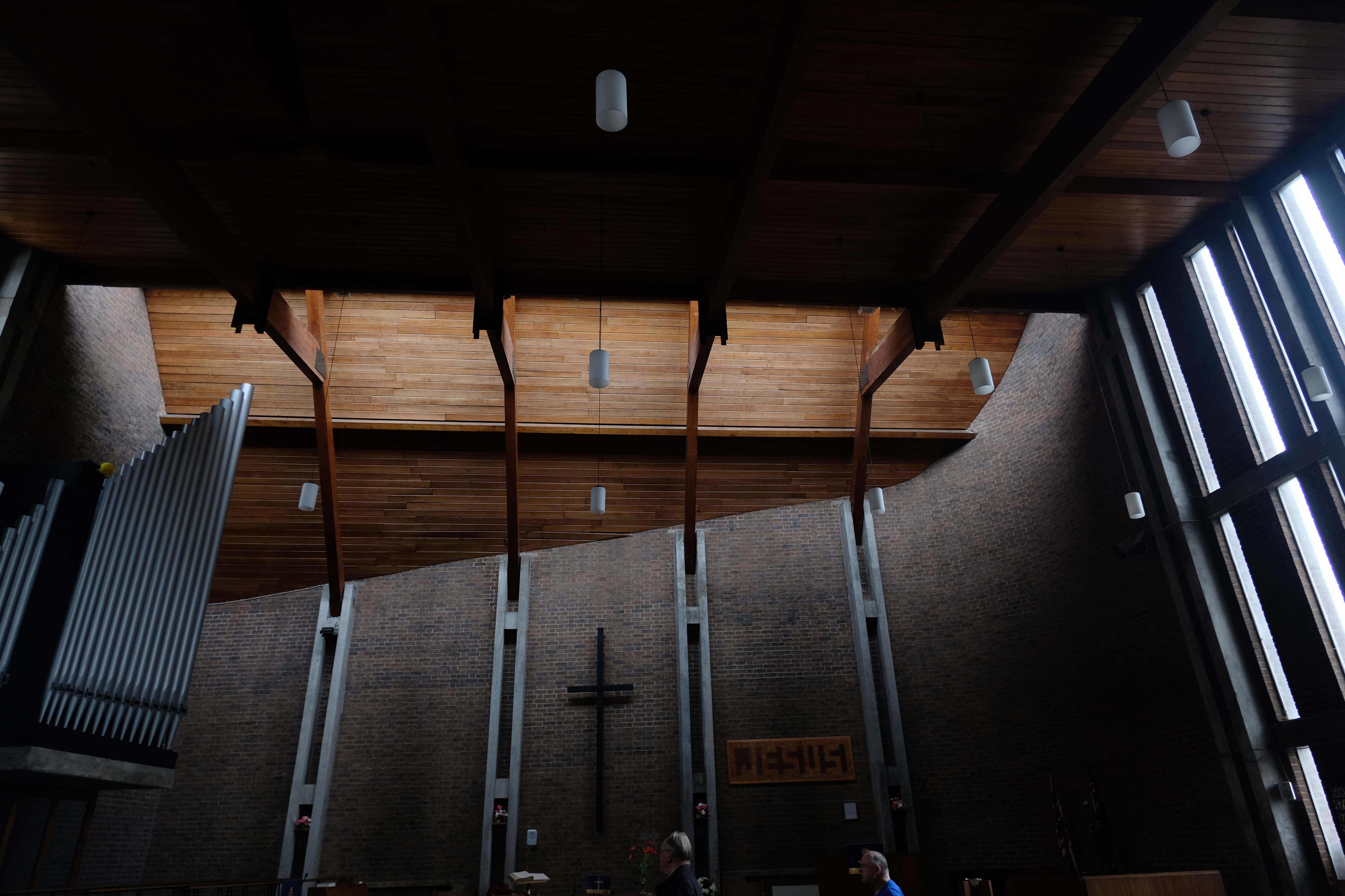
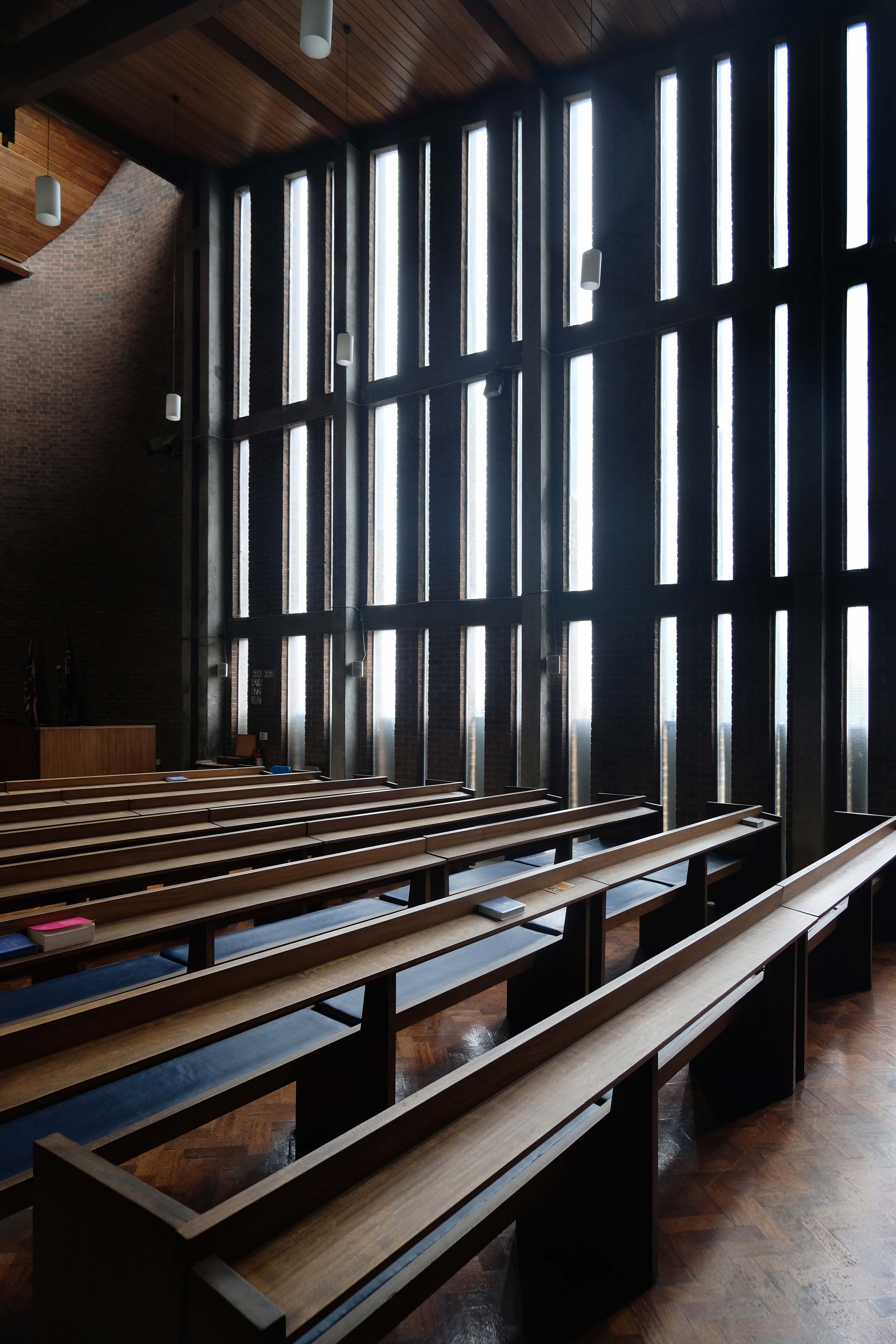
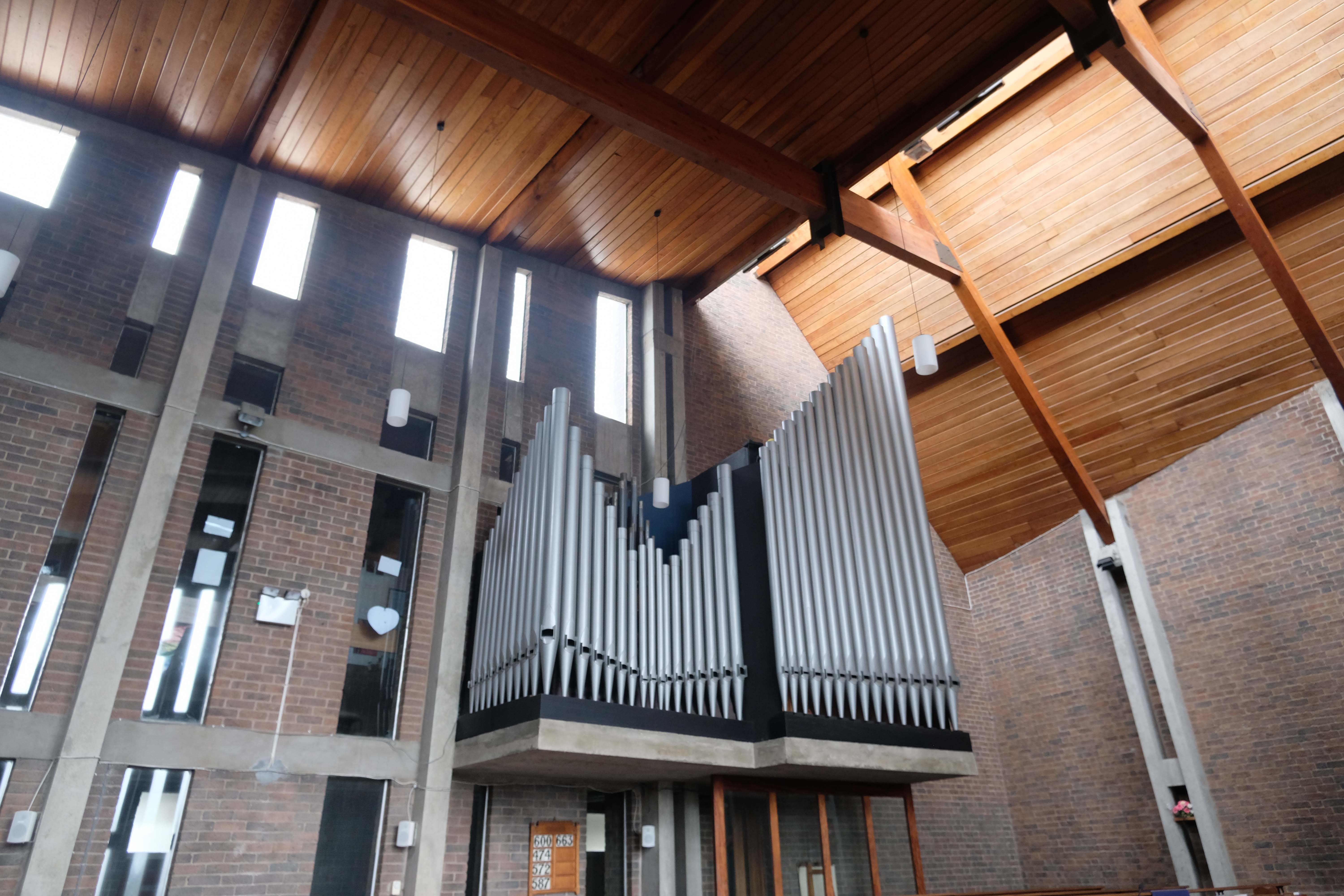
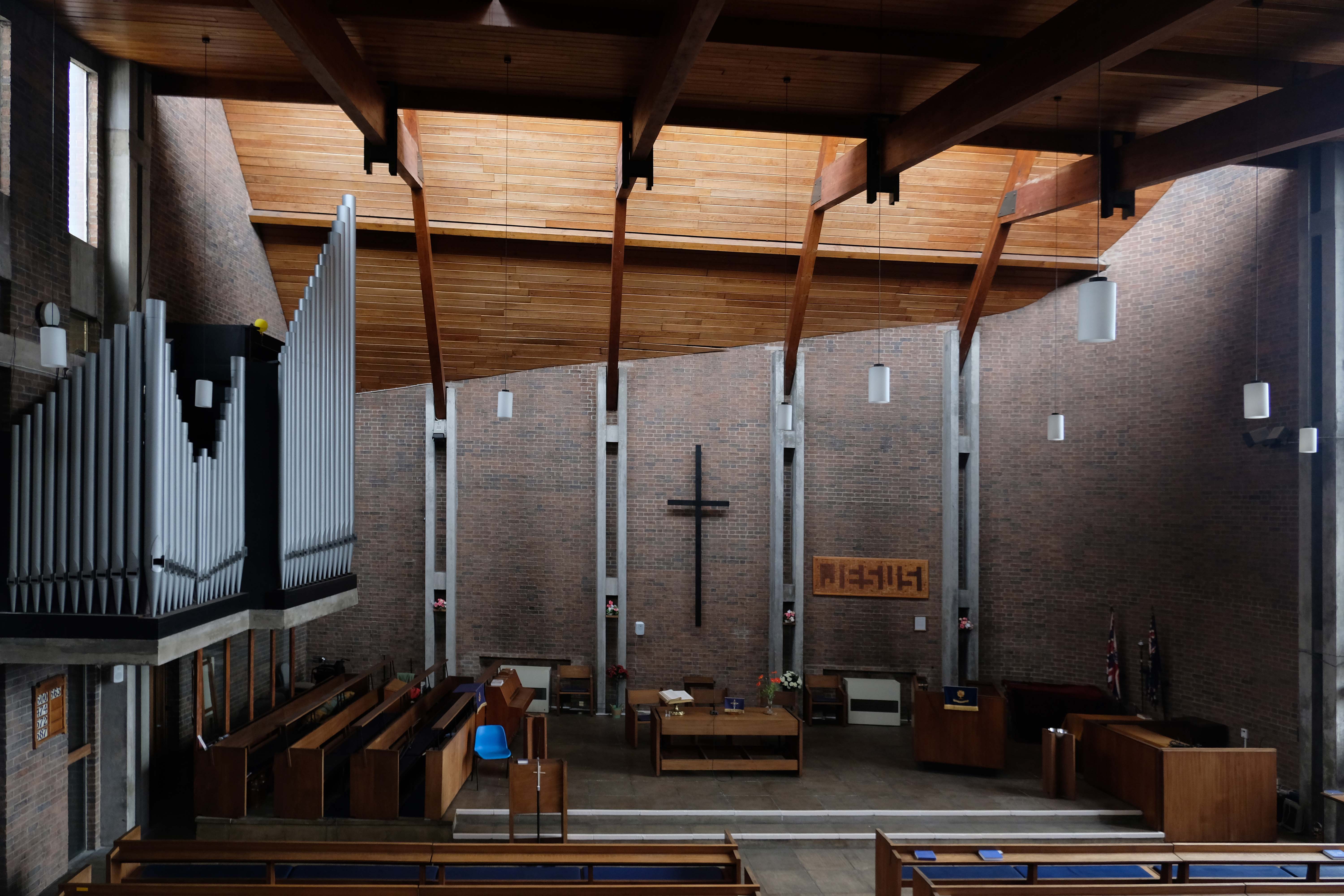
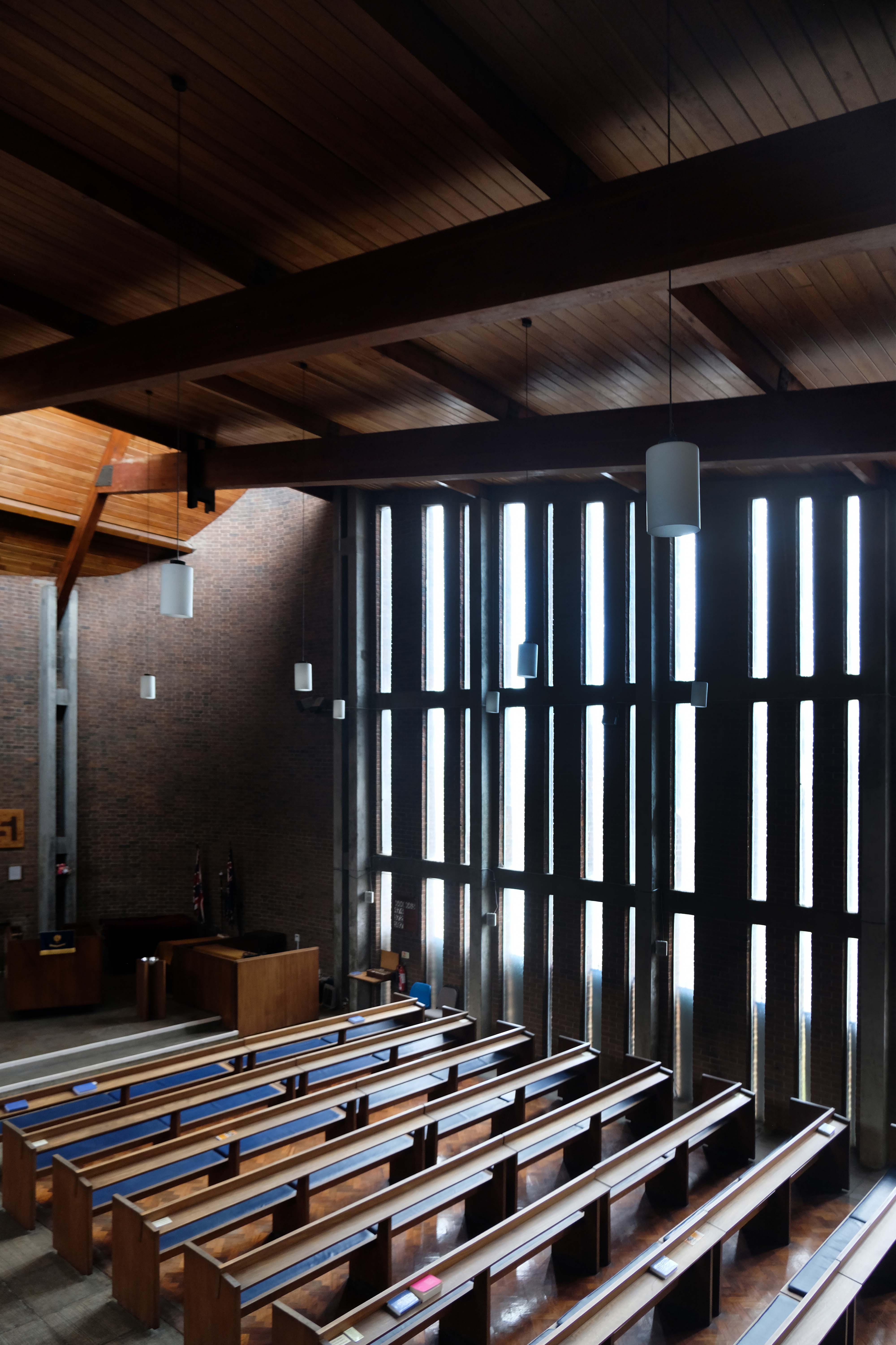
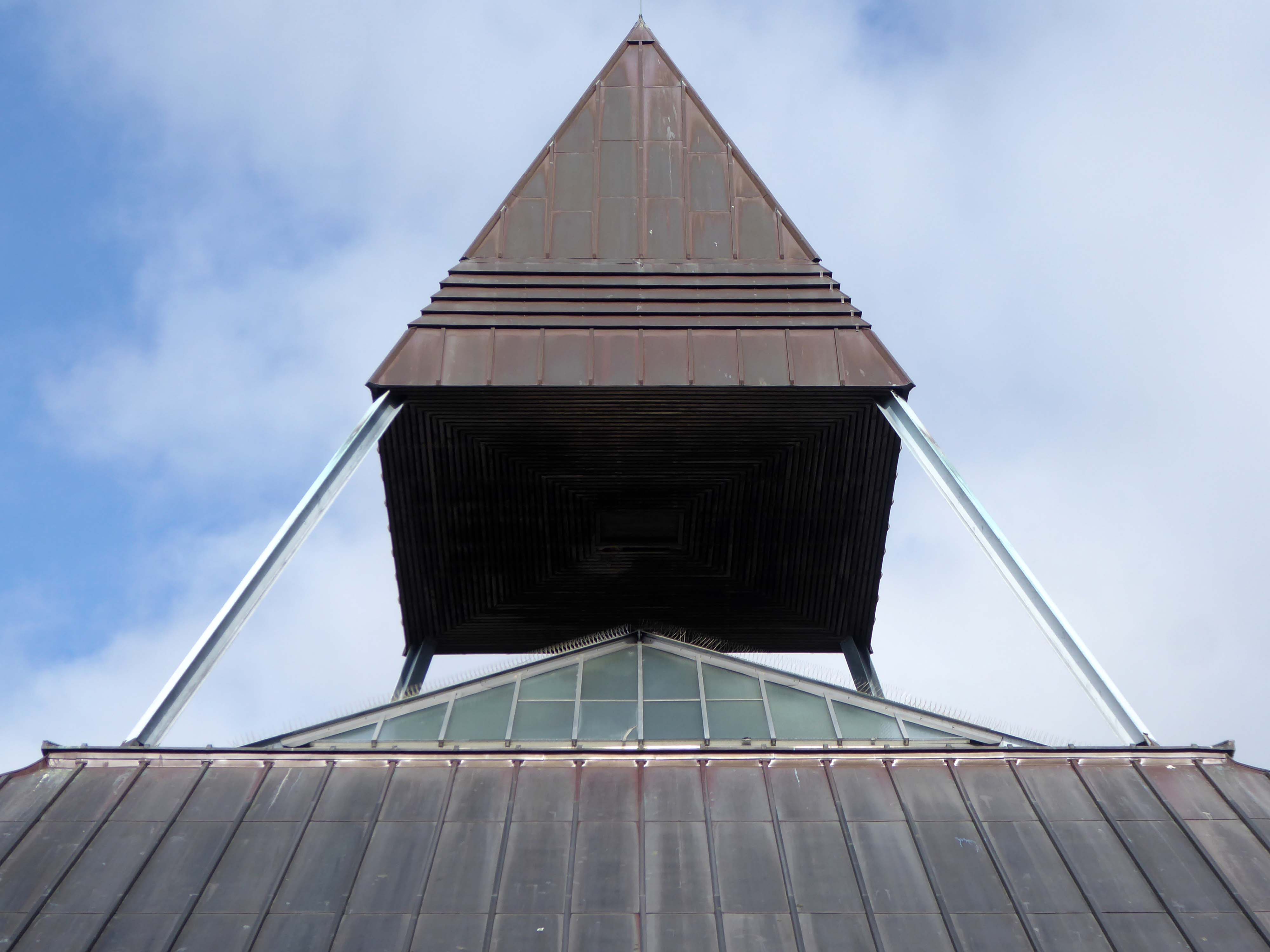
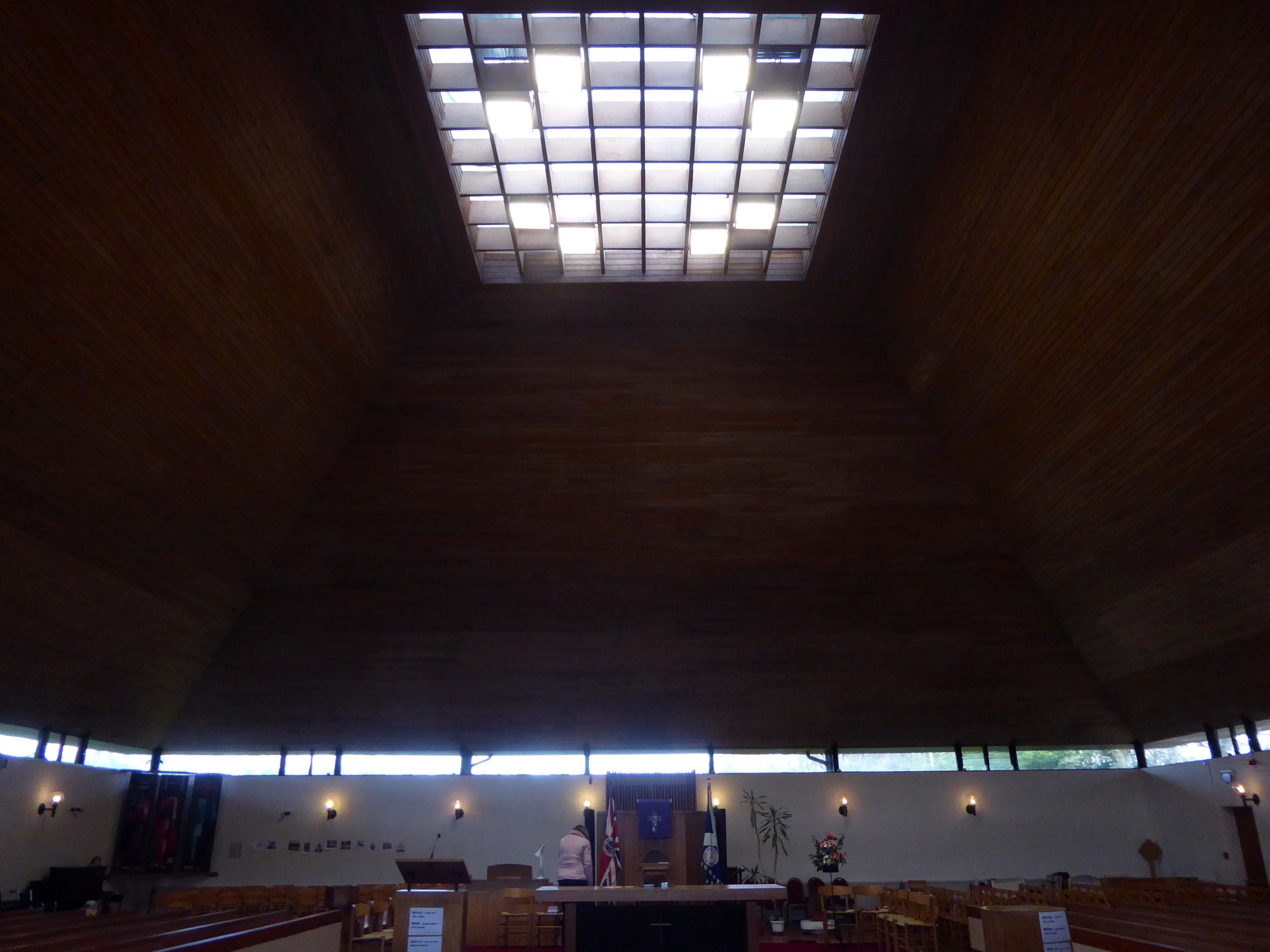
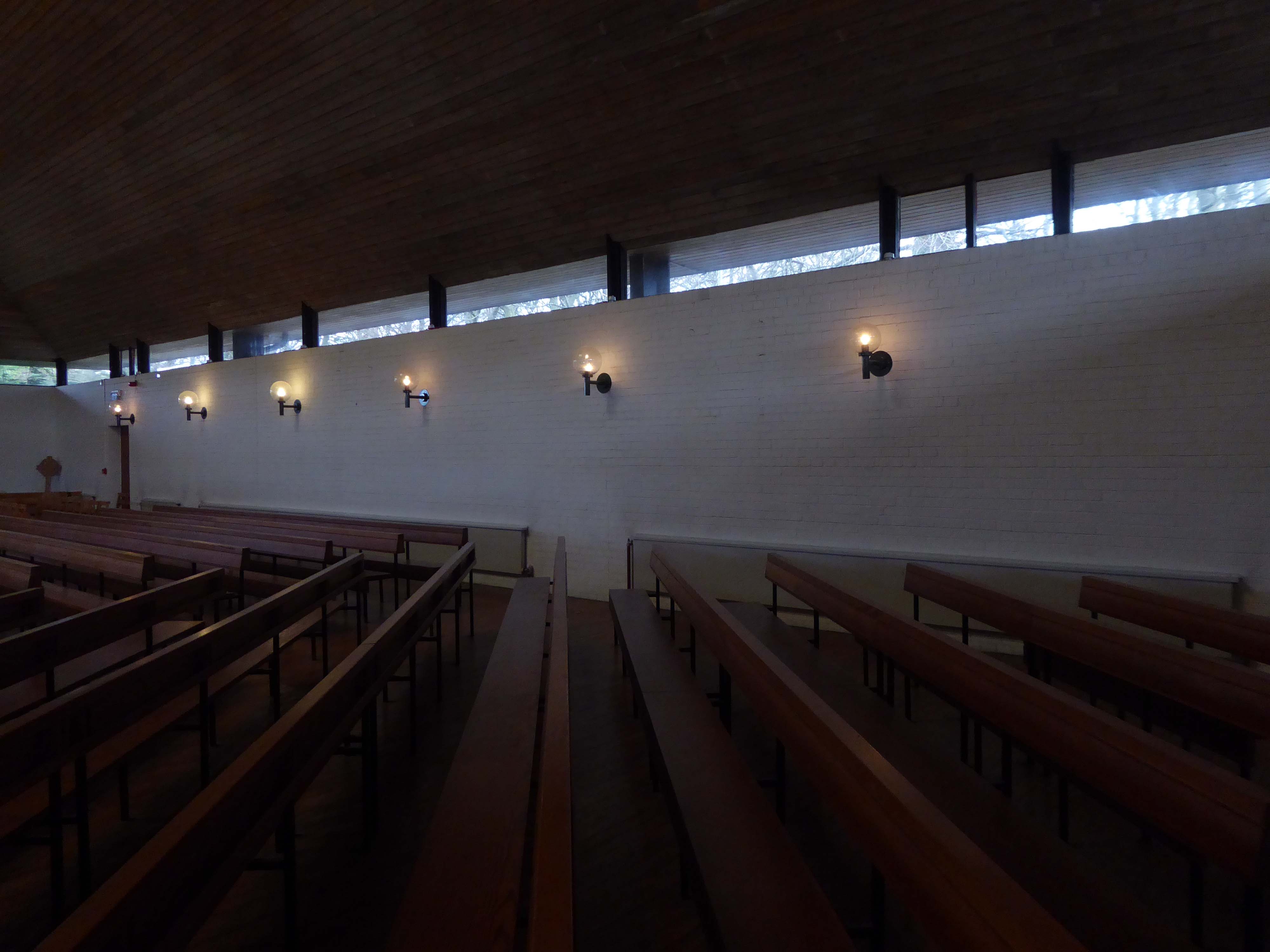
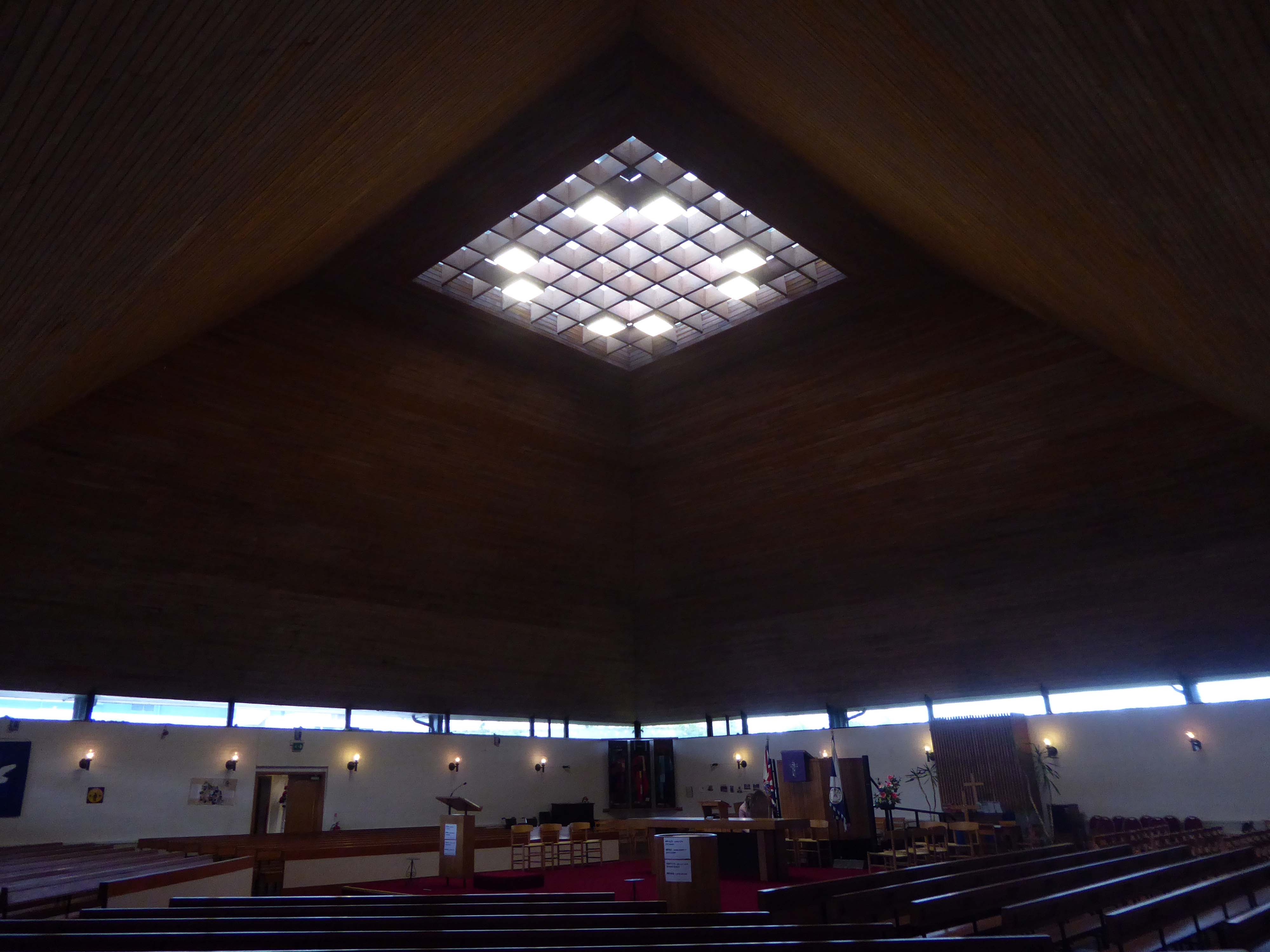
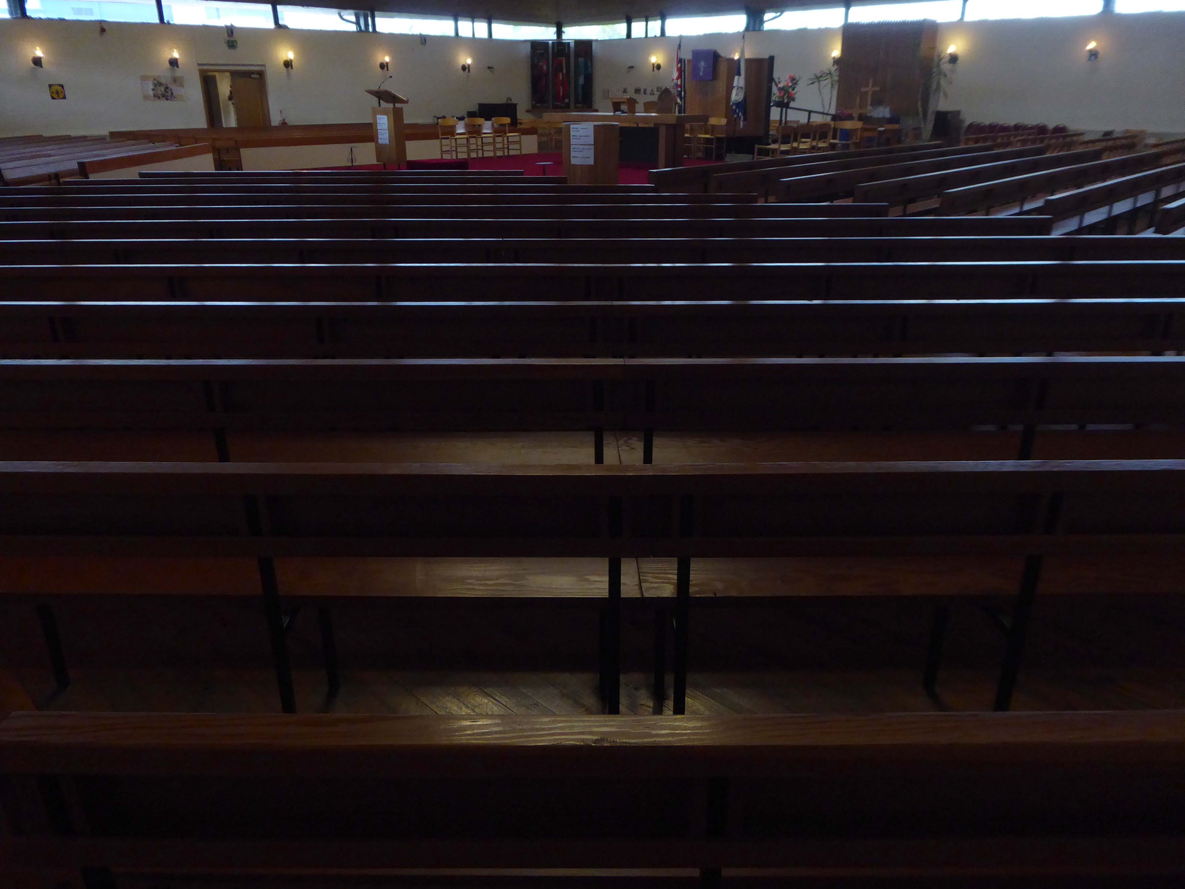
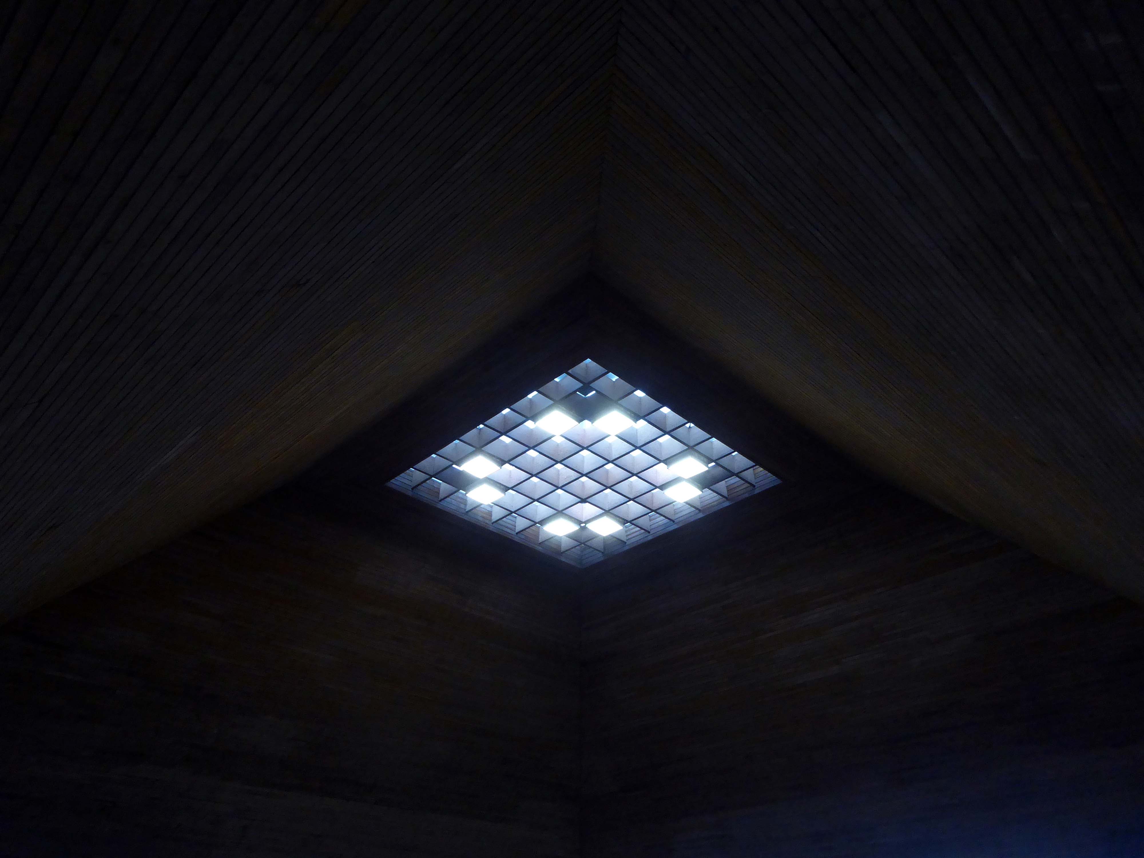
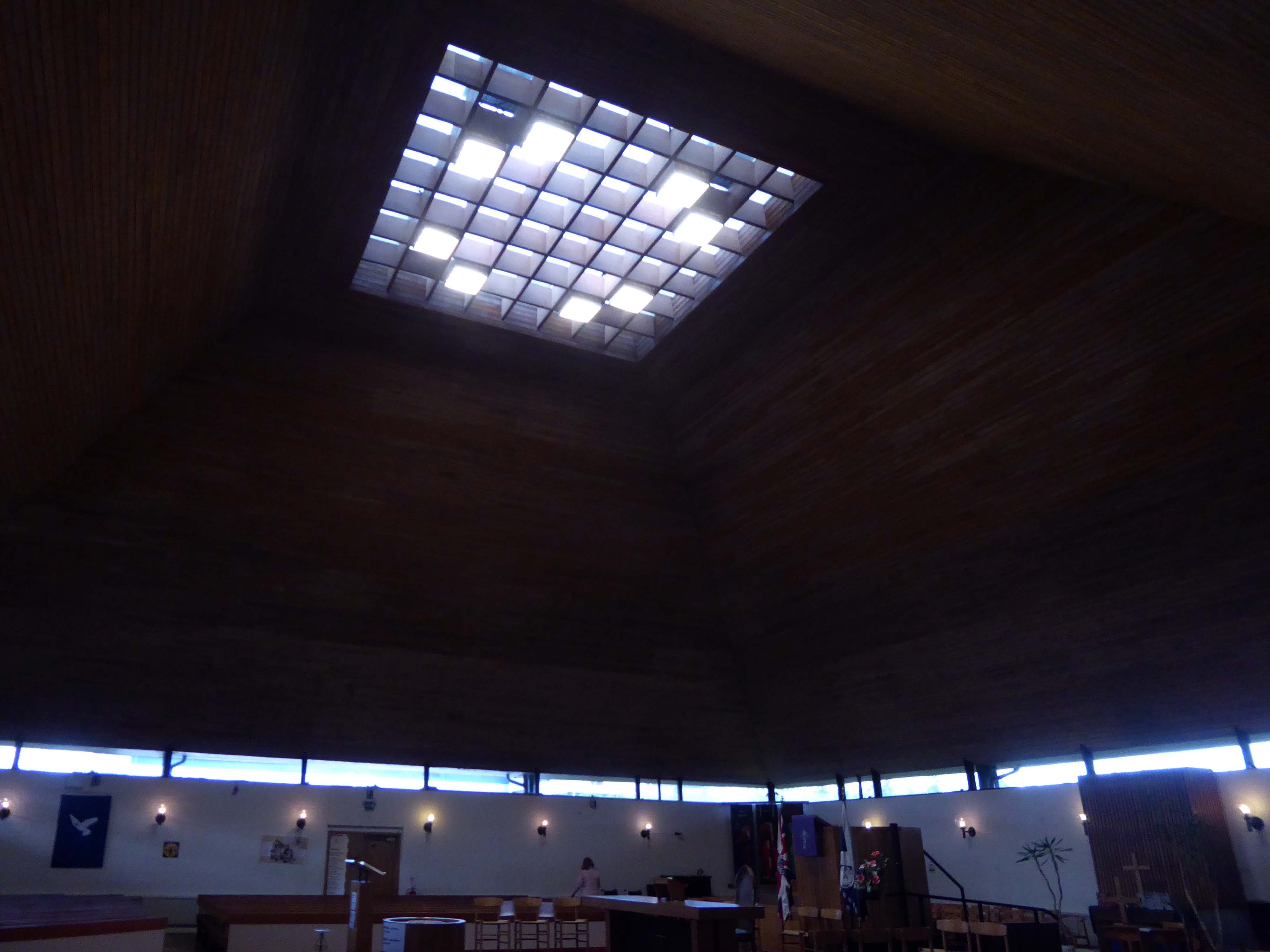
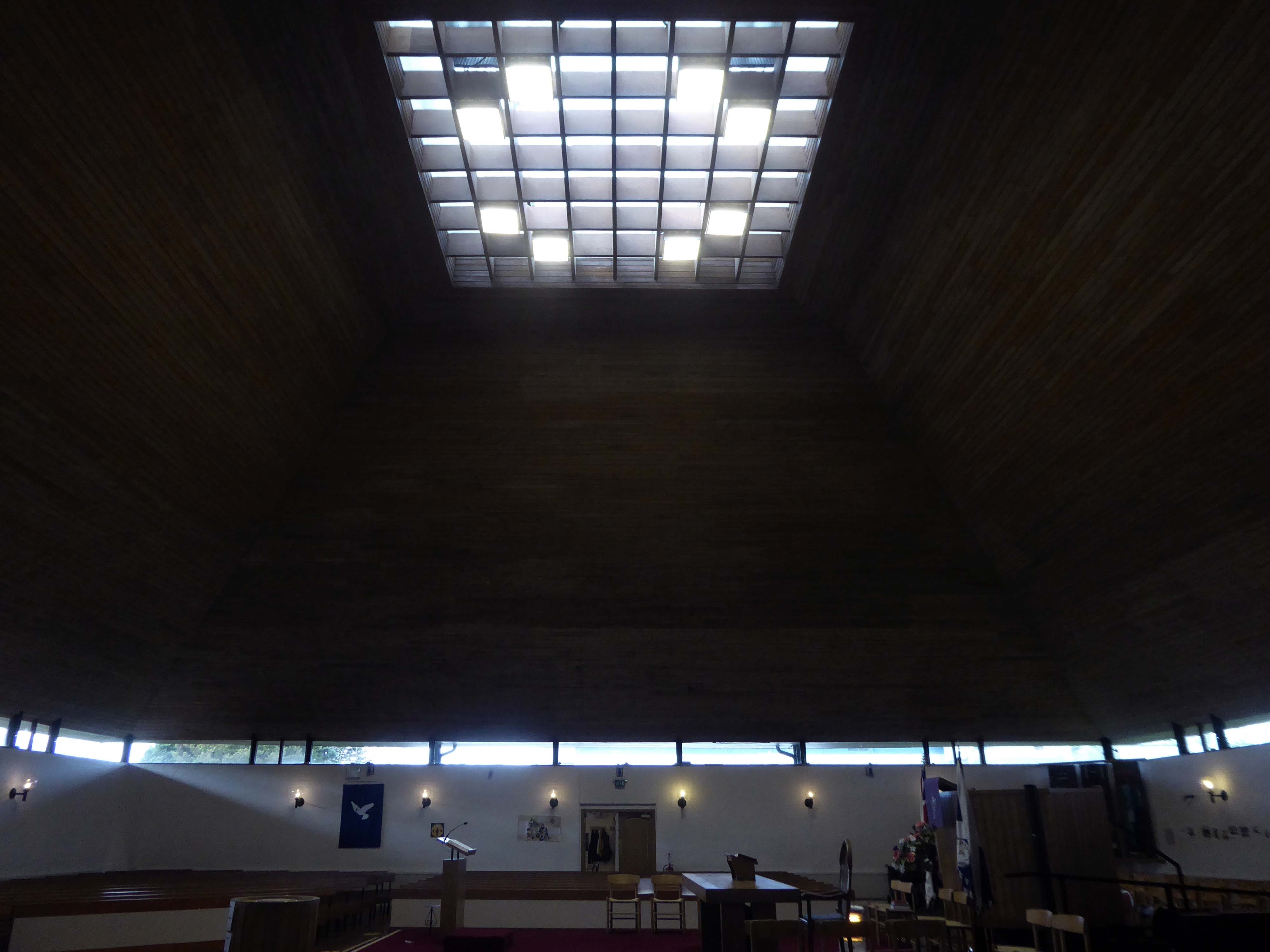
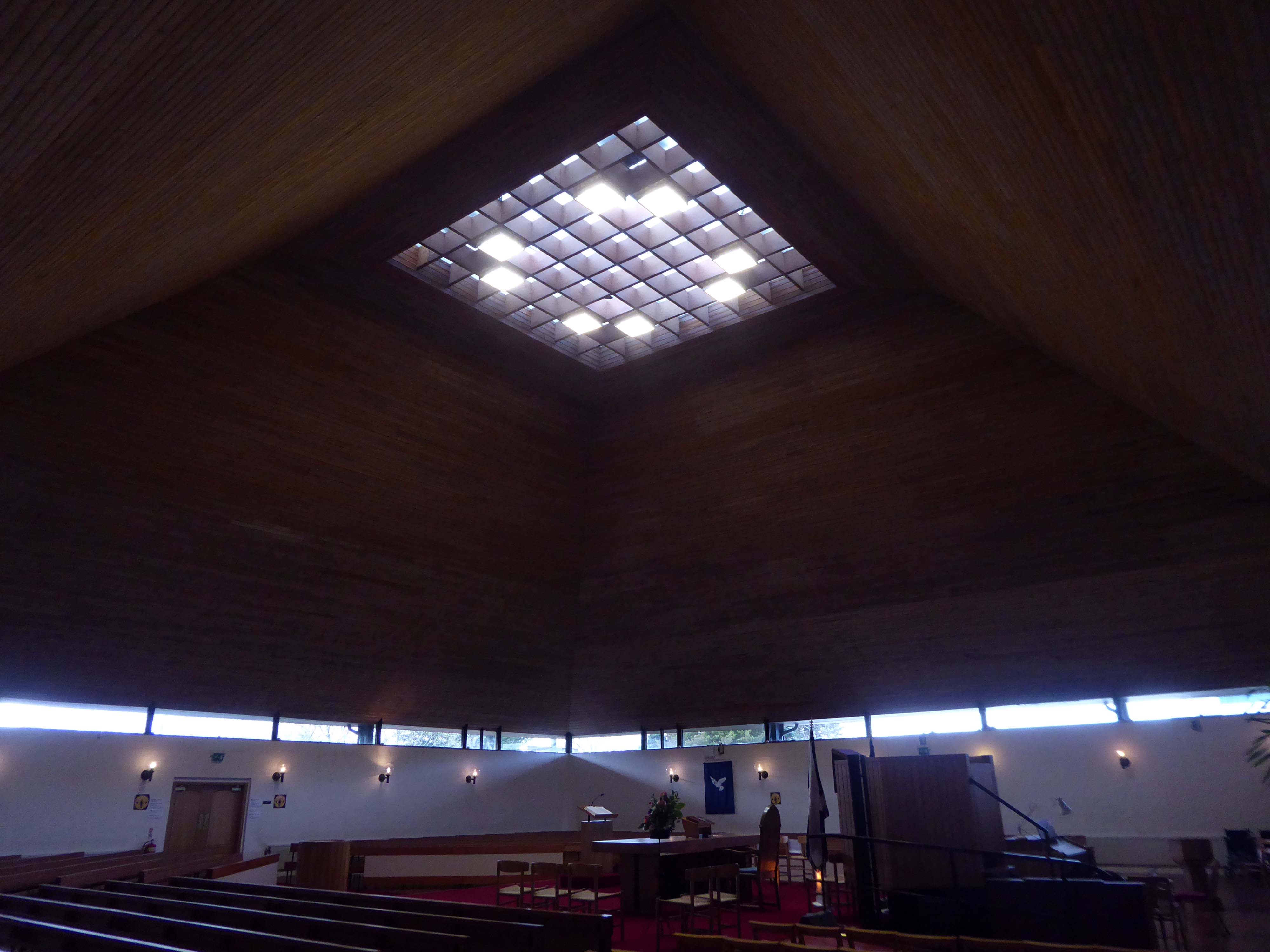
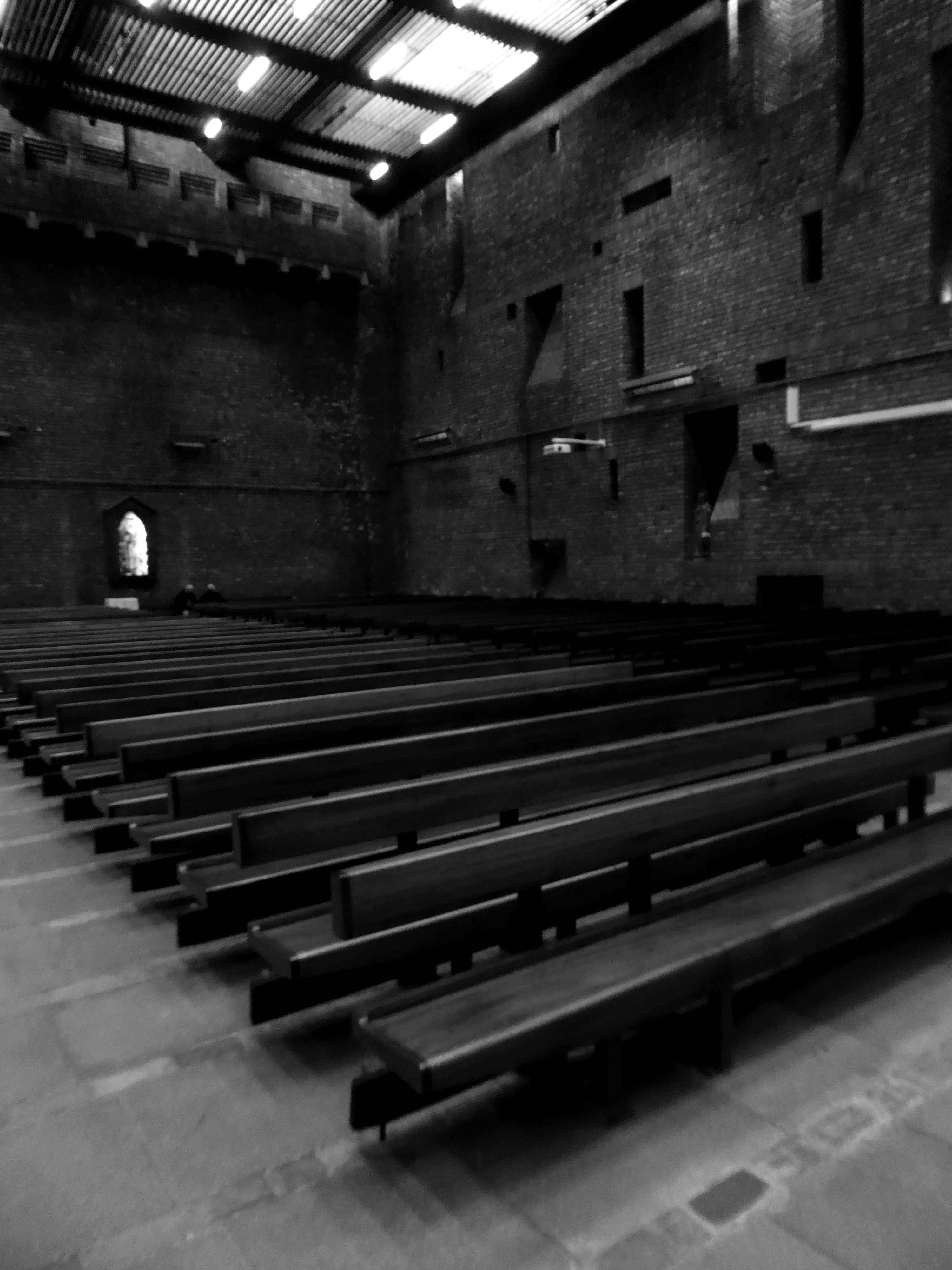
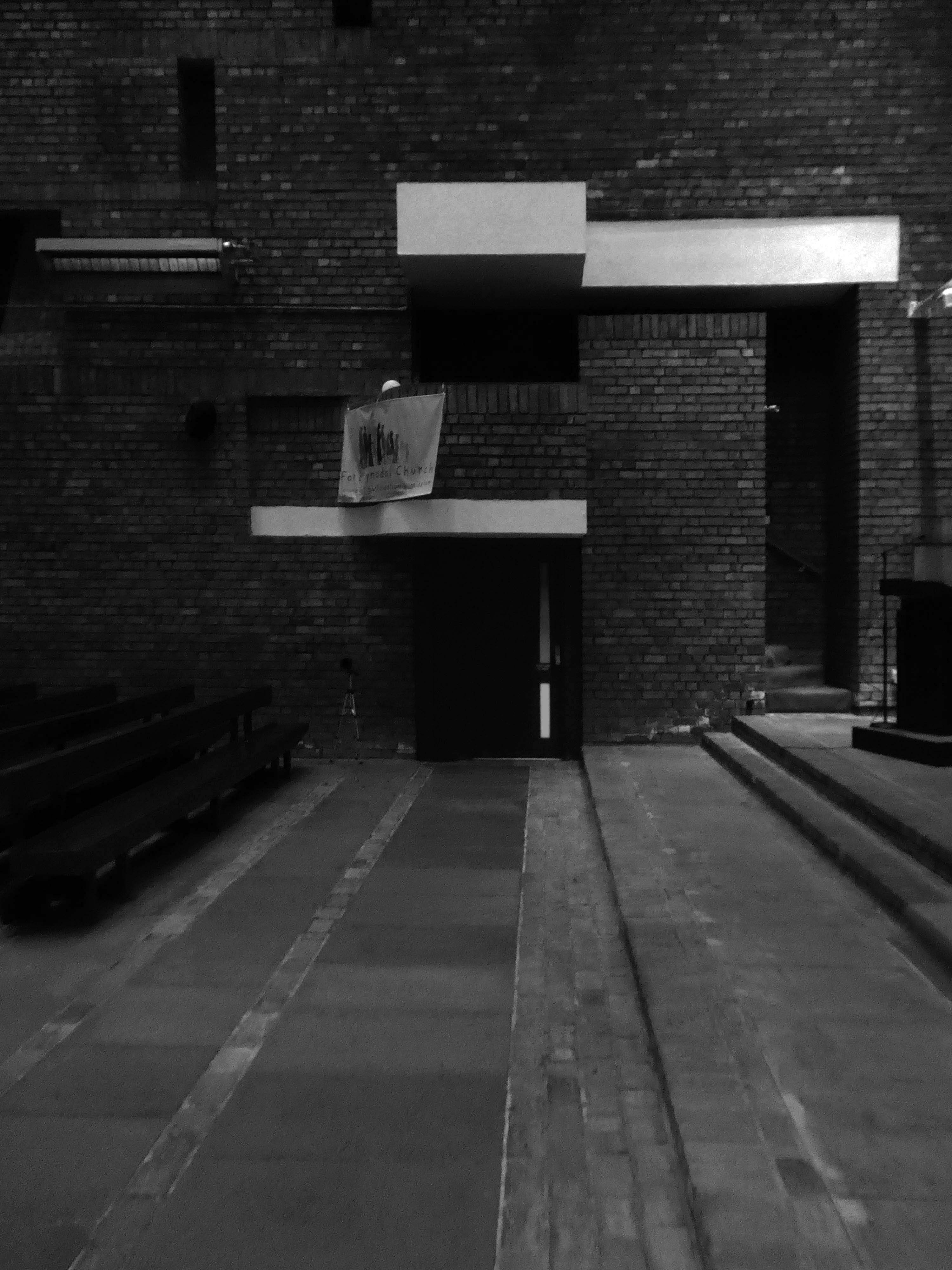
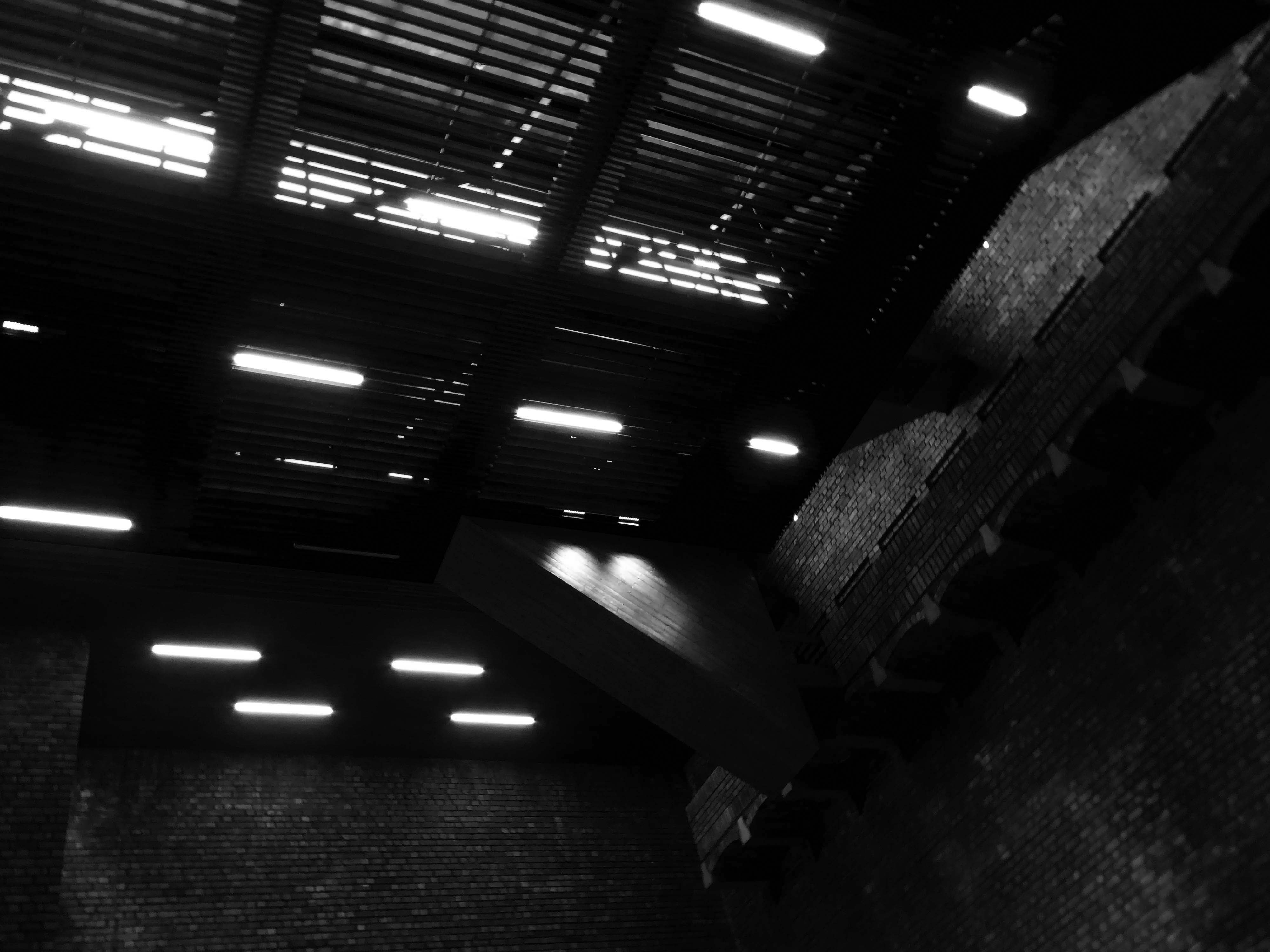
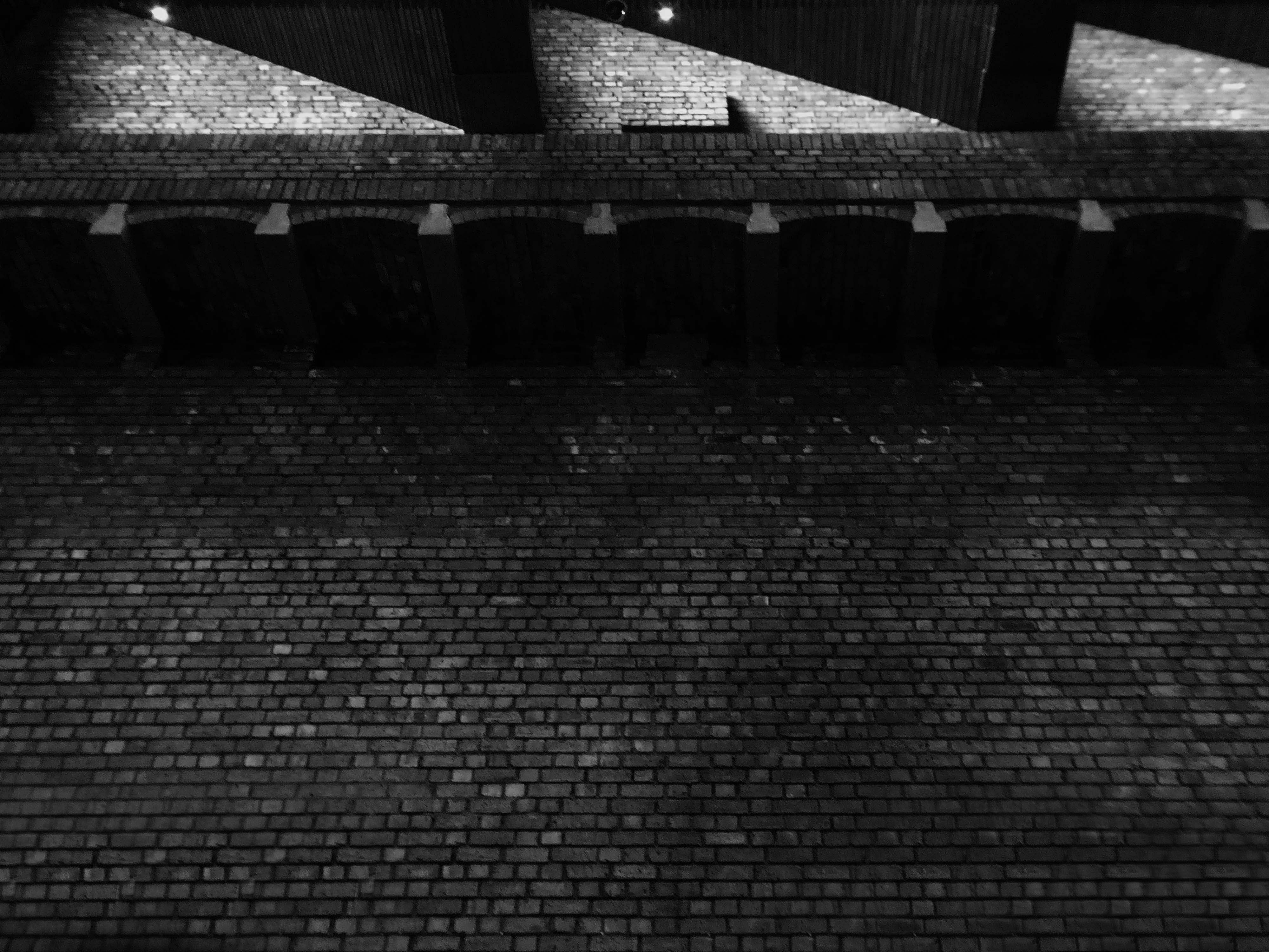
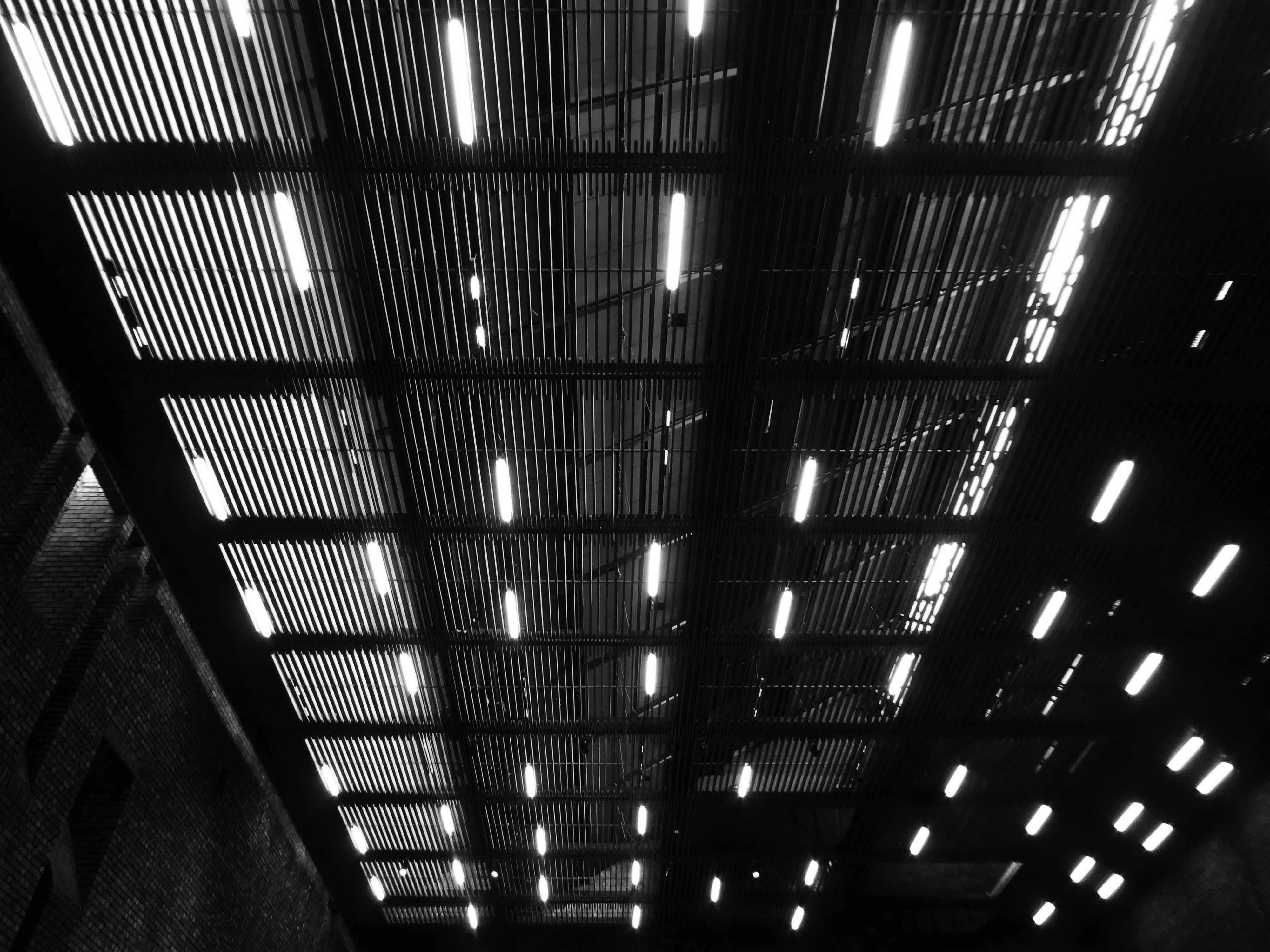
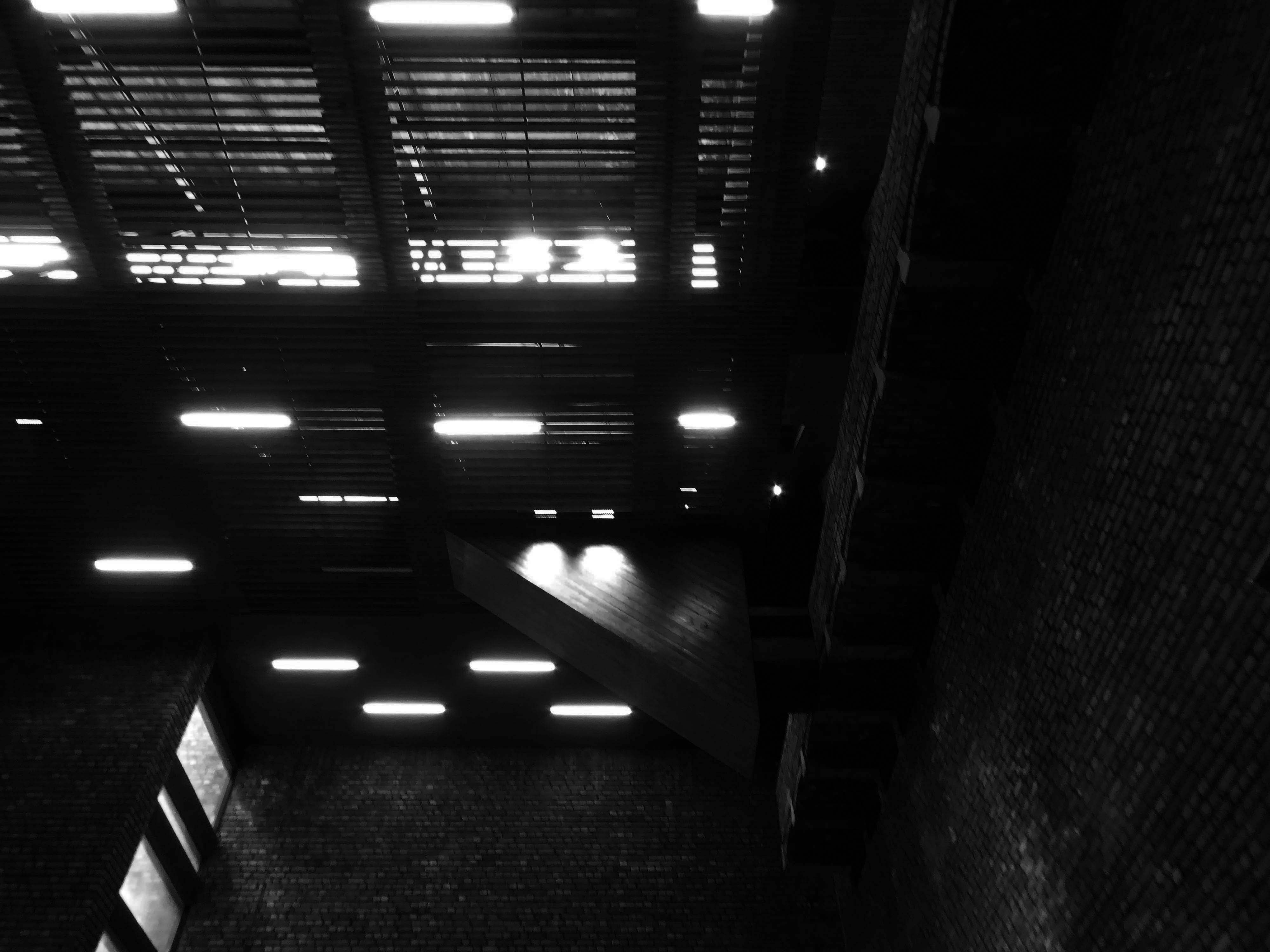
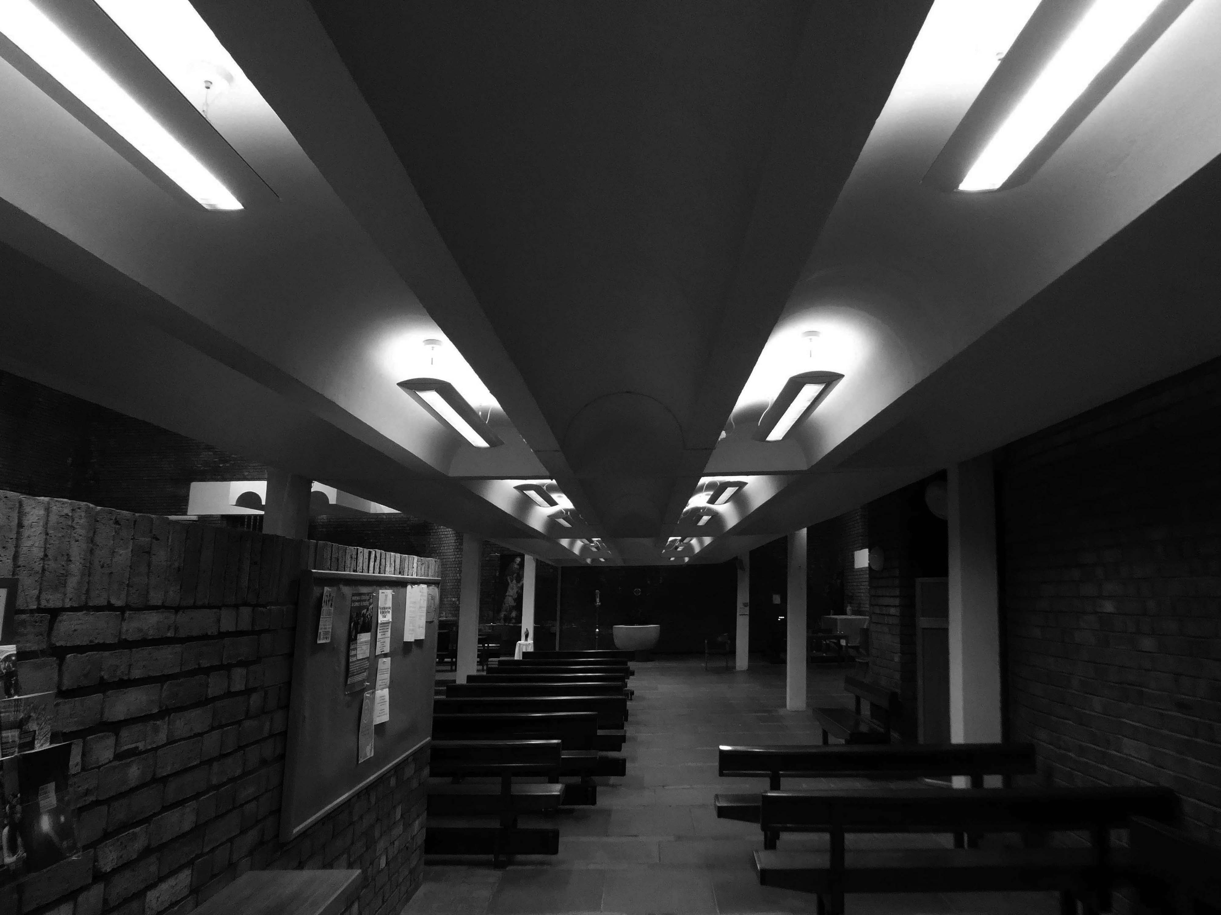
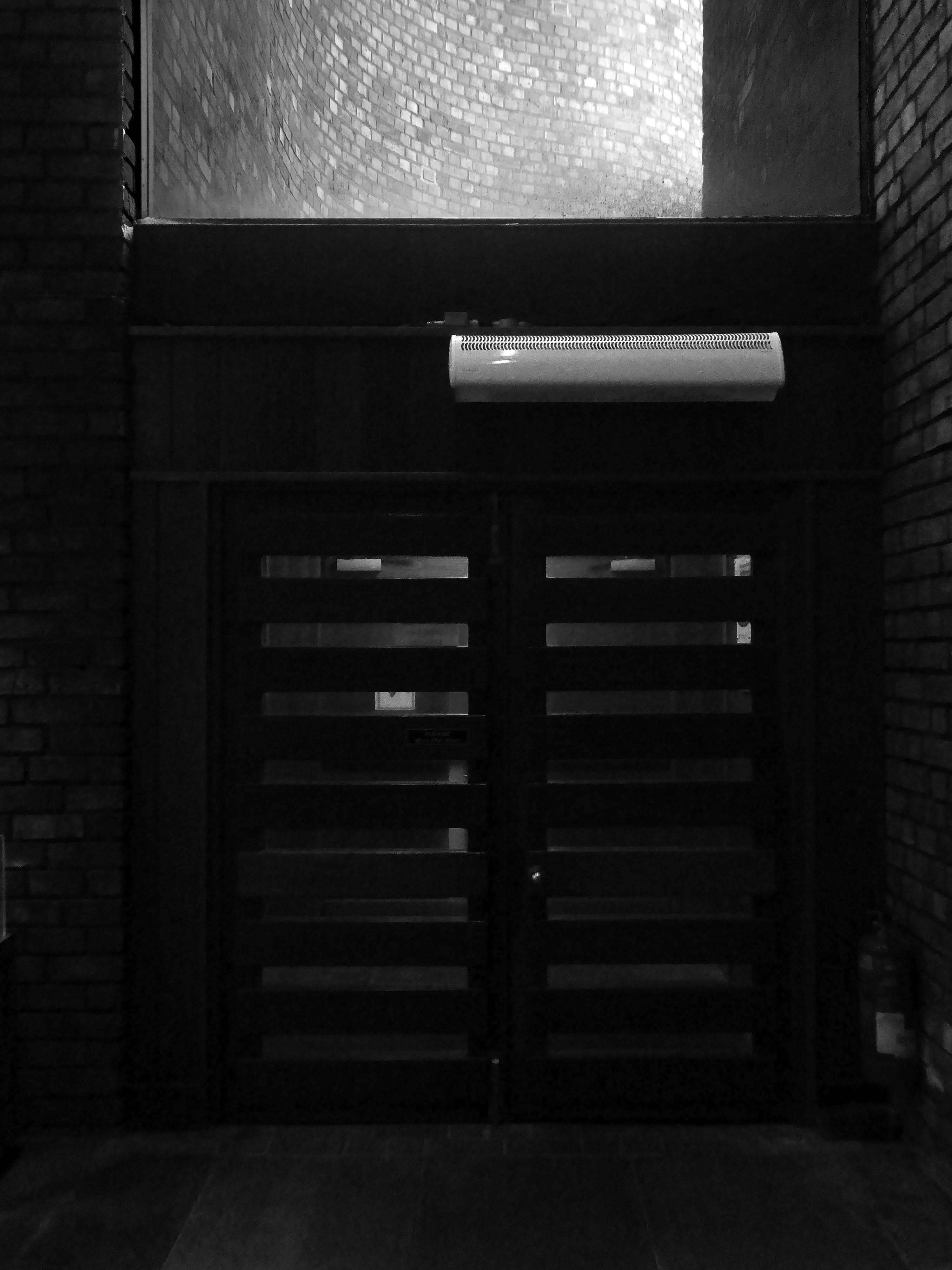
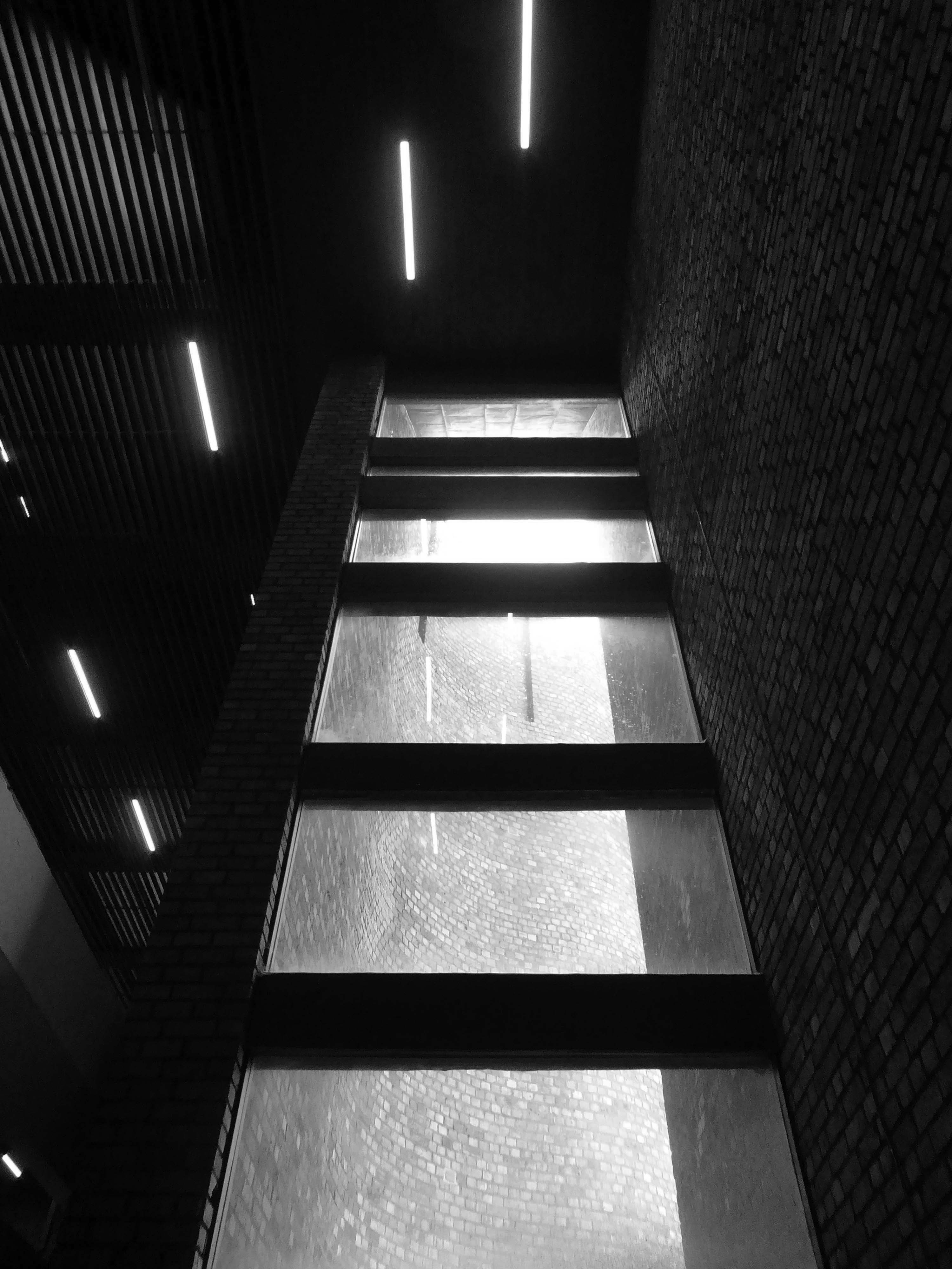
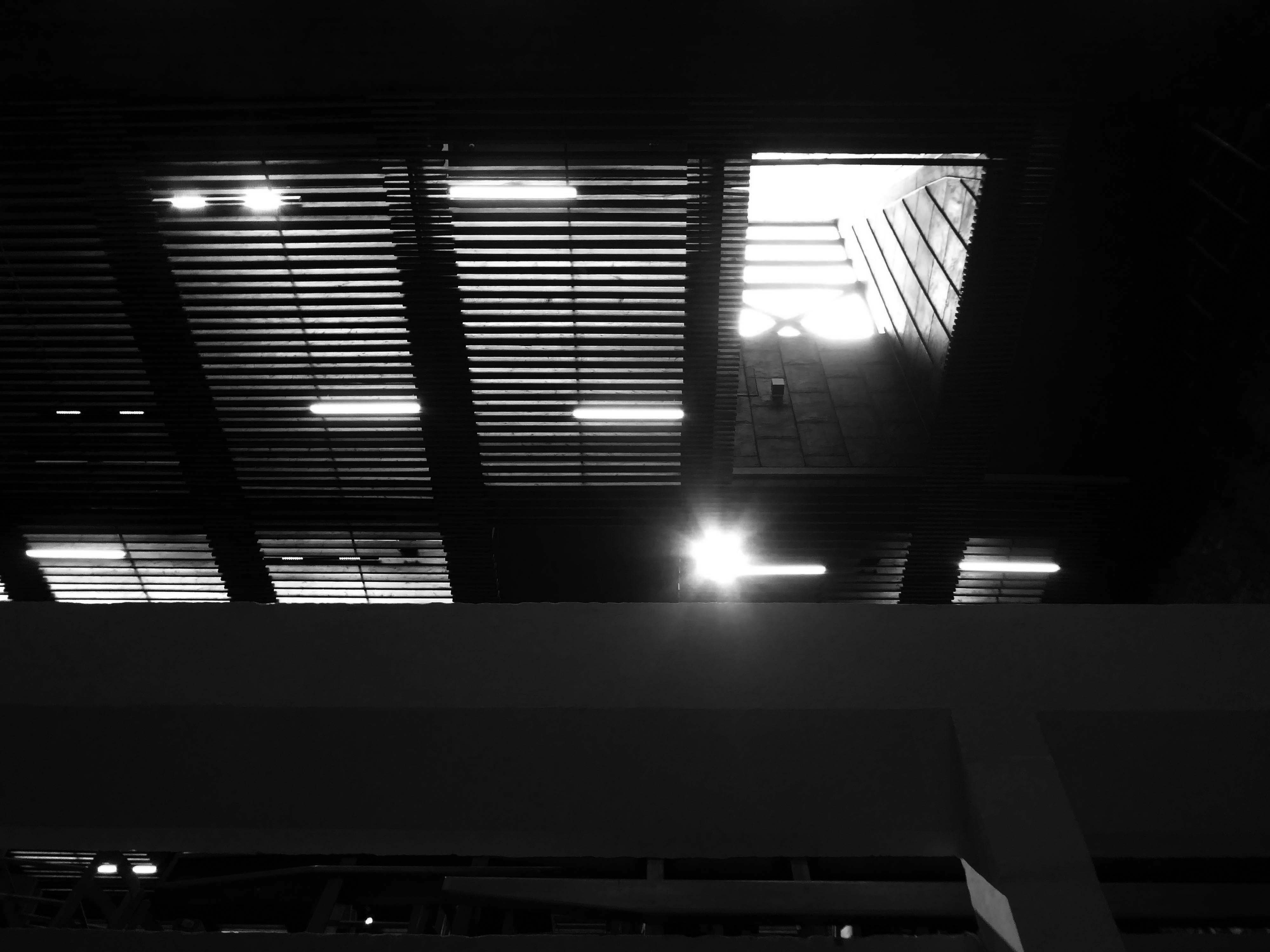
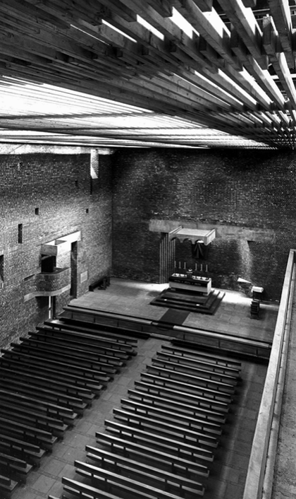
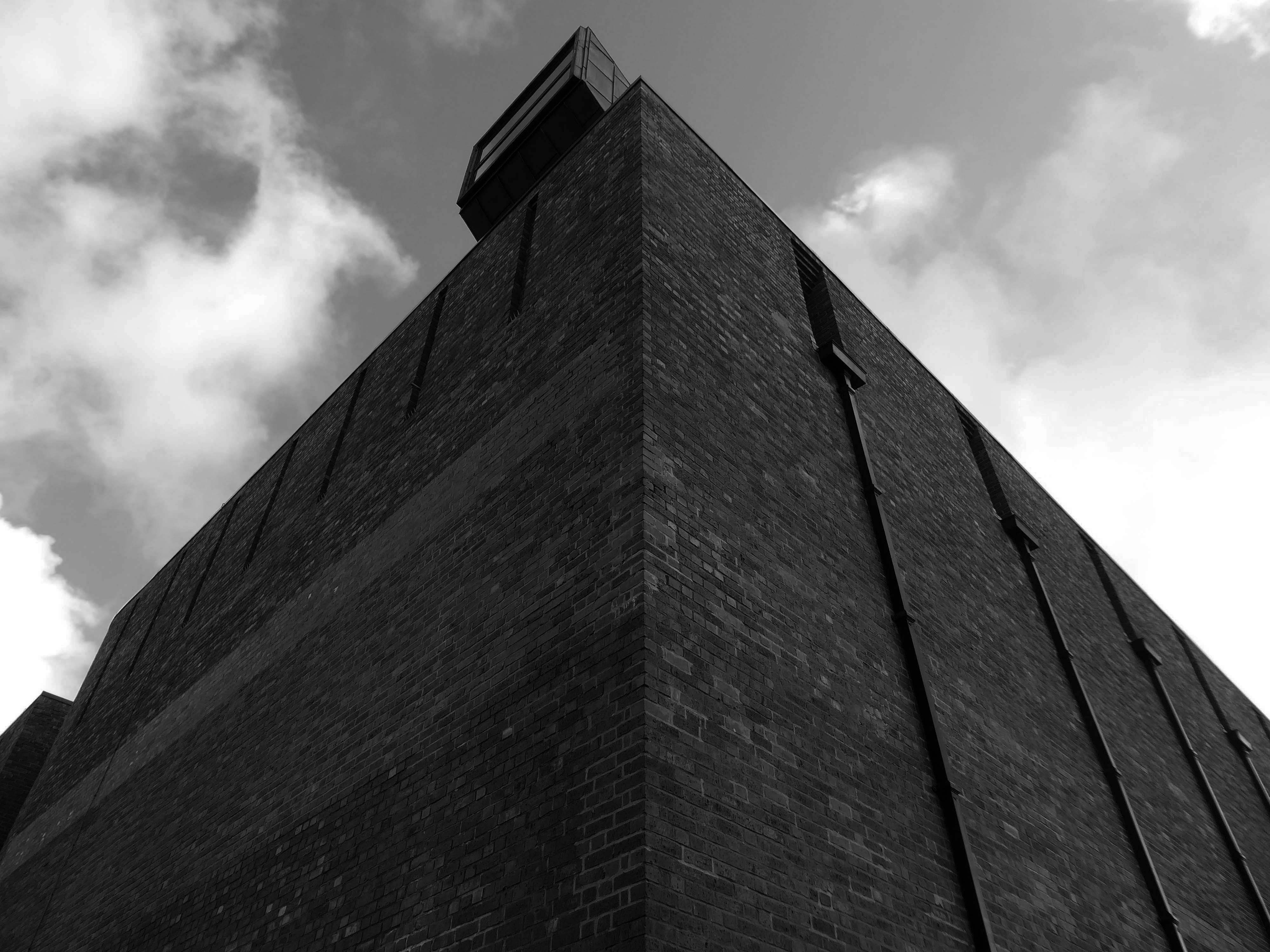
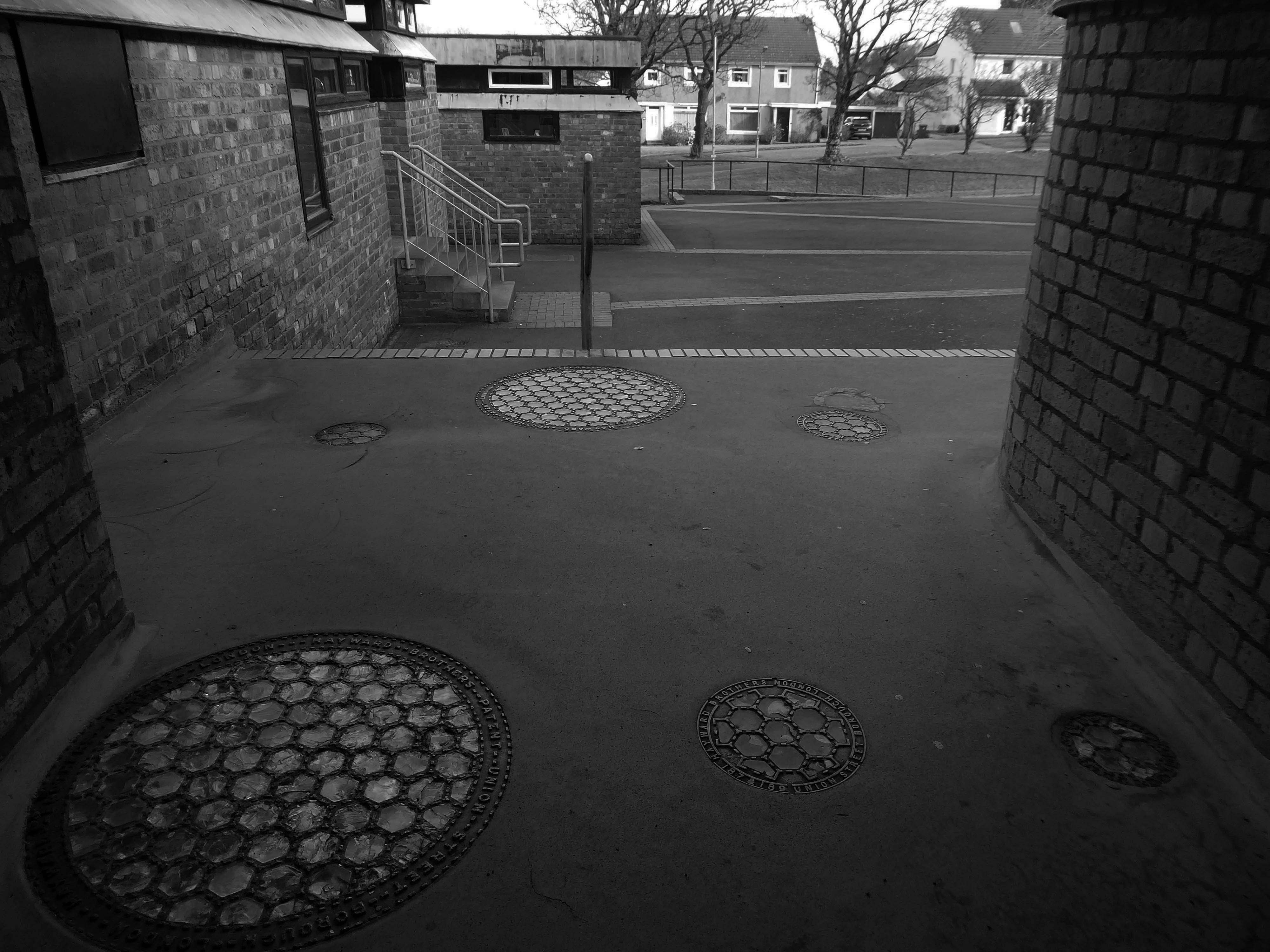
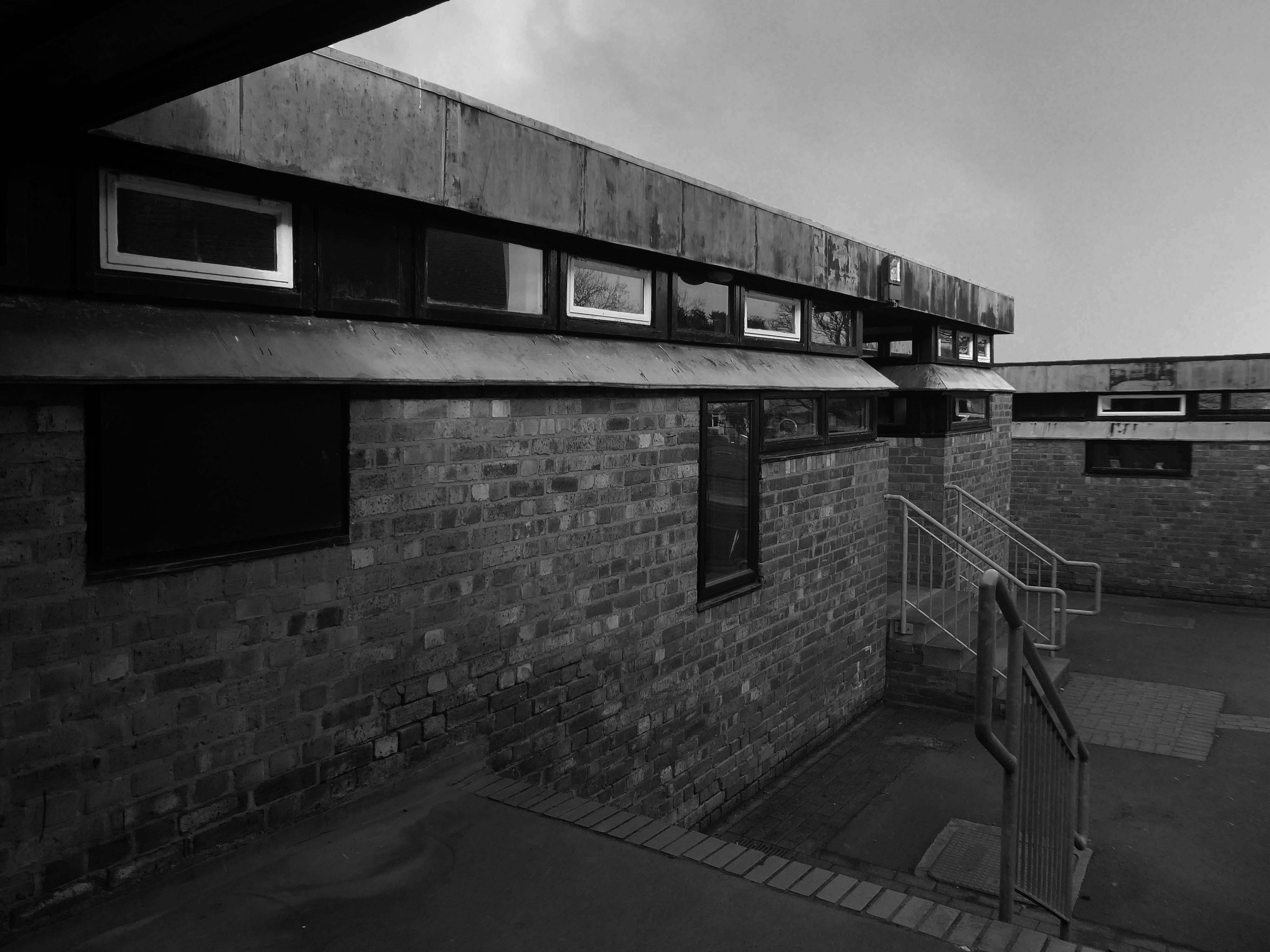
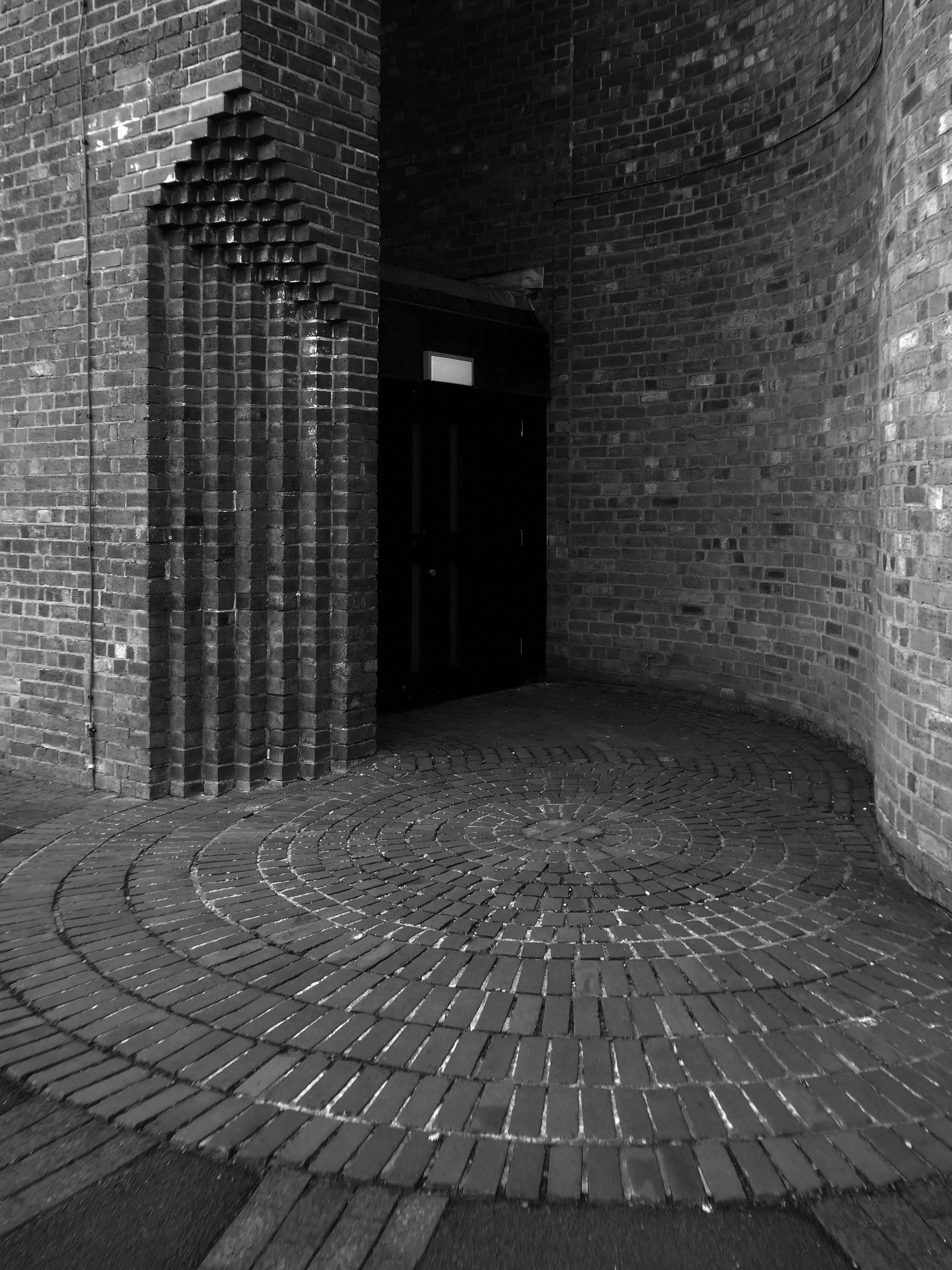
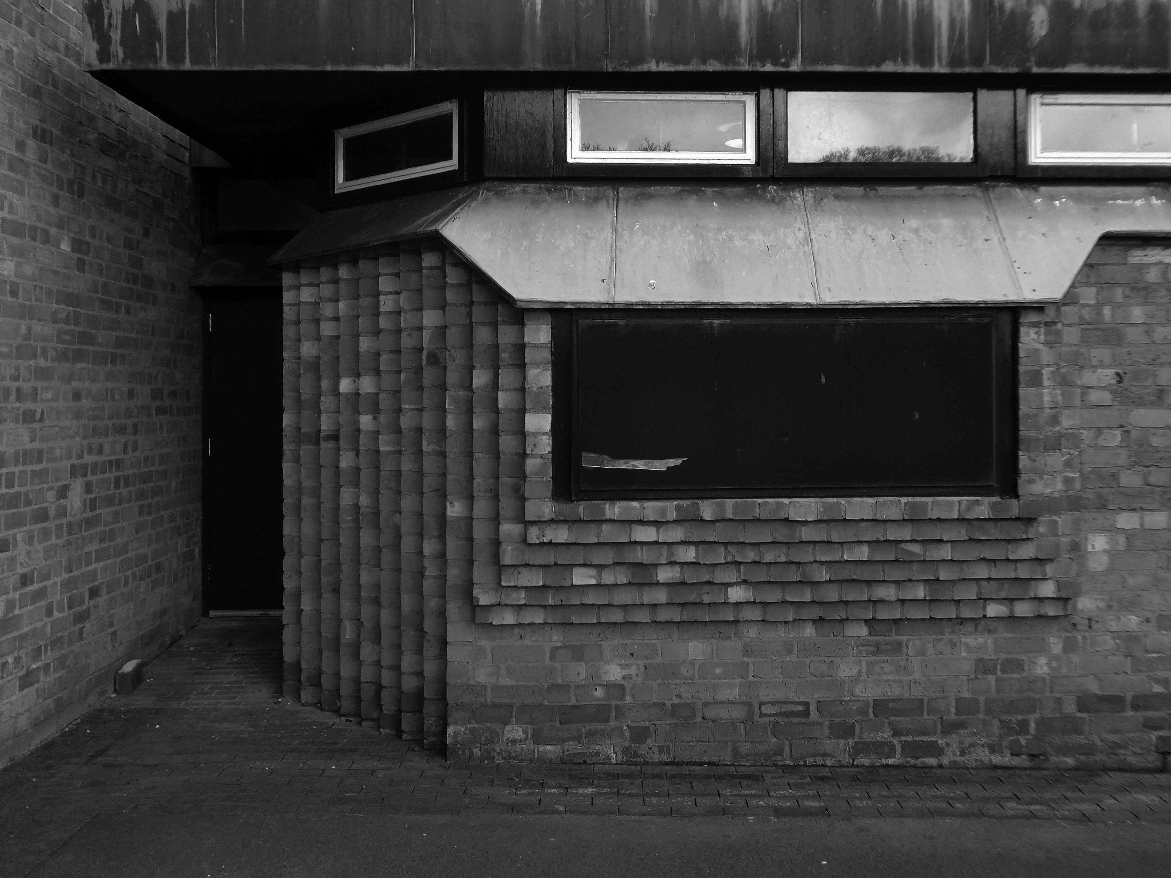
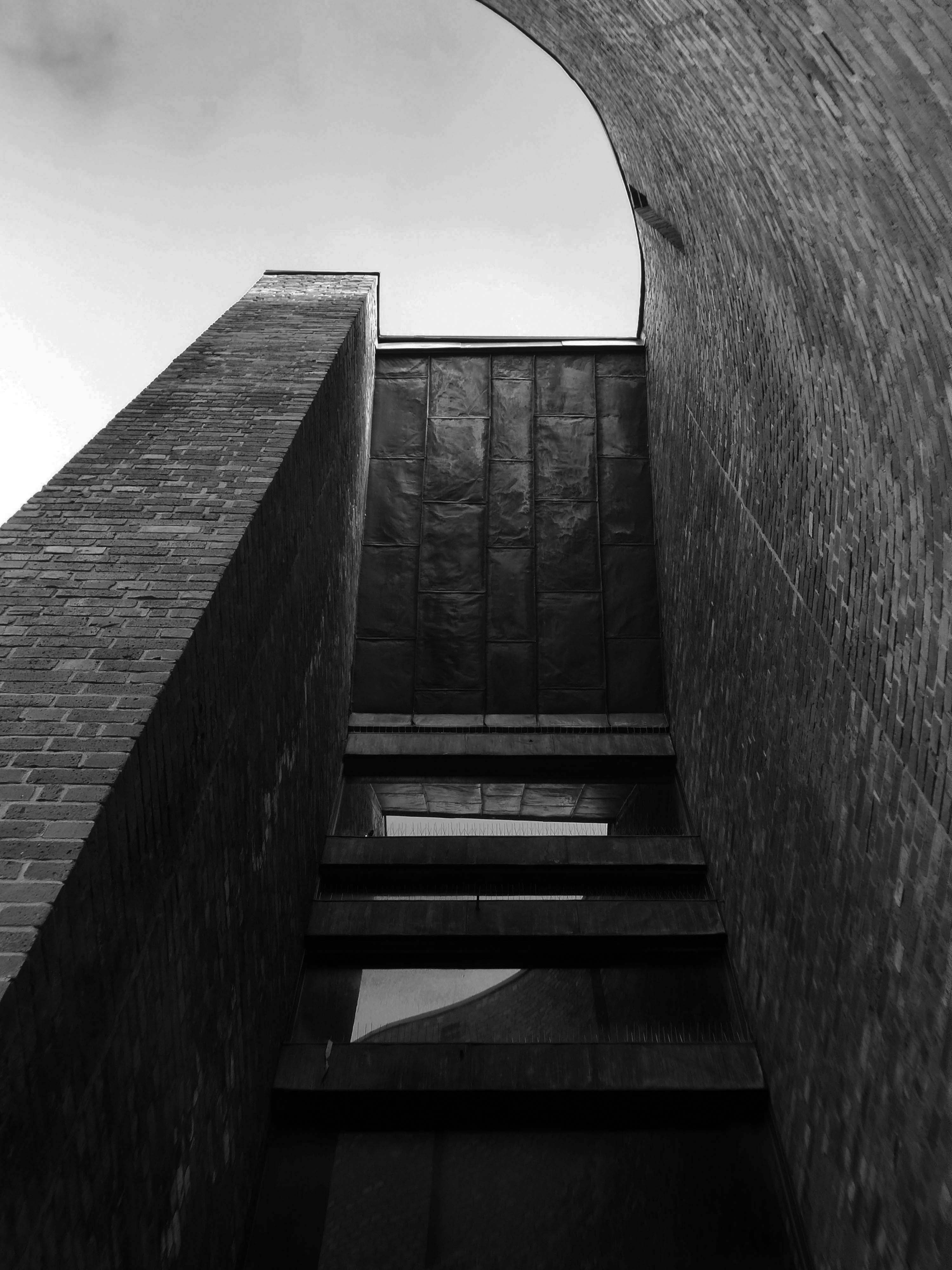
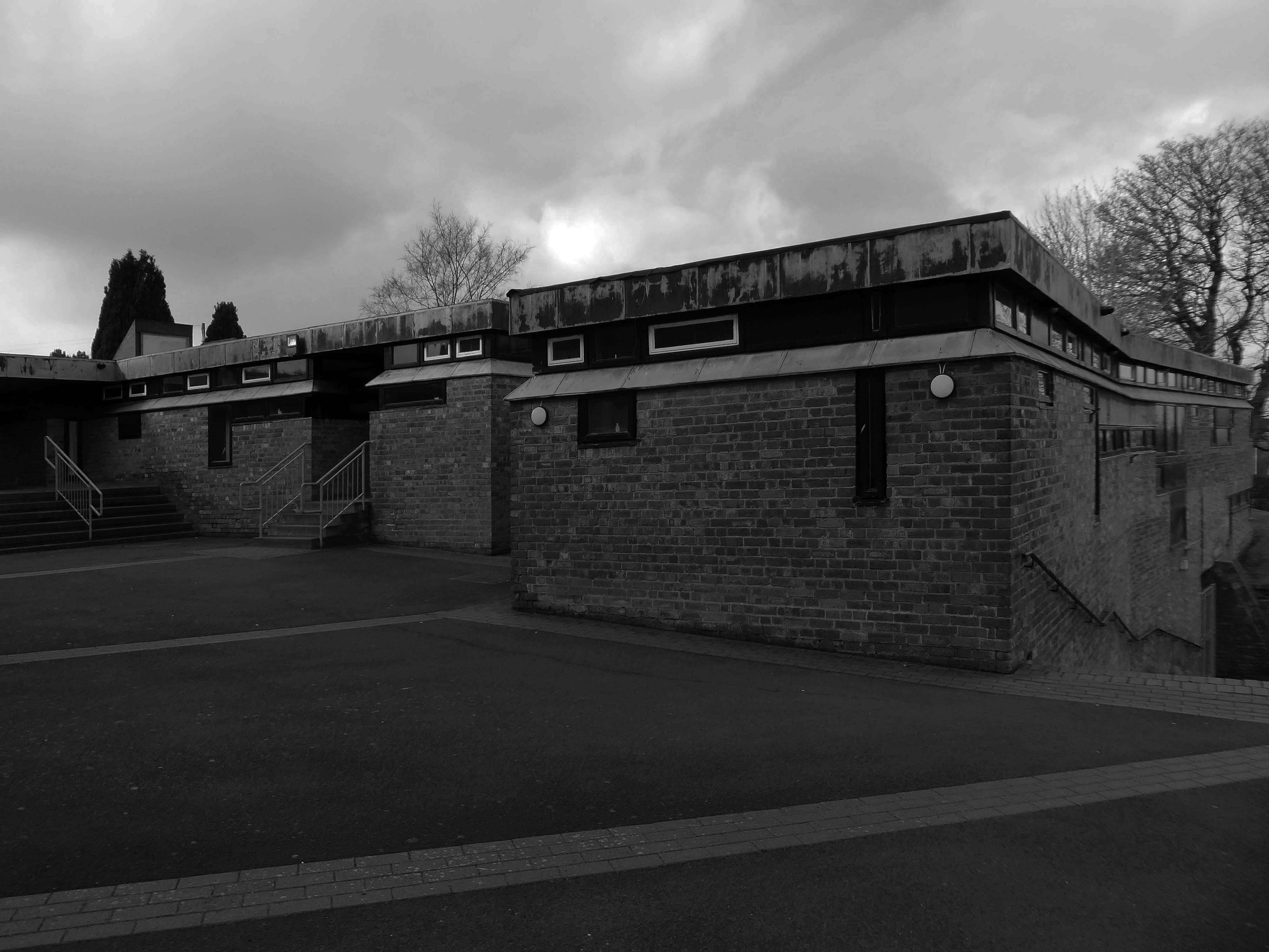
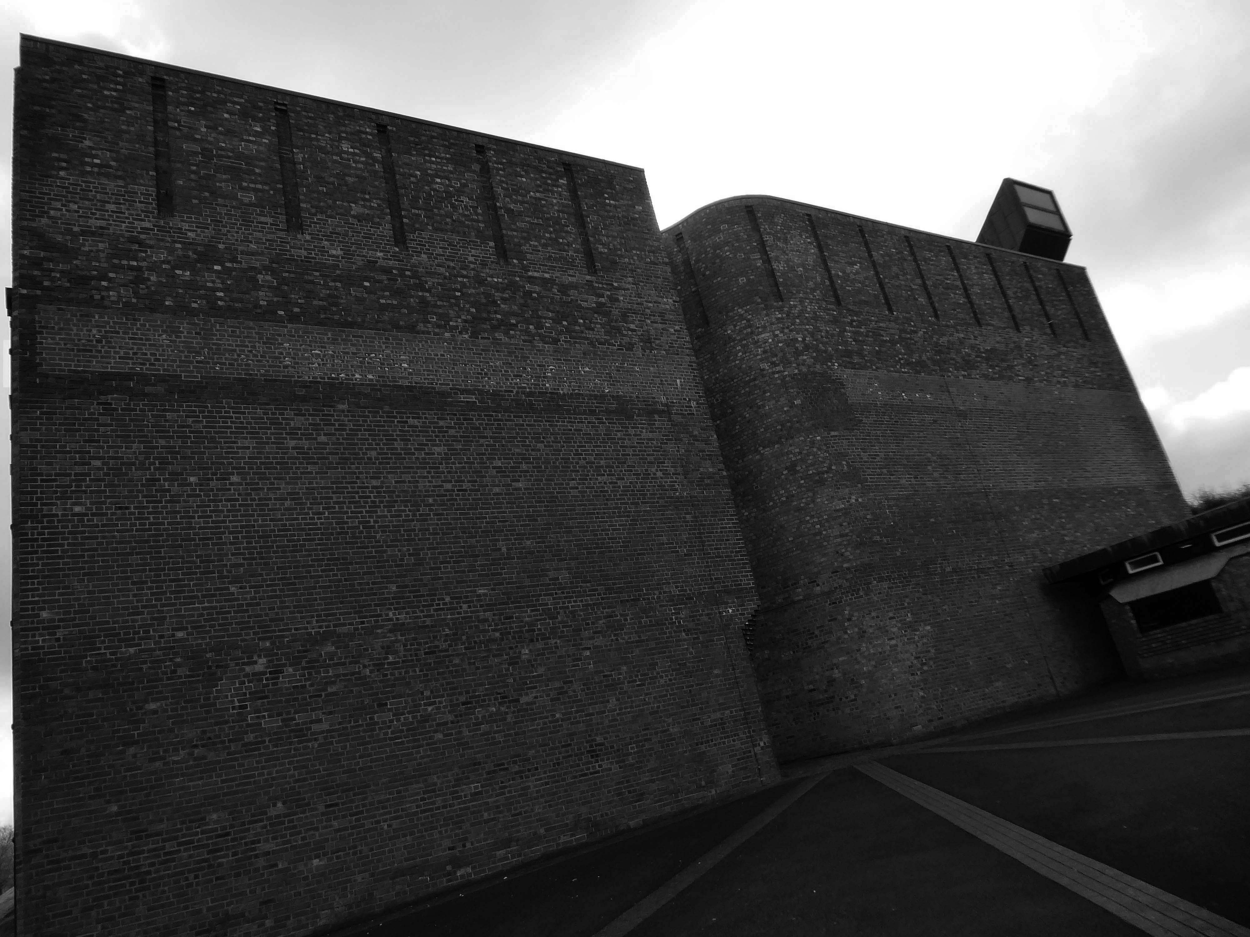
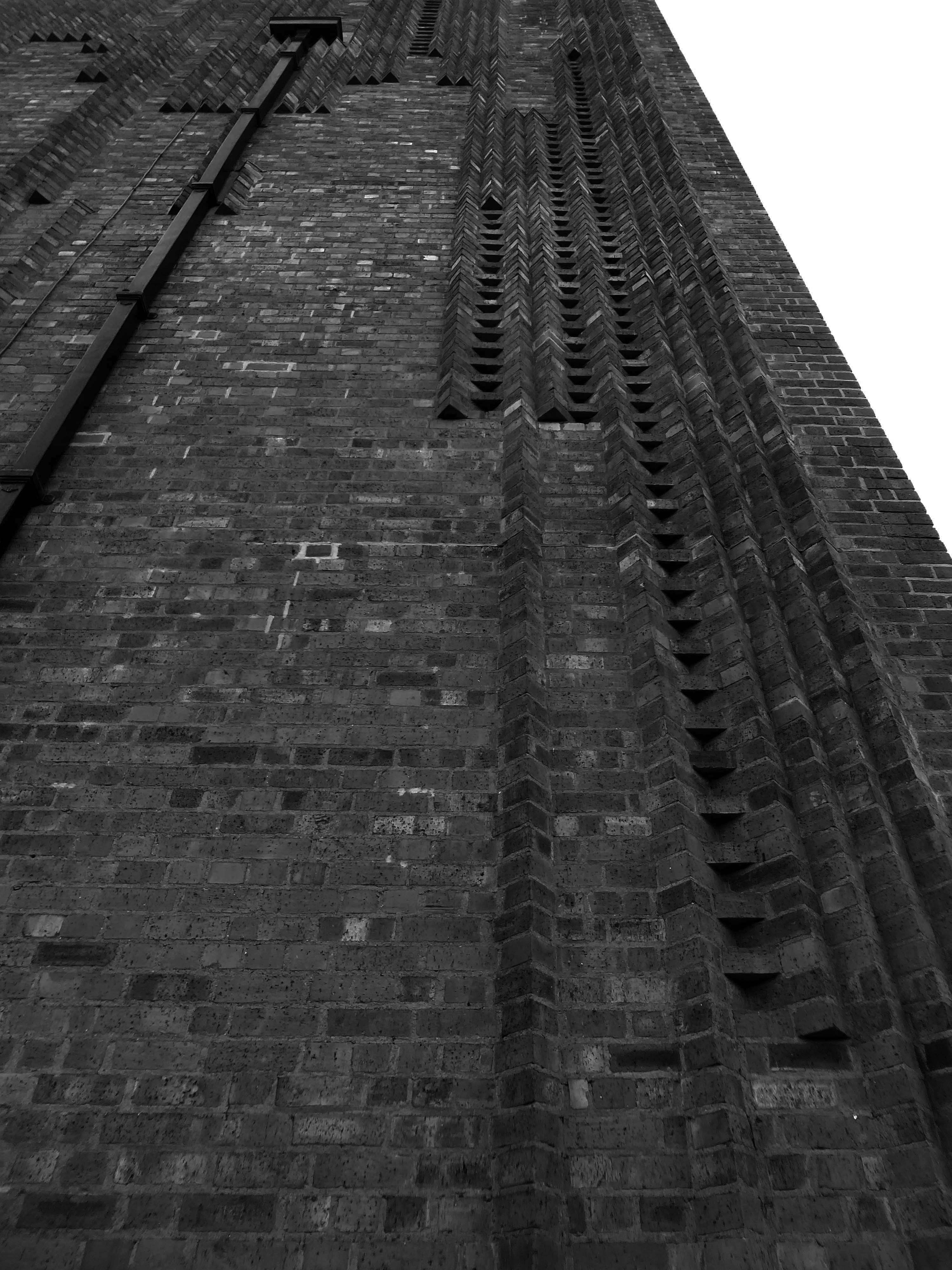
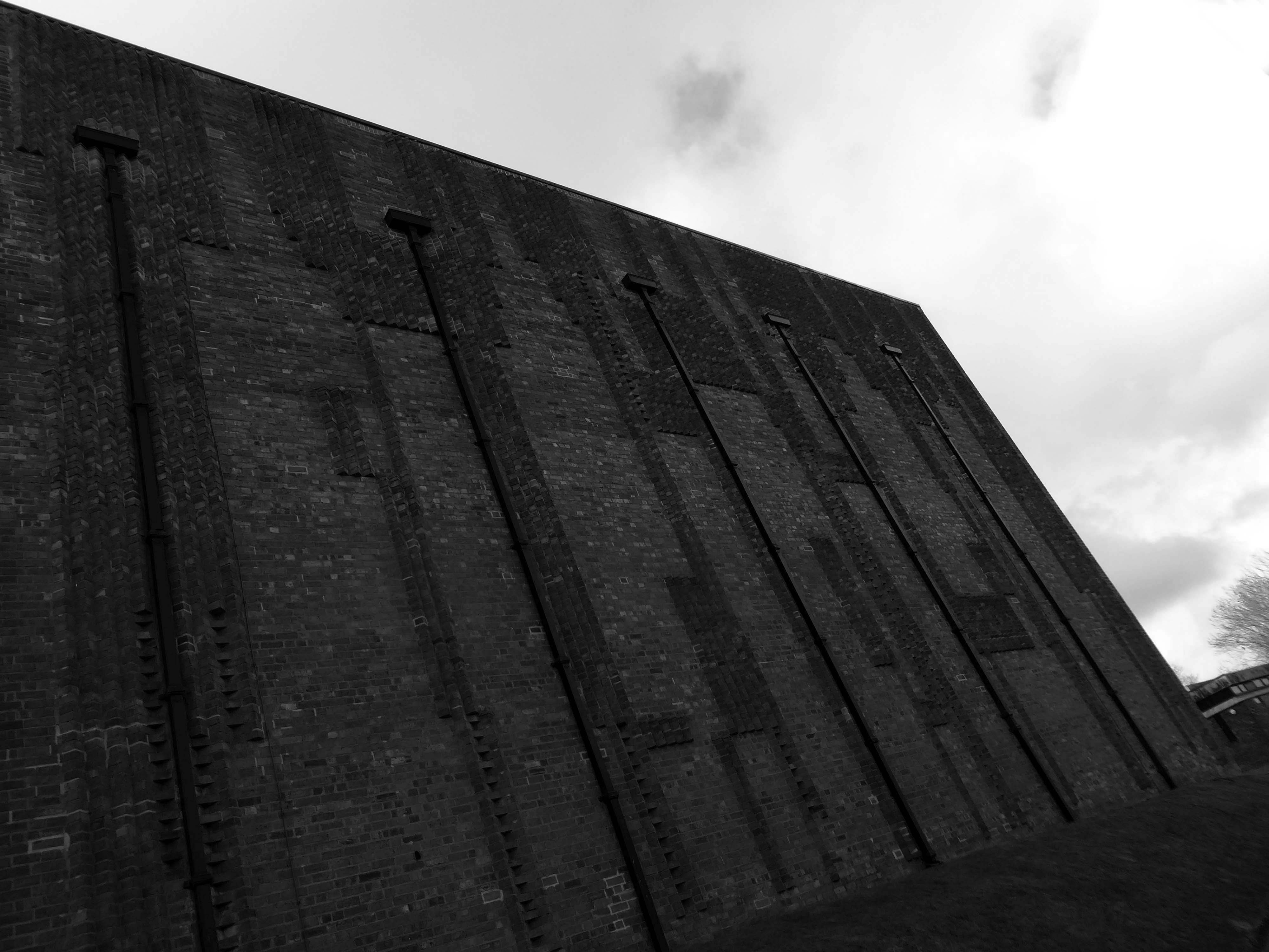
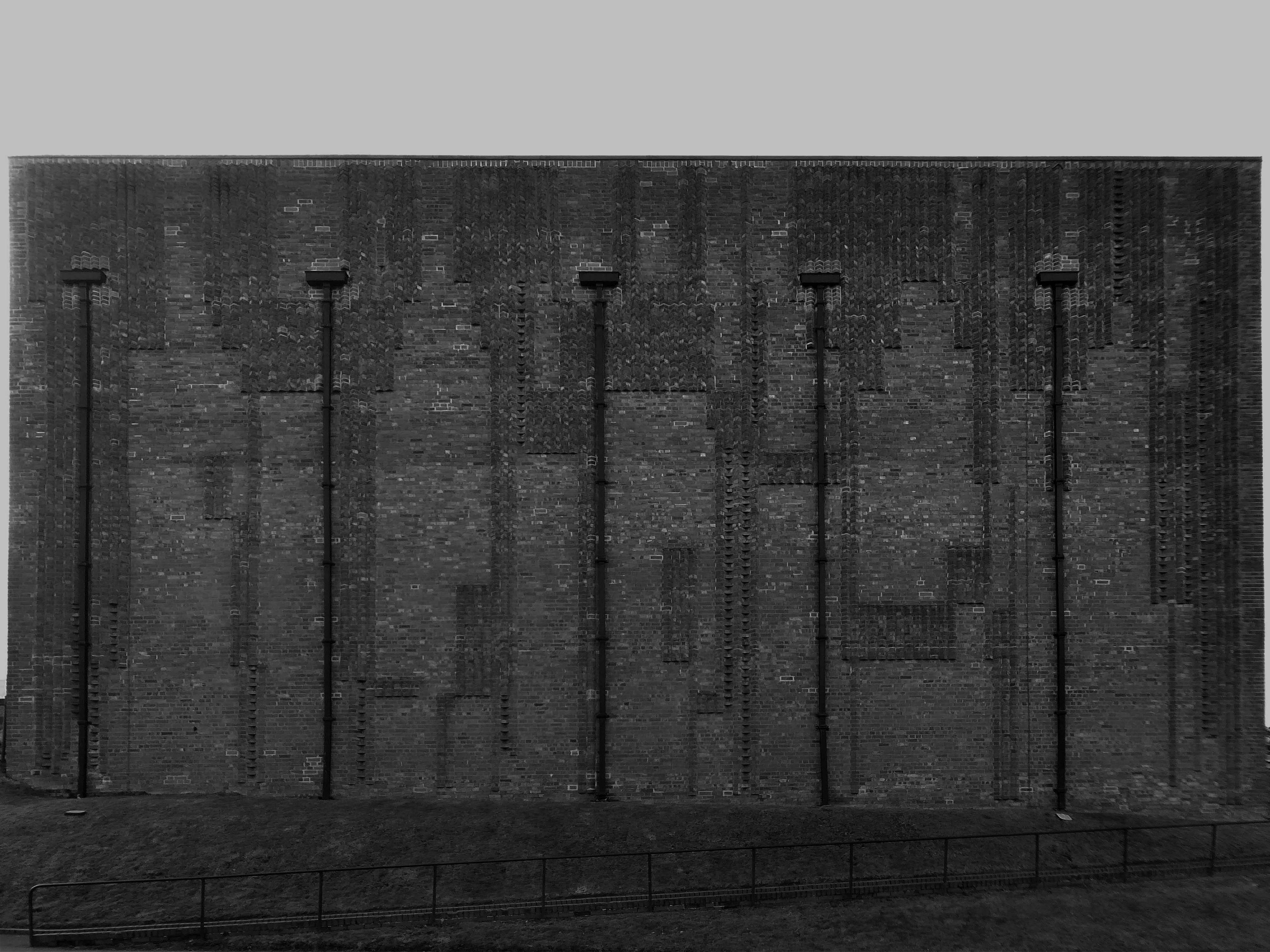
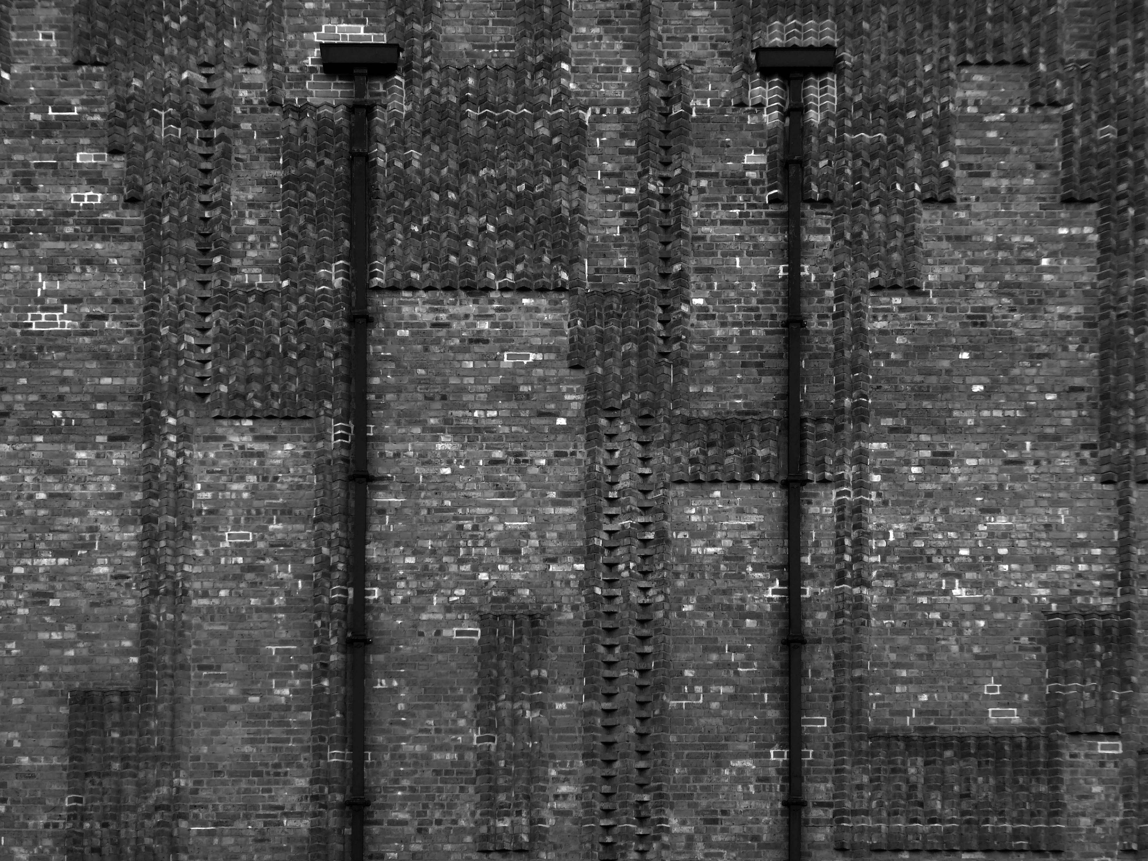
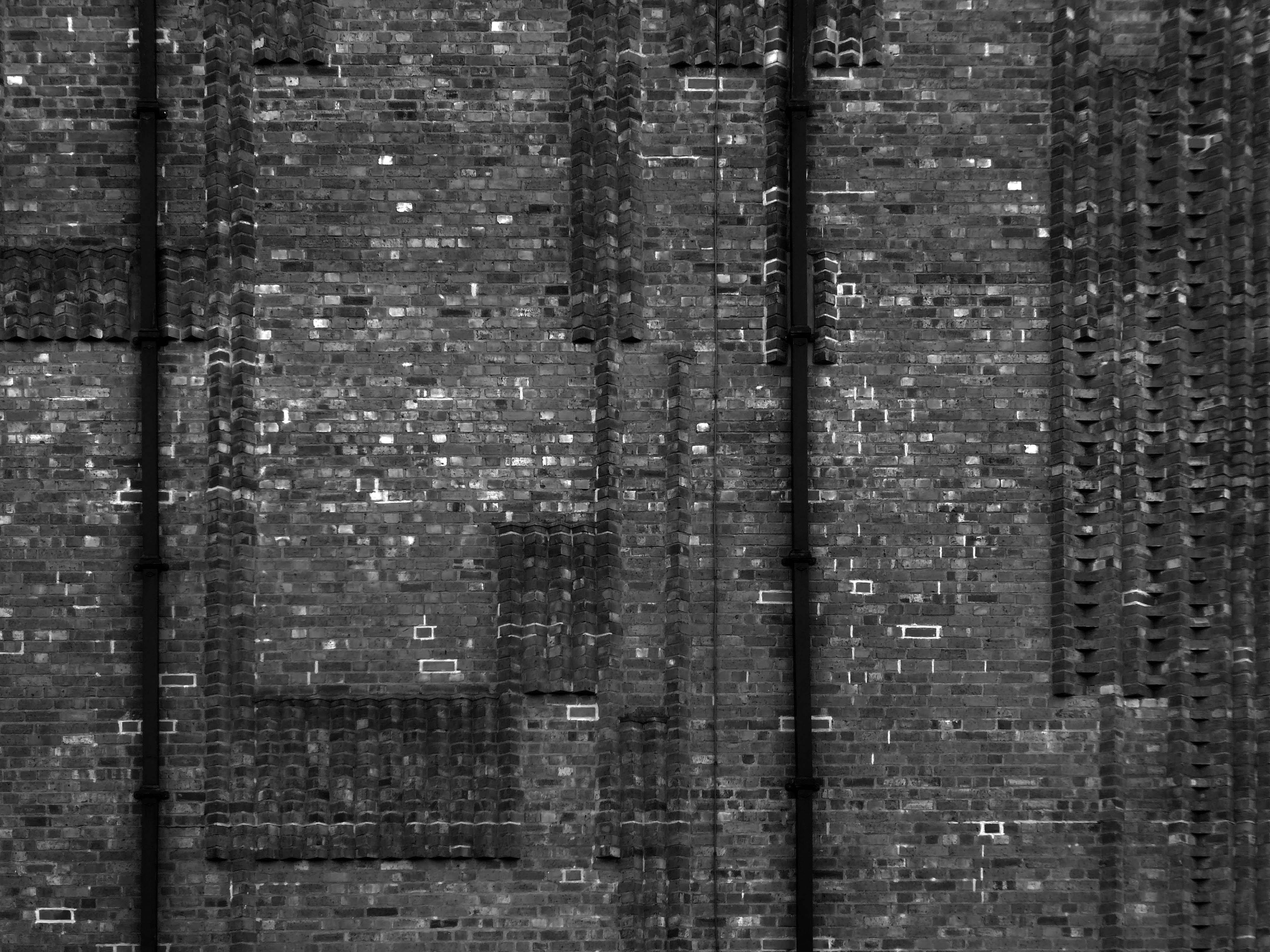
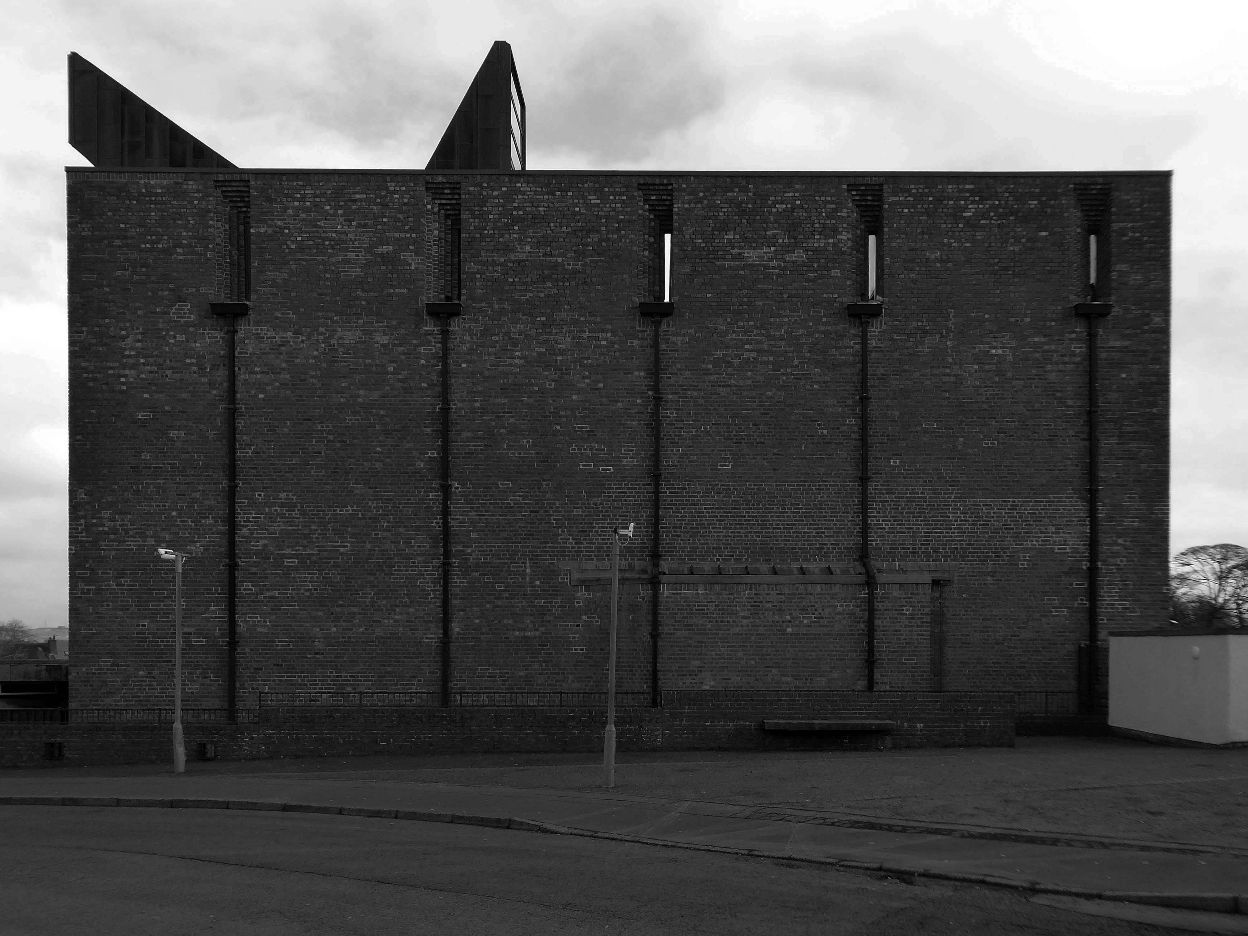
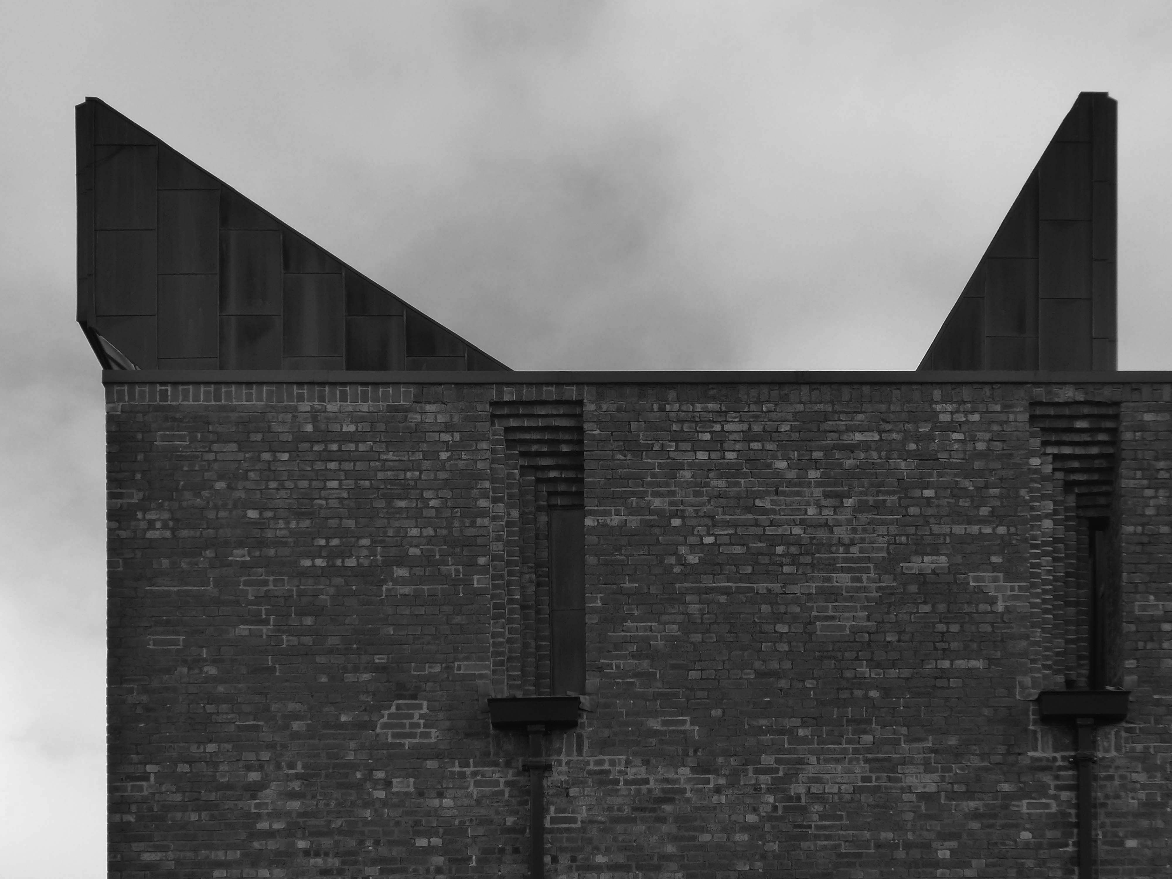
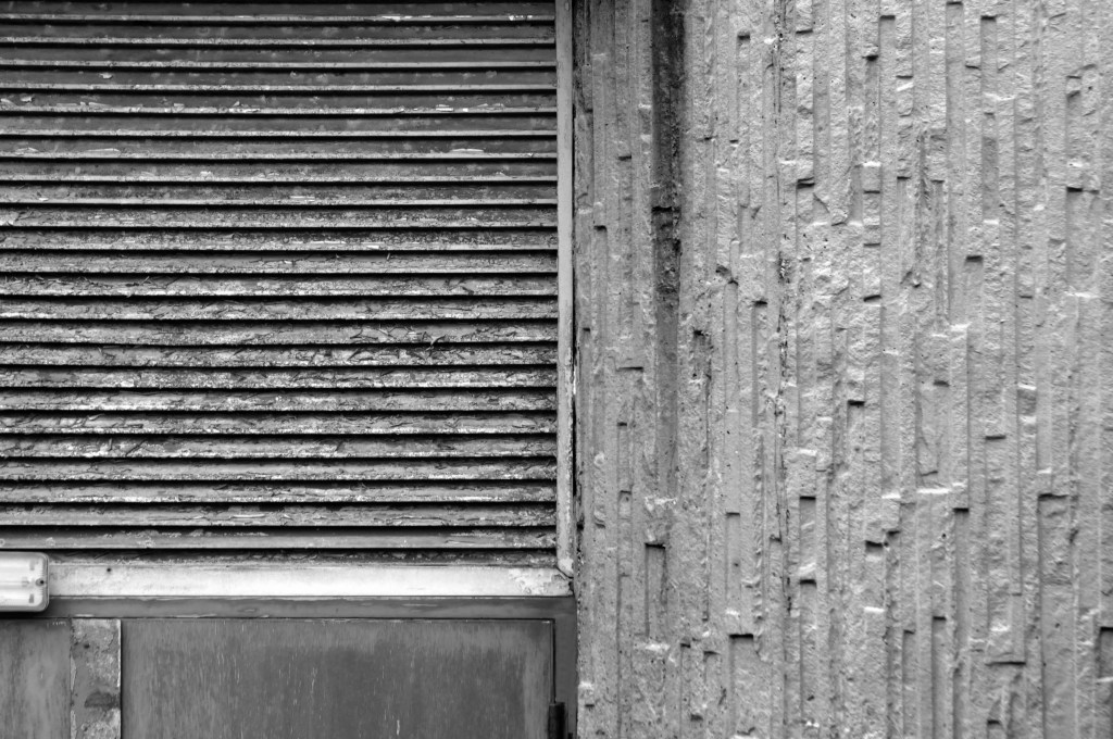
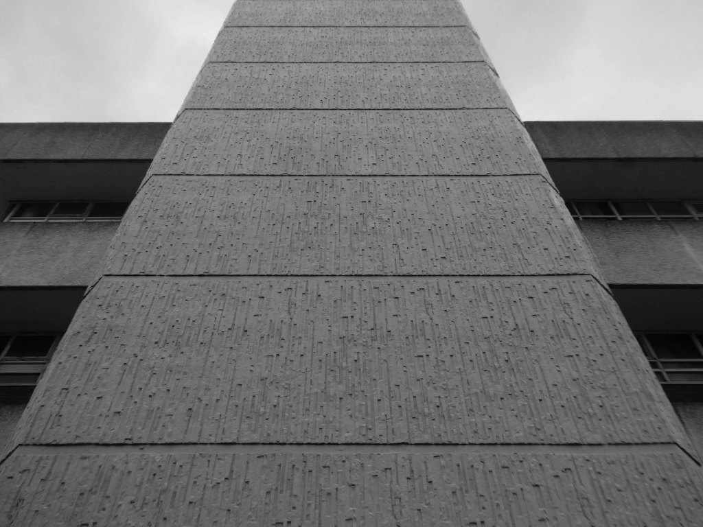
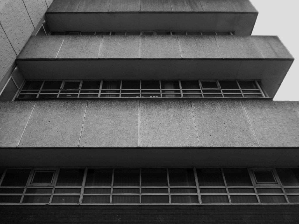
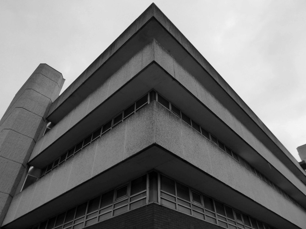
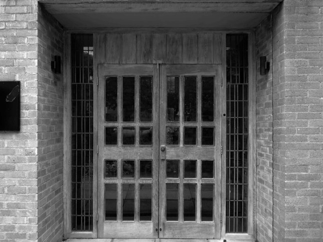
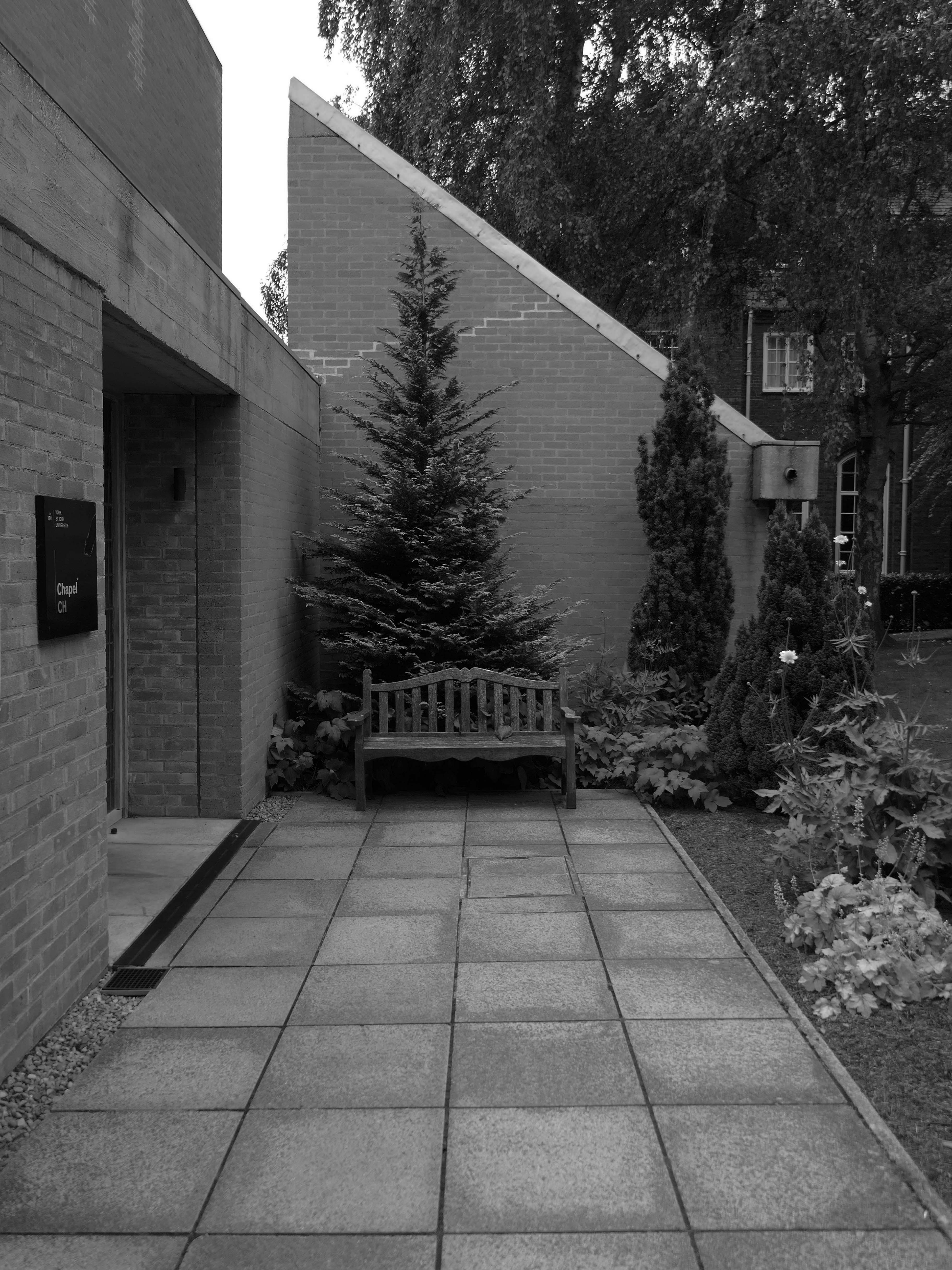
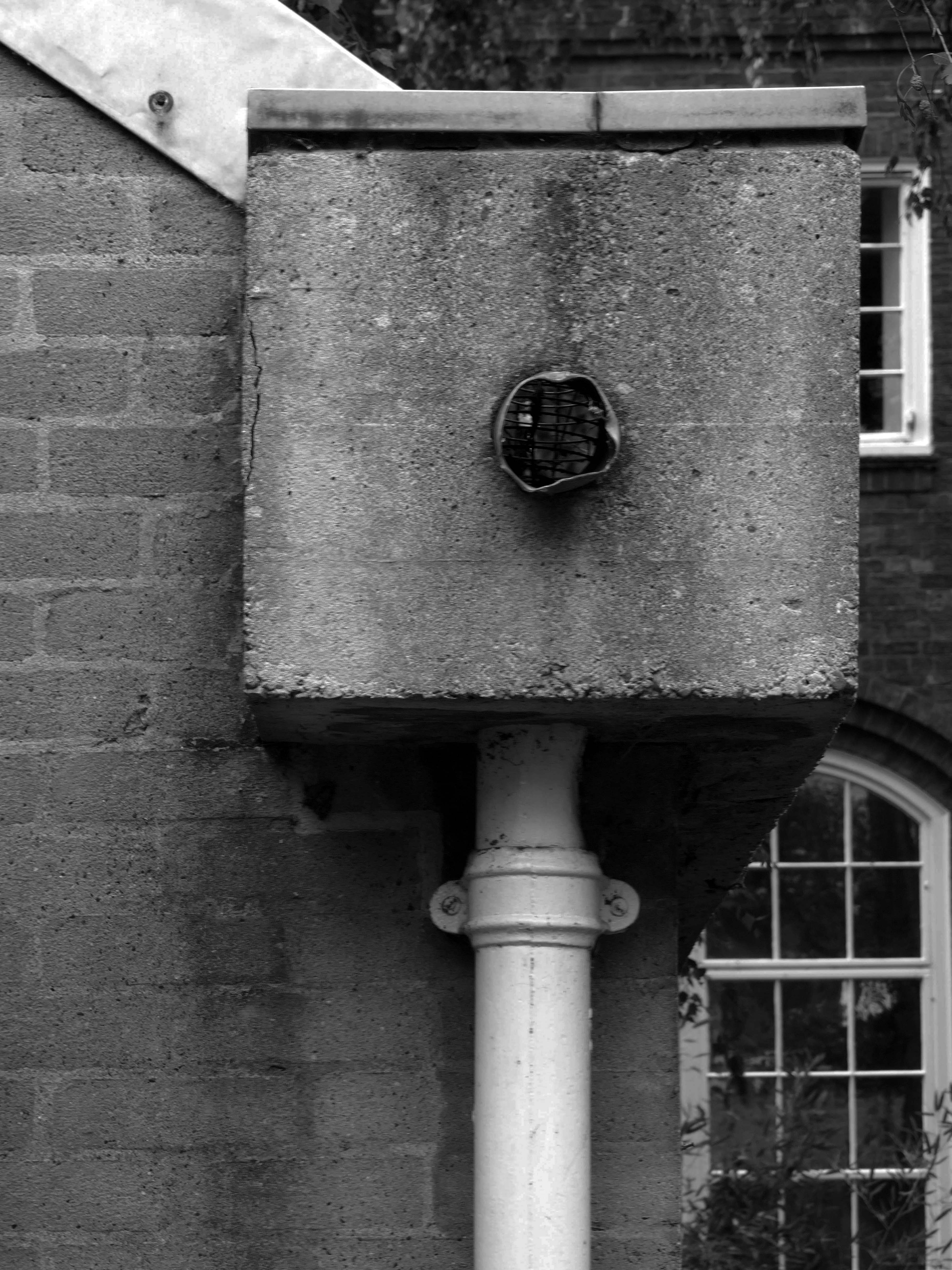
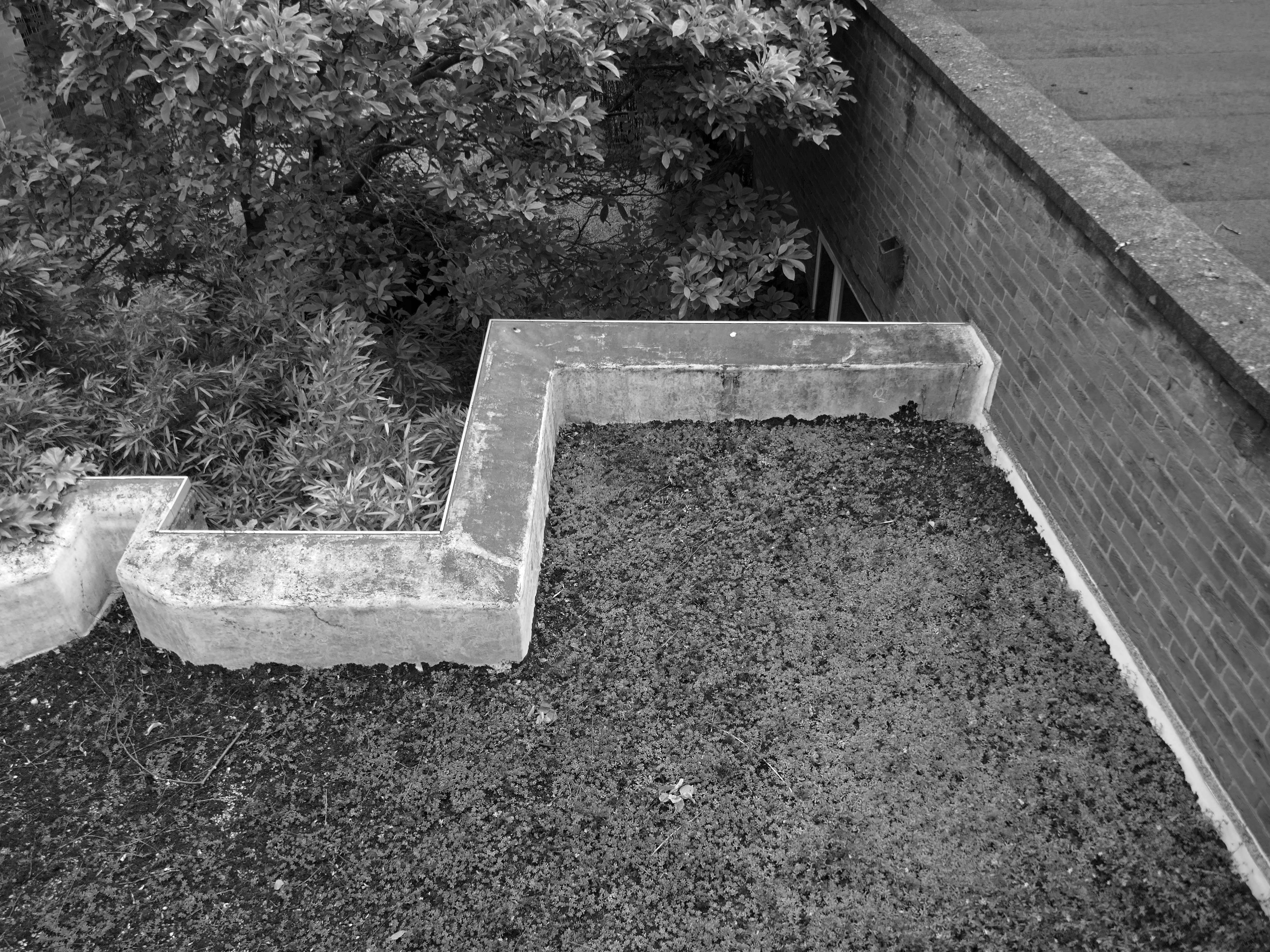
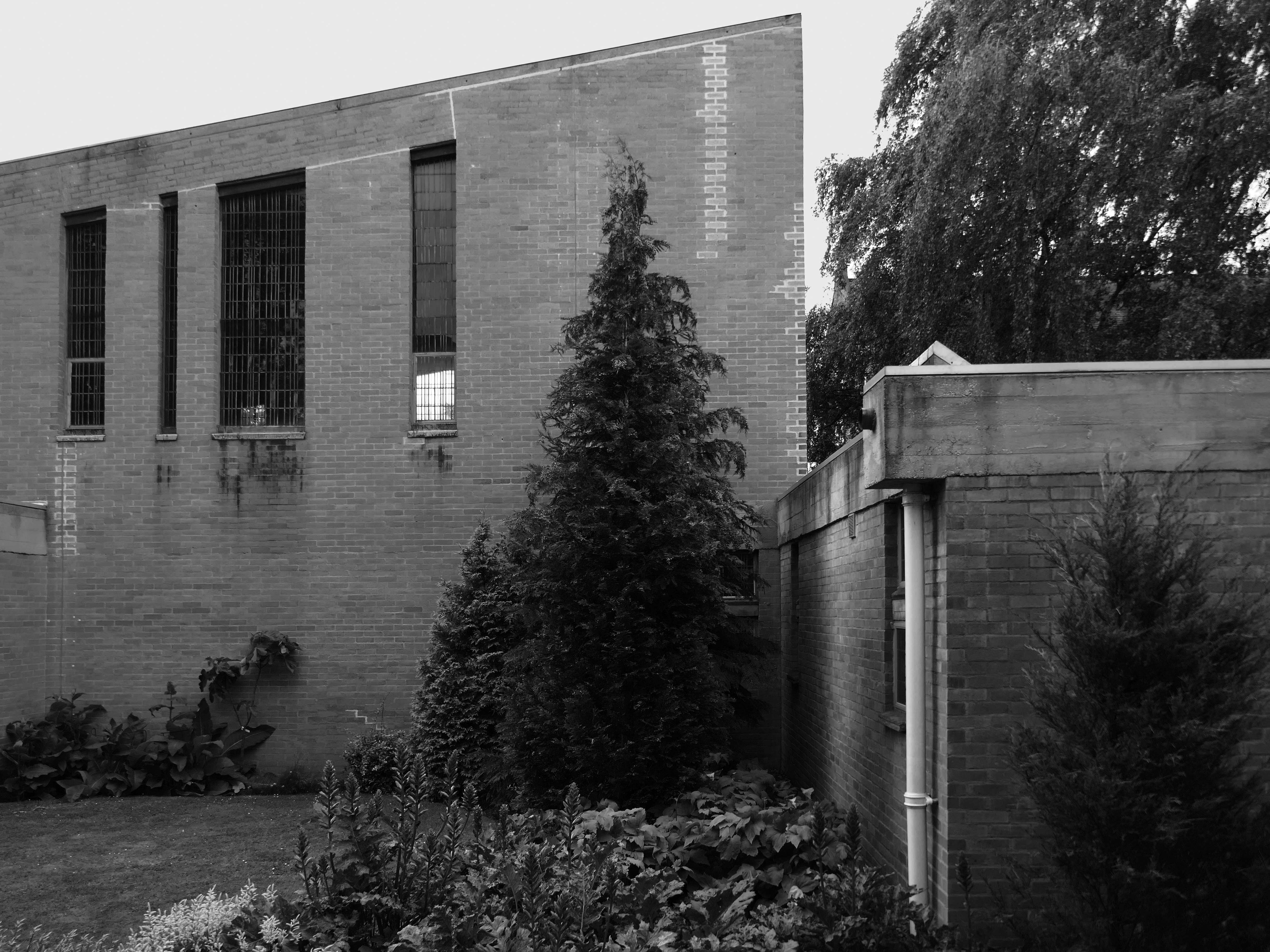
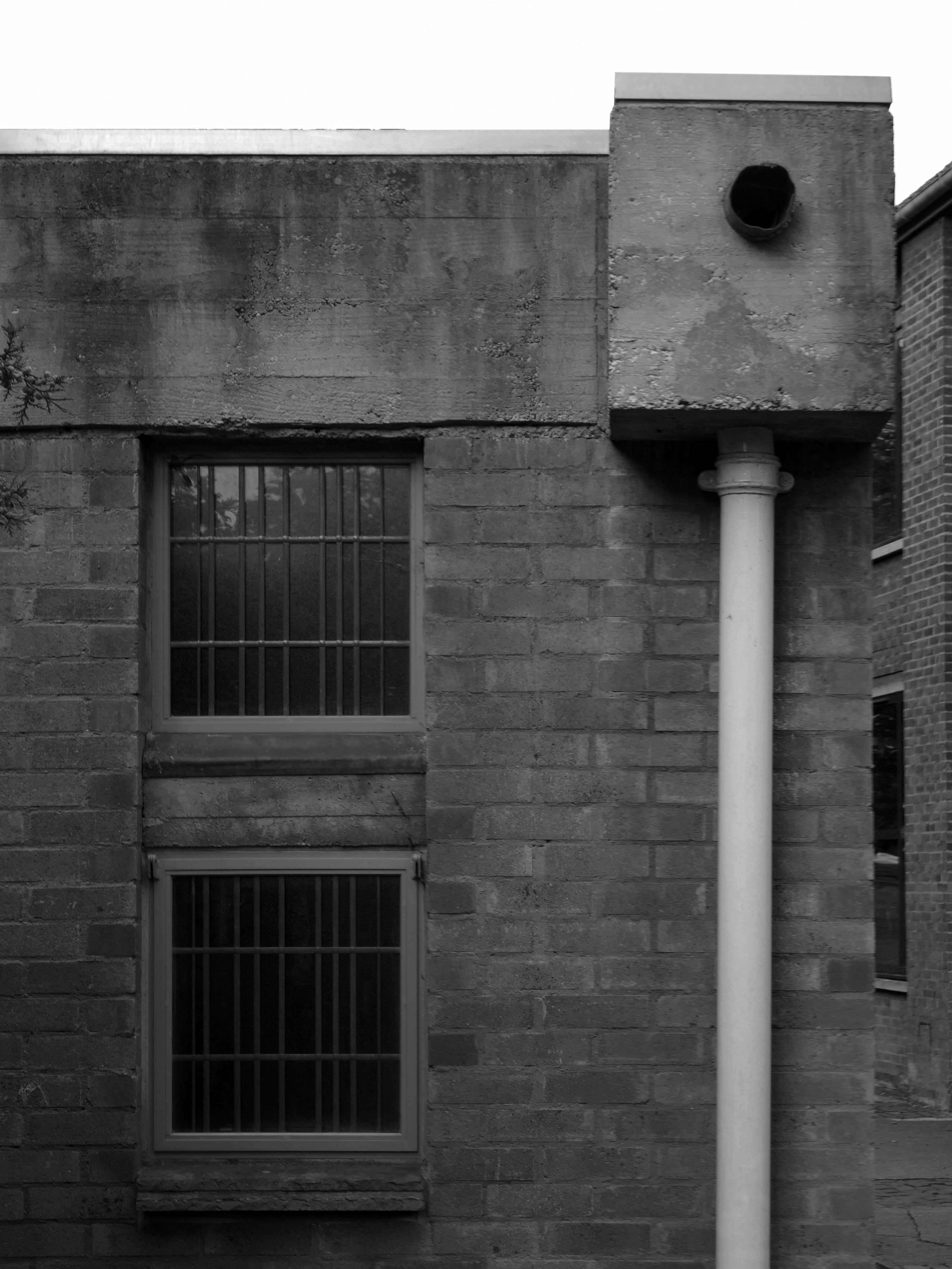
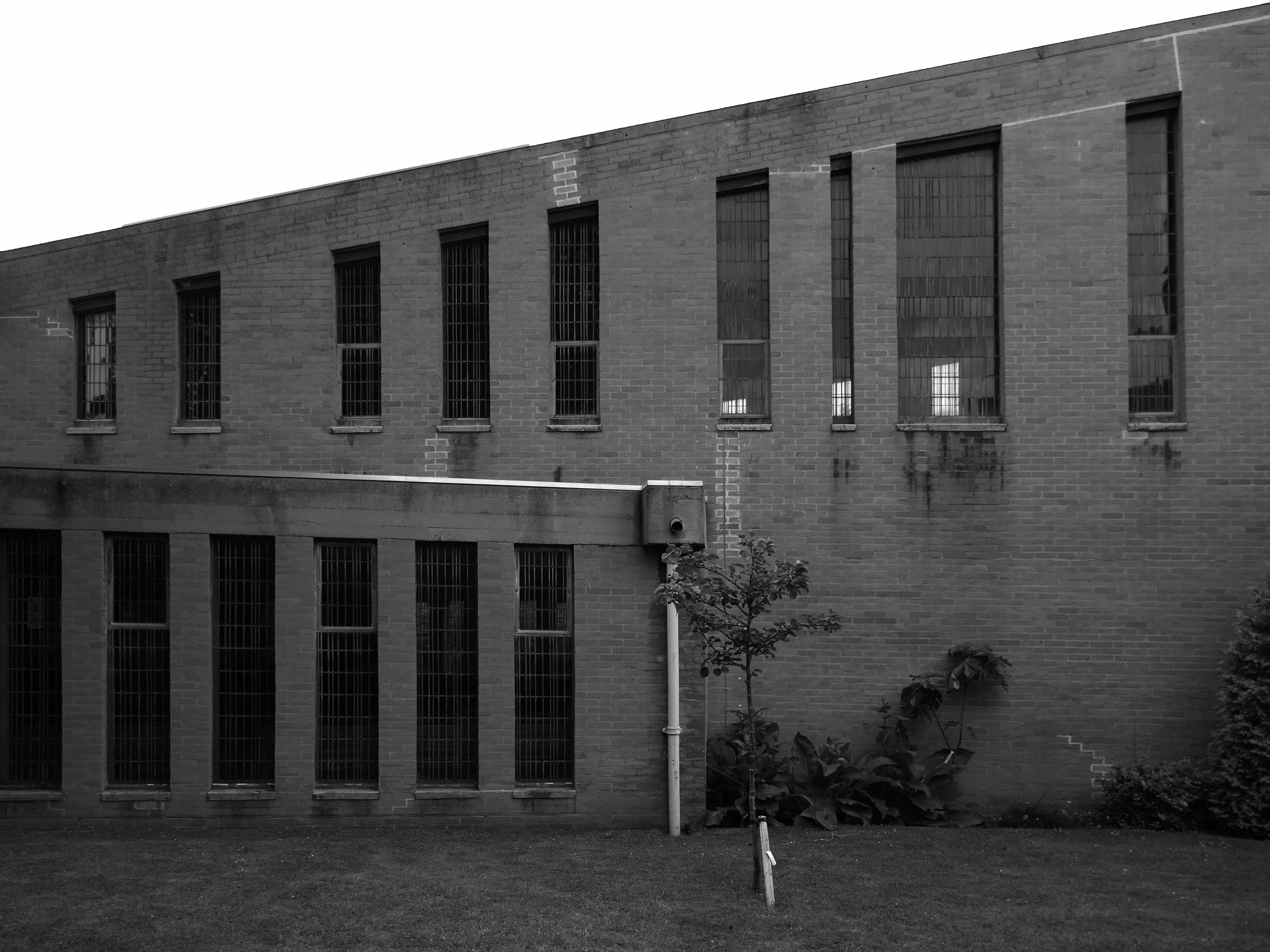
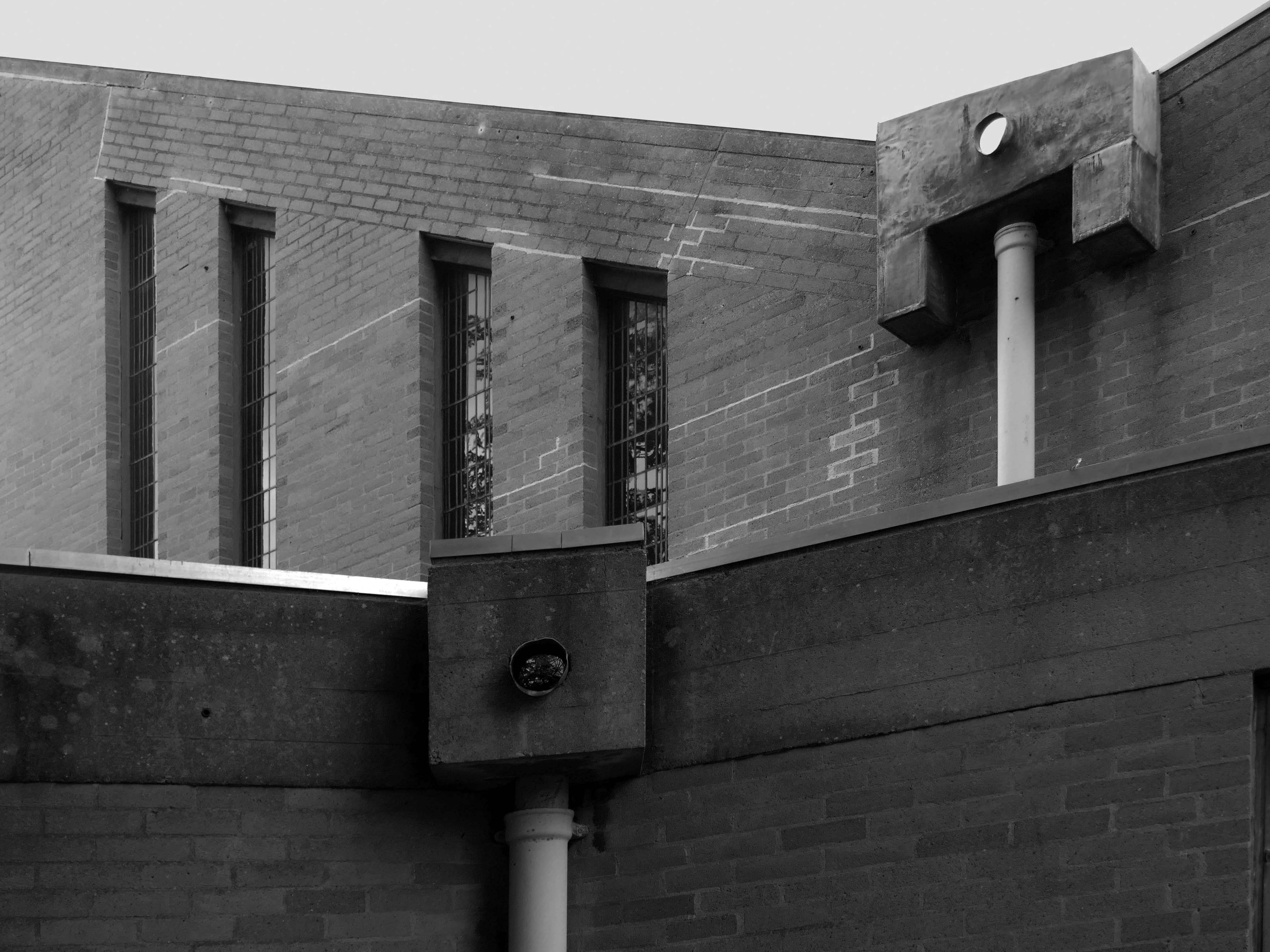
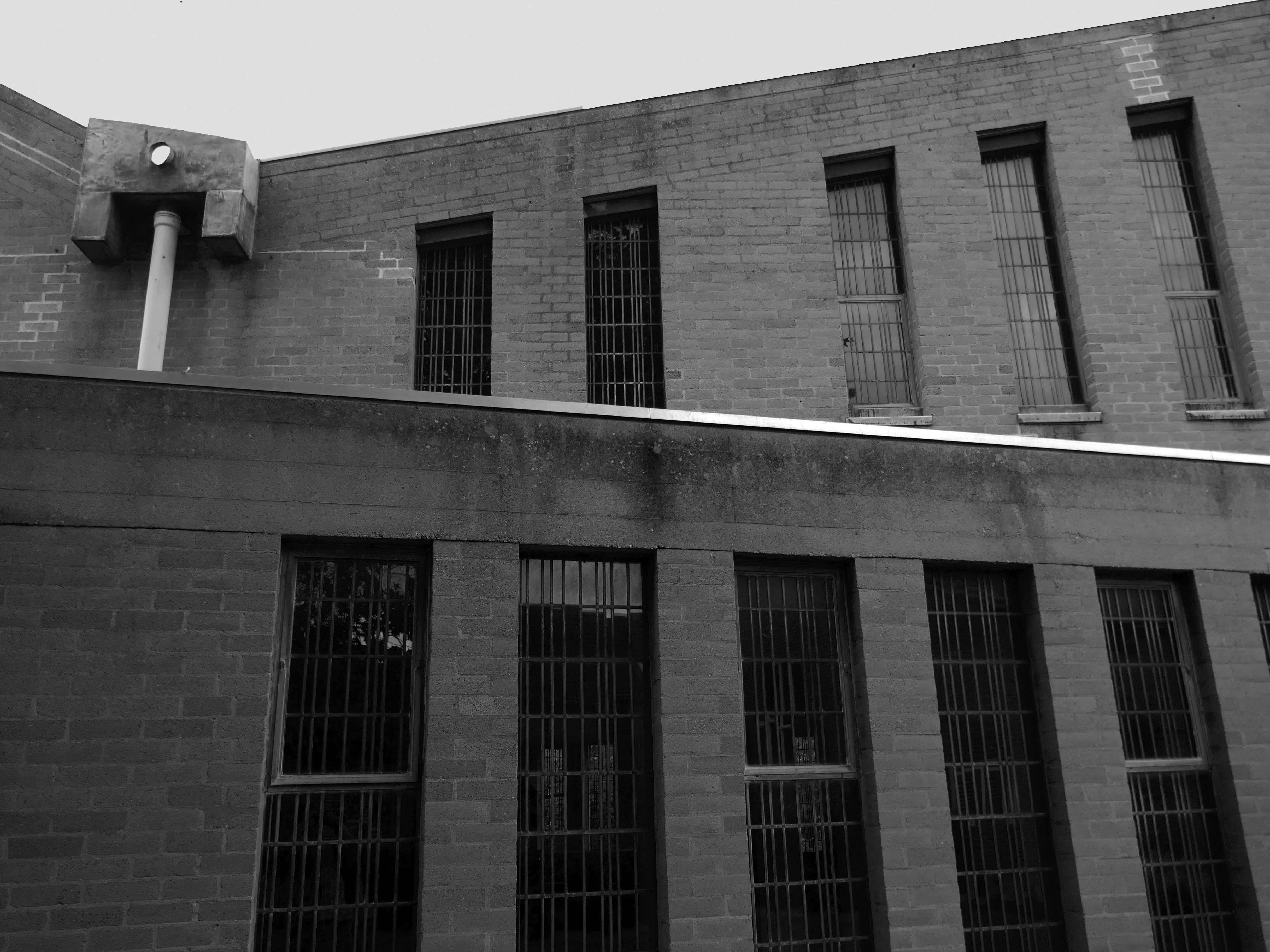
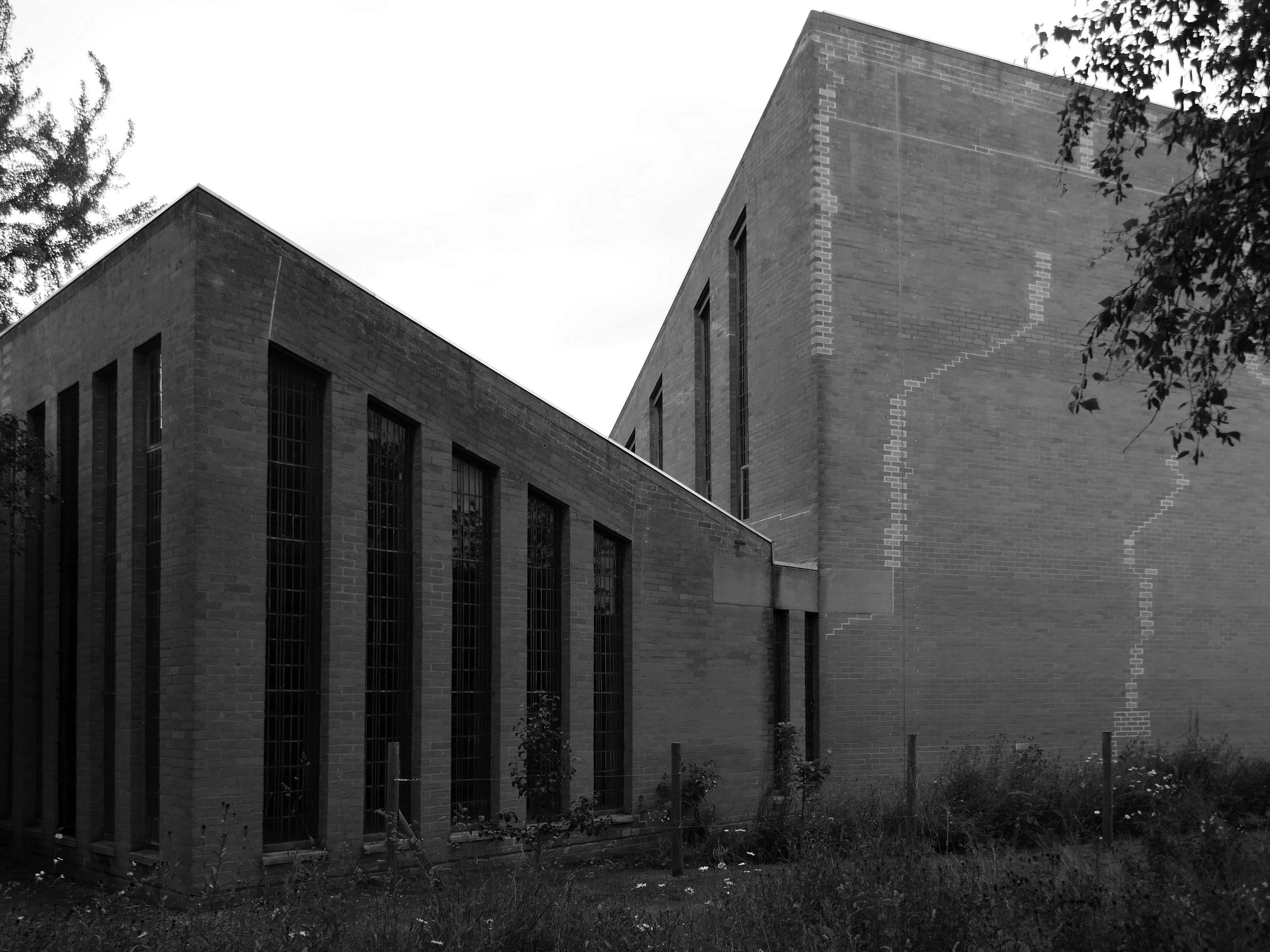
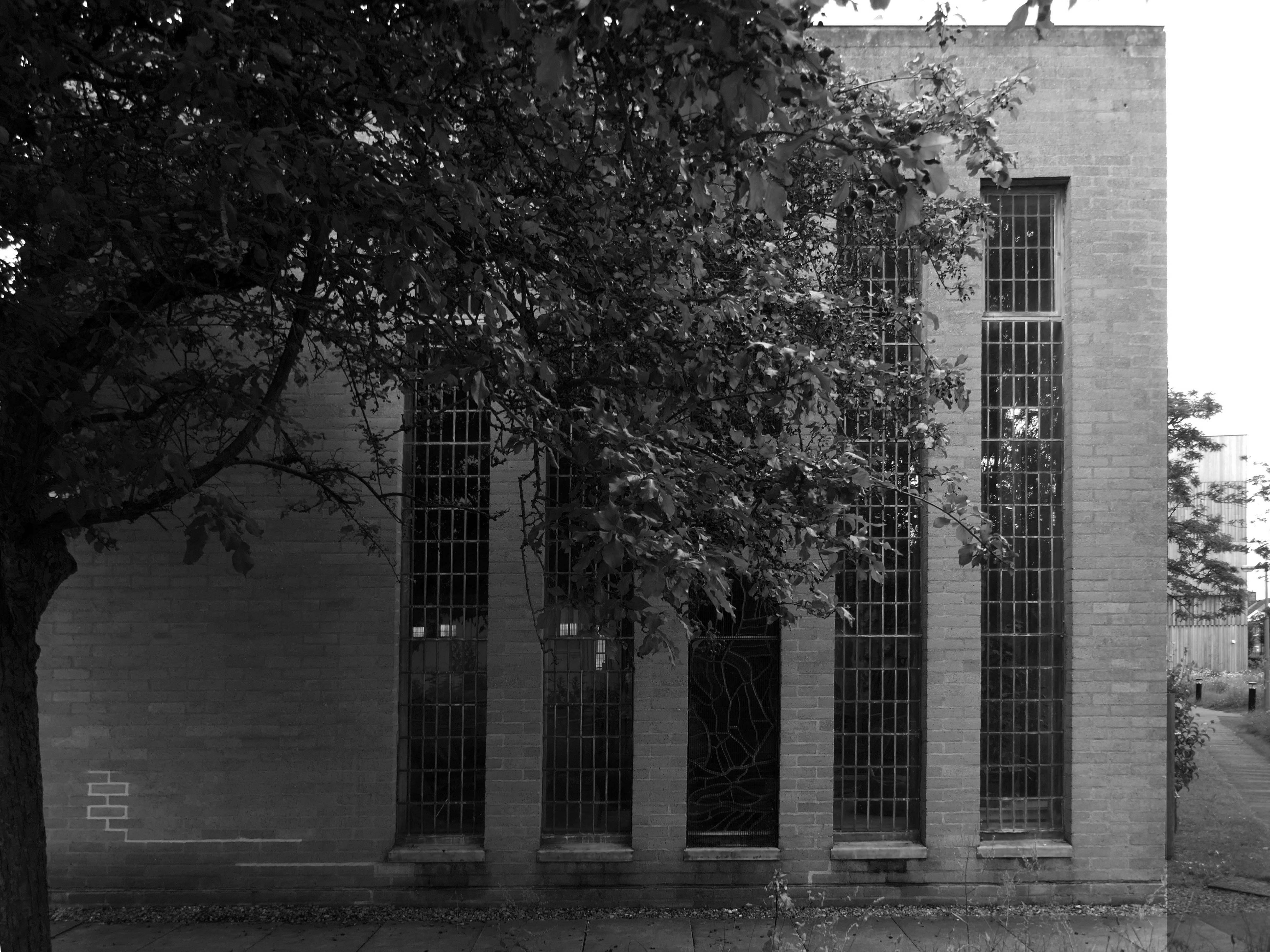
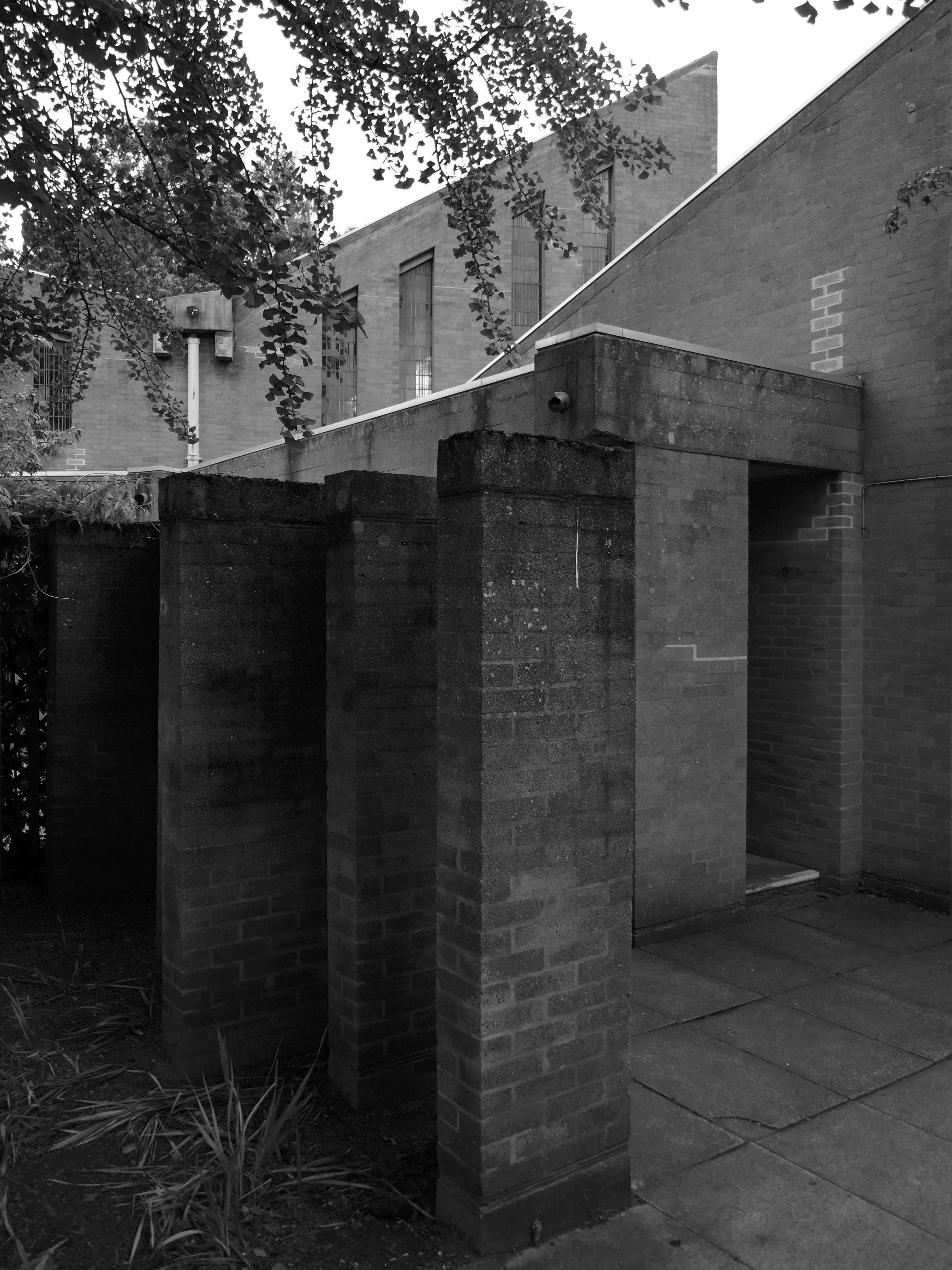
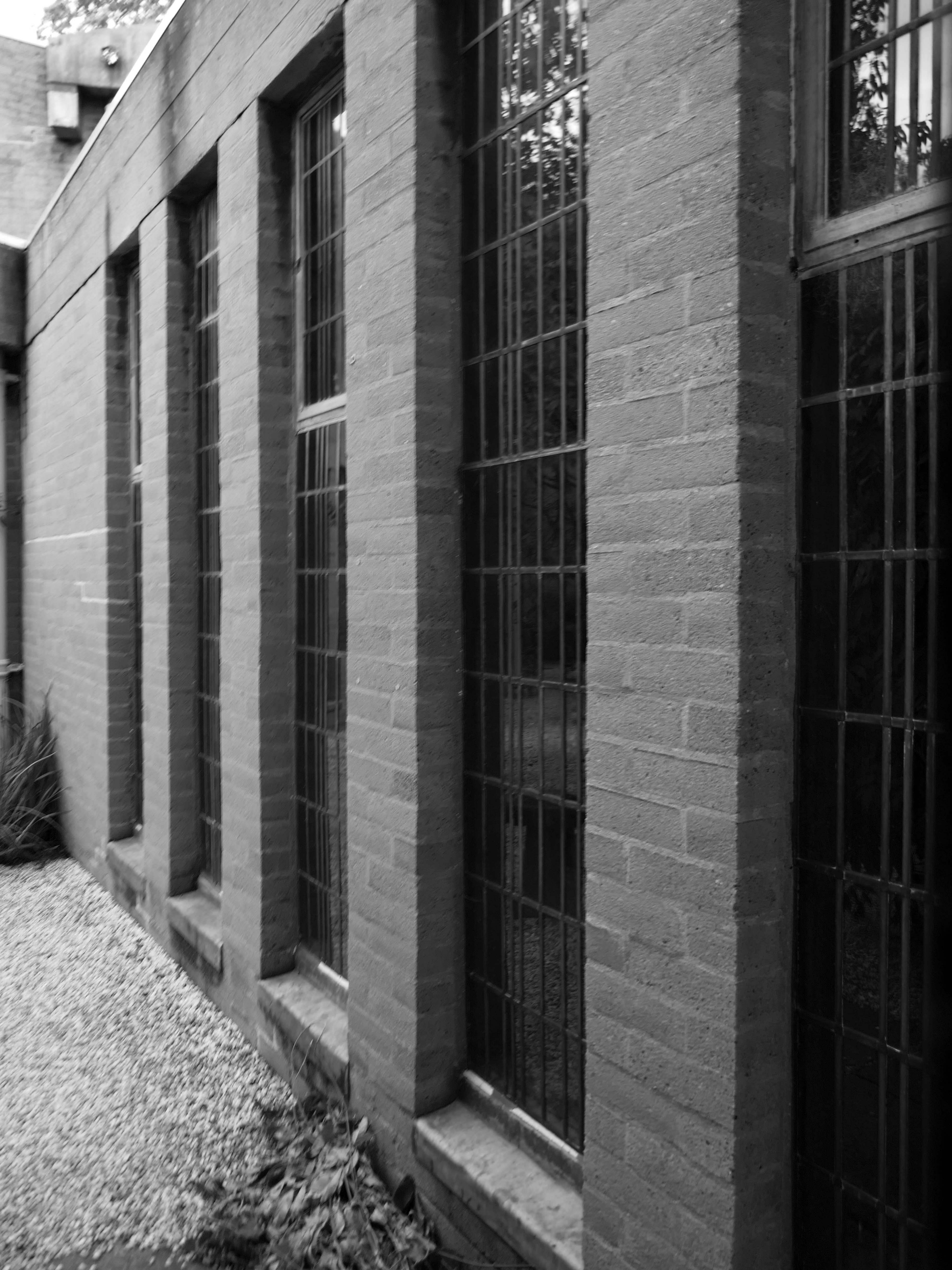
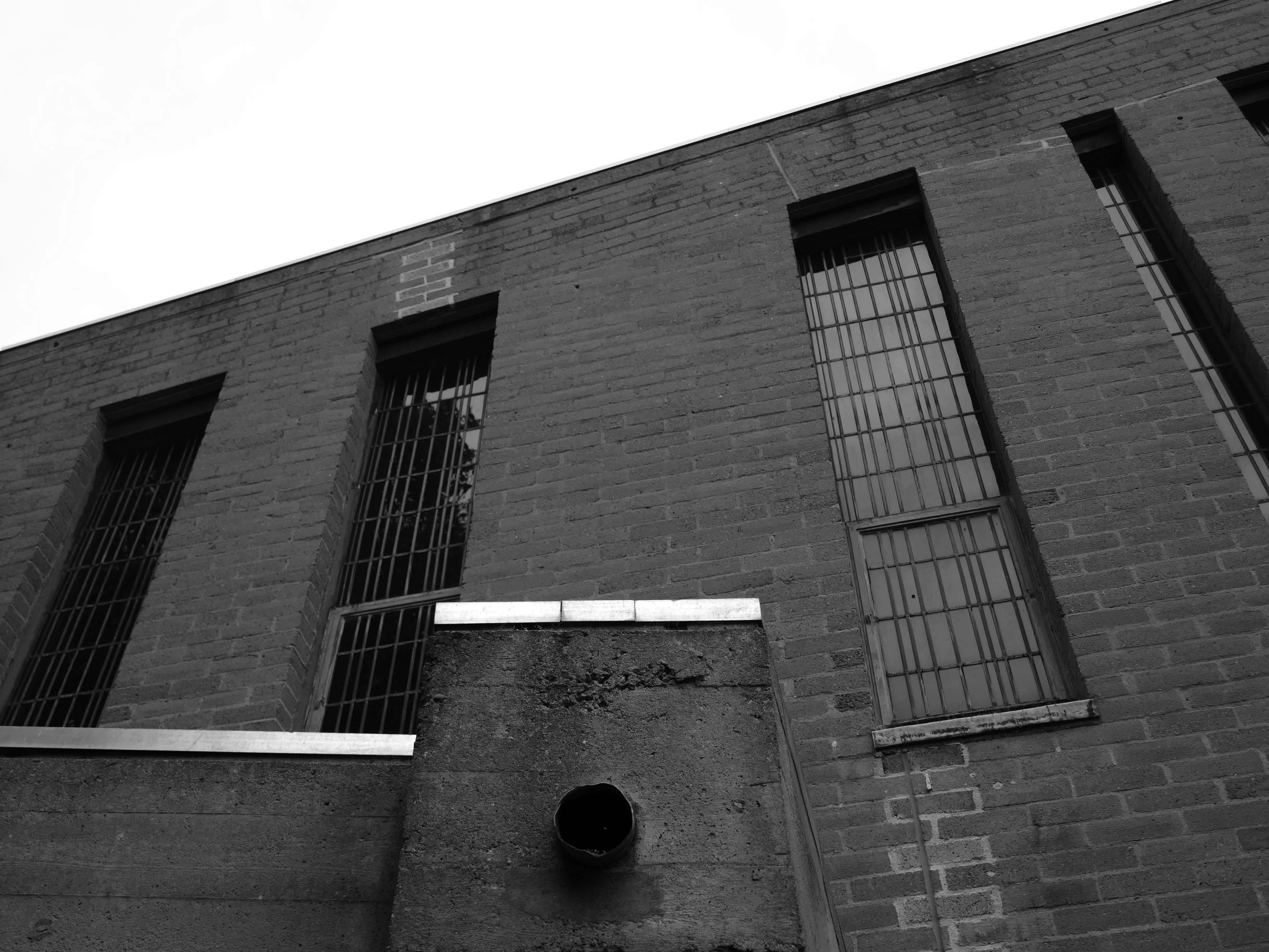
Reinforced concrete frame, partly left exposed, clad in pale brick. Monopitched roofs. Low flat roofs to entrances and between the three main elements with thick board-marked eaves. Central space flanked by angled transepts, with organ loft to (liturgical) west end and wing of offices behind. Long narrow flat-headed windows between brick mullions, timber doors. Attached walls and steel gate lead to inner garden, intended for contemplation.
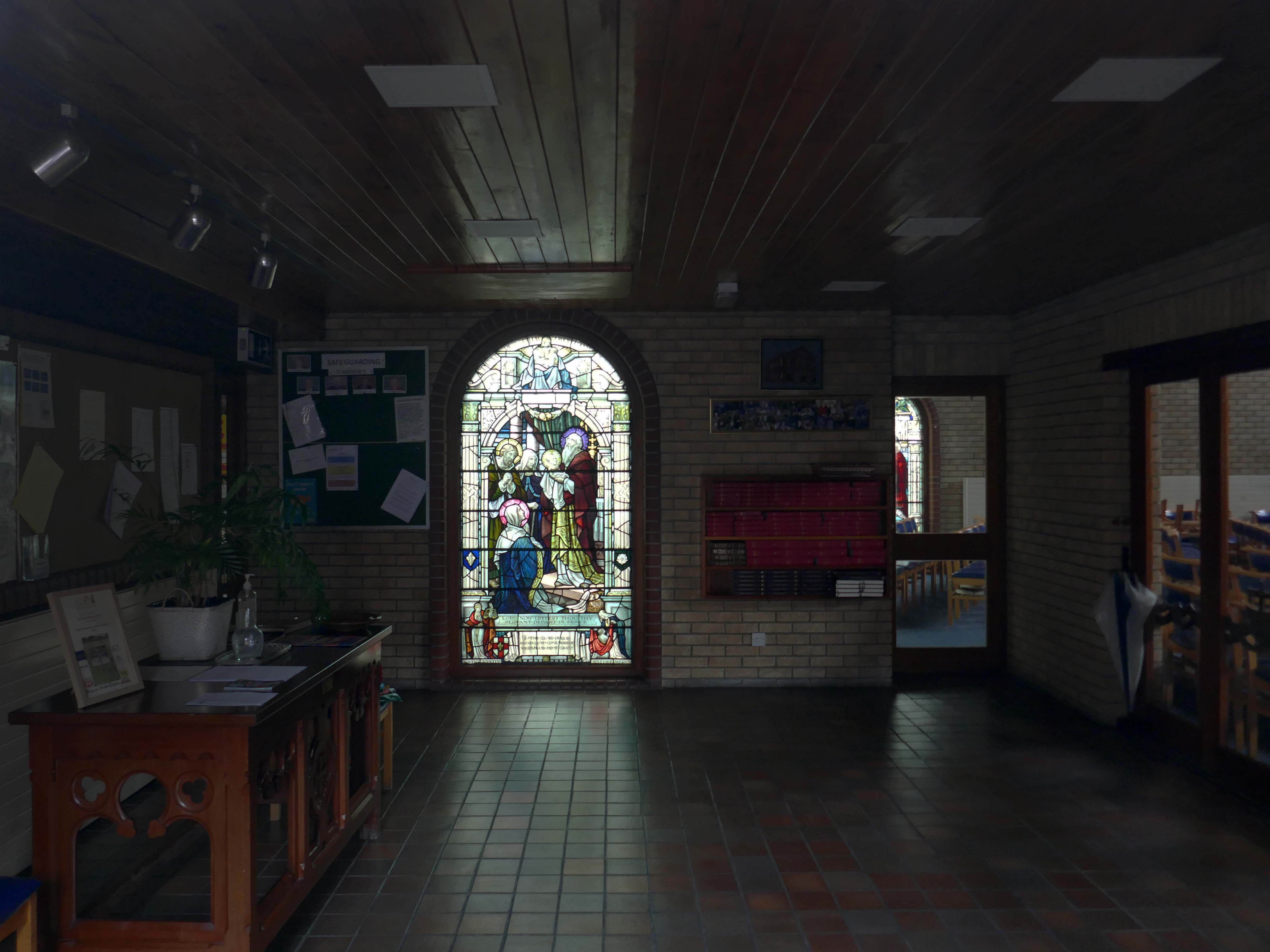
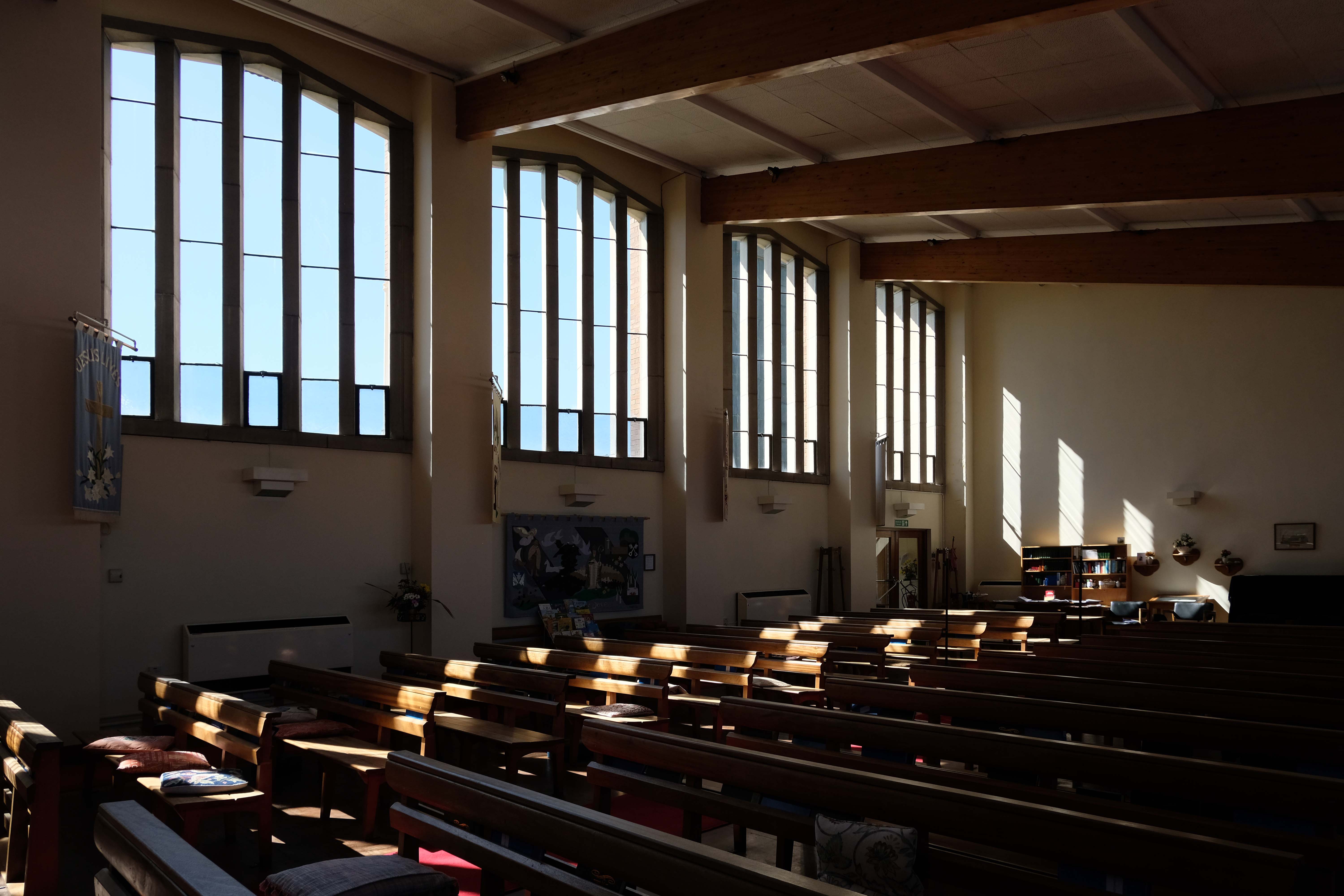
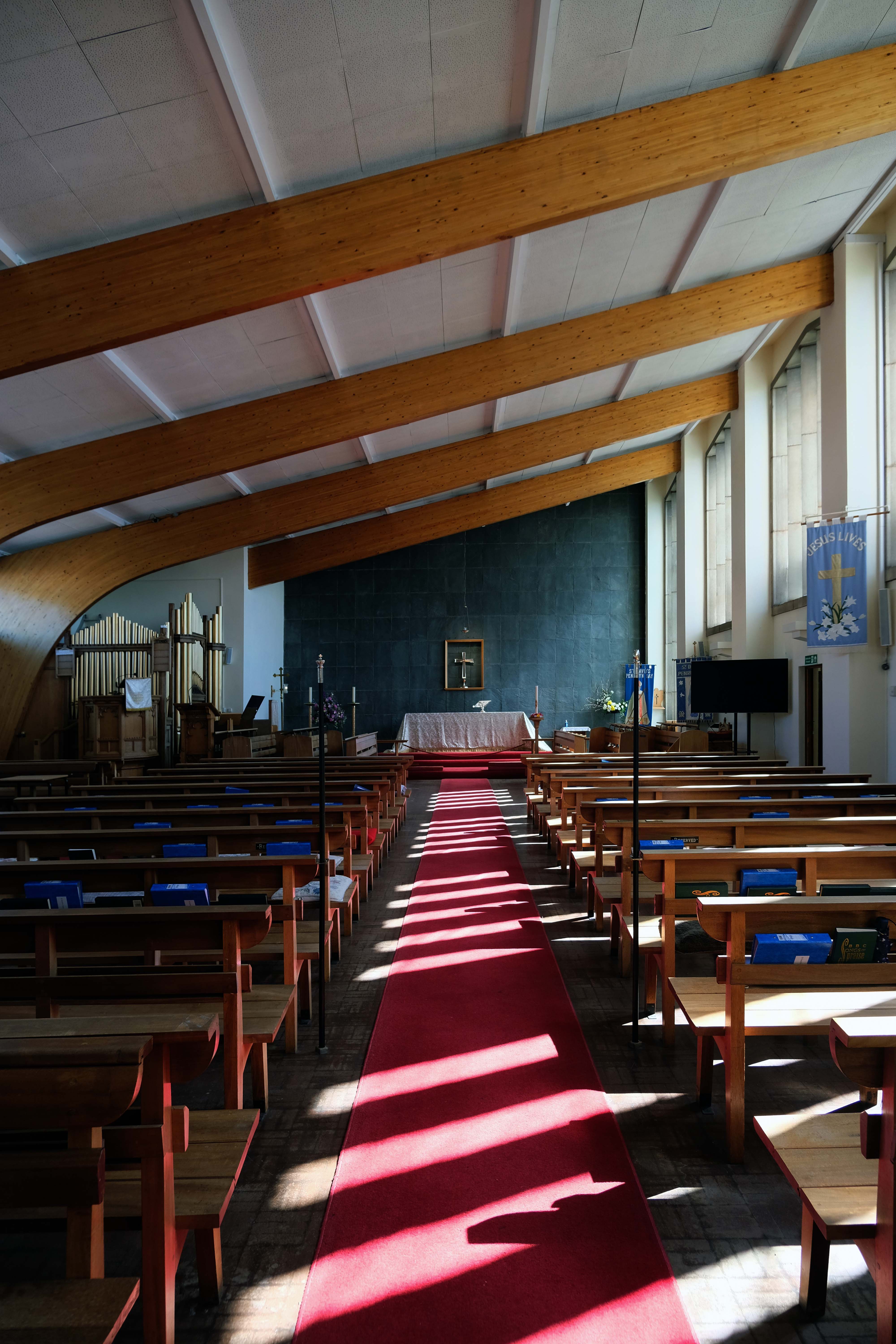
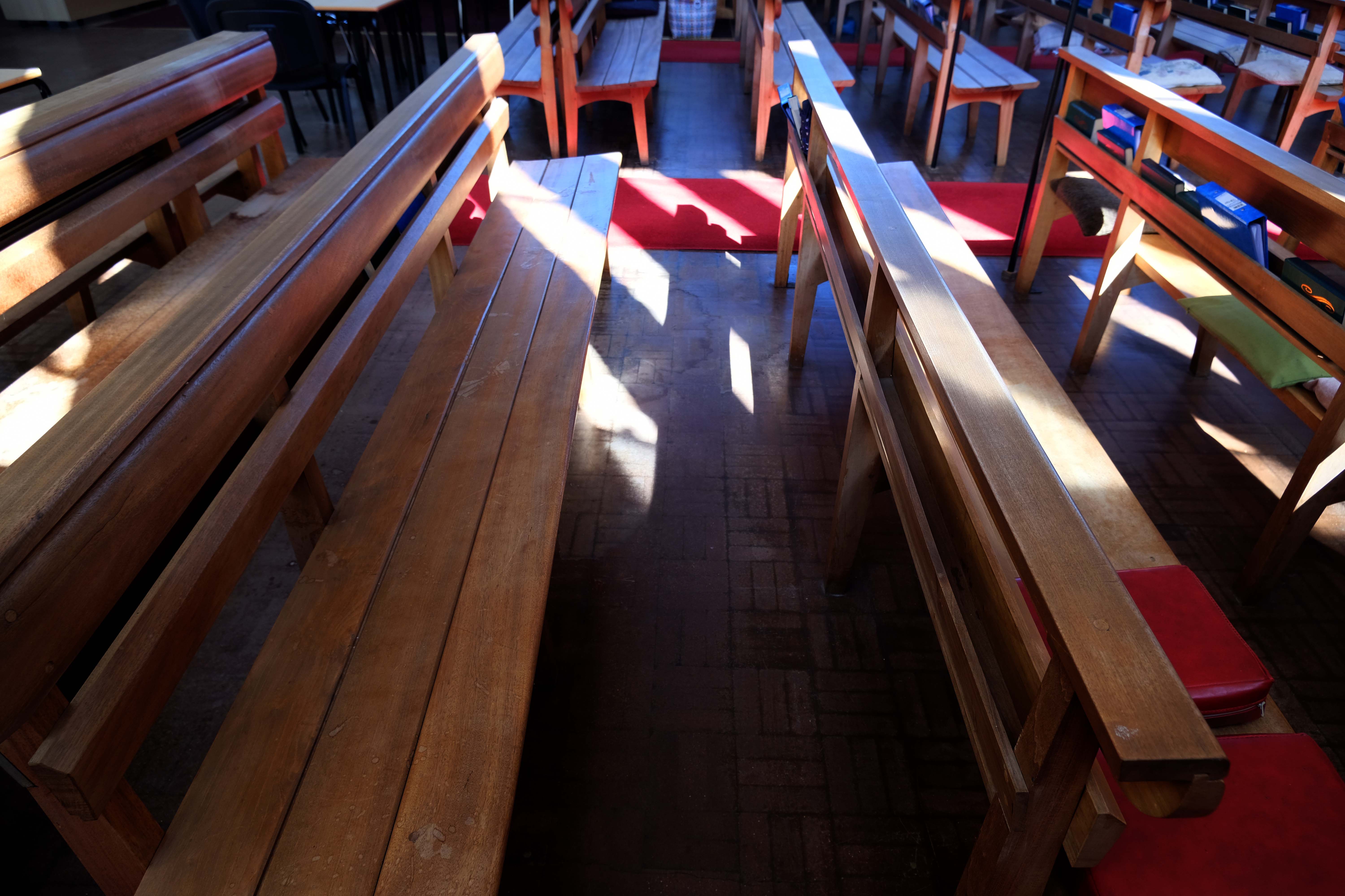
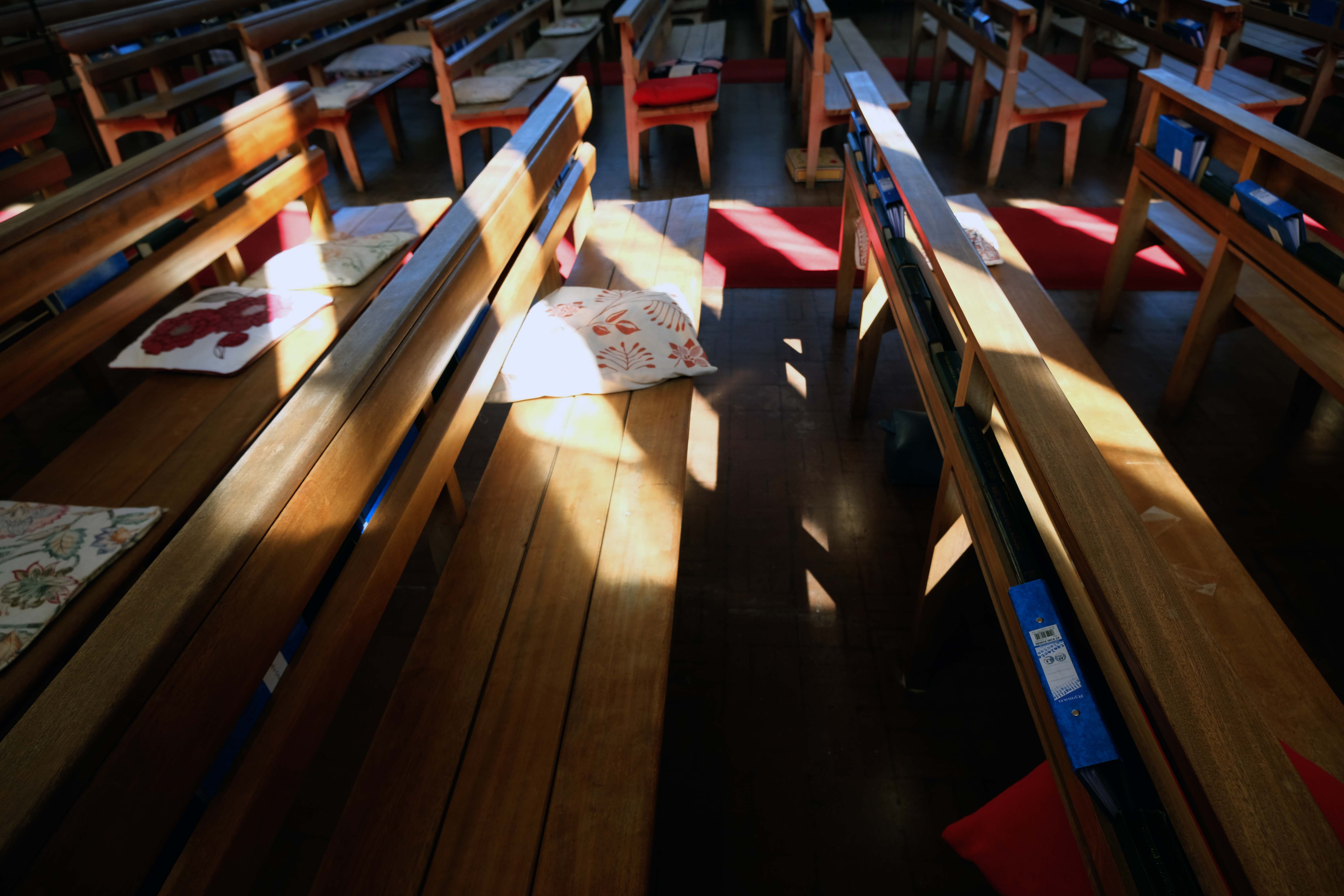
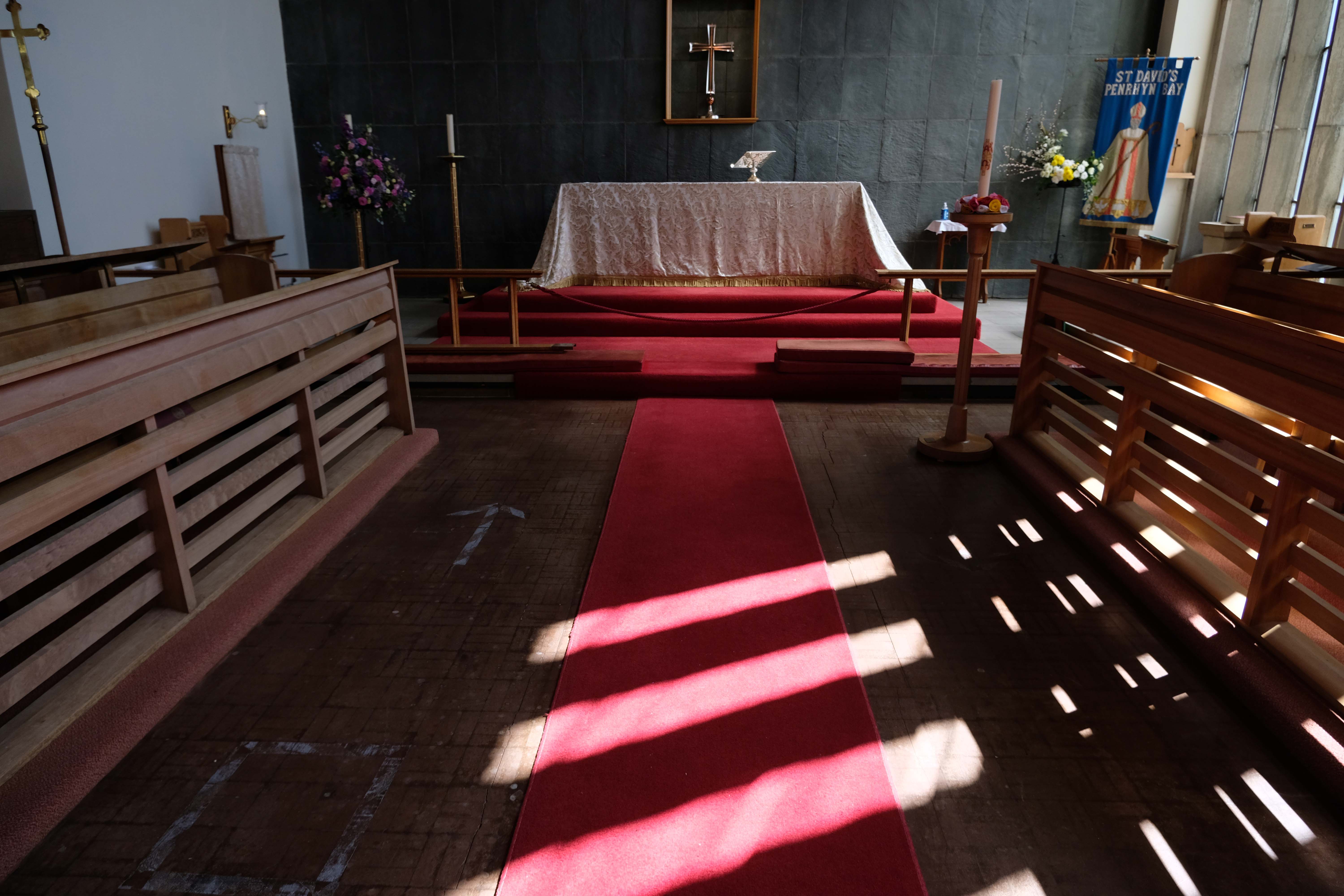
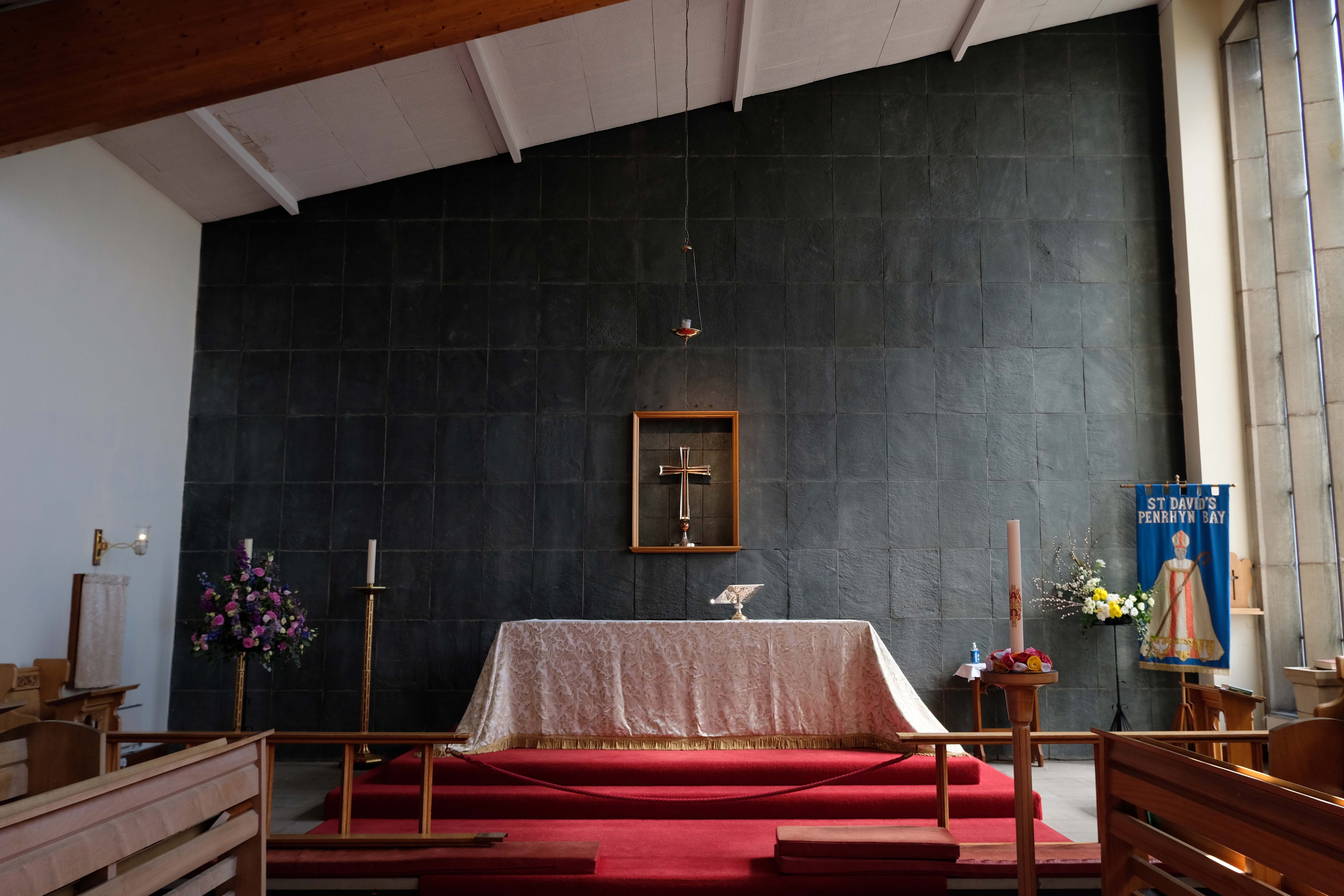
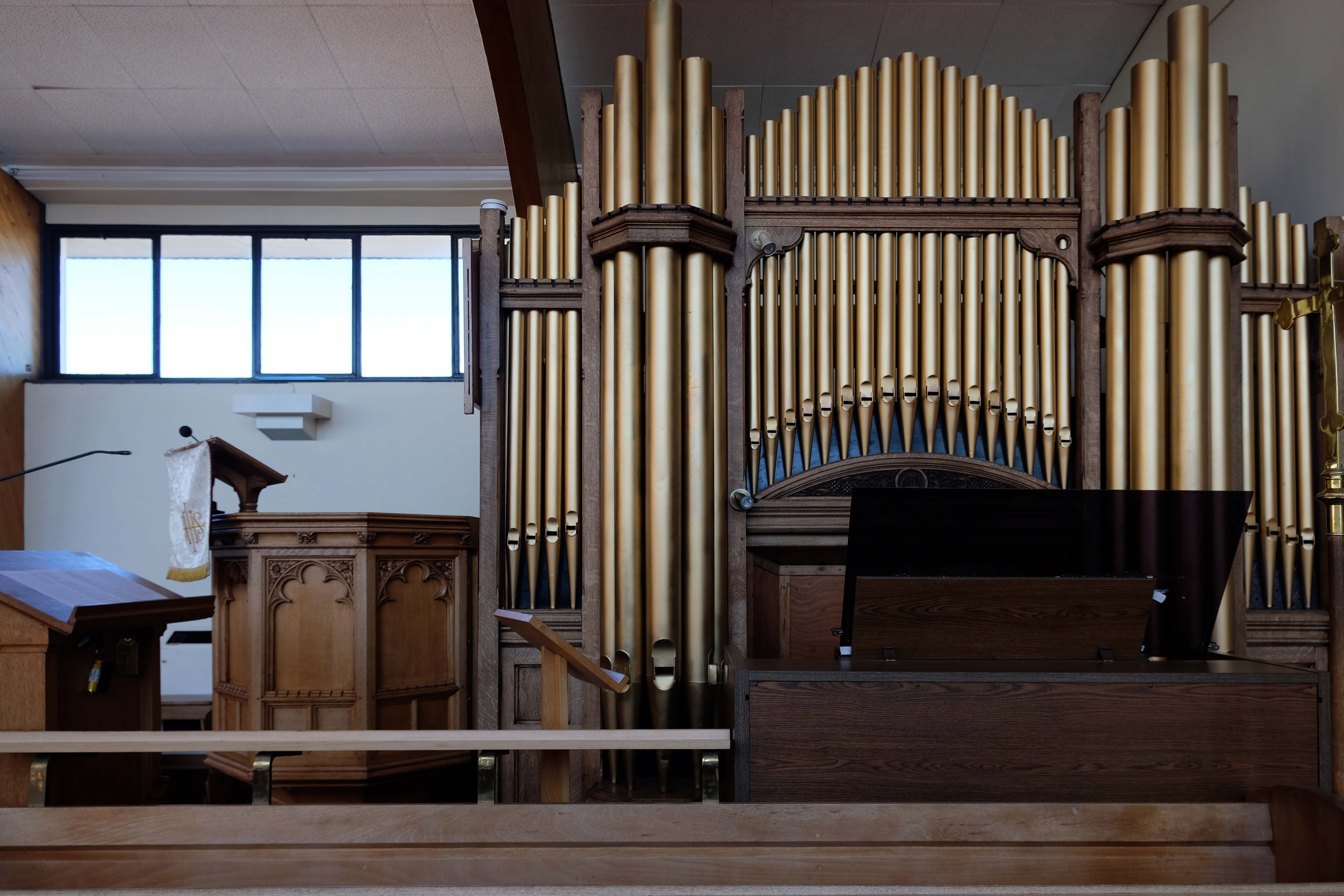
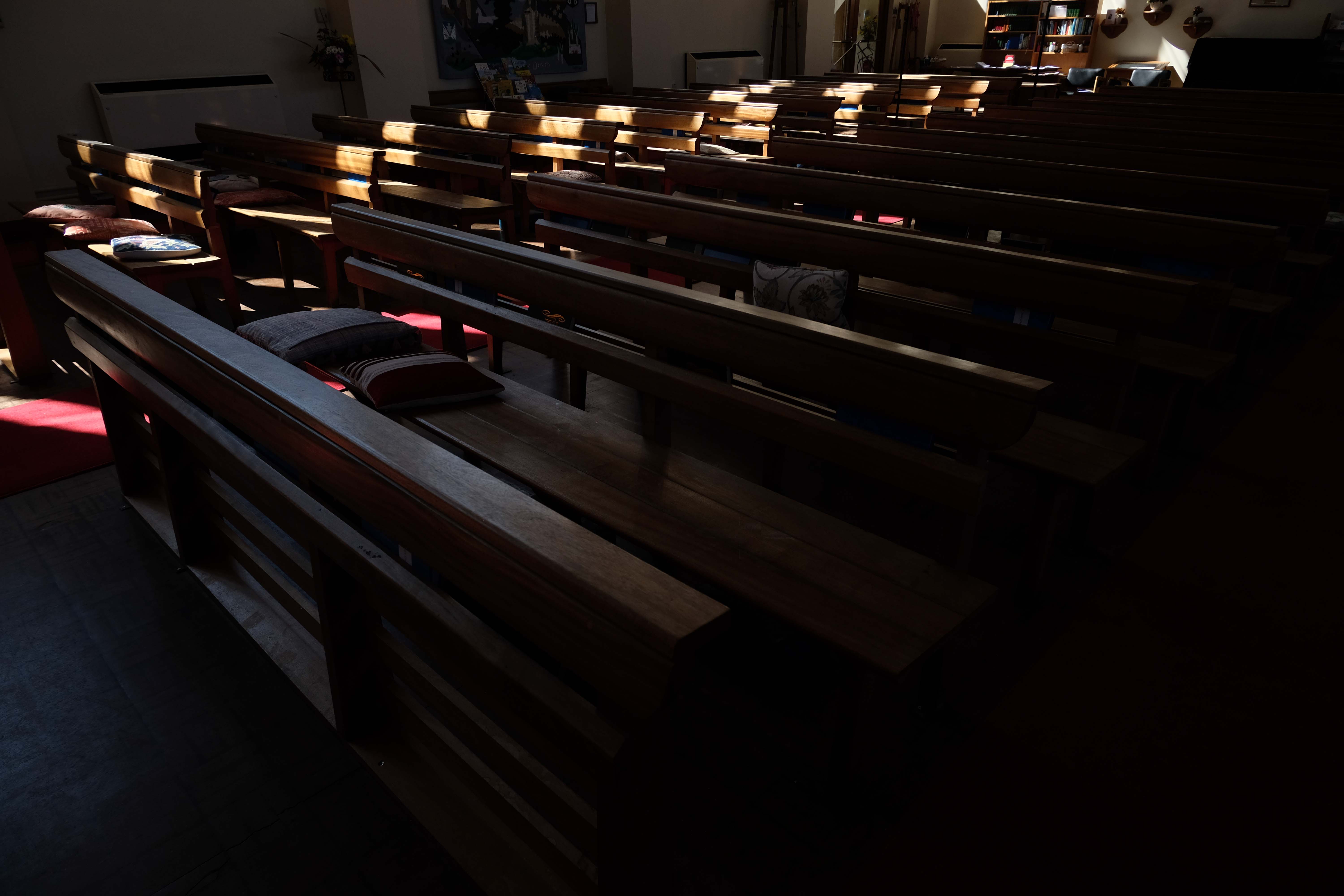
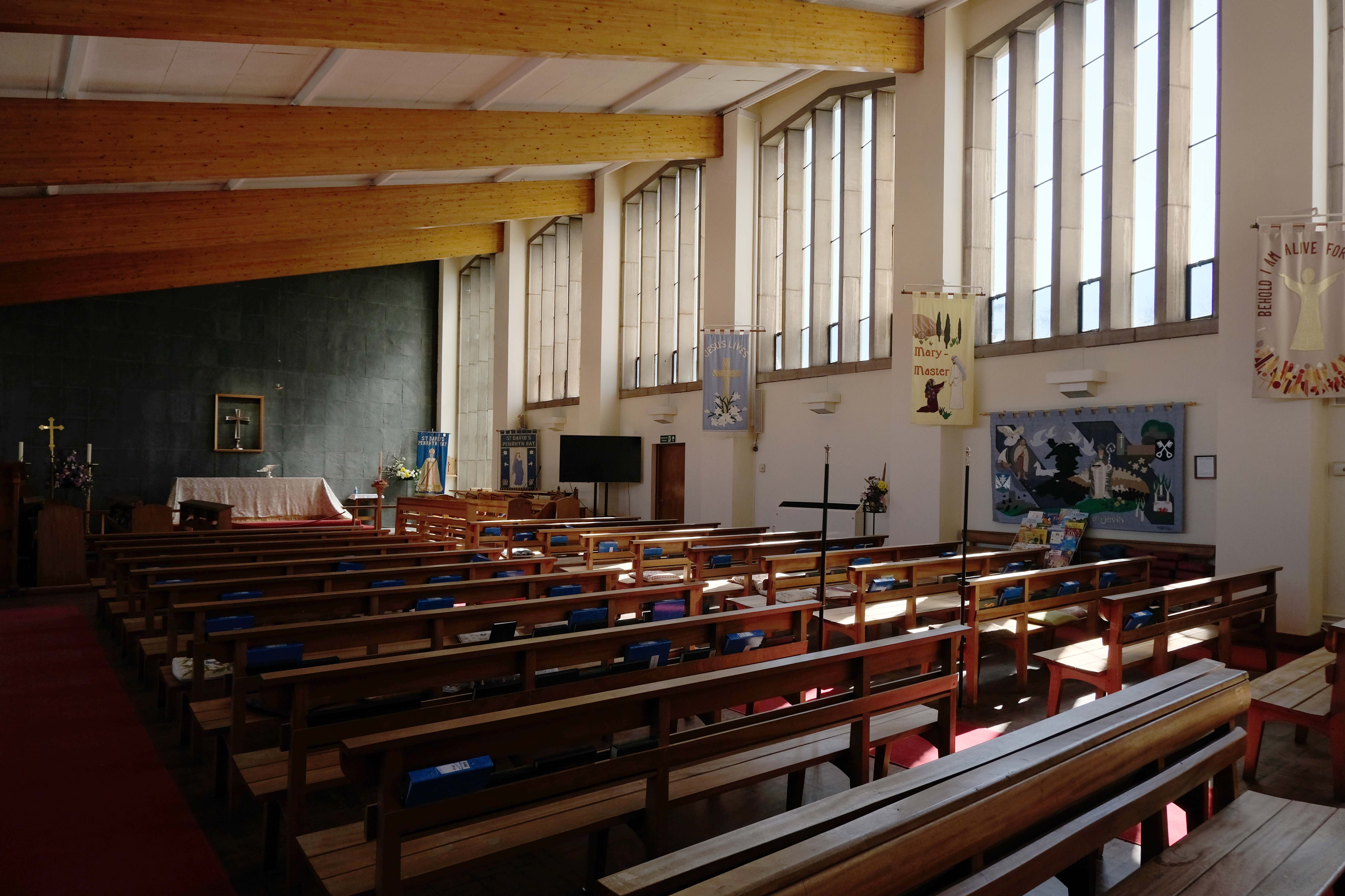
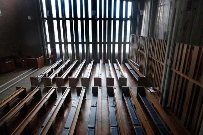
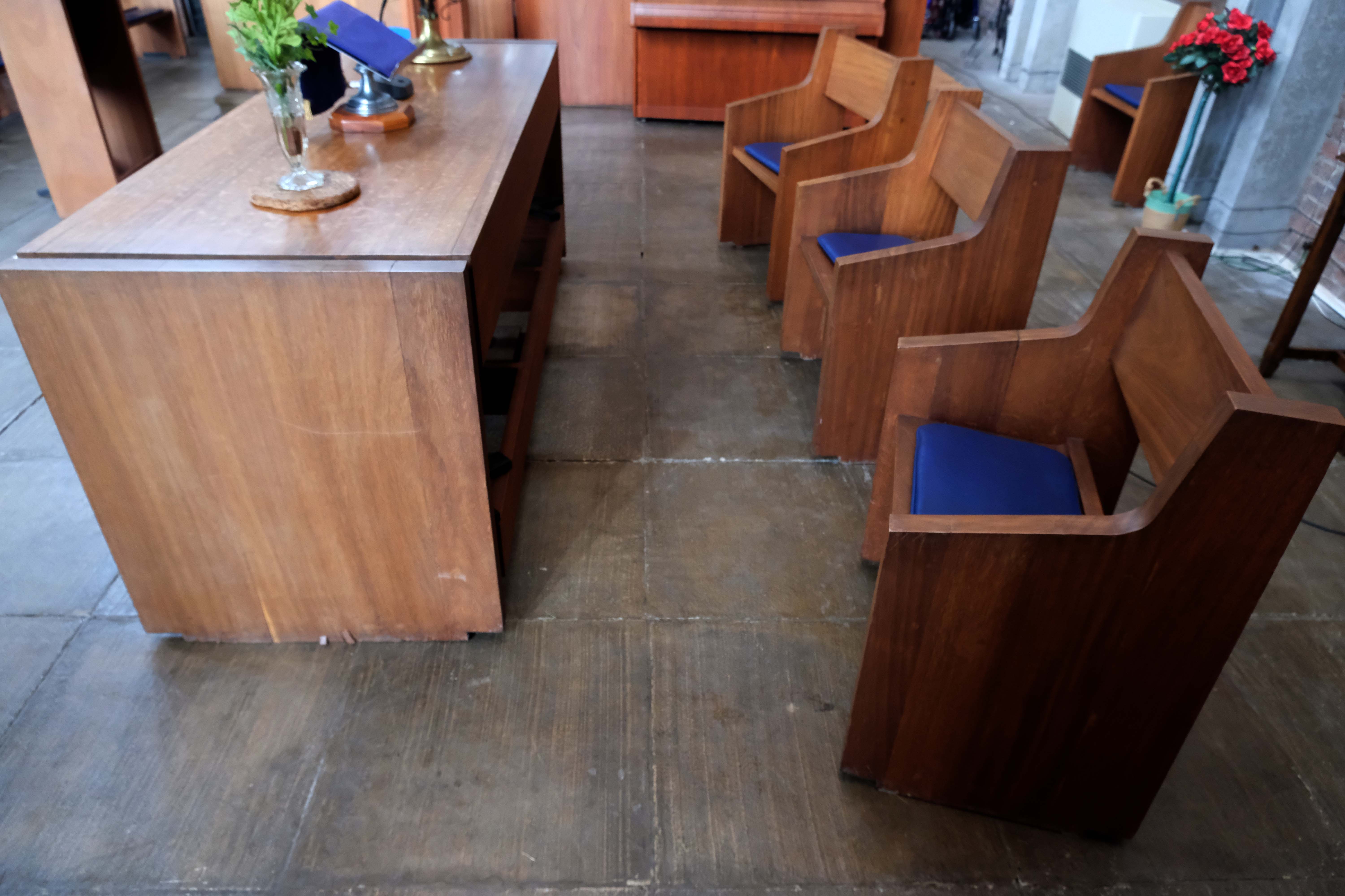
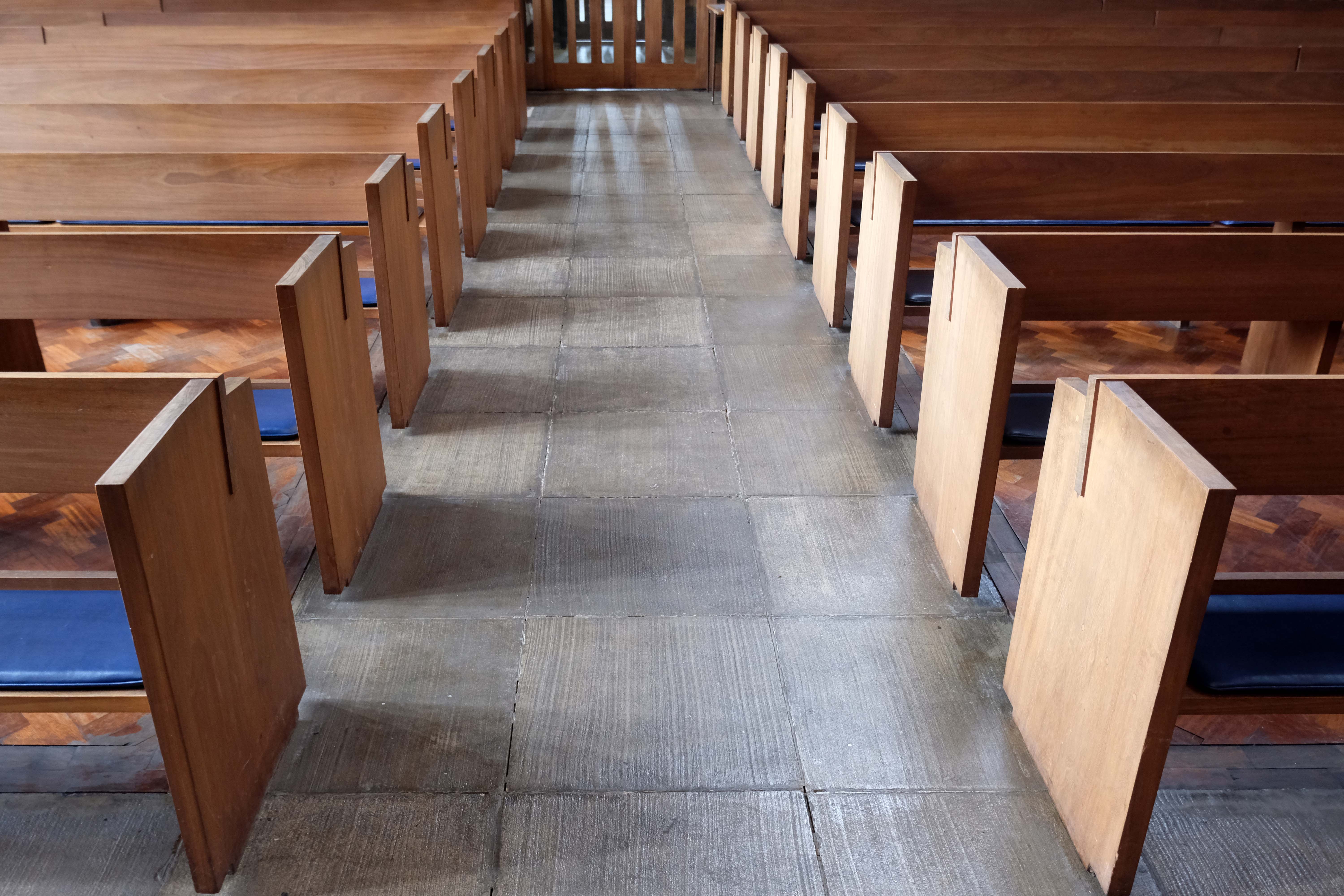
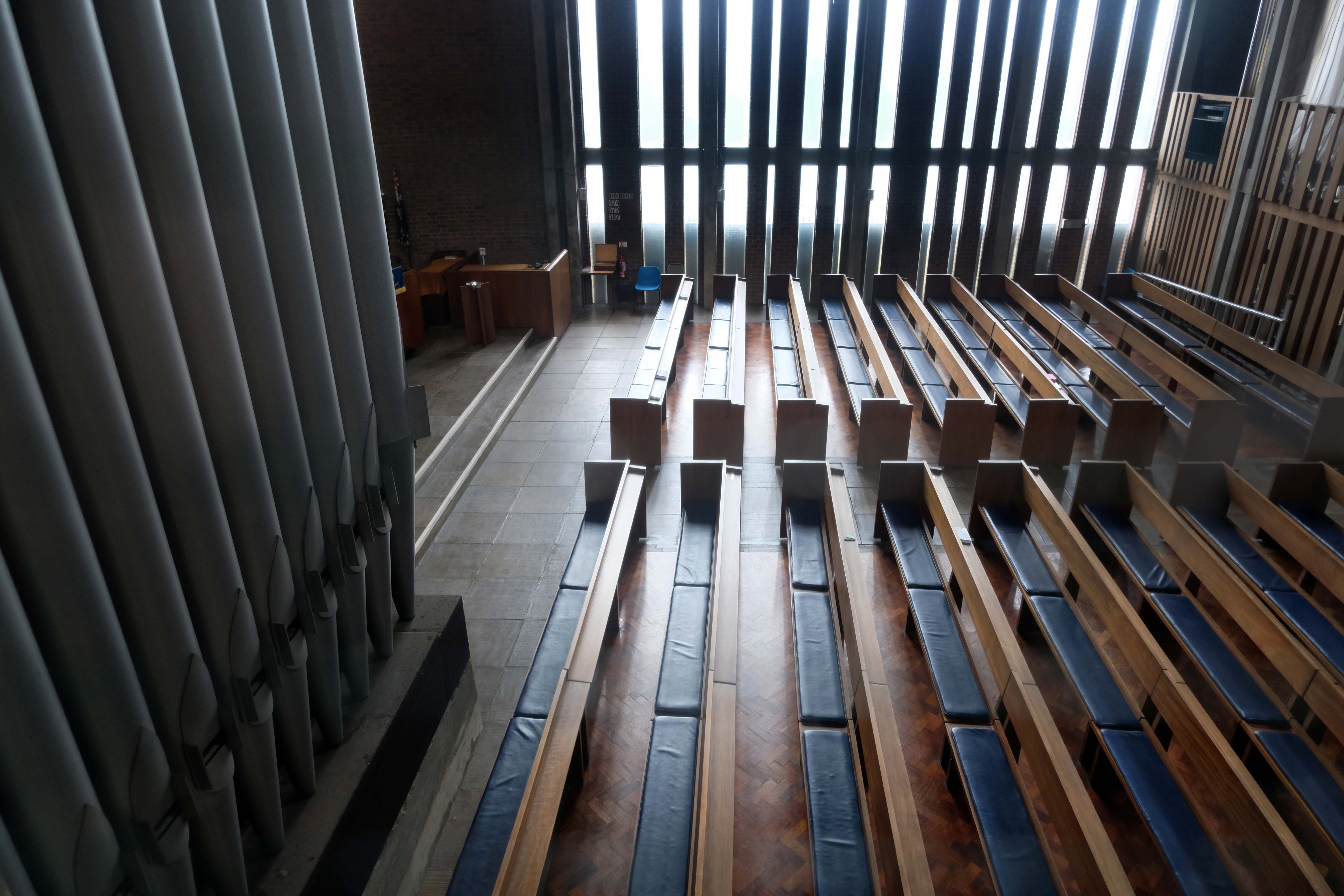
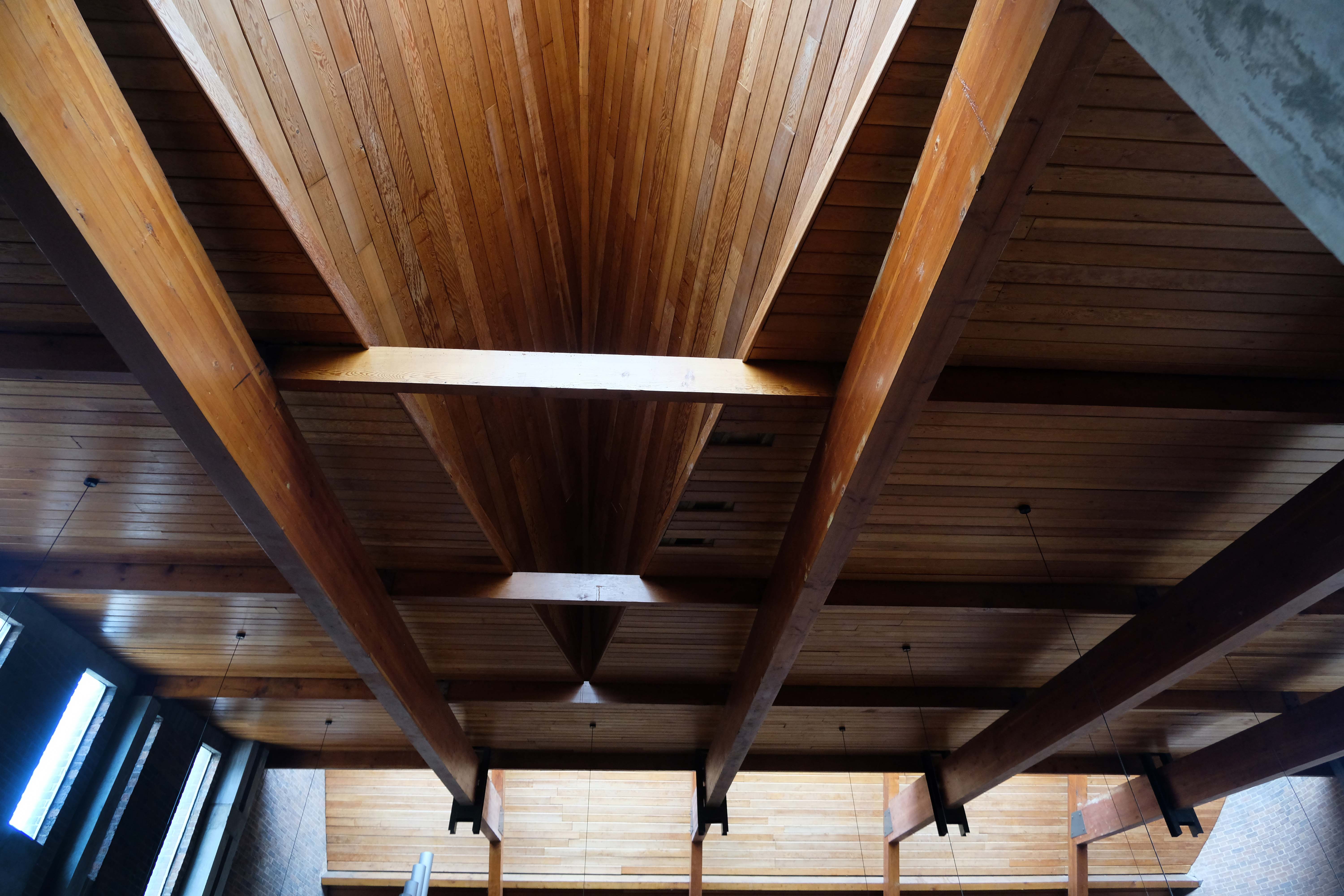
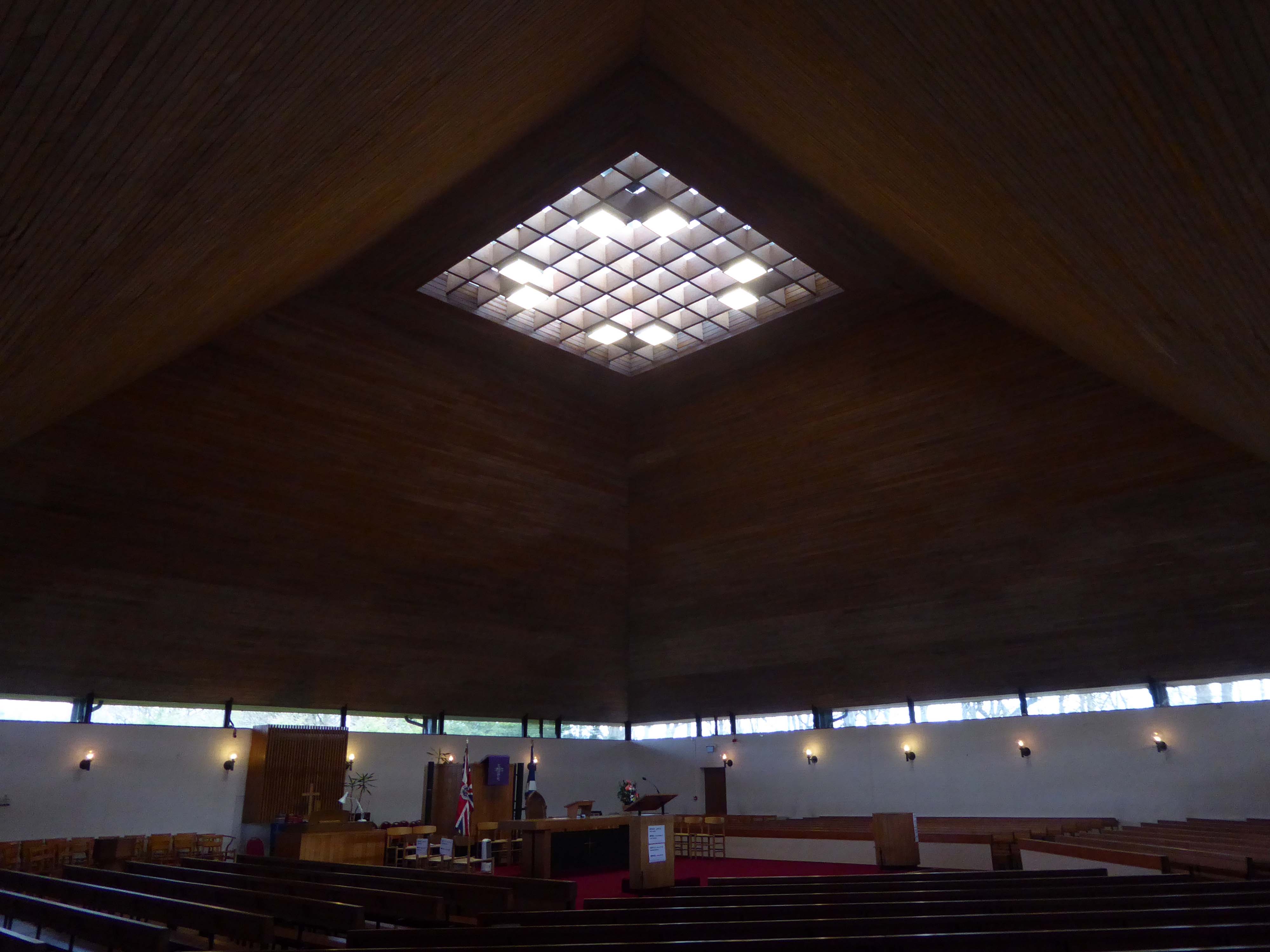
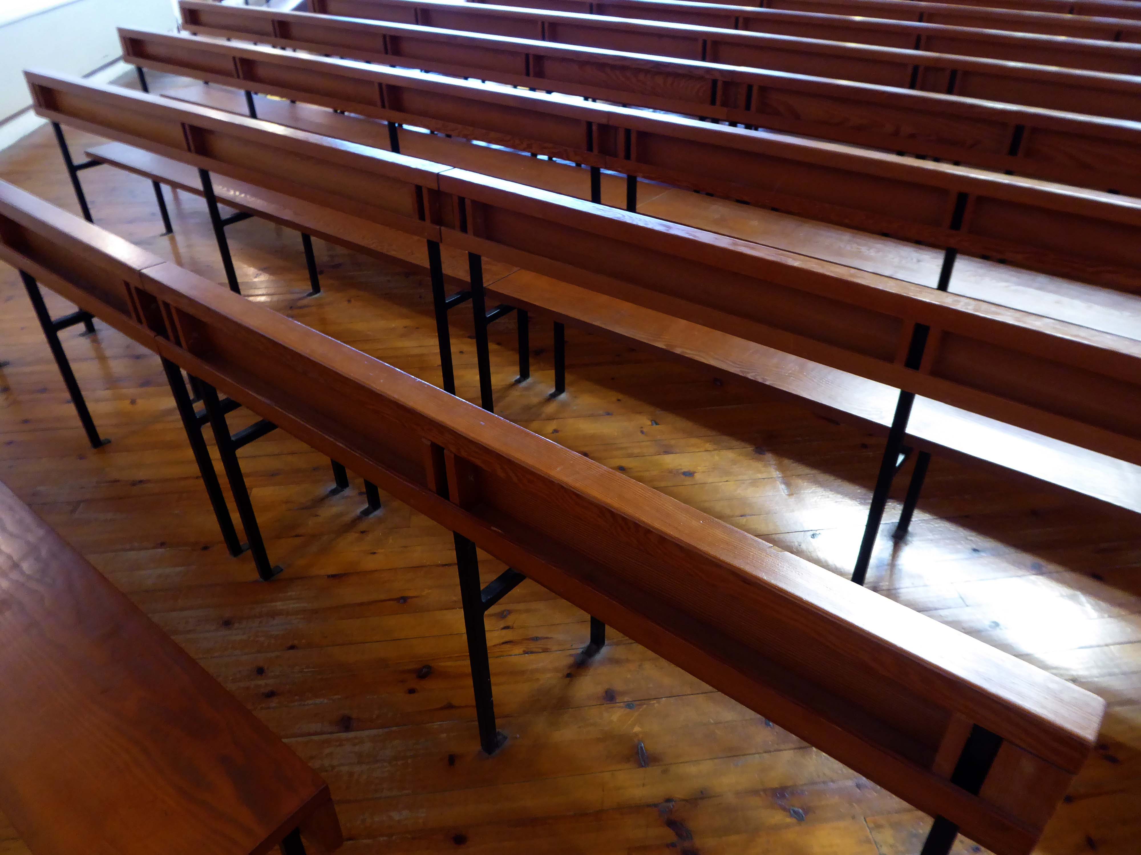
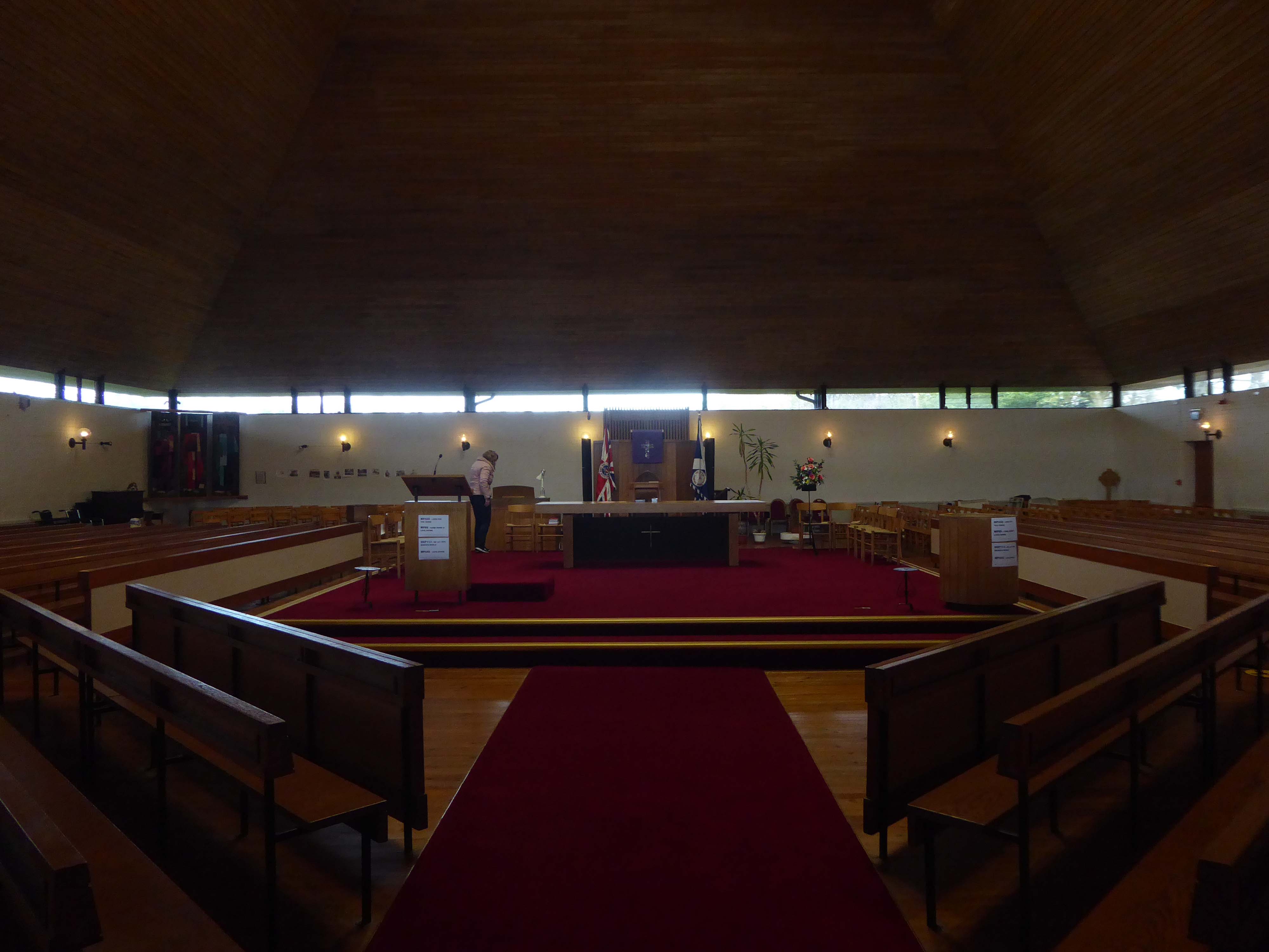
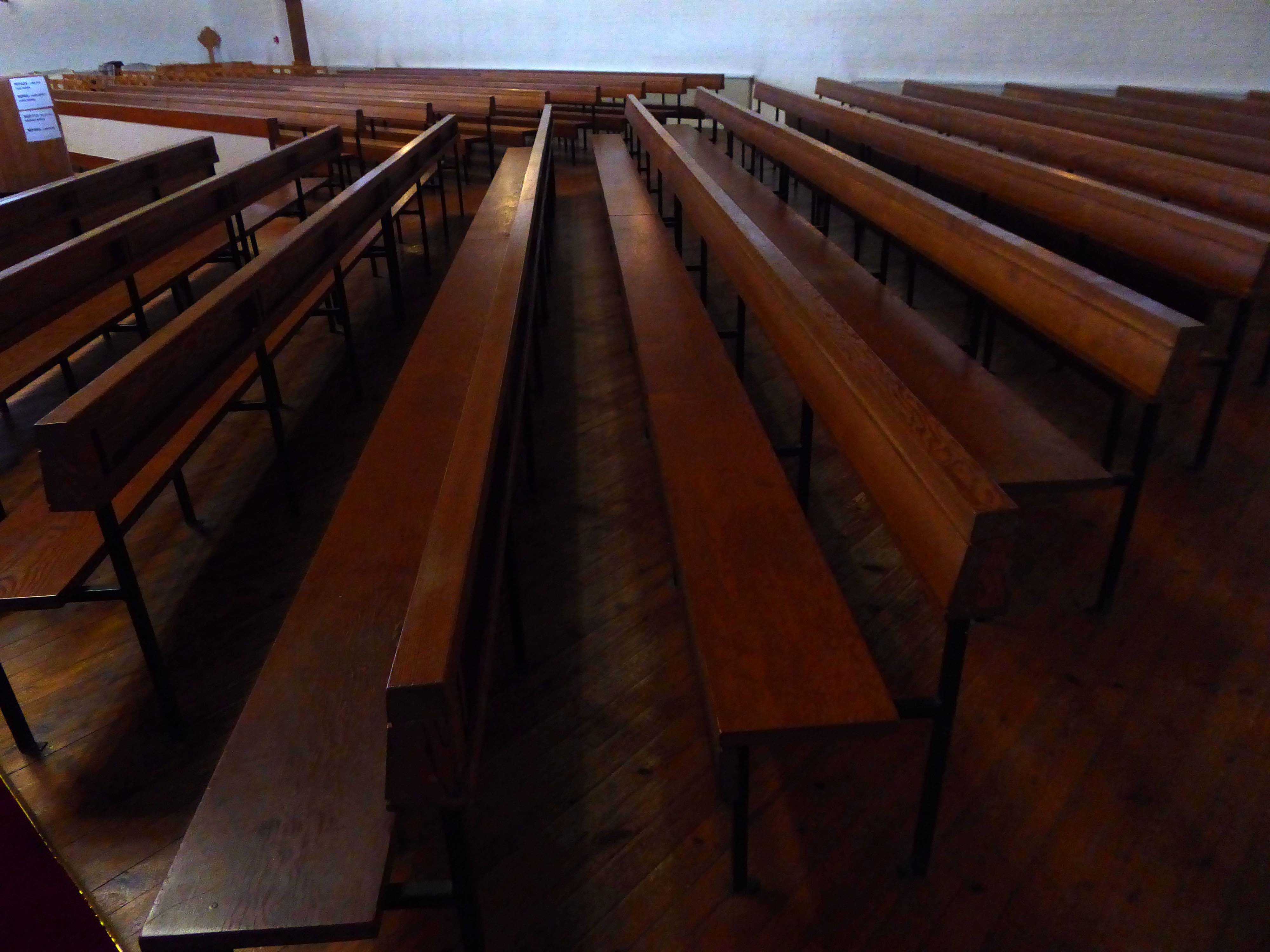
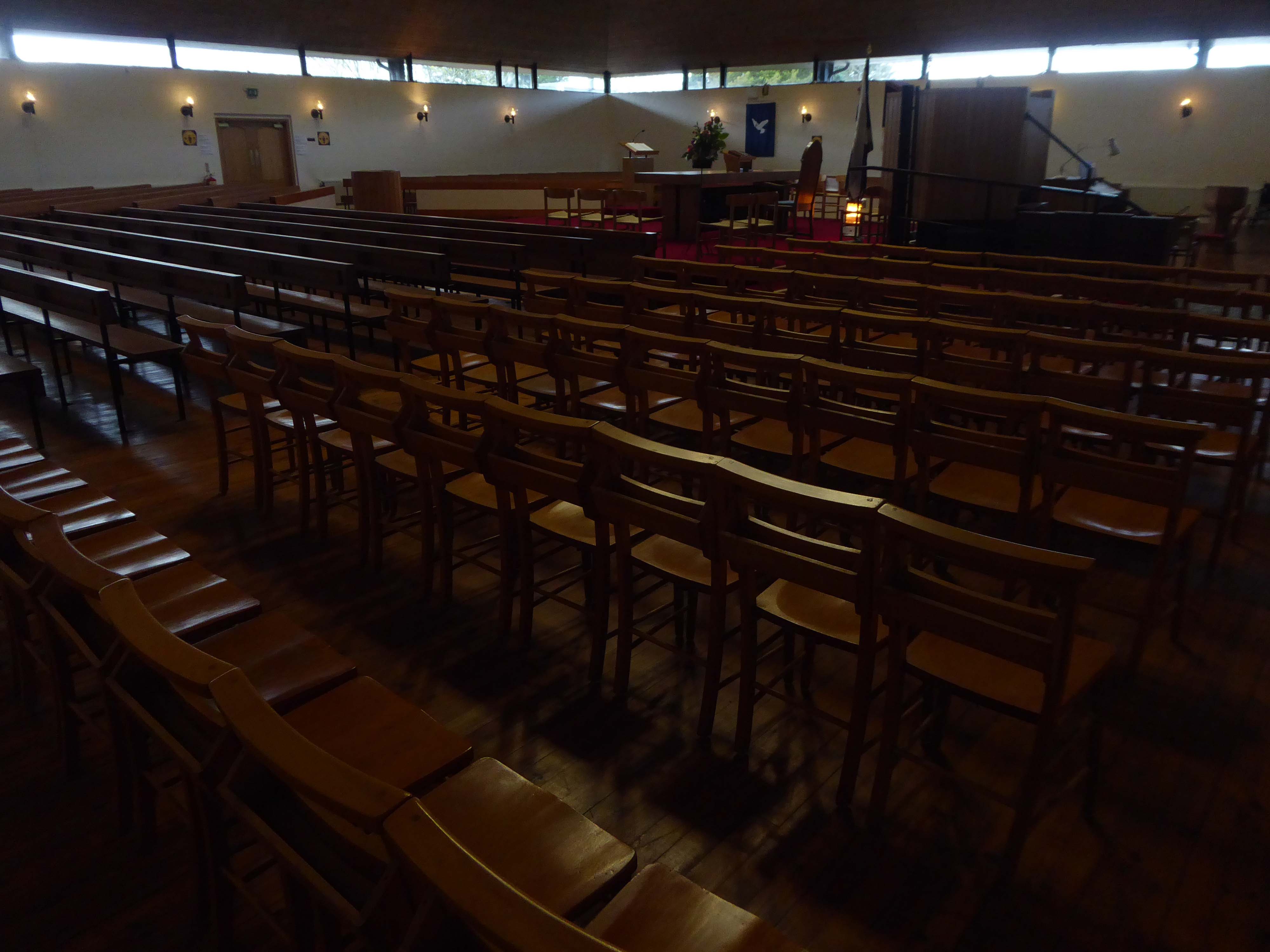
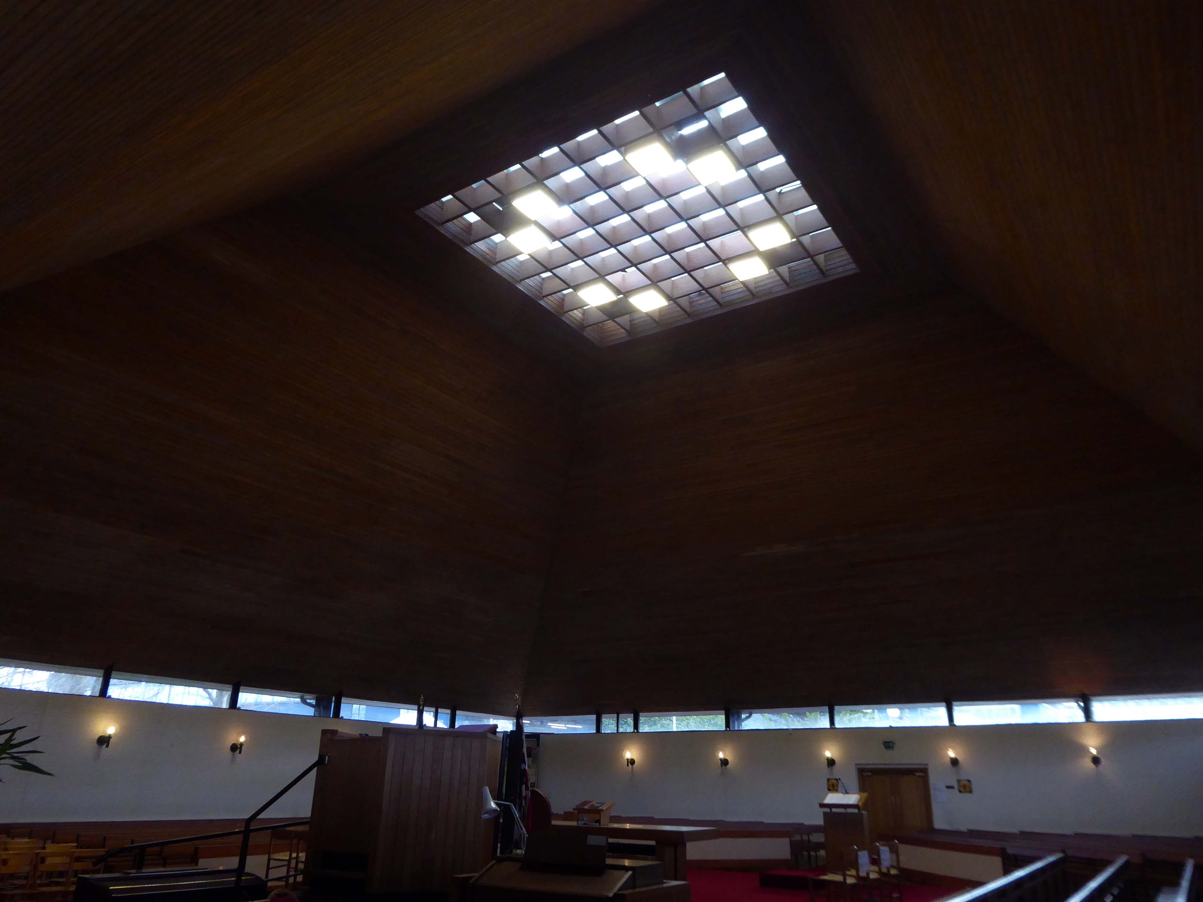
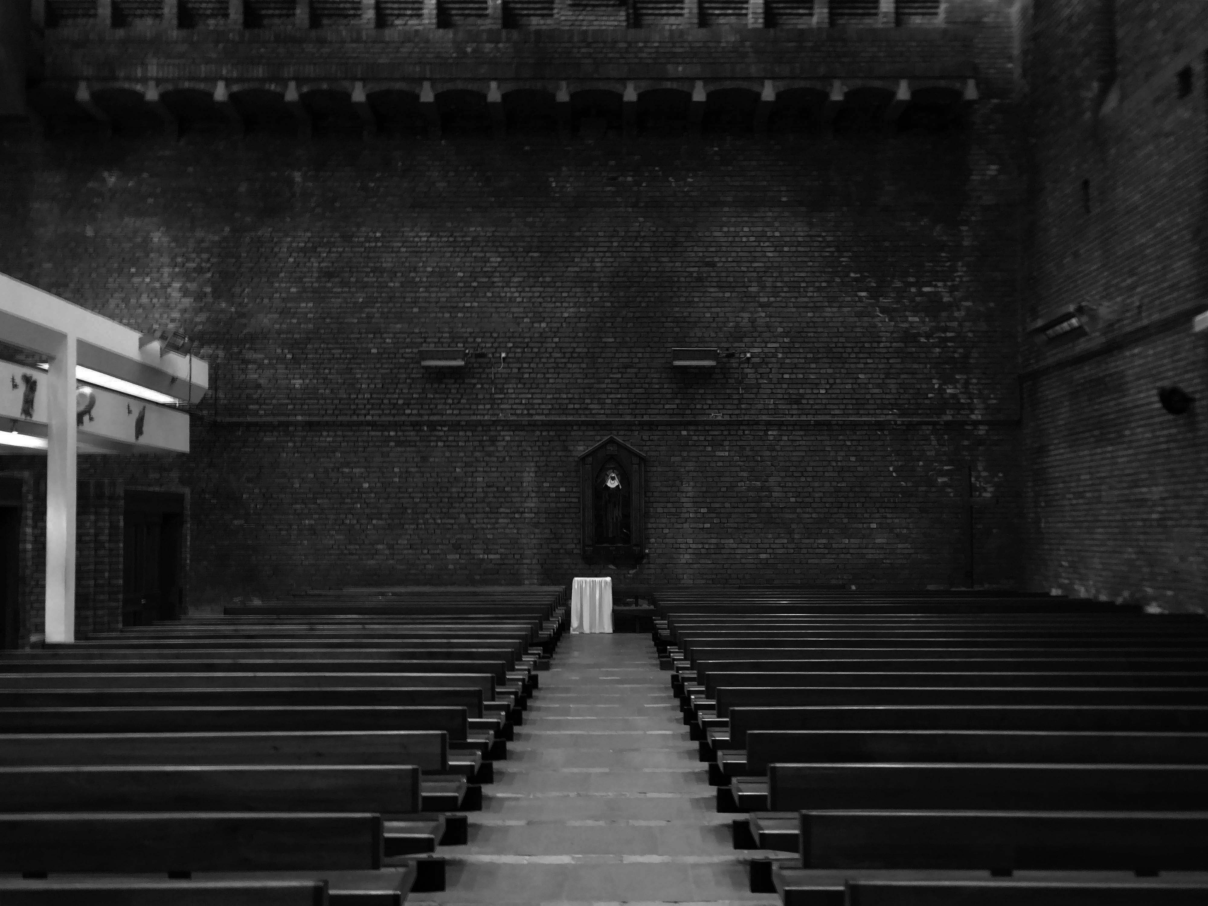
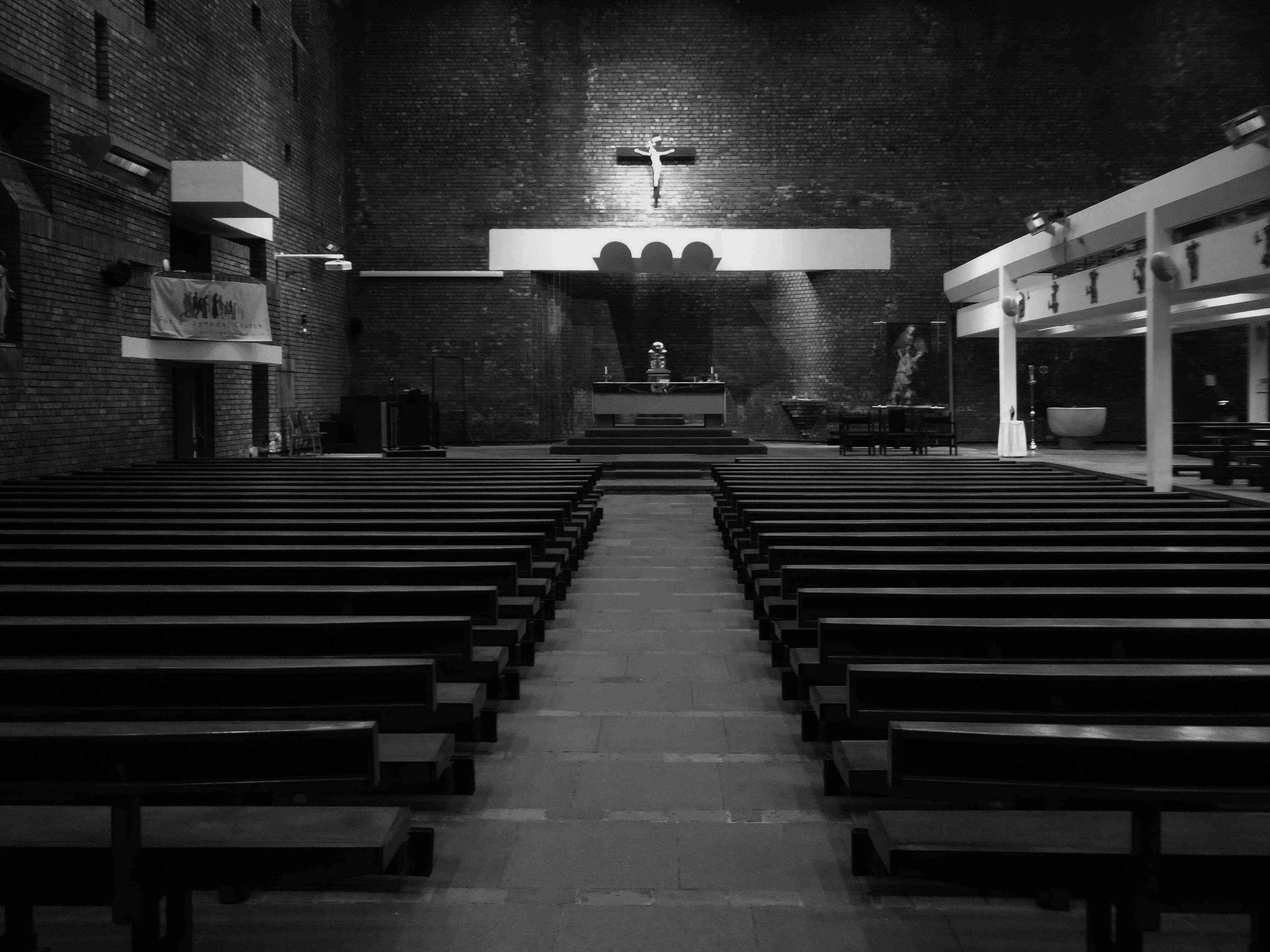
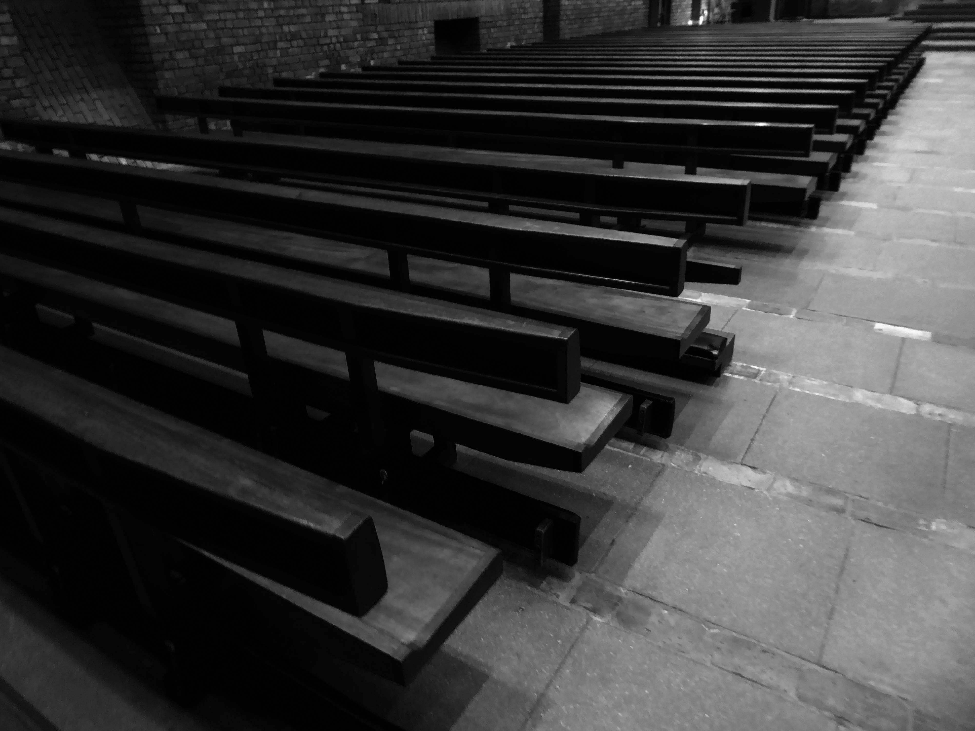
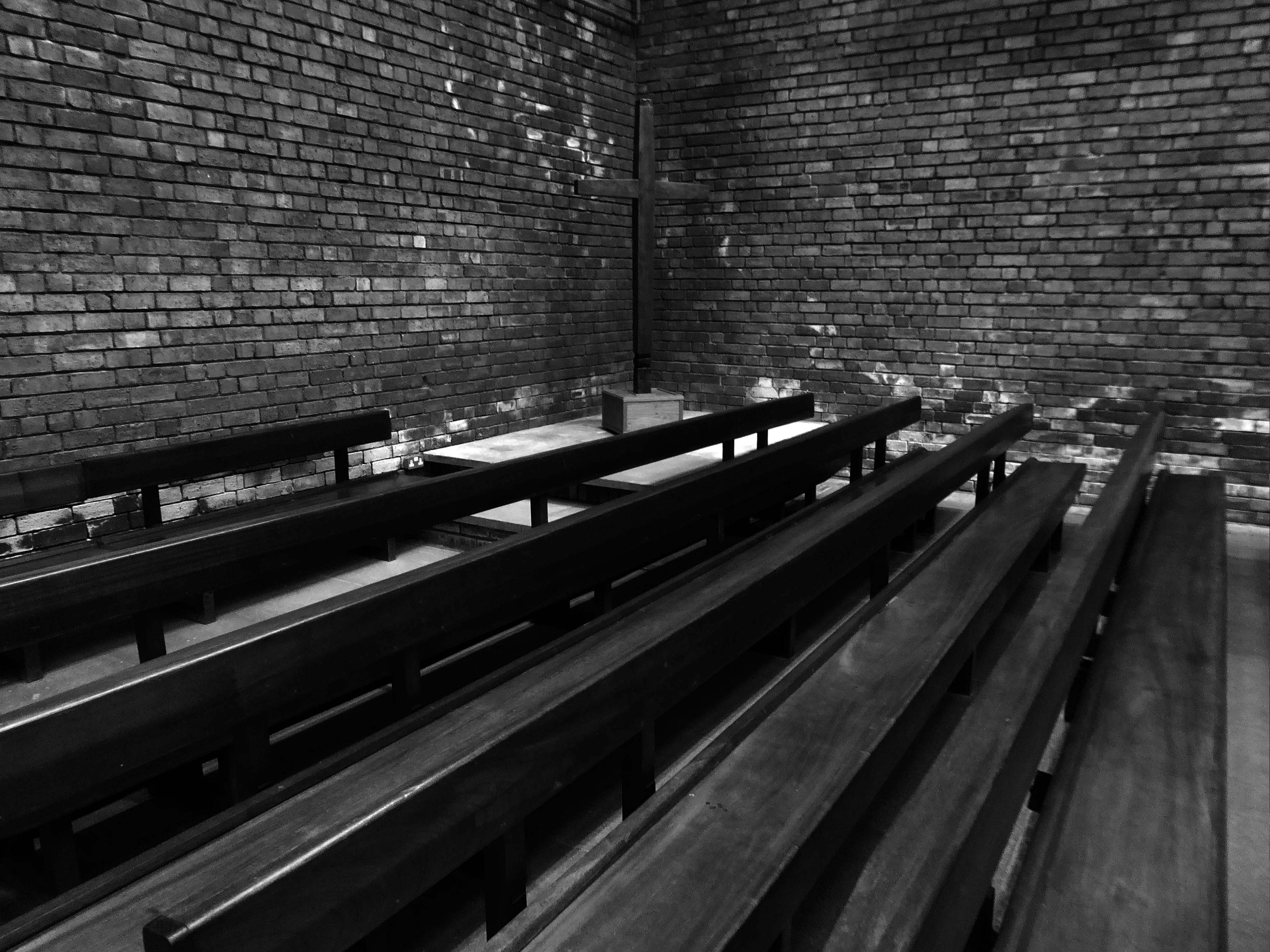
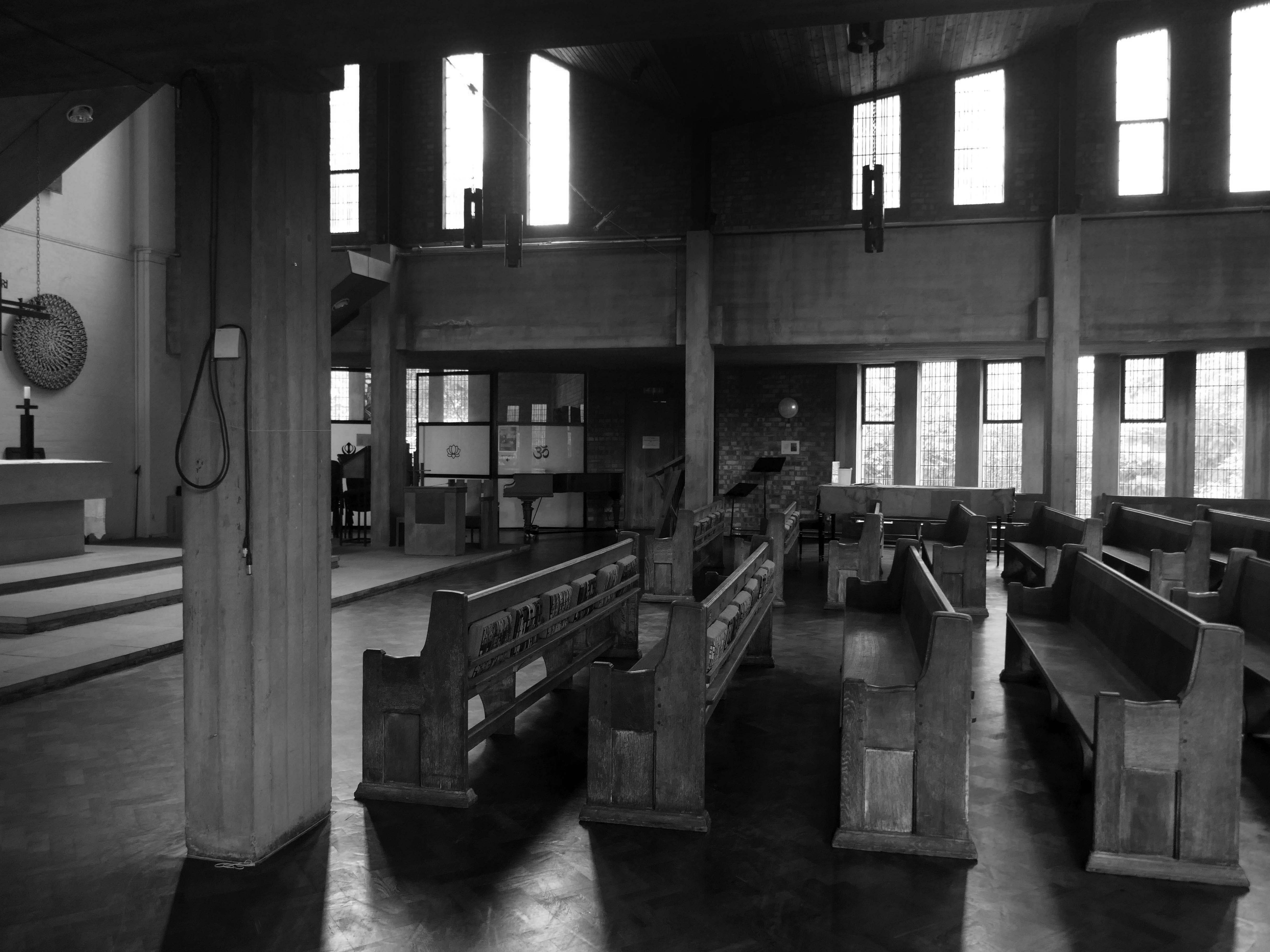
Interior with exposed concrete frame, including piers and thick ring beam at gallery level, with brick infill. Boarded timber ceiling to main space; board-marked ceilings to low side aisles. Choir gallery with organ, designed by Pace, set behind timber lattice screen also to his designs, and reached via narrow spiral stair. Ceramic piece to balcony front 1999 by Helen Batty. Some pews, brought from the college’s former chapel of 1858 remodelled by Pace in the 1950s.
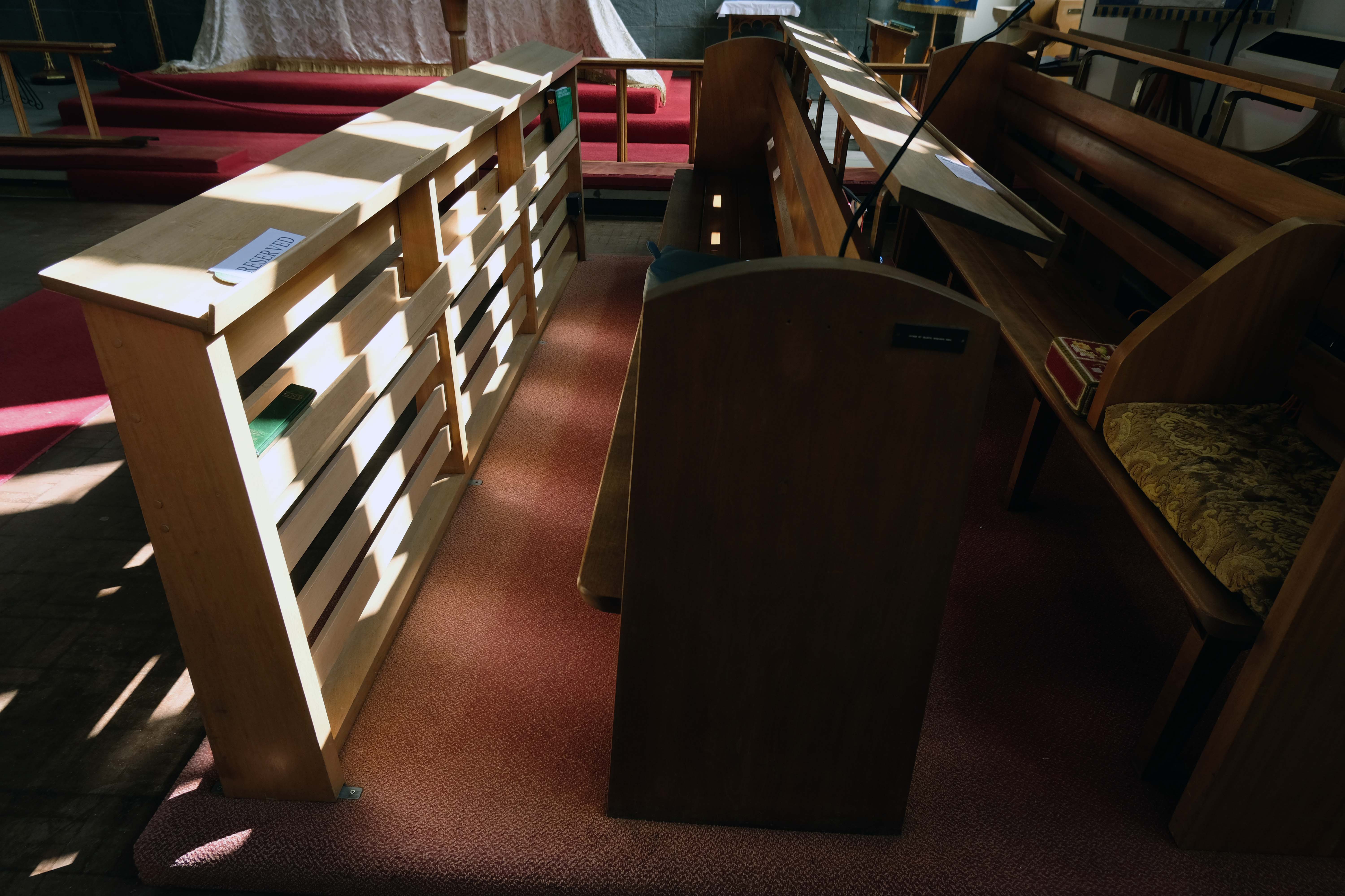
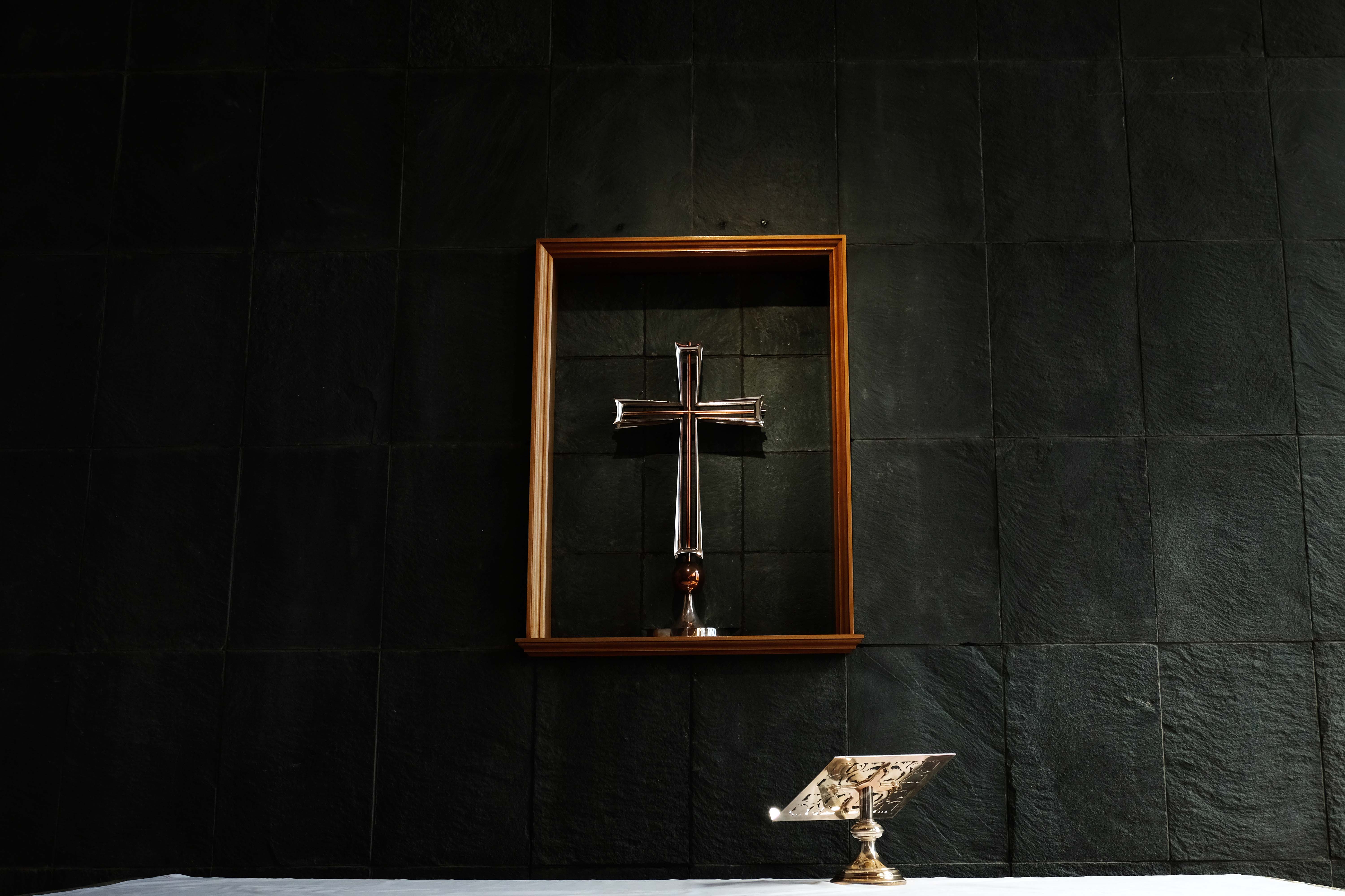
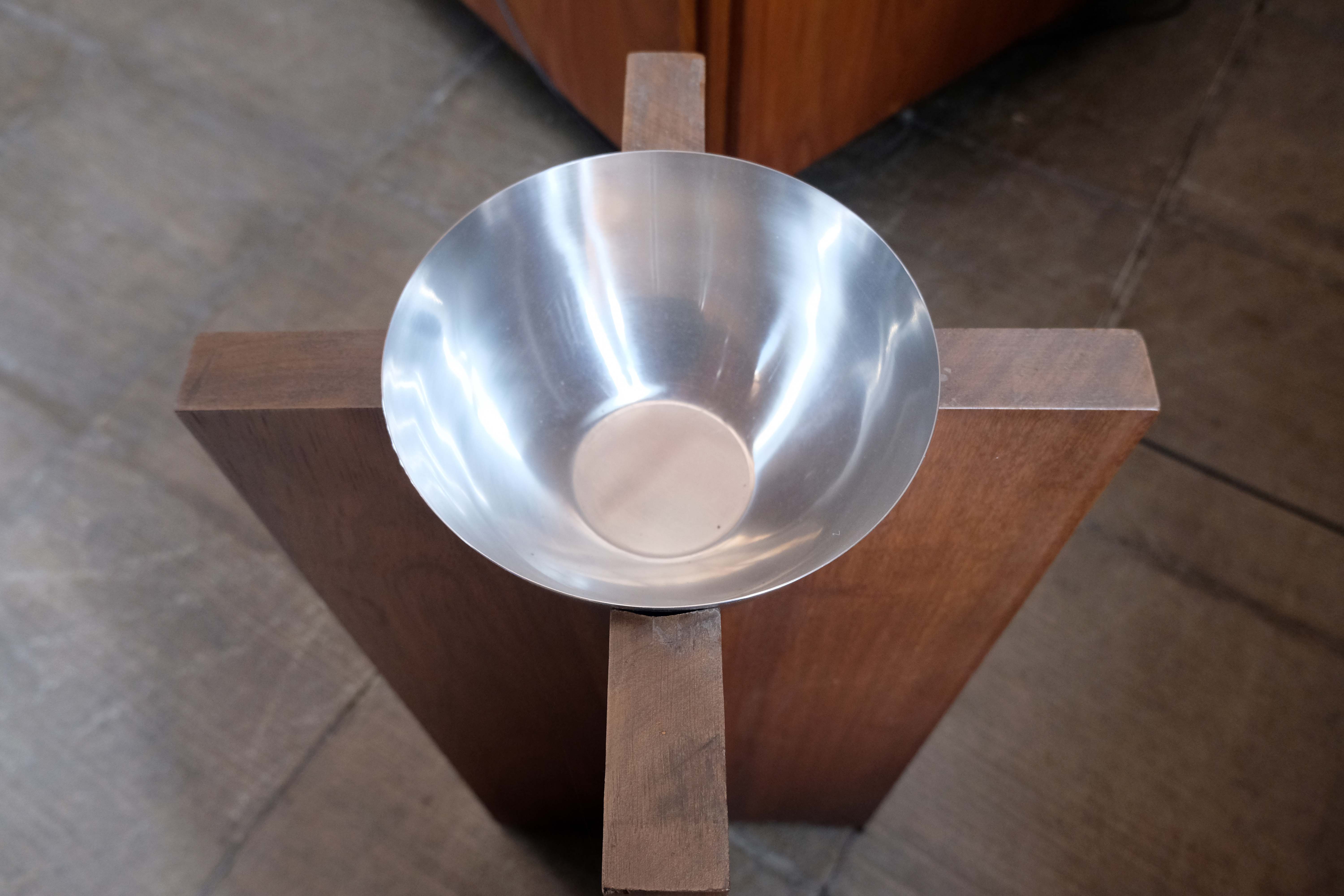
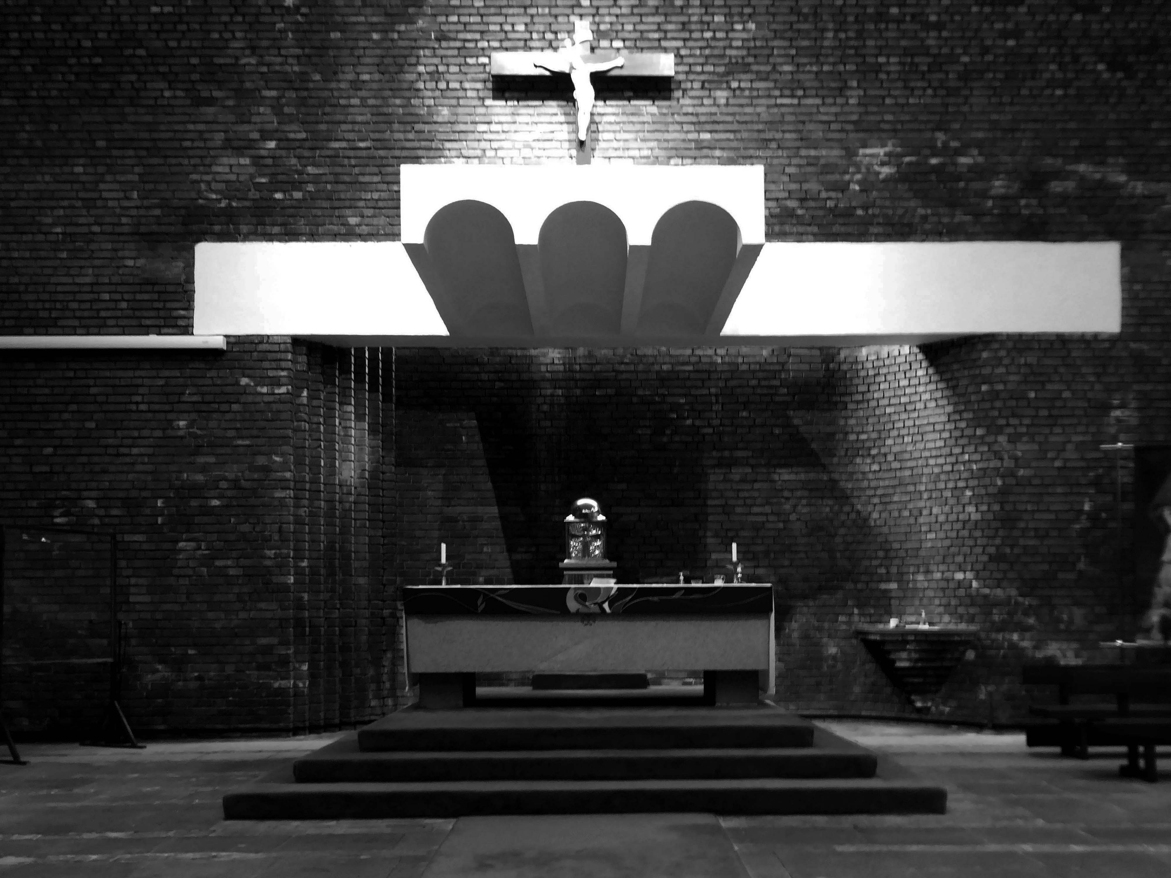
Hanging pendant light-fittings to Pace’s designs. Altar, lectern and altar seating all by Pace; pulpit designed 1998. Windows – internally the concrete of the mullions is exposed, all originally clear leaded lights, but now stained glass is being incorporated, most notably ‘The Water of Life’ by Cathy Nutkins, a 1990 graduate, in right-hand transept.
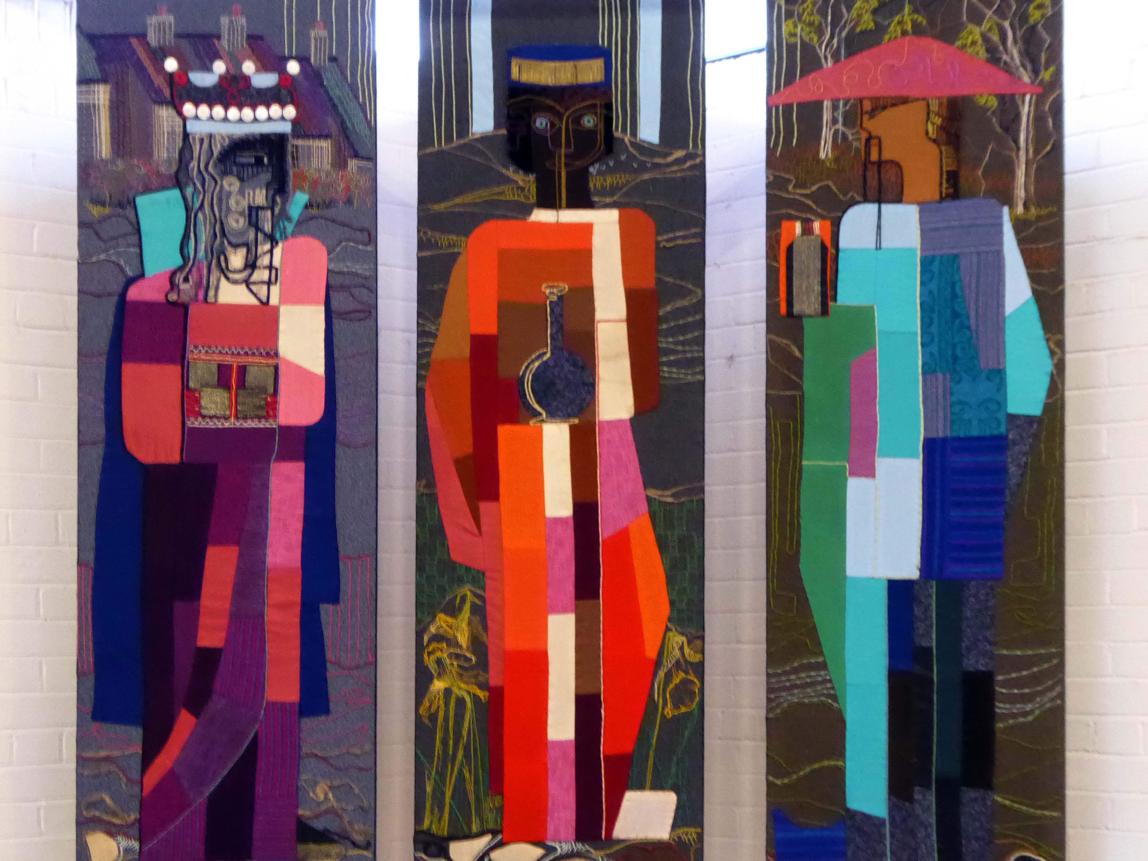
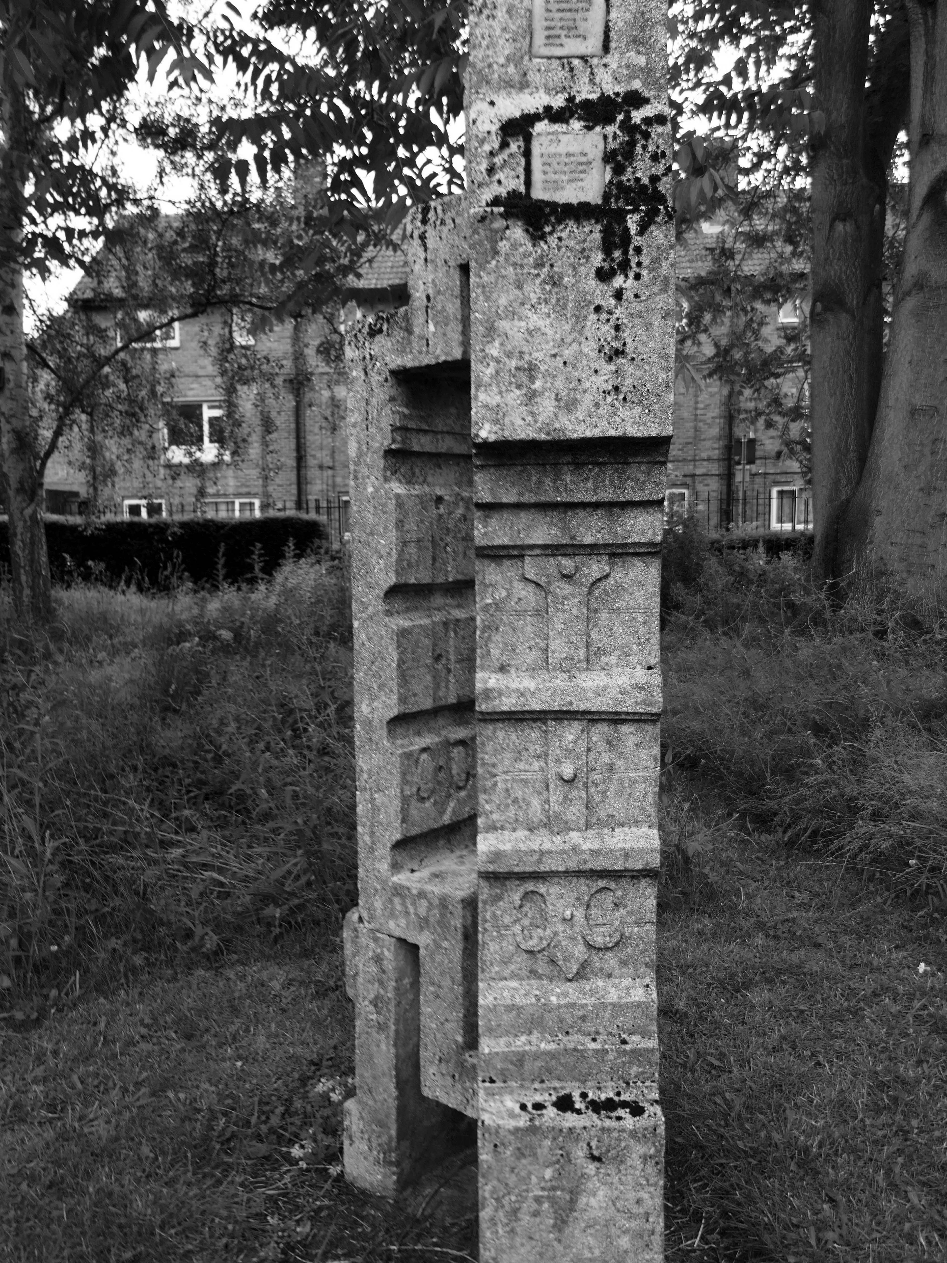
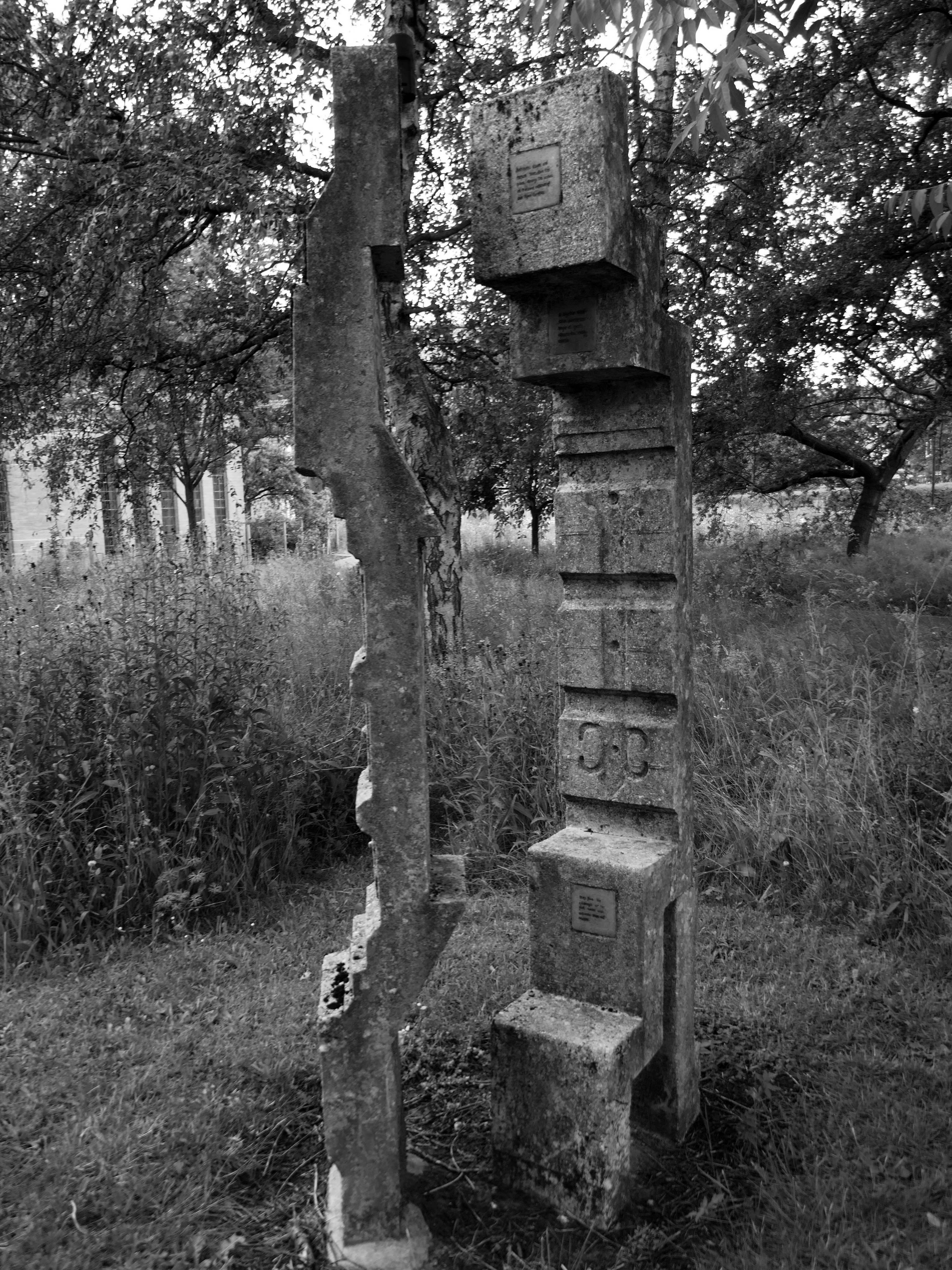
Chapel of Christ the Teacher to rear, by foyer, refurbished 1994 by Helen Turner, textile artist. The building is well-suited to the incorporation of student works of art, some temporary, some permanent, and additions are continually being made to the collection.
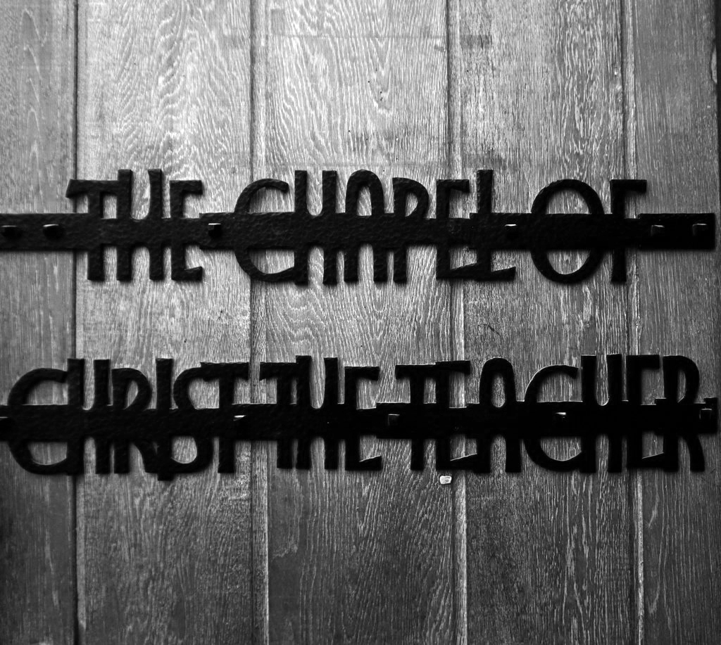
Photo: © Richard Burrows 2022
There is a full and thorough analysis of the building here at York C20
And an audio tour right here.