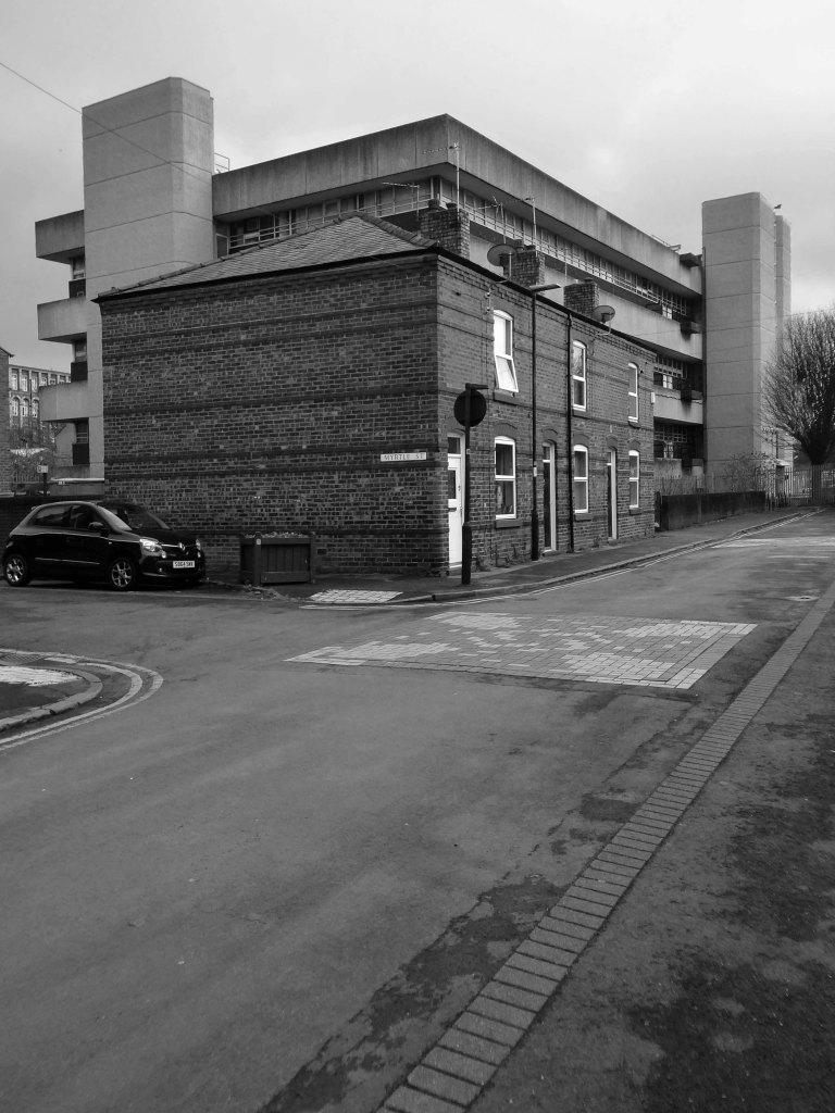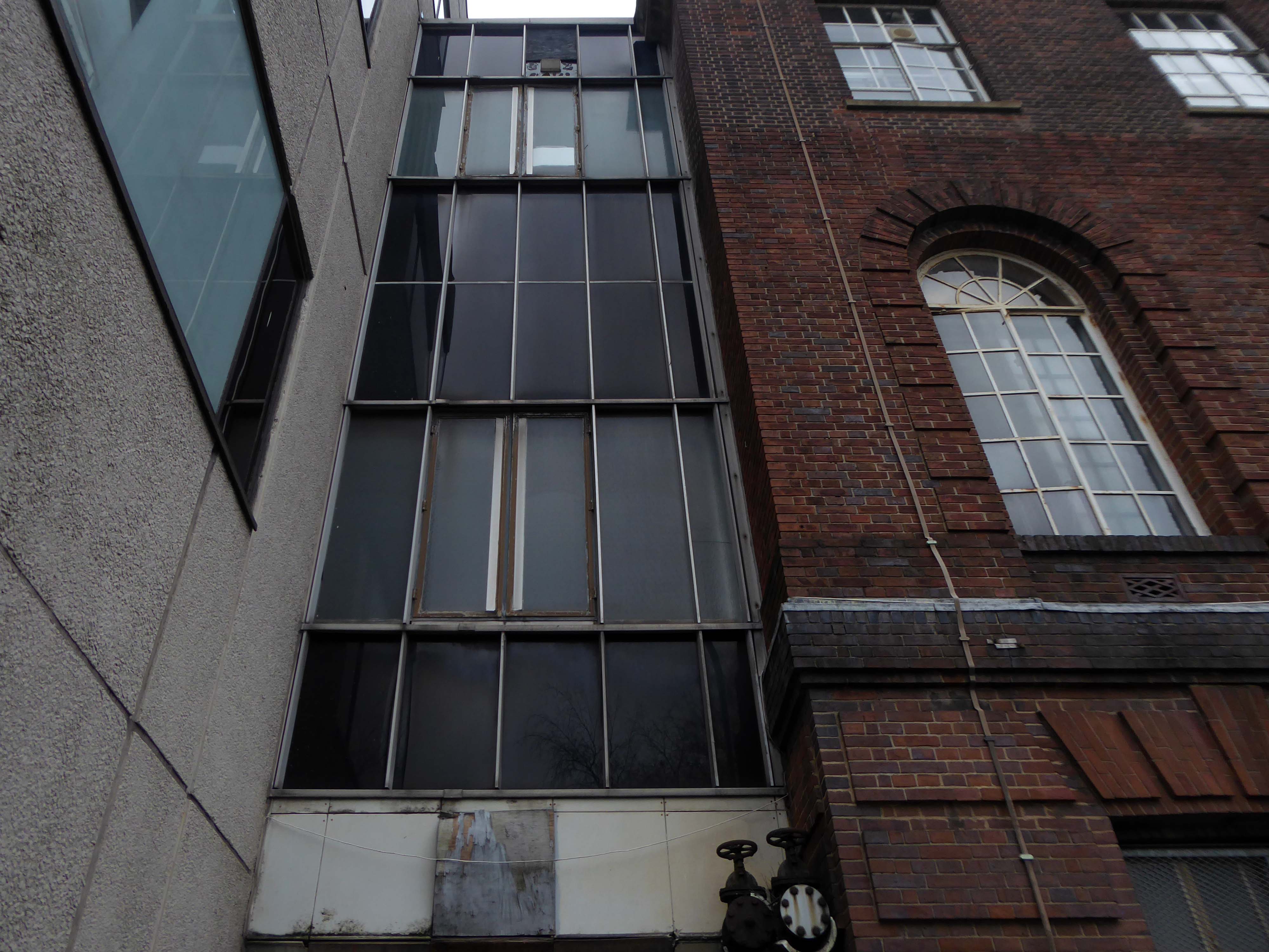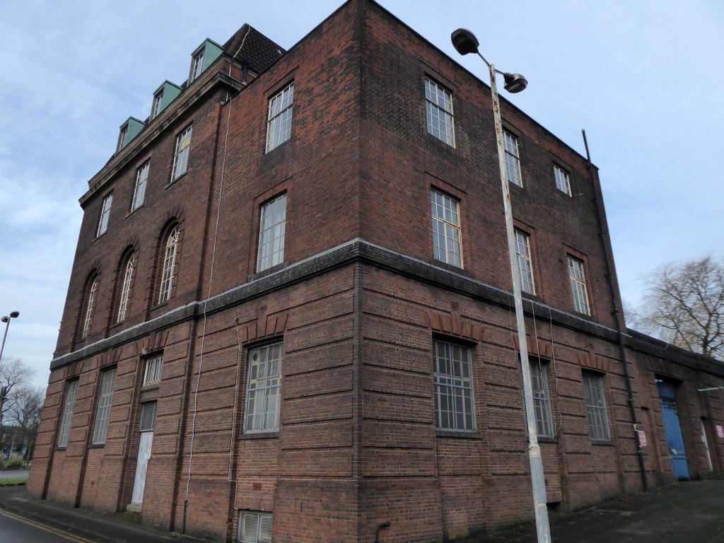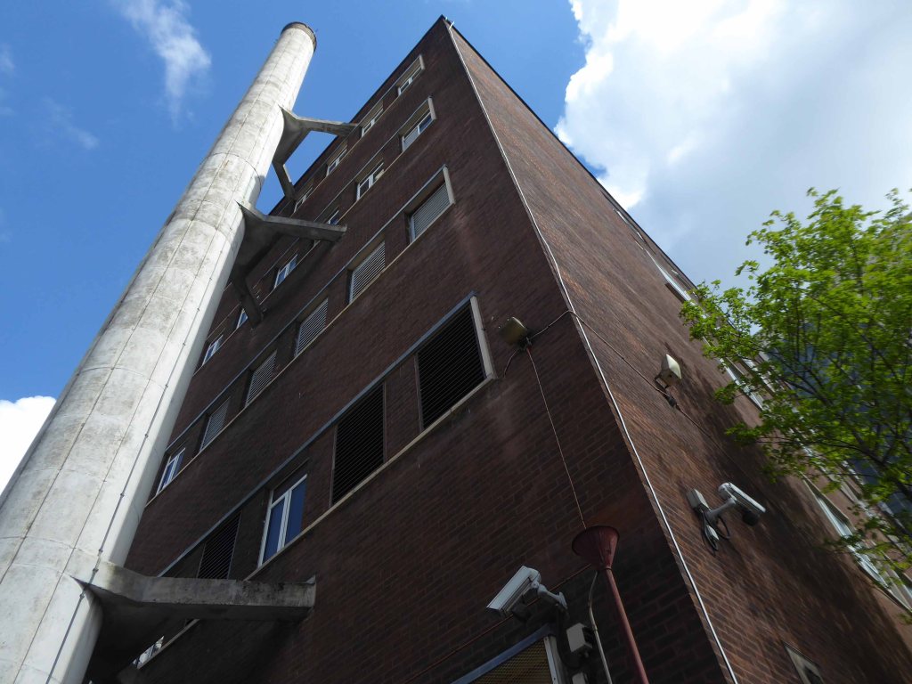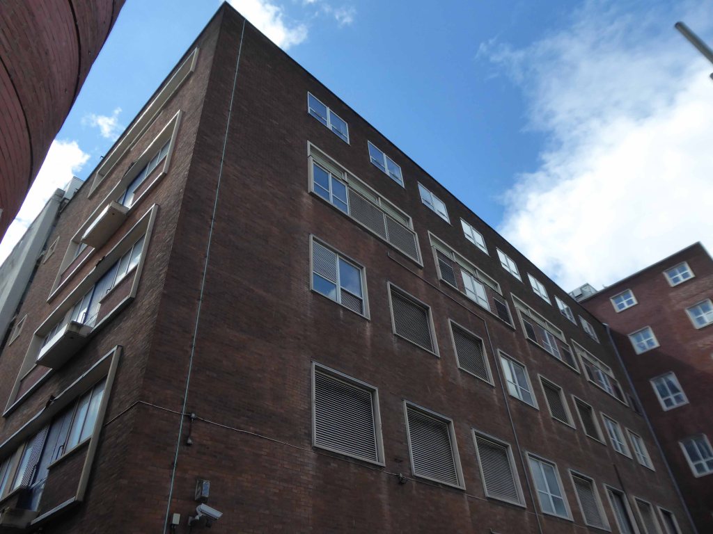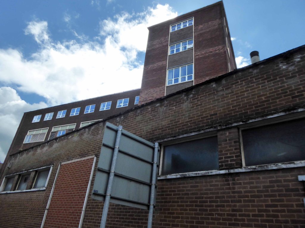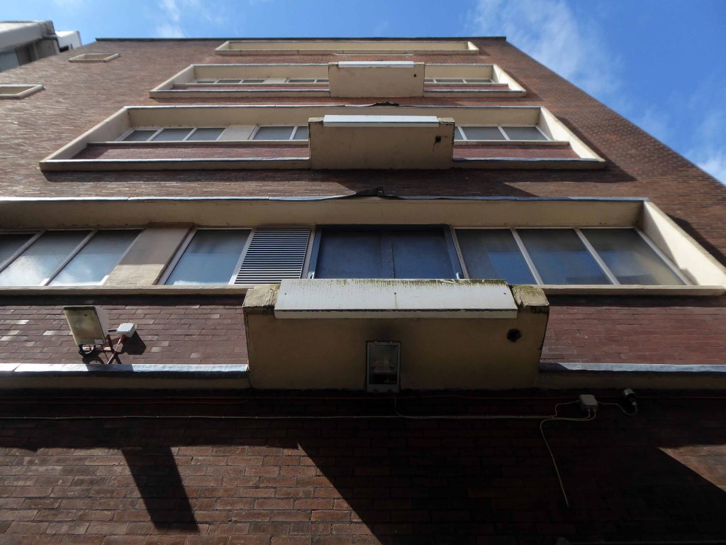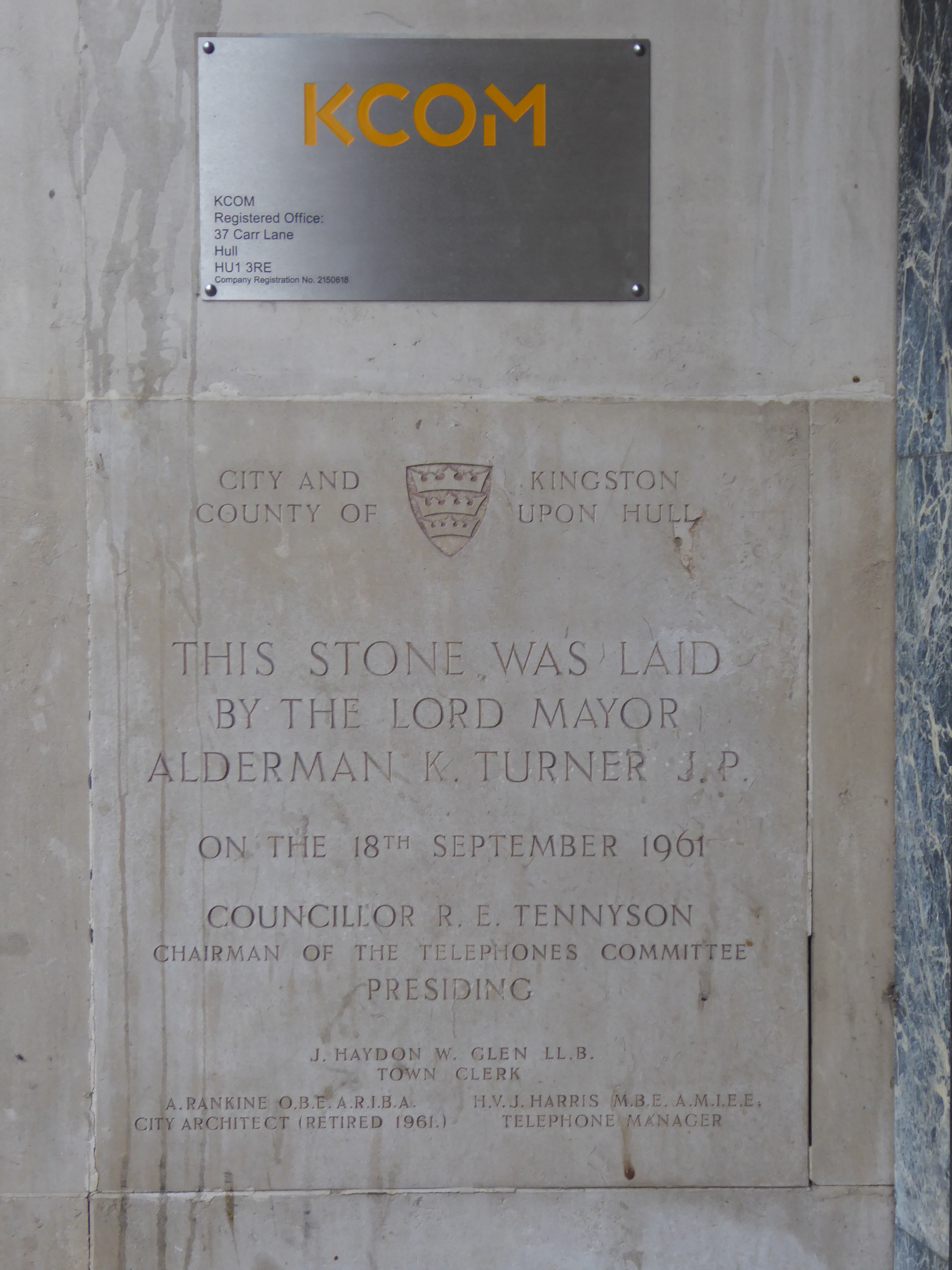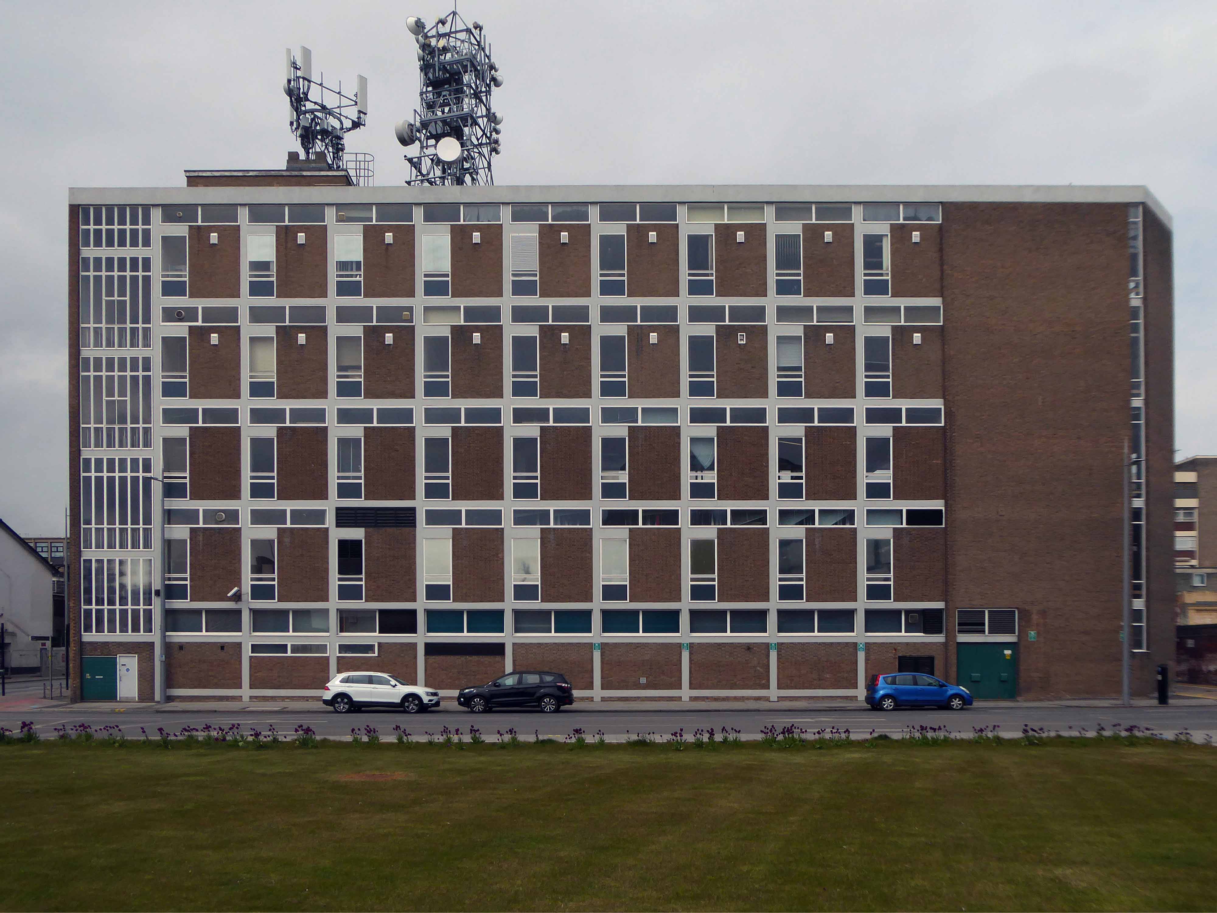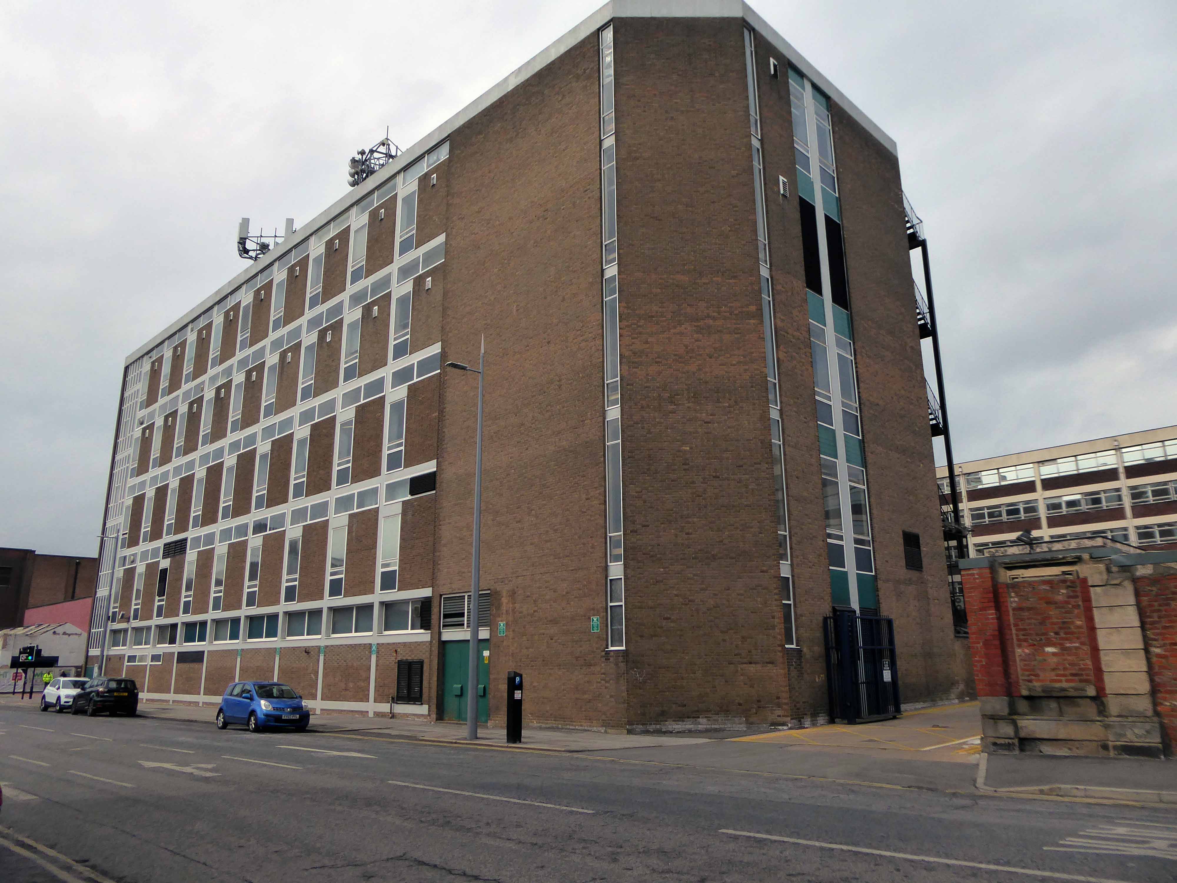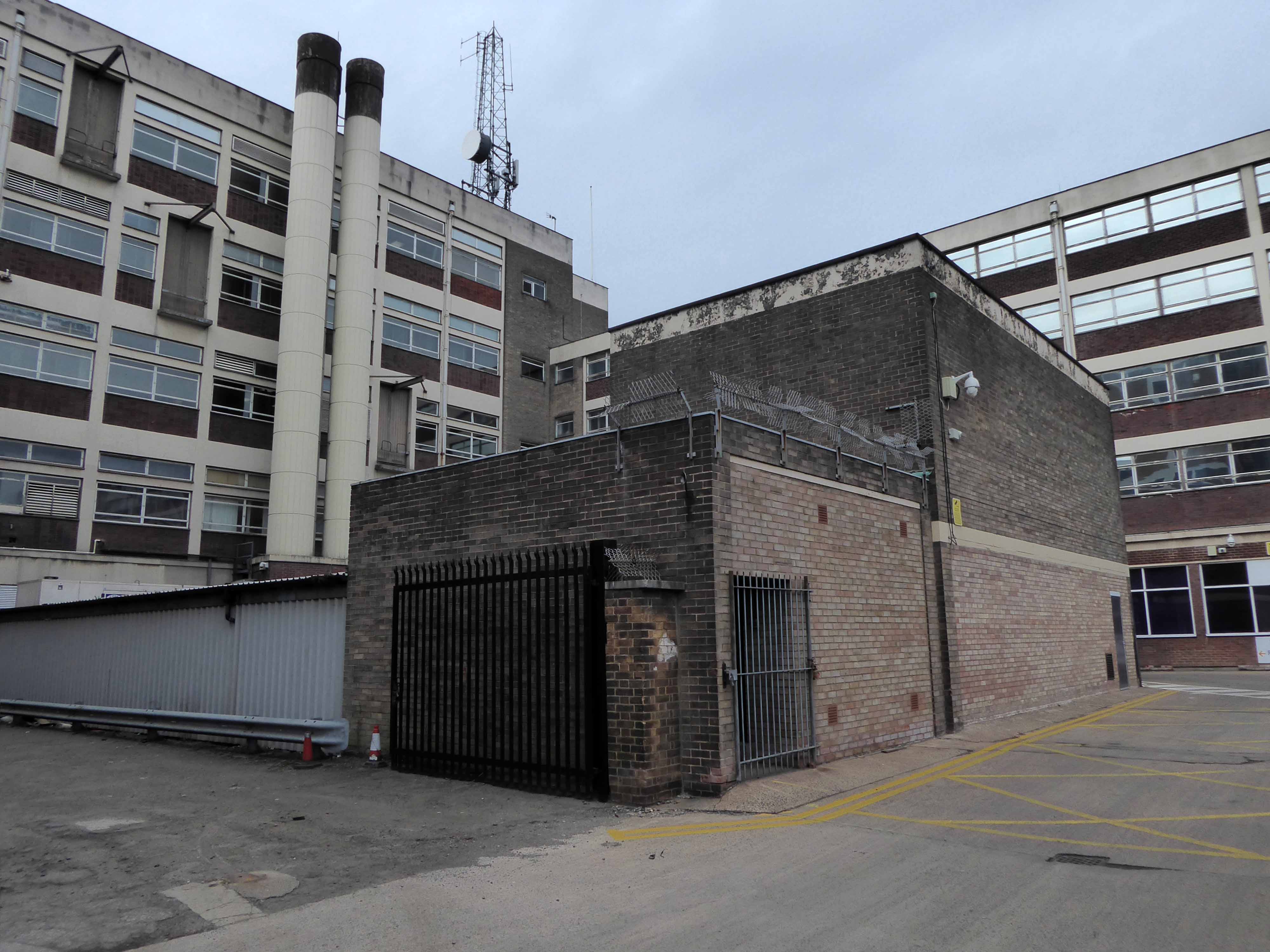


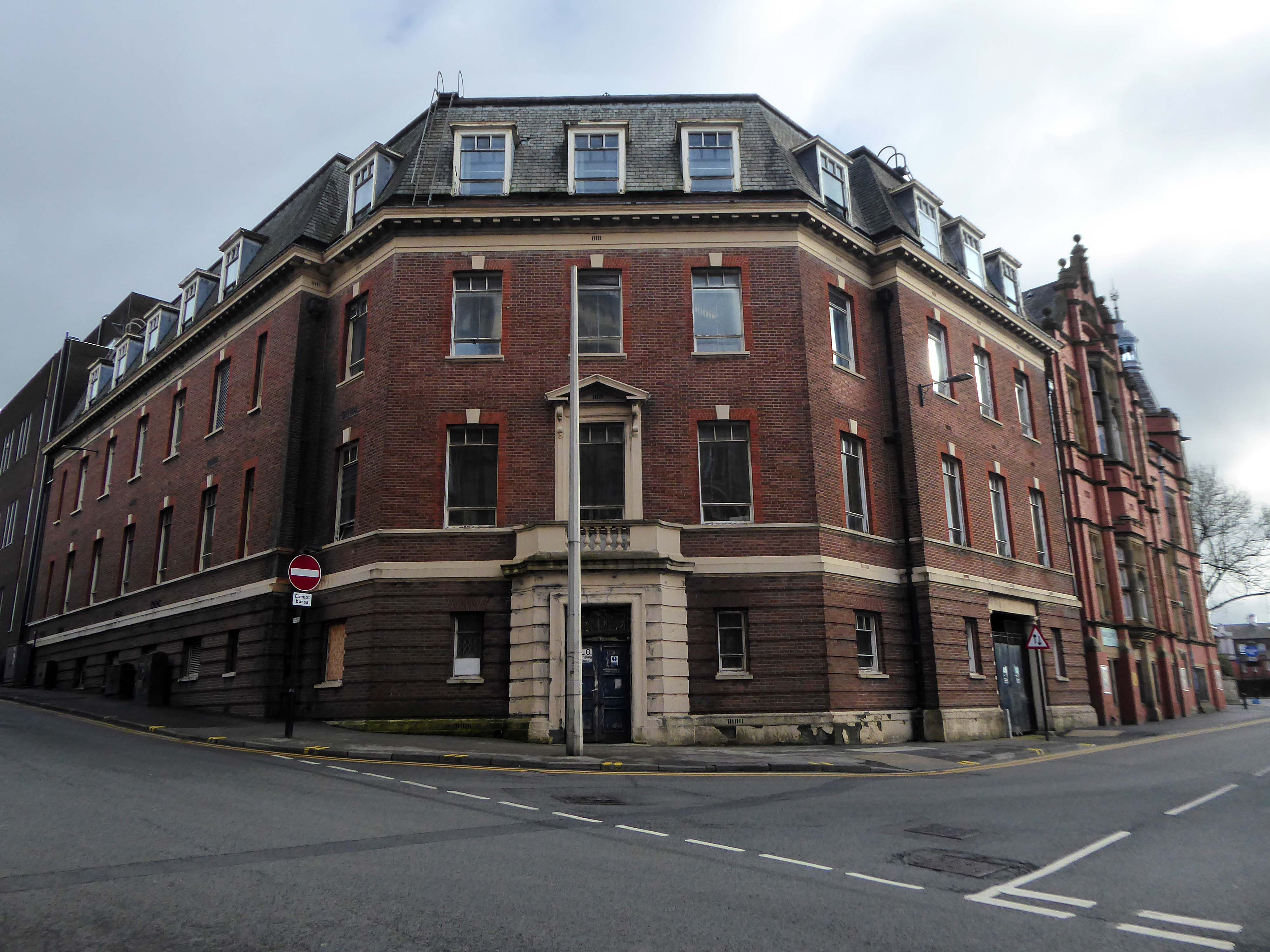
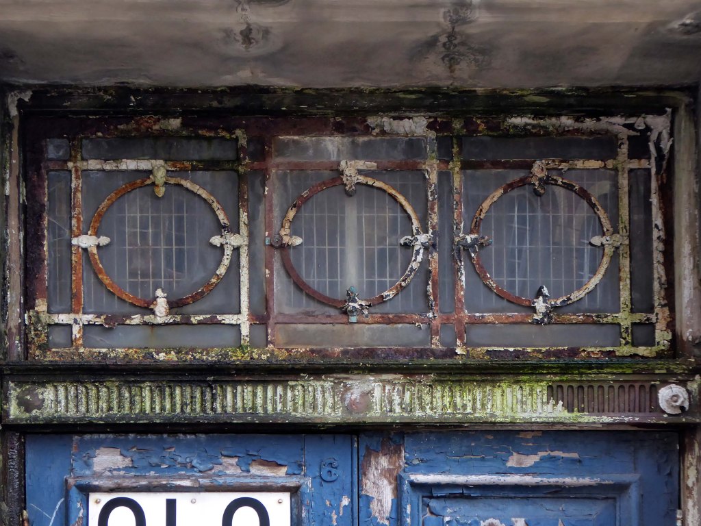
Wandering around Wigan left and then left out of Wigan Wallgate ending up on the corner of Dorning Street, there’s a big red brick building.
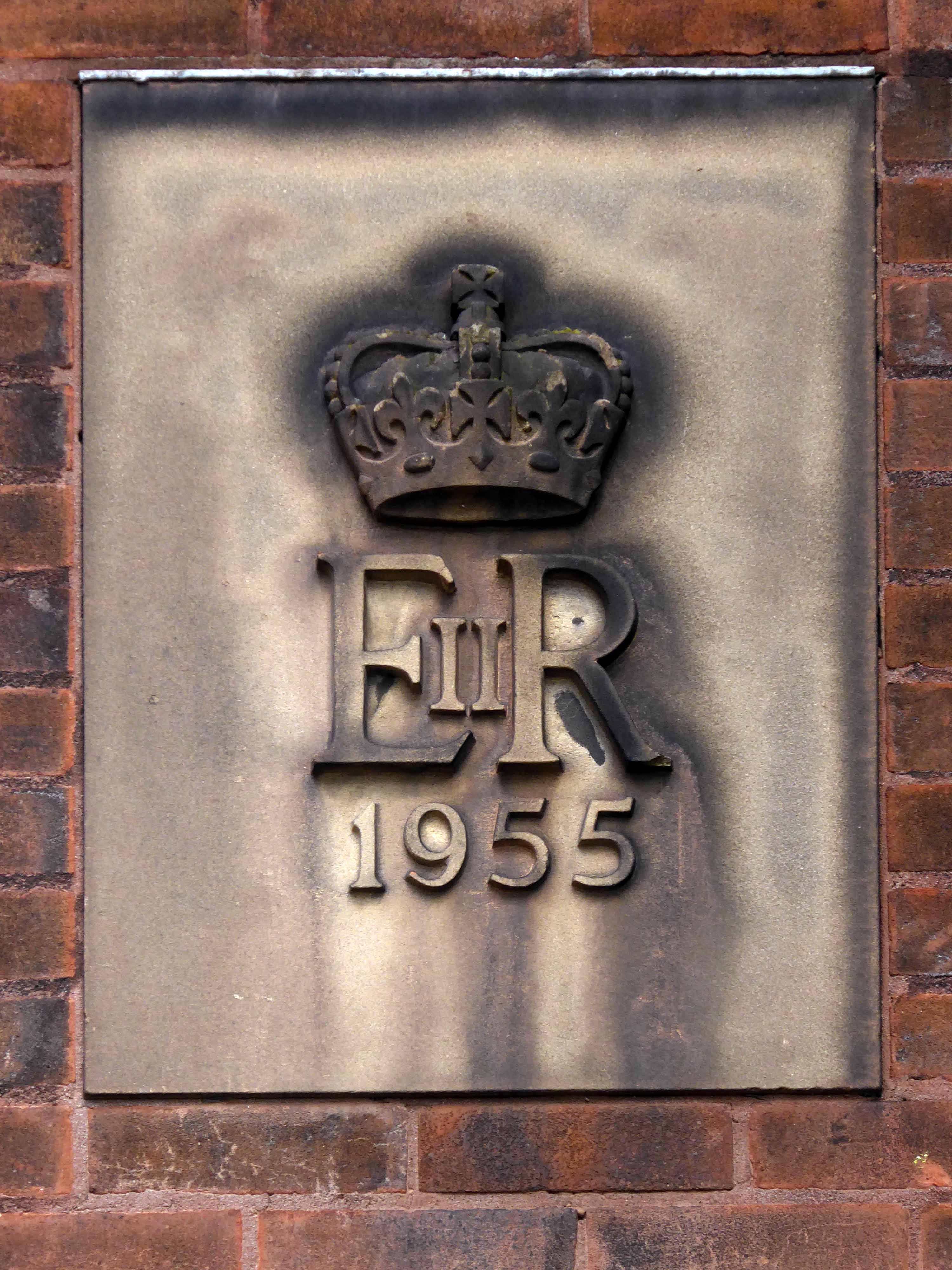
1882

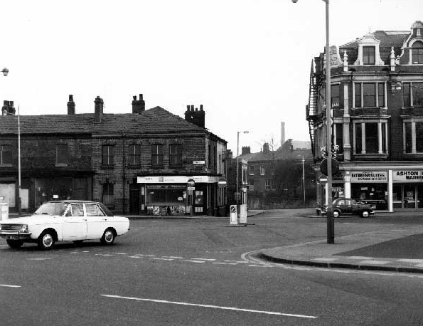
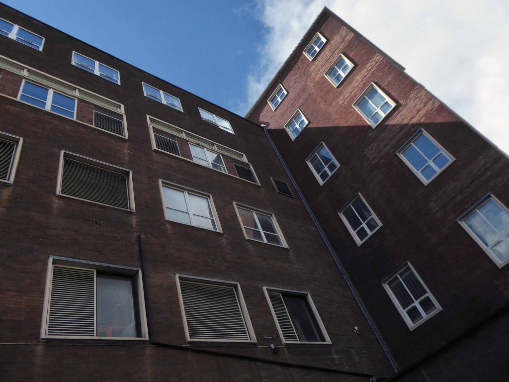
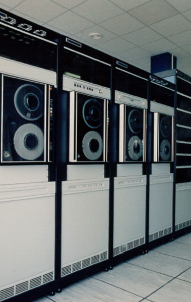
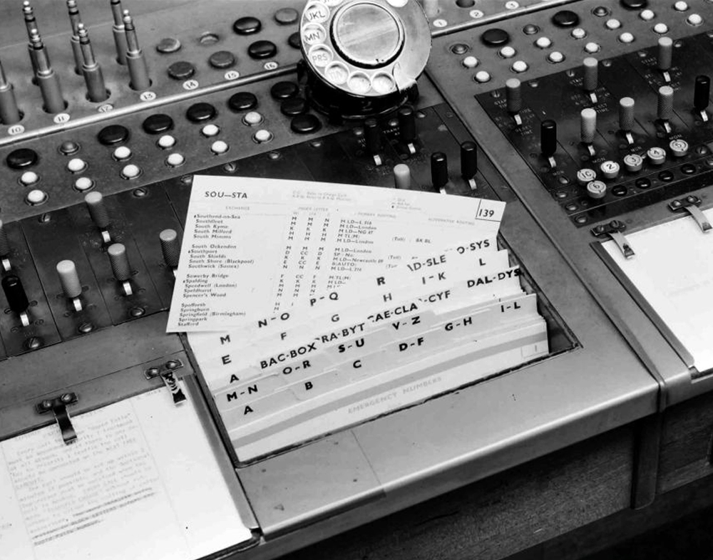
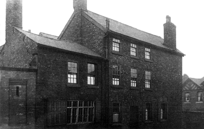
Where all this went on in 1946.

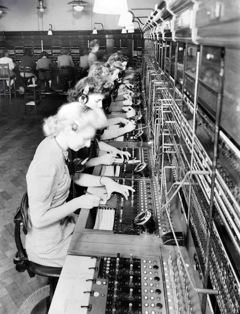
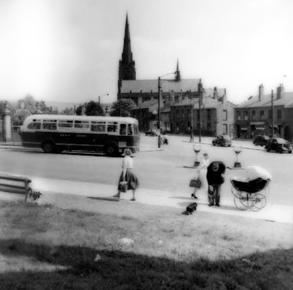
And all this went on too!
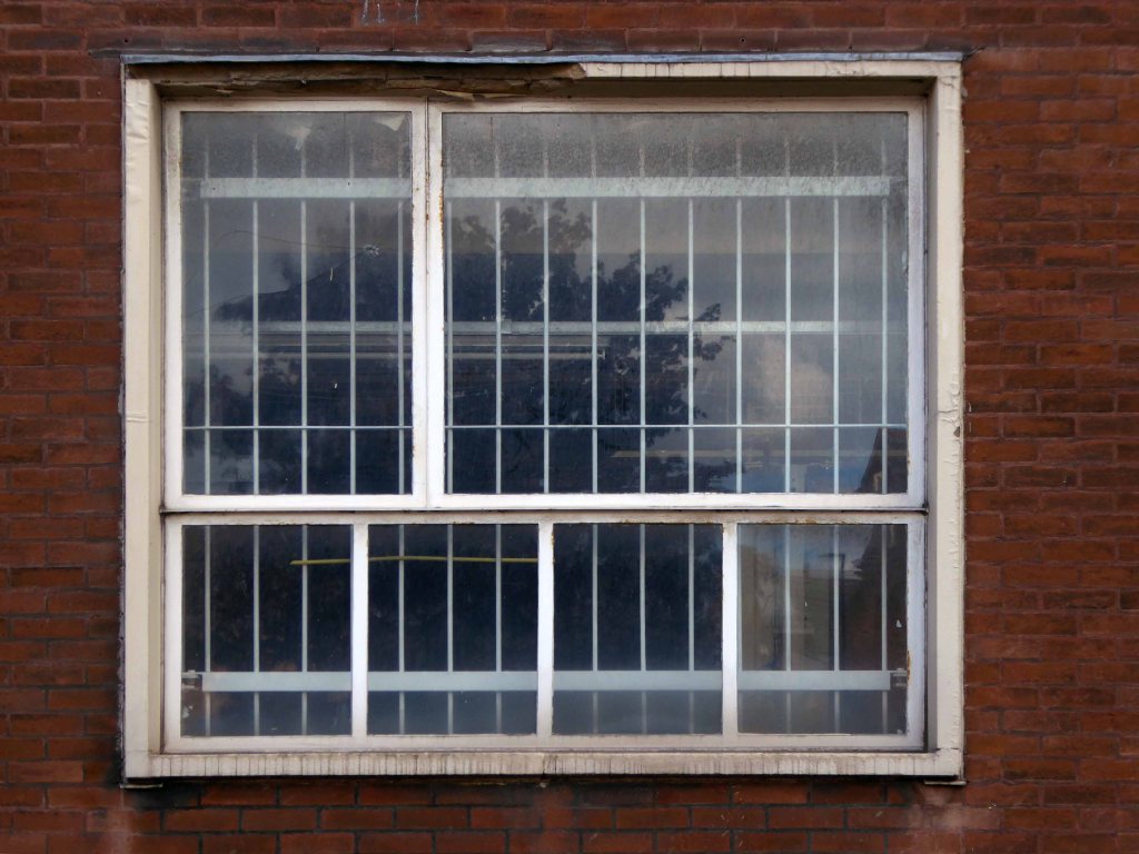
I only worked there very briefly in 1965, to do my Test Desk Training. It was a pleasant, if too hot, place to work: I remember being taken out for lunch at the Grand on my first day – very nice!
One peculiarity, which always stuck in my mind, was the canteen, upstairs, where the men all clung to one side, and the women to the other, never saw that anywhere else.
I was a telephonist 1961 -1968, I married a telephone engineer, you are right about the canteen or kitchen upstairs. When I first started after I’d finished my training I was sent down to the test desk for a long stand. Being a naive little thing I did as I was told, then sent out for some sky hooks and hen party hens, the girls I worked with were a great bunch we had ball best working years of my life, still friends with some of the telephonists I worked with – happy days.
Walking down Dorning Street one day going back to work and on the pavement outside the Grand there was a half crown. Tried to pick it up to howls of laughter. The lads in the telephone exchange opposite had welded a nail to it and pushed it in the ground between the paving flags. Very funny, and no I didn’t get it out.


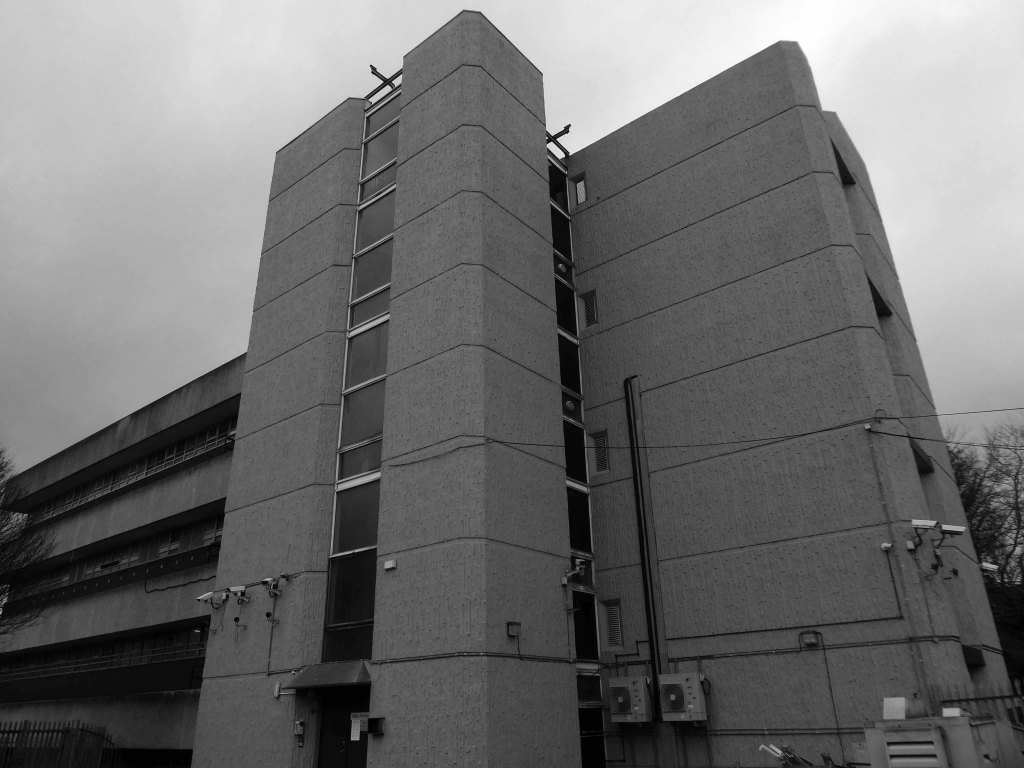
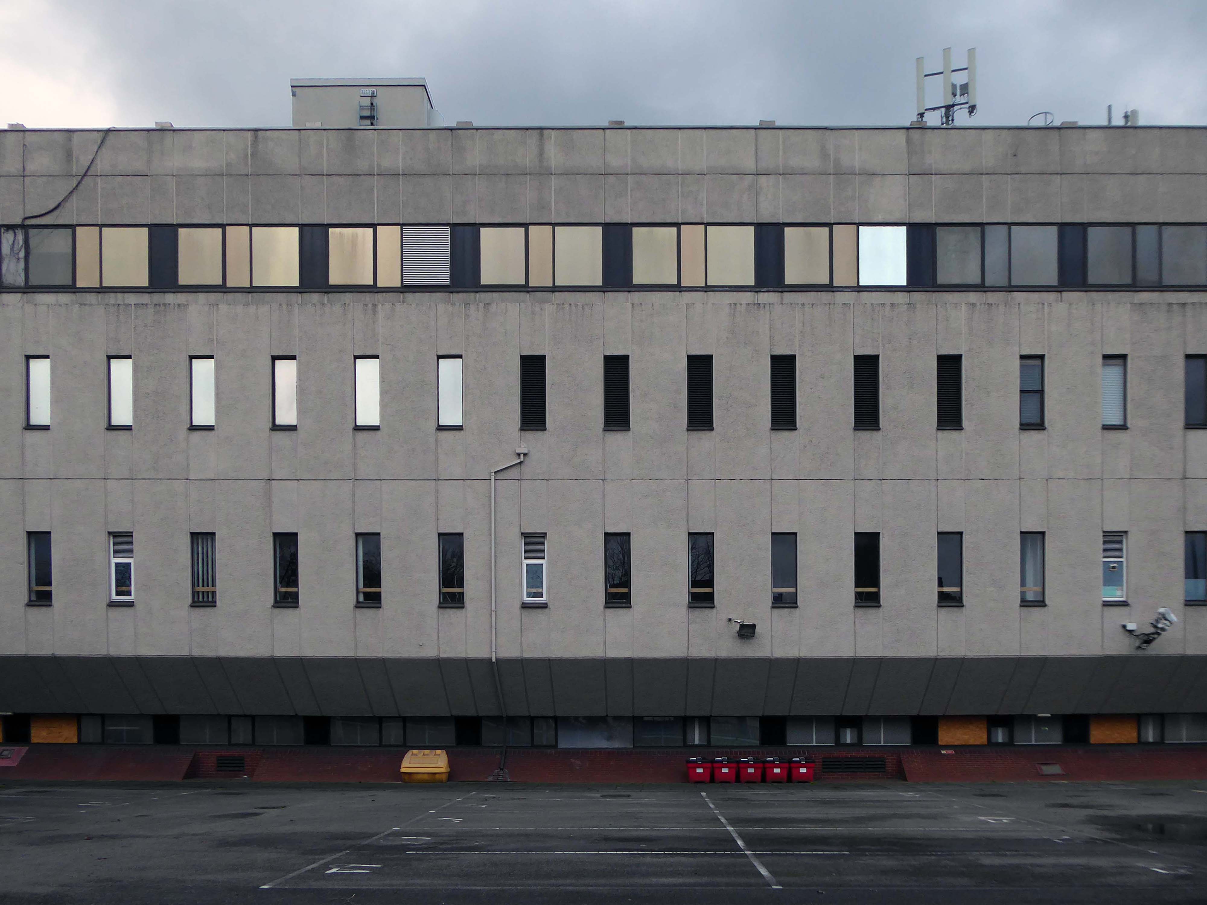
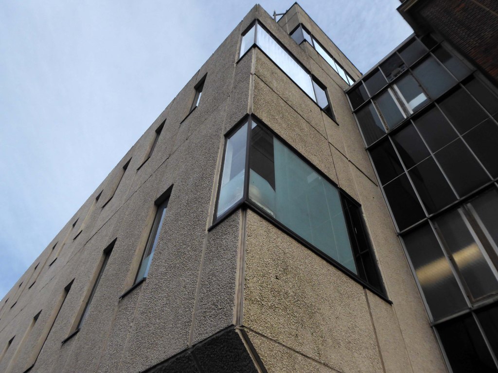
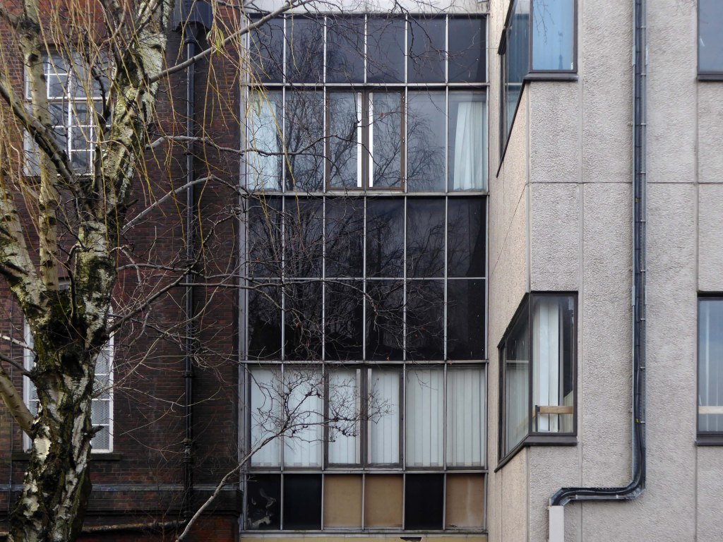
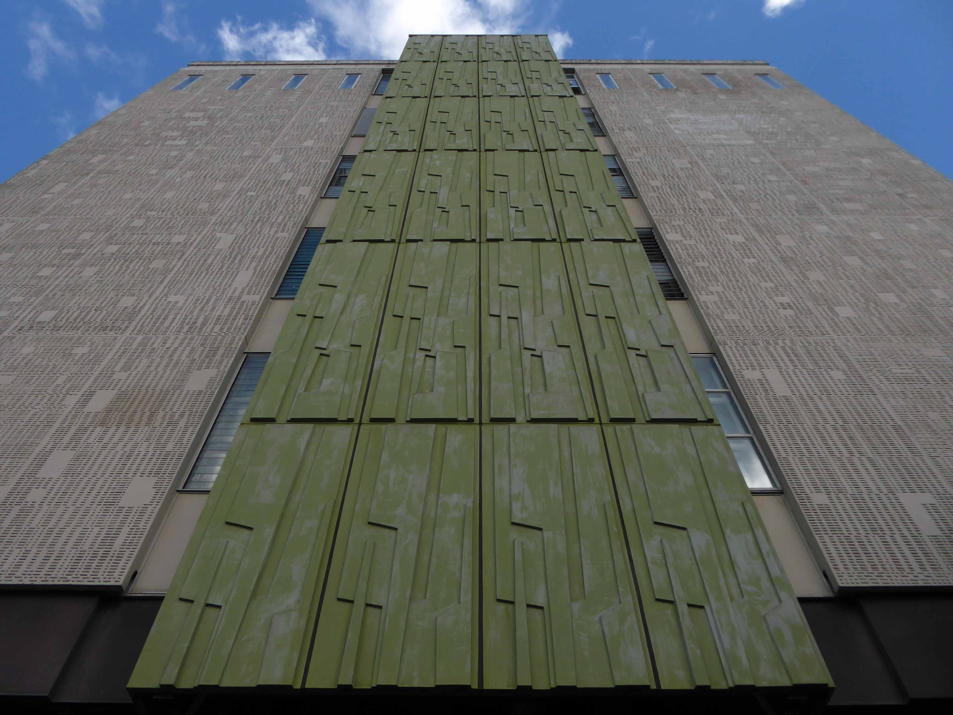
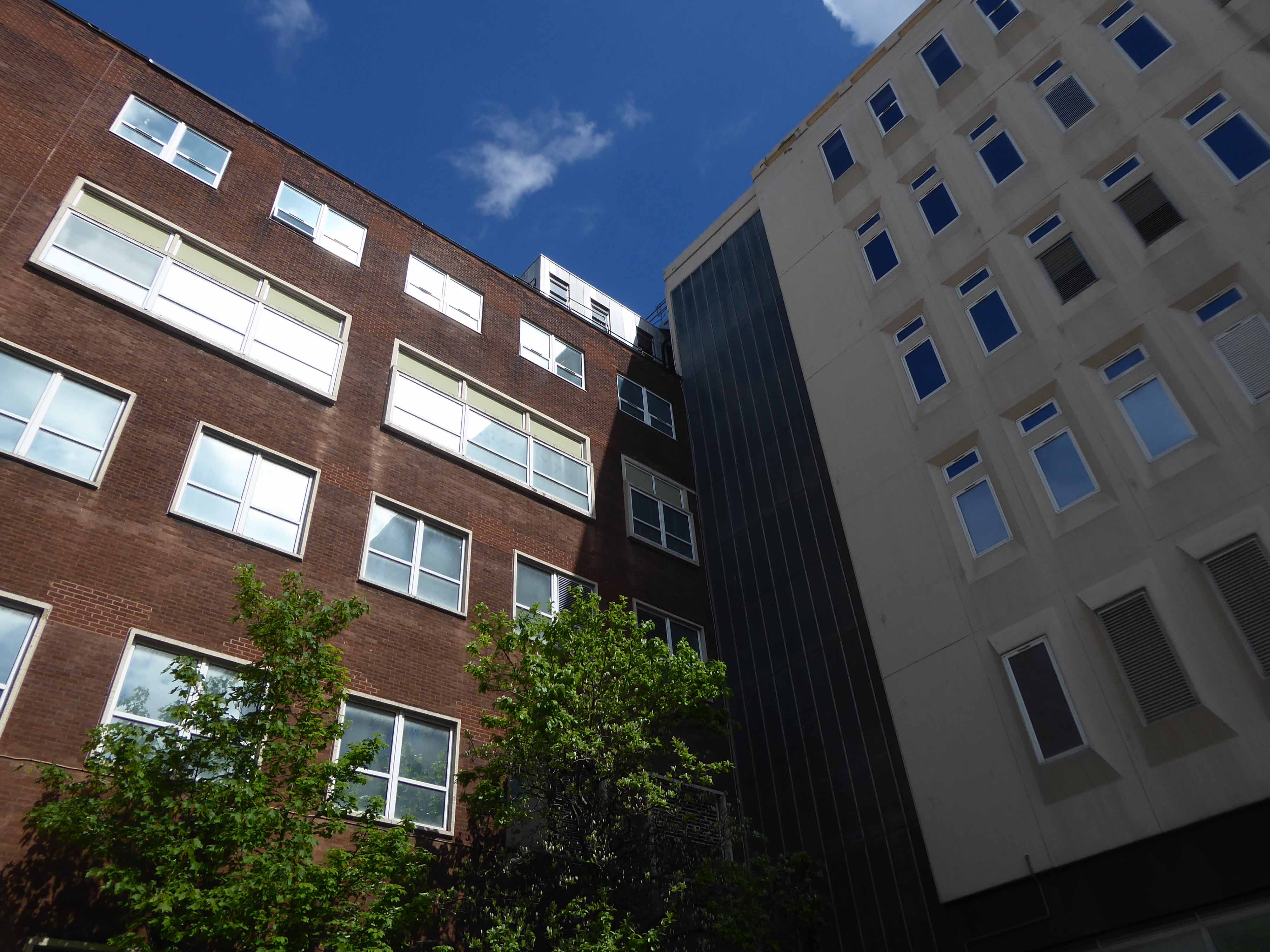
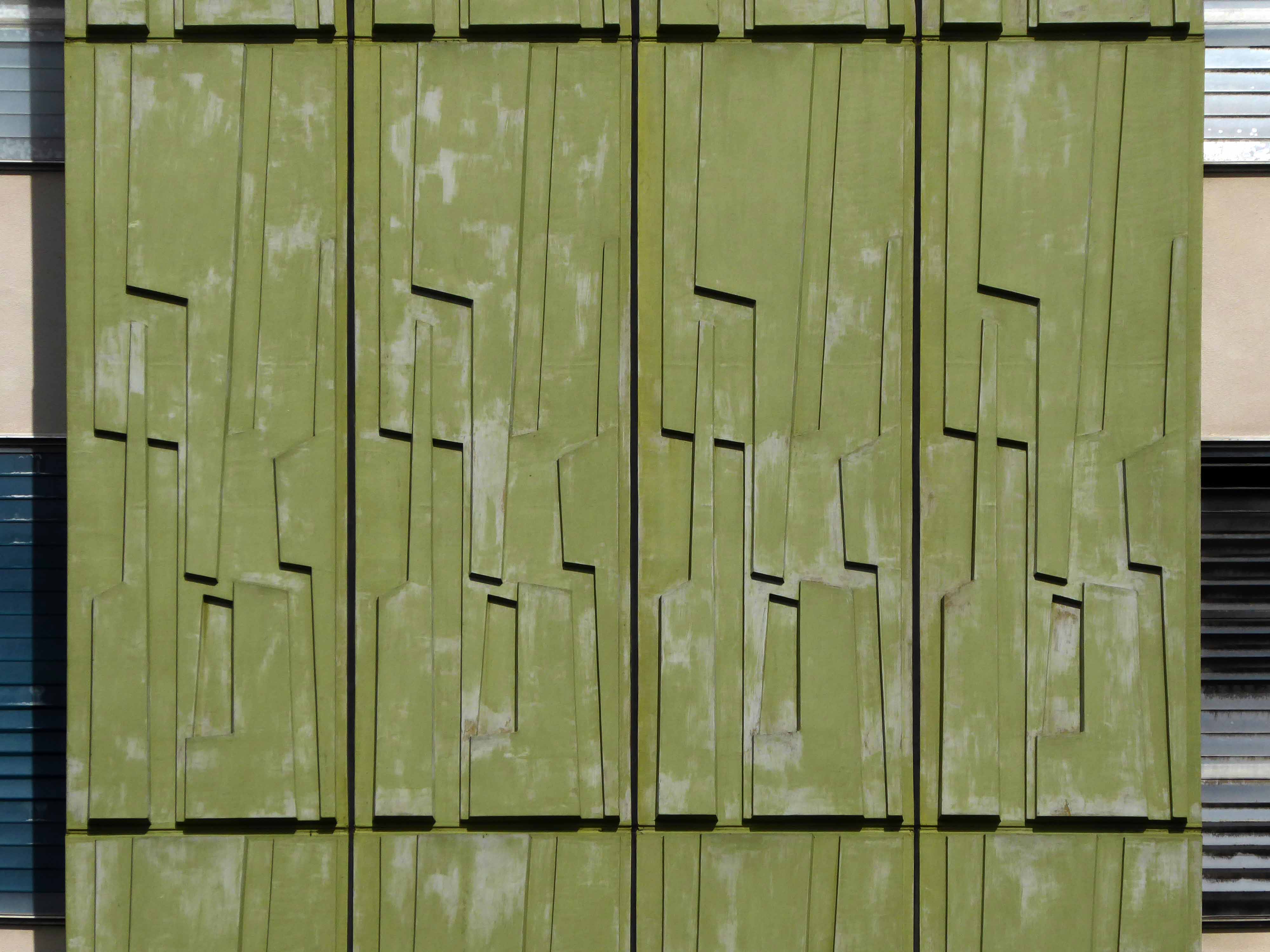
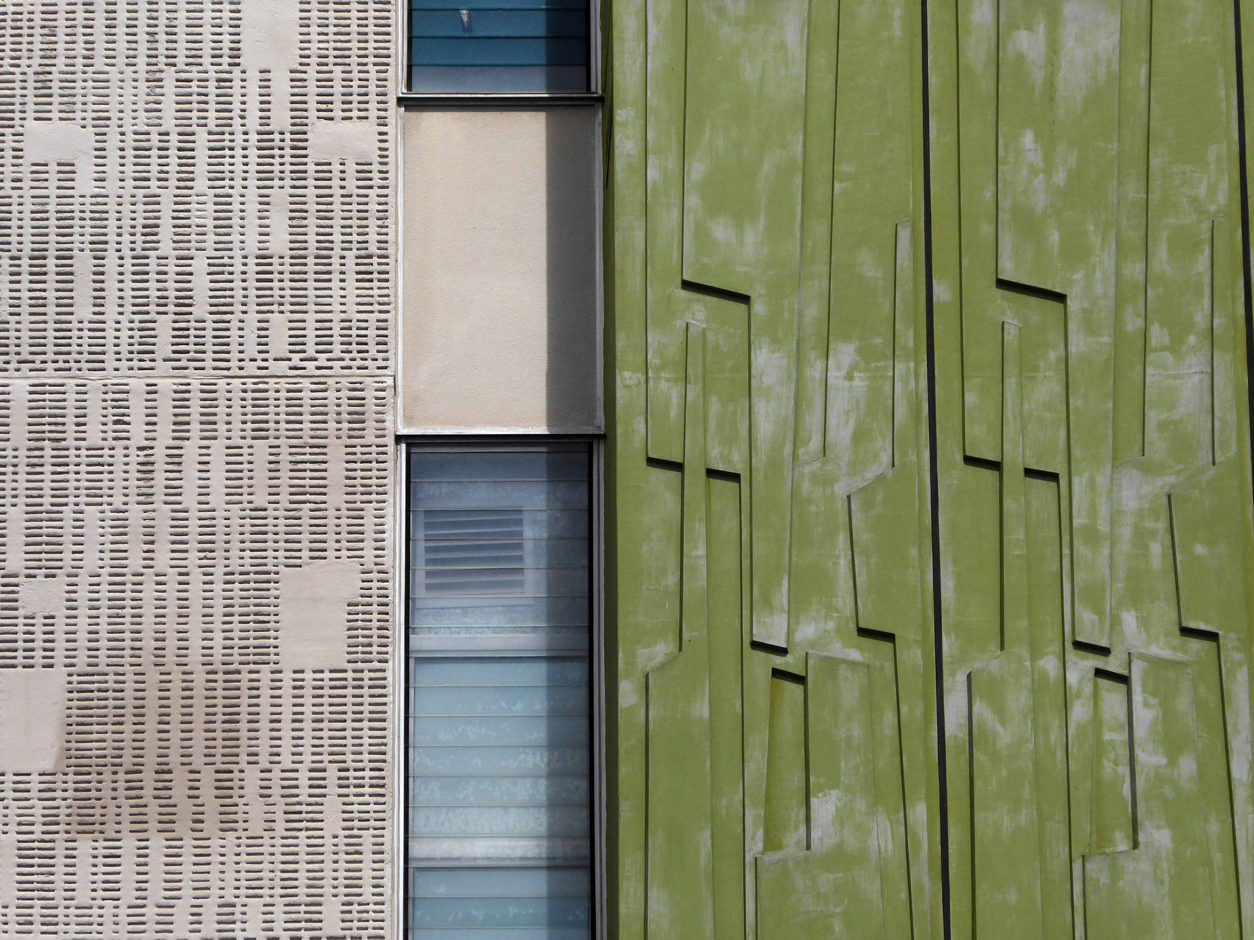
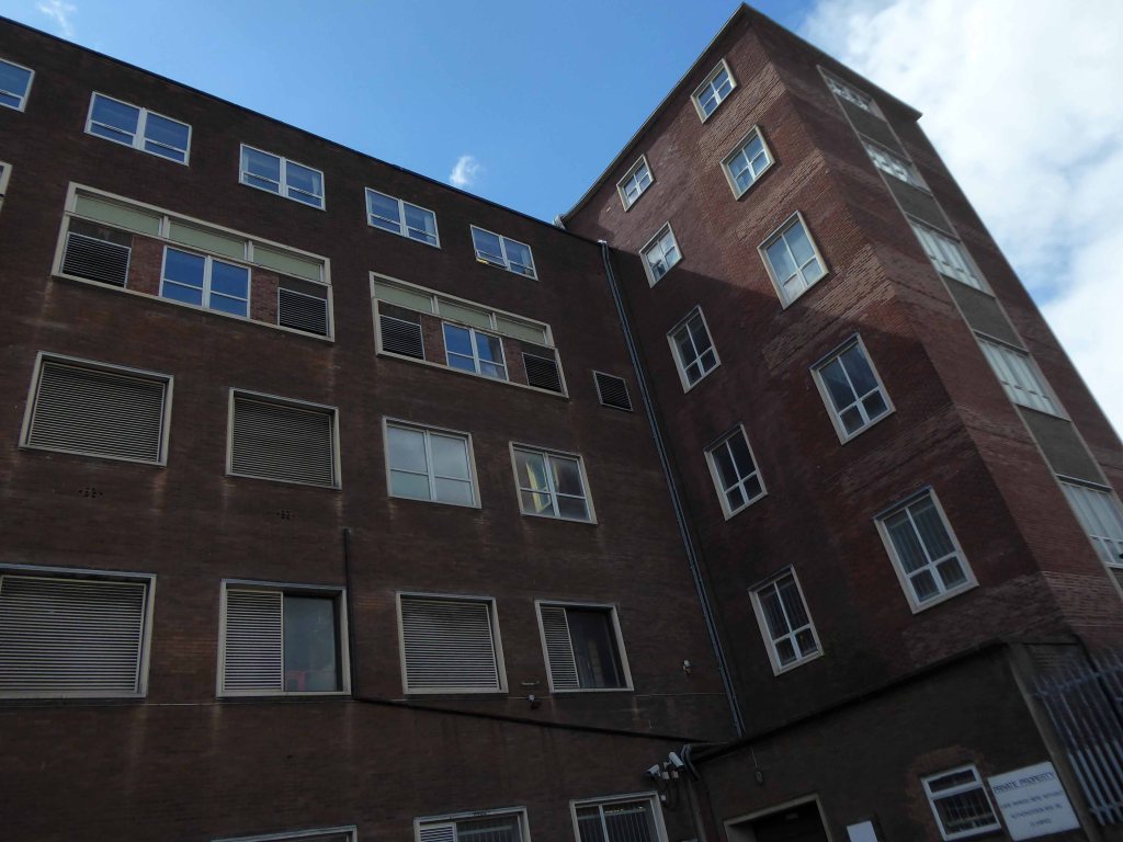
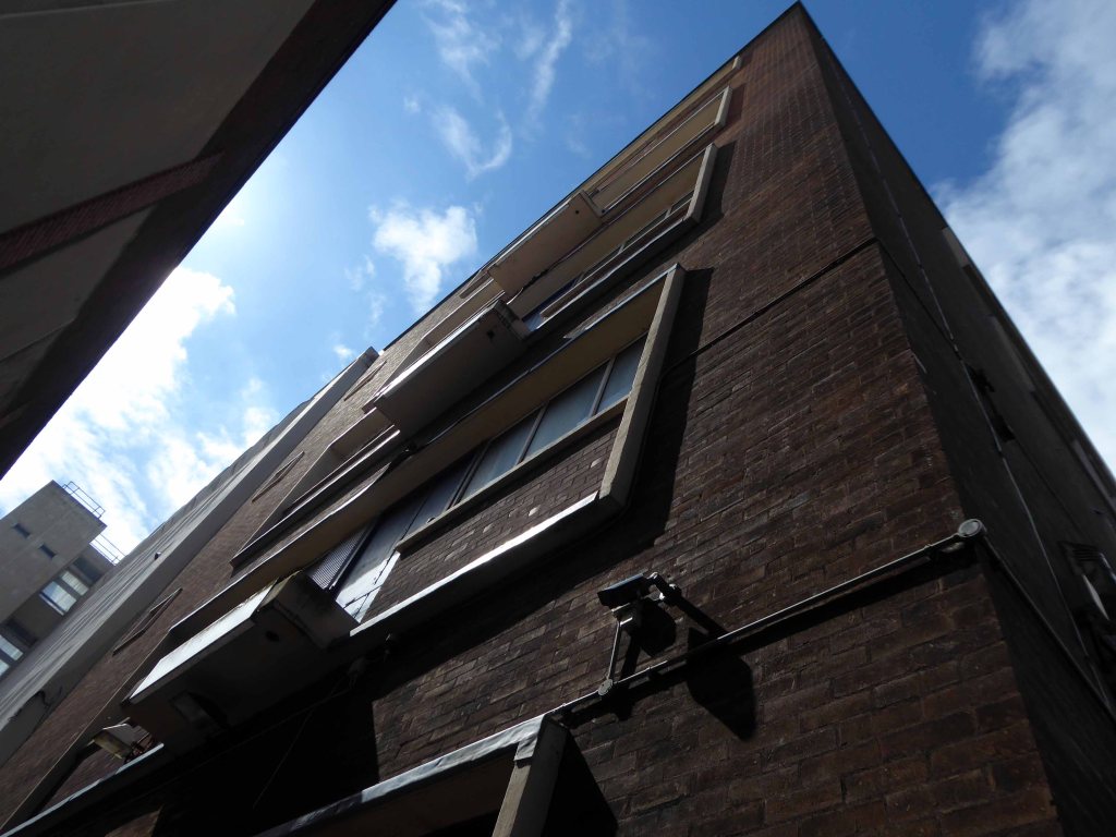
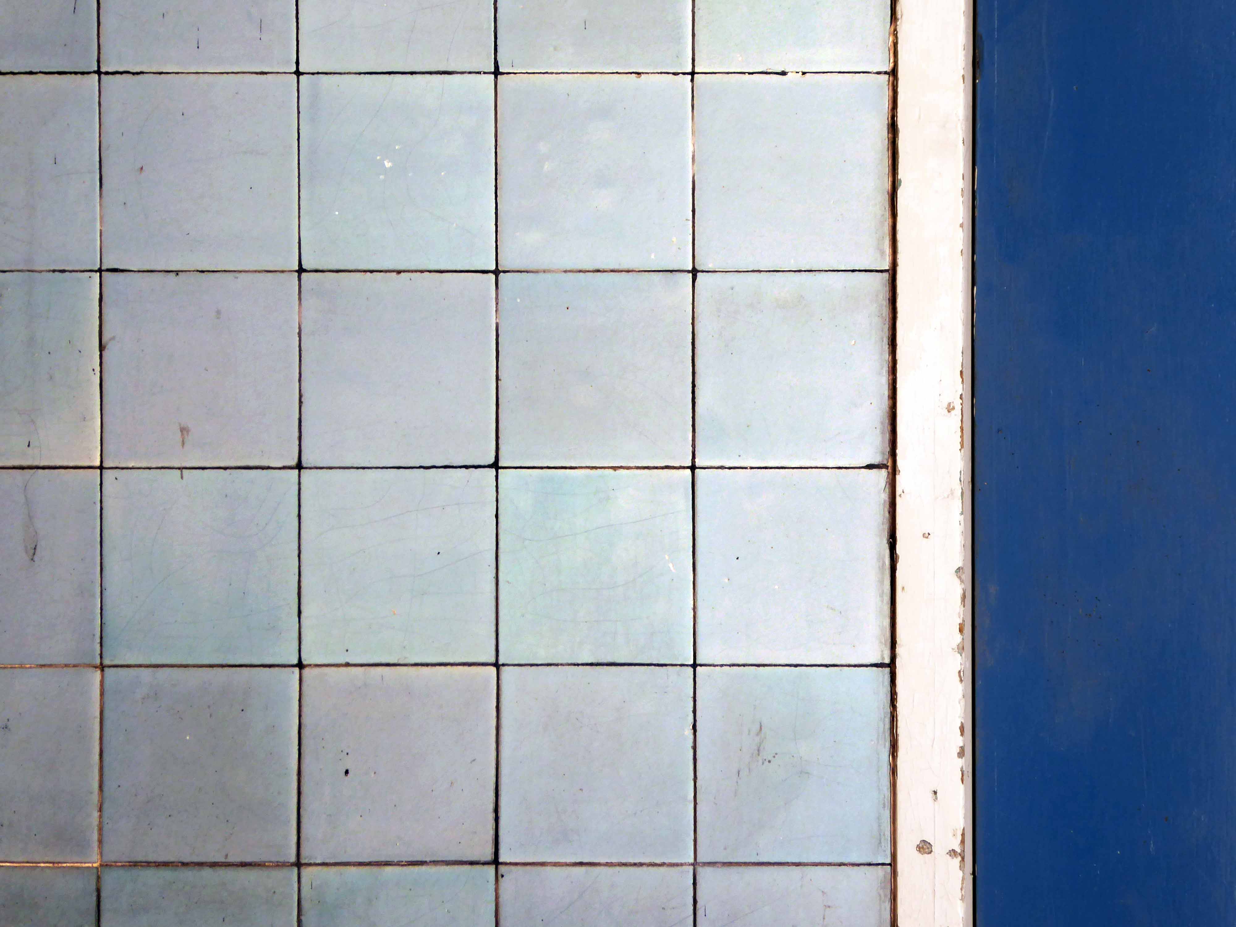
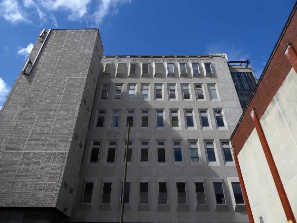
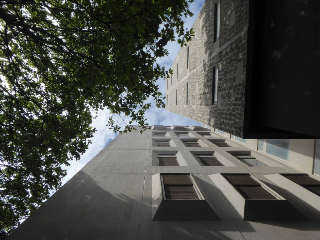
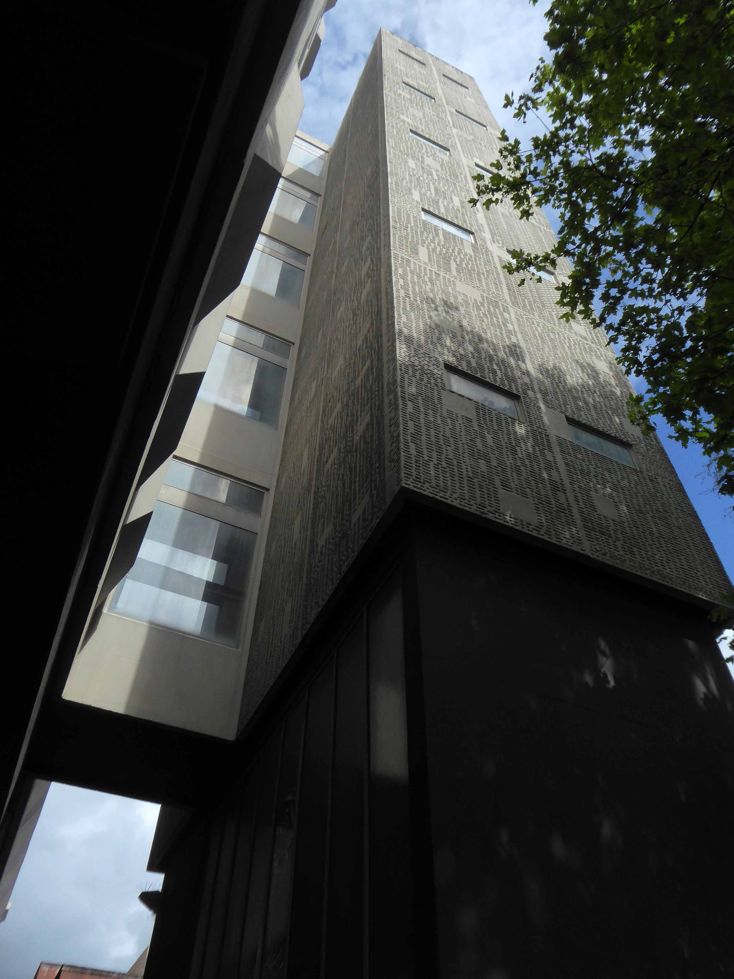
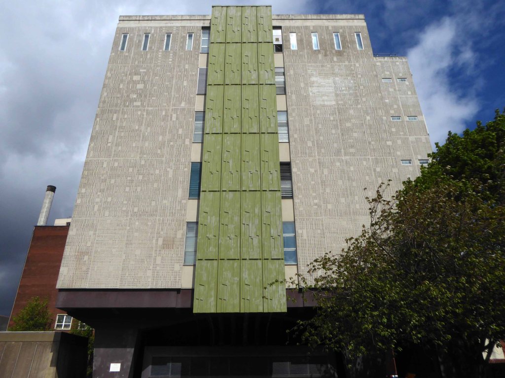
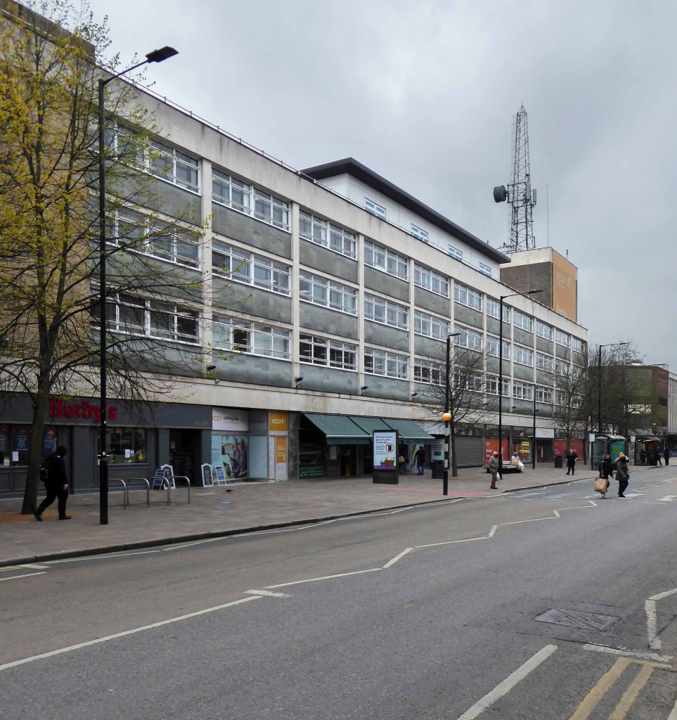
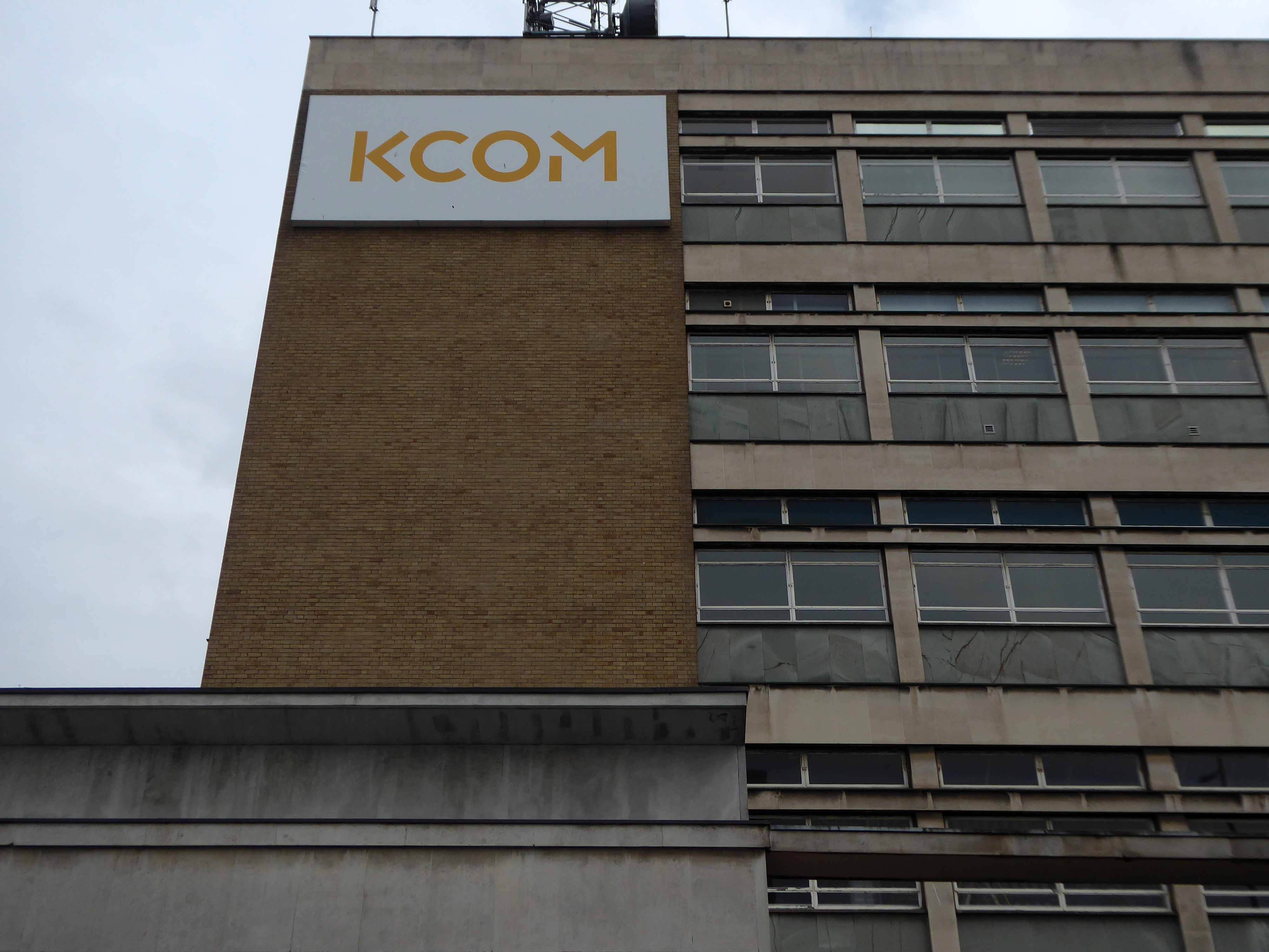
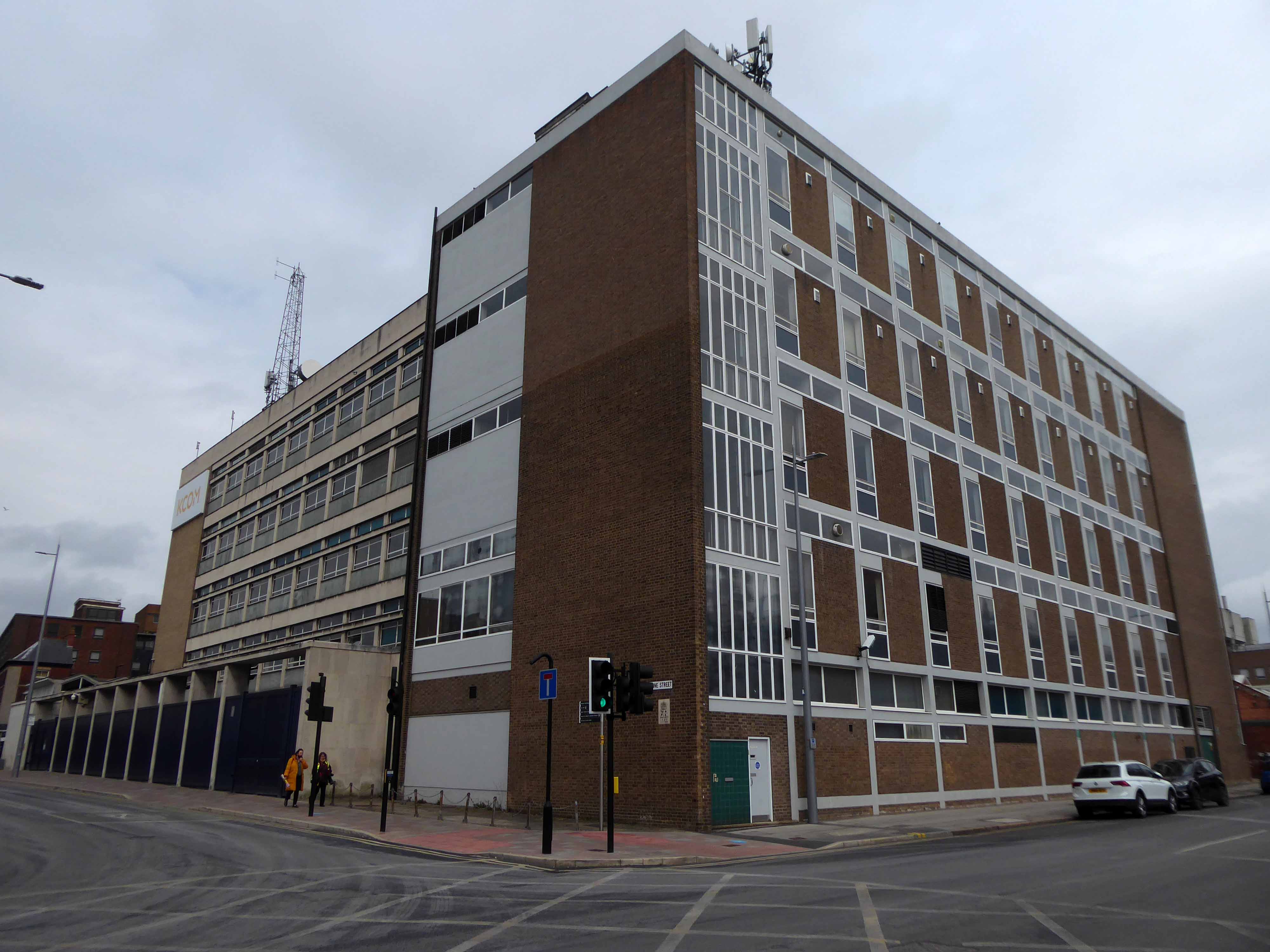
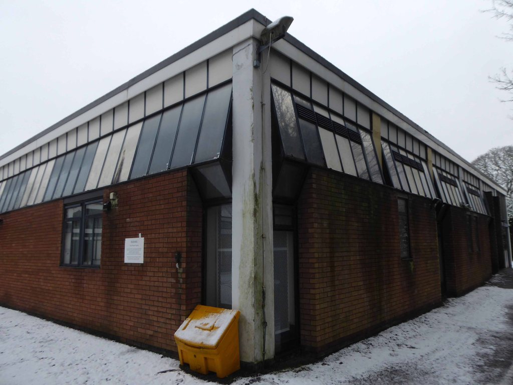
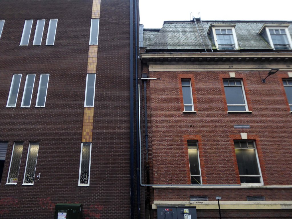
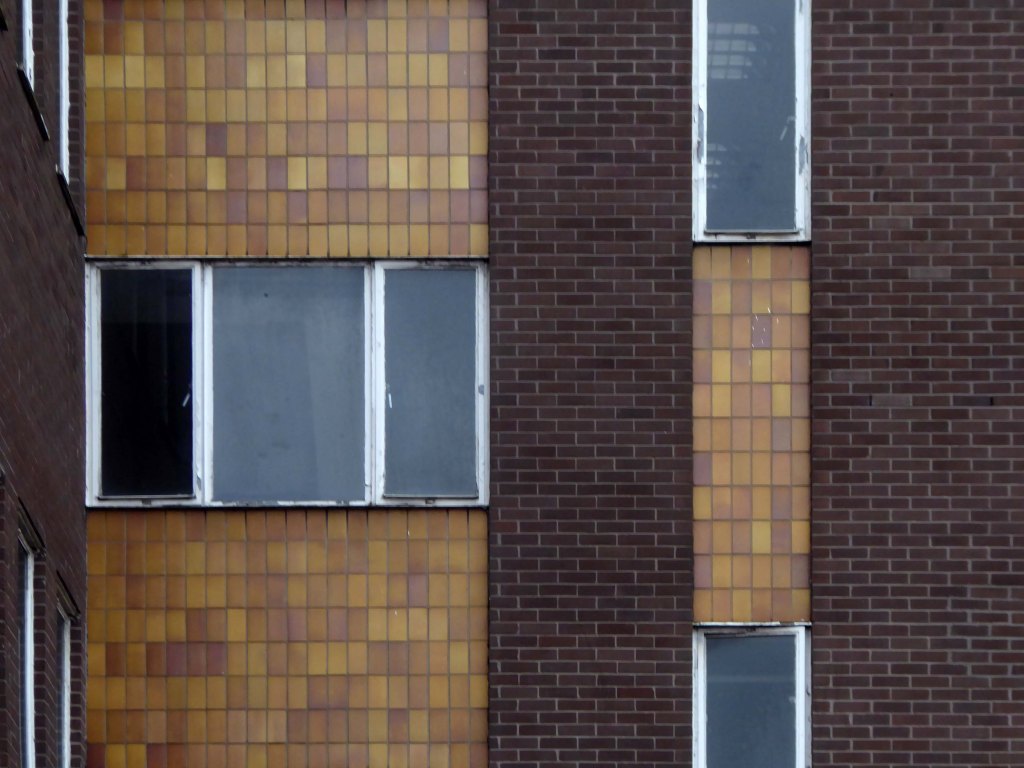
hen you notice that there’s a Sixties’ neighbour.
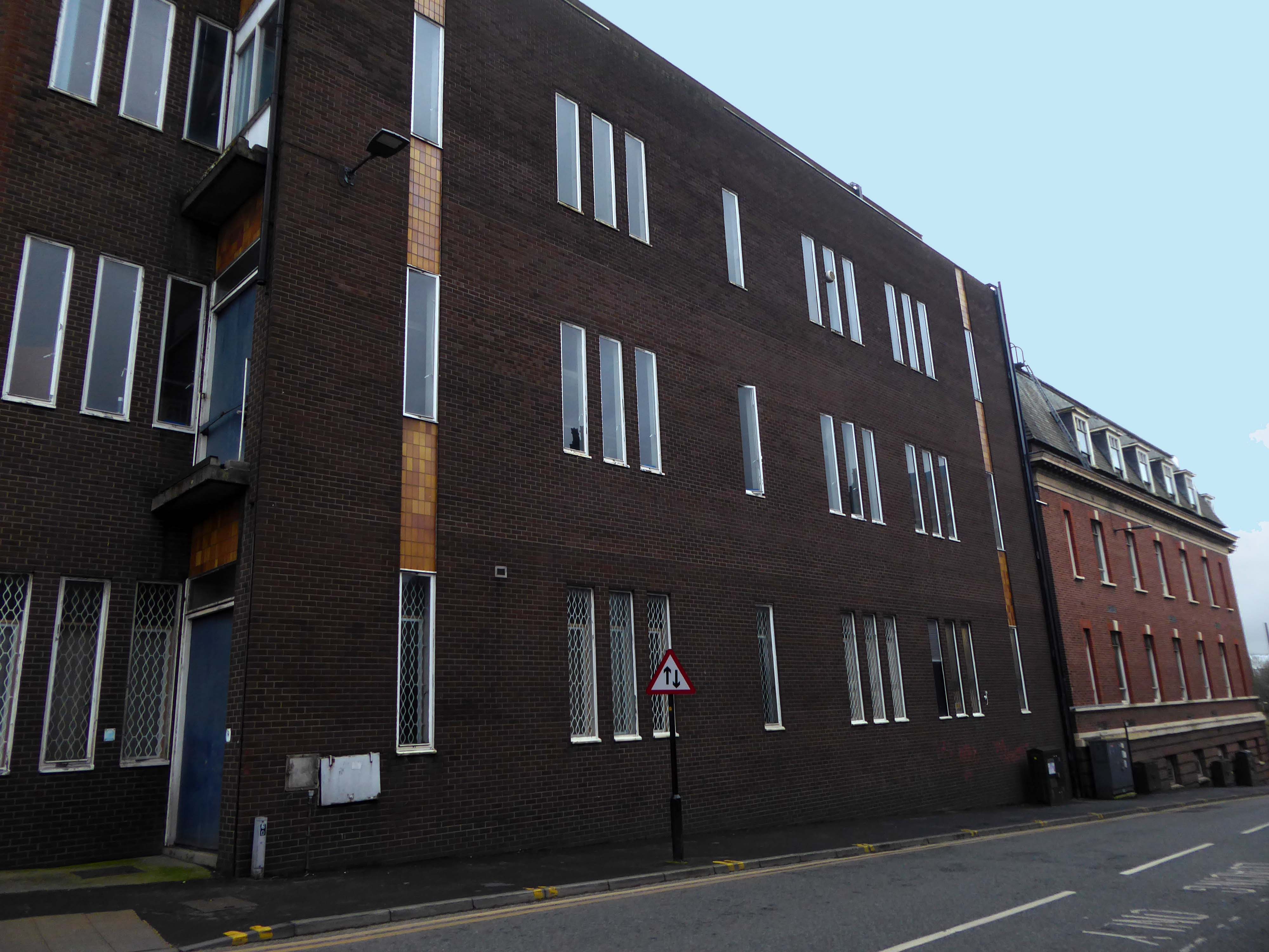
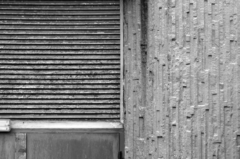
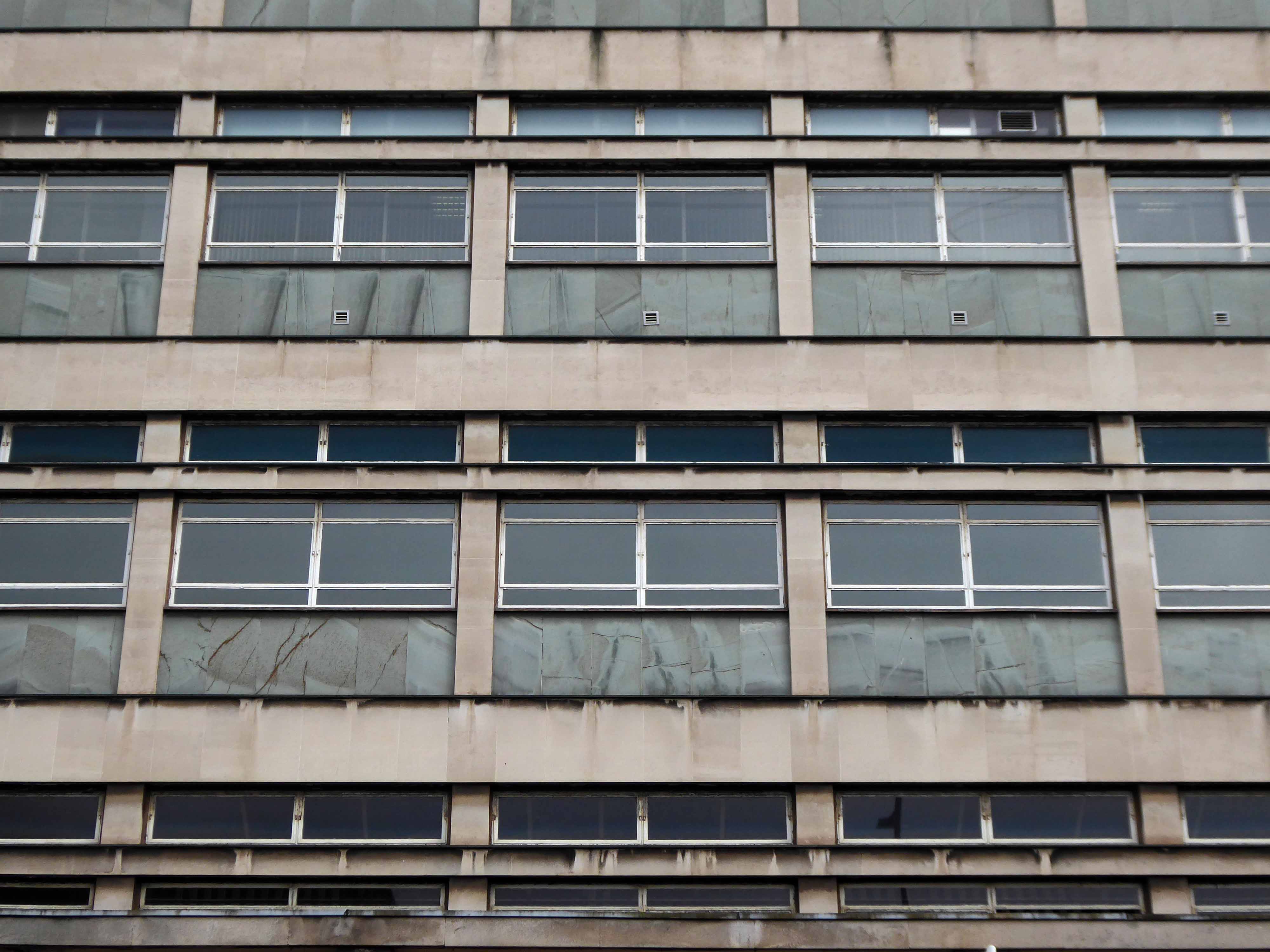
With narrow windows and inset light and dark tan tiles.


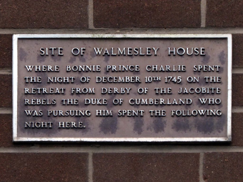
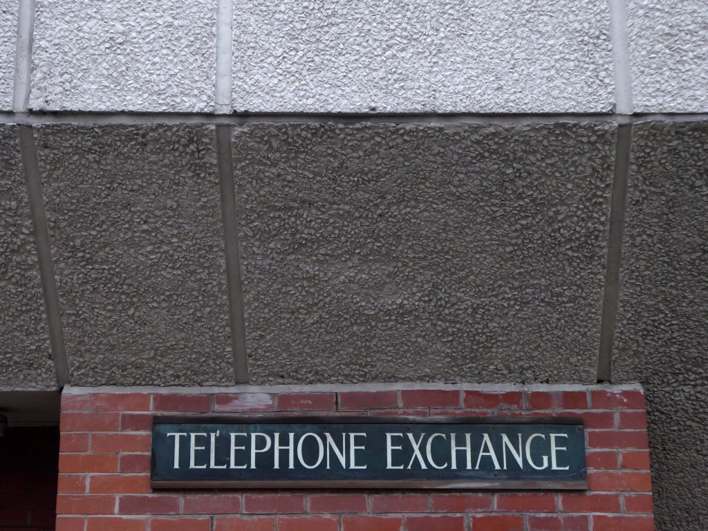
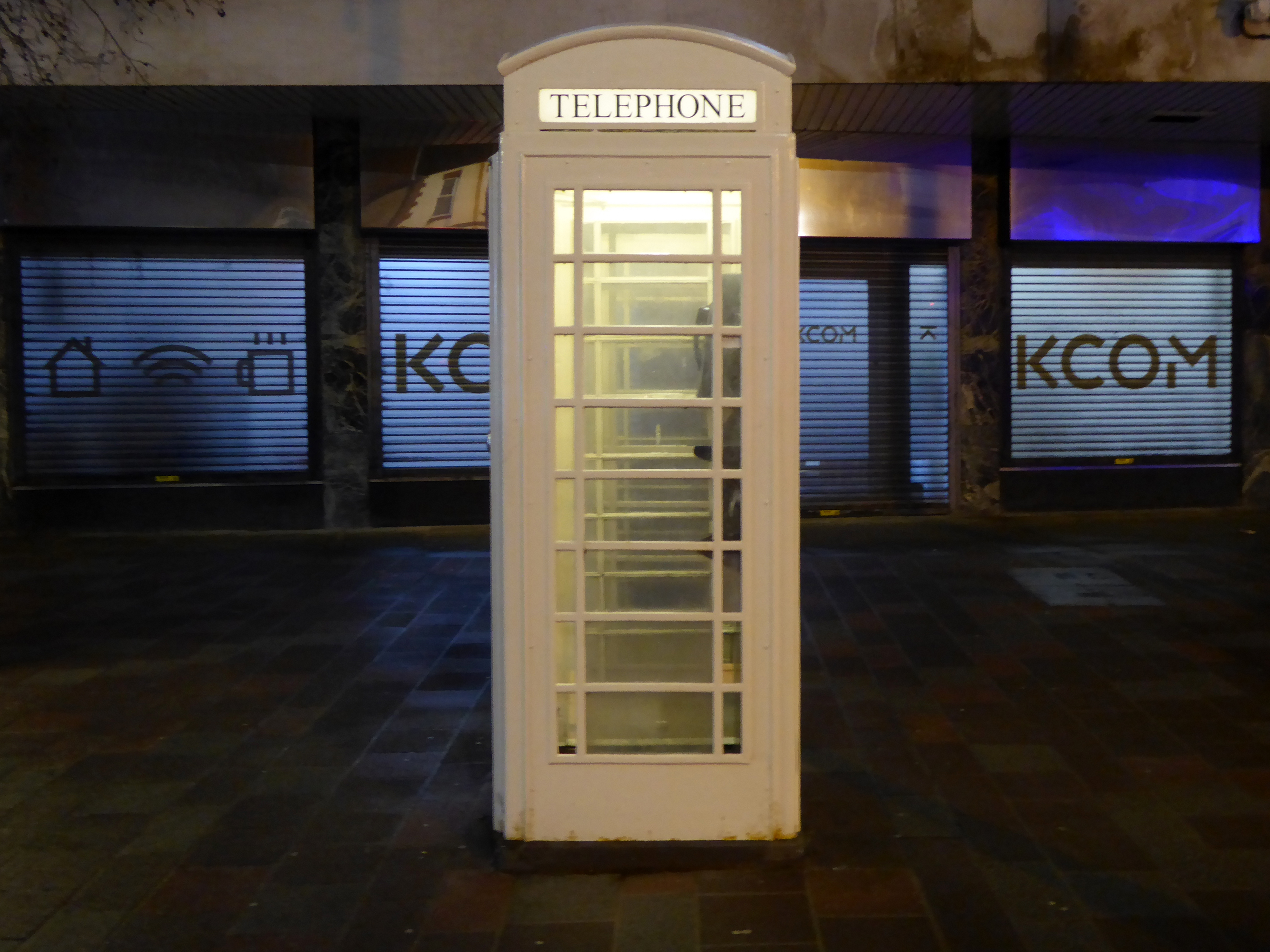
Prior to the exchange of telecommunications’ messages, the site was preoccupied by the exchange of partisan residents with a predilection for particular political persuasions.
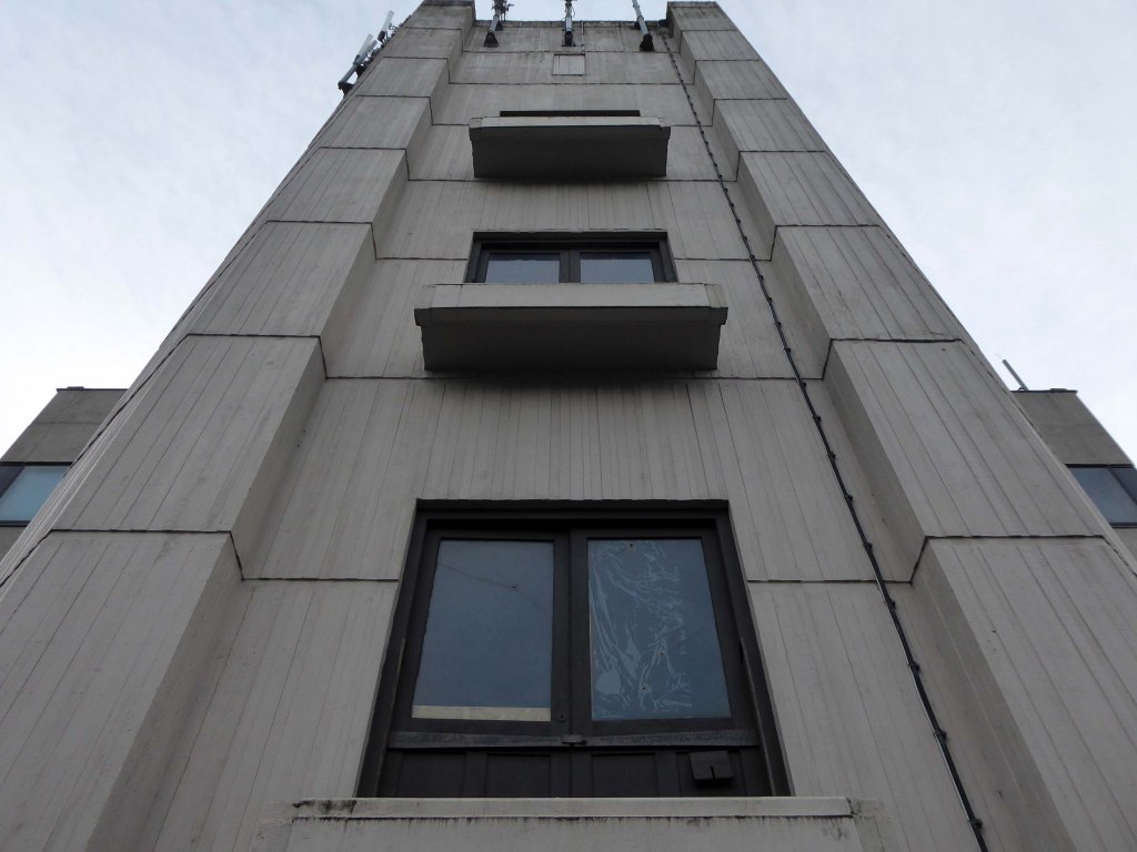
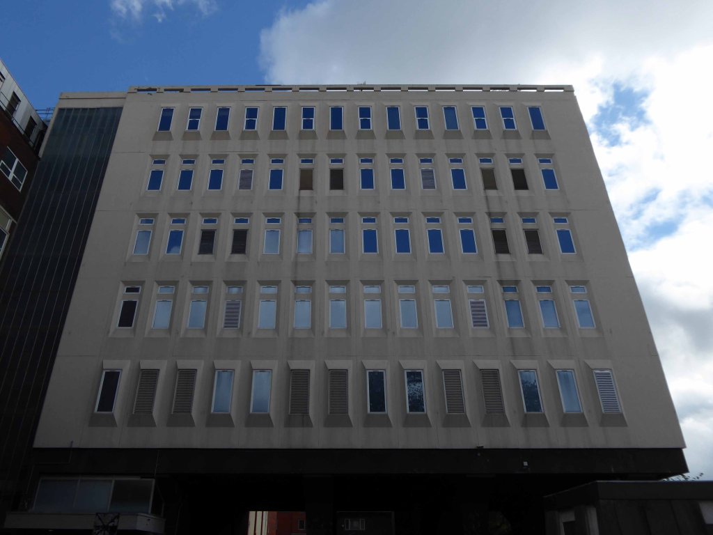
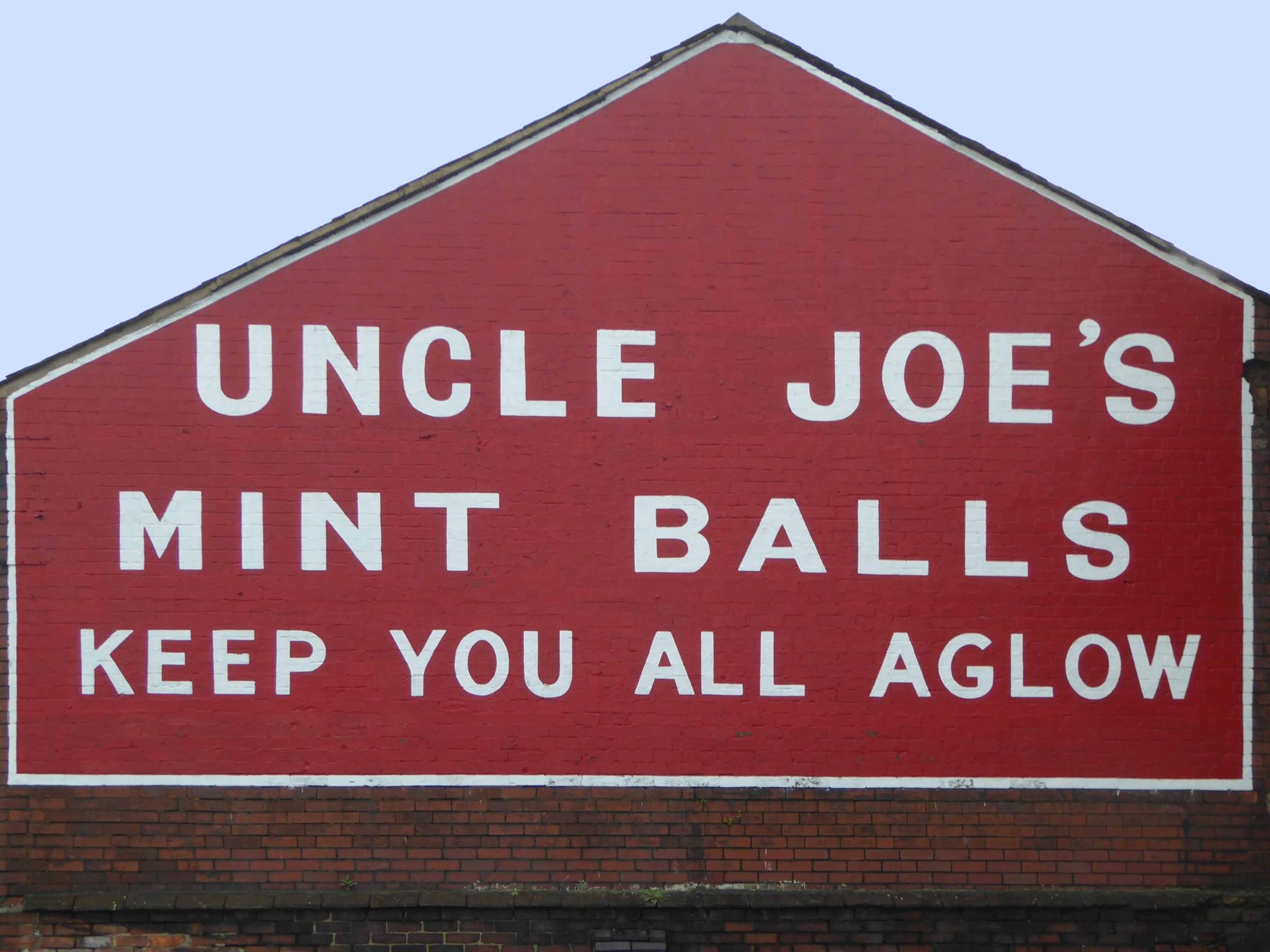
Let’s back track along Dorning Street and follow the aroma of Uncle Joe’s Mint Balls – to the Santus Works and beyond.
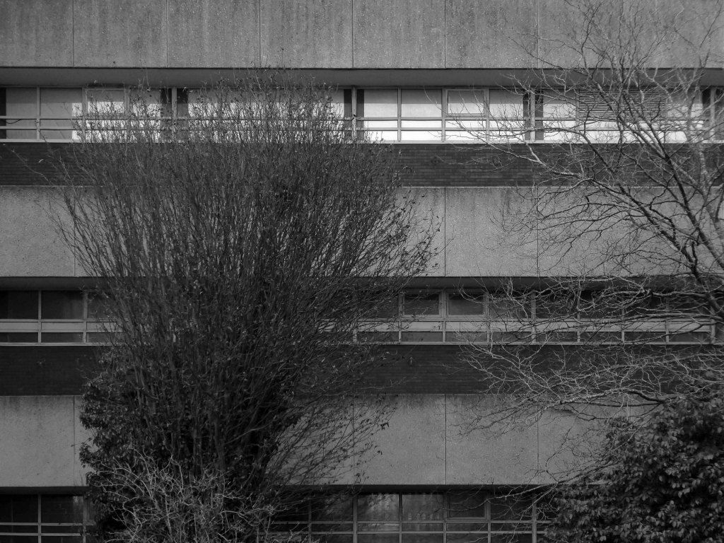
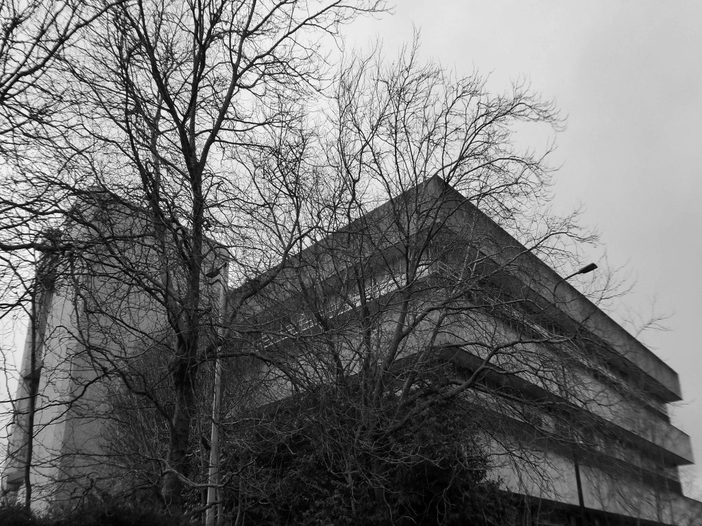
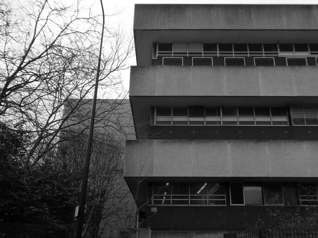
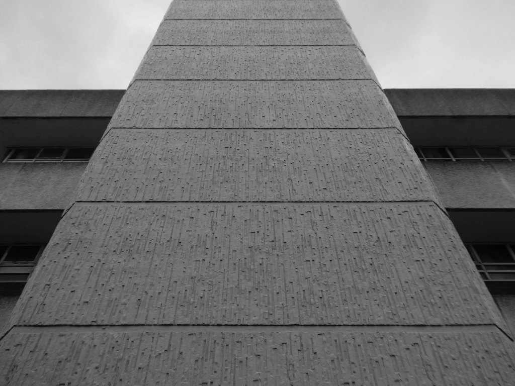
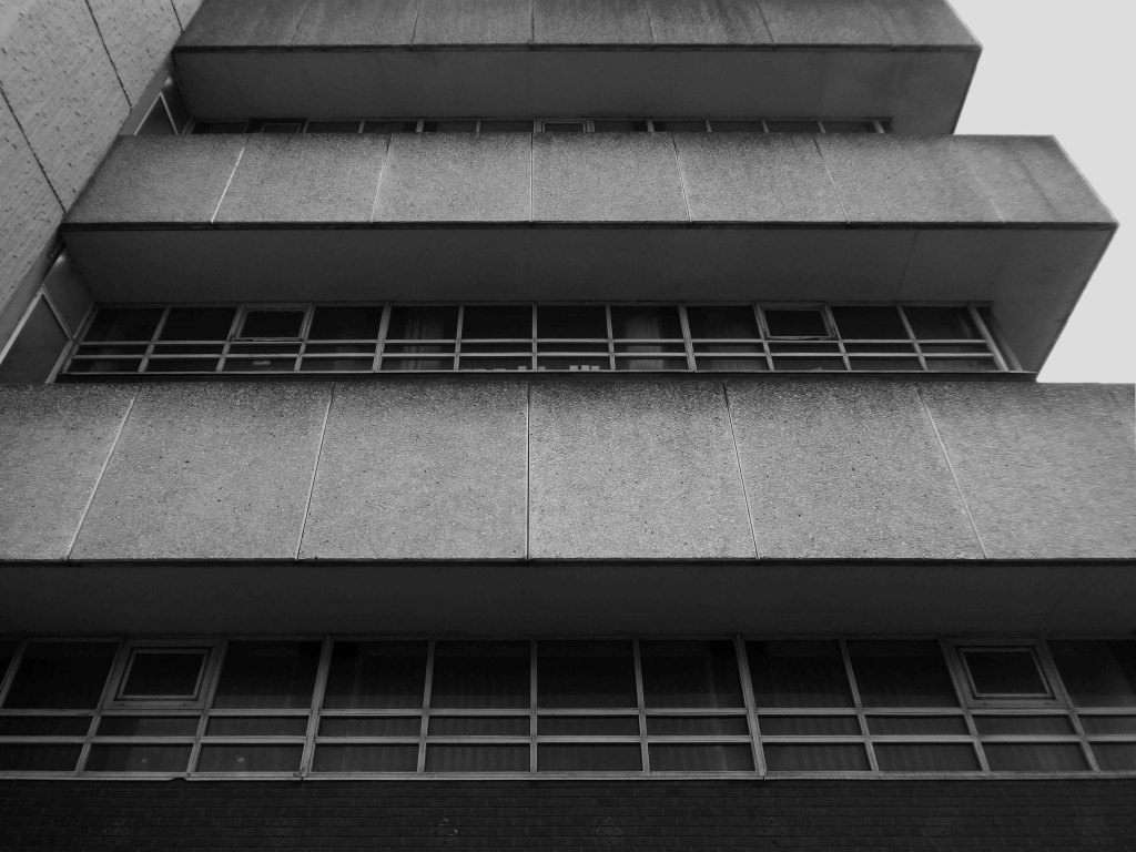
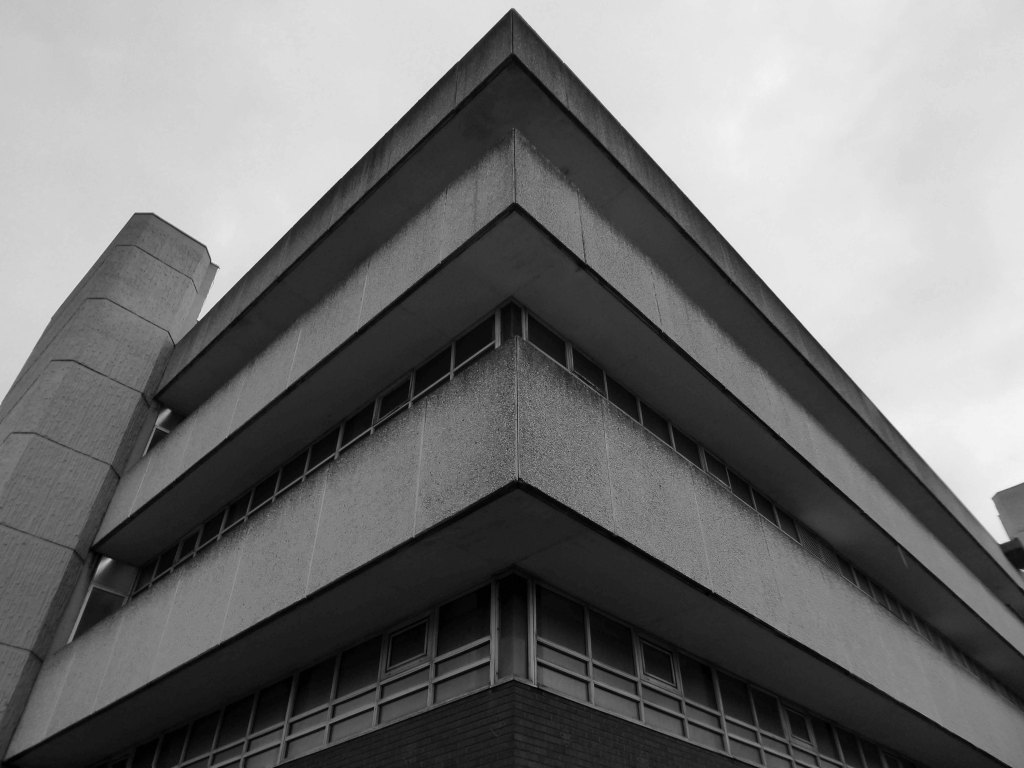
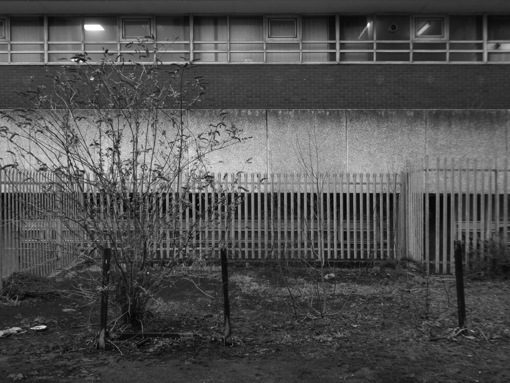
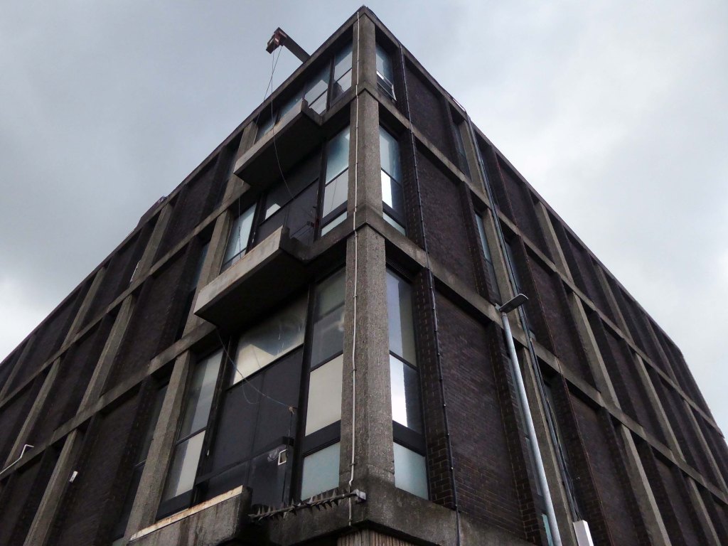
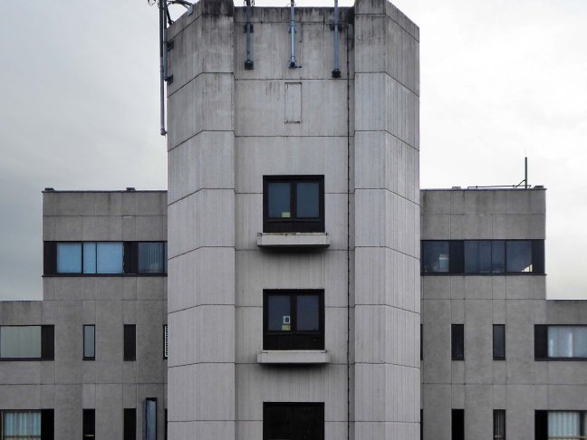
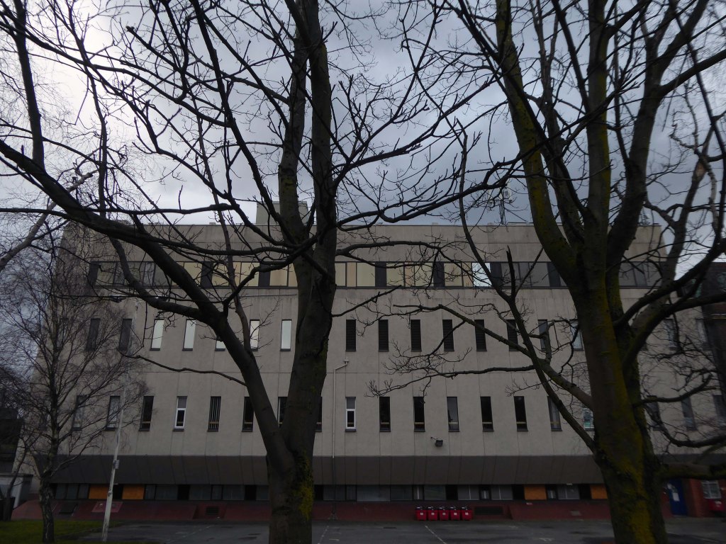
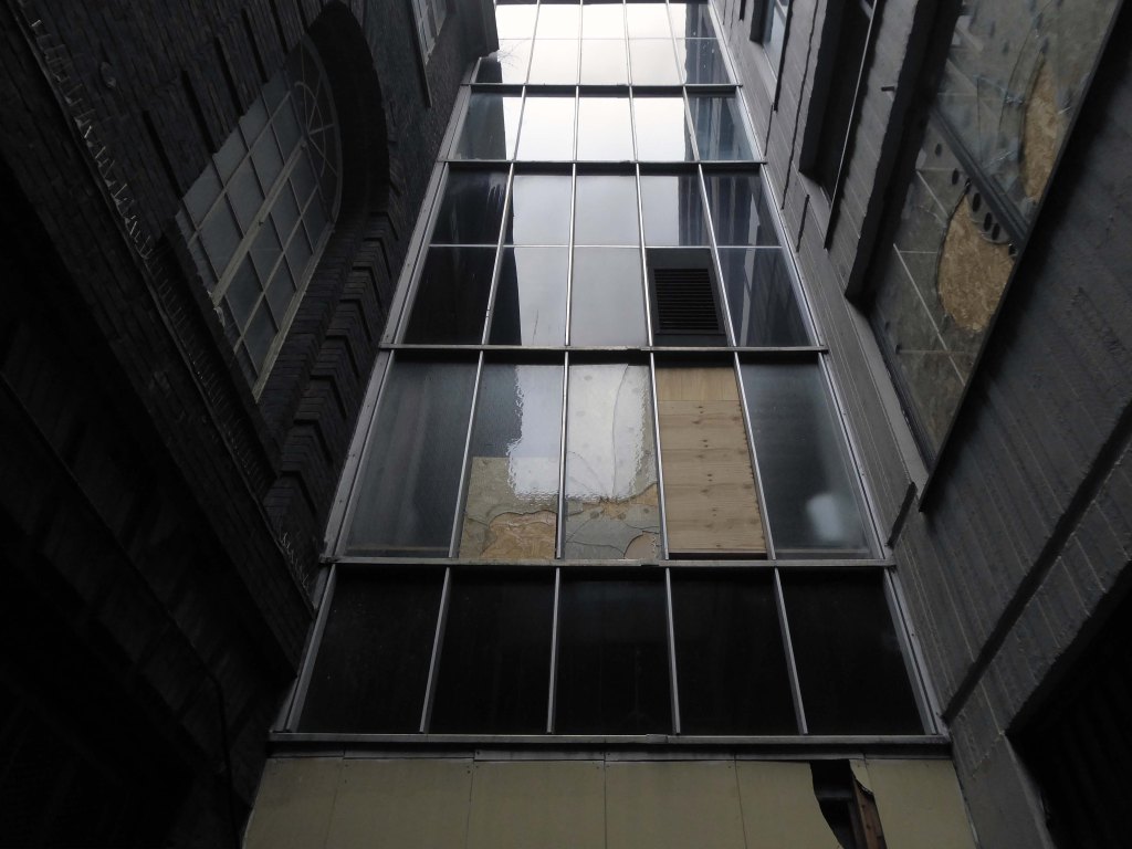
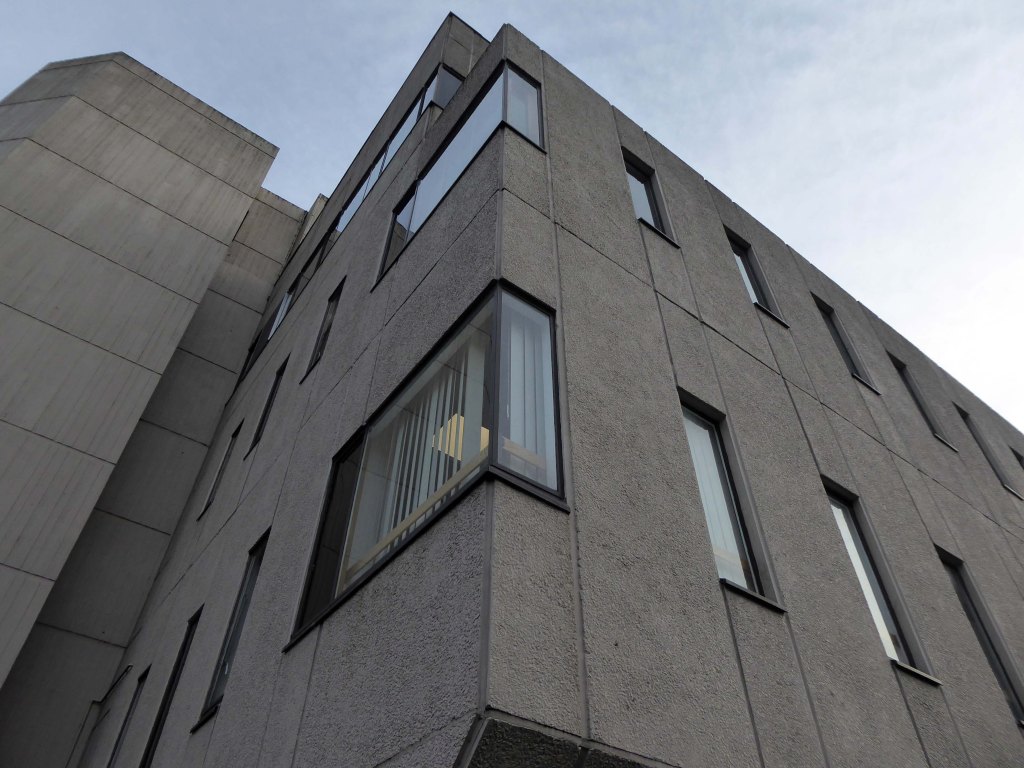
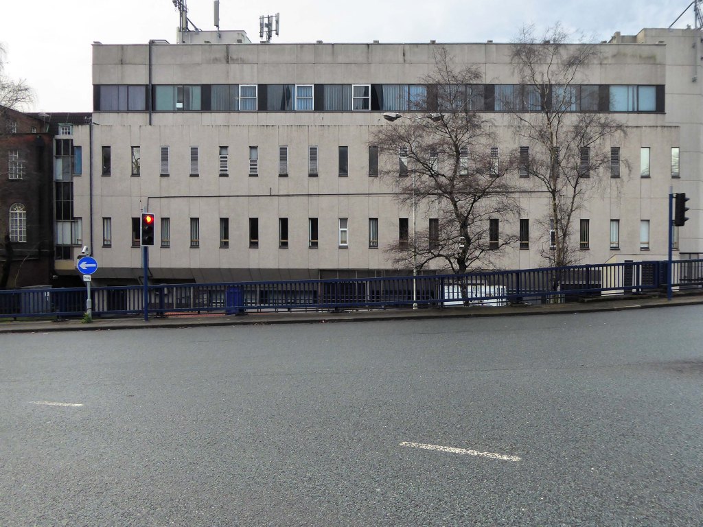
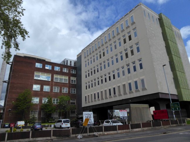
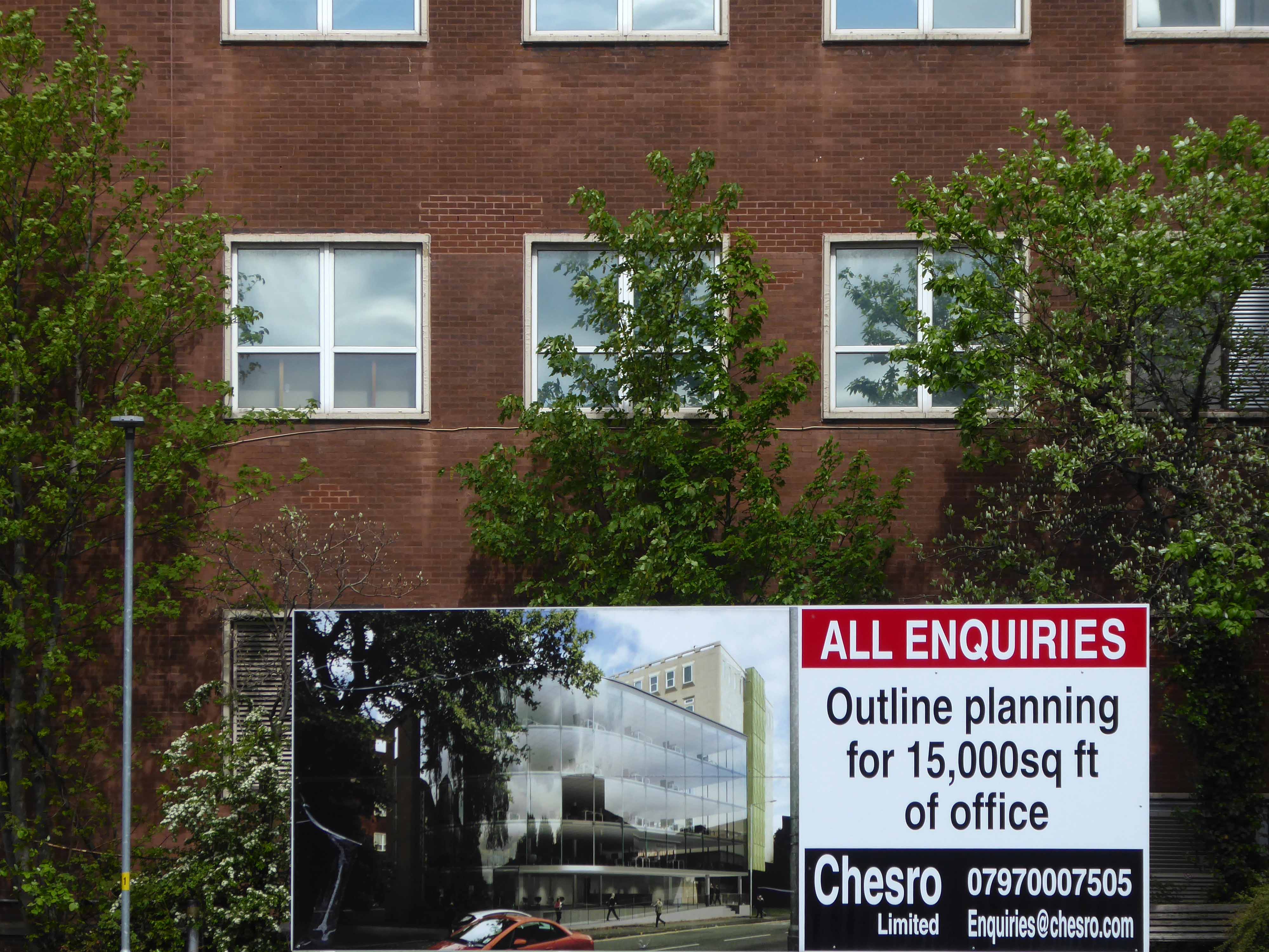
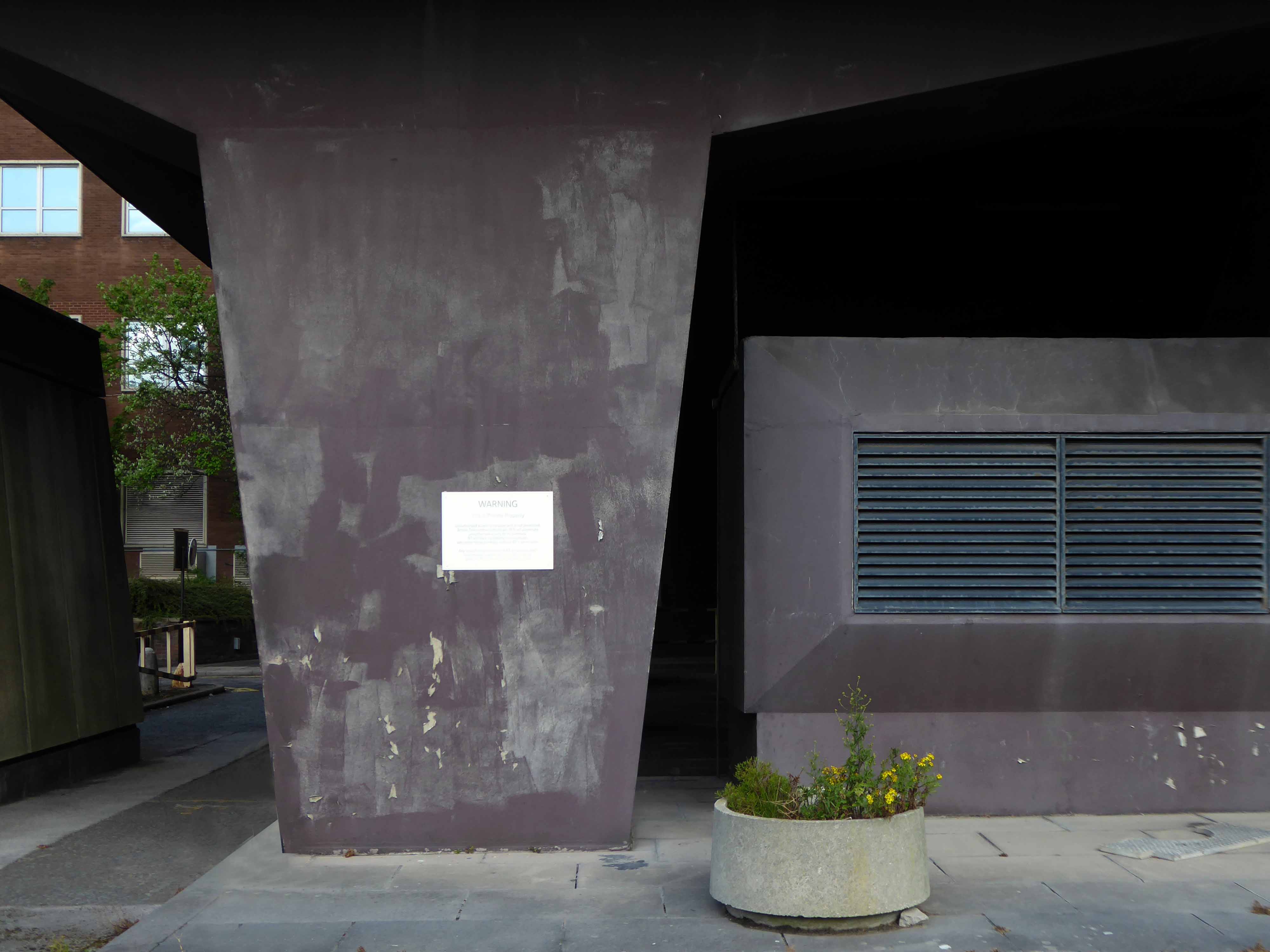
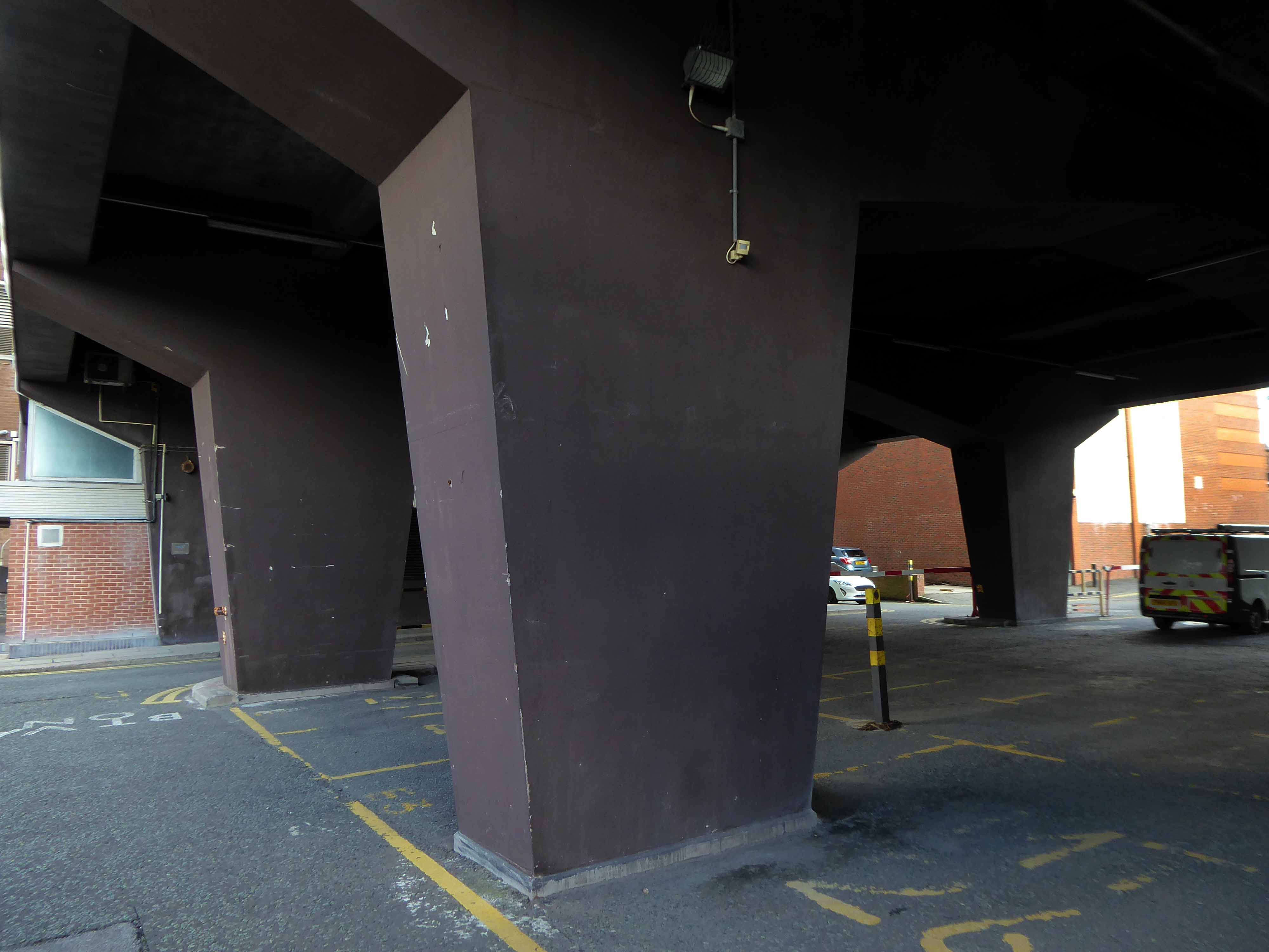
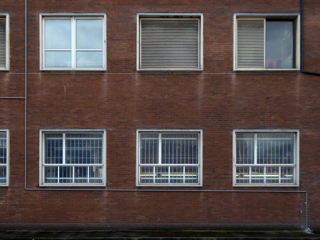
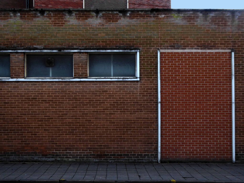
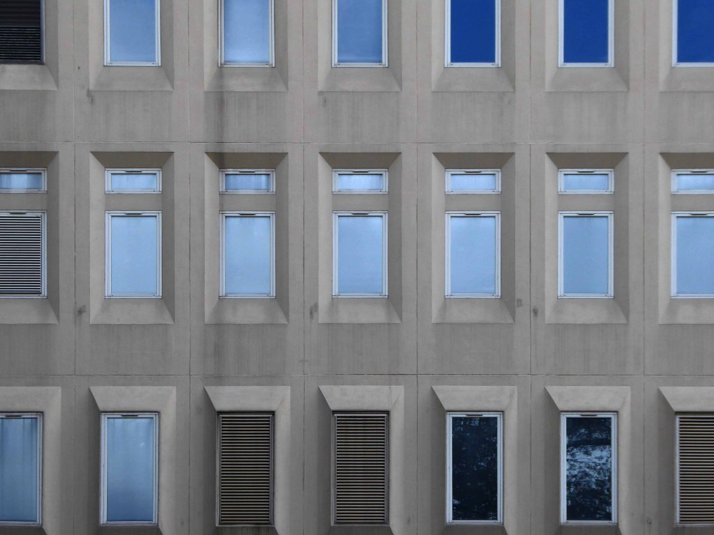
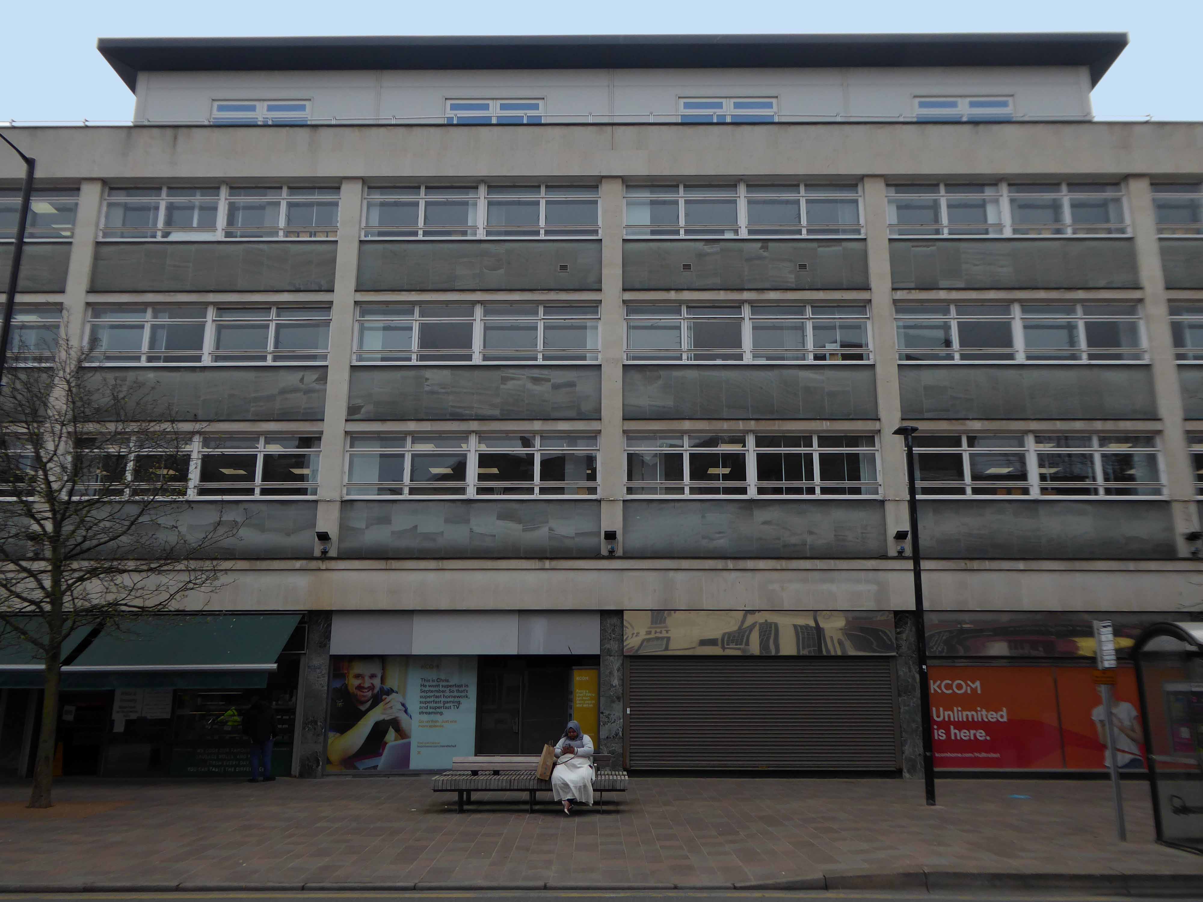
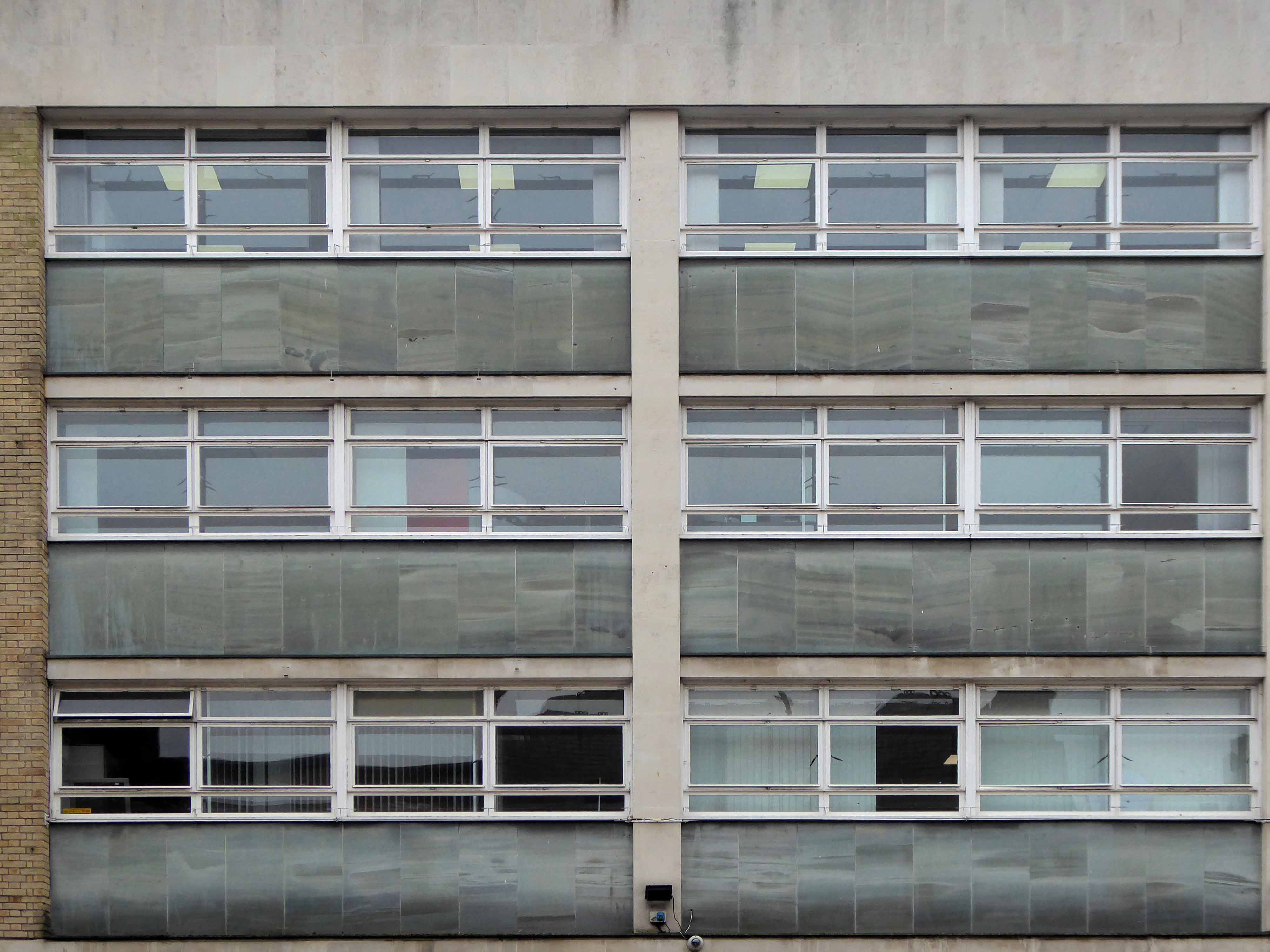
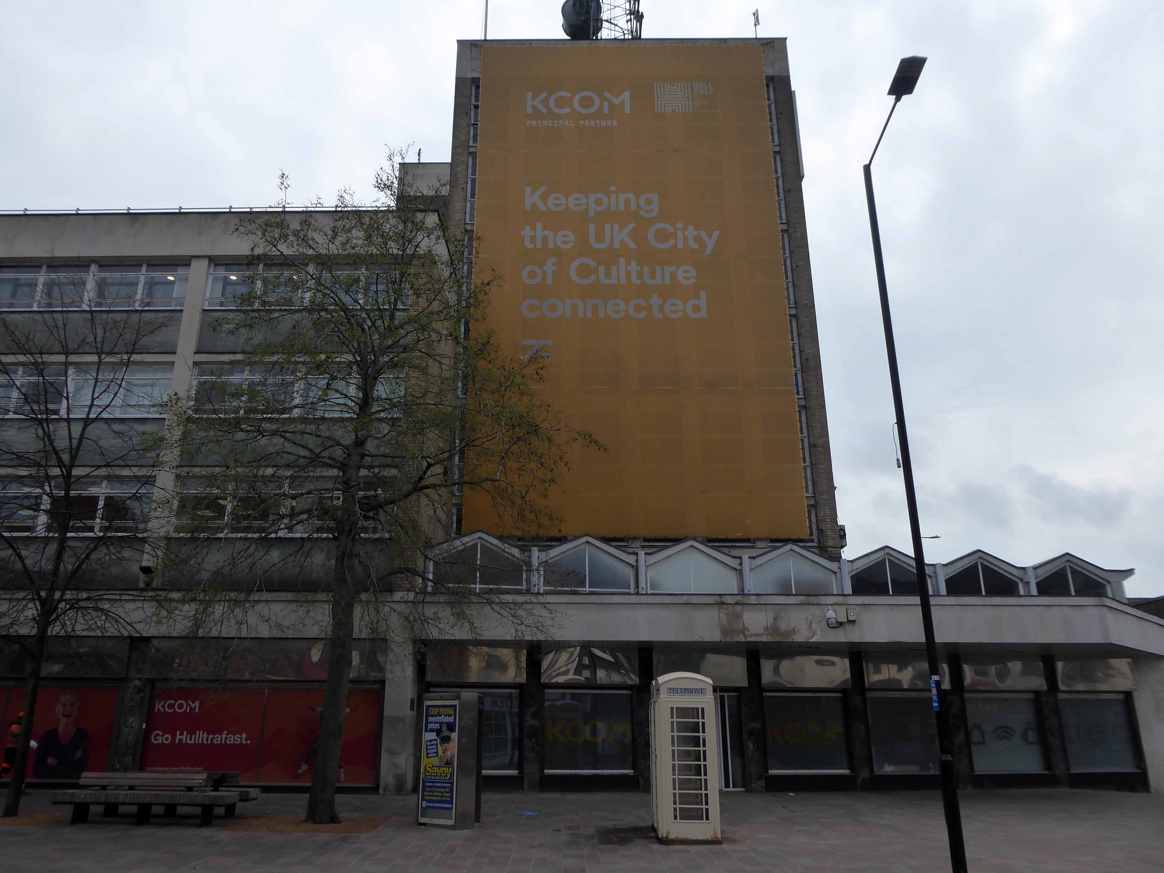
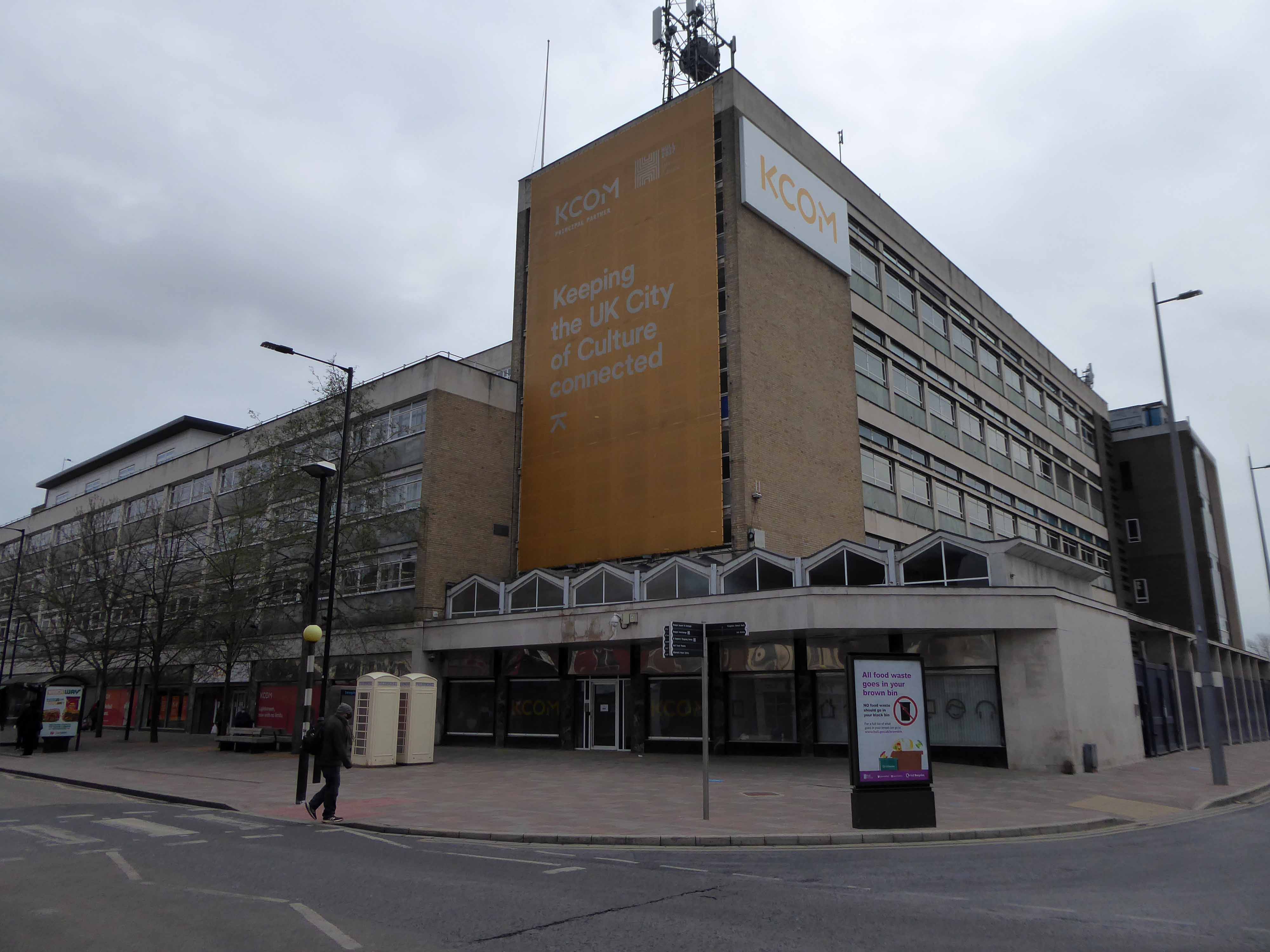
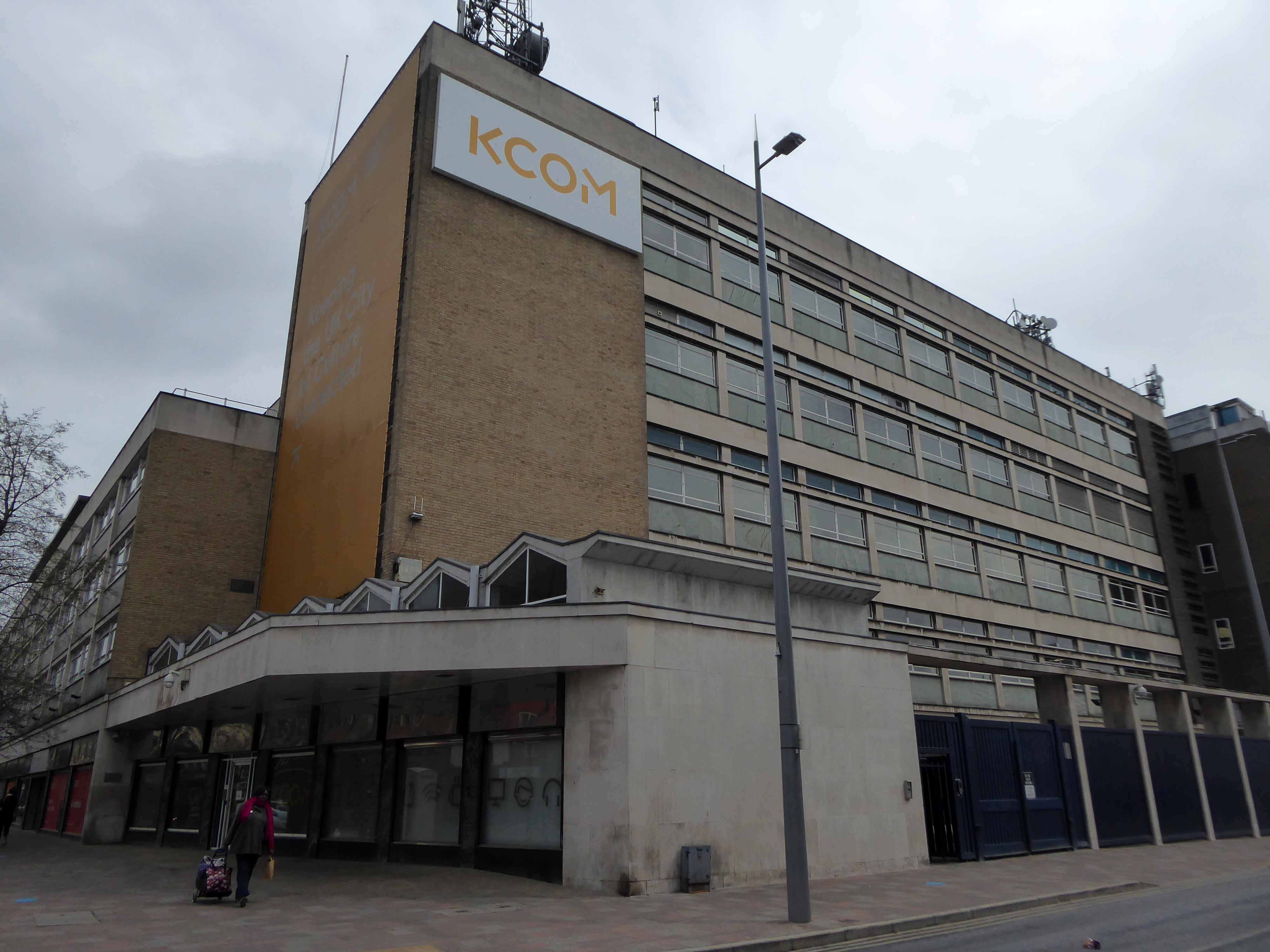
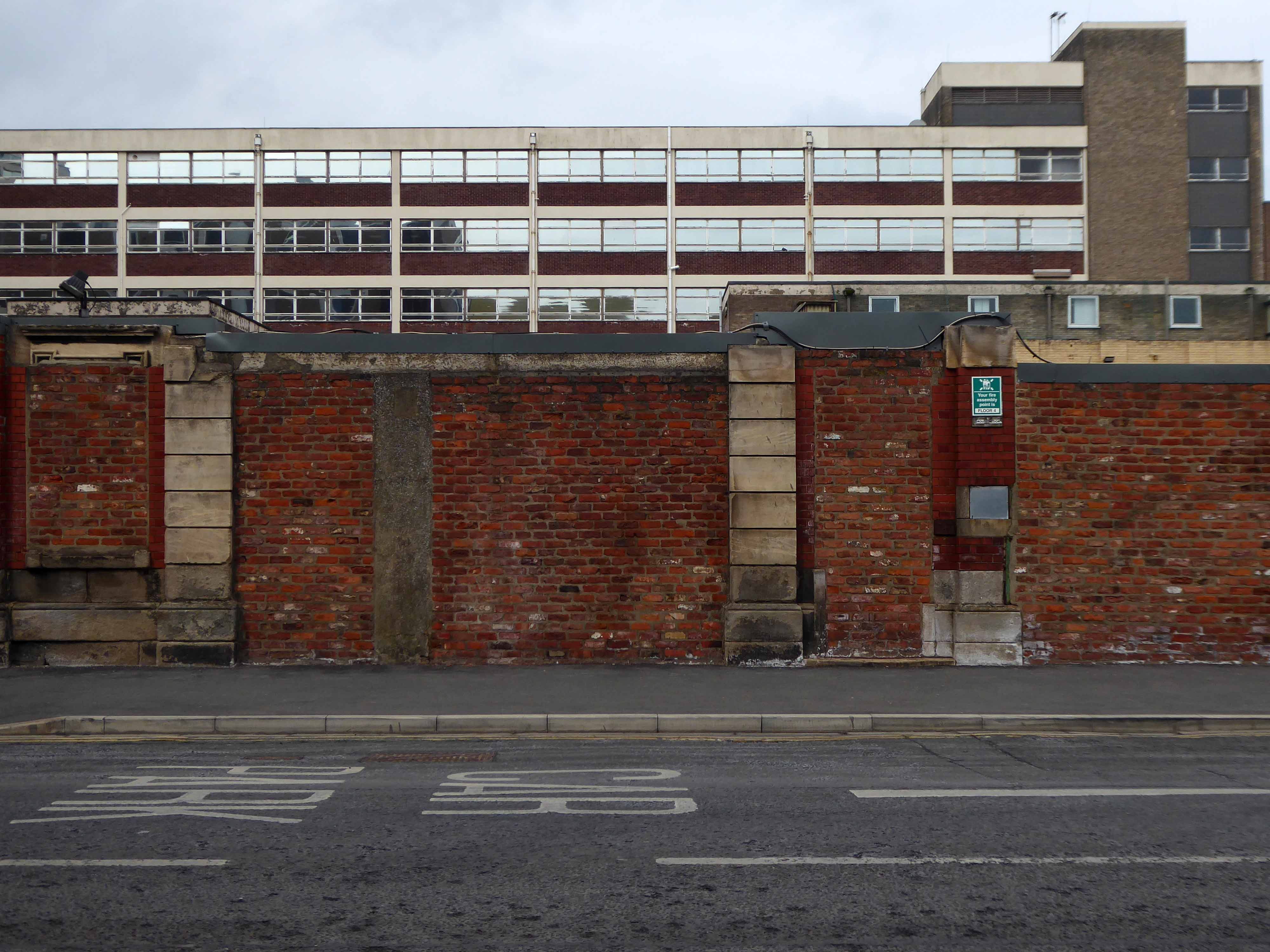
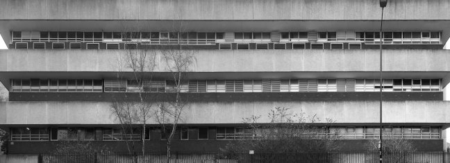
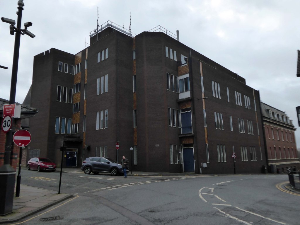
There stands a concrete behemoth.


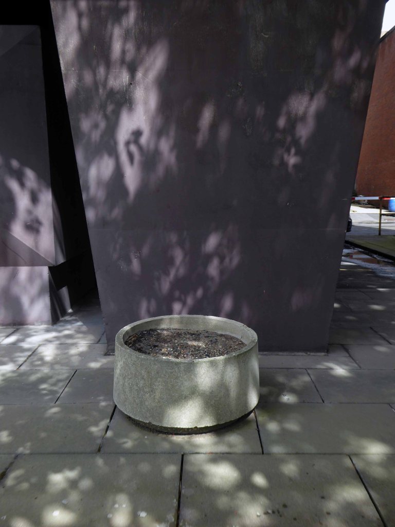
Which has of late been beset with particular problems of its own.
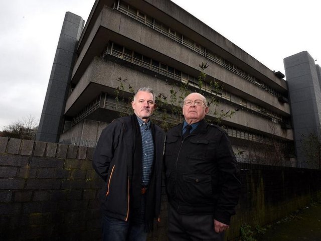
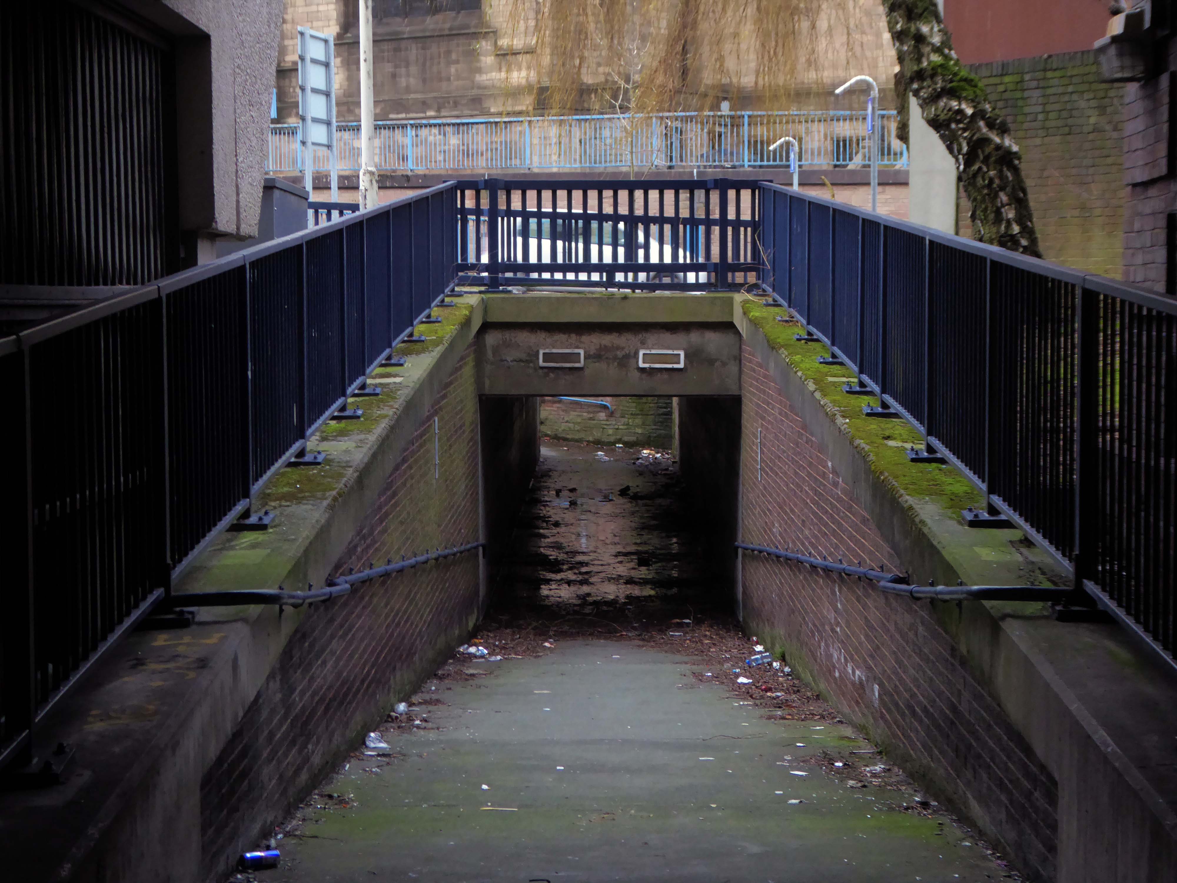
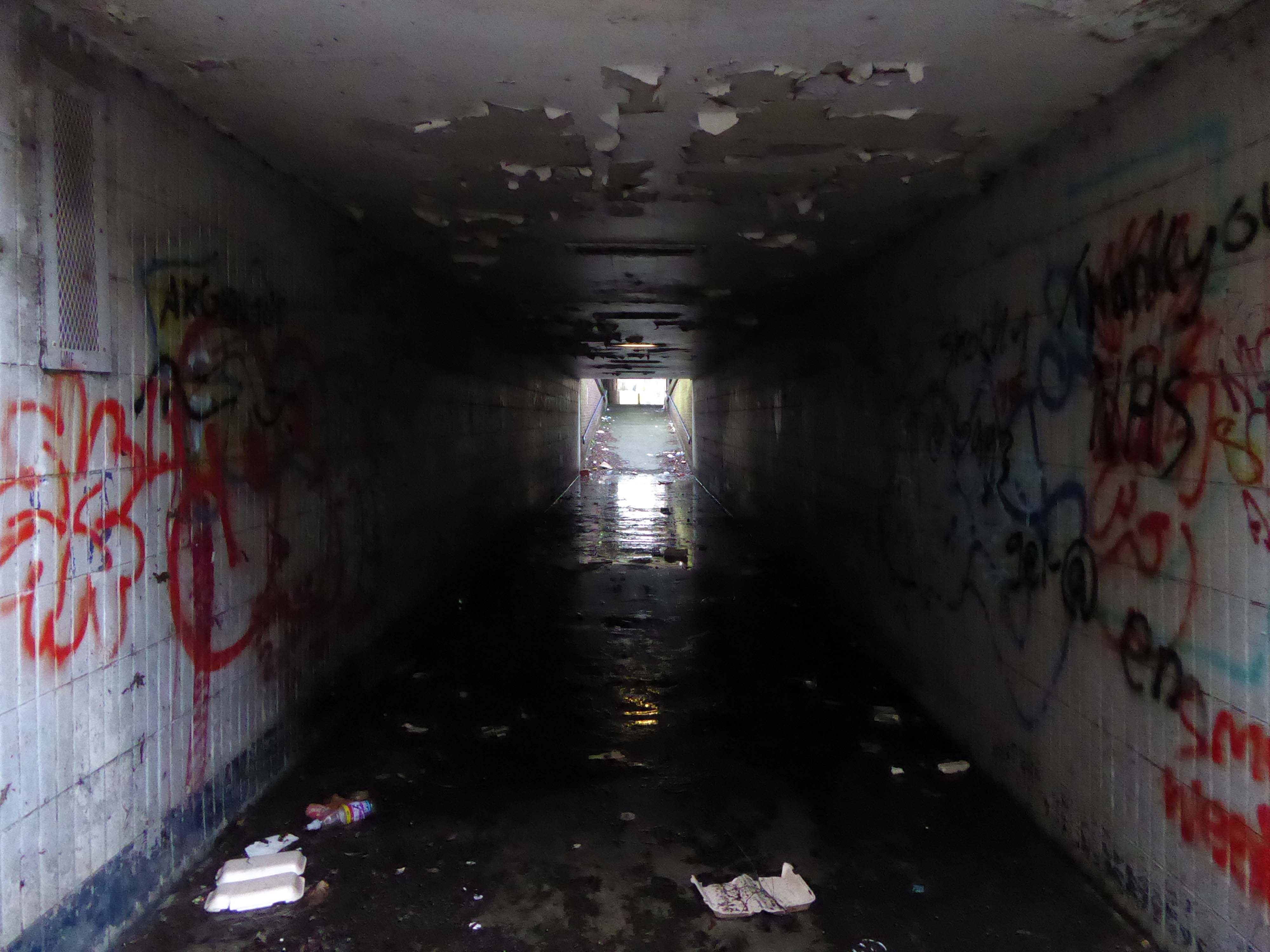
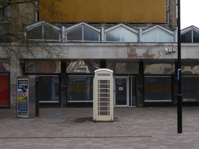
Minefield of lager cans near Wigan school sparks worry Wigan councillors.
They are on a mission to stop the grounds of a derelict building, which lies just yards away from a school, being used as a drinking den.
Though in fairness I was witness to neither a minefield or drinking den – just a telephone exchange.