BHS Murals – Newcastle upon Tyne

We here in Stockport have our own BHS murals, happily so does Newcastle.

The work of acclaimed artists Joyce Pallot and Henry Collins, they worked on a large number of murals and exhibition designs for amongst others, Jamestown Festival, USA; Brussels Exhibition; Expo 70; Japan; Shell Centre; GPO Tower, London; Grosvenor House, London; Ind Coope Ltd; Philips Business Systems; Sainsburys; British Home Stores; Cwmbran Arts Trust; Essex County Council and IBM, London.

1460712918

They never worked on the site itself, but used a regular contractor Hutton’s Builders Ltd Colchester, who cast the concrete in panels around four feet square. There are two relief panels, depicting events in the history of Newcastle. Highly stylised, the relief is moulded to a depth of 5cm and features some charming Geordie characters.

The left panel contains the following inscriptions and images Monkchester with Roman head and Newcastle coat of arms. Roman ship and golden coin. Collier Brig 1704-1880 with ship. Oceanus with anchor and seahorse with trident. The right panel contains the following inscriptions and images: Jupiter Fortuna with two figures. Engineering; Davy and Stephenson; coal mining ship building with images of same. G & R Stephenson; Armstrong Whitworth; Rocket 1829 with image of first steam engine. Armstrong 12 Pounder RA with image of gun. 1878 J.Swan Pons Aelius with bridges depicted below. Turbinia and image of ship. Various churches with names carved about including Grainger Dobson 1865; 1838 Green Stokoe; Bewick with a swan; a figure and Brigantia. Final section on far right has Geordie over two figures, then the Keel Row with a loading boat at the bottom. 

Information from – PMSA

P1160129

The building was originally developed by C&A and it is thought that funding for the reliefs might have been provided by the store and/or Northern Arts. It became BHS which subsequently closed last year, the building is now occupied by Primark, C&A estates still own the site. 
    panel 1

panel 2

The mural illustrated the cover of the 1975 Newcastle Festival.

NewcastleFestival1975

NewcastleFestival19752

P1160116

P1160117

P1160118

P1160119

P1160121

P1160122

P1160124

P1160125

P1160126

P1160127

Concrete Toon

Everything is up in the air.

Tyneside is self evidently enamoured of elevation – they simply adore bridges, having five and another one as well.  Walking driving, running trains across the mighty Tyne Valley, why they even write songs about them.

In the Swinging Sixties T Dan Smith vowed to create a Brasilia of the North, which as good as his word he did, though sadly lacking the requisite regard for the law of the land.

What remains is a complex interwoven structure of urban motorways, walkways, multi-storey car parks and tower blocks. To explore is to enter a world of the sublime, exhilarating and still yet mildly confusing.

Can you get there from here?

P1160439

P1160440

P1160442

P1160443

P1160444

P1160445

P1160446

P1160447

P1160449

P1160450

P1160451

P1160454

P1160455

P1160456

P1160457

P1160458

P1160459

P1160438c

Newcastle Civic Centre – Rooms

Following a path from the Grand Entrance and Council Chambers, my genial host and erudite guide Debbie took me behind the scenes into the back rooms. 

Further delights unfold in this most remarkable of buildings.

Firstly into the Banqueting Hall – beneath your feet Arabescato Marble, inset with a sprung dance floor and on the vaulted ceiling  hand carved African walnut. The slightly sloping walls are of Clapham Stone, with the only double glazed arrow slit windows in the country.

P1150893

The chandeliers are hand cut crystal from Westphalia and  have the Newcastle castles on the top part of the fitting.

P1150892

The seahorse carpet was recently replaced, digitally designed and woven to perfectly match the original.

P1150895

The facing wall is graced by a John Piper tapestry, which  represents the mineral resources of the area.

P1150899

P1150901

Grilles by Geoffrey Clarke cover the alcoves and have an orange backlight to simulate a medieval fireplace.

P1150896

The room can seat up to six hundred people and is available for hire, in regular use for a wide variety of functions.

P1150891

The Model Room houses a magnificent architectural replica of the city.

P1150988

P1150962

It is also blessed with a living, walking talking spiral staircase, cast in one single piece of steel, it moves with you as you ascend and descend.

P1150983

P1150984

P1150987

This ante room dressed with Arne Vodder furniture, walls clad in raw silk and hand carved wood, is a place green oasis, a sea of calm.

P1160002

P1160003

P1160004

P1160005

Newscastle Civic Centre – The Grand Entrance

Opened on 14th November 1968 by King Olav of Norway, opened for me by Debbie Harvey on Friday 5th May 2017, thanks ever so much.

This takes us into architect George Kenyon’s Civic Centre 

Cast Aluminium portals and reveals to Ceremonial Entrance by Geoffrey Clarke.

P1160082

Staff on reception were once able to notify officials of the arrival of guests and dignitaries, using this right bang up to the minute electrical intercom.

P1150867

To the right is the engraved John Hutton Screen engraved glass panels depicting – the inventive genius of Tyneside’s most famous sons and daughters.

From left to right: George Stephenson the steam locomotive, Sir Charles Parson the turbine engine, Sir Joseph Swan electric light bulb, Lord Armstrong the gun.

Brigantia – Celtic Goddess of the tribe, The Three Mothers – offering fruit for fertility, Mithras – the slaying of the bull , Coventina  the goddess of a well, she reclines on a water-borne leaf and below her are three intertwined figures of nymphs of streams,  for in those days every self-respecting stream had its own tutelary deity. All have been found when Roman temples have been unearthed on the Roman wall.


P1150869

P1150870

P1150871

P1150872

P1150874

P1150876


P1150878

P1150879

P1150880

P1150881

A twenty three foot high, eleven tiered chandelier of hand cut Bavarian crystal from Westphalia, hangs above your head. This chandelier was commissioned on behalf of Newcastle City for the opening of the building in 1968. It has 119 light bulbs, the crystal on the top is in the shape of a castle on the base of the chandelier are sea horses. The walls are lined with random English oak, the floor down stairs is Portuguese Verde Viana marble.

P1150883

P1150884

P1150887

P1150908

P1150909

P1150910

P1150994

P1150998

Elegant Arne Vodder designed sofas litter the entrance, this truly is a palace of delights a temple of  Municipal Socialism, take your shoes off set a spell.

Y’all come back now!

P1150912


Newcastle Civic Centre – Council Chamber

Within the exterior of architect George Kenyon’s distinguished civic drum sits the inner sanctum of the Council Chamber – my thanks to the delightful head of hospitality Debbie Harvey for providing me with the most erudite and educational tour.

DSC_0059 copy

Outside the division bell, set against Danish slate, was originally to be found on the HMS Newcastle.

This silver bell is of the 10,000 ton cruiser HMS Newcastle presented to the ship by the Lord Mayor and citizens of Newcastle upon Tyne to mark her commissioning in 1937. Launched by the Duchess of Northumberland on the 23rd January 1936 at the Walker Naval Yard. In 1959 HMS Newcastle was towed from Portsmouth to Newport Monmouthshire to be broken up.

P1150916

The entrance padded with soft green leather the door clad in hand carved Cedar of Lebanon.

P1150917

P1150921

We illuminated the illuminated sign and entered – what treasures await, leather and teak furniture by acclaimed Danish designer Arne Vodder, worth thousands and thousands of pounds. Fine Swedish marble and further Cedar of Lebanon acoustic cladding, each surface of the highest quality and chosen to enhance the sound properties of the space. The councillors seated once a month on 149 leather clad  seats with integral voting and microphone modules. A high grey, skylight lit domed ceiling.

This is work of the highest possible quality, a proud summation of Municipal Socialism, our friends in the North, matched with the imaginary world of the Man from Uncle.

P1150922

P1150923

P1150924

P1150925

P1150926

P1150927


P1150929

P1150931

P1150932

P1150933

P1150934

P1150935

P1150936

P1150937

P1150938

P1150939

P1150940

P1150942

P1150943

JS109654085


Subway – Scarborough

When is a subway not a sandwich?

When it’s a doughnut!

Hard by the seafront linking Foreshore, Cleveland Way and Valley Road sits a neat little tight little island, giving pedestrian access to almost everywhere – and a car park.

Screen Shot 2017-05-03 at 16.54.51

As with every other torus worth calling a torus, at its very centre sits the presence of absence, darkened concrete subterranean causeways, linking everything to nothing.

There’s a world going on underground.

P1150450

P1150451

P1150452

P1150453

P1150454

P1150456

P1150457

P1150458

P1150459

P1150461

P1150465

P1150467

P1150468

P1150469

P1150471

P1150472

P1150482

Paddling Pool – Whitby

High atop West Cliff Whitby is a pale blue imitation of the deep blue North Sea below.

A TG Green Cornishware blue and cream striped pot, reimagined on the distant Yorkshire coast, in paddling pool form.

Scarborough Borough Council has resurfaced the paddling pool, re-concreted and repainted the bottom and the sides. The railings adjacent to the footpaths at Whitby Pavilion have been repaired and re-painted and seating next to the crazy golf has also been improved.

 Martin Pedley, Scarborough Borough Council’s asset and risk manager said:
The council has, in conjunction with the voluntary sector, invested both time and money in continuing to revitalise the West Cliff area in preparation for the summer season and the influx of visitors to Whitby.
1033839943West Cliff councillor Joe Plant added:

The improvement works that have been done both last year and this year is most welcome. Not only the visitors will benefit, but local people also and it again shows working in partnership with the voluntary sector does make a difference.

The Big Society in action, replacing railings improving lives.

I arrived in late April the pool as yet sans d’eau, more of a pedalling pool than paddling pool as the BMX bandits invaded the space, in direct contravention of the rules and regulations.

P1150592

The water when present is some twelve inches deep, clearly better suited to larking, splashing and cavorting rather than performing The Twister, a  bewildering blur of twists and turns two and a half back-somersaults with two and a half twists during the 1.5 seconds between launching and entering the water at 40mph.

The pool is flanked to the north by a sweeping Lubetkin style, flat roofed pavilion complete with fully functioning toilet facilities.

Turn your back on the Abbey, go wild – take a wet walk on the West Cliff side.

P1150586

P1150587

P1150588

P1150589

P1150590

P1150596

P1150599

P1150603

P1150604

P1150605

P1150606

P1150607

St Barnabas – Manchester

barnabas

There has been a church here since 1837, there is still a church here.

Almost.

webmedia-1.php

Openshaw in the 60s was still a busy community of terraced homes and their occupants, tumbling cheek by jowl with industry, both heavy and light.

webmedia.php copy

A tightly wrapped world of corner shops and sun-canopied Silver Cross prams.

webmedia-1.php copy

The original imposing, imperious St Barnabas’s was demolished, to be replaced by a sharper space age architecture, embodying a new age of optimism.

webmedia-2.php

webmedia-3.php

webmedia-6.php

webmedia-5.php

Photographs from the Manchester Image Archive

At the same time the soot-blackened Victorian terraces, are in part replaced by newer brick and block homes, the future seemed bright.

The industry however, once so invincible, both light and heavy, begins to disappear, becomes weightless, invisible.

Slowly the assured social cohesion of that new age comes unstuck.

When the doors of one St Barnabas’s close, likewise eventually another closes.

P1050899 copy

P1050900 copy

P1050901 copy

P1050904 copy

P1050905 copy

P1050907 copy

P1050910 copy

P1050911 copy

P1050912 copy

P1050914 copy

P1050915 copy

P1050916 copy

P1150211 copy

P1150212 copy

P1150218 copy

San Remo Coffee Bar – Rochdale

Sanremo or San Remo is a city on the Mediterranean coast of western Liguria in north-western Italy. Founded in Roman times, it has a population of 57,000, and is known as a tourist destination on the Italian Riviera. It hosts numerous cultural events, such as the Sanremo Music Festival and the Milan–San Remo cycling classic.

Rochdale is a market town in Greater Manchester, England, positioned at the foothills of the South Pennines on the River Roch, 5.3 miles north-northwest of Oldham, and 9.8 miles  north-northeast of the city of Manchester. Rochdale is surrounded by several smaller settlements which together form the Metropolitan Borough of Rochdale, population 211,699. Rochdale is the largest settlement and administrative centre, with a total population of 107,926. Home to the Cooperative Movement, Rochdale AFC and a redundant cotton industry.

The two towns come together at 27 Drake Street, Rochdale, Lancashire OL161RX, home to a fine café and Italian born Tony and family. It has a well preserved menu that reflects industrial Lancastrian tastes rather than flavours of Liguria. It has an internal decorative order that is pure mid century a la mode – Pennine Style. Several more than several signs leave you in no doubt as to the availability of pies, pies with chips/potatoes, peas, gravy, veg – pies of all varieties, pies.

So pie, chips, peas and gravy it was, with a mug of tea – it always is.

Pop in say Buongiorno!

DSC_0069

DSC_0071

P1140277

DSC_0039 copy

DSC_0041

DSC_0043

DSC_0044

DSC_0050

DSC_0051

DSC_0053

DSC_0056

DSC_0059

DSC_0064

P1140278

P1140280

P1140282

P1140283

P1140287

P1140288

P1140289

P1140290

P1140294

P1140295

P1140296

P1140297

P1140298

P1140300

P1140302

P1140308

London Road aka Piccadilly Station – Manchester

The station was originally built as Store Street Station by the Manchester and Birmingham Railway in 1842, before being renamed London Road Station in 1847.  It was shared by the Sheffield, Ashton-under-Lyne & Manchester Railway and it has been rebuilt and added to a number of times, with two news spans added to the train shed roof in 1881 and island platforms added linking to Manchester Oxford Road in 1882 (replacing two old Manchester, South Junction and Altrincham Railway platforms which were built next to the station).

1997-7409_lms_2969

An imposing classical façade with a substantial cast iron and glass train shed, the approach sloping up to the frontage, as of necessity the line entered the city on a raised trackbed.

Manchesterlondonroad_old_postcard

Initially the approach was lined with railway warehousing, subsequently demolished to make way for the redevelopments of the 1960s.

webmedia-5.php

Detailed plans are made to reshape the station concourse and entrance.

webmedia-2.php
1997-9266

Dreams are turned into reality, as near as makes no difference.

webmedia-6.php
webmedia-8.php
tumblr_npa35mFqXm1rr41pto1_1280

The newly electrified lines opening up the city to a world of high speed intercity travel.

0000-0-a-nmsi-wcml-electric-1

The Krays it seems were deemed to be unwelcome visitors, everyone else came and went, met with equanimity and a bright new modernist vista.

tumblr_mhwtgsHJhN1rr41pto1_1280

The brand new shiny buffet replaces the archaic dining rooms, as Brylcreemed, bow tied and moustachioed waiters are consigned to the scrapheap of history.

1995-7233_livst_hr_76

Likewise the gloomy destination boards – out with the old!

1997-7409_LMS_2972

And in with the new.

webmedia-11.php
piccadilly

We have a fully integrated modern interior to deal with the modern passengers’ every need – including crystal clear signage, seating and bins.

114900
webmedia.php
34483218_10216677058538309_3758328904939470848_n
114899
webmedia-12.php
webmedia-14.php

Stars of screen and stage are guided through with consummate ease, Margot Fonteyn and Rudolf Nureyev in his brand new baby seal skin coat arrive in 1968 to dance Swan Lake at the Palace.

128088

Esteemed footballer Eusebio on his travels during the 1966 World Cup.

Eusebio

In 1969 Gateway House arrives, Richard Sieffert & Partners wavy hello and goodbye to  Manchester’s premier railway station.

webmedia-17.php

Piccadilly has now seen several revamps, the concourse an exercise in contemporary cluttered retail/airport chic, a 125mph Pendolino journey away from the carefully considered internal order of yesteryear.

Who knows what the future holds?

HS2 to name but one – sit back let the train take the strain.

bdb45994802efc2dffc5f6d4b13b0f78

Archival images Manchester Local Image Collection

Salford Shopping City

The construction of the shopping centre and surrounding areas continued and on 21 May 1970 the new Salford Market officially opened. From 1971 onwards new shops inside the precinct itself began to open.

However, due to a lack of funds and a political scandal which saw chairman Albert Jones jailed for eight months construction of Salford Precinct was halted. The site had only 95 shop units compared to the proposed 260, the hotel and two storey car park were never built.

In 1991 the building was refurbished at a cost of £4 million, this included the installation of roofs across various walkways, making large swathes of the centre undercover. The shopping centre which at the time was known as Salford Precinct was renamed Salford Shopping City.

On 9 August 1994 the Manchester Evening News reported that Salford City Council was planning on selling off Salford Shopping City to raise money for local housing repairs, these plans split the ruling Labour Party council, one councillor telling the press that it would be like selling off the family silver.

In 2000 Salford Shopping City was eventually sold to a private company for £10 million in an effort to cut the council’s deficit. It was then later sold in March 2010 to Praxis Holdings for £40 million, the company stated that it wanted to invest in the precinct and link it to the new food superstore.

This is a tale of our times – 60s and 70s redevelopment designed and built in the rampant spirit of free enterprise and uber-buoyant consumerism, falling foul of an economic downturn, subsequent unemployment and shrinking retail spending. Property is ping-ponged between local authority and speculative developers.

Following the riots of 2011 pledges were made regarding the future of the site, plans are still afoot, as yet to be rendered corporeal. Although the area has benefitted from an influx of students and a refurbishment of housing stock, there is pressure on the prosperity of the precinct from thriving retail developments in nearby Manchester and the Trafford Centre.

The architectural core of the site has been retained, including the 23 storey Briar Court residential tower, though diluted by more recent additions, misguided post modern detailing that threatens the integrity of full many a post war development.

P1140819

P1140823

P1140827

P1140828

P1140832

P1140834

P1140835

P1140836

P1140837

P1140839

P1140840

P1140843

P1140855

P1140856

P1140857

P1140858

P1140861

P1140864

P1140865

P1140868

P1140869

P1140870

P1140871

P1140872

P1140873

P1140874

P1140875

P1140876

P1140878

P1140879

P1140881

Minut Men Totems – Salford

The three concrete totem sculptures of 1966 by William Mitchell, which stand in the courtyard of the Allerton Building, University of Salford, are recommended for designation at Grade II for the following principal reasons: * Historic Interest: as a good representative example of the commissioning of public artwork as an integral element of the design of new higher education colleges and universities in the post-war period, here succeeding in imbuing a distinct identity and image on an otherwise relatively plain complex.

So it seemed appropriate to cycle to Salford early one sunny Saturday morning, in an otherwise relatively plain manner in order to see the three totems.

William Mitchell was a leading public artist in the post-war period who designed many pieces of art in the public realm, working to a high artistic quality in various materials but most notably concrete, a material in which he was highly skilled, using innovative and unusual casting techniques, as seen in this sculptural group. He has a number of listed pieces to his name, both individual designs and components of larger architectural commissions by leading architects of the day.

Historic England says so, they loved them so much they listed them Grade II.

I loved them so much I listed them lovely, especially in lowish spring light, set against a clear blue sky and framed by the surrounding academic buildings.

Further info here on Skyliner

Go take a look.

P1140759

P1140760

P1140761

P1140762

P1140764

P1140766

P1140767

P1140770

P1140771

P1140774

P1140776

P1140777

P1140778

P1140779

P1140780

P1140784

P1140786

P1140789

P1140790


Galt Toys – An Exhibition

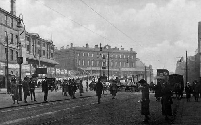
Cheadle, Stockport, Greater Manchester 1962 – and the grey post-war fug of austerity is blown away, almost forever. Though very much a local enterprise their toys, games and puzzles display a strong European influence and were distributed globally.

Educational in nature, non-gender specific, simple, bold, well constructed, collaborative not competitive – employing sound modernist principles and design, they were at that time almost unique in the UK toy industry.

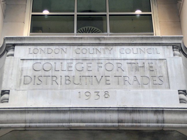
James Galt & Co Ltd. were established in Manchester in 1836 as a manufacturer and publisher of educational books and toys, relocating to Cheadle in 1956.

Ken Garland had worked for the influential Abbatt Toys, formed in 1931 by Paul and Marjorie Abbatt. Paul and Marjorie had collaborated with Modernist architects Oliver Hill and Ernő Goldfinger – committed to designing and producing educational childrens’ toys influenced by the new European movements in art and design.

Paul emphasised the importance of play, described as:

‘A force which can be used for development and valuable experience, a force which, if it is not thwarted by the wrong choice of playthings, develops into the power behind the successful architect or engineer.’ 

In 1955 Edward Newmark, who had established the Astu Studios toy company, was taken on as a junior partner by Paul and Marjorie. He remained only five years, leaving in 1960 to go to James Galt and Co. Ltd. He was joined the designer Ken Garland, who, between 1958 and 1961 had designed the Abbatts’ catalogues and advertisements, creating their distinctive house style.  His practice Ken Garland & Associates, formed in 1962, employed a small rotating group of designers over its 47-year period. Prior to forming the studio, Garland worked with editor Michael Farr at Design magazine, where he held the position of art editor from 1956 to 1962.

Ken set about smartening up the Cheadle based company, hauling it into the heart of the Modernist Sixties, the company name shortened to GALT TOYS and a sharp new Swiss style typography was adopted. Together they created flexible corporate identity, which as Ken says: they were determined not to let the Galt Toys logo become a sacred cow, not to be mucked about with.

It would, indeed, be mucked around with, but only by us.’

The style was maintained consistently for 20 years. The letterforms chosen for GALT TOYS were from a very recently issued typeface, Folio Medium Extended. The Folio type family was the creation of the Bauer Type Foundry, Frankfurt, then a close rival to the Helvetica and Univers type families.

The product line which encompassed a whole range of educational toys, games, school fixtures and fittings henceforth embraced a Scandinavian ethic of clean functionality and truth to materials. Though central to the reshaping of the brand, Ken is keen to emphasise that this was a collaborative process, involving several other designers within a flexible team.

The toys and games were modern in very sense, child-centred, none gender-specific, simple bright and colourful – employing simple graphic shapes, illustration and type, attractive and durable. The newly designed shop in Carnaby Street, with Verity & Beverley as architects, and a retail/factory/café in Cheadle were equally forward thinking in design and layout, purposely encouraging children to play with the stock, prior to possibly purchasing.

His ancillary work on the design of packaging, catalogues and in-store graphics was similarly ground-breaking, mixing image and text, very much in the mid European manner, pioneered by the likes of Max Bill and Richard Paul Lohse.

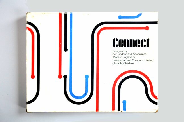
Connect exemplifies the best of Garland and Galt, twelve squares of card each with a simple linear motif, which can then be combined in a succession of seemingly infinite permutations – following a simple set of rules, the players can then produce a carpet covered in exciting abstraction. The connection to Harry Beck’s London Underground map is clear, Ken wrote and published Mr. Beck’s Underground Map in 1994, a tribute to the clarity, functionality and modernity of good design. This imaginative use of a single unit  which continually unfolds from limited graphic means to limitless possibilities, was further developed in Ken’s Trap Snap and Anymals.

Bob Chapman and I spent a lot of time developing Connect, based very loosely on dominoes, which turned out to be a best-seller, and still is, in a modified form now produced by Ravensburger Spieleverlag of Germany.  Another associate, Daria Gan, found a most satisfying outlet for her drawing skills in the card games Anymals and Upside-Down Jigsaws.’

Octons was designed by William Edward David Ryan, he was educated at Preston Grammar School and Harris Technical College/School of Art pursuing architecture. He became a member of Royal Institute of British Architects in 1965 and a partner in Derby Fazackerley Wood & Ryan Architects, Preston from 1965-1993. It is an eight sided modular construction toy manufactured in clear, coloured plastic, a slot cut into each face, permitting their interconnection in a mind boggling array of three dimensional forms. Further exemplifying the principles of simplicity and inherent stimulation of the child’s fertile imagination and explorative creativity. It is one of the few Galt games which has remained in production until the present day.

Fizzog remains a firm favourite, a fabulous name, a fabulous game of many faces. Pairing pairs of halved fizzogs, the better to produce ever more inventive and laughter inducing visages.

Kenneth Townsend was based in Hastings and worked as a freelance designer for Galt along with Hornsea Pottery, Chance Brothers, Cuckoo Bird Productions and Merit. His lively and stylised illustrative style enlivens both Super Snap and Remember Remember – these were produced, alongside several other matching games in the golden age of Galt. Employing yet again the use of strong graphic shapes, bold colour and a happy go lucky playfulness that were central to the company’s output. Developing shape recognition, numeracy, colour identification and a simple love of the visual world through play and fun.

So for some twenty years Galt and Garland et al injected some much needed life into an otherwise moribund world of play, their catalogues and products finding a way into the majority of Britain’s schools and homes, from Bauhaus to your house.

Many thanks for the loan and/or sourcing of exhibits to Wayne Astbury, Dawn Bunnell, Gemma Burgess, Paul Burnett, Sue Cook, Gail Eagle, Alison Heffernan, Sarah Moss and Alex Stone.

info panel 1ainfo panel 2ainfo panel 3a

.

Lansbury Tower – London

Neither wrought from purest ivory, nor containing some woe begotten, long gone, misplaced Rapunzel, but conceived as a democratic symbol of a new age of concrete, brick and steel.

Frederick Gibberd’s almost triumphal tower interlocks zig-zag diamonds of cast concrete upwards towards a silently clicking clock, at the head of the Chrisp Street Market.

Lewis Mumford wrote of the adjoining Lansbury Estate:  

Its design has been based not solely on abstract aesthetic principles, or on the economics of commercial construction, or on the techniques of mass production, but on the social constitution of the community itself, with its diversity of human interests and human needs.

15631.1.434.434.FFFFFF

I was privileged to ascend the internal staircase, once open to the public – now reserved for high days, holidays and nosey northern interlopers. Having mildly vertiginous inclinations when so inclined, I gingerly went up in the world and leaned out to take the air and the view.

And this is what I saw.

P1130755 copy

P1130757 copy

P1130758 copy

P1130759 copy

P1130760 copy

P1130761 copy

P1130762 copy

P1130763 copy

P1130765 copy

P1130766 copy

P1130768 copy

P1130770 copy

P1130771 copy

P1130773 copy

P1130775 copy

P1130777 copy

P1130778 copy

P1130825 copy

Lansbury Estate – London

The Lansbury Estate, to the north of East India Dock Road, is the most important, largest and best-known council estate in Poplar. It demonstrates the different trends in post-war council house design and layout. The interest of the estate lies as much, if not more, in the story of its planning and construction, as in what was actually built. This is especially true of its first phase, which formed the basis of the Live Architecture Exhibition in the 1951 Festival of Britain.

lansbury-neighbourhood-map-1951


Originally outlined in the 1943 plan for London, replacing the bomb damaged homes of displaced dockers, the estate has weathered well enough, though changes in demographics, the ever greater engulfing tide of gentrification and the containerisation of all ports, brings a fresh set of challenges and changes.

Go east – I visited the V&A Micro Museum, which has become a focus for residents’ and visitors’  memories and projections of a certain uncertain past and future. Arriving by the Docklands Light Railway, I was immediately drawn towards my destination, by the prominent Lansbury Tower, its clock patiently ticking away the time to and from 1951. Welcomed by staff and fellow travellers at the Chrisp Street Market site we began our tour at the heart of the Festival area – further details of which can be found here at Municipal Dreams.

A mix of market, shops, Festival pub, warm cream London brick terraces and low rise, later tower blocks, schools, churches and open grassed communal areas. On a cold and getting colder late winter’s day, a smattering of residents went purposefully about their business.

Life goes on.

Next time everything’s going to be different.

P1130822 copy

P1130821 copy

P1130820 copy

P1130819 copy

P1130818 copy

P1130817 copy

P1130815 copy


P1130812 copy

P1130811 copy

P1130810 copy

P1130809 copy

P1130807 copy

P1130806 copy

P1130805 copy

P1130803 copy

P1130800 copy

P1130796 copy

P1130794 copy

P1130793 copy

P1130788 copy

P1130786 copy

P1130785 copy

P1130784 copy

P1130783 copy

P1130781 copy

P1130769 copy

P1130767 copy

P1130754 copy

P1130753 copy

P1130751 copy


Seven Sisters – Return to Rochdale

I’ve passed this way before, they’re hard to miss, seven substantial tower blocks towering over the town on College Bank.

But what goes up, may come down.

Screen Shot 2017-03-23 at 13.53.11

Construction in 1963

Demolition in 2017 is one suggestion – following years of poor maintenance, problems of heating and ingress, plus a whole host of other reasons outlined here.

Screen Shot 2017-03-23 at 13.50.02

The housing trust in consultation with residents, have produced a tentative plan.

Screen Shot 2017-03-23 at 13.50.49

This may or may not include the demolition of one or more blocks. On the day of my visit, the tenants I spoke with understood that the blocks faced an uncertain future, and were rightly concerned by the rumours and conjecture. The majority would prefer to stay put, having lived there for several years, raising families and building  homes.

Whatever the outcome I hope that the wishes of the residents are not overwhelmed by political expedience, or the will of the developer.

Take a look for yourself.

P1140328 copy

P1140335 copy

P1140337 copy

P1140339 copy

P1140340 copy

P1140346 copy

P1140347 copy

P1140348 copy

P1140350 copy

P1140351 copy

P1140353 copy

P1140355 copy

P1140356 copy

P1140358 copy

P1140362 copy

P1140370 copy

P1140372 copy

P1140374 copy

P1140444 copy

P1140445 copy


Lower Falinge – Rochdale

Walking between College Bank flats and St Patrick’s church you and I will almost inevitably pass through Lower Falinge.

In April 1967 Rochdale Council’s Estates Committee considered a proposal to build 750 dwellings in four-storey deck access flats in the Falinge area. By November the £1,810,000 scheme for the area bounded by Spotland Road, Hudson Street and Toad Lane was given the thumbs up.

C_71_article_515340_body_articleblock_0_bodyimage

The four-storey development was to provide 527 dwellings with deck access, ramps and overheard walkways. It was planned so people could walk from any point in the area to another without having to return to ground level. Work began in early 1968 and was completed in three stages. More recently they have been up-graded and now have pitched roofs. Freehold Flats were built in the early 1970s. Eleven of the eventual 19 blocks were occupied by August 1971. 

Redevelopment_in_Falinge,_Rochdale,_Lancashire_-_geograph.org.uk_-_1395299

Built at a time when full employment was a tangible reality rather than a fondly recounted folk memory, the area was buoyant and relatively prosperous.

Time, the free market, and casualised labour has not been kind to Lower Falinge and many other post-industrial estates. The Thatcherite press conveniently badges the residents as scum, scroungers and frauds, a carefully conceived sleight of hand, transferring responsibility onto those careless enough to become the victims of an uncaring economic system.

scroungers_headlines_lg

Demonising and dividing working people regardless of ethnicity, ability, sexuality or ability – the equal opportunities abuser.

A few years ago there was even a national news story about a Falinge café serving fry-ups with a can of Stella for £2.50, this was untrue.

So Lower Falinge and its like become the convenient exemplar for the inconvenience of Broken Britain, a PR device to whitewash the very dirty hands that authored its very dirty demise. Those very dirty hands that have no viable solution to a very real problem, of resolving poor peoples’ uncertain futures.

Meanwhile the journalists form a disorderly queue to file the next in line, online assessment of an awful situation devoid of resolution, short of revolution.

2008826_152139

2016126_162425

Transferred from local authority control to charitable trust, forever shape shifting its hard lines to a softer, home made, fluffier image as limited resources, chase limited opportunities, all around the deck access landings.

Life goes on, we live in hope or Lower Falinge.

Limbo-5880

Mishka Henner

The estate is now post-post modern, acquiring another veneer of refurbishment over the now tarnished green of the cover all, all purpose un-repurposed steel railings.

P1140380

P1140381

P1140382

P1140383

P1140384

P1140385

P1140386

P1140387

P1140388

P1140397

P1140399

P1140401

P1140403

Balfron Tower London

The Balfron Tower Conservation Area was designated in October 1998 around the two residential blocks designed by Ernö Goldfinger for the London County Council in the 1960s. The Conservation Area boundary protects the listed Balfron Tower and Carradale House, and other buildings in the ‘Brownfield Estate’, including Glenkerry House, a community centre, shops and associated low-rise housing development.

The 27-storey Balfron Tower is Goldfinger’s first public housing project, and a precursor to his better known Trellick Tower in North Kensington. The neighbouring Carradale House and Glenkerry House sit within the landscaped areas developed at the same time. The Brownfield Estate, also known as the East India Estate, is now recognised as a fine example of planned 1960s social housing. Considered to be exemplary examples of the post-war housing schemes, Balfron Tower and Carradale House were listed in 1998 for their cultural & architectural merit.

This was my first visit, to a key building in the short history of modernist post war housing, currently something of a sleeping giant, awaiting Prince Charming’s kiss.

What will it awake to?

Tower Hamlets are mid consultation, as evidenced in this here document.

On an overcast and ever darkening afternoon, the rain cutting in on a chill wind, set against a slate grey sky, its surfaces and volumes were ever so slightly forlorn.

There is much to be done by way of regeneration, with the attendant issues of heritage, funding, gentrification and inevitably who lives where and why?

Everything you may care to almost know is here.

I walked around the area and took these pictures.

p1130830-copy

p1130831-copy

p1130832-copy

p1130833-copy

p1130834-copy

p1130835-copy

p1130836-copy

p1130837-copy

p1130838-copy

p1130839-copy

p1130840-copy

p1130841-copy

p1130842-copy

p1130843-copy

p1130844-copy

p1130845-copy

p1130846-copy

p1130847-copy

p1130848-copy

p1130849-copy

p1130850-copy

p1130851-copy

p1130852-copy

p1130853-copy

p1130854-copy

p1130855-copy

p1130857-copy

p1130858-copy


p1130860-copy

p1130861-copy

Adolfine Ryland

Adolfine Ryland worked as a printmaker, sculptor, painter and designer. Her practice across these different media was united by her keen-edged, modern style and inventive graphics. She had studied at Heatherley’s and at the Grosvenor School of Modern Art under printmaker Claude Flight. 

Ryland’s main exhibiting venue was the Women’s International Art Club, where she showed from 1927 onwards, becoming a member from 1936 to 1954. She also undertook public commissions, and worked for London County Council designing low reliefs for a number of buildings, among them the School of Butchers and St Martin’s School of Art. Her reliefs for the art school, which still decorate the entrance, show students at work. But Ryland’s work is not always easy to identify as she sometimes signed herself ‘Koncelik’, her mother’s maiden name.

In 1987 the Michael Parkin Gallery in London held an exhibition Printmakers of the 20s and 30s and Adolfine Ryland. On show were Ryland’s paintings, drawings, prints, sculptures and designs for book jackets and posters. Amongst them were two designs advertising London Underground, which speak of an optimistic age of efficient, modern public transport to the new suburbs.

It says so here

I was sauntering down Charing Cross Road on Saturday last, minding my own and everyone else’s business, then perchance I chanced upon a series of low reliefs, tucked neatly away in a nearby portal.

The London County College for the Distributive Trades – rightfully adorned with appropriate public art depicting the lasses and lads, going about their very practical business.

These are the work of Adolfine Ryland.

The building is currently in use as Foyles Bookshop.

p1130719

p1130720

p1130721

p1130722

p1130723

p1130724

p1130725

p1130726

Returning home, I did a little online research, turning these examples of her work. As is often the case with those figures considered to be on the margins of the big bad Art World, time and the subsequent neglect, conspire to leave little by way of evidence of their invaluable efforts.

This is our loss.

149557_6d70c380-a7ab-4c68-9103-bf7788fc3391_-1_570

h0433-l06066177

original

Newcastle upon Tyne – Civic Centre

Hope, we need a little hope, here embodied in a huge municipal undertaking.

Having survived the indignity of the Luftwaffe’s absence, Newcastle set about the task of knocking itself down. T Dan Smith’s Brasilia of the North had to be built, the self-styled former revolutionary communist, Sunday painter and jail bird had a vision – fuelled by that hopped up, post war optimism that had engulfed the land.

Newcastle Civic Centre is a local government building located in the Haymarket area of Newcastle upon Tyne, England. It is the main administrative and ceremonial centre for Newcastle City Council. Designed by the city architect, George Kenyon, the building was completed in 1967 and was formally opened by HM King Olav V of Norway on 14 November 1968. It is a Grade II* listed building. The Newcastle Civic Centre is the joint eighth tallest building in the city.

It is a concrete poem clad in Portland stone ashlar, Cornish granite, Broughton Moor stone, hand made bricks, Norwegian slate, Portuguese marble, English oak, travertine hand hewn and assembled into one of the finest buildings in the land, no expense spared. Liberally dotted with the labours of John Piper, Victor Pasmore, John Robert Murray McCheyne, Charles Sansbury Geoffrey Clarke, David Dewey, John Hutton and David Wynne.

A building full of surprises, big and small that repays exploration and further exploration, in that order. Go take a look, breathe that air, that air which whistles up the River Tyne, fresh from the Continent – and glow, all aglow with civic centre pride.

dsc_0058

dsc_0108

dsc_0119

dsc_0122

dsc_0121

dsc_0099

dsc_0068

dsc_0067

dsc_0063

dsc_0059

dsc_0077

dsc_0087

dsc_0088

dsc_0124

dsc_0090

dsc_0133

dsc_0091

dsc_0092

dsc_0093

dsc_0096

dsc_0106

dsc_0109

dsc_0113

dsc_0114

dsc_0116

dsc_0115